Thomas Nelson’s new KJV Vintage Series of Bibles are a set of large print thin-line text-only editions designed to match the heritage of the King James Version. This series is an upgraded version of the Large Print Thinline and includes thicker ribbons and more cover options. It’s available in Leathersoft with black, dark brown, burgundy, and tan Leathersoft. Each has unique vintage designs. In this review, I’m looking at all four editions. I’ll also compare them with several other text-only KJVs to help you decide if these Bibles are right for your needs.
Thomas Nelson provided this Bible in exchange for an honest review. I was not required to give a positive review, only an honest one. All opinions are my own.
_________________________________________________________
This Bible is available at (includes some affiliate links)
and many local Bible bookstores
_________________________________________________________
Table of Contents
Video Review
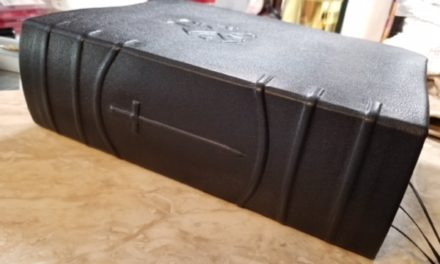
Binding
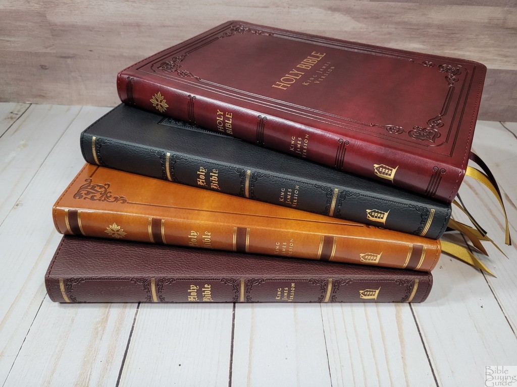
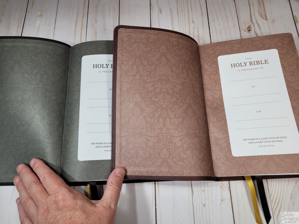
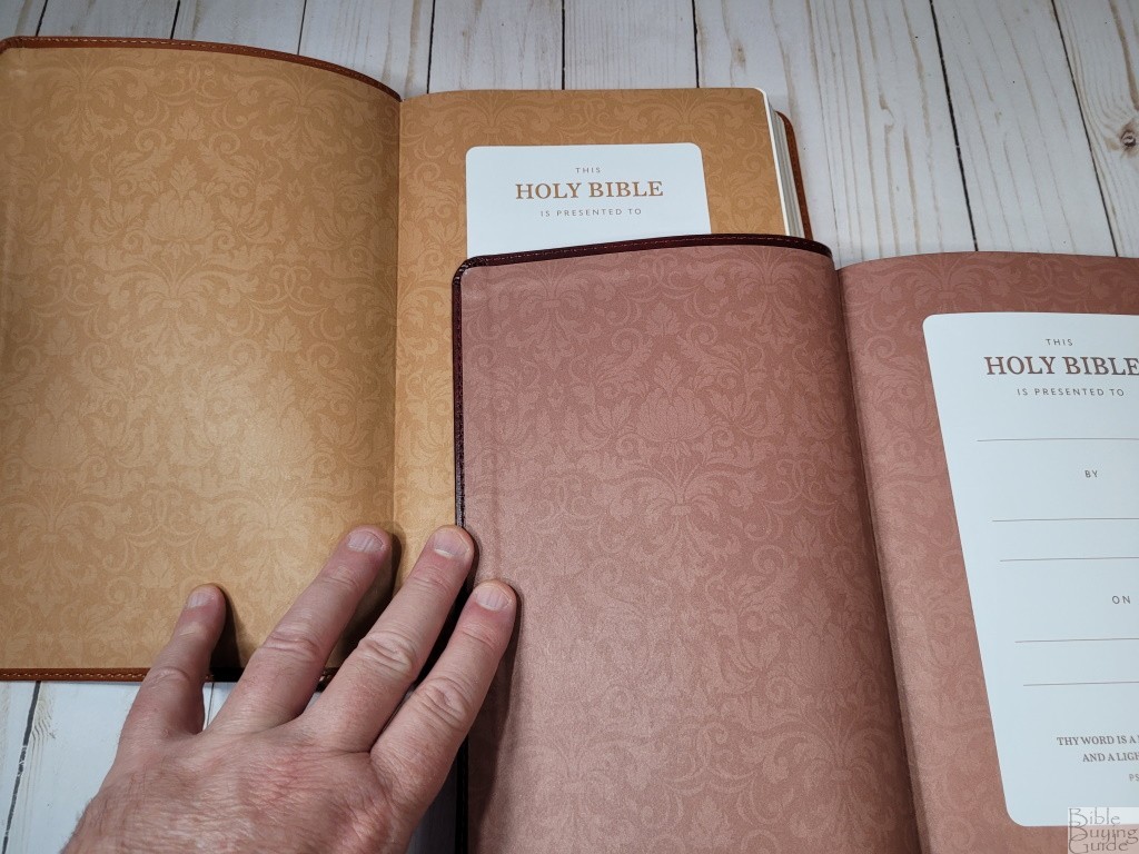
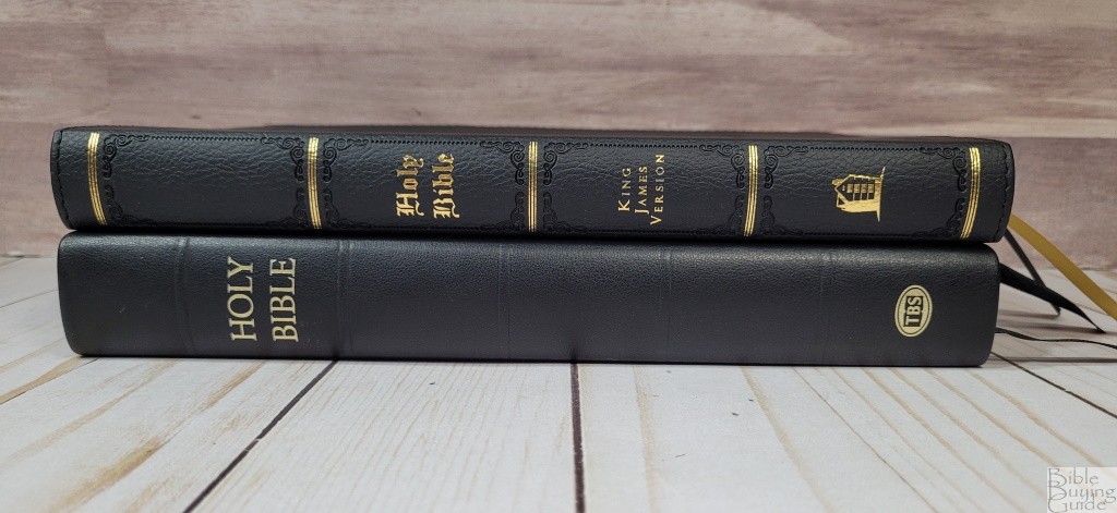
I’m looking at all four editions of the Large Print Thinline. They have several things in common. They have fancy fonts printed in gold on the front and spine that give it the vintage look. Each has a different pattern on the front. Everything else about them is modern. The text blocks are the same. All have paper paste-down liners that match their colors. They all have sewn blocks and gilded edges. They’ll need to be used enough to break them in before they’ll stay open well at the beginning of Genesis. They have two 3/8″ ribbons in different colors. Their overall size is 6.5 x 9.52 x 1″. They weigh 1 lb, 10.8 oz.
Here’s a look at all four. Two are pebbly and two are smooth, so I’ll group them together based on their texture.
Black and Brown Leathersoft
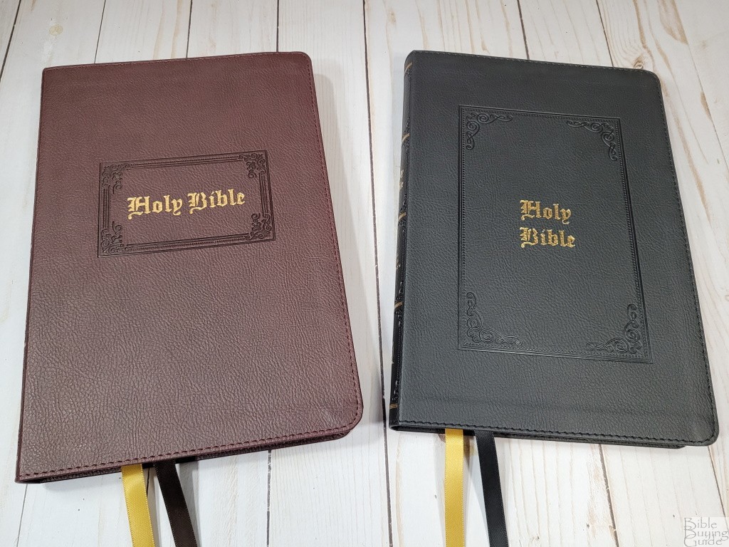


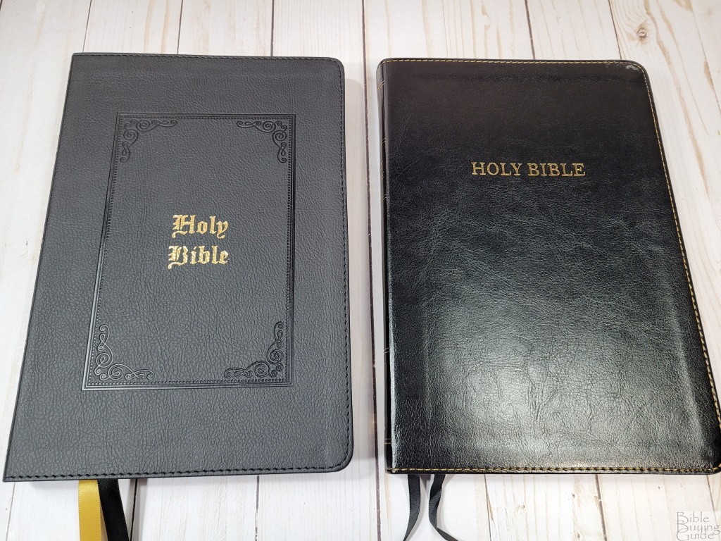
The black and brown have a pebbly grain that looks like real leather. They have debossed designs around the text on the front and within the areas on the spine between the gold rib indications. Both have a square pattern on the front, encasing the text. The black square is large and the brown square is small. The black has a black and a gold ribbon. The brown has a brown and a gold ribbon.
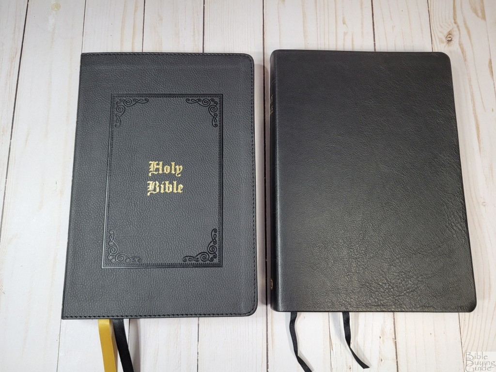
Burgundy and Tan Leathersoft

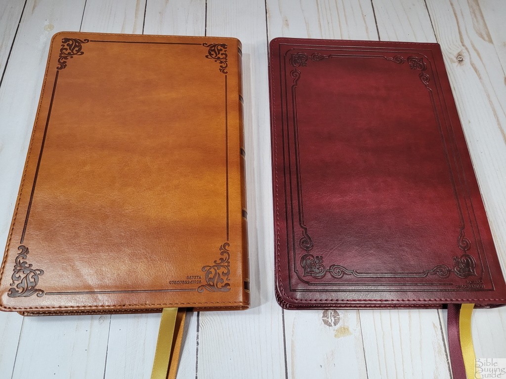

The burgundy and tan are smooth to the touch. Both have some color variation that looks elegant and interesting. The burgundy has a large pattern etched around the perimeter on the front. The font on the burgundy looks like a modern font, closing matching the Comfort Print. The tan has a large pattern around the perimeter. It’s fancy, but not as fancy as the burgundy. The spine has dark brown blocks debossed with gold on both sides to indicate spine hubs. The burgundy has a burgundy ribbon and a gold ribbon. The tan has a tan ribbon and a gold ribbon.
Paper

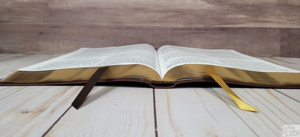
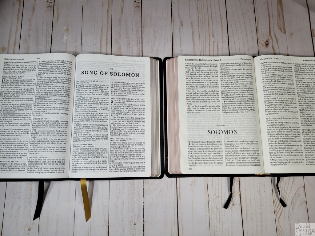
The paper is 30gsm. It’s the same paper used in all Thomas Nelson’s lower-cost thinlines. It’s white and decently opaque. It has no glare under direct light. The texture is slightly rough, making it easy enough to grab and turn. This is good paper for this price range.
Typography and Layout
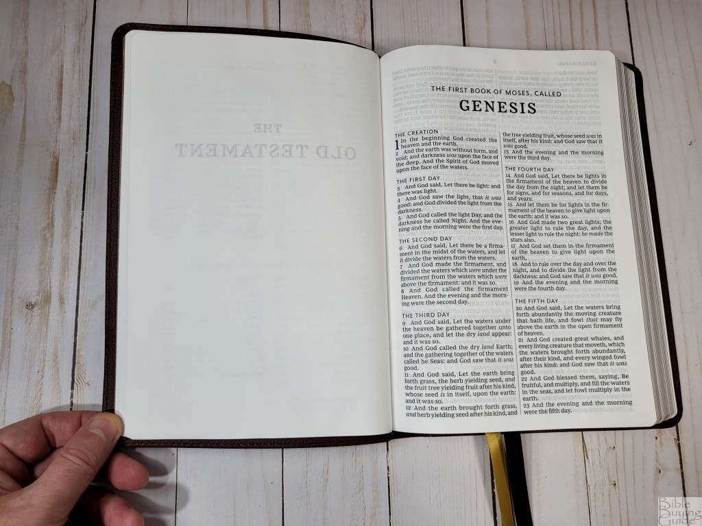

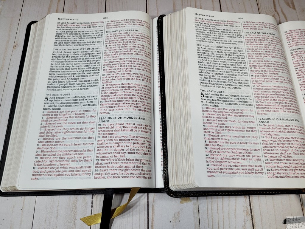
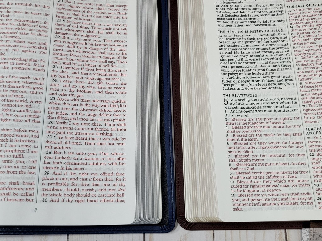
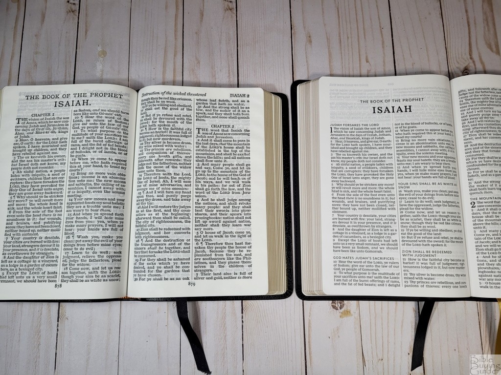
The text is set in a double-column verse-by-verse layout. The two columns are separated by a line. The text includes section headings in a large sans-serif font in all caps. The header includes the book name and chapter and verse number in the outer margin and the page number in the center. The verses are indented, but the verse numbers are not. Italics are used for supplied words.
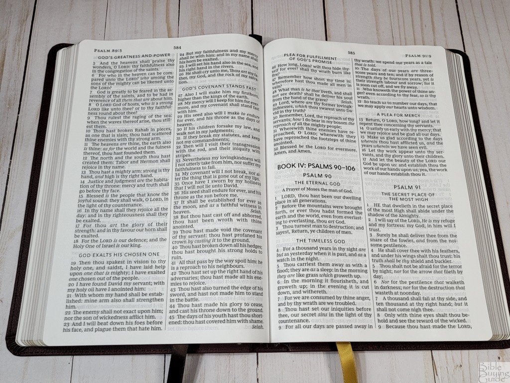

The typeface is 11.5 red-letter. This is the KJV Comfort Print typeface designed by 2K/Denmark for Thomas Nelson. The black and red letters are dark and consistent. It has between 7-9 words per line and it was printed with line matching. The text on both sides line up perfectly through most of the Bible. There are a few pages where they’re not lined up exactly. Those pages are still readable, but it does stand out a little.
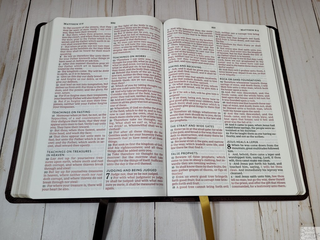

There are a lot of section headings. These take the place of pilcrows and help with the paragraphing. I’d like to see some kind of formatting to show when something is a letter (like those in Ezra and Acts), and when something is poetry. Matching the v-b-v NKJV would be ideal. Poetry is beautiful and the KJV is the most poetic translation. Other than section headings, this text is clear of distractions. This makes it ideal for preaching and teaching, or any type of public reading. The text is a joy to read and preach from.
Extras
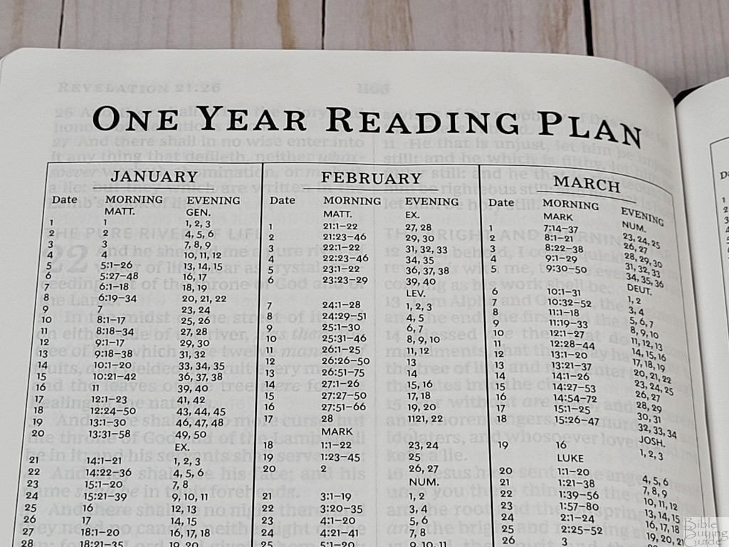
One Year Reading Plan – In the back is a one-year reading plan that includes a morning and evening reading. It shows the month with the day, and morning and evening readings for each. The morning reading is from the New Testament while the evening reading is from the Old Testament. This is a good reading plan, but it includes a reading schedule for February 29th. This means for three years you’ll have to read extra on the 28th and/or March 1st.

30 Days with Jesus – This is a table with 30 daily readings from key teachings of Jesus. It shows the day on one side and the references on the other. Most are complete chapters.
Bible Atlas
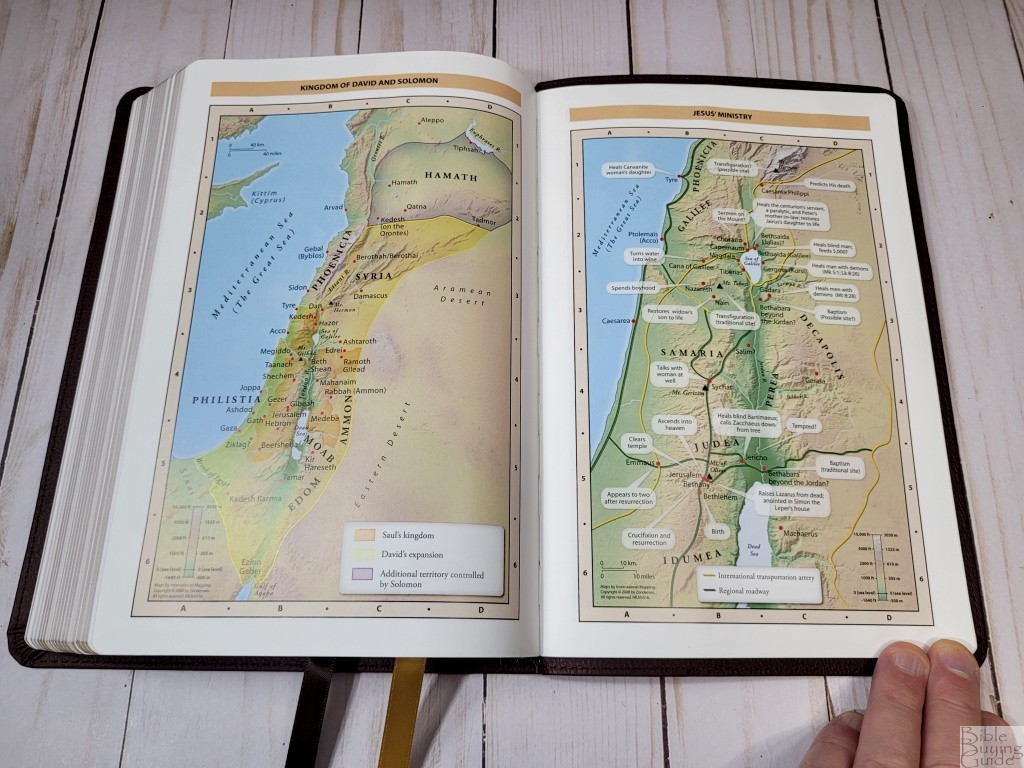

The Thinline Reference Bible has the standard 7 Zondervan maps on 8 thick semi-glossy pages. They’re printed in full-color earth tones that look great. They include topography, distance, routes, borders, possible locations of lost places, battles, elevation, cities, and locations for the events of Jesus’ ministry. It doesn’t include an index. The maps are annotated well, making them easy enough to use.
Maps include:
- World of the Patriarchs
- Exodus and Conquest of Canaan
- Land of the Twelve Tribes
- Kingdom of David and Solomon
- Jesus’ Ministry
- Paul’s Missionary Journeys
- Jerusalem in the Time of Jesus
Comparisons
Here’s how the KJV Vintage Series Large Print Text Bibles compare with several other text-only editions. Most of these are in a different price range and have better covers.
Thomas Nelson Large Print Thinline


The Thomas Nelson Large Print Thinline is the same Bible with thinner ribbons and slightly less yapp. The text block is the same. Same paper, print, pagination, etc. They’re interchangeable.
TBS Large Print Family Windsor

The TBS Large Print Family Windsor has about the same footprint, but it’s around 1/4″ thicker. Its paper is 32gsm and has a slightly creamier color and it’s more opaque. The font is slightly larger. This is a black=letter edition with no section headings or other distractions in the text. In the back are a pronunciation guide, word list, reading plan, and maps.
CBP Midsize Large Print Text
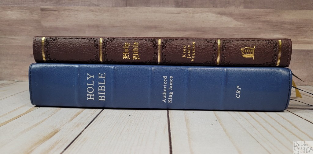
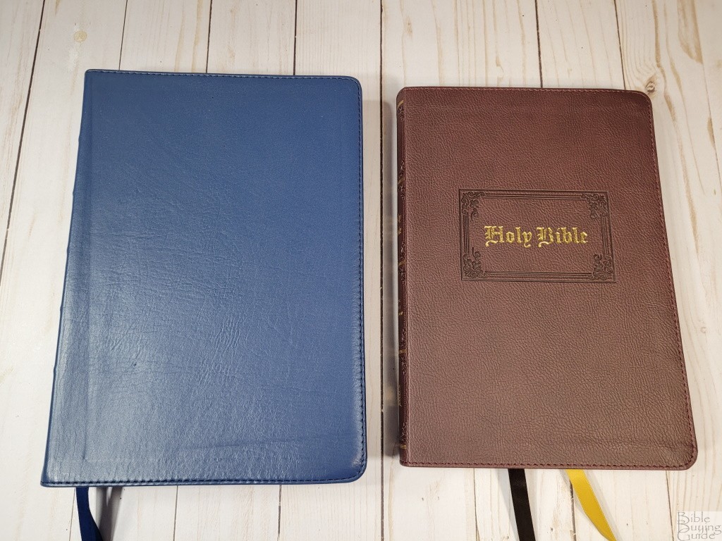
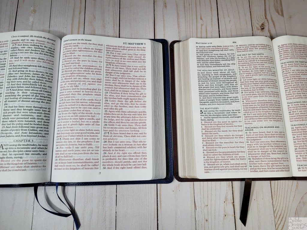
The CBP Midsize Large Print Text has about the same footprint, but it’s a half-inch thicker. The paper is slightly thicker, but it’s not as opaque. The font is larger and has more space within the text and between the lines. The black and red text is about the same darkness. It doesn’t have section headings, but it does have summaries at the top of the page. This one has a concordance and maps with an index.
Cambridge Large Print Text
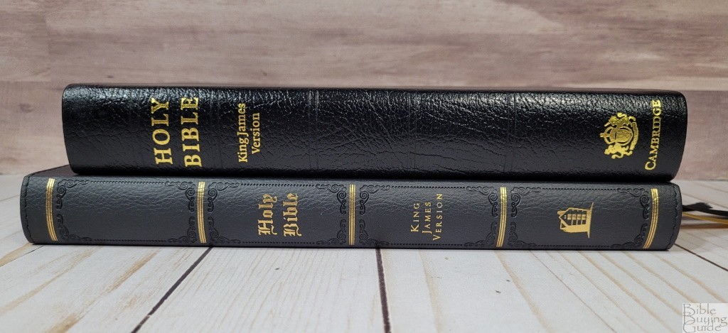


The Cambridge Large Print Text has a smaller footprint, but it’s 1/4″ thicker. The paper is slightly thicker. The font is larger and bolder, and it includes self-pronouncing marks within the text. It’s a black-letter edition. Rather than section headings, it has page summaries at the top of each page. It has no other features in the back.
Conclusion

Thomas Nelson’s Vintage Series is a clean and usable KJV. The size is good for carrying. The font is dark and consistent. Due to the clean text, I can see this being the Bible I use for preaching and teaching. The quality is excellent for this price range. These are excellent Bibles to carry and use without having to worry about them getting damaged from use.
My only complaint is the name only applies to the cover. I expected to see drop caps like those in the Sovereign and maybe even some articles in the front or back about the KJV. This is what I think of when I hear “vintage” with KJV. The covers do look interesting and they’re great for the price. I appreciate the extra thought that went into the covers and the ribbons.
Anyone looking for a large print KJV at a low price should consider the Vintage Series. I’ve always liked the thinline design, and this design is clean and draws me to it. Now, I want this Bible in the Premier Collection with two-color printing.
_________________________________________________________
This Bible is available at (includes some affiliate links)
and many local Bible bookstores
_________________________________________________________
Thomas Nelson provided this Bible in exchange for an honest review. I was not required to give a positive review, only an honest one. All opinions are my own.


Trackbacks/Pingbacks