
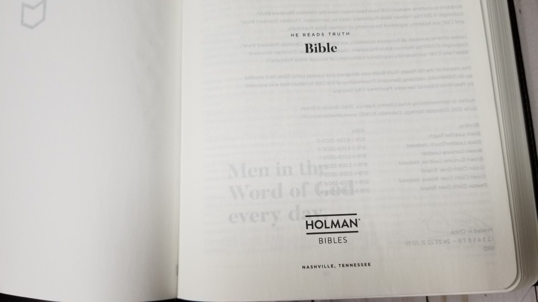
He Reads Truth is a CSB Bible that’s part of the He Reads Truth ministry. The goal of this Bible is to provide a design that would draw you to read it every day. The design and content of this Bible are similar to She Reads Truth, but it doesn’t include devotionals, color for the maps and graphics, or the topical index. It’s available in several covers including hardcover, imitation, and genuine leather. I’m reviewing black Leathertouch, ISBN: 9781535935050, made in China.
B&H provided this Bible in exchange for an honest review. I was not required to give a positive review, only an honest one. All opinions are my own.
_________________________________________________________
This book is available at (includes some affiliate links)
and many local Bible bookstores
_________________________________________________________
Table of Contents
- Video Review
- Cover and Binding
- Paper
- Typography
- Book Introductions
- Study Material
- Comparisons
- Conclusion
Video Review
Cover and Binding
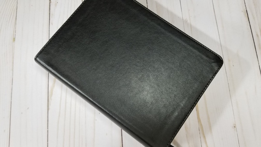
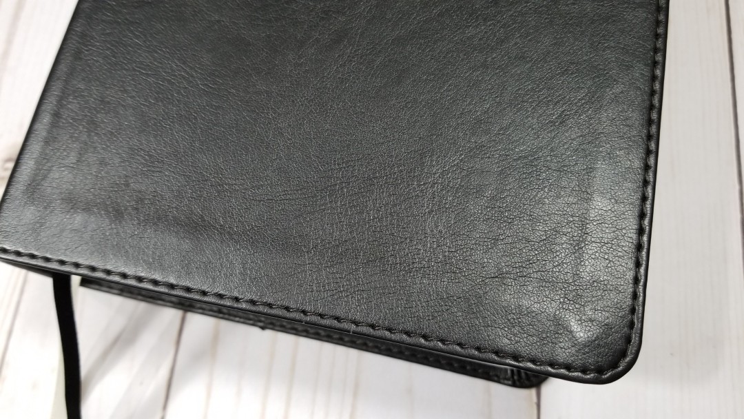
The cover of my review copy is black Leathertouch (imitation leather). It’s smooth but it does have texture and a grain that looks like natural calfskin. I won’t mistake it for calfskin, but I do like how it looks and feels. It has perimeter stitching. It has nothing printed on the front. The spine has the title and logo dry-stamped so it shows without color.

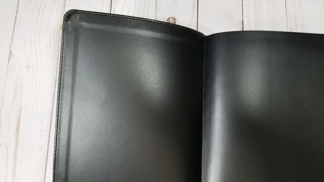
It has a paste-down liner. It’s Smyth sewn and stays open out of the box if you flatten the spine to the table. Even though this makes the pages not as flat as I’d like, it was still easy enough to use.
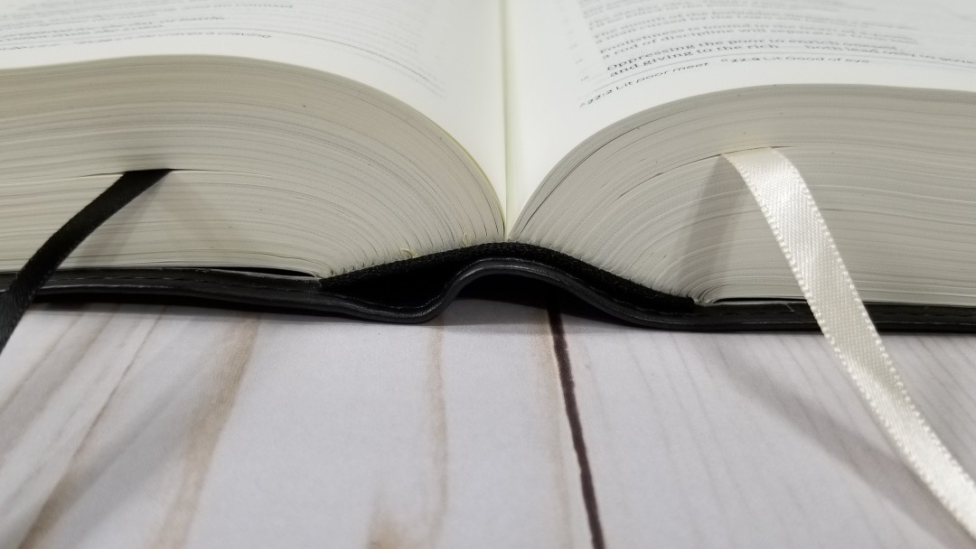
It has two different colored ribbons: one black and one cream. They’re thin, but they’re long enough to pull to the corner to open easily. The overall size is 8.8 x 6.5 x 2.5″ and it weighs 3lbs, 4.2oz. At this size, I’m not likely to carry it with me.
Paper
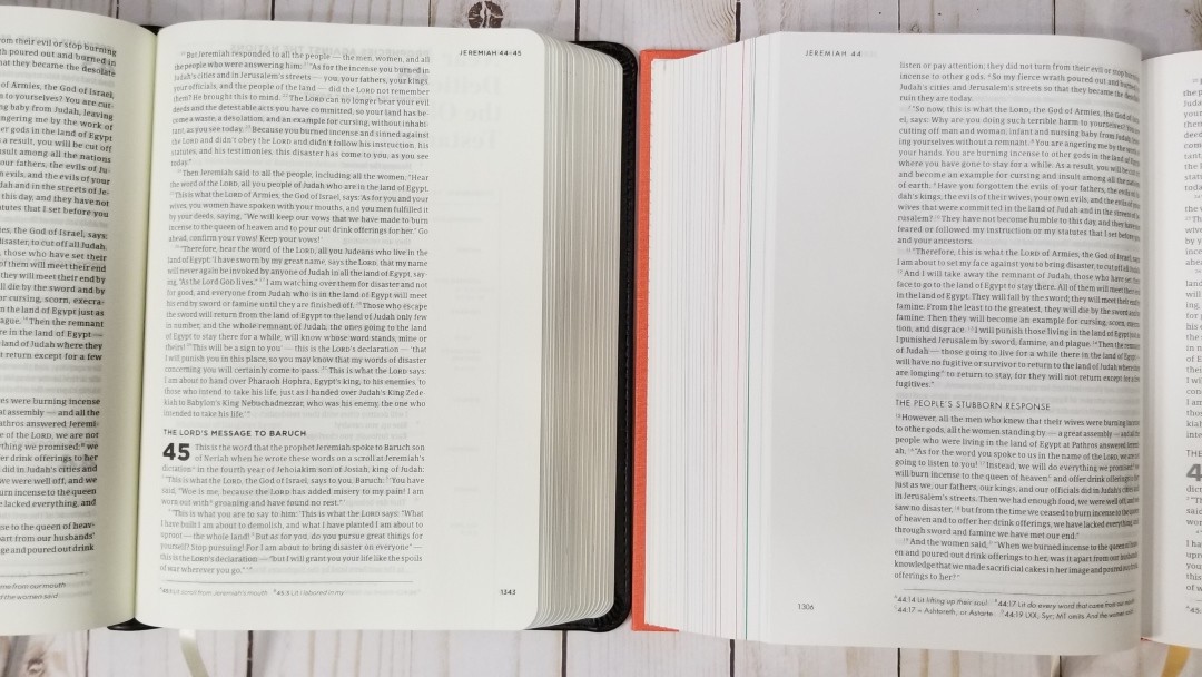
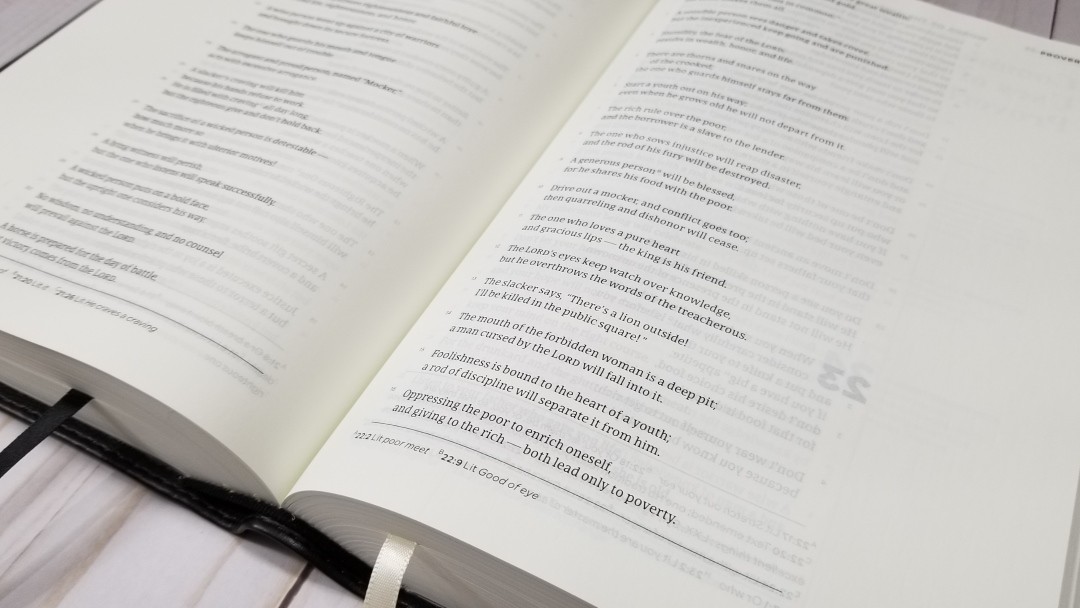
The paper is interesting. I love it and I’m annoyed by it at the same time. I’d guess it to be in the low 30’s in gsm. It’s ivory in color and the texture is rough and it has a streaky grain that I find attractive. It’s easier to turn than most Bibles. The part that annoys me is the opacity. The print shows through several pages. This is partially due to how dark and bold some of the print is, which I also love. It’s most obvious with graphics.
If they could make the paper more opaque without changing the thickness (I don’t want this Bible any thicker), color, or texture they would have about the perfect paper. I don’t want to mark in this Bible because I’m afraid it would show through too much. It’s not so bad that I can’t use it, but I do notice it every time I read from it. The page edges are white.
Typography
The text is presented in single-column paragraph format with poetry in stanzas. Footnotes are placed under the text and are separated by a line. The book name and chapters are placed in the outer corner in the header and the page number is placed in the outer corner in the footer. Chapter numbers and section headings are in bold.
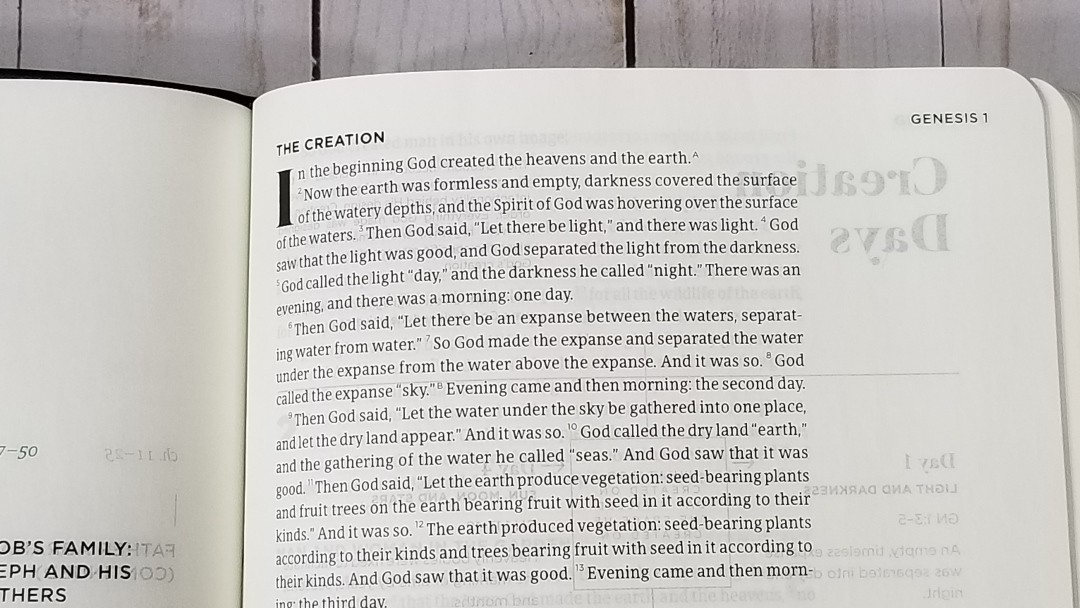
The typeface is around 8 point with a generous leading. This is the Bible Serif typeface designed by 2K/Denmark. It has around 14 words per line and it’s printed with line-matching so the lines of text line up in the same location on both sides of the page to improve readability. The text is a joy to read.
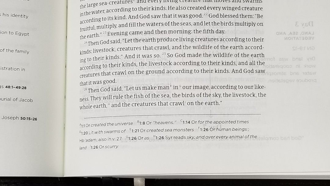
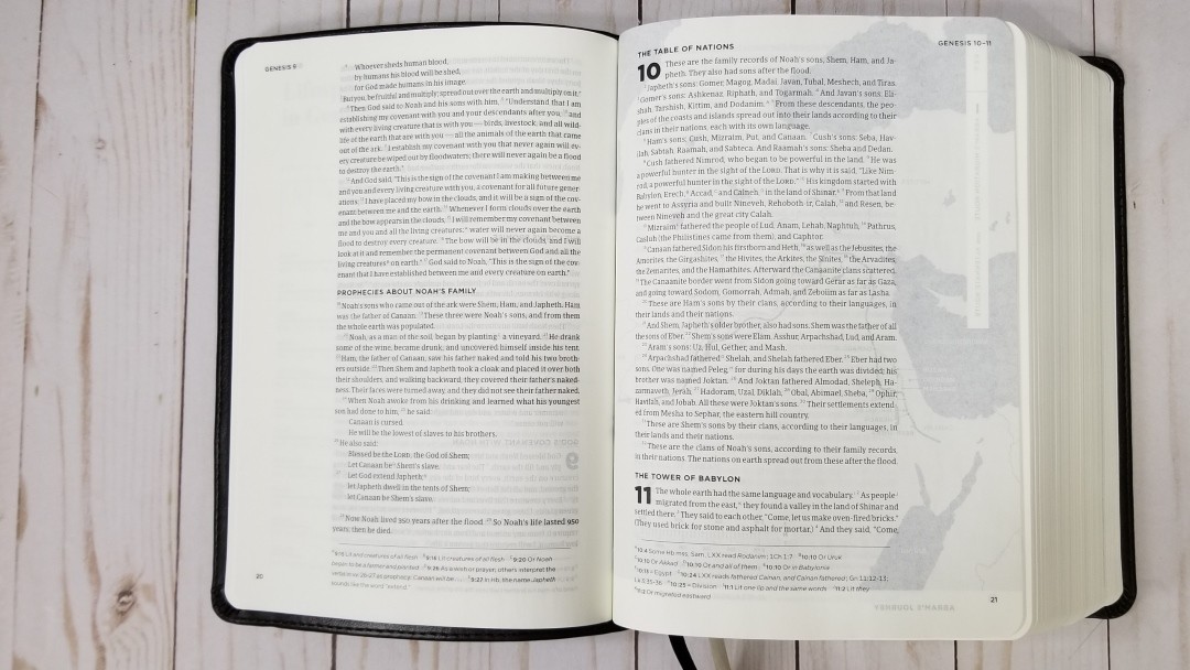
It has wide outer margins for notes. The format looks like a journal edition, but the margins do not include ruled lines. The inner margin is extra-wide to bring the text out of the gutter.
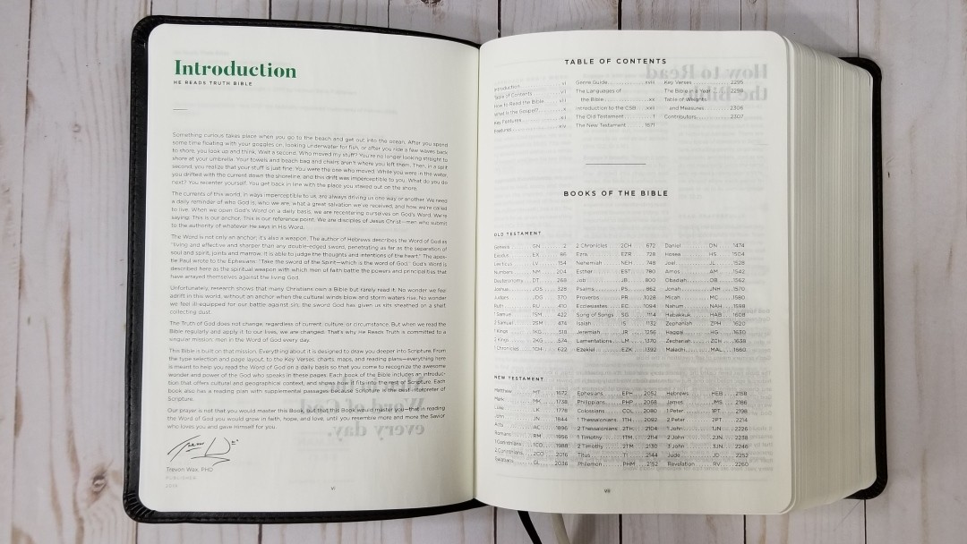
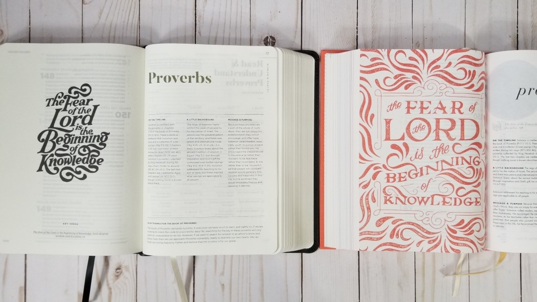
Book Introductions
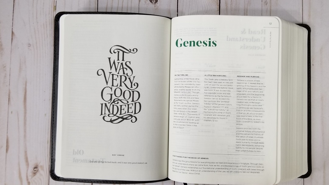
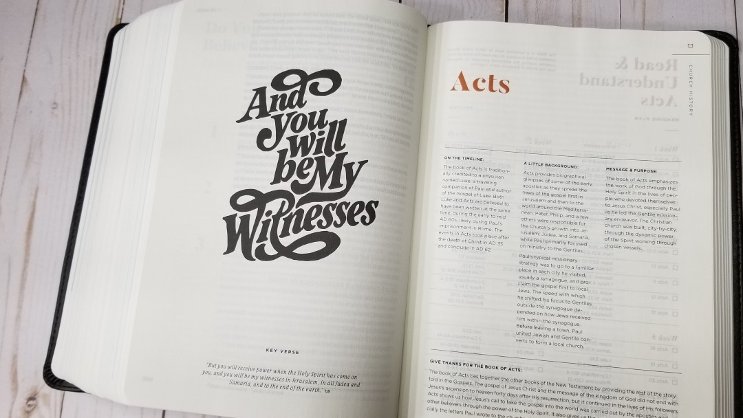
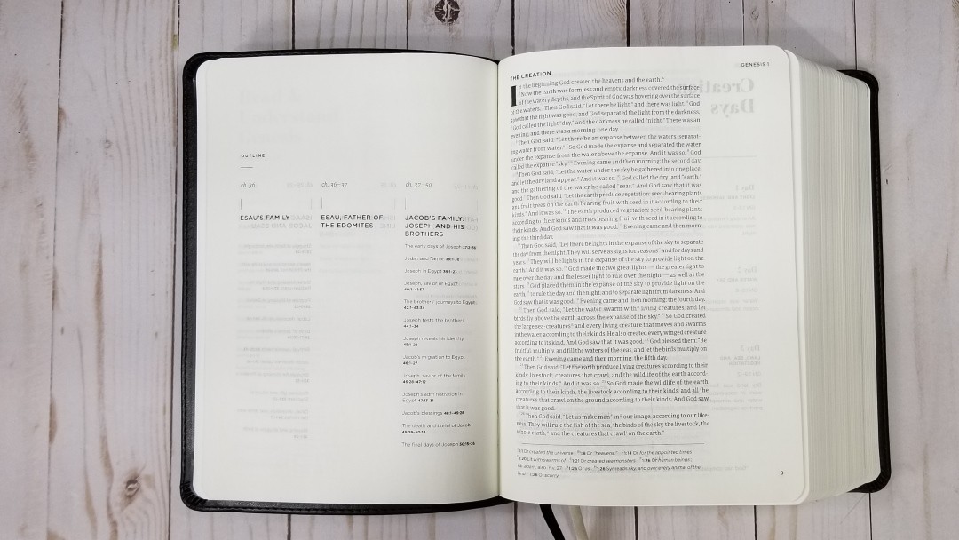
The book introductions include the key verse with a portion written in script on the first page. The script is printed in black ink and is large, thick, and dark. These are designed to help with memorization. Next is the title with the genre, information about the timeline, background, message, purpose, and a small devotional of giving thanks.
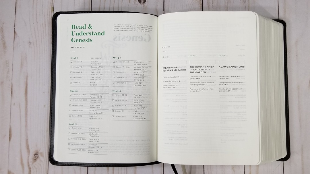
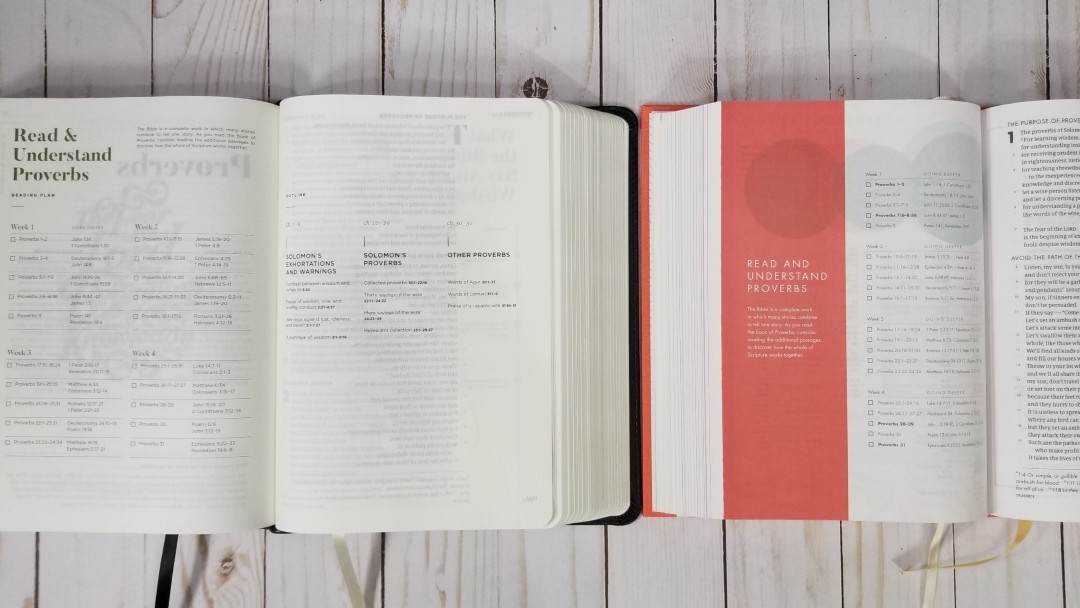
A section called Read and Understand provides some reading tips and a reading plan with checkboxes. An outline is printed horizontally and covers several pages. Vertically, the outline covers the chapters, a title of that section, and key points with references.
Study Material
The CSB He Reads Truth Bible encourages men that are seeking to know God’s Word. It does this through theological notes that are designed to increase biblical literacy including book introductions, color maps, charts, timelines, and reading plans. Each book of the Bible is color-coded according to the genre.
The study material is placed throughout the Bible on their own pages. I like this because it keeps the biblical text clean of distractions. Here’s a look at some of the features.
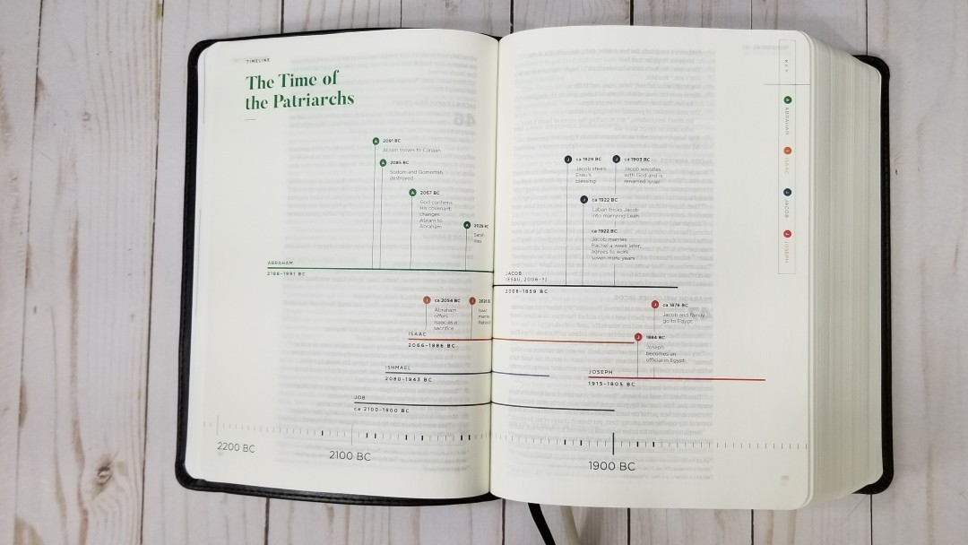
Timelines – it has 17 timelines. Most include a key and show the dates across the bottom of the page with markings of a scale. Where something shows on the timeline, those markings are in bold. The events include lines with bullets that include a letter that ties to the key, the date, and the event. Others provide a line with times or days and events for each.
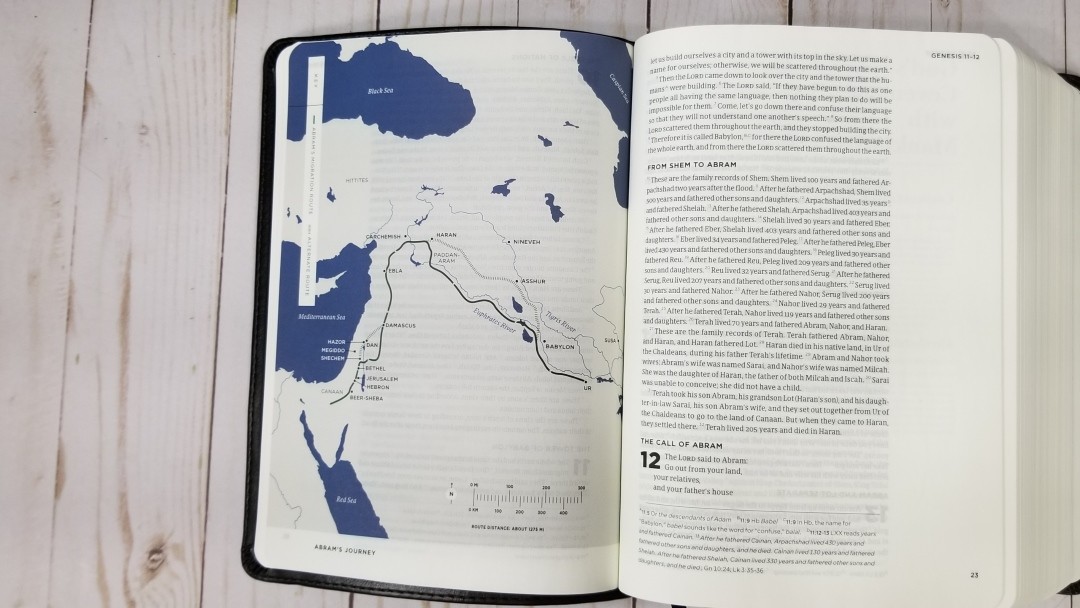
Maps – it has 21 maps. They’re printed in a minimalistic style that shows water in a solid dark blue and land in gray. The content of the map focuses on just the purpose of the map. For example, if the purpose of the map is to show a journey it shows only the cities on the route of that journey. If it only shows territories, then it doesn’t show cities within those territories. Some include lists of key places with detailed descriptions. The maps are easy to follow.

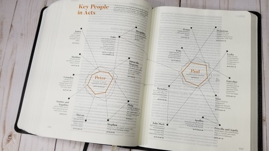
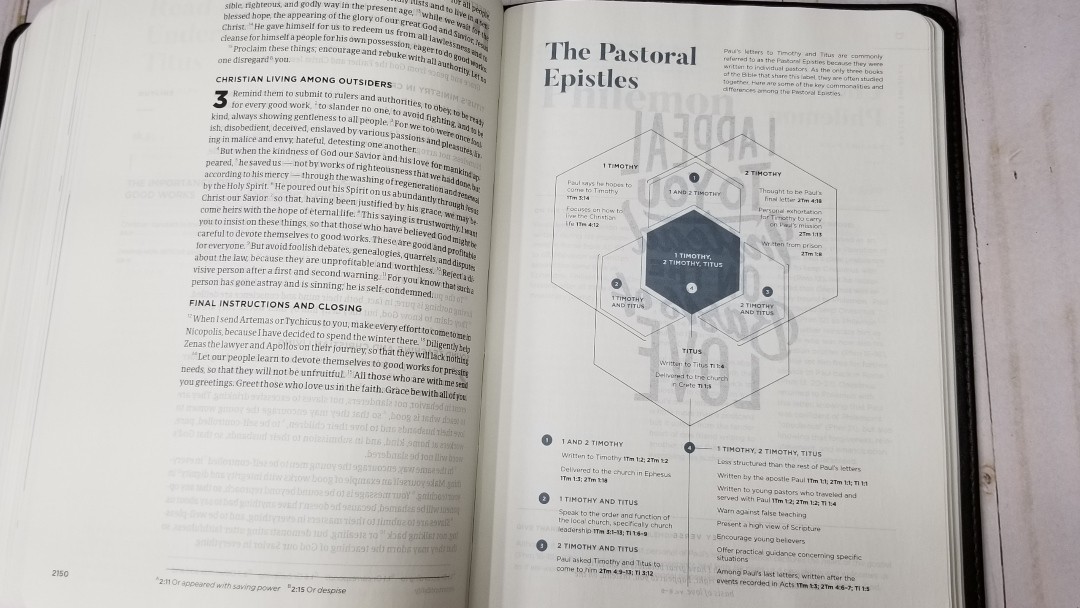
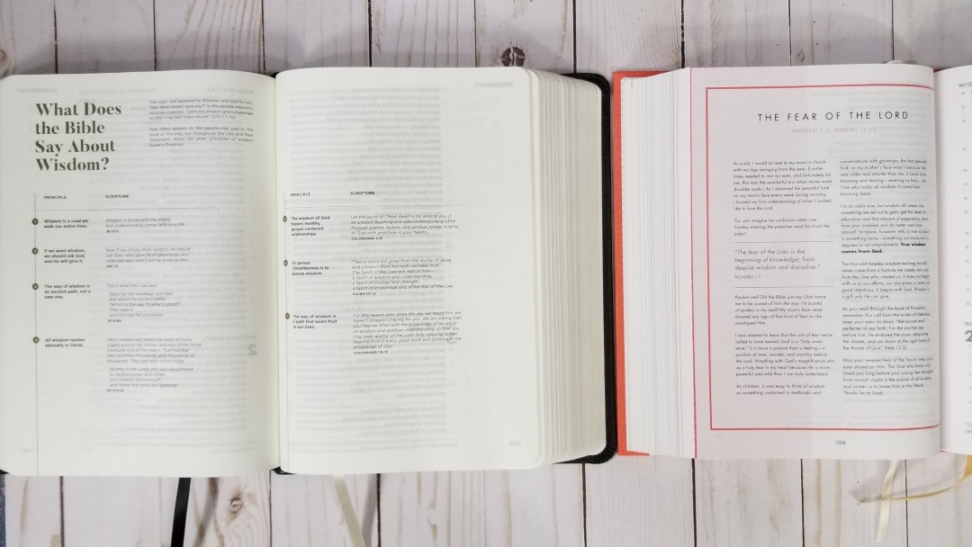
Charts – it has 122 charts, which include infographics and lists. They’ve found a clean way to present text in chart-form. They show main headings along one side with descriptive points on another side. The text of the point is placed in a column under the heading, keeping the chart clean, easy to follow, and informative. Lists answer questions or provide information. Some are numbered lists, others provide bullet points with Scripture references. They’re shown with different types of graphs or graphics.

Illustrations – it has 3 illustrations. These are line-drawings with a detailed breakdown that shows a description and provides references.
Other helps include:

How to Read the Bible – This article provides the groundwork of Bible study. It covers how to approach God’s Word, engage with it, understand it, read it prayerfully, and be doers of the Word.
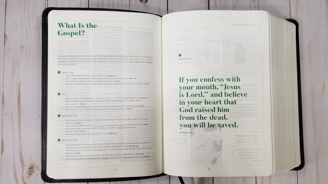
What is the Gospel? – This article steps through creation, the fall, redemption, restoration, and invitation. It’s simplified, so you’ll want to go further and read all of the Scriptures in context and compare Scripture with Scripture.
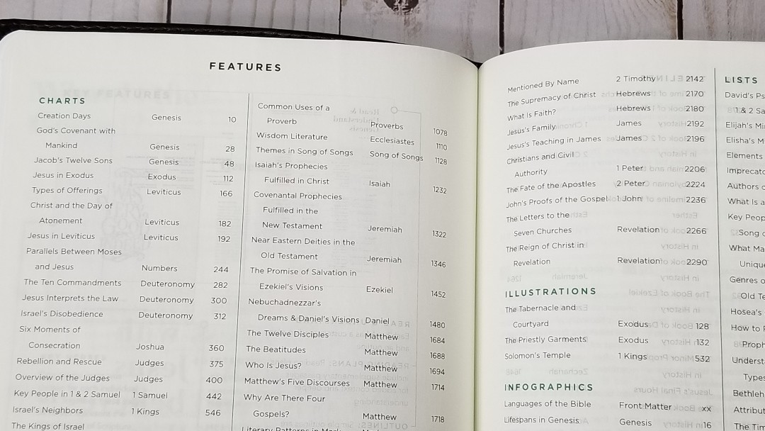
Features – This is an index in the front that shows each of the features and provides the topic, book, and page number where it can be found.
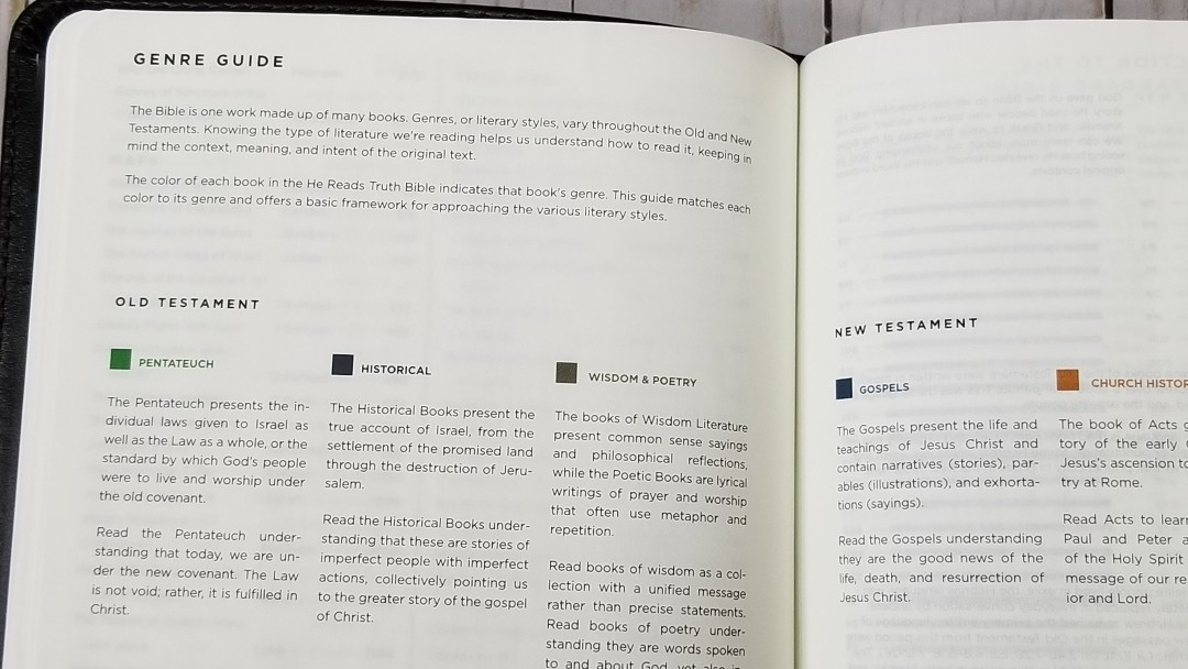
Genre Guide – This shows a list of the genres with a description of each one. It also provides a swatch of the color-code for that genre. This helps describe the literary style of each book.

The Languages of the Bible – This describes each of the biblical languages and provides a chart with a key to show which languages were used in each book of the Bible.
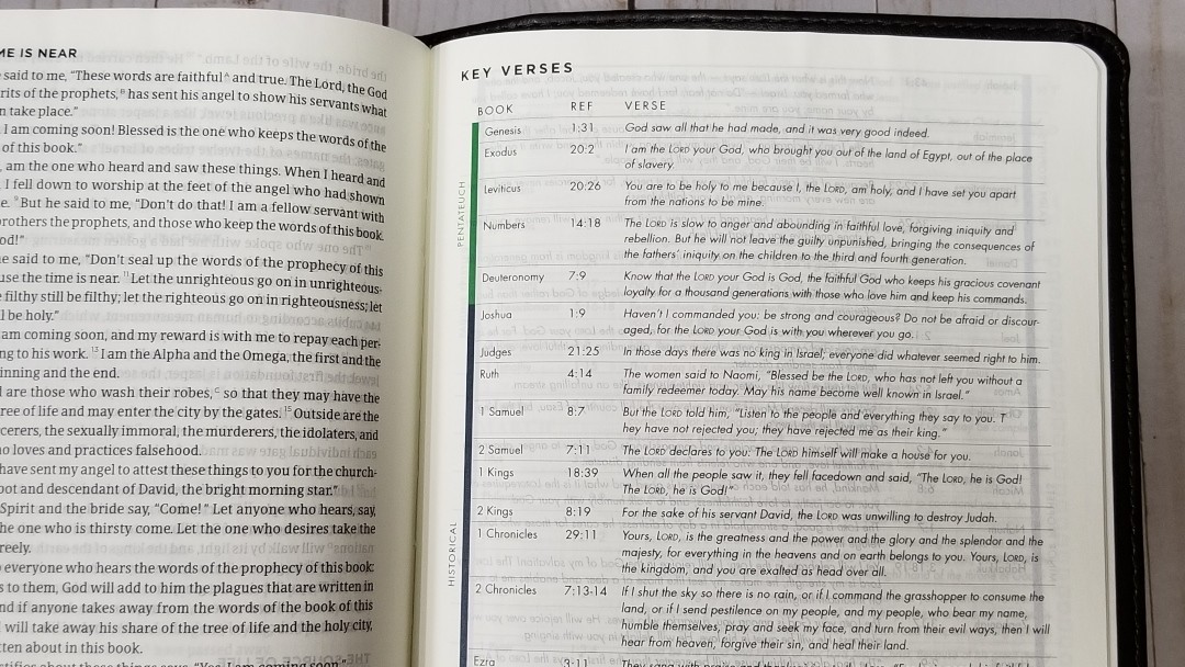
Key Verses – This is a chart in the back of all of the key verses for each book of the Bible. It shows the book name, reference, and prints the verse. A colored bar next to the book names shows the genre of each book.

Reading plan – it has the M’Cheyne one-year Bible reading plan in the back. It provides the month with a verse and then a chart with the date and reading for that date. Each day has a checkbox. It provides readings from four different places in Scripture every day.

Table of Weights and Measures – This is a chart that shows the biblical unit, language, biblical measure, US and metric equivalents, and translations.
Comparisons
Here’s a look at He Reads Truth next to She Reads Truth.
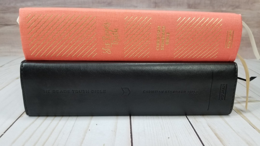
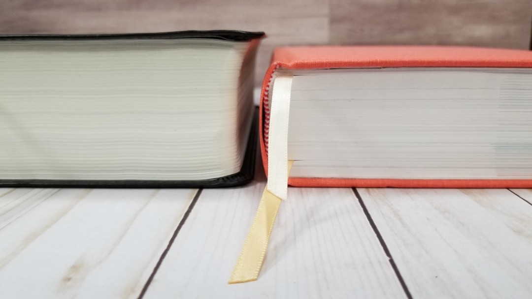

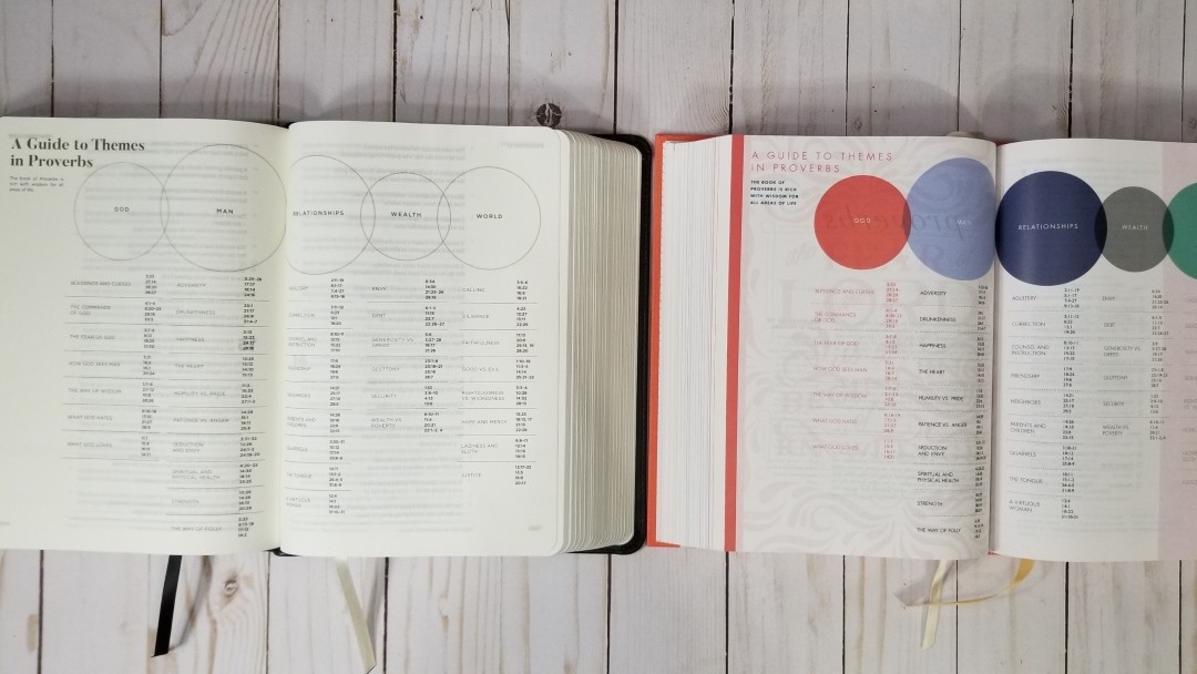
She Read Truth includes devotionals and color, and the paper is whiter and more opaque. It has different material and some of the same material is presented in different ways and in different locations such as within the book’s introductions. It’s also a thinner Bible even though the font size is the same.
Conclusion
He Reads Truth is an interesting study Bible. The design takes a minimalistic approach and seems to be done from the goal of clean graphic design. They look like they were done by a professional draftsman. This is a style that I think will appeal to the target audience perfectly. It doesn’t feel overdone and I like that the study material has its own pages rather than being printed on the pages with Bible text.
The materials are nice and it does have an elegant feel. I love the look and feel of this Bible – especially the clean charts and map designs. I also like the use of different colors based on the genre. If I could change one thing it would be to improve the paper’s opacity. I wouldn’t want the paper any thicker (this Bible is thick enough already). It has a journaling Bible feel to the Bible text. The typeface is excellent. The extra line-space (leading) makes it great for reading.
If you’re interested in a study Bible that isn’t heavy on the commentary, but instead focuses on reading the Bible with note space and a few helps here and there, He Reads Truth is a good choice.
_________________________________________________________
This book is available at (includes some affiliate links)
and many local Bible bookstores
_________________________________________________________
B&H provided this Bible in exchange for an honest review. I was not required to give a positive review, only an honest one. All opinions are my own.


Another excellent review, Randy. A few observations: 1.) Judging from both the video and your photos of this Bible, I think I am a bit skeptical about the quality of the paper in “He Reads Truth.” The ghosting looks pretty severe to me, and would be a pretty big distraction for me if I were to read it. 2.) I like the typeset they used. Everything from 2K/Denmark seems easy on the eyes, even in smaller font sizes. 3.) Did I miss something, or are there no cross-references in this Bible? I should think that would be a key feature for any Bible used for study.
Thanks Mike! There are no cross-references except for those in the introductions and charts.
Randy, I’m jumping back to your preaching bible series. On the Nelson Kjv reference journaling bible, what was the gsm on the paper and how opaque was the paper. Great review, I’ve seen this bible, the opacity is a problem and it’s because it’s as thick as the esv study bible.
Good review, men’s bibles could just provide a reference journaling bible, and that’s sufficient.
Thanks Prentiss. The paper in the Thomas Nelson is around 38gsm. It’s highly opaque.
Randy – Did you finally attempt to make notes in and/or color highlight the text? I’d be curious as to the results and what you used.
Hi Jerry. I haven’t marked it in yet. My standard is to use Pigma Microns and color penciles. That’s probably what I’ll use.
After some period of consideration and reading the various reviews, I somewhat reluctantly made the decision to purchase this Bible. I say reluctantly because I generally prefer a Bible with a slightly larger point size (I prefer 9.5-11 point size), and I was very concerned given the comments on opacity/bleedthrough. (I have the genuine leather edition in case the paper is different between editions). After getting my copy and using it for a short while, here are my comments:
– the opacity problem is real. I generally keep a piece of card stock, cut to the size of the page, in my bible — it’s especially helpful to make sure that when I make notes, that the impressions don’t go to the next page,. For this Bible this also help reduce the impact of bleed through when reading — I am actually going to locate and try a piece that is black in color. That may help even more.
– I wish the publisher had made the page size 1/2” to 3/4” larger in both directions (up to the size of the Every Man’s Bible NLT Large Print edition which has 9 point — that Bible is also thinner) — this would have allowed a slightly larger type size (perhaps 9 or 9-1/2), and might have enabled fewer pages. I agree that I would not have wanted it any thicker.
– Even though there is ample margin space in this Bible, due to the very light weight paper used and the bleed through, I am very unlikely to make notes in this Bible.
I still am looking forward to using the content of this Bible.
Hello Randy, thank you for this review! I am a proud owner of a He Reads Truth Bible, for over a year and 5 months now. I was wondering however, if there is a KJV Bible you would recommend that is similar to the he reads truth bibles, especially in terms of note taking space, study material on separate pages, maps, as well as a more modern and simple design?
Thanks and God Bless you.
Eleazar
Hi Eleazar. Excellent question! Nothing comes to mind, but I’ll think on this and be looking for something similar.
Hi Randy,
This is a well thought explanation on what the bible contains. I’m a girl, and have the He Reads Truth Bible. I was looking for bible to begin a relationship with God, and came across this Bible in our bookshop that sells second hand book. I was also not aware that this book is highly purchased and thought that maybe the “He Reads Truth” was a company name, so I didn’t bother to search it first before I bought it. I just bought it since it has infographics, charts, timelines and most specially the maps which would help me to understand the bible. Although the book suffered drink spillage causing the pages to deform. Regardless of its state, I still decided to buy it since I am a visual learner. Having this book has helped me every time I read the bible. Seeing your review also made me envious, I’m a little bit OC so it makes me comfortable that your bible is so so pristine. I hope that everyone, who is also a visual learner or someone who wants to learn a deeper level about God, purchases this. Also, I use highlighter to highlight words in this bible. Yes the opacity problem is real, it was not my problem when I saw it at the bookshop since I’m most interested in the content. But the highlighters that you can use here are the ZEBRA MILDLINERS (MILD or COOL PACK) and PILOT KIRE-NA HIGHLIGHTER (PALE). Although the PILOT KIRE-NA light are a bit stronger than the ZEBRA MIDLINERS but both don’t bleed through. For taking notes, you can use the transparent sticky notes, i just cut them in half and it fits perfectly on the space.