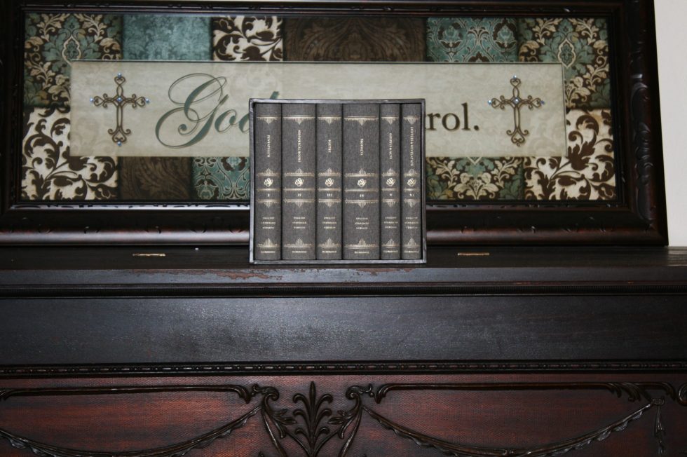
Several months ago I received a review copy of Glenn R. Paauw’s book Saving the Bible from Ourselves (review coming soon). Paauw describes the problems with Bible design and the need for a readable Bible that’s made specifically to do the #1 thing we should be doing with the Bible – reading it. The need for a reading Bible is why Crossway’s ESV Reader’s Bible, Six-Volume Set was created.
The typical Bible is a series of compromises. The text usually has to share space with footnotes and references. The font size and leading are reduced in order to make room for these tools. Paper is thin to reduce the thickness of the book block. The reason for these compromises is the typical Bible is a multi-tool. They dampen readability which in turn affects interpretation and comprehension.
There is a place for reference editions but they shouldn’t be the only Bible we use. Not every Bible needs to be a multi-tool. Bibles that specialize in one thing are better suited to that one purpose than any other Bible can be. The number one thing we should be doing with a Bible is reading it. Unfortunately, Bibles are designed in such a way that hinders readability.
Crossway answered this problem with the Reader’s Bible. It was a single volume edition that greatly improved readability but it also had to make some compromises. The paper had to be thin in order to make the Bible fit into a single volume. Although the leading and column-width was good, the leading was smaller and the column was wider than what I consider optimal. Improvements could be made, but it would require a much larger volume.
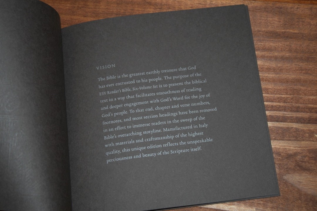
Crossway’s 6-Volume Reader’s Bible doesn’t suffer from these compromises. They created a Bible made for a single purpose – reading. They used thicker paper, larger fonts, larger leading, and a smaller column-width. They removed the section headings, verse numbers, chapter numbers. They removed the cross references and footnotes. They didn’t include a concordance, tables of weights and measures, or maps. They removed everything that hindered readability and focused on what would improve readability. It didn’t matter that it would take 6 volumes or cost over $100.
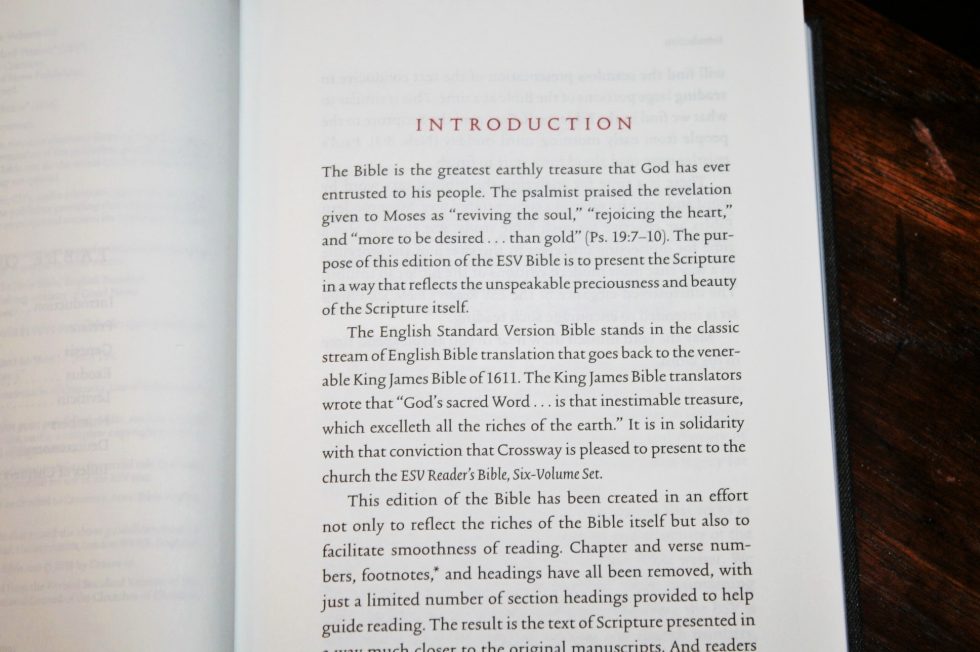
The Reader’s Bible, Six Volume Set presents the 2016 ESV text with reading in mind. The goal is to make reading smoother, which improves comprehension and engagement. It helps you to see the overall story.
It’s available in cloth over board with cardboard slipcase (ISBN: 978-1-4335-5347-9) and cowhide over board in a hand-made walnut slipcase (ISBN: 978-1-4335-5728-6. This one’s an EvangelicalBible.com exclusive). In this review I’m taking a look at the cloth over board.
_________________________
Buy from:
__________________________
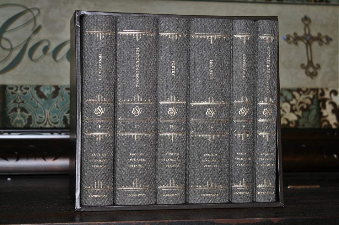
The 6 Volumes
The Bible is published in 6 volumes:
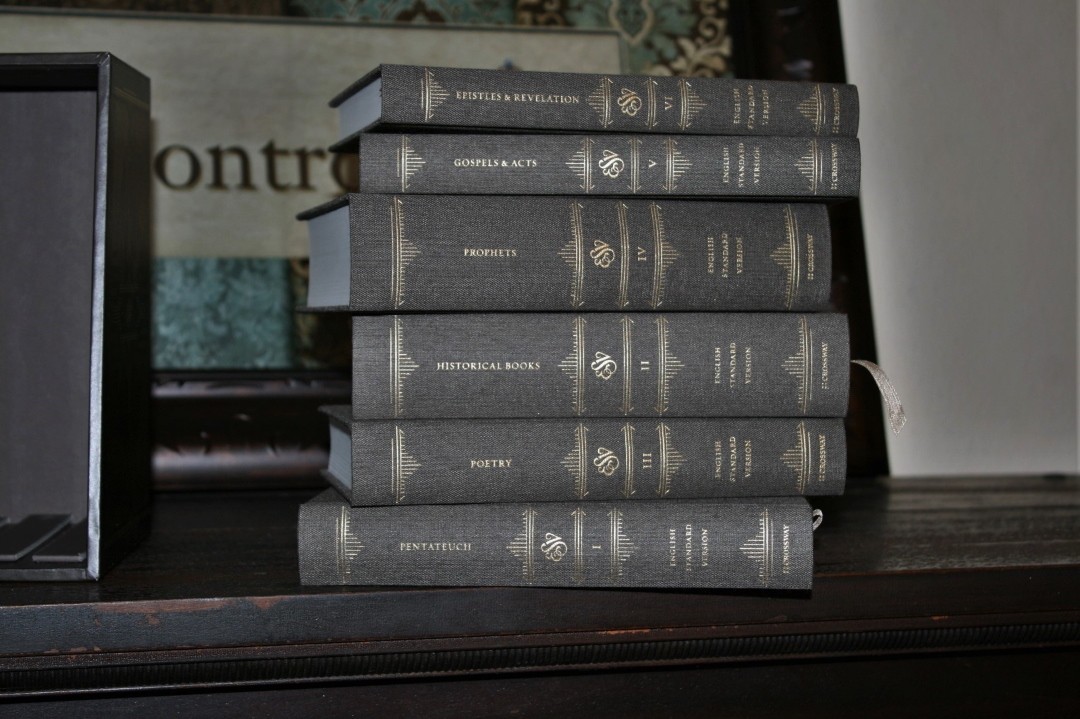
- Pentateuch (Genesis – Deuteronomy)
- History Books (Joshua – Esther)
- Poetry (Job – Song of Solomon)
- Prophets (Isaiah – Malachi)
- Gospels and Acts (Matthew – Acts)
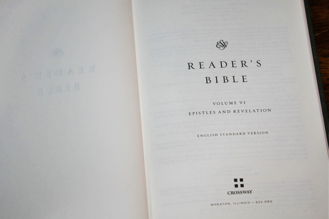
- Epistles and Revelation (Romans – Revelation)
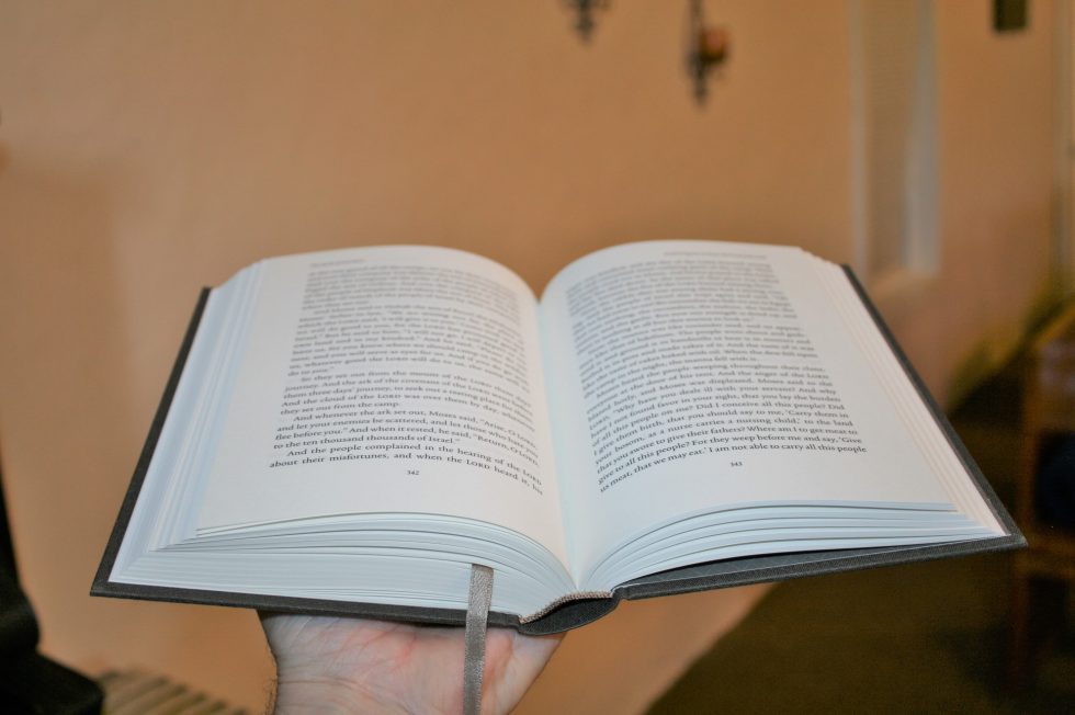
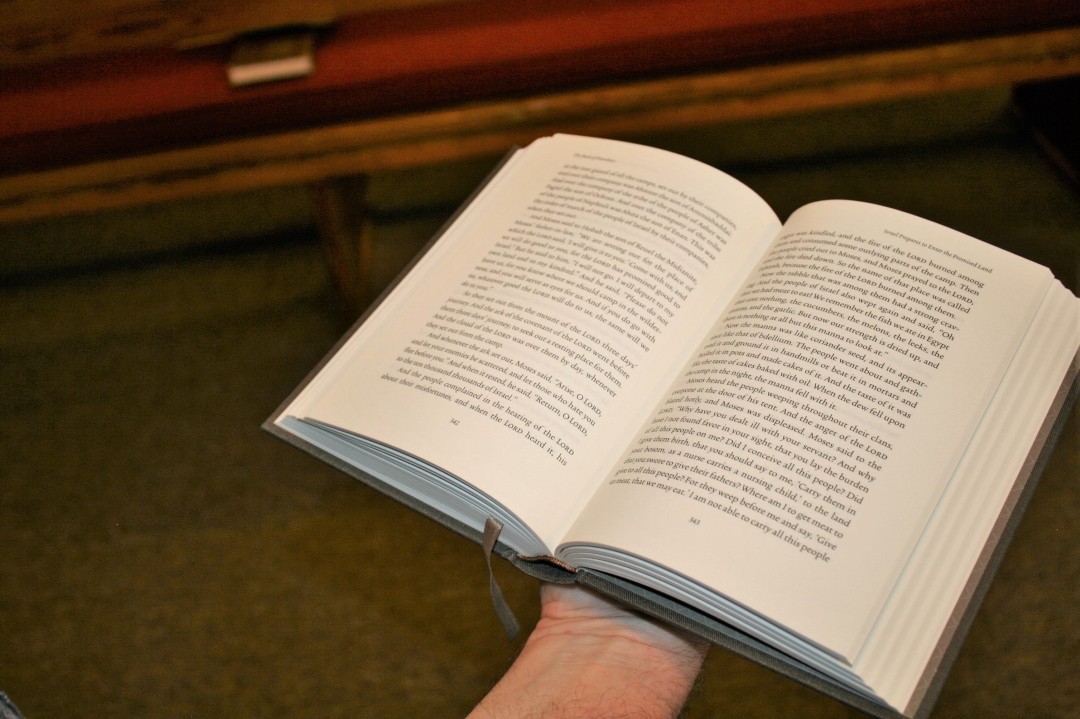
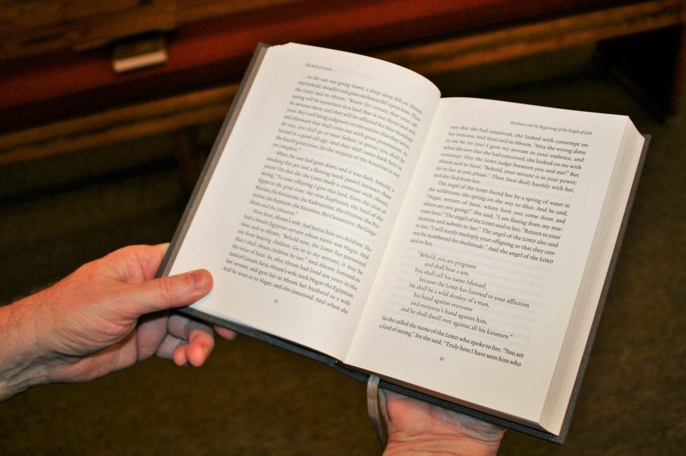
The overall size is 8 x 5.5 x 1 (smallest edition) – 1.75 (largest edition). This size is just right for my hands. It feels like holding a regular size novel.
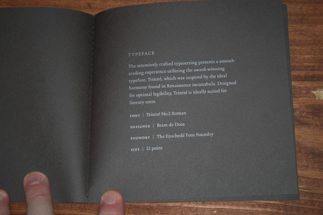
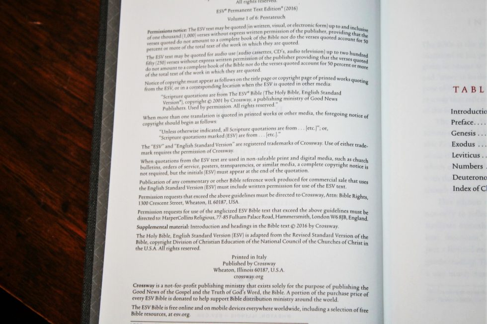
It comes with a sewn booklet with a lot of the production information that reviewer’s want. No guessing page thickness. It even tells the cloth and ink that was used. I’ll include these details where appropriate.
It was printed and bound in Italy by L.E.G.O. (Legatoria Editoriale Giovanni Olivotto). It was printed in Comune di Lavis, Trentino, Italy and bound in Comune di Vicenza, Veneto, Italy.
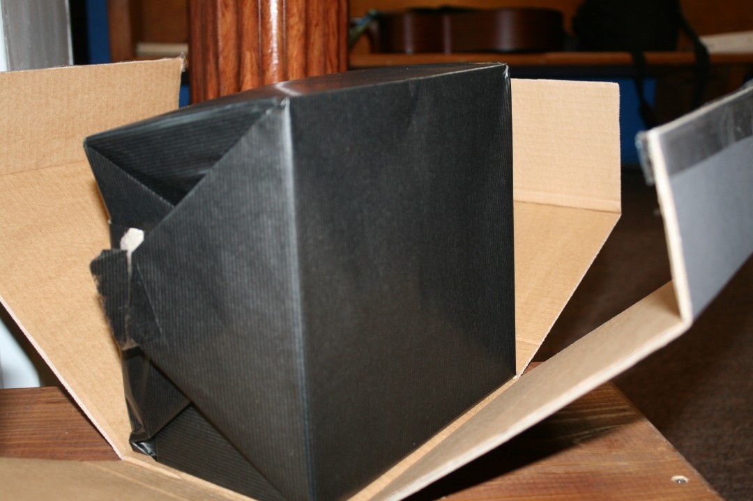
I typically don’t comment about the box something was shipped in… but, wow! The box is heavy duty corrugated with ESV Reader’s Edition printed in elegant styling on the outside. Inside the box the 6-volume set was gift-wrapped in thick paper.
Binding
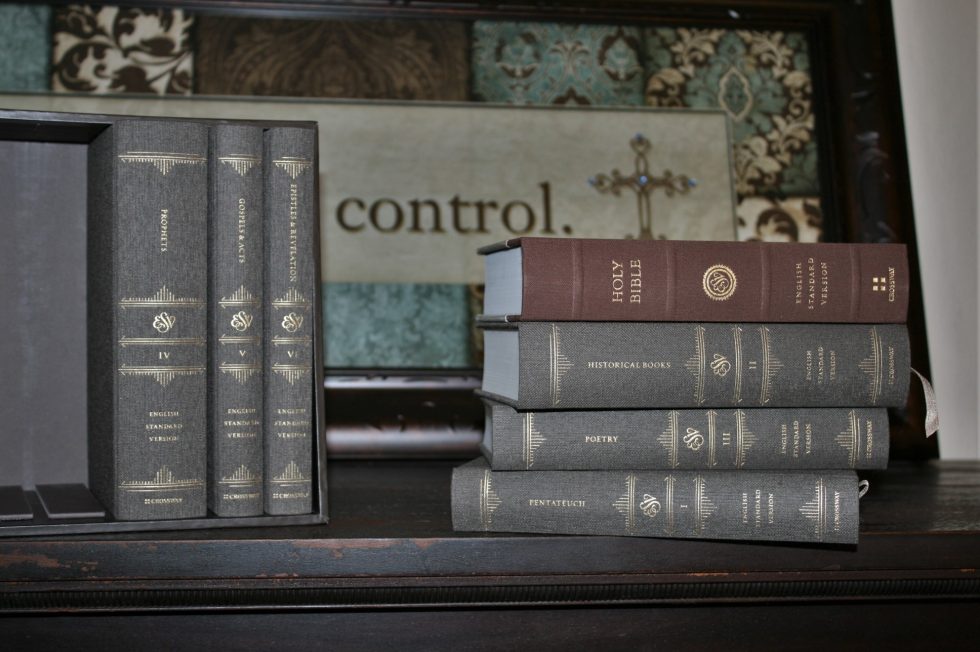
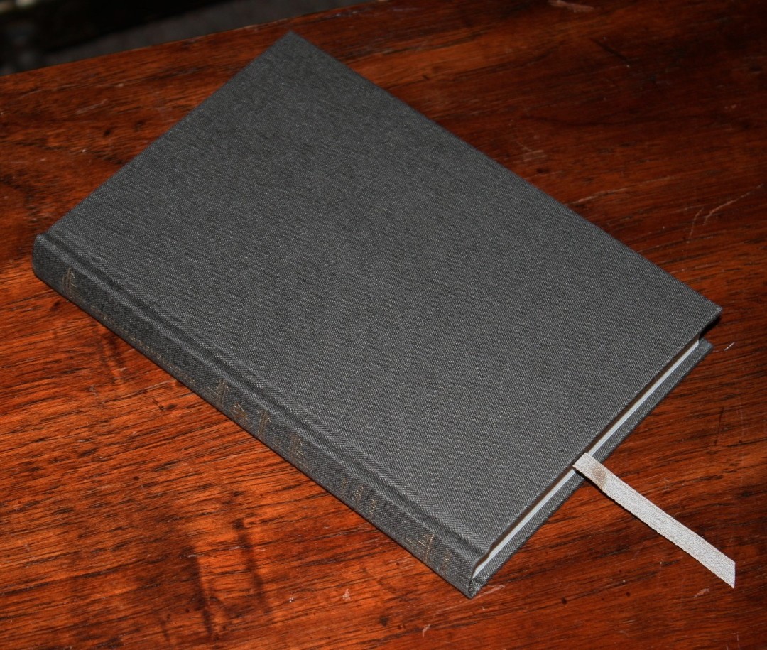
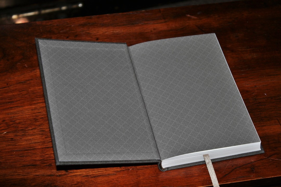
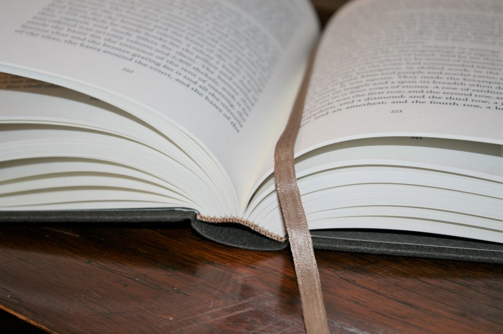
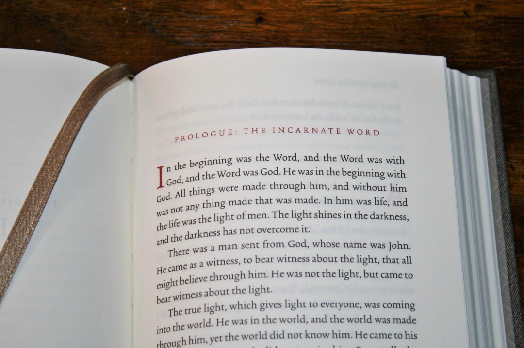
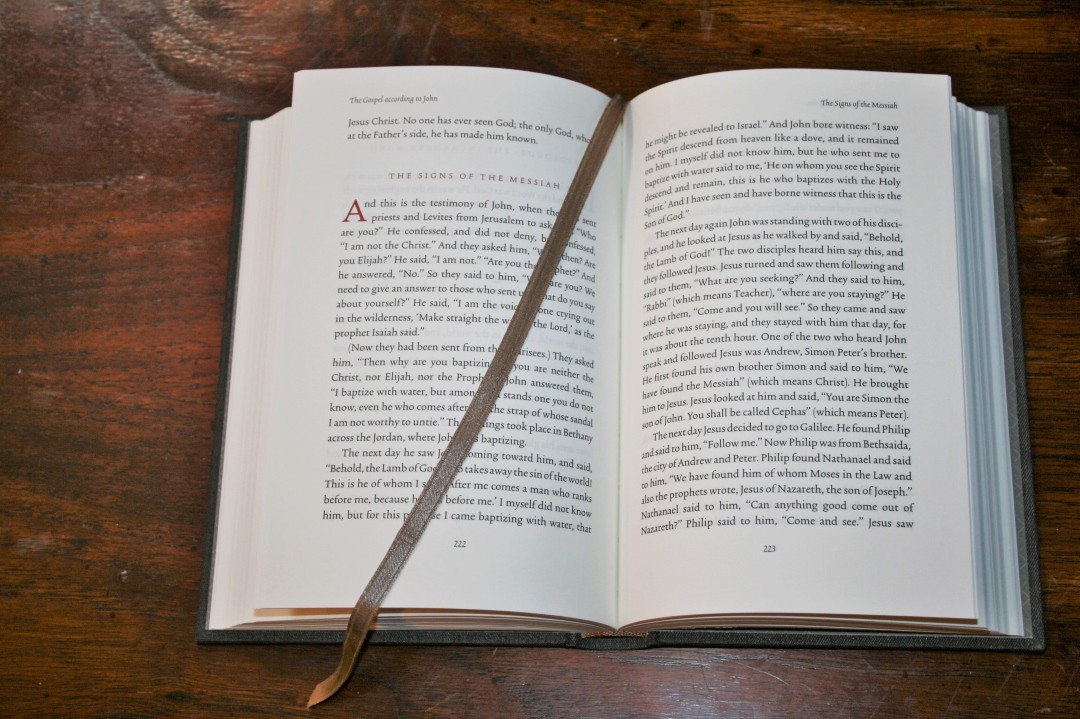
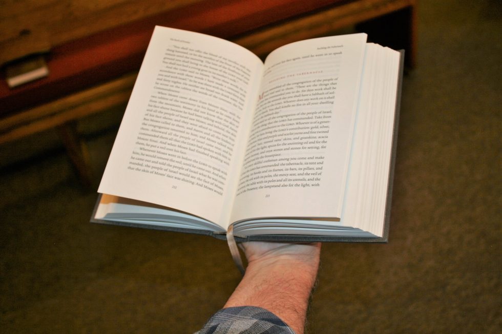
These are hard cover editions with cloth over board. This is a different cloth than the single volume Reader’s Bible. This is Manifattura Tasmania 7107 over 2.25 mm board. The liner is brown paper with a diamond design. It’s a brown/gray/earth-tone color with a single tan ribbon and tan head/tail bands. The ribbons feel like silk and are more elegant than anything I’ve seen from Crossway.
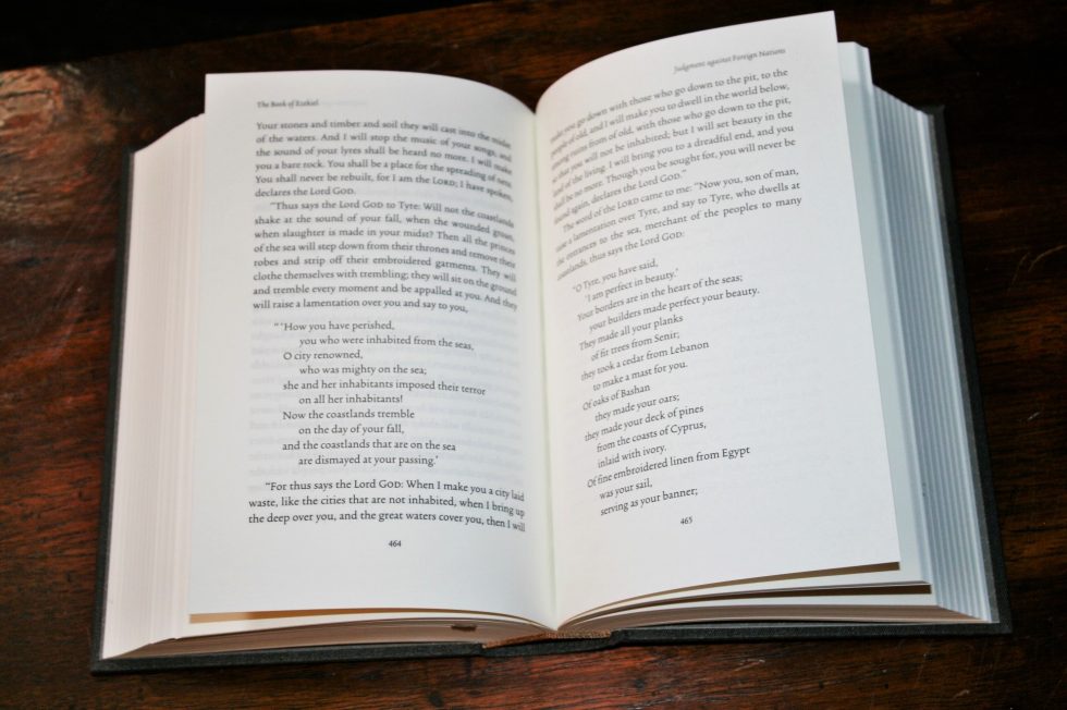
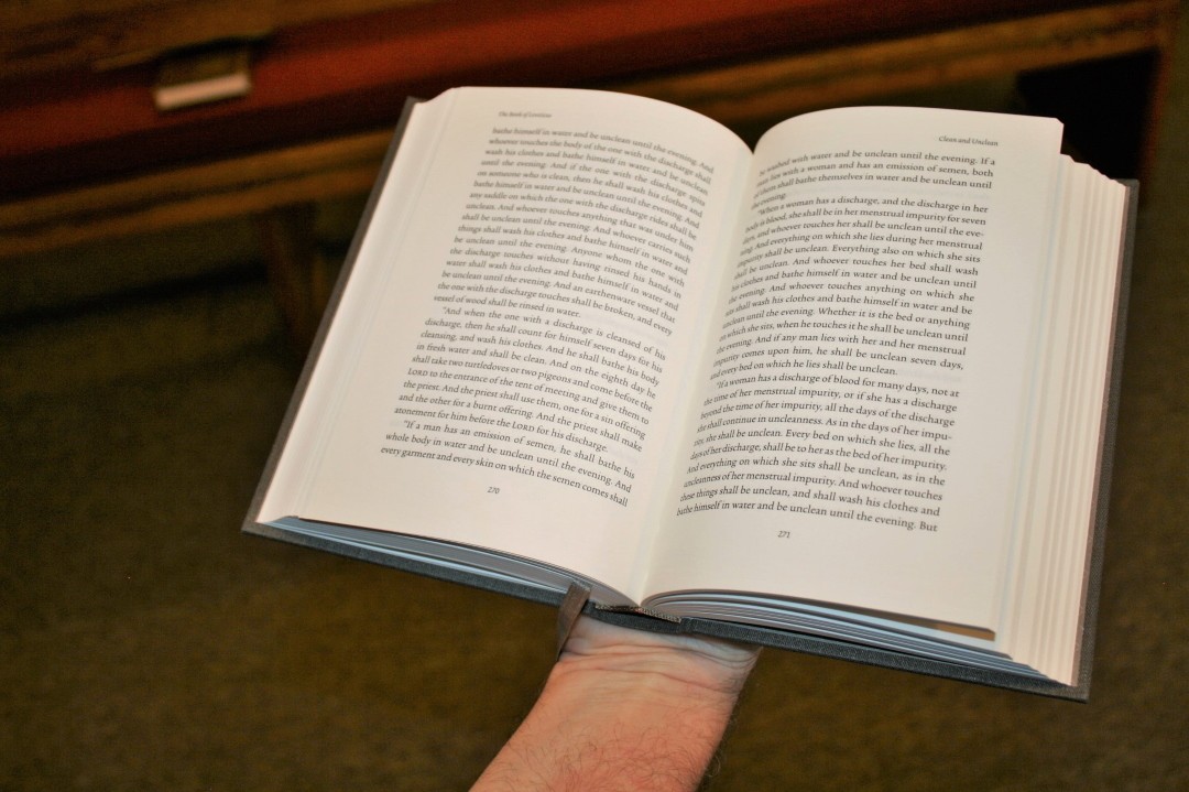
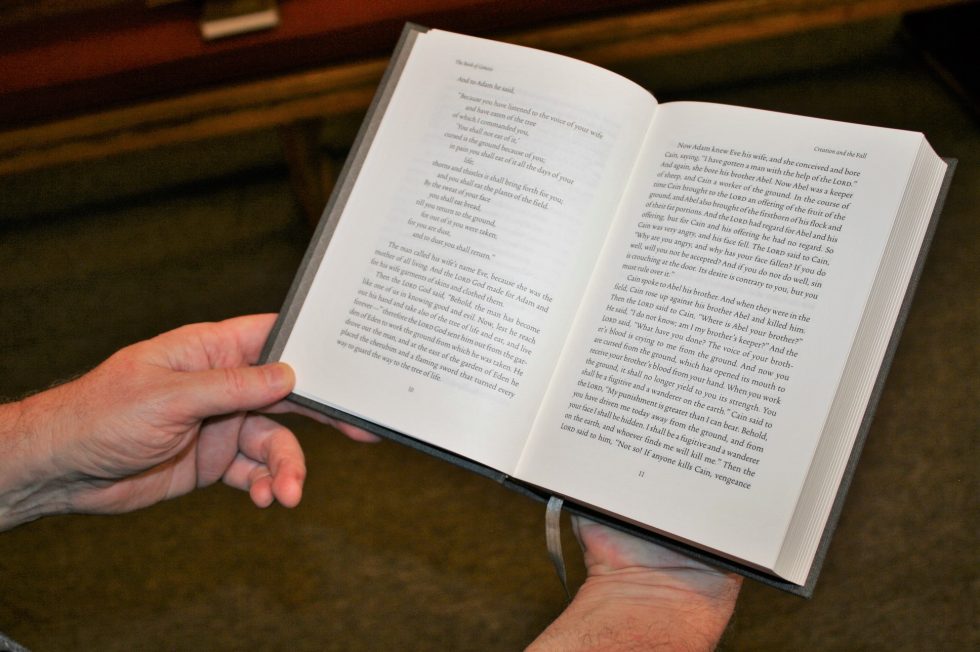
The books are Smyth-sewn with 48-page signatures. Signatures were carefully sewn using the exact amount of thread tension to ensure the perfect spine flexibility. Cold-setting glue was used so it will lay flat. This lets each book lay open perfectly. The books lay open but they are a little stiff out of the box. They’re not laying open as well in these photos but they’re still new. I’ll post pictures again after I’ve had them for a while.
The construction quality is state of the art. It was bound and covered in a climate-controlled facility, so there won’t be any issues with warping. The grain of the cloth is parallel with the spine so each book will keep its shape. They don’t feel cheap by any means.
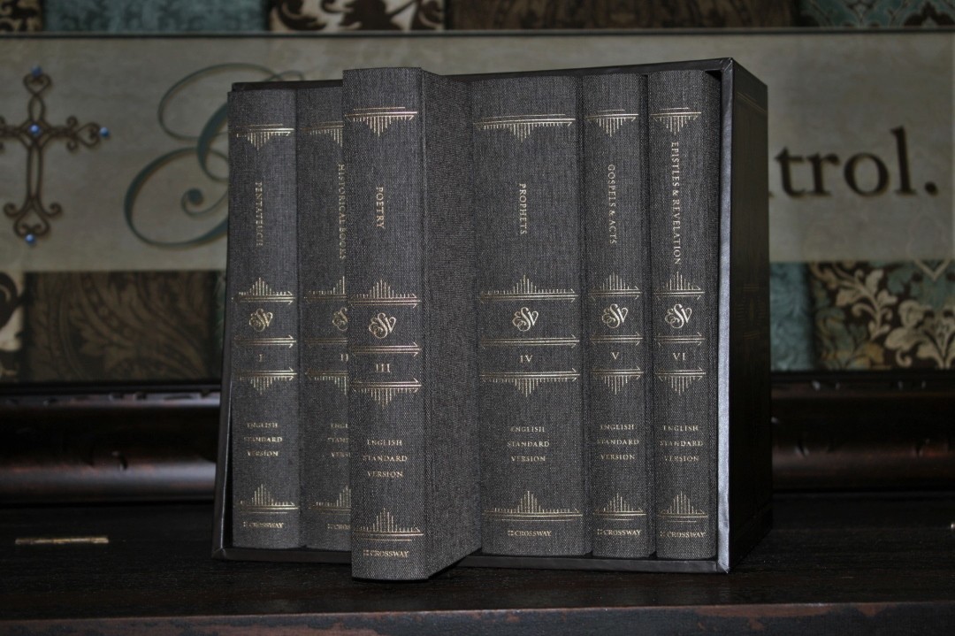
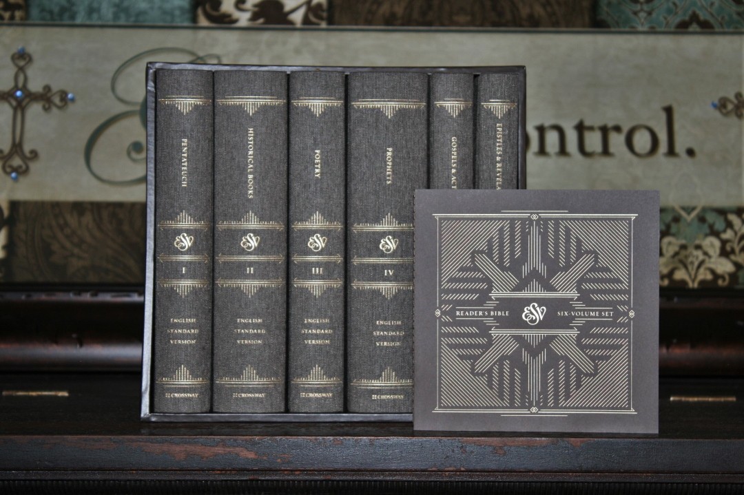
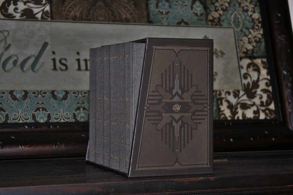
The spine contains an elegant design printed in gold that’s continued onto the slipcase itself. It has the name of the specific volume (showing the content of that book), ESV, the volume number in Roman numerals, English Standard Version, and Crossway. Each section of text is divided with the line-designs.
Paper
The paper is 80 gsm Munken Premier Cream uncoated from Sweden. It’s highly opaque and at 104 microns thick it’s super easy to turn. It has a cream tint that strikes the perfect contrast with the typeface, creating a readable page that can be read for hours on end.
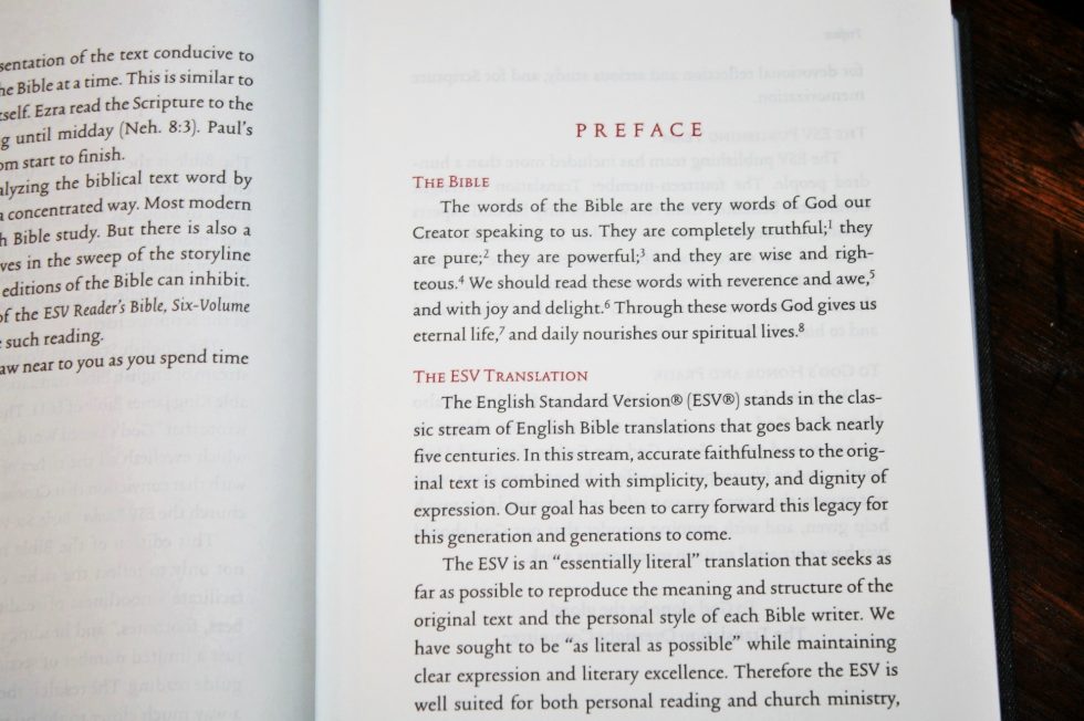
I personally prefer uncoated paper. I find it easier to handle and it looks better to my eyes. I didn’t have any issues with turning pages or with page-curl. I’m not planning to write in this but I’d be surprised if it had problems with highlights or notes.
Typography
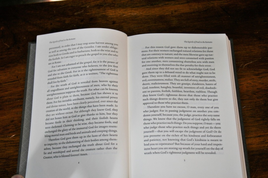
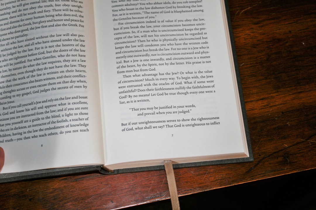
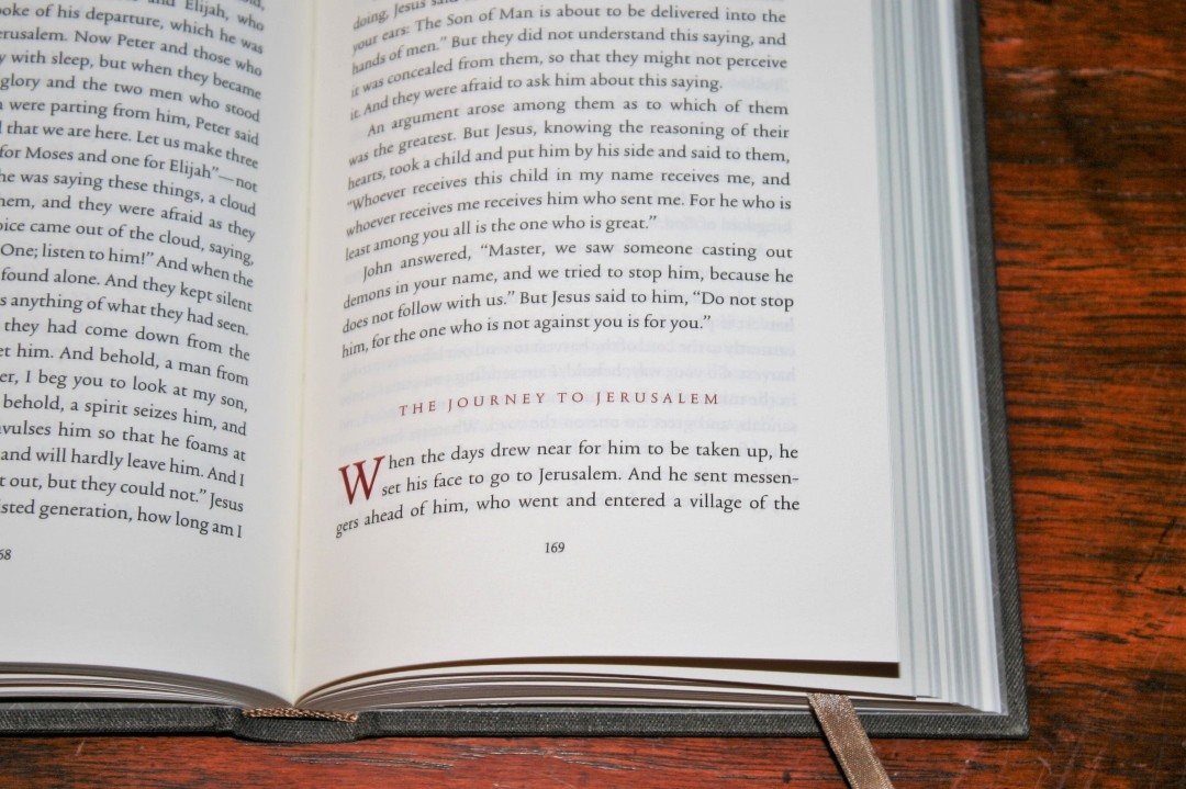
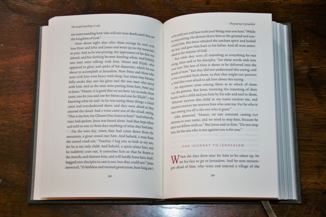
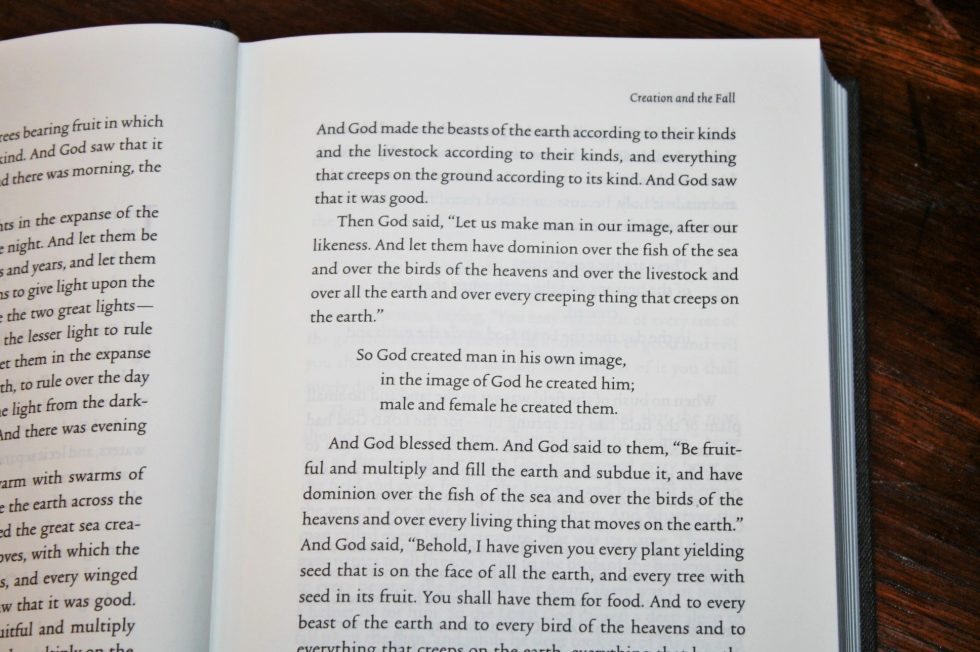
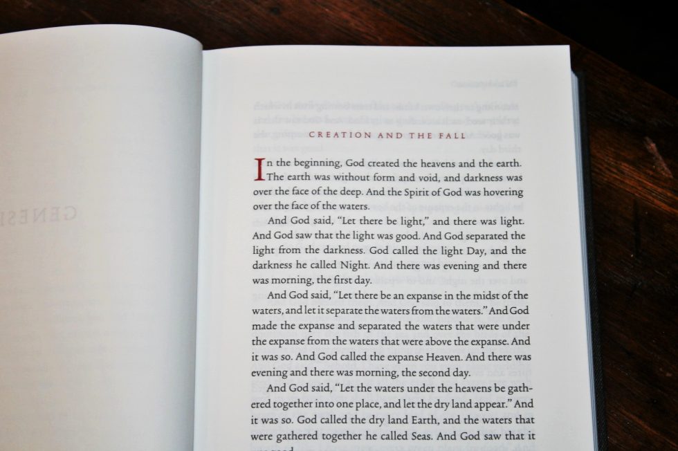
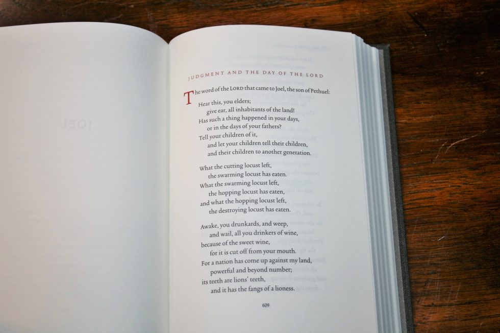
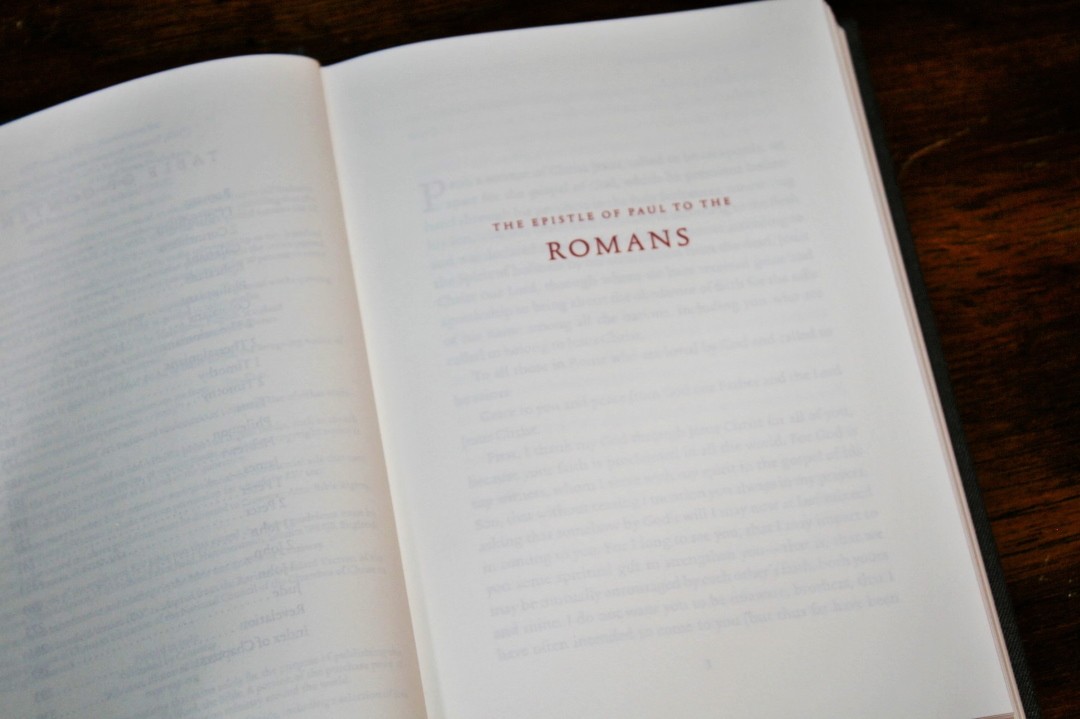
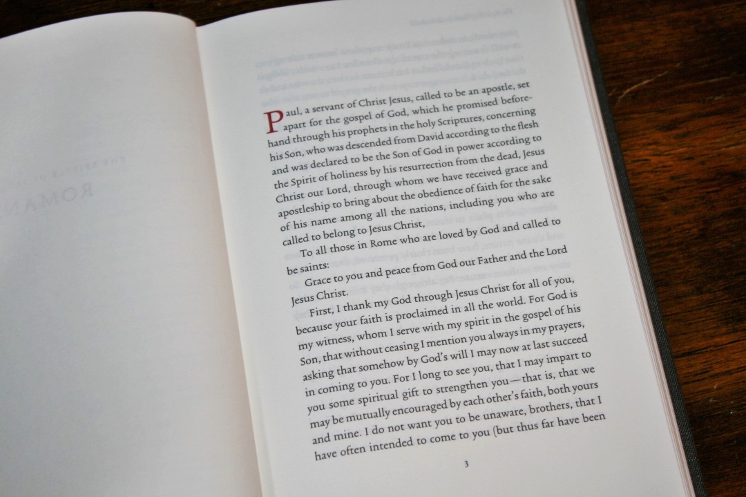
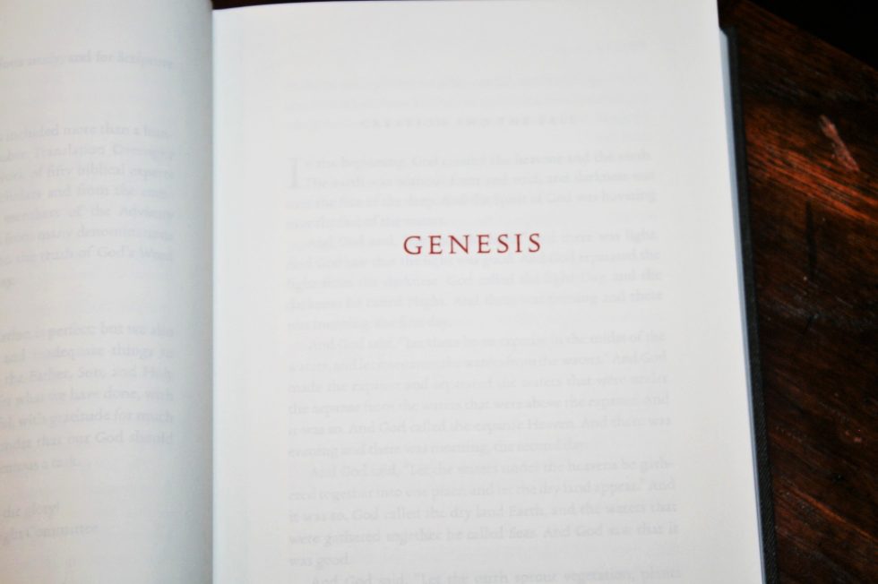
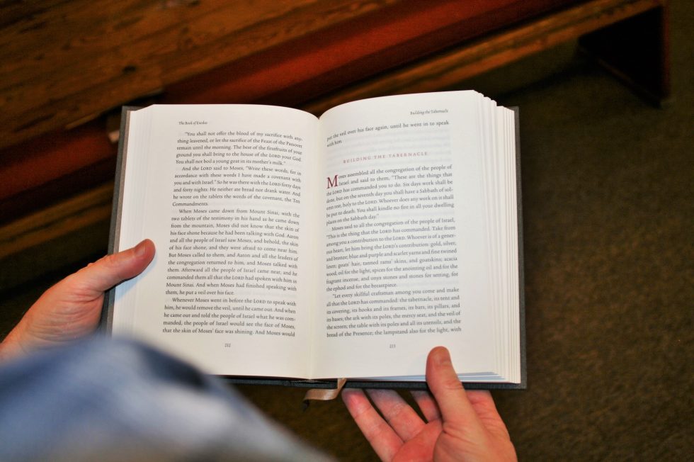
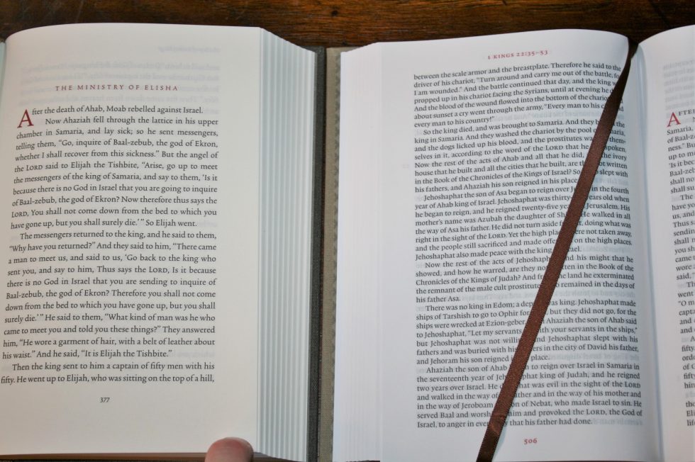
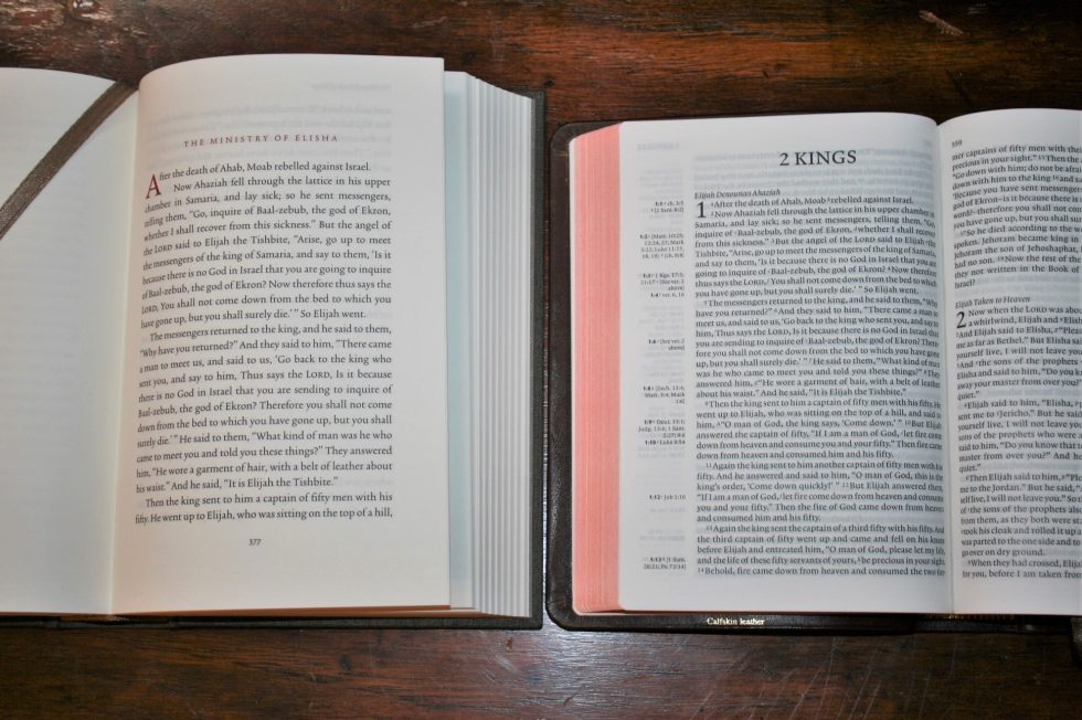
The text is presented in single-column paragraph format with no chapter or verse numbers, no references or footnotes, and very few section headings. The header shows the book name in the left and right corner, or a section heading in the right corner. They’re printed in an elegant font. The first verse in a book or section has a drop-cap. Drop-caps and headings are in red.
The typeface uses a 12-point black letter (inkcredible Revolution Black ink to be exact) Trinité No.2 Roman font designed by Bram de Does. The 15-point leading (size of the font plus the space between the lines) makes the typeface elegant and readable. It was designed with reading in mind. If you love reading you will love this Bible set. Even though it’s a 12-point font is doesn’t make me think ‘giant-print Bible’. It just feels like a book with a comfortable font.
The chapters are not marked. It’s difficult to know where one chapter ends and another starts. This gets rid of un-natural stopping points. This is it makes it more difficult to use most reading plans, but Crossway has a solution to this.
Crossway included very few section headings, but there are a few here. There aren’t enough to get in the way and hinder reading, but they do come as a surprise and almost felt out of place at first. These aren’t the standard ESV section headings that typically refer to a paragraph. These are designed for large sections to break a book up into 3 or 4 parts.
They break up the narrative into major sections and are mostly found in the historical books. In the NT the Gospels, Acts, and Revelation has them. Most have around 4 or 5. Revelation has 3. The section headings are placed in the header of the right side. For a reader’s Bible it’s better to have fewer headings and make them more important.
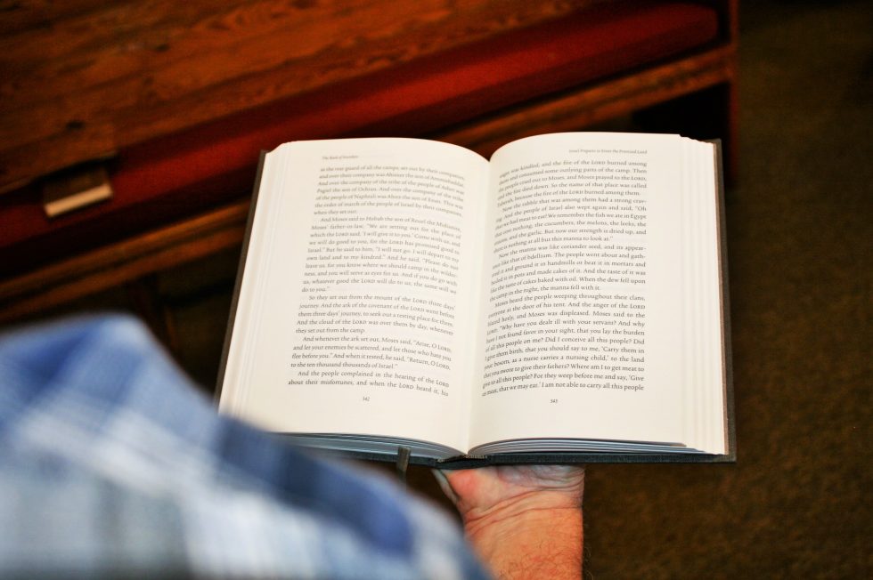
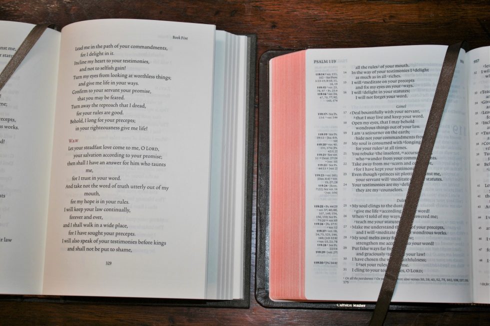
The columns are 3.68” wide and have around 61-64 characters across. This gives space for around 12 words per line. The 12-point font with 15-point leading allows for 28 lines per page. This column-width and font size combination is the sweet-spot for my eyes. A lot of Bibles have fonts that are too small for their column-width, creating an overly wide column with too many words. I prefer 10-12 words per column with a character-count in the 60’s. This is too difficult to do in a single column without making the Bible huge. It does affect poetry though.
The inner and outer margins are .75”. This brings the text completely out of the gutter and gives it lots of room to breathe. It keeps the lines of text straight across which, along with the shorter lines and the large leading, keeps me from losing which line to read next.
The layout itself doesn’t change from the standard ESV format. In other words, the paragraphs are the same as other ESV’s. Dialog is not set to its own line as in a novel. This is still the familiar ESV.
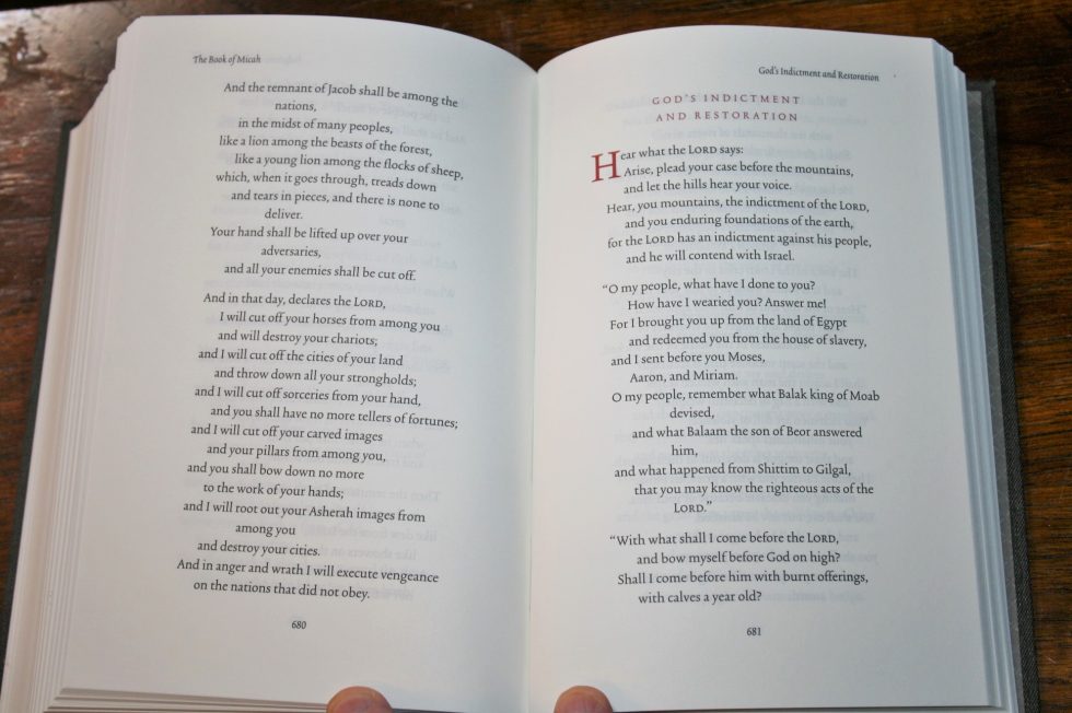
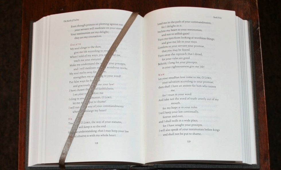
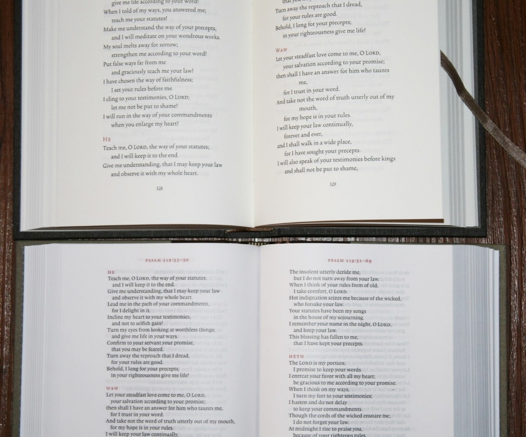
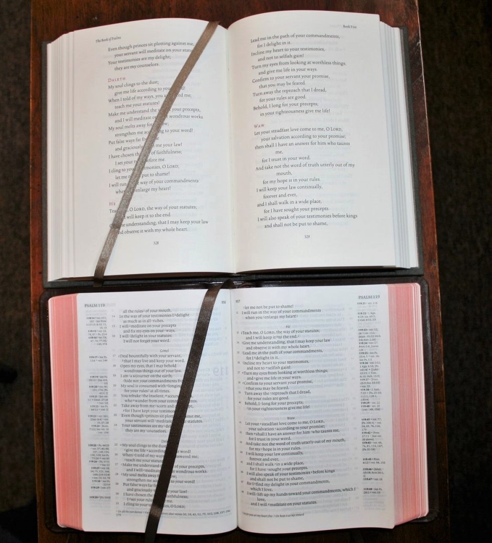
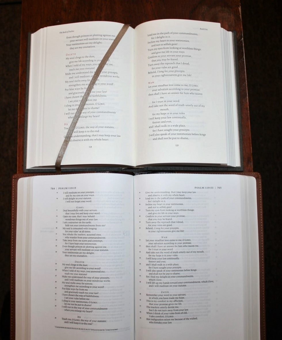
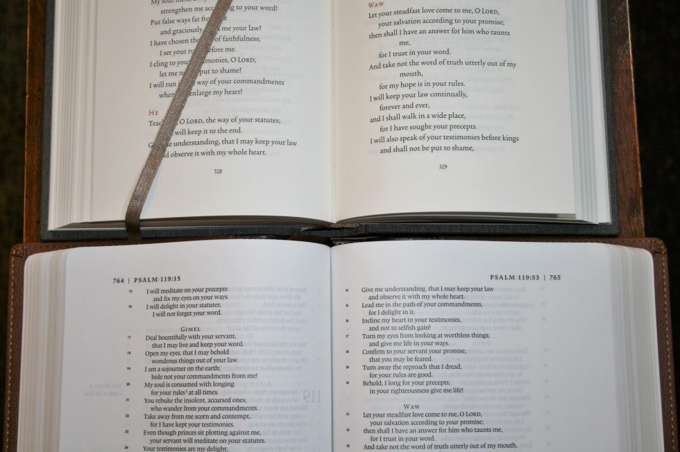
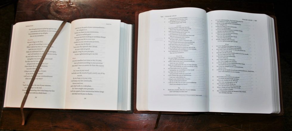
Poetry looks nice in this format but it is affected by the shorter column-width. The combination of font size, large leading, and column-width give poetry more white-space than normal. However, this is the one text-type that needs a slightly wider column. This is seen where a few poetic lines wrap a word or two to the next line, which breaks up the flow of thought. 99% of the time this is not the case and this is a compromise I can live with. As is typical with poetry, this is where the show-through is the most obvious.
I like that Psalm 119 retains the English spellings of the Hebrew letters and prints them as headings in red.
There are 1-2 blank pages at the end of each book. The left page is always blank. Before each book starts there’s a page with just the book’s name printed in red.
It doesn’t have line-matching but I only noticed because I was looking for it. This doesn’t affect readability but I would have preferred line-matching for those places that I do notice it. This won’t keep me from reading it.
Table of Contents
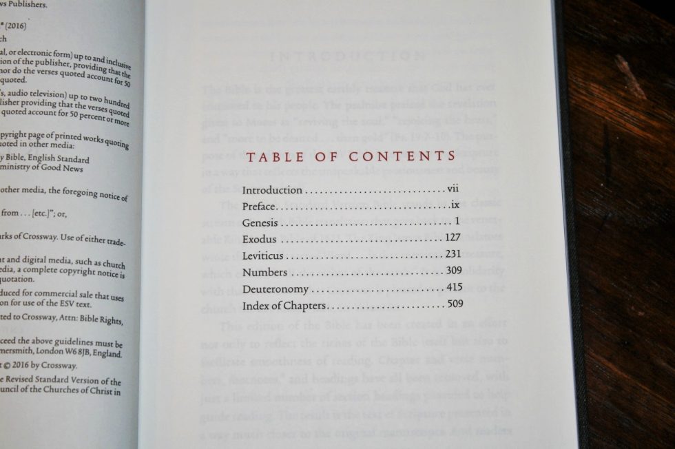
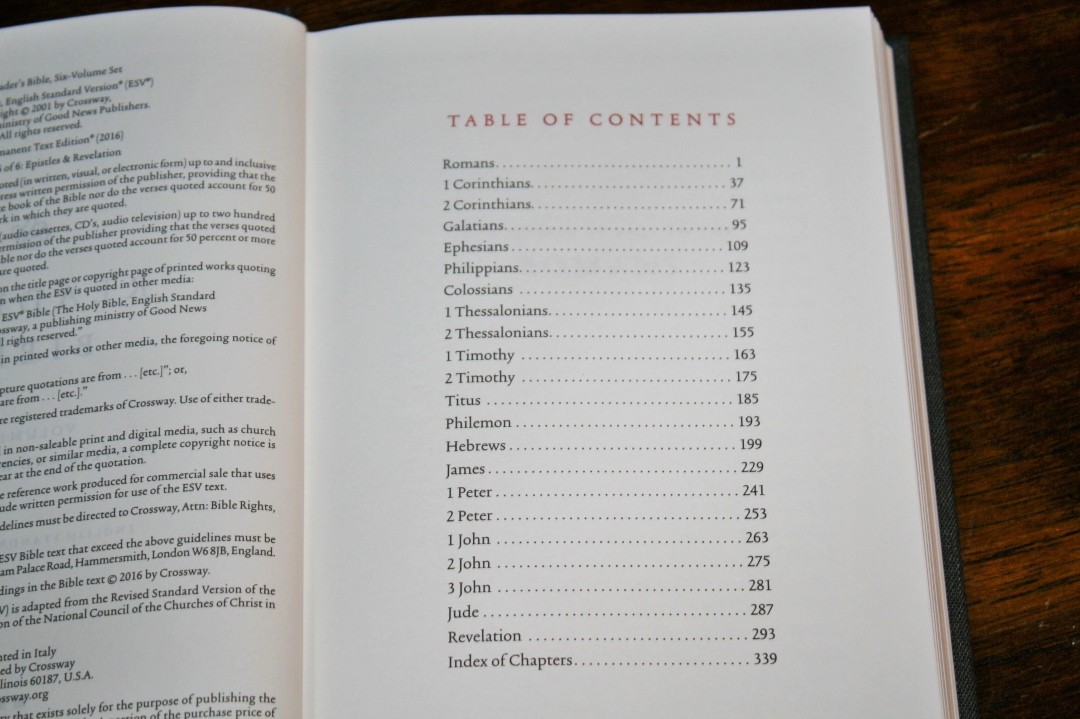
There’s a Table of Contents is in the front of each book and shows you which Bible books it contains and gives the page number where they start.
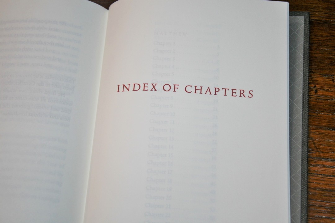
Index of Chapters
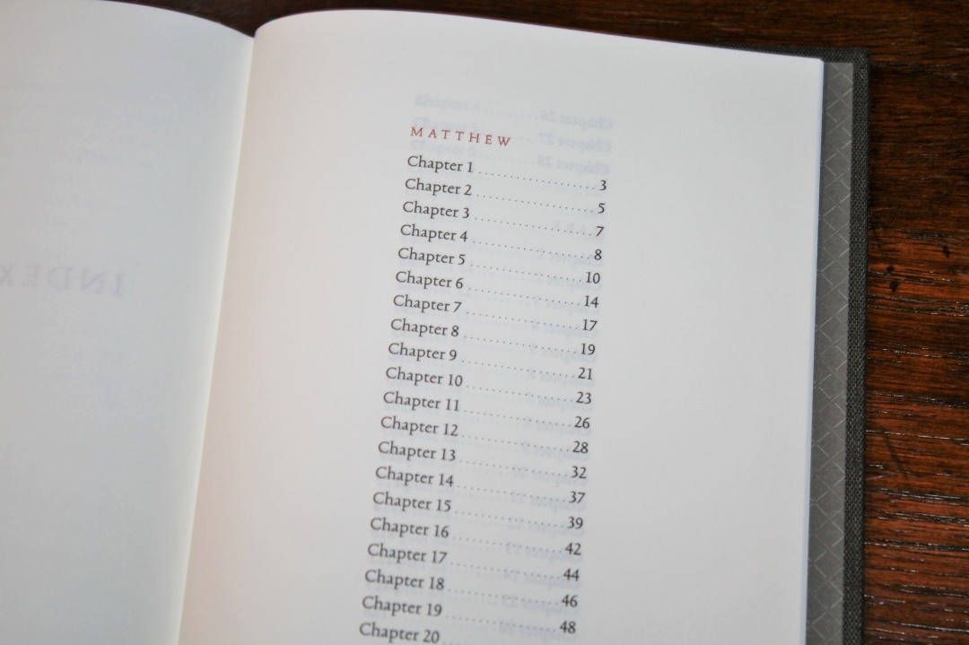
In the back of each book there’s an index to the chapters in that book. It shows the name of each book in this volume in red as a title followed by the list of chapters with the page number for that chapter.
These are helpful because they’ll get you on the right page but it’s still difficult to find the start of a chapter because they’re not marked on the page. It doesn’t hurt to back up and read what starts at the beginning of the page anyway because it helps keep things in context.
Slipcase
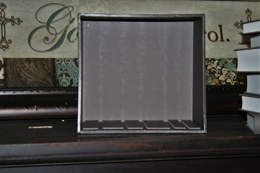
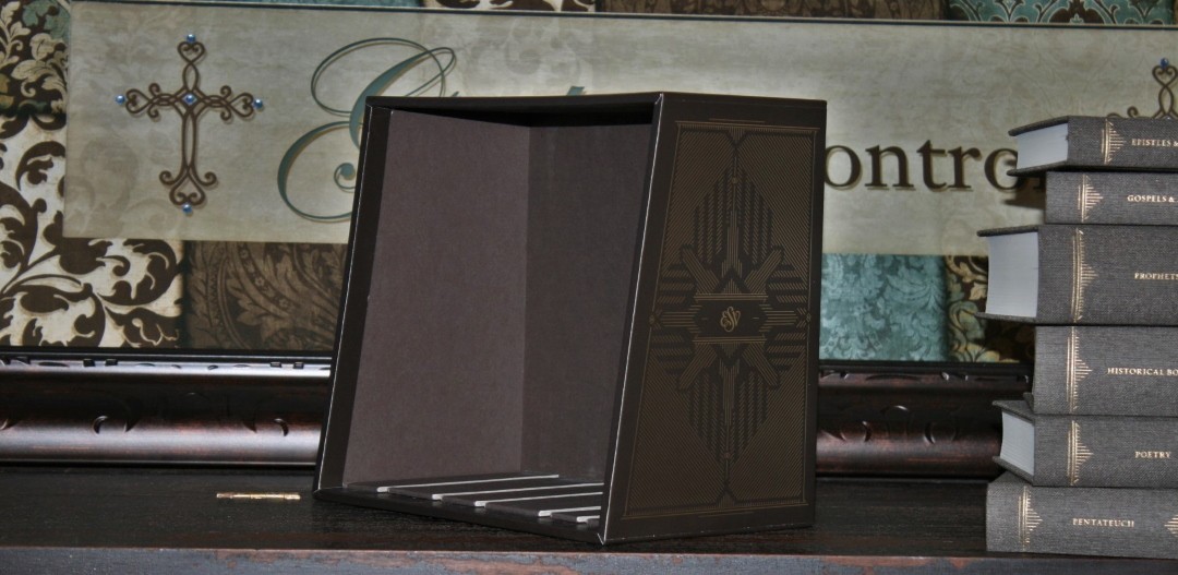
The slipcase is sturdy cardboard with gold foil. The cardboard is almost .25” thick. The case is a touch over 13.25” high x 9.25” wide x 5.75” deep.
It has the same brown with gold highlights as the book covers.
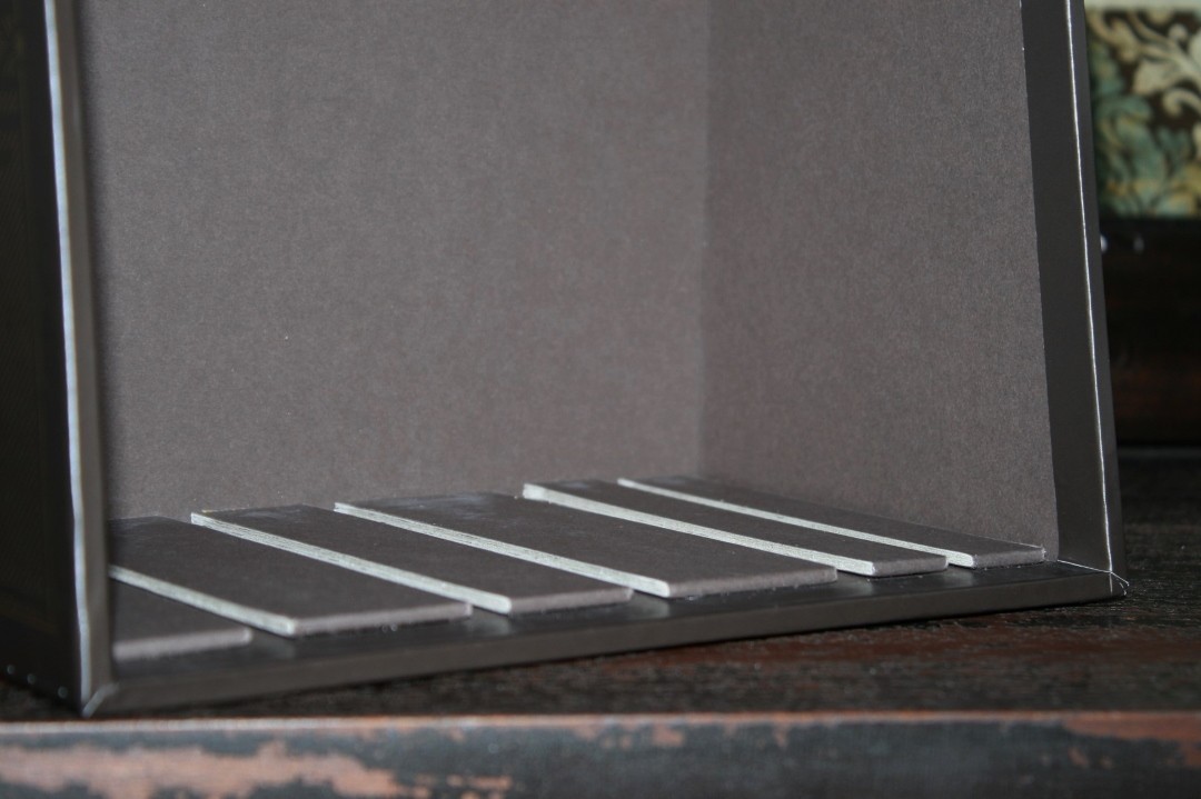
The case includes tracks that were made for each specific book. You can’t place the Prophets in the slot made for the Gospels and Acts. The track holds the paper in place, keeping the pages from sagging and pulling on the binding. The books are easy to place and remove. Putting them in place will move the ribbon so I move the ribbons to the front of the book so they don’t hang out of the slipcase.
It does feel sturdy but I’m not sure about feeling durable. If it sits on a shelf it might be fine for a long time, but I don’t think I want to move it around a lot.
Reading Plan
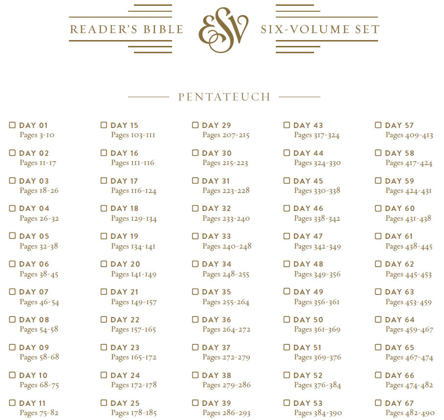
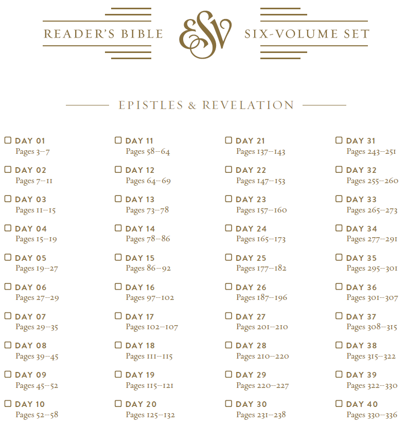
The typical reading plan would be difficult to use with this Bible because they divide the daily reading by chapters and verses. Fortunately Crossway thought of a solution and has created a couple of reading plans in PDF that you can download and use with the ESV Reader’s Bible, Six Volume Set. You can download the plans here: ESV Reader’s Bible, Six Volume Set Reading Plans.
They include a one-year plan that takes you through the Bible in order, and a reading plan for each of the 6 volumes so you can read them all simultaneously through the Bible in one year. It gives you the day number (1-365) and the page range for that day. It doesn’t mention book names or chapter numbers. It includes a checkbox so you can check off each day.
I think this is a great idea and I’d like to see this printed as a booklet and be included in the box. Another option would be to print it in the books themselves, but I like the idea of a separate booklet to help minimize the content in the 6 volumes to just Scripture.
Comparisons
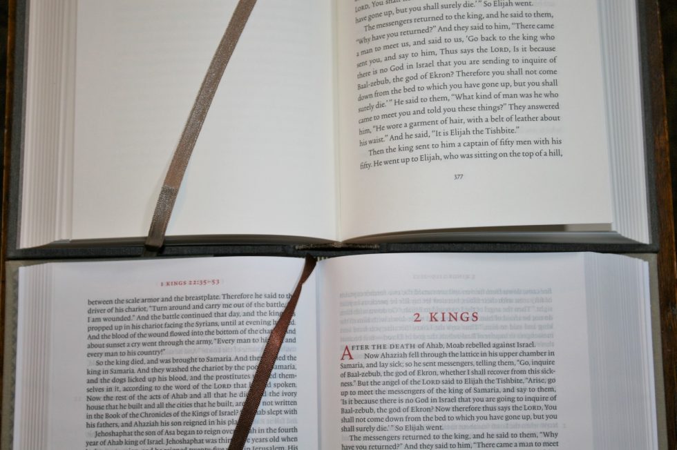
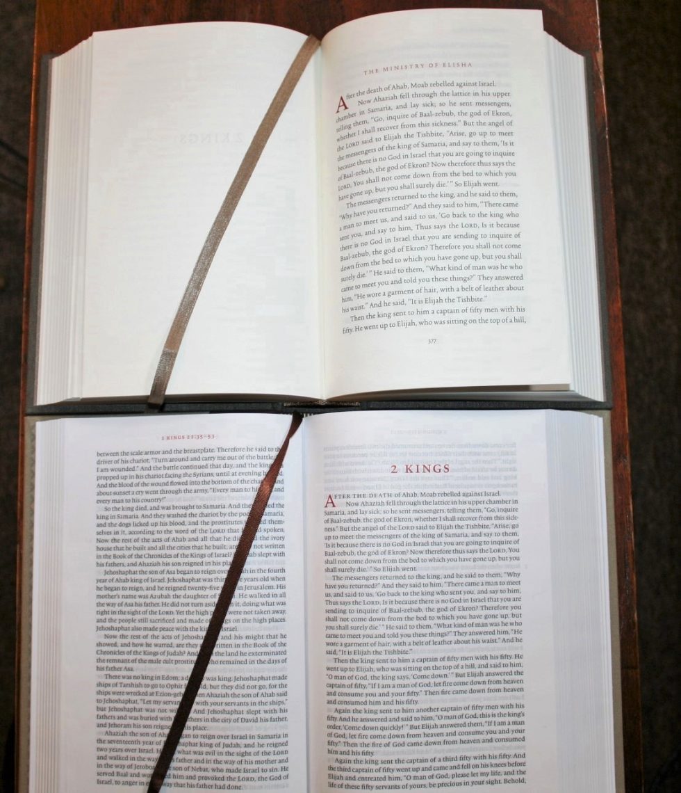
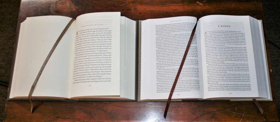
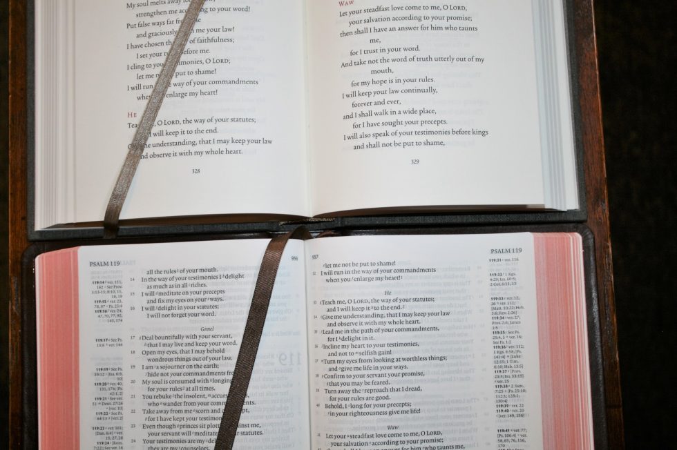
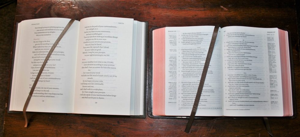
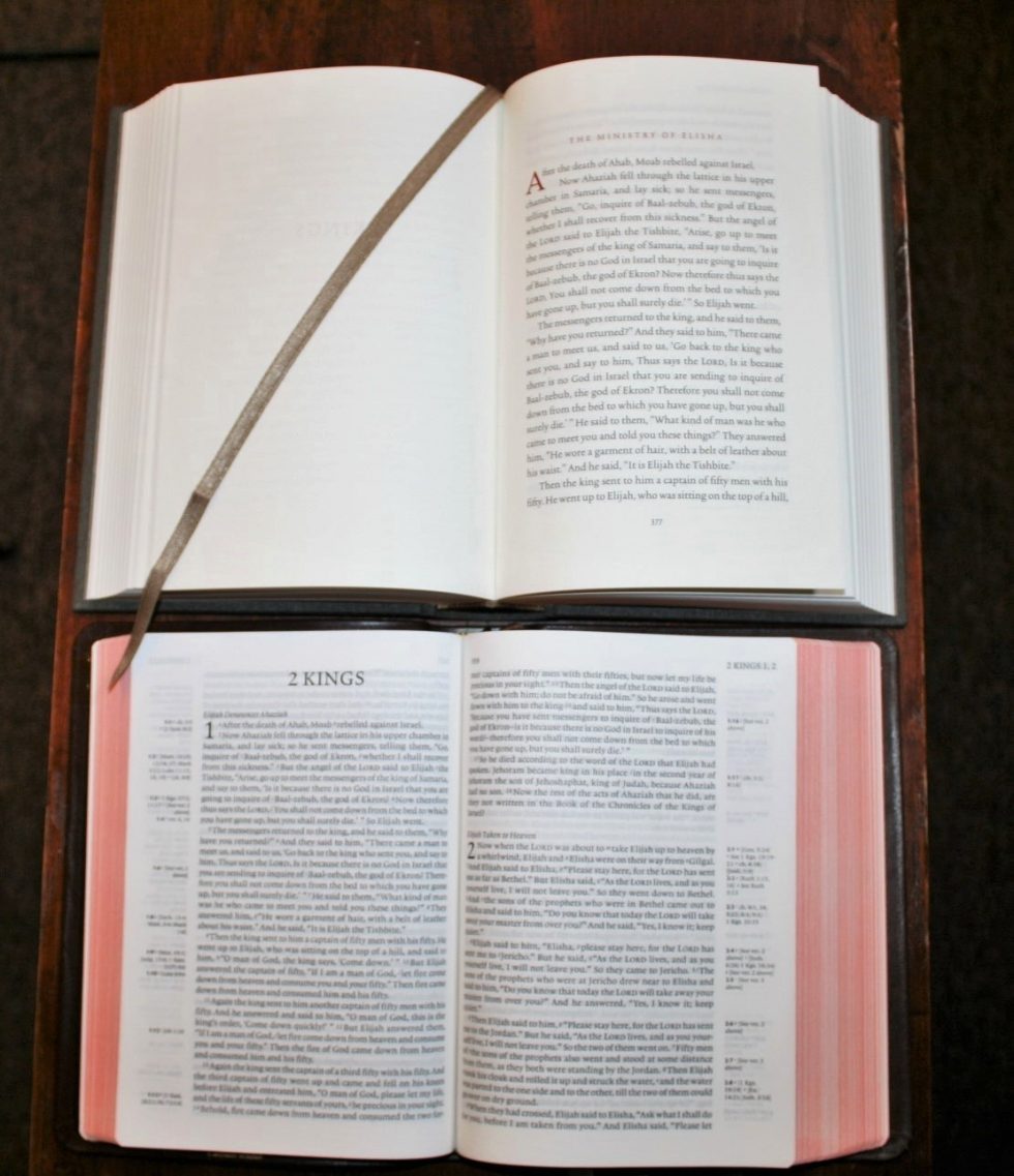
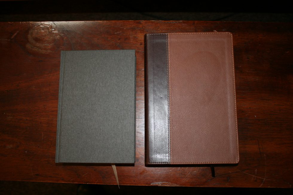
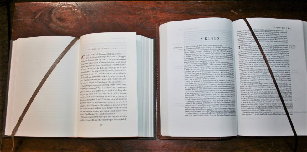
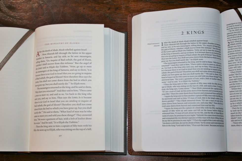
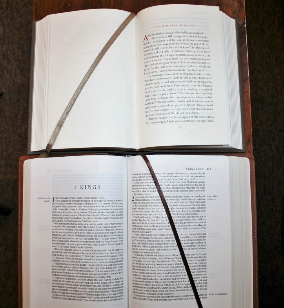
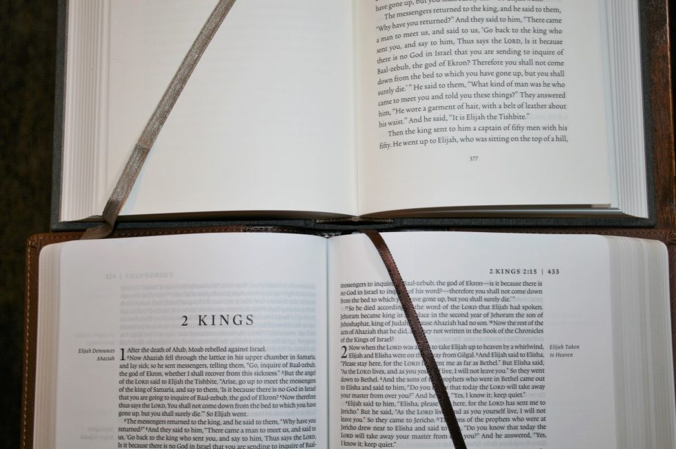
Here’s a look at how the Six-Volume Reader’s Bible compares to the single volume Reader’s Bible, Cambridge Clarion, and Crossway’ Single Column Legacy.
ESV Reader’s Bible
Cambridge Clarion
Crossway Single Column Legacy
Conclusion
In a world that seems to be overly saturated with study and reference Bibles I’m glad to see Crossway taking the lead on producing reading Bibles. The advantage in producing a reading Bible in 6 volumes is everything is optimized for reading. From the font size to the leading, to the line-width to the character count, from the print darkness to the paper thickness and color – everything is optimized for reading. I find that I read even more when there are no artificial stopping points and I stop where it’s more natural.
Although it isn’t perfect (perfect would have zero show-through and never have a line in Psalms with a word by itself), it’s as close to perfect as possible. It’s like any good quality book except it still feels like reading the Bible. I’d like to see this very same set available in every major translation. The ESV Reader’s Bible Six Volume Set is the perfect gift for anyone that loves reading the ESV.
_________________________
Buy from:
__________________________
Introducing the ‘ESV Reader’s Bible, Six-Volume Set’ from Crossway on Vimeo.
Are you getting the ESV Reader’s Bible Six Volume Set?
Crossway provided this Bible for review. I was not required to give a positive review – only an honest review. My opinions are my own.












I appreciate someone who gives a thorough honest review and who hasn’t had publishers hand him complimentary Bibles in order to secure positive feedback. So tired of reading a positive review of every new Bible from people who get free Bibles to review.
Thanks Jeff. Just for clarity I did get this free for review but that doesn’t influence my opinion. I would be doing my readers a dis-service if I didn’t point out both the good and the bad.
Ultimately, after using the set pretty consistently since receiving it, I feel that there are certain limitations to the format which negatively impact its usability. It seems to me to be more of a “specialized setting” sort of thing. It will be interesting to see what the estimation of the six volume set is like after there has been time to digest its format and production.
Overall I really like the 6 volume set, but I agree with the criticism about poetry formatting and opacity (see NIV Sola Scriptura for an example of highly opaque paper).
But what I really appreciate about the ESV 6 vol. set is the fact that it doesn’t acknowledge conventional chapter and verses divisions. As far as I know, the ESV 6 vol and Bibliotheca are the only reader’s editions that totally ignore chapter/verse. The other reader’s Bibles in some way retain chapter numbers/divisions, or at least print the “range” somewhere on the page. Others even retain the verses (NKJV edition).
I feel like the genius of a reader’s Bible is to step away from all influence of the received divisions. We have dozens of thousands of Bibles divided with chapters and verses, can we get a few more without those divisions?
I agree. I’d love to see even more Bibles made specifically for reading. Remove the distractions and let me get lost in God’s Word.
I hope both the 6-vol set and the single vol would be available here in the Philippines. I already have the kindle version and read in my phone via kindle app.