One type of KJV that doesn’t have a lot of high-quality options is a text-only edition in large print. The CBP 215 series is in a league of its own. It has a sharp font and opaque paper that’s a joy to read and use. In this review, I take a look at the red letter Large Print Text Corporate Series in blue ironed calfskin.
Church Bible Publishers provided this Bible in exchange for an honest review. I was not required to give a positive review, only an honest one. All opinions are my own.
_________________________________________________________
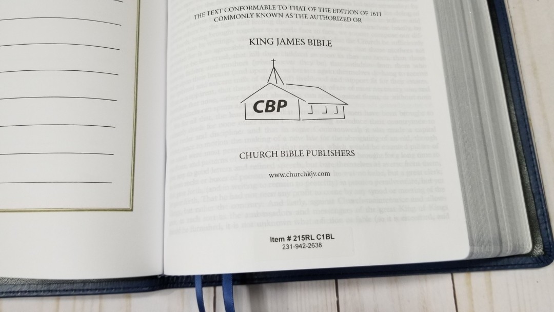
This book is available at Church Bible Publishers
_________________________________________________________
Table of Contents
- Video Review
- Cover and Binding
- Paper
- Typography
- Front Matter
- Concordance
- Maps
- Comparisons
- Conclusion
Video Review
Cover and Binding

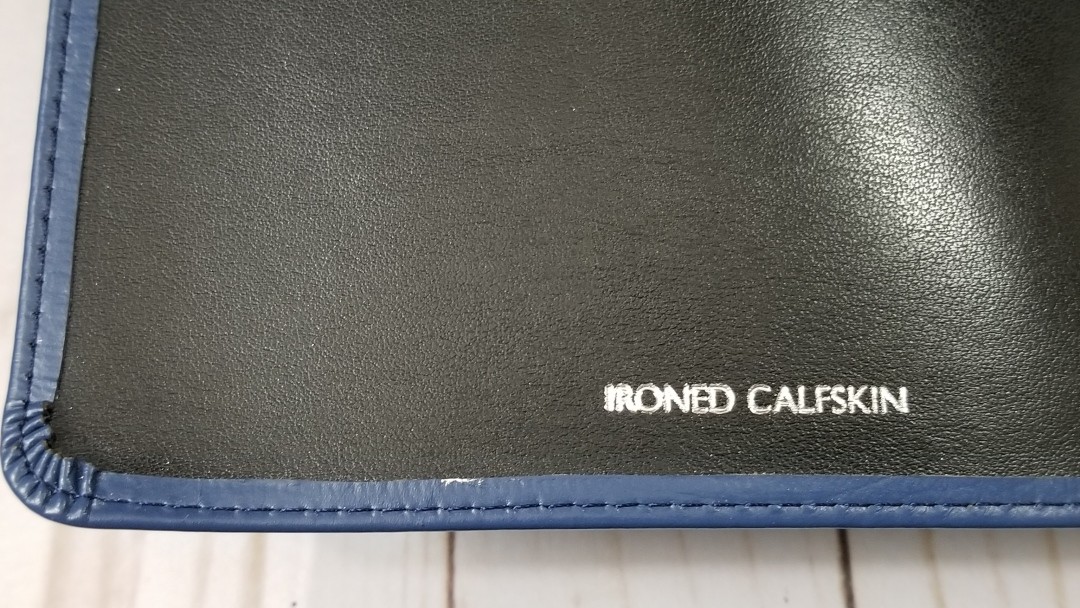
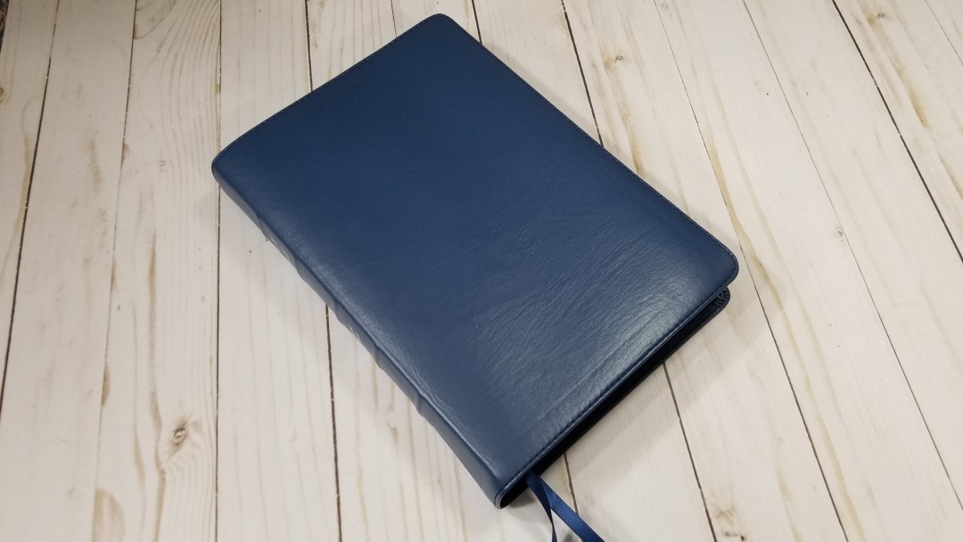
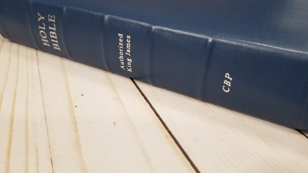
This cover is blue ironed calfskin. The blue has a warm undertone. The grain isn’t deep or heavy but there is some noticeable grain. The liner is edge-lined with synthetic leather. It’s perimeter stitched. The spine has 5 raised ribs and Holy Bible, Authorized King James, and Church printed in silver. It has a stronger smell than I’m used to. I’m sure that will fade over time.

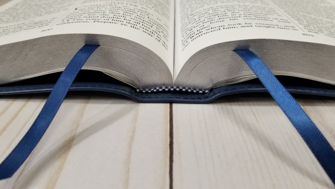
It’s Smyth sewn and has no trouble staying open and laying flat to any page. It includes 2 blue ribbons and blue and silver head/tail bands. The overall size is 9.75 x 7 x 1.75″ at the spine and 1.5″ for the block. It weighs 2lbs, 11.7 oz.
Paper
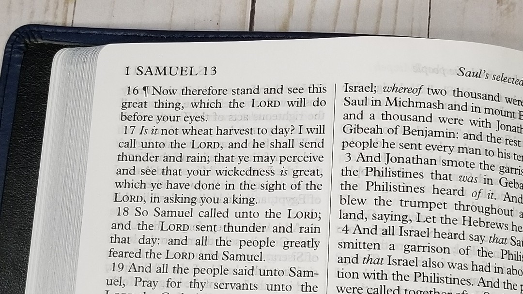
The paper is similar to the 22#, which is somewhere in the mid 30’s in gsm. It’s white in color. It’s decently opaque, but it’s not as opaque as I’d like. It’s show-through is more noticeable than other editions I’ve seen from CBP. It isn’t enough to keep me from using it, though. It better under some light than others.

It doesn’t seem to have any glare under direct lighting. This is a welcome improvement. The rough texture of the paper makes it easy to separate the pages with one hand. The page edges are silver gilt.
Typography
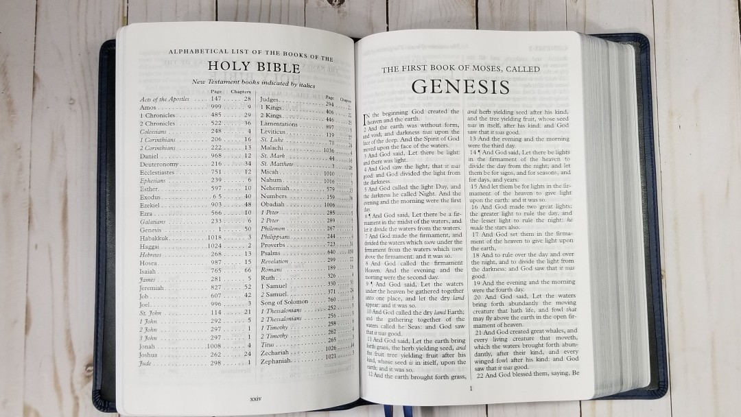
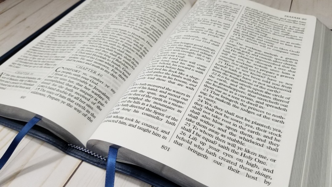
The text is presented in a double-column verse-by-verse format. The header includes the book name and chapter number in the outer margin and a page summary in the inner margin. The page number is centered in the footer. Books begin on the page where the previous book ended.
This is a text-only edition, so the text doesn’t have to share space with any else and there are no distractions such as reference or footnote keys.
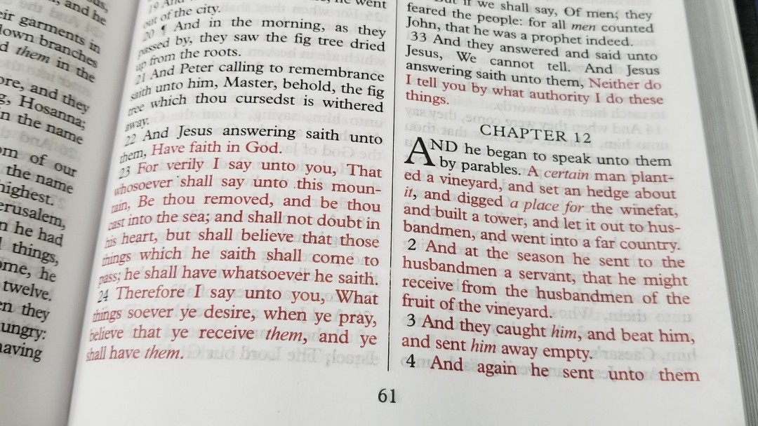
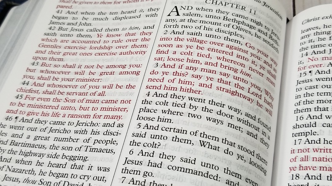
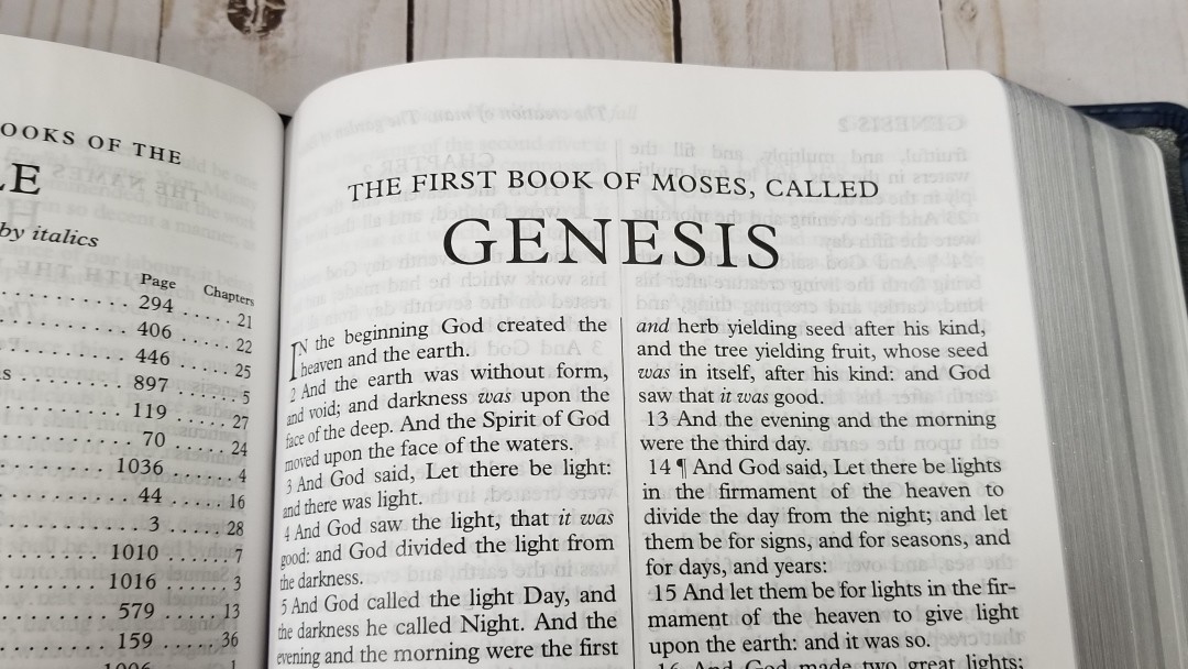
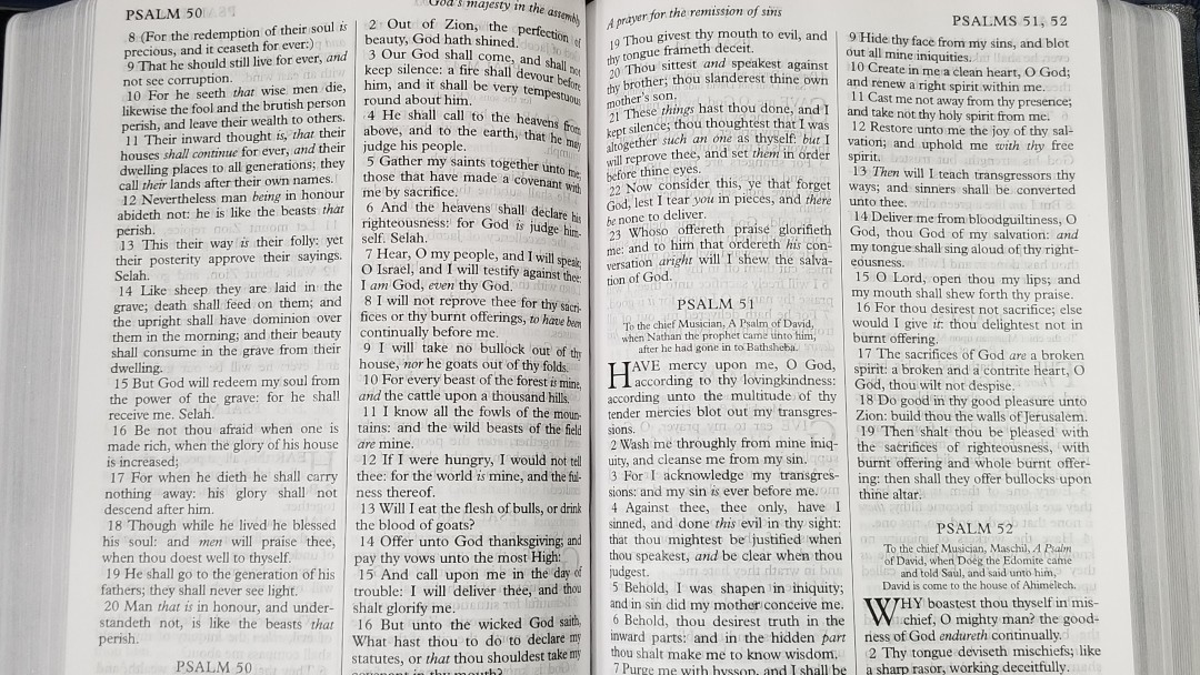
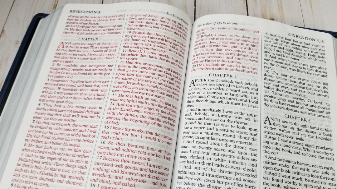
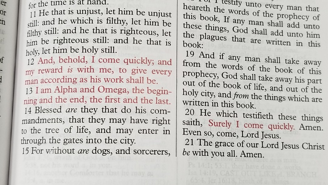
The font is 12-point. This is one of my favorite fonts. It’s one of the most readable fonts I’ve seen. It has extra space between the lines (leading). It’s a red-letter edition. The text is sharp with a medium boldness. Italics are used for supplied words. It does not have self-pronouncing marks.
It wasn’t designed with line-matching, but many of the lines do match up well. The show-through is more prominent where they don’t match. It has 40 characters per line with around 7-8 words per line. The words never feel too close, but they do sometimes have extra space that stands out.
Front Matter
Family Records
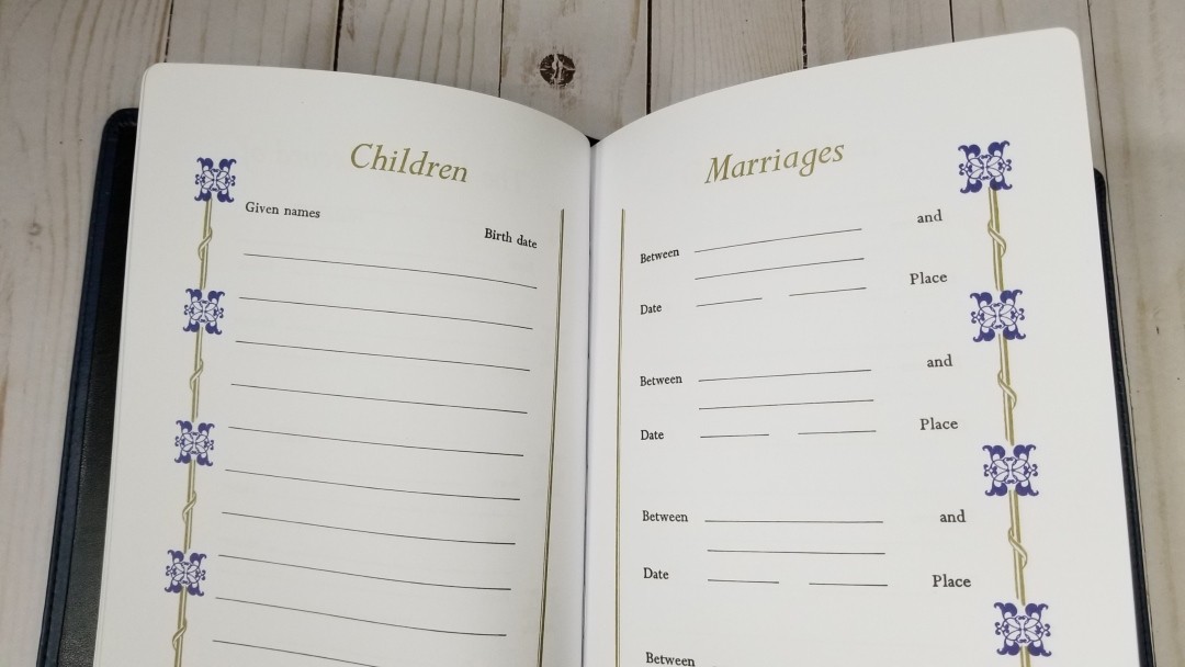
It includes several family records pages in the front printed on thick non-glossy paper. They include a presentation page, the family record of the husband and wife, children, marriages, grandchildren, and deaths. They have blue and gold highlights with the deaths page having black and gold highlights.
Translators to the Reader
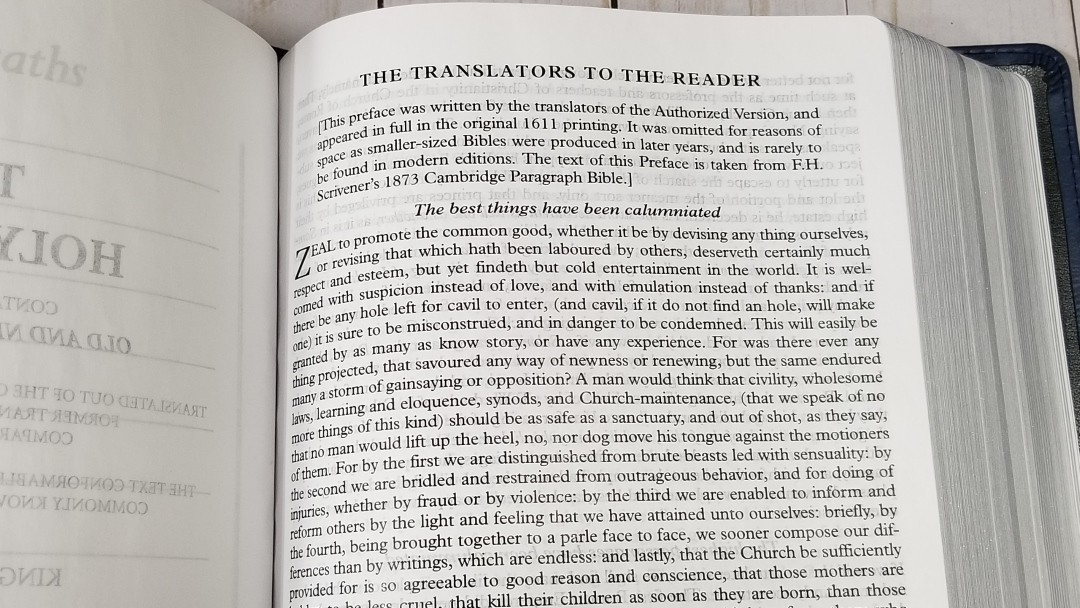
It also includes the Translators to the Reader. This is in large print. I’m glad to see this included.
Epistle Dedicatory to James
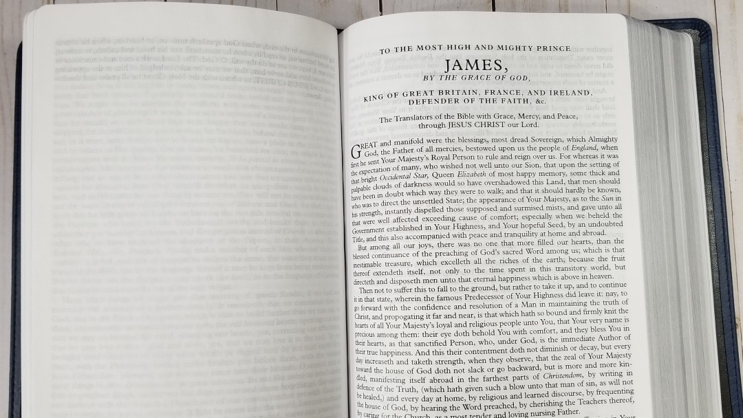
It also includes the Epistle to James in large print.
Concordance
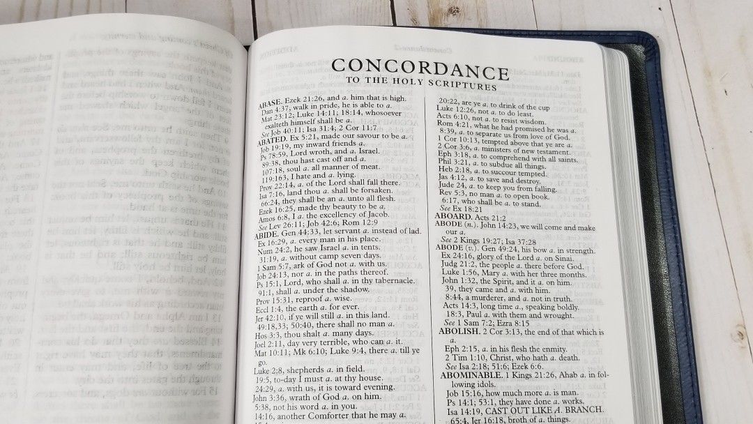

The concordance has 196 pages with 2 columns per page and tons of entries. I like this concordance. It has a lot of references and is excellent for study. Here are a few words with the number of entries for each to help you compare:
- Christ – 15
- Christian – 3
- Faith – 124
- Faithful – 57
- Faithfully – 4
- Faithfulness – 10
- Faithless – 4
- God – 58
- God (an idol) – 20
- Goddess – 4
- Godhead – 3
- Godliness – 14
- Godly – 14
- God save the king – 1
- Praise (n) – 42
- Praise (v) – 26
- Pray – 45
- Prayer – 39
Maps
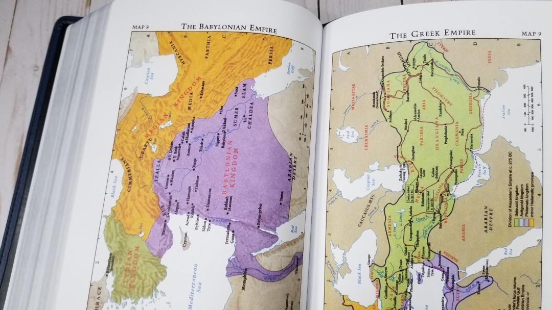
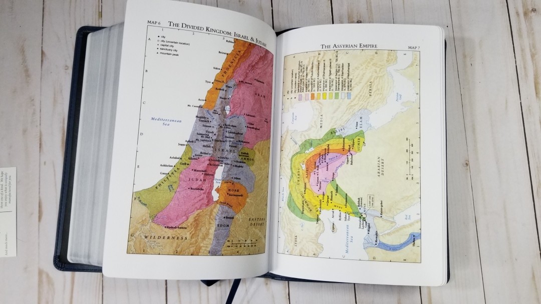
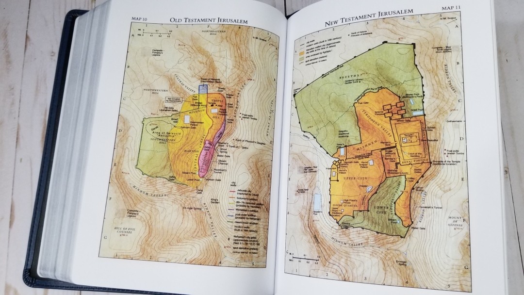
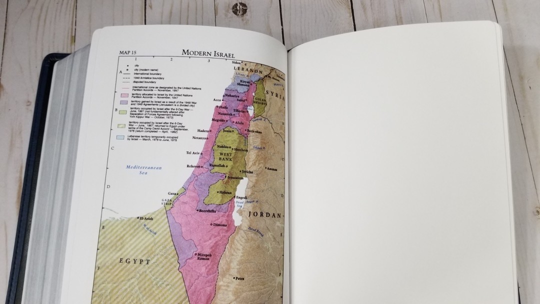
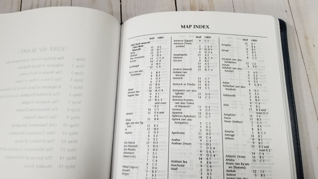
It has 15 older Moody maps that Cambridge used to use printed in bright colors on thick non-glossy paper. They include cities, routes, Scripture references, distance, mountains, territorial expansions with dates, topography, kingdoms, battle sites, locations of events, addressees of Pauline epistles, etc. It also has an 8-page index, which makes finding locations much easier.
The annotations are bold and dark, which can make some of the small text difficult to read. They’re not as easy to read as their Cambridge versions, but they’re still nice maps.
Maps include:
- The Biblical World of the Patriarchs
- Palestine: Political Regions
- The Route of the Exodus
- The Twelve Tribes of Israel
- Kingdoms of Saul, David & Solomon
- The Divided Kingdom: Israel & Judah
- The Assyrian Empire
- The Babylonian Empire
- The Greek Empire
- Old Testament Jerusalem
- New Testament Jerusalem
- The Ministry of Jesus
- The Missionary Journeys of Paul
- The Spread of Christianity
- Modern Israel
Comparisons
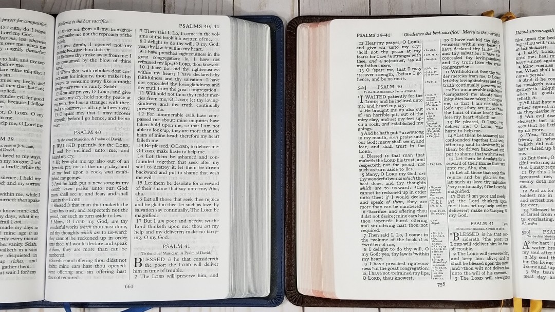
Here’s how the text looks next to the CBP Turquoise. The font’s not as dark as the Turquoise, but it has more space in the text.
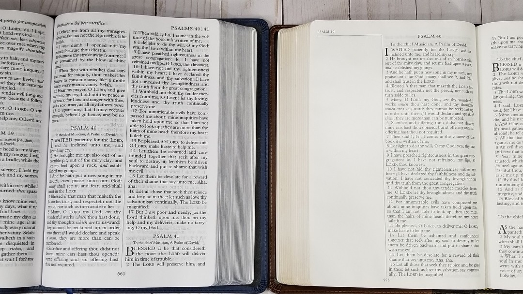
Here’s how the text looks next to the CBP Notetakers. The font is the same typeface family, but the Notetakers is slightly smaller and not as dark.
Conclusion
The CBP 215 is an excellent large print text-only KJV. There aren’t enough high-quality text-only editions on the market. I’m glad to see this one in blue. I’m a fan of blue Bibles and I’m glad to see Church Bible Publishers producing more editions in blue. Even though it’s a large print Bible, it’s not overly large or heavy. The paper is easy to turn and read from. It does have more show-through in some lighting, but I still found it easy enough to read. I would like to see the opacity improved. I’m glad to see that it doesn’t have glare under direct light. If you’re looking for a large print text-only KJV, I recommend the CBP Large Print Text in blue.
_________________________________________________________
This book is available at Church Bible Publishers
_________________________________________________________
Church Bible Publishers provided this Bible in exchange for an honest review. I was not required to give a positive review, only an honest one. All opinions are my own.


I purchased and received this same Bible about 3 weeks ago. Very pleased with the Bible and your review is spot on. The only negative for me was a strong chemical smell instead of the anticipated leather smell. This was my first leather cover that was not black, so I thought it might be due to the blue dye. I contacted CBP and they confirmed it was from the dying process. My hope is the smell will fade sooner than later. Excellent review!
Thanks Roger! I thought the smell might have been the die. It has faded since I first got it, so I’m sure it will go away. I’m a big fan of blue 🙂
Dear Rev.Randy ,A,Brown, uncle Praise The Lord, Please Prayer For Me uncle