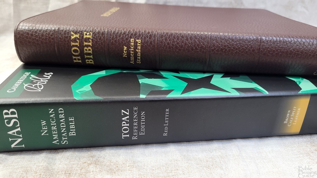
Cambridge has just released their Topaz setting in the 2020 NASB. Unlike most NASBs, the Topaz follows a strict verse-by-verse layout. It’s available in several covers including black, dark blue, or dark green goatskin and black or dark brown calf-split. I’m reviewing the dark brown calf-split, ISBN 9781009415309, model made in the Netherlands by Royal Jongbleod, and designed and typeset by 2K/Denmark.
Specs
- 2020 NASB
- Brown calfsplit leather
- Pasted vinyl liner
- Sewn binding
- 2 1/4″ ribbons
- 6 3/4 x 9 7/8 x 1 1/4″ overall size
- 2 lbs, 6.5 oz
- 28GSM French paper
- Gold page edges
- Double-column verse layout
- Line matching text
- 10-point More Pro typeface
- Red letter
- 95k outer-column reference
- Family pages
- Topical Index
- 15 maps
- Printed in the Netherlands
- Currently $175
Cambridge provided this Bible in exchange for an honest review. I was not required to give a positive review, only an honest one. All opinions are my own.
_________________________________________________________
This Bible is available from
Amazon (affiliate)
_________________________________________________________
Table of Contents
- Video Review
- Cover and Binding
- Paper
- Typography
- References
- Presentation and Family Records
- Topical Index
- Maps
- Comparisons
- Conclusion
Video Review
Cover and Binding
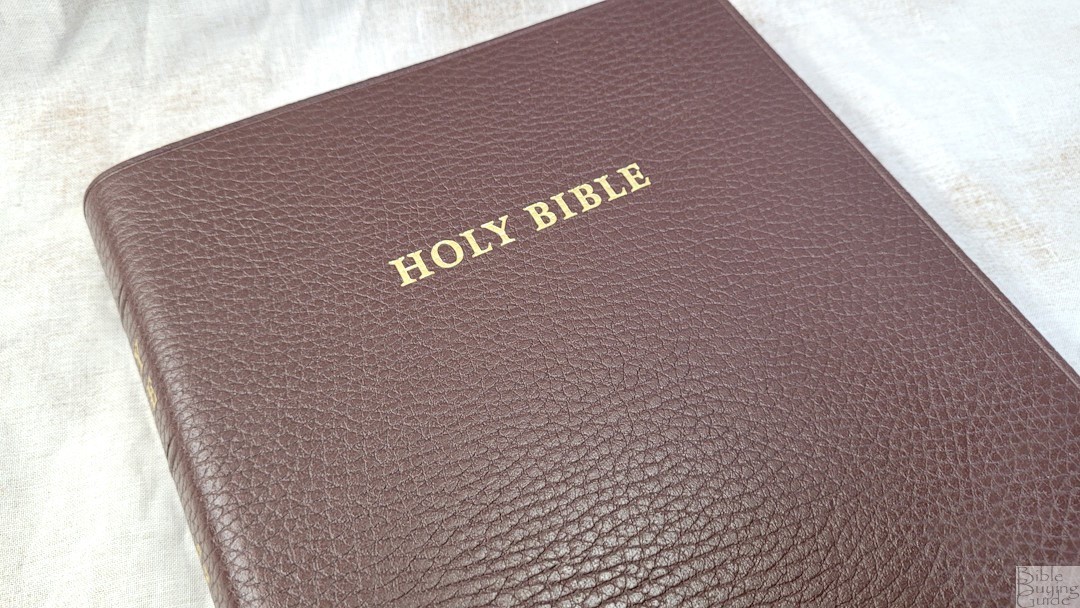
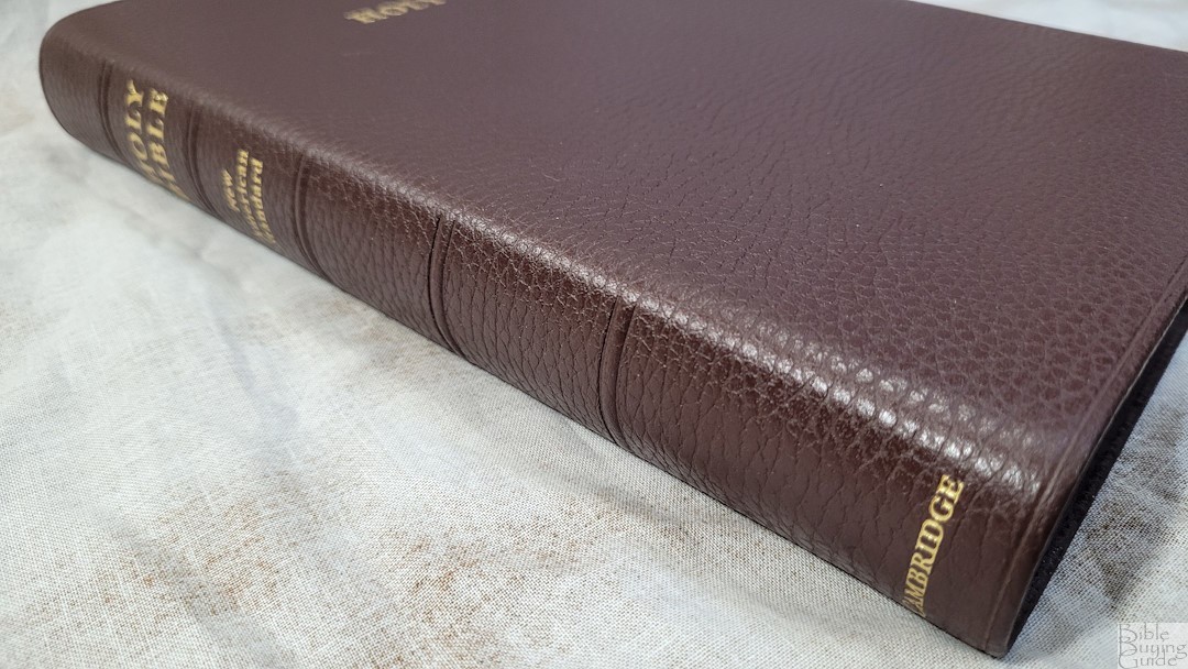
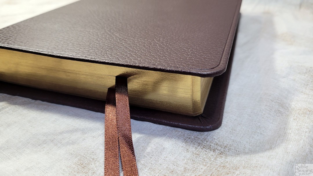
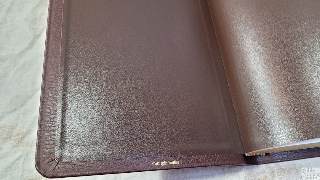
The dark brown calf-split has a pebbly grain that looks and feels natural. I love this color and grain. It has an indent around the perimeter and a 3/8″ yapp. HOLY BIBLE is stamped on the front in gold. The spine has 5 rib indications and HOLY BIBLE, NEW AMERICAN STANDARD, and CAMBRIDGE stamped in gold. The liner is past-down brown vinyl. It looks to be reinforced. The text block is sewn and it has no trouble staying open on any page. The cover and liner are stiff enough to make it easy to hold in one hand to carry and read. It has two brown 1/4″ double-sided satin ribbons. They’re long enough to pull to the corner to open the page easily. The head/tail bands are brown and gold. The overall size is 6 3/4 x 9 7/8 x 1 1/4″. It weighs 2 lbs, 6.5 oz.
Paper
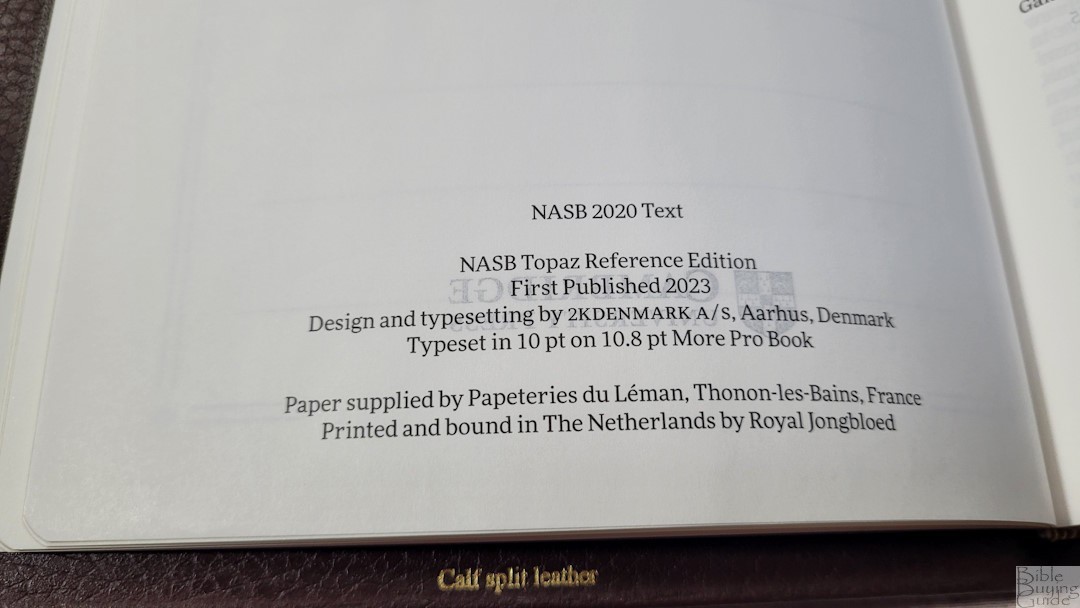
The paper is 28gsm Indopaque by Papeteries du Leman, Thonon-les-Bains, milled in France. This is a Royal Jongbloed exclusive, and it’s the same premium paper that’s used in many premium Bibles produced in the Netherlands by Royal Jongbloed. It has a titanium pigment to increase opacity. It’s coated, which gives it a silky feel. I find the paper easy to turn, but it can be difficult if you’re not used to thin paper. It has no glare under direct light and the color and opacity are easy to read for long sessions. The page edges are gold gilt.
Typography
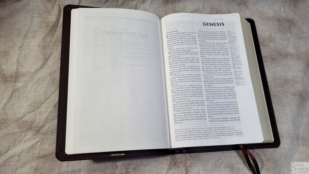
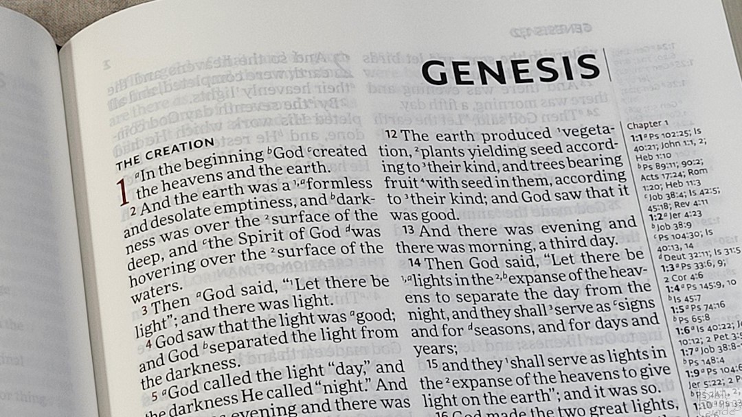
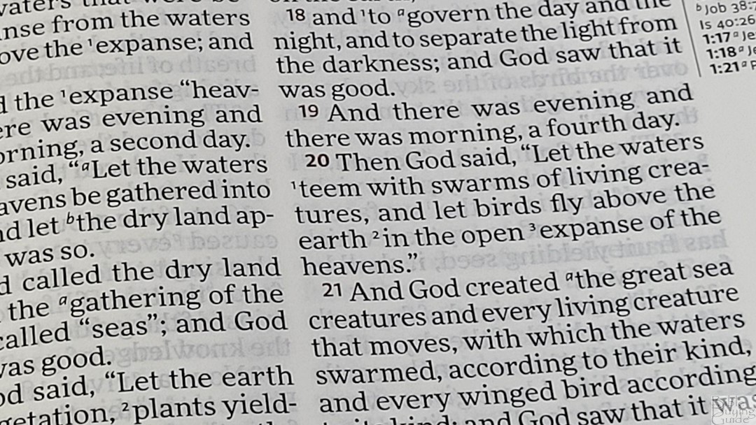
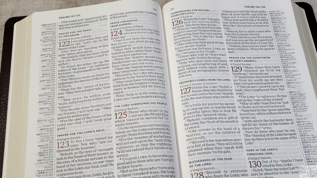
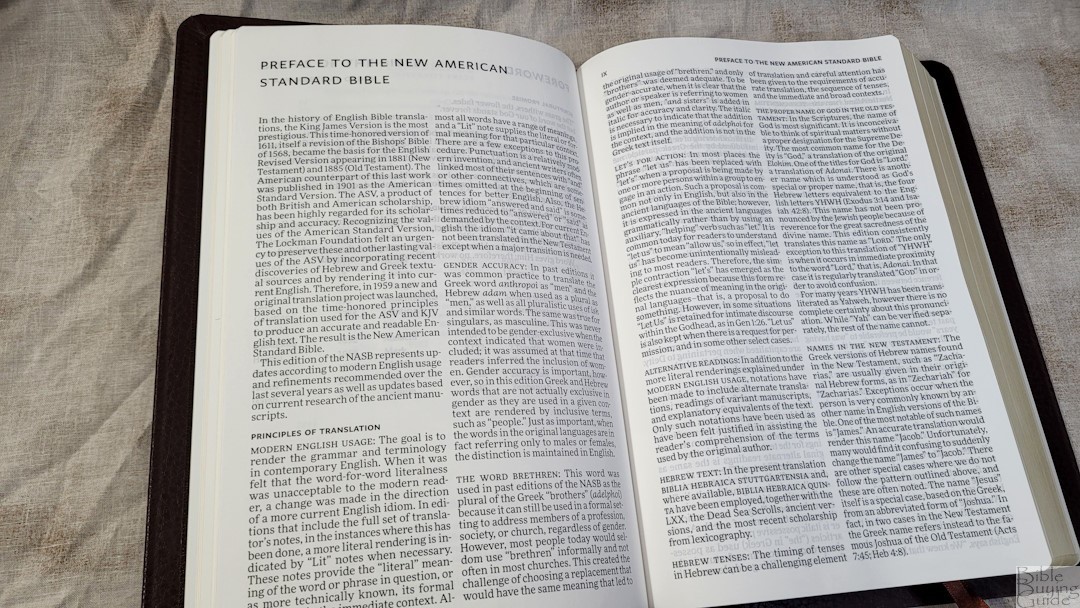
It does not present poetry, letters, or lists in any special formatting. It does include all-caps for Old Testament quotes in the New Testament. Chapter and verse numbers are printed in dark red. Verses that start with red-letter text have black verse numbers. Section headings are in black. The header shows the page numbers in the inner column and the book name and chapter number over the outer column. References are placed in the outer margins and footnotes are placed in the footer.
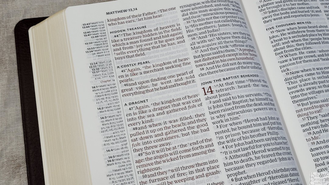
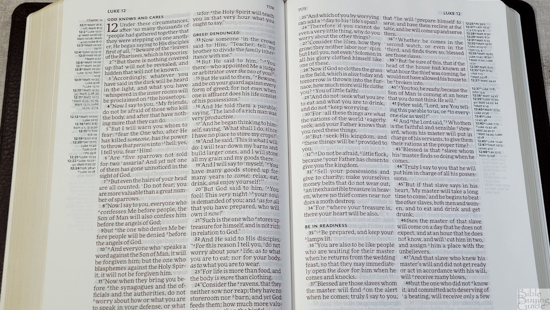
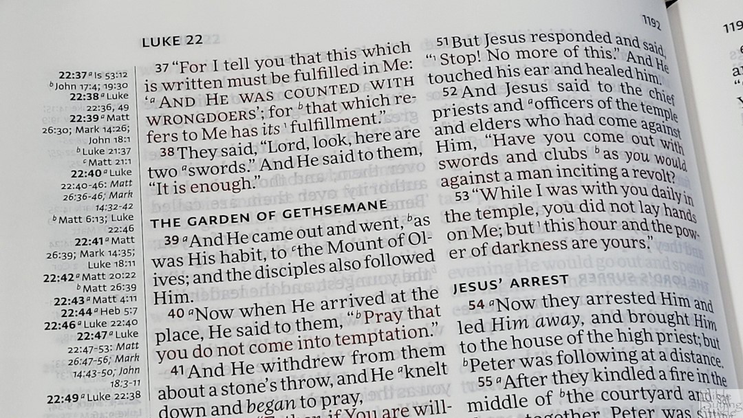
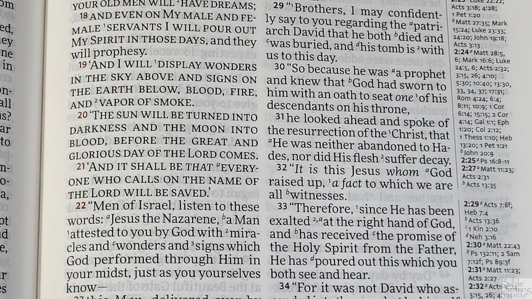
The layout was designed and typeset by 2K/Denmark with the More Pro Book typeface in a 10-point dark red letter. The black and red are dark but not too bold and they are highly consistent. This is ideal for reading, and I can read this for hours without eye strain. Supplied words are in italics. Paragraphs are marked with bold verse numbers. The footnote and reference keys are superscripts. I found them large enough to see and small enough that they don’t get in the way of reading.
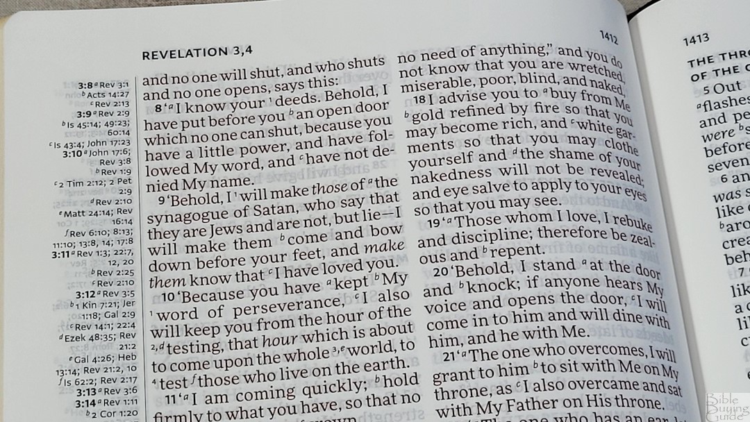
It has around 6-7 words per line. There is enough space between the words and the lines to be comfortable to read. It was printed with line-matching, meaning the lines are printed in the same location on both sides of the page to reduce show-through and improve readability. It has a good amount of extra space in the inner margin to bring the text out of the bend of the page and onto the flat part of the page. Cross-references are placed in the outer margin to keep the text together. This keeps you from having to jump over the non-biblical text to continue reading. This leaves some empty margin space on some pages that can be used for notes. Having the references and footnotes separate makes them easier to find.
References and Footnotes
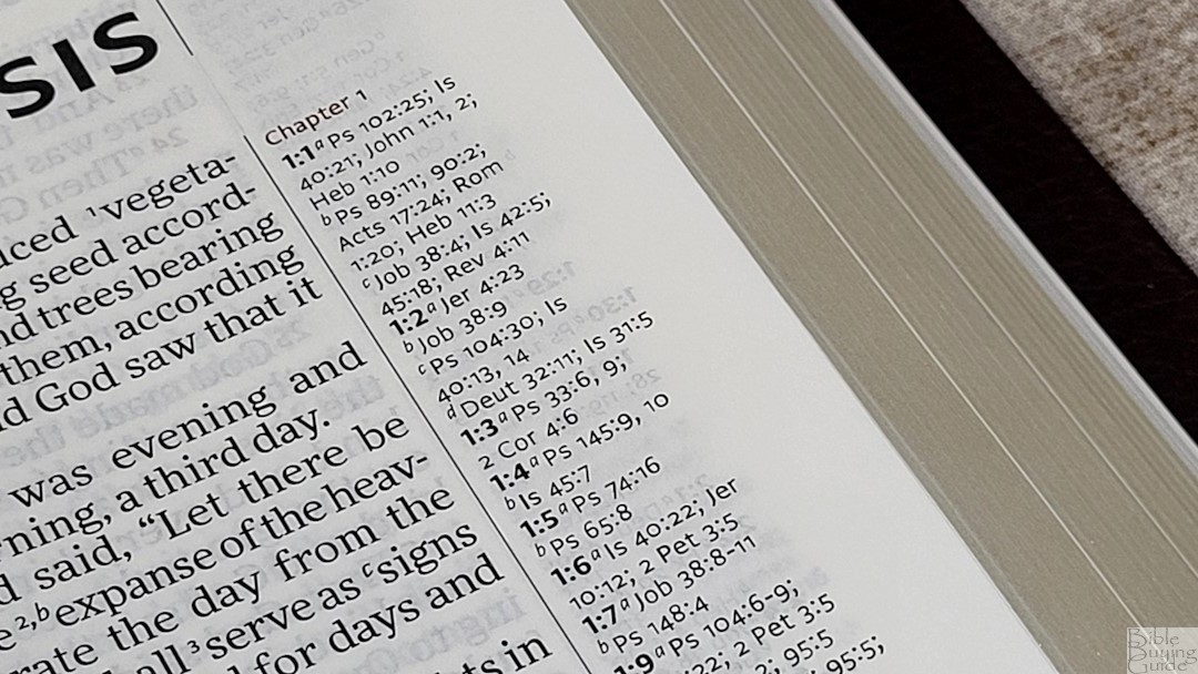
This edition has 95,000 cross-references in the footer. The primary chapter and verse numbers are in bold, making them easy to find quickly. They’re excellent for study and sermon prep. Here are a few example references to help you compare:
- Genesis 1:1 – Ps 102:25; Is 40:21; Jn 1:1, 2; Heb 1:10; Ps 89:11; 90:2; Acts 17:24; Rom 1:20; Heb 11:3; Job 38:4; Is 42:5; 45:18; Rev 4:11
- Deuteronomy 6:4 – Matt 22:37; Mark 12:29, 30; Luke 10:27; Deut 4:35, 39; John 10:30; 1 Cor 8:4; Eph 4:6
- Isaiah 9:6 – Isa 7:14; 11:1, 2; 53:2; Luke 2:11; John 3:16; Matt 28:18; 1 Cor 25:25; Is 22:22; Is 28; 29; Deut 10:17; Neh 9:32; Is 10:21; Is 63:16; 64:8; Is 26:3, 12; 54:10; 66:12
- Matthew 28:19 – Mark 16:15; Matt 13:52; Acts 1:8; 14:21; Matt 25:32; Luke 24:47; Acts 2:38; 8:16; Rom 6:3; 1 Cor 1:13, 15; Gal 3:27
- Mark 12:29 – Deut 6:4
- John 1:1 – Gen 1:1; Col 1:17; 1 John 1:1; John 1:14; Rev 19:13; John 17:5; 1 John 1:2; Phil 2:6
- John 3:16 – Rom 5:8; Eph 2:4; 2 Thes 2:16; 1 John 4:10; Rev 1:5; Rom 8:32; 1 John 4:9; John 1:18; 3:18; 1 John 4:9; John 3:36; 6:40; 11:25
- Acts 2:38 – Mark 1:15; Luke 24:47; Acts 3:19; 5:31; 20:21; Mark 16:16; Acts 8:12, 16; 22:16;
- Romans 10:9 – Matt 10:32; Luke 12:8; Rom 14:9; 1 Cor 12:3; Phil 2:11; Acts 16:31; Rom 4:24; Acts 2:24
- 1 John 1:1 – John 1:1; 1 John 2:13, 14; Acts 4:20; 1 John 1:3; John 19:35; 2 Pet 1:16; 1 John 1:2; John 1:14; 1 John 4:14; Luke 24:39; John 20:27; John 1:1, 4
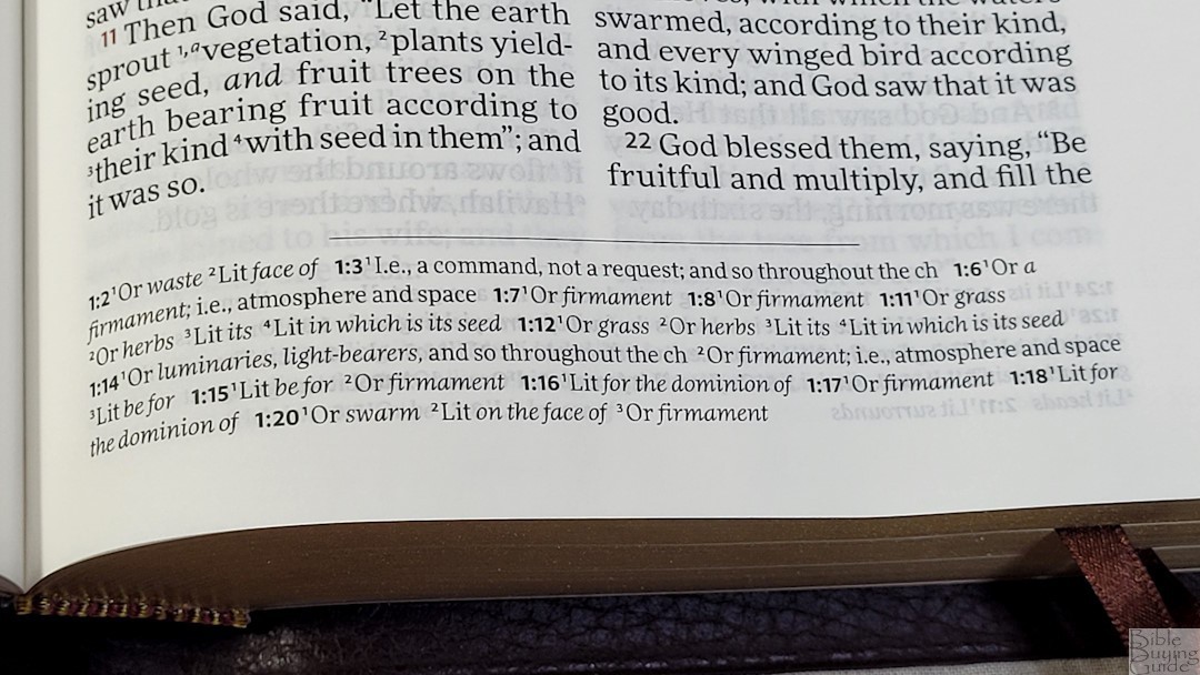
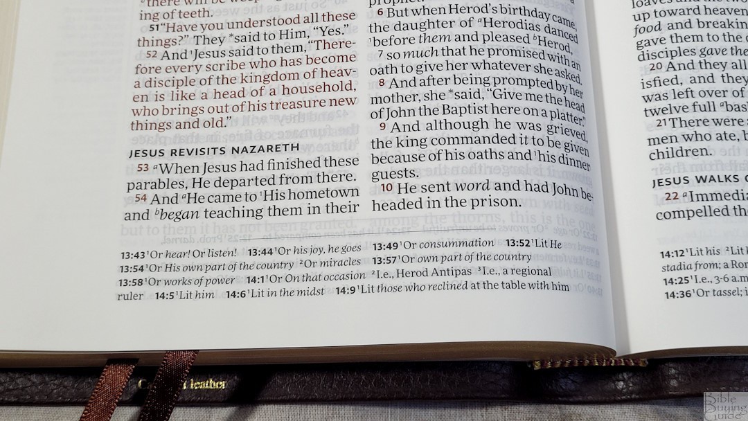
This edition has the full set of translation footnotes. They’re placed under the text in the footer. They include alternate renderings, literal renderings, the Septuagint, explanations of the original languages, etc. These help study and understand more about the 2020 NASB translation.
Presentation and Family Records
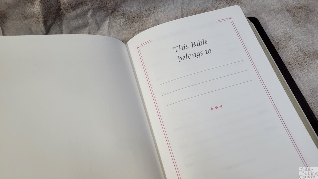
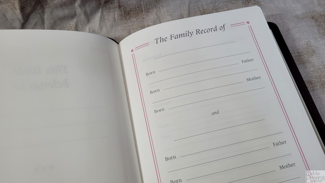
In the front of the NASB Topaz are several pages for records printed on thick, non-glossy pages. The presentation page shows who the Bible belongs to. Following this is the family record of the husband and wife, children, marriages, grandchildren, and deaths. There are a few blank pages before the family pages. All of this thick paper helps give the Bible structure.
Topical Index
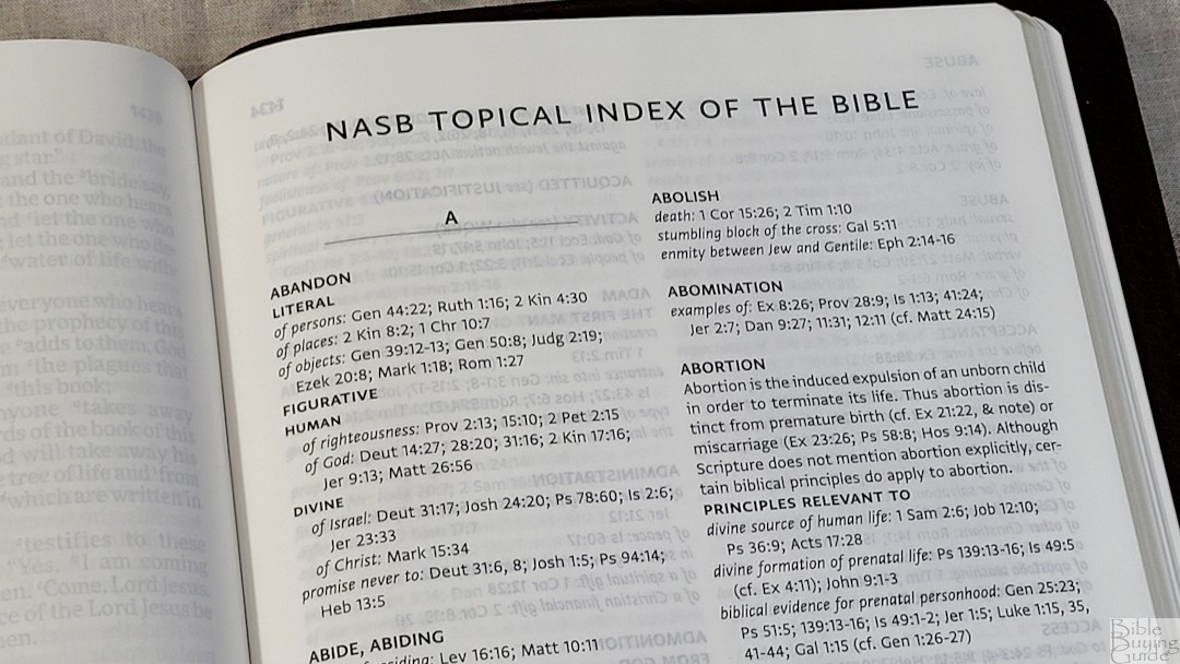
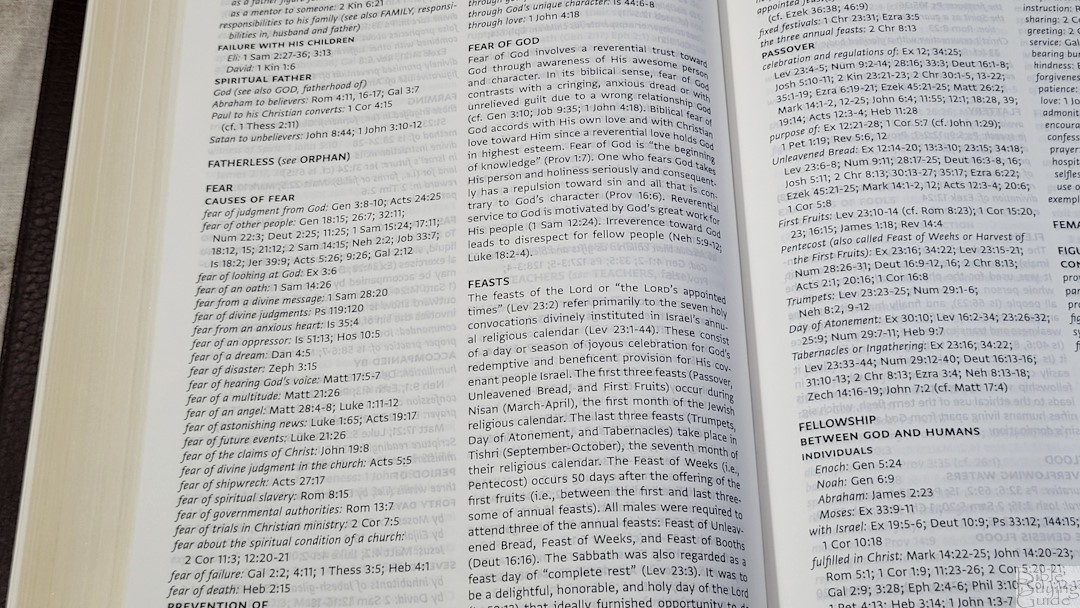
This is a large index that covers many topics, and it breaks many of them down into smaller topics. It’s 135 pages with two columns per page. It includes people, places, events, concepts, theology, etc. It’s excellent for sermon prep and personal study. With its theological notes, I recommend just using it as a resource and doing your own study.
Maps
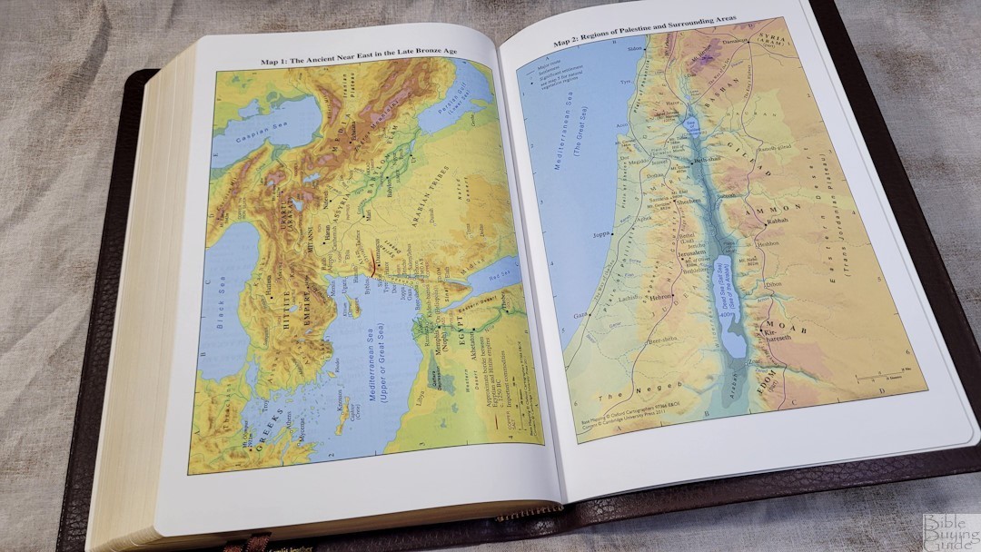
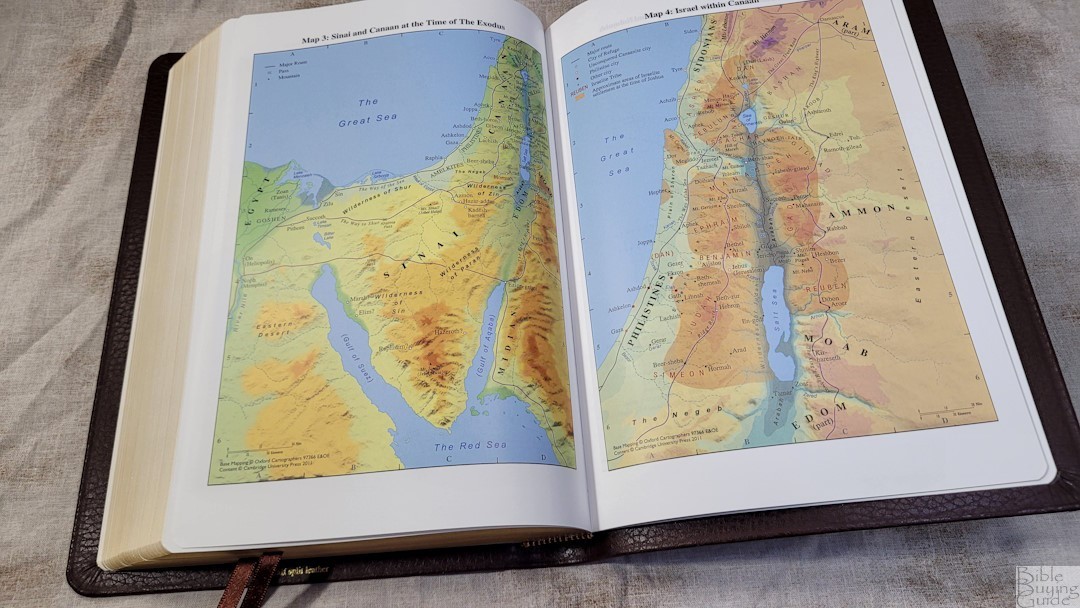
The NASB Topaz includes 15 pages of maps on thick semi-glossy paper. They’re printed in vibrant colors and they’re highly detailed. They show borders, import commodities, dates, routes, passes, settlements, distance, topography, mountains, cities of refuge, cities, tribes, vegetation, kingdoms, battle sites, satrapy, city walls, city gates, older city walls, seven Churches of Asia, etc.
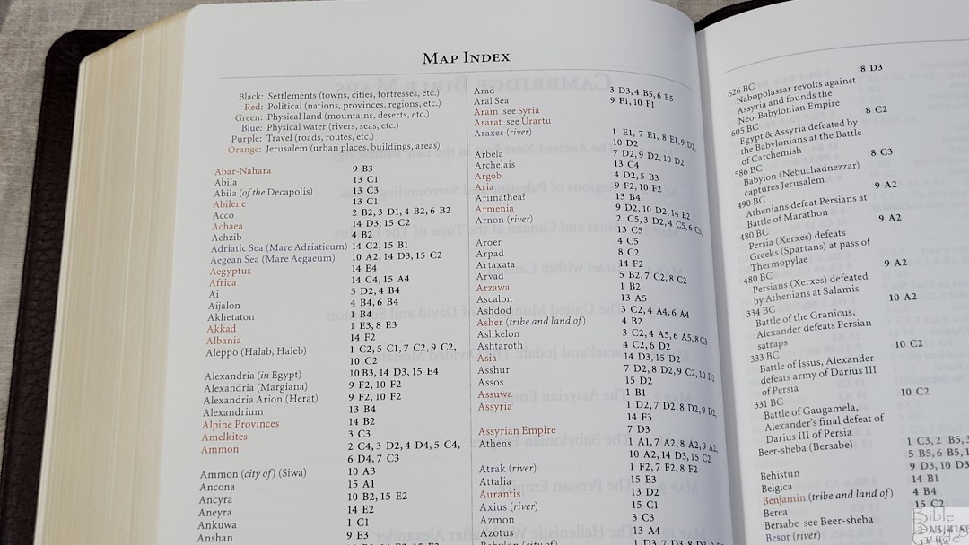
It also includes an 8-page color-coded index to the maps printed on the same paper as the maps. It includes the settlements, political (nations, provinces, and regions), physical land, physical water, travel, and Jerusalem. I think the Cambridge color-coded index to be one of the best available. I’m always glad to see a map index included.
Maps include:
- The Ancient Near East in the Late Bronze Age
- Regions of Palestine and Surrounding Areas
- Sinai and Canaan at the Time of the Exodus
- Israel within Canaan
- The United Monarchy of David and Solomon
- Israel and Judah: The Divided Monarchy
- The Assyrian Empire
- The Babylonian Empire
- The Persian Empire
- The Hellenistic World after Alexander
- Jerusalem in Old Testament Times
- Jerusalem in New Testament Times
- Palestine in New Testament Times
- The Roman Empire
- The Eastern Mediterranean in the First Century AD
Comparisons
Here’s how the Cambridge Topaz compares to a few other NASB editions from Cambridge.
Diadem
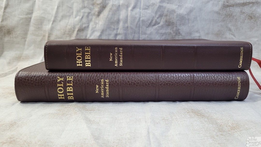
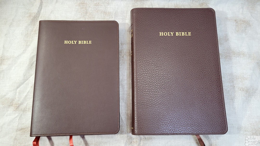
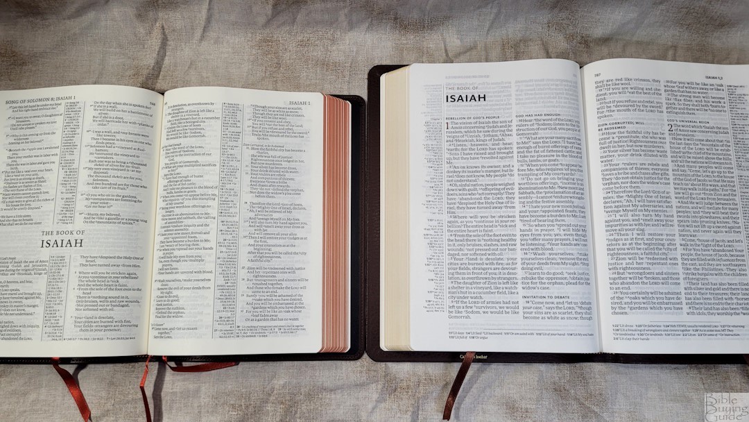
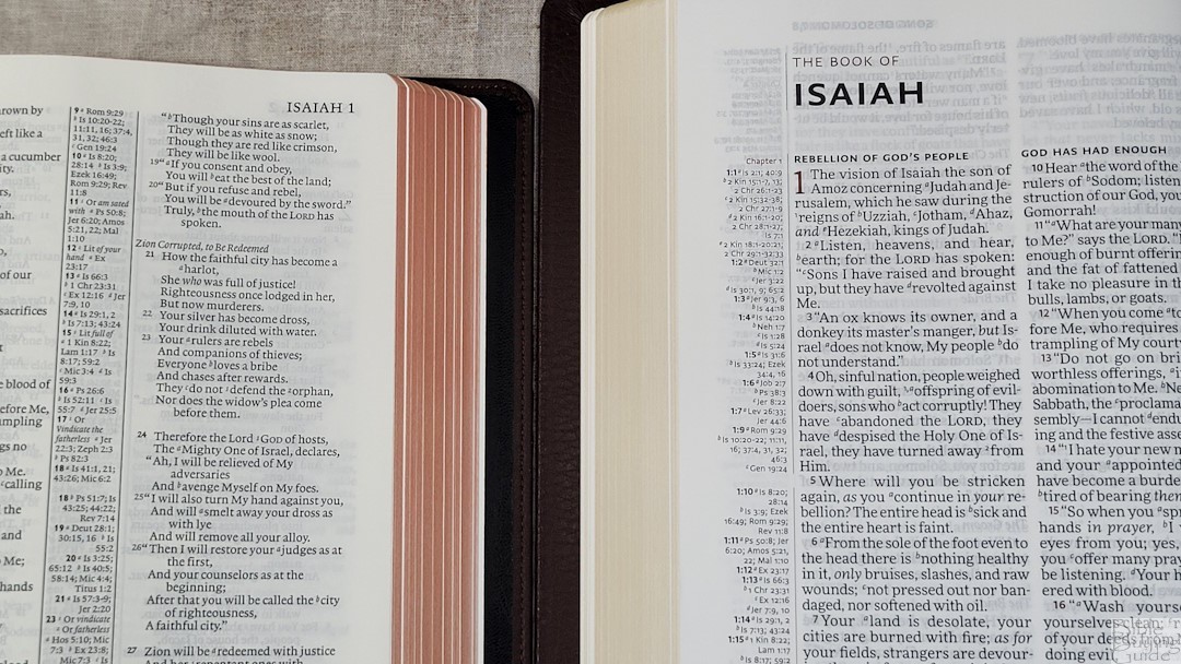
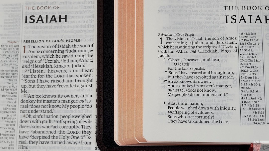
The Cambridge NASB Diadem is a 1995 NASB in a double-column, paragraph layout. It’s an enlargement of the Pitt Minion, and the font is 8.2. It has the same paper, references, footnotes, and maps but has a concordance. The thickness is the same, but the footprint is smaller, making it a hand-sized Bible.
Clarion
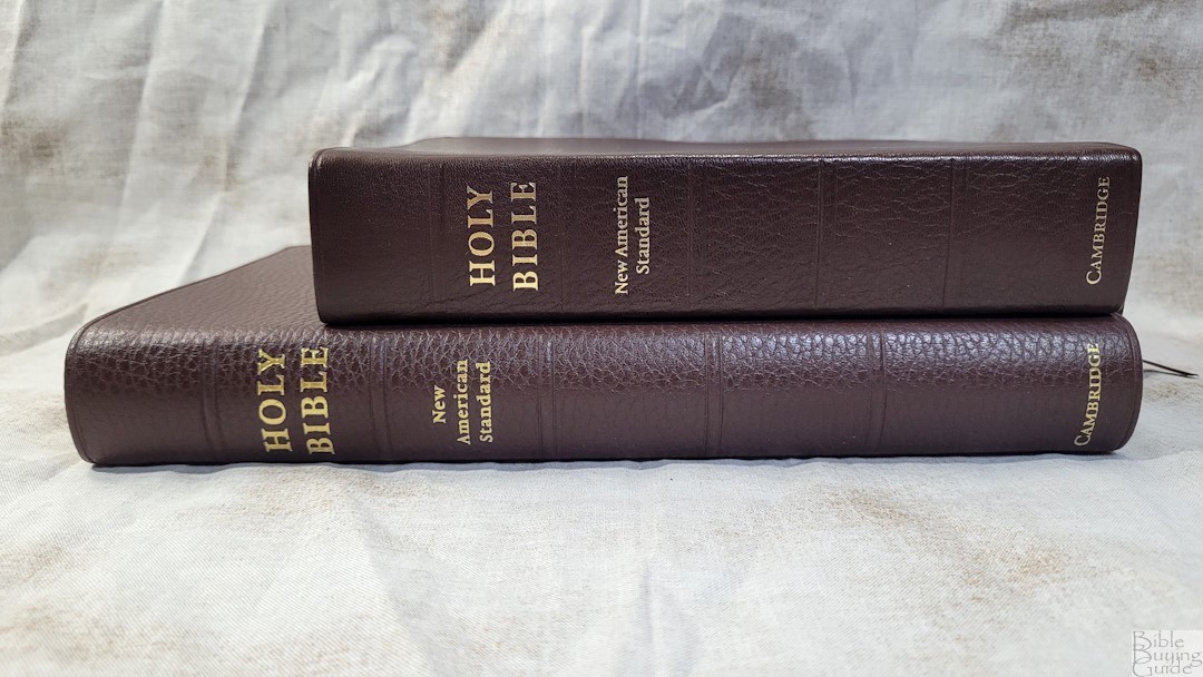
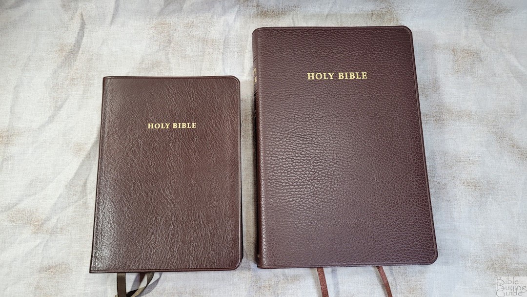
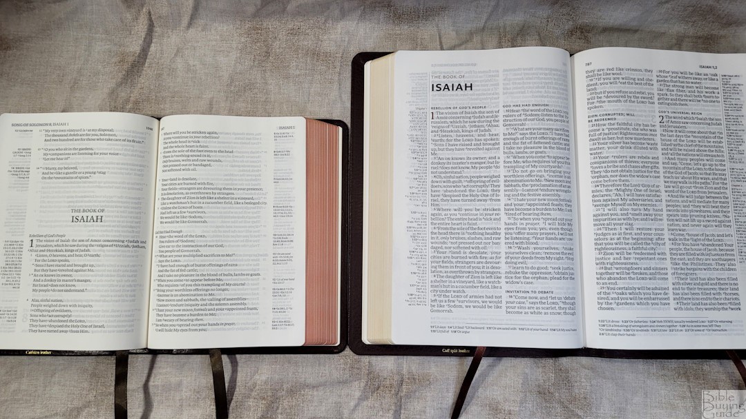
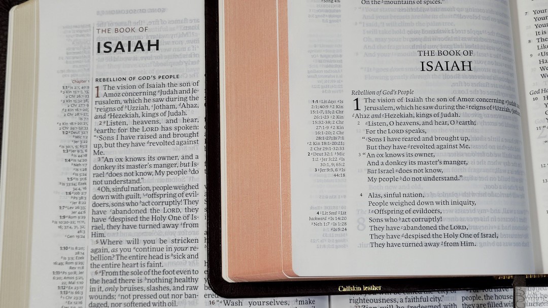
The Cambridge NASB Clarion is a hand-sized 1995 NASB with the same paper. It has an 8.75 font, a paragraph format with poetry and letters indented, and a lot smaller footprint, but it’s thicker. It’s designed to be a personal-sized Bible for carrying and reading. The Clarion has the same references, footnotes, and maps, but it has a concordance. It’s also made in the Netherlands.
Schuyler Stridon
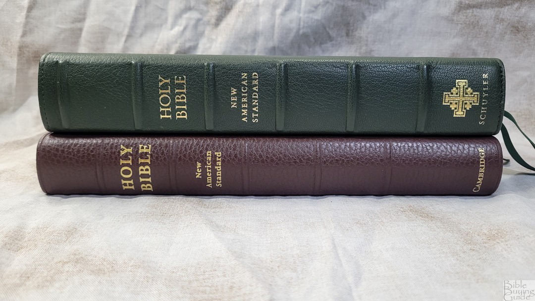
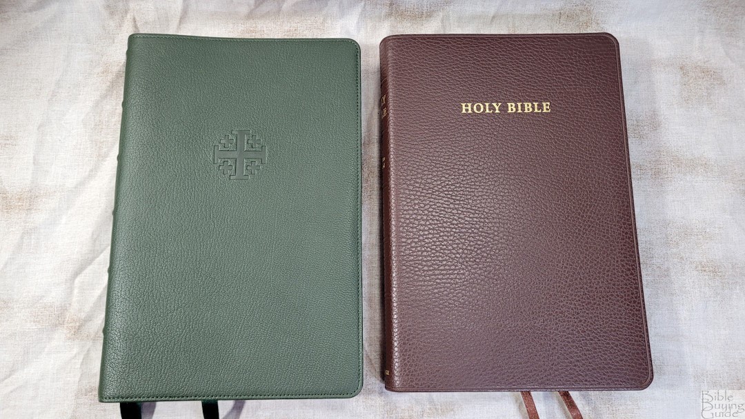
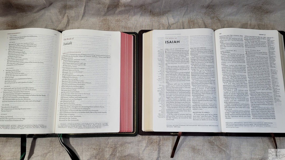
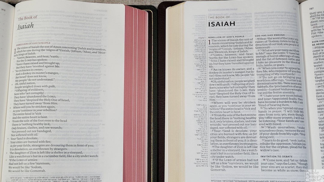
The Schuyler NASB Stridon is a wide-margin 2020 NASB. It isn’t as wide and it’s thicker. Both have the same paper. The Stridon’s font is slightly smaller, but it’s darker. The Stridon has a single-column v-b-v layout, but it retains the formatting for poetry, lists, and letters. It has the same references and footnotes, but it has a concordance rather than a topical index.
Conclusion
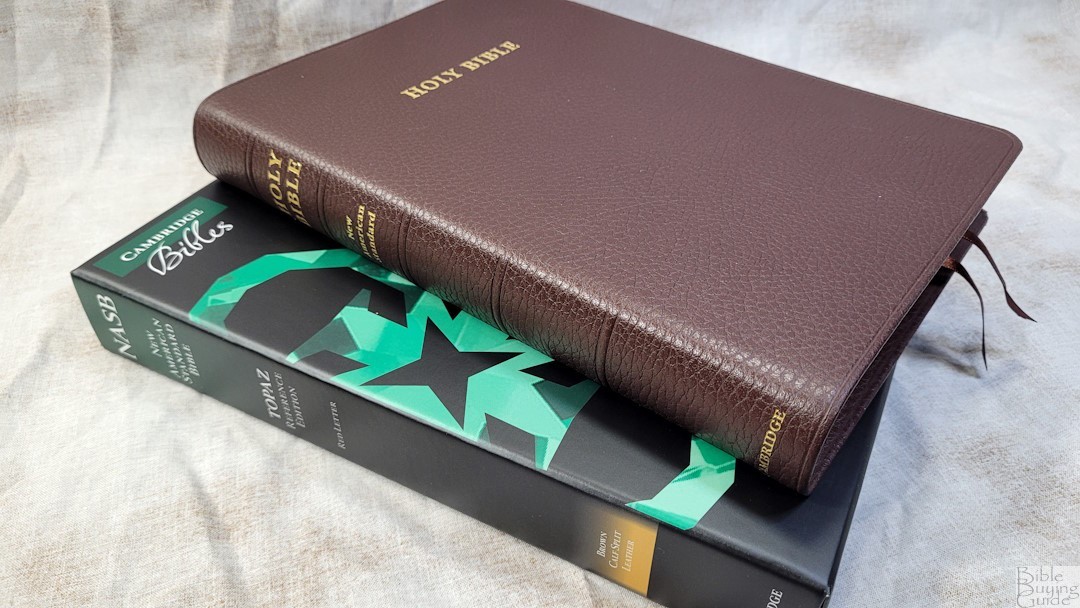
The Cambridge NASB Topaz Reference Edition is a well-made Bible. The quality of the construction and design is excellent. The text is highly readable and the overall size is great for everyday usage. This is an excellent Bible for preaching, teaching, and study. If you’re interested in a high-quality NASB in verse-by-verse without extra formatting, the NASB Topaz is a great choice.
_________________________________________________________
This book is available from
Amazon (affiliate)
_________________________________________________________
Cambridge provided this Bible in exchange for an honest review. I was not required to give a positive review, only an honest one. All opinions are my own.




The calfsplit actually looks great. I can see the Cambridge quality in the pictures. I hope I can get one of these sometime.