As I grow older I find myself gravitating toward smaller Bibles with larger and bolder print. I used to use large Bibles with small print and lots of extras, but I’ve found that I don’t use the extras that much. They have their place but I usually study with tools outside of my Bible. They mostly take up space at the expense of a print that’s comfortable to read. I don’t need extras in a Bible I read or preach from.
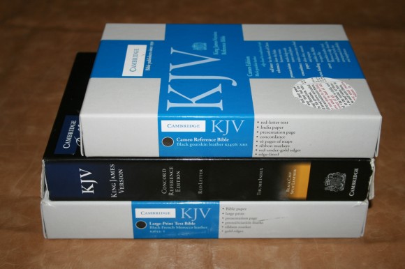
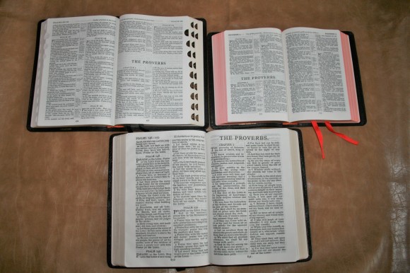
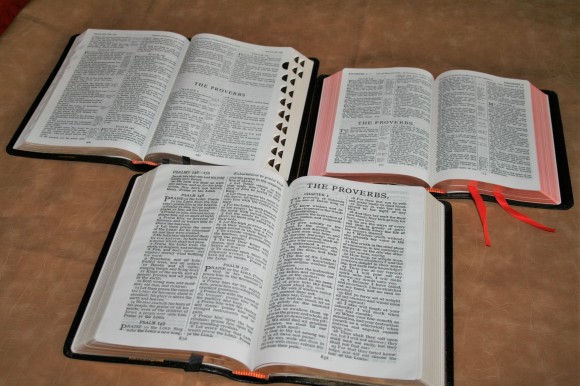
For most of my reading I just need a small to mid-size Bible that I can carry and hold in the car to read, and a large font that’s sharp and bold. I want a text clear of distractions. The Cambridge KJV Large Print Text is exactly that. It’s a large print text-only edition in a size that’s comfortable for reading and carry. This edition was printed in the UK by Clays, Bungay, and Suffolk.
Cover and Binding
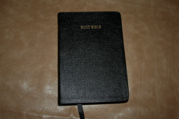
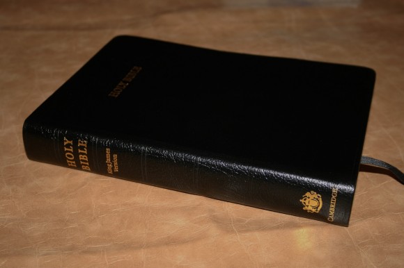
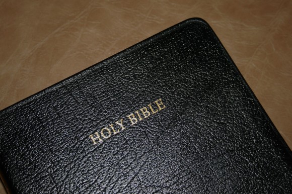
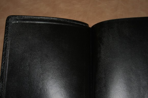
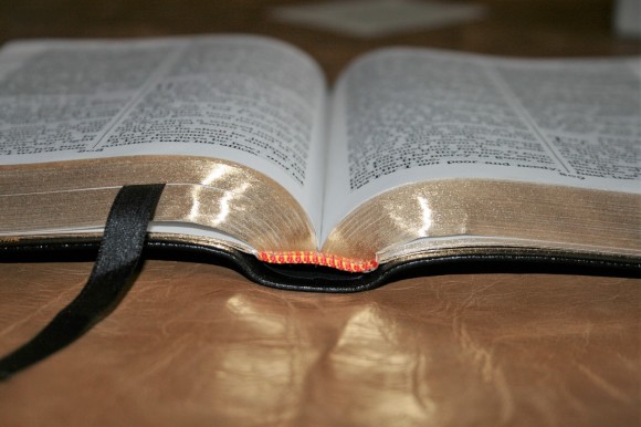
The cover is French Morocco. This is the underlying portion of the split calf skin. It has a grain stamped into it (this is normal for many leathers. You’d be surprised at some Bibles that have a stamped grain). It has a shiny finish. It’s stiffer than calf split. I actually like this because it will lay flat in one hand. The liner is paste-down vinyl. The cover doesn’t want to stay open until it’s broken in. The binding is sewn.
Size
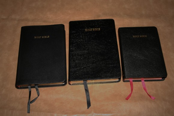
The size is 6.25 x 9 x 1.25. This is within my sweet-spot of perfection when it comes to Bible sizes. It lives in the same footprint range as the Westminster and Concord. To my hands that feels right. It’s not too big or too small. It’s on the large side of that scale, so I don’t want it any larger, but this size is good. Don’t change it. I can carry it with me and read it in the car. I can hold it in my hand as I walk across the platform on Sunday. I can lay it on the pulpit and it doesn’t take up too much space.
Paper
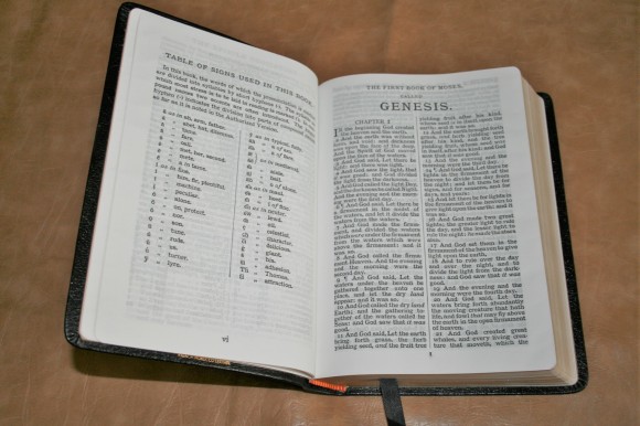
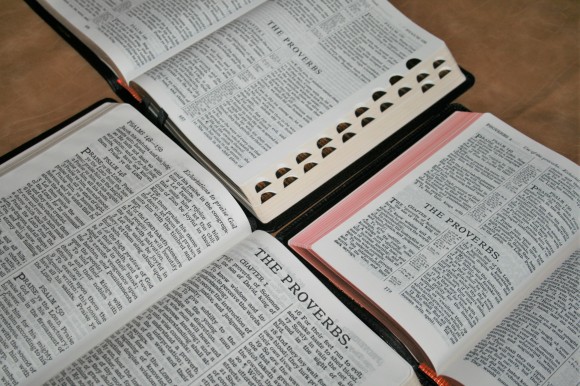
The paper feels like 30+ gsm to my fingers (but that’s just a guess). It’s off white and not at all shiny. It’s not the paper used in their reference editions. I prefer the paper from the Concord or Cameo. This feels like a lower quality that those, but it’s not bad paper. It’s wavy on the outer margins.
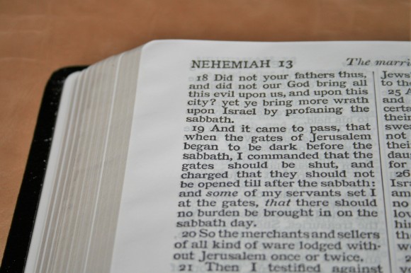
The edges of the paper have a slight bend. I imagine a knife dropping down and cutting the paper, bending the edge of the page. This makes it difficult to turn pages easily.
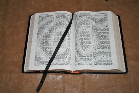
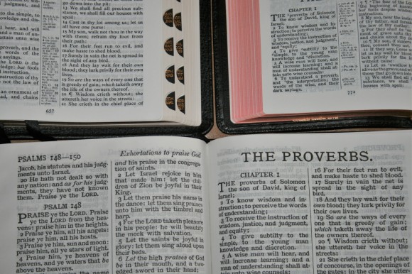
They say this font is a 10-point, but the design makes it look much larger than that to me. I’ve seen 12-point fonts that were not this large. I would at least call it an 11-point if I didn’t know better. It’s a 10/10 ½ Petit Medieval Clarendon. It’s bold, but not burn-your-eyes bold. It’s fairly thick. A little thinner might improve the readability. This is a black-letter edition.
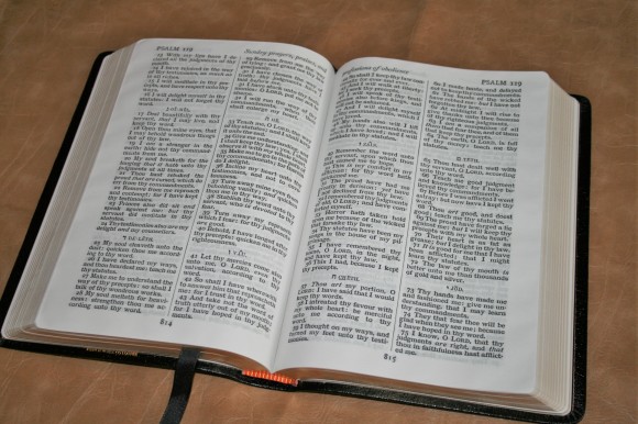
The top of the page includes the book name and chapter number, and a page summary. This is an older style setting where chapters are separated with the word CHAPTER and then the chapter number. The drop-cap is the first letter from the first word in the verse.
The print quality is consistent throughout. It has self-pronunciation marks and italics for supplied words. It doesn’t happen a lot, but sometimes some of the wordsaretooclosetogether. This usually doesn’t bother me at all, but there are a few places where it stands out. The columns are 2.25” wide and have around 32 characters across.
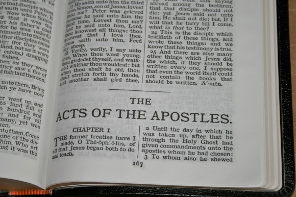
There’s even a little bit of margin space and some room in the footer for notes. It has .5” for the inner, outer, and bottom margins. I’m considering writing chain references for topical studies in the margins and updated words in the footer.
It has some show-through that reads as gray to my eyes in some lighting. In other lighting it looks excellent. If the lighting is right and the pages are pressed against the page under it, the show-through can give a look of copied artifacts. This makes the font look fuzzy and dark gray, but it’s not really fuzzy at all and it is a black font. When I sit in my favorite reading chair under a light the page looks clean and the font looks sharp. There actually isn’t too much show-through, but if there seems to be I just lift the page so it isn’t pressed against the page under it and it looks great.
My Thoughts on Footnotes
It would be nice to see an edition of this Bible made for those of us that believe the translators footnotes are part of the translation. They could be placed in the footer. I’m planning to write the footnotes myself. Maybe not all of them, but at least the notes that are the most helpful. I still want a clean edition too. There’s a lot of value in a Bible with no distractions.
Ribbon
The ribbon feels like fabric rather than silk(ish). It’s functional. It’s more than long enough to pull to the corner and open the pages easily. This adds to the utilitarian feel of this Bible where function is placed over elegance.
How I Use It
Here’s how it’s worked the best for me and how I’ve used it for the last few months. The short version is it’s great for reading, carry, and preaching.
Reading
I’ve noticed that I gravitate toward large and bold fonts and hand size Bibles. This is exactly that. I wear bifocals and it’s difficult (VERY difficult) to find a Bible that I can read through both lenses and still hold comfortably. For smaller fonts I usually end up holding the Bible close to my face and lift my head up high to read through the bottom lens. For Bibles like that I can’t read them with the Bible in my lap. It’s out of focus. The alternative is to get a giant print. Those Bibles are usually LARGE and hard to hold. I want hand size. The Cambridge Large Print lets me lay the Bible in my lap and read from the top lens AND I can hold it closer in one hand to read from my bottom lens. This is helpful for those times when there are too many cats fighting over my lap (and arms, shoulders, and my head). This bible passes my reading test with flying colors.
Carry
I carry a Bible with me every time I leave the house. I do a lot of reading in the car in the parking lots of stores or any time I’m waiting for anyone. I don’t like to carry large Bibles. They’re too difficult to hold and read. Smaller is better. I could just use my phone, but I like the idea of seeing someone reading a Bible in public. The more they see it the harder it is to forget. I have no problems holding this one. I open it and lay it across my hand. It lies flat, making it super easy to read. It’s not overly large or heavy. I also carry it outside when I’m walking in my pastor pasture. I can walk around the land and read it with no issues. I never want to set it down and give my arms a rest. It passes my carry test with flying colors.
Preaching
This is a fine Bible for preaching. It has a large and bold enough font that I can read from it easily when behind the pulpit and it’s not so large that I don’t have room for a notebook. It’s easy enough to pick up and carry around the room. The self-pronouncing text is helpful if I want to make sure I pronounce name correctly. I passes the preaching test and now I’m wondering exactly what “flying colors” are. Hmm. Never mind. I’ll just edit all of that out.
Marking
I haven’t tried marking it yet, but I can talk myself into marking this one. I haven’t marked in anything except a wide margin Bible in a long time. I’ve been waiting until I find that one Bible that I want to preach from that I also think I can carry with me. I enjoy preaching from Bibles such as the Westminster, Concord, Concord Wide Margin, Cameo, and others, but I’ve been waiting for a large font in a Bible this size. This one fits the bill (whatever that means). If I do decide to mark in it I will either use my standard color-coding with PrismaColor pencils, or underline with Pigma Micron markers. I think either both would work fine in this Bible. Since it isn’t red-letter I don’t have to worry about my colors looking good over both black and red (or pink, or multiple shades of red). If I do mark in it I’ll post some pictures and share my results.
If I Could Change One Thing
I don’t want to change the font size, overall size, or paper thickness. If I could make just one, and only one, change I would like to see this in a premium edition. This means edge-lined goatskin, art-gilt edges, several silky ribbons, and higher quality paper. I realize that all together those add up to more than one thing. So if I could just choose one of the items on the premium list it would be a goatskin cover.
I like that Cambridge makes this available in the sub $100 range, but I also think it’s a great candidate for a high-end premium edition. I would like to see text-only editions make an appearance in the world of premium covers.
Comparisons
Conclusion
This Bible feels like a utilitarian Bible. It feels like function and utility without much elegance. The Cambridge KJV Large Print Text comes close to being the perfect text-only KJV. It’s a good Bible to preach from, mark in, carry everywhere, and grow old with. I’ve never once thought this Bible was too large or too small. I’ve never needed the text to be larger or easier to read. It’s easy to hold. I love how it lays flat in my hand and how it lays open on the pulpit.
I would LOVE to see this Bible made available with high-quality paper, leather, and ribbons. Just saying (again). Covers can be changed. Ribbons can be replaced. But the paper and print – that’s the heart of the Bible. That’s what makes the Bible what it is. I like this paper and print enough to rebind it in goatskin if I ever have issues with the cover.
Anyone that want’s a KJV with a large and bold font in a size that’s easy to handle would appreciate the Cambridge Large Print Text. It’s an excellent choice for both reading and using in the pulpit. I highly recommend for both laymen and preachers.
Cambridge provided this Bible free for review. I was not required to give a positive review – only an honest review. My opinions are my own.







Take note Bible publishers, this is the way to do a large print Bible–nice dark lettering, portable, no nonsense, black letter, easy to read and definitely easy to preach from. A Bible that tends to get forgotten amidst the Cameos, Concords, Longprimers etc. Excellent Bible–thank-you Cambridge. BTW, I understand the newer printings are done by L.E.G.O. in Italy. I’d love to see this in Calfsplit and love the fact that it’s also available in nice, affordable hardcover. Thank-you Cambridge.
Please suggest me where can I buy is it available in Bangalore in India.
What is price
Kindly let me know.
Regards
Sam
9902537218
Hi Sam,
Bibles Direct carries Cambridge Bibles and offers free worldwide shipping. They have the hard back, but the French Morocco is currently out of stock. I am sure they would let you know when they have some more.
http://www.bibles-direct.co.uk/products/?c=52
They have currency converter on the website. It costs about $20-40 to mail bibles from the UK to the USA.
Another company here in the USA is http://evangelicalbible.com/shop/ They offer free shipping on orders over $75. I do not know if that just applies to the USA or not.
You may want to buy 2 at once, if you can. Shipping is less and you have a spare for the future when you wear the first one out.
ebay stores might be another source. Or contact Cambridge:
http://www.cambridge.org/bibles/
I hope this helps. – Michael
Eph 3:9 And to make all men see what is the fellowship of the mystery, which from the beginning of the world hath been hid in God, who created all things by Jesus Christ:
http://www.graceimpact.org
Have you seen the Bible put out by Local Church Bible Publishers.com Surer Giant print .. Check it out!
If you’re used to having the highly enlightening translator’s notes in your KJV Bible, this Bible will be a let down. Really, they shouldn’t publish the KJV without the translator’s notes. That’s how the translators intended it. I also prefer the words of Christ in red and good, non show-through paper.
Nice review Randy. I believe the LCBP 180/355 and wide-margin 390 are exactly the same text as the Cambridge Large Print. This is one way to get a nice cover. I have the Cambridge hard cover and in my comparisons the LCBP version has slightly better paper.
I have seen the French Morocco binding and the LCBP is vastly superior.
This text block is about my favorite in terms of all the trade-offs. Very readable, portable, no excessive self-pronouncing and the wide margin 390 gives you a good study bible option with the exact same text block. The only hand size competition in my opinion is the Longprimer.
If someone wants this text block with a really nice cover and for less money ($30) try the LCBP 355. Amazing value.
After getting home and comparing the Cambridge Large Print hardcover to the LCBP 355 I see that the LCBP text and page is slightly smaller. I would guess it is the Cambridge shrunk by a factor of 90-95%. Still, for all practical purposes the same bible.
Would love to see a review of the regular size print Cambridge Text Bible too! That and the Personal Concord are the cheapest Cambridge Bibles you can get.
Thanks Lawrence. That one’s been on my want list for a while. I do plan to review it but I can’t say when. Thanks for letting me know you’re interest in it. I’ll try to get it soon.
Sounds great!
Hello Brother.
It has been a while, but I noticed this review and wanted to comment on my experiences with this Bible. Firstly, my pastor loves this layout and has used it for decades. He wears one out and purchases another. When I entered the ministry with him, I purchased one for myself. Within a few months, I had binding issues, with the spine pulling away from the pasting. I contacted Cambridge and they sent me a new one under warranty. I moved on to another format. My pastor has the same problem with his, and uses black duct tape to reinforce the spine.
It is a nice size, but I agree it needs a premium binding option.
Brian
Could you recommend a Bible that is similar to this one (text only, good bold print, thick pages so that there is very little show-through) that is available in a more premium feeling leather (and preferably in a brown, tan, blue, green, or other more lady-friendly color)? Thanks!
Hi Candi. Unfortunately I don’t know of anything like what you’re looking for. Probably the closest is the LCBP 215 with tan spine (I’ve reviewed it here). Your best bet might be to get a Bible rebound.
This is my favourite bible too and I have used the expensive versions . It is a pure Cambridge text uncluttered and the easiest to read. The authorised version KJV, the only Holy Bible. I was surprised to find out recently they did do a rare “top grain cowhide” version of this. I bought one second hand on eBay which is on its way to me . They should make more of them. They don’t want to do premium because they don’t want more people having the pure text
One of your replies said the Cambridge large print Bible was pure Cambridge- not so. The text of the large print is an enlarged Cameo text and the Cameo text originates from Oxford University Press. The Brevier Clarendon text of Oxford fame originates from Cambridge University Press. Sorry. Keith, Cambridge, England’ .
Hi Keith. Thanks for clarifying!