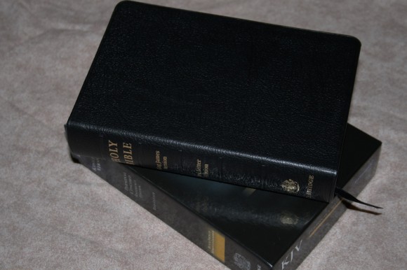
 The Personal Cambridge Concord is a smaller version of one of Cambridge’s most popular KJV’s: the Concord. This one has all the tools of the regular edition, but is that a good idea in such a small package? Something that little can’t be readable or useful can it? I’ve used this Bible for about two months now, putting that very question to the test.
Pros
- French Morocco cover
- Very readable at a small size
- Bold-figure reference system
- Dictionary
Cons
- Cover is stiff
Features
- KJV
- French Morocco cover
- Sewn binding
- Translators to the Reader
- Epistle Dedicatory
- 6.5 font
- Red letter
- Bold-figure reference system
- Translation notes
- 7 page glossary
- 137 page concordance
- 128 page Bible dictionary
- 15 maps
- Index to maps
- 1 ribbon
- Gilted edges
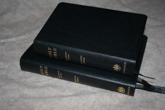
- 5 x 7.25 x 1.5
- Printed by Printcorp in Belarus
- ISBN: 9780521702522
- MRSP: $80
Cover and Binding
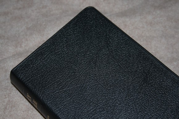
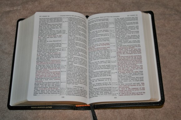
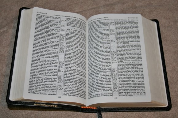
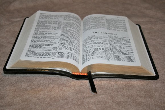 The cover is French Morocco. This is just a touch under calf-split and a higher quality that genuine leather. It has a grain that is pressed into the leather. It looks amazing. This is a very thick cover. It’s almost too stiff. It’s so stiff that it doesn’t want to lay open on its own in Genesis. It has loosened up a lot since I started using it, but it still doesn’t lay all the way open. Once it’s been open for a while it doesn’t want to close all the way. I love the way it looks and feels. I just wish it wasn’t so stiff. The liner is paste-down vinyl. It is smyth sewn.
Paper and Print
The paper is opaque and has an ivory color. It has a rougher texture and is thicker than the regular Concord. This makes the overall size thicker than the regular edition.
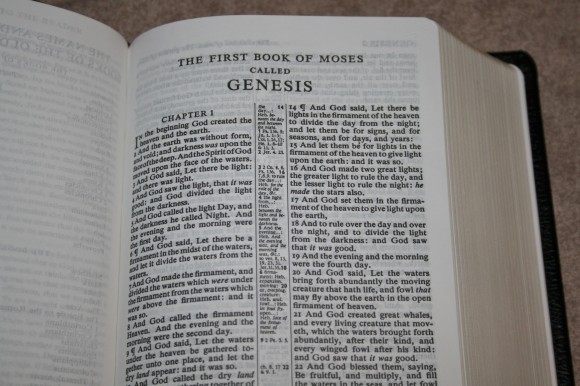
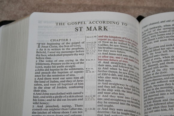
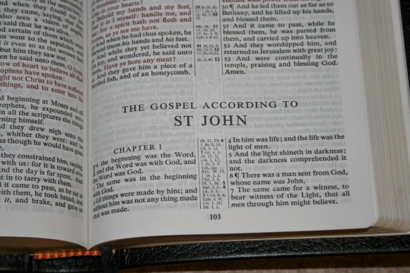
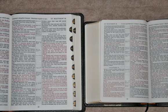
The font is a 6.5 Times Semi-bold with 7.5 leading. This font was designed to be readable in a small size. I honestly didn’t think I could read a font this size, but it’s so sharp and bold that I can read it laying in my lap easier than some fonts that are much larger. The color and opacity of the paper helps with readability.
It has a self-pronouncing text with a guide in the front on how to use it. I like this feature. It isn’t overdone. It just has the really hard words. This is handy when reading out loud and you want to make sure you get it right.
The print quality isn’t as consistent as the regular Concord (the regular edition is printed by Jongbloed). Not that it’s that bad, but the variation is just noticeable. It’s still better than most Bibles out there. It ranges from dark to medium dark. The red is more noticeable than the black. I like this red better than most reds – especially the darker red. The columns are 1 11/16 (almost 1 3/4”) wide and contain 36 characters. Even when the words are a little tighter than normal it’s still readable with no issues at all.
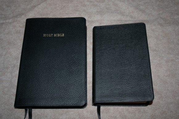
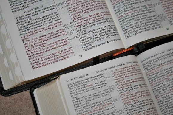
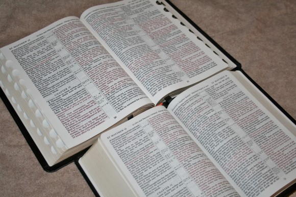
In comparing to the regular edition, the font in the personal size is not as bold (but still very bold and is probably due to being smaller), the paper looks more opaque (probably due to the font not being as bold), the paper is a lot thicker (obvious when comparing the thickness of both), and the paper in the personal size is slightly whiter (at least to my eye).
The top of the page shows the book names and chapter numbers for everything that appears on that page, and a summery for the page. The summaries range from 1-3 statements. I find this handy for doing quick scans when I’m looking for something. Sometimes I just look at them to see what catches my eye.
References and Notes
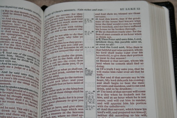
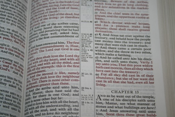
The Concord has an interesting center-column system for its references and notes called the Bold-Figure Reference System. They appear next to the verse they reference. I like this because I don’t have to look up and down the center-column to find them.
Instead of having any keys in the text, there is a bold verse number on the side of the column where the verse is. The references and notes appear under that number. This keeps the text extremely clean and readable. Some don’t like this because it’s difficult to know which reference and note goes with which portion of the verse. I like it because I don’t use references and notes that often anyway. I would rather have a clean text with no distractions.
There are a lot of references. I’m not sure of the count but I think it’s less than 100,000. I think it’s the 80,000 that the TBS Westminster uses as its starting point. Here are some quick counts:
- Gen 1:1 = 11
- John 1:1 = 8
- 1 John 1:1 = 7
There are also a few missed opportunities. For example, Matthew 17:20 takes you to ch. 21:21, Mark 11:23, ch. 13:31, and vs. 9. There is enough room that more verses could have been written, but Luke 17:6, 1 Cor. 12:9, and 1 Cor. 13:2 were left out. Luke has Matthew and Mark. Mark 11:23 doesn’t have a single reference. There are 7 lines of empty space. There should have been reference back to Matthew, Luke, and 1 Cor.
All of these verses are found in the concordance, but if there’s room next to the verses then I prefer the references to be there where I need them. I have been able to find pretty much anything I wanted, but not from references alone. With that said, I do like the references in the Concord. It’s just that there could be a few more.
The notes are the translator’s notes that include Hebrew and Greek alternate renderings. It gives you the original word and then the alternate rendering.
Glossary
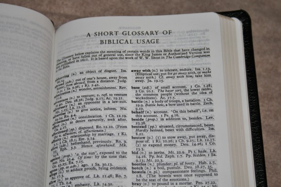
There is a 7 page glossary for words that have changed meanings or are no longer in use today. It’s based on The Cambridge Companion to the Bible by W. W. Skeet. It gives the word, the part of speech, the definition, and verses where it can be found. I love having this feature. It’s one of the things that makes the Concord stand out to me.
The only problem is you don’t always know to look. For example, I thought I knew what the word prevent meant, but the glossary shows that in the KJV it means to go before (pre event). There’s no reason to look for that in the glossary. There needs to be some kind of marking in the center column. Maybe it should just have a note that contains the word and something like glos. The note might look like this: prevent: glos.
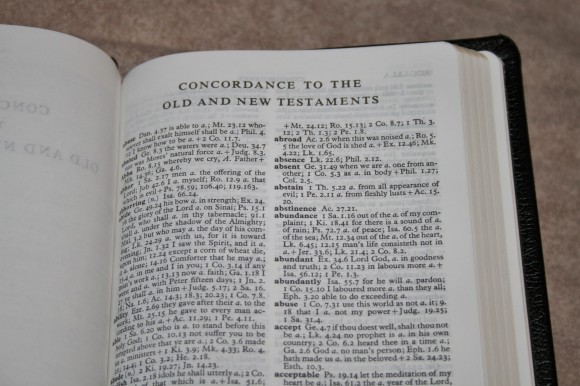
Concordance
The concordance is 137 pages. It has a lot of entries and is one of the better concordances. I’m not a fan of the layout and it can be a little difficult to use. Rather than having one verse per line, the verses are ran together. This isn’t a bid deal for words that only have a few entries, but when there are a lot of entries it can be very confusing. Also, the order of verses can be confusing. You might find an entry in Acts, then 1 Corinthians, and the next one might be John. It goes back and forth between giving the reference and then the snippet of the verse and then the snippet and the reference.
Here some of the entry counts (if I counted right):
- God = 41 entries with 76 total references (include both upper case and lower case g to show which word the verse refers to)
- Faith = 55 verses
- Faithful = 25 verses
- Faithfully = 3
- Faithfulness = 6
- Faithless = 4
It is a good concordance simply by the number of entries it contains. However, if I can find a verse another way I will avoid the concordance. It’s just too difficult to read and use. Which is better? A concordance with less in it but easier to use, or a concordance with a lot in it that’s difficult to use? If I really needed to use a concordance I want more entries over ease of use. It will take me longer to find what I’m looking for but I’m more likely to find it.
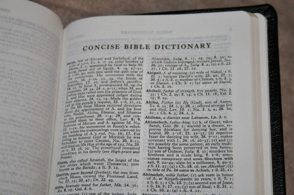
Dictionary
It has a 128 page dictionary with two different sections: one for words and one for book summaries. This is one of my favorite features of the Concord and in my opinion puts it in a league of its own. I’m glad it was included in the personal sized edition. There’s a lot of good material here for study, sermon and class prep, etc. For example, the entry for Christ has so many references that I can’t count them and shows the topics. Here’s the gist of what it says:
- The anointed, the Greek name for Messiah
- The Christ was also the Son of God
- And the Son and Man
- Names and Titles of Christ in the OT
- Names and Titles of Christ in the Gospels and Acts
- Names and Titles of Christ in the Epistles
- Names and Titles of Christ in the Apocalypse
- Christ’s Kingdom
- His Church
- His victory and triumph
- His resurrection
- His ascension
- His glory in heaven
- His death
- His mediation
- His second coming
- His judgement
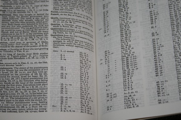
It also has the Harmony of the Gospels, chronological tables, OT quotes in the NT, and lots more. It’s rare if I want to look up something in the dictionary and it’s not here. It includes peoples, places, events, etc. There is some theological bias but it isn’t much. Like always, do your own study when it comes to theological issues.
Maps
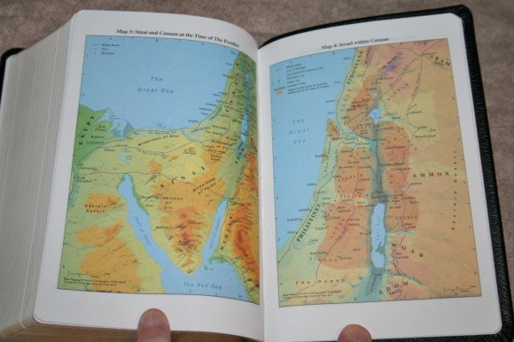
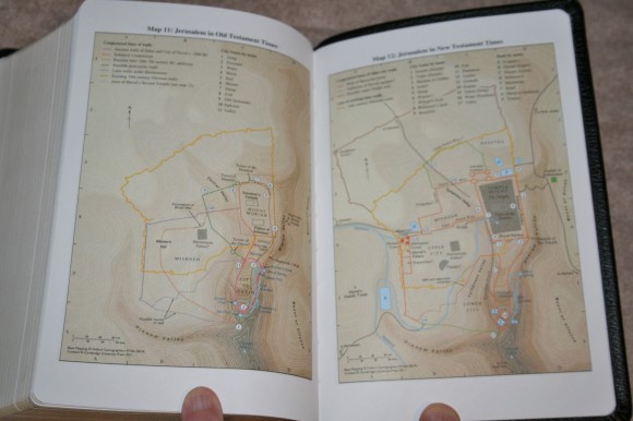
There are 15 maps with an 8 page color-coded index. Maps include:
- The Ancient Near East in the Late Bronze Age
- Regions of Palestine and Surrounding Areas
- Sinai and Canaan at the Time of The Exodus
- Israel with Canaan
- The United Monarchy of David and Solomon
- Israel and Judah: The Divided Monarchy
- The Assyrian Empire
- The Babylonian Empire
- The Persian Empire
- The Hellenistic World after Alexander
- Jerusalem in Old Testament Times
- Jerusalem in New Testament Times
- Palestine in New Testament Times
- The Roman Empire
- The Eastern Mediterranean in the First Century AD
The maps are very colorful and extremely detailed. They’re labeled well and everything is easy to read.
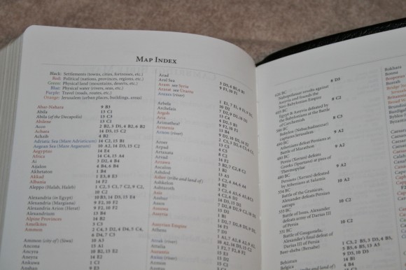
The index is color-coded to make it easier to find what you’re looking for. The colors include:
- Black: settlements (towns, cities, fortresses, etc.)
- Red: political (nations, provinces, regions, etc.)
- Green: physical land (mountains, deserts, etc.)
- Blue: physical water (rivers, seas, etc.)
- Purple: travel (roads, routes, etc.)
- Orange: Jerusalem (urban places, buildings, areas)
I’m glad the index is included. I’d like to see this to be a standard in Bible publishing.
Size
The size of this Bible is 5 x 7.25 x 1.5. It’s a good size for carry, but still too large to go in a pocket. The text-block is thicker than the regular Concord. I’d like to see it have the same thickness. I carried it pretty much everywhere. I had no problem carrying it and reading it in the car.
For preaching I prefer a larger text. When I did read from it I stood closer to the Bible than I normally do, but the small text didn’t really give me any problems. I did have to hold it open. That was the only real complaint about using it for preaching.
Conclusion
I have a friend that’s always telling me how awesome his Personal Concord is and he’s right. I can see needing something with a larger font if your eyes are tired (in that case I highly recommend the regular Concord), but this small font is easier to read than many fonts that are larger. The sharpness and boldness, together with the opaque paper, make a great reading Bible with no distractions in the text. The extras, such as the glossary and dictionary, are icing on the cake. I highly recommend the Personal Concord for anyone that needs a smaller Bible for carry but still wants the tools that the Concord offers. It’s a good Bible for students, anyone in the ministry, and as a regular everyday carry Bible.
Comparing it to the Regular Concord
Cambridge provided this Bible free for review. I was not required to give a positive review- only an honest review.






Thanks for the review! If you want to avoid the pesky red letter text (the whole Bible is the Word of God–not just the words of Jesus) check out the Trinitarian Bible Society Classic Reference. It is the exact same Bible without the wonderful Cambridge Bible Dictionary. TBS has a policy of not printing red letter Bibles for good reason which you can find on their website. Plus, the Classic reference can be purchased for cheaper than the Cambridge–esp. when you look at the hardcover options.
From the TBS FAQ section: “Many Bible publishers today distribute red-letter Bibles, with the words of our Saviour printed in red (or some other colour) while the rest of the text is in black. The Society holds to the position that all Scripture is given by inspiration of God, and is all equally important, and that by the use of different colour text, the impression is given that some parts of Scripture are more important than others. Furthermore, it is very interpretative. In some passages we are unsure how much was spoken by Jesus. For example, in John 3 Jesus is conversing with Nicodemus. We know that Jesus is speaking in verses 10 to 13, but do His words continue to verse 15, or to verse 17, or to verse 21? In addition, should the words of the pre-incarnate Christ be included, or His words in Revelation? For these reasons we distribute only black-letter Bibles.
Dear Richard:
Do you really think that the color of the letters make any significant difference? The bible I carry to Church is all black letter, the TBS Westminister Reference Bible. I have no need for the red letters, but many editions don’t offer all black letter editions (the Cameo for instance). I view it as a non-issue although, I do understand TBS reasoning. One could just as well say that the words of Christ are worthy of special consideration. Yes the whole bible is the Word of God, only a fool would believe otherwise red letters or not. To me, Red vs Black is a tempest in a teapot. I know at least a few persons who like Red Letter because they like the color, go figure. I easily transfer instantly from Red to Black with no change in my view of the value of the words
Yours in Christ
Don Denison
Dear Randy:
This is a very good and fair review. You noticed the faults and the good points of this bible and treated it fairly. My history with bibles dates from my school days in the mid-50’s. I won’t go into all the different ones I tried, but I did settle down to one for many years. Then came the day I picked up my father’s old blble the family bought him in 1954, and I wanted one of this quality for my own. I realized that I couldn’t use it without destroying it, or spending a young fortune getting it repaired, so I looked for a good KJV with basic tools until I could find and afford a “good” bible. This temporary stand-in is the Personal Concord purchased for $49 and change from EV Bible. When I first got it I was disappointed, it was like a brick and thicker than I had imagined. I continued to look, but put the Personal Concord on my lampstand and read it regularly every night sometimes for multiple hours. If that is all I had tried to do, this would have been the perfect bible as the small print is easy to read in good light. One Sunday I took it to church with me, and found that in dim light the print was too small for my 74 year old eyes. This is the bible’s only serious fault, it loosened up enough that the stiff cover didn’t matter indeed it helped one handed reading while in my easy chair. If one does not venture into dim light, or has eyes that are younger than mine, it should satisfy almost all needs. I still use my Personal Concord, it remains the king of the lampstand. I plan to purchase a Cameo if I can find an earlier edition in New Old Stock condition that includes the Concise Dictionary, it is the same size, a little thinner, and with an 8 point font instead of a 6.5 font. From my personal experience, the Personal Concord will satisfy all needs, as a bonus it looks good and is well made. If my eyes were younger, I would look no further, easy to hold and read with one hand, it has all the features of the full size Concord, and still can be bought for just a little over $50 at EVB. You can’t go wrong with this little bible. As to words of Christ in red, for me, this is not an issue, if push comes to shove, I would prefer the black letter editions, but if it is well printed, I won’t care one way or the other.
Yours in Christ
Don Denison
Hi Don,
Thanks for your response! If the words of Christ are worthy of special consideration, then the whole Bible should be done in red letter since the entire Bible is written through the Word of God. Here’s where they have made a significant difference–when people come to me and say “I’m a red-letter Christian”–I follow the teachings of Jesus as if His words on earth had some special status apart from the rest of the word of God. Taken further, “I don’t believe same sex marriage is wrong because Jesus never said anything about it”–i.e. the “important” or red letter words in the Bible saying nothing specifically about it regardless of the “less important, less authoritative” teaching of Paul and Leviticus etc. Don–why not take it one step further–the words of David in orange, the words of Paul in blue, the words of Peter in pink…. One non-Christian denomination took this one step further and highlighted their unique doctrine in blue lettering in the Bible. Whether the effect is significant or minor it does change the way we read by creating a canon within a canon. Considering the Bible is the word of God, we should be careful with human-tampering with the word. Don’t you think?
Dear Richard:
I said that I got your point. Indeed people color different passages, highlight and underline, make notes etc. If that makes them happy so what, they are reading the Word. I myself do not mark up my books or my bibles, I have repented of it after going over some valuable textbooks I highlighted when I was in University trying to get an education, wondering now why I ever marked up the passages as I did. What you are dealing with is not a “red letter” problem, but a problem of ignorance there will always be folks who don’t get it. I don’t care one way or the other, Black letter is good for me, but I wouldn’t turn down a well built bible just because of red letters. The one I use for serious study is the TBS Westminister Reference Bible, you better believe though that when I recognize the words of Christ in this Black Letter bible, I pay closer attention whether they are marked red or not. The entire bible is about the Gospel in a broad way, there are good reasons for the bible including some passages containing geneologies, and the details of Mosaic Law and worship, but Christ’s own words get my attention easily. I view the Black letter, Red Letter as a non-issue though I do take your point. I also read the Douay-Rehims to get another slant on given passages sometimes, does this make me an Heretic? I don’t think so.
Yours in Christ
Don Denison
These religious, hard-line, black-letter only posts are utter nonsense and should be removed.
Thanks for your thoughtful and gracious comments Don. I’m not sure you got my point but we can agree to disagree. Eastwood–in the interest of civil discussion, can you explain further why my comments are “utter nonsense?” How does the act of highlighting certain parts of the Bible not make them stand out and therefore give the reader the sense that they are somehow “more special” or more important than the rest of the Word of God? How is this “utter nonsense”–does it really makes “no sense” to you? How? Your comment sounds quite “hard-line” in its censorious nature.
Dear Richard:
I have found it is often best to acknowledge someone’s comment without responding. “Utter nonsense” is perhaps a little over the top, but like the Red vs Black tempest in a teapot, is not worth any additional time or concern. People have opinions, some informed, some not, when anyone gets their back up about a subject, I usually leave them alone, at least until they are talking sense again. You can take my advice or not as pleases you, God Bless you, happy reading and bible study.
Yours in Christ
Don Denison
Yours in Christ
Don Denison
Thank-you for the wise and gracious words Don. Blessings!–Richard
It’s obvious TBS is an organization with a twisted, extreme ideology. I would never support or buy anything from them. I didn’t know there were people alive on earth today so stupid.
If you want to avoid “pesky” black-letter only bibles stay away from TBS.
Thank-you Eastwood…er….Sam. And, I know, if you want to avoid pesky trolls don’t feed them. May God bless your day, Eastwood/Sam!! 🙂
Wise thoughts, graciously said, Don. May God bless you as you get deeper into His word!–in Christ, Richard
Sorry for the duplication–I hadn’t seen my first reply had posted.
After reading that unbelievable statement by TBS, I will NEVER buy anything from them. Thanks for the heads-up.
Dear Christian Brothers:
I can’t believe that the innocuous statement quoted from the TBS website, re: Red Letter bibles has raised such a dust up. Their well reasoned statement gives an explanation of their position on the issue. Probably if required to choose one position or the other I would side with the Black Letter group, but a well built Red letter one is fine with me. What dismays me, is the passion wasted on this relatively meaningless issue. I would be willing to bet almost everyone (myself excepted) marks up, highlights, underlines, or makes notes in their bible, thus “altering the Word of God”, given this fact, those getting themselves exercised one way or another is unseemly. We as Christian gentlemen have better things to occupy ourselves with, actually reading the bible is an activity that comes to mind. Please gentlemen, let us not get so worked up about something so minor in scope that feelings get hurt, and time, that can more usefully be spent actually reading the Word, is wasted. I believe Christ would be disappointed in those involved in this little “Tempest in a Tea Pot”. After all everyone is free to buy and read what he wishes, Red Letter or Black Letter. Let us concentrate on issues that really matter in the future.
Yours in Christ
Don Denison
Thanks for this review. Glad to know I will likely enjoy my personal sized Concord anyway. I thought I had found a great deal on a Concord due to not noticing the word “personal” in the description. Oh Well, if it is the same size as a Cameo, it might be just right for the bed stand. I have recently found a vintage NASB (83?) Cameo in almost brand new condition to replace an old Cambridge NASB I have had since 82. I hope Mr. Denison has similar fortune. These Cameos will make a great pair.
Nice! I just learned about the NASB Cameo a few days ago. It sounds like a great Bible. I’m sure you’ll love the personal size Concord. The text is small, but it’s also sharp and bold which helps a lot.
Hi SIr, it seems to me that the TBS Classic Reference Bible (https://www.tbsbibles.org/store/ViewProduct.aspx?id=9661752) is just like an authorised copy of this Cambridge Personal Concord, am I right? Have you done a comparison between the two?
Cheers and God bless.
You are correct. I don’t have the TBS version, but I did see it at one of the Bible publishing shows. The main difference is it doesn’t include the dictionary.
Glad to declare that largely based on this favourable review by Randy, I’ve bought my first real leather Bible in this Cambridge Personal Concord. Exactly as what Randy has said, even though the fonts are a tiny 6.5, its boldness and the paper quality made it very readable, this is a Bible that begs to be read often.
Thanks Randy!
Thanks Danny! I’m glad you like it!
Hi Randy it’s me again, I tried searching for help on this online but to no avail, so I hope that you could be of help (and hopefully you still have either a personal concord or a concord on hand in order to help).
It’s about the cross references.
(1) 2 Chronicles 17:2 – “ch. 19.5: see ch 11.5” – why is it written in such manner, instead of “ch. 19.5 & 11.5”?
(2) 2 Chronicles 13:9 – “ch. 11.14, 15: see 1 Ki 12.31” – why is it written in such manner, instead of “ch. 11.14, 15 & 1 Ki 12.31”?
What function does the word “see” serve in such instances?
(3) 2 Chronicles 17:19 – What is meant by “so verse 2”?
Appreciate if you could advise. Thanks in advance.
Hi Danny. I have this information in a PDF somewhere, but I haven’t been able to find it. I’ll keep looking.
Any accurate answer to what the gsm is on the “Bible Paper” of the Cambridge Concord personal reference kjv Bible? Thanks. -Jasen.
I’ll ask my contact at Cambridge.
Hi Jasen. I heard back from Cambridge. It’s 36gsm.
Is it accurate to say that the text in Concord Bible is based on 1769 edition of Oxford (Benjamin Blayney) ?
No, the Concord is a blend of the Blayney and Cambridge editions with the goal of harmonizing them, bringing them in “Concord” with each other.