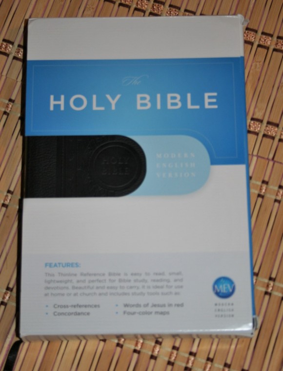
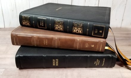
Every translation needs a thinline reference edition. In this review I will take a look at the Modern English Version Thinlne Reference Bible from Passio. I will save the critique of the MEV itself for another post, but I’ll touch on a few points that I think makes this a nice carry and reading Bible.
The Feel – Size and Build
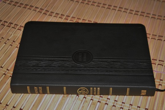
This is a hand-sized Bible at 8.5 x 5.75 x .875. It has an imitation leather cover with a nice design and texture molded into it. It doesn’t feel like leather, but it doesn’t feel cheap either. It feels durable. I don’t mind tossing it around. The liner is a textured paper. The binding is glued. It has one ribbon.
The Visuals – Print and Layout
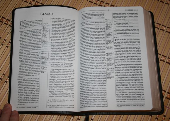
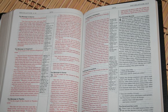
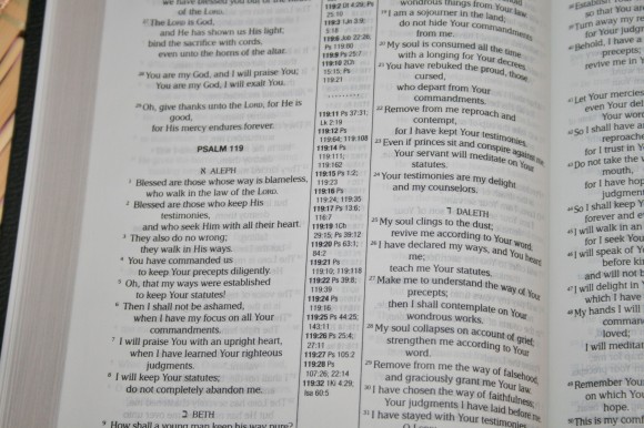
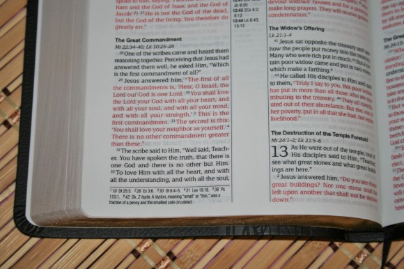
The font 7-point with an 8-point leading. It’s about a medium boldness. It is sharp and is easy to read. This is a red-letter edition. The red is about a medium darkness. Both the black-letter and the red-letter tend to vary from one page to another in darkness. It never gets too faint to read, but it is enough to notice. The print is line-matched.
The section headings are bold. The section headings in the Gospels contain references to the parallel passages in the other Gospels.
The layout itself is amazing. It is a paragraph layout with poetry set to verse. Letters are indented. Old Testament quotes are centered(ish) so that stand out.
Each book has an introduction page that summarizes the book. It includes information about the author, date, setting, content, etc. They’re placed on their own page and usually take about a fourth to a third of the page. Books start on a new page.
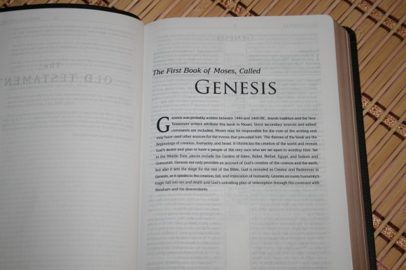
The paper is fairly opaque. There is some show-though, which is expected in a thinline, but I didn’t find it to be distracting. There are four pages in the back for notes.
The Tools – References, Translation Notes, Concordance, and Maps
This is a center-column reference edition. References are not keyed to the text. The center column has the chapter and verse number in bold, followed by the references for that verse. There are two verses for Genesis 1:1.
Translation notes appear in the footer under the column on the outer margin and are keyed to the text with numbers. This includes Hebrew and Greek words, manuscript variations for the Masoretic Text and Septuagint, weights and measures, and OT quotes in the NT. Having references for the quotes is a little odd because the same references will appear in the center-column.
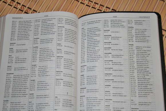
The concordance is 73 pages and has three columns per page. It actually has a lot of entries with 57 references for God. The entries are in bold and the references are separated well, making it easy to use.
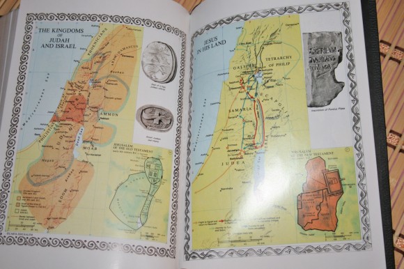
There are 8 maps on glossy thick paper. The maps look old-world, mostly using yellow and pink, and showing images of archeological items such as coins, drawings, or inscriptions, etc.
Modern English Version Translation
Since this is an update to the KJV (the translation I have used the most) I expect it to read similar to the KJV and NKJV. For the most part that’s about accurate. There were some places where I felt like I was reading a King James. There were other places where it felt similar to a New King James. There were other places where it felt different from both.
For the most part it didn’t sound too out of place or odd. I could read it as my daily reader. As for study I’m still evaluating it, so I’ll hold my opinion for now.
One thing that does raise a red flag is the inserted words for clarity. Taking a look at Esther 1:1:
Now in the days of Ahasuerus, also called Xerxes, who reigned from India to Ethiopia, over one hundred and twenty-seven provinces,
Now, I love knowing that Ahasuerus is Xerxes. I even like my Bible to tell me this. However, I think it should be in a note – not an editorial insertion into the text, even with an italic to show that it was inserted for clarity. This is not in the text of any manuscript that I’m aware of (I will not pretend to be qualified to evaluate manuscripts).
Using It
I mostly used this for reading and carry. Its size is perfect for carry. Unless my eyes are tired from staring at a screen all day I don’t have any issues reading the font. I like a larger font for preaching and I don’t want to use a new translation during our services until I’ve spent more time with it. It does have some good tools for study, so I think it would be a good choice for personal study, group study, and devotions.
Conclusion
Passio’s Thinline Reference Bible looks like a good value. I appreciate the effort they put into this. I love the layout. I want this exact Bible in King James in both a hand sized thinline and a large print. The font is on the small side and has some variation, but it is sharp and is always readable. The paper isn’t bad at all and the line-matching is icing on the cake. I’m reserving my judgment of the translation until I’ve had more time with it, but it does have the sound of the KJV and has so far been a joy to read.
Passio provided this Bible free for review. I was not required to give a positive review- only an honest review.

