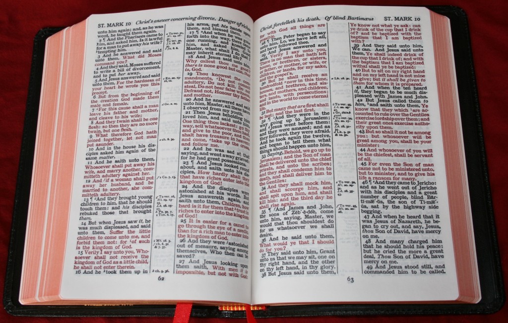
I own and use both red-letter and black-letter editions of the Bible. I don’t really have a favorite between the two for several reasons. I use one for reading and another for serious study. Also, red-letter is usually not done to my liking.
There are different versions of red-letter printing. For example, Cambridge prints the words of Christ on Earth in red, while other publishers print all the words of Christ in red- including from Acts to Revelation. I prefer all of the words of Christ in red, not just while Jesus was on Earth. One problem with this is that there is some controversy with a few verses (particularly in Revelation). I’ve only seen one Bible that has the words of God in the OT in red (maybe it was blue). That would be nice too.
There are many shades of red that publishers use. Kirkbride’s red-letter is closer to the pink range. Other publishers use a faint print that is hard to see. Still others use a shade that looks more brown than red. My hat goes to Cambridge. Red-letter text in Cambridge editions are a bold red. Cambridge has by far my favorite shade of red. LCBPs red-letter edition looks to be on par with Cambridge (from the pictures I’ve seen).
Another problem is consistency. This goes for both black and red-letter. Some Bibles have dark text on one page and a lighter text on another (some are much worse than others). Is it too much to ask that the text is the same shade throughout the Bible?
I like red-letter for reading, but for marking and study I prefer black-letter- specifically for color-coding (and most of my marking is color-coding). With black-letter, my colors only have to work with one color of text. With red-letter, my colors have to work with two colors- and the red is different from one publisher to the next, so what works in one Bible might not work in another.
For reading I prefer red-letter, but I want a nice, rich red that is consistent in shade and includes the words of Jesus through the NT. The words of God in the OT in red would be nice too. For study I usually prefer black-letter (if I’m color-coding), but I want that to be a nice, bold black (none of this faint text that’s hard to see). I would love to have a Cambridge Concord Wide Margin in red-letter. So do you prefer red-letter or black-letter?


I prefer black-letter, not only because I see little value in making the words of Jesus red in any Bible, but also because I have seen so few red-letter Bibles in which the red ink is dark enough to be easily read by older eyes. Most red-letter Bibles have a sea of pink when you get to such passages as Jesus’ Sermon on the Mount. It can easily cause serious eyestrain.
I find great value in having the Words of Christ in red. It is also especially nice to be able to quickly locate something Jesus said – without having to reread the whole passage to see who’s saying what.
Dear Friends:
I have seen comments from various sources concerning the red vs black letter issue for words of Christ in Bibles. I own both types including one with and one without the red letters in Revelation. Neither format has been of assistance in discerning what are or are not the words of our Lord. I find that deciding what words are Christ’s is a non issue for me. In poor light or with very small print, the color contrast is lower with red letters thus creating a legibility problem if the type is very small. My reading Bible, a Cambridge Personal Concord has red letters, and relatively small type; I have no difficulty reading with this Bible, but I have glasses that correct my vision. For some types of visual problems that are not easily corrected by lenses, there remains the problem of lack of contrast for red letters. The quality and size of printing, the contrast with the paper, and the environment where the Bible will be read, should be considered carefully before purchase. I was a teacher for many of my years of employment, and can’t imagine the necessity of different color print for identifying who the words are to be attributed to, context and basic intelligence should suffice for this. Having said all this, if someone thinks that red letters helps in identifying when Christ is speaking, or needs this help, or even if one just likes the color, by all means, choose the red letter edition if you have that choice available.
Sincerely Yours
Don Denison
Red letter seems to be a notch/emotional attachment thing. Okay for those who want that but wrong to make the standard. It is annoying when HCSB and NKJV do that.
The very existence of red-letter Bibles is based upon the assumption that the reader is not conversant enough with the English language to know what quotation marks mean. Red-letter editions also can lead to the lazy habit of quickly skimming just the passages in red without paying attention to whom Jesus is speaking, the context, etc. Furthermore, those who underline their Bibles in red ink find that it doesn’t show up well on the red-letter portion and others find that if they must read in less than perfect light, it is harder to read red-letter text. Only modern-day English editions tamper with the text to the point of color coding it. It is becoming harder and harder to get quality black-letter editions that are accessible in terms of font size and format. Another example of the market principle that bad drives out good.
I currently read the Christian Standard Bible. I would love to find this bible without the red print. If not this one is, where can I find a bible without red print? Because of vision problems, it is hard to read the red print. Would be better for me if print was bolded or have nothing at all. Thank you for your information.