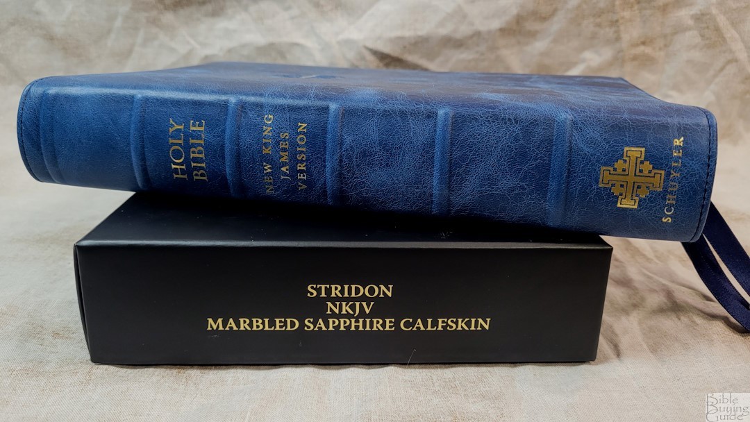
The Schuyler Stridon is a verse-by-verse single-column layout Bible with references in the footer and wide outer margins that are great for small notes. It’s been available in the NASB and ESV, and it’s now available in the NKJV. There are several colors and covers to choose from. I’m reviewing the Marbled Sapphire calfskin with a regular yapp. It was typeset by 2K/Denmark and made in the Netherlands by Jongbloed.
Specs
- NKJV
- Calfskin leather
- Leather liner
- Sewn binding
- 3 3/8″ ribbons
- 6.75 x 9.75 x 1.5″ overall size
- 2 lbs, 14.2 oz
- 28gsm French paper
- Blue art gilt
- Single-Column layout
- 10-point typeface
- Line matching text
- 7/8-1″ wide outer margin
- 70k references
- Full set of footnotes
- References and footnotes in the footer
- Concordance
- 14 lined pages for notes
- 12 maps
- Map Index
- Printed in the Netherlands by Jongbloed
- Current price – this cover is $235
Schuyler provided a discount for this Bible in exchange for an honest review.
_________________________________________________________
This Bible is available at Evangelicalbible.com
_________________________________________________________
Table of Contents
- Cover and Binding
- Paper
- Typography
- References and Footnotes
- Concordance
- Maps
- Video Review
- Conclusion
Cover and Binding
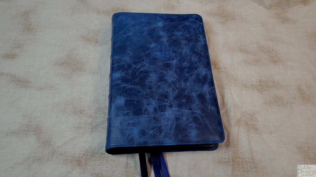

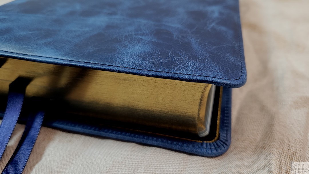
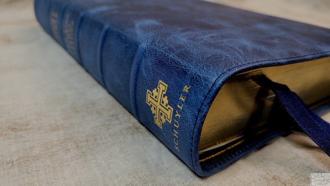
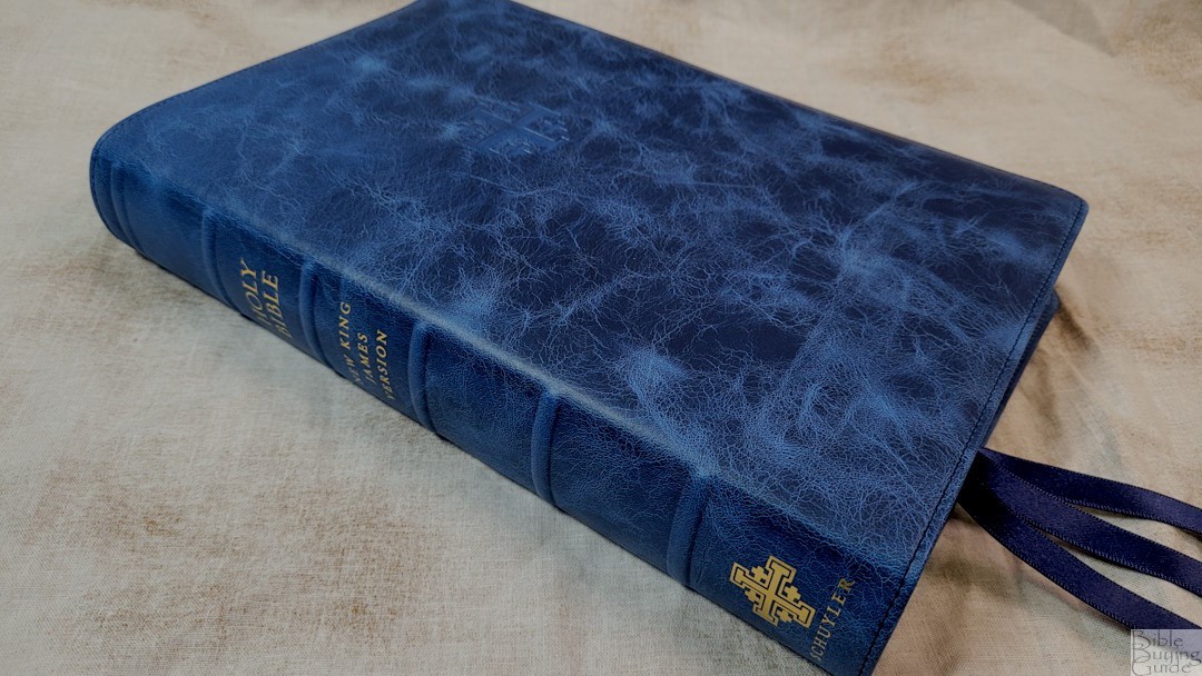
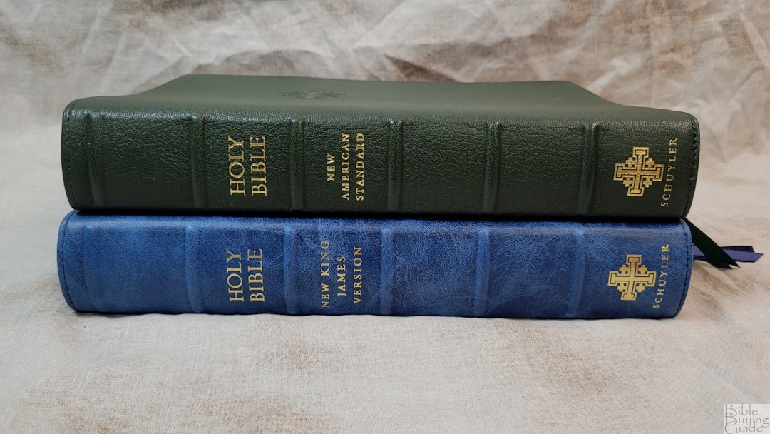
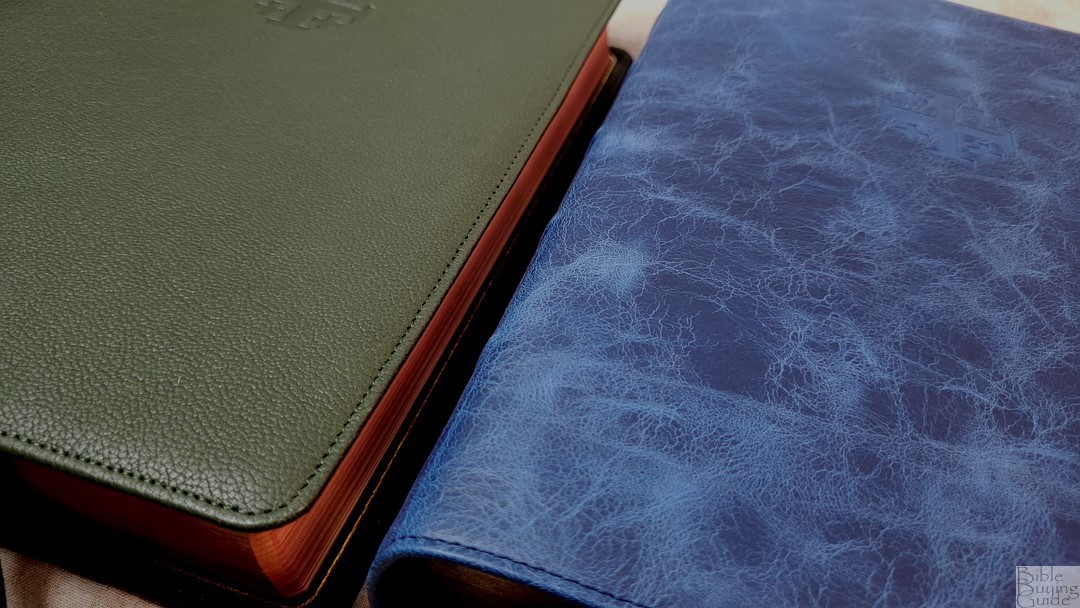
The Marbled Sapphire calfskin is thick and feels elegant. The marbled blue has lots of black that highlights the blue. It has a natural grain with rough patches that match the texture. It’s a joy to see and touch. It has perimeter stitching. The Jerusalem cross was debossed on the front. The spine includes six raised hubs and text printed in gold. This is a regular yapp edition, but it has enough overhang to conform to the hand when holding it. This is my favorite yapp. The leather is flexible, but it’s stiff enough to hold open easily in one hand.
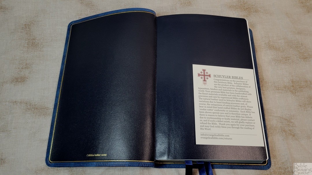
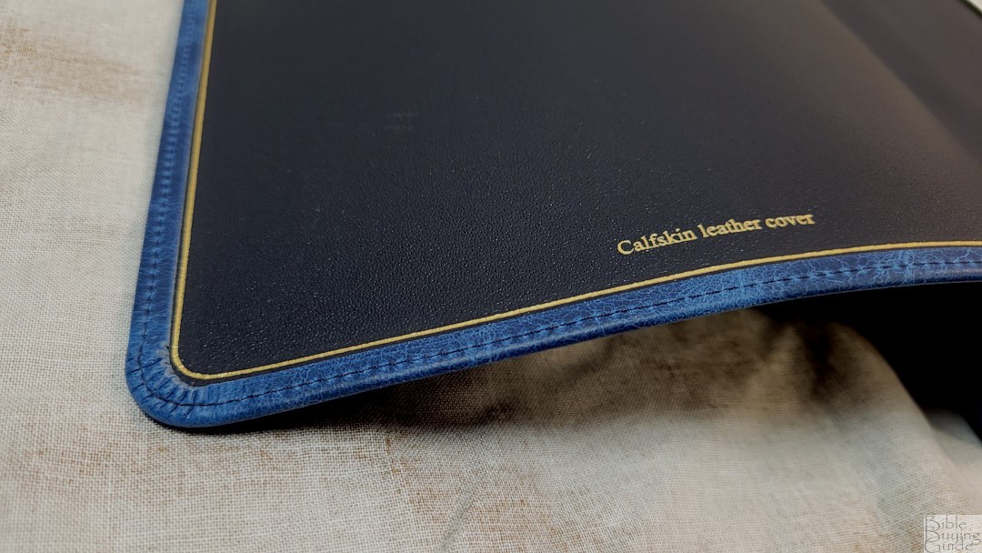
The liner is navy edge-lined calfskin leather with a gold gilt line around the inside perimeter. The block is sewn and it stays open perfectly in Genesis 1. It has three extra-long, 3/8″ wide angle-cut double-sided satin ribbons in a dark blue. The head/tail bands are also navy. The overall size is 6.75 x 9.75 x 1.5″, and it weighs 2 lbs, 14.2 oz. This size is excellent for carrying, reading, and preaching.
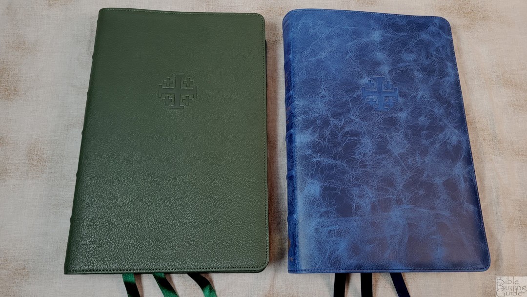
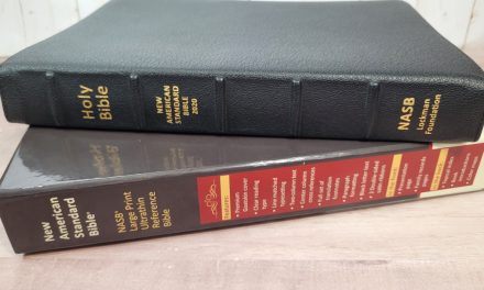
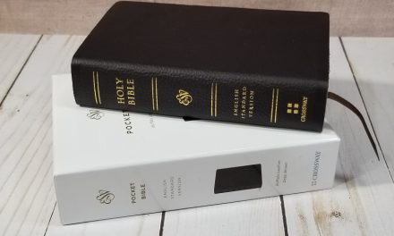
I’ve included photos comparing it with the NASB Stridon in green goatskin:
Paper

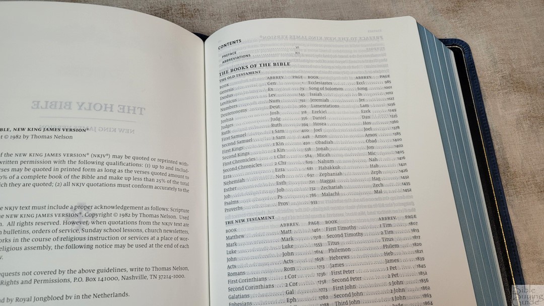
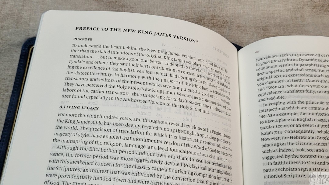
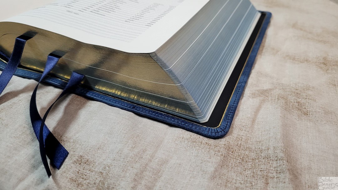
The paper is 28gsm French paper. This is the same paper found in most of the premium Bibles printed by Royal Jongbloed. It’s only slightly less opaque than 36gsm, but it’s a lot thinner, making the Bible easier to carry. It’s ivory in color and has no glare under direct light. The paper is smooth, but I find it easy to separate to turn pages. This is an excellent paper for reading. The page edges are art-gilt with blue under gold.
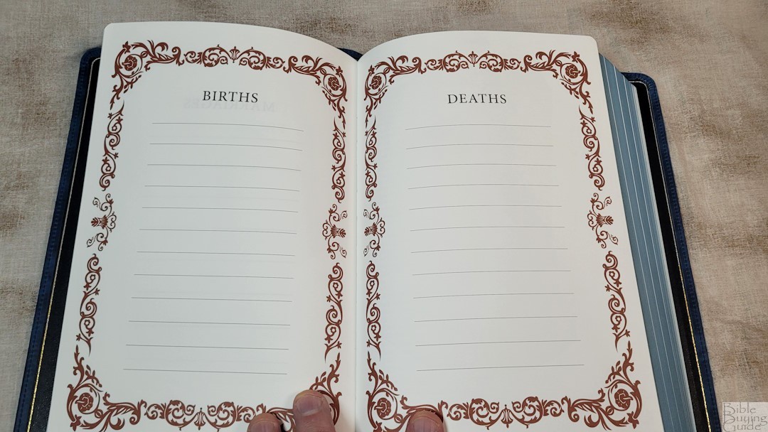
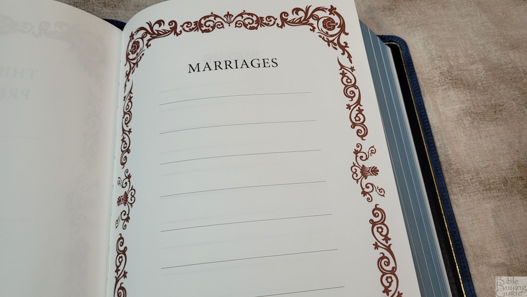
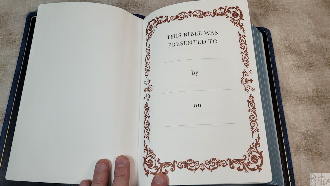
In the front are presentation and family pages printed on thick non-glossy paper. They include marriages, births, and deaths. These thick pages give the Bible some extra structure.
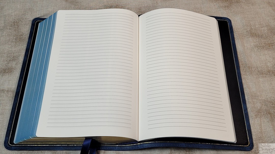
In the back are 14 lined pages for notes. This is the same as the regular Bible paper.
Typography
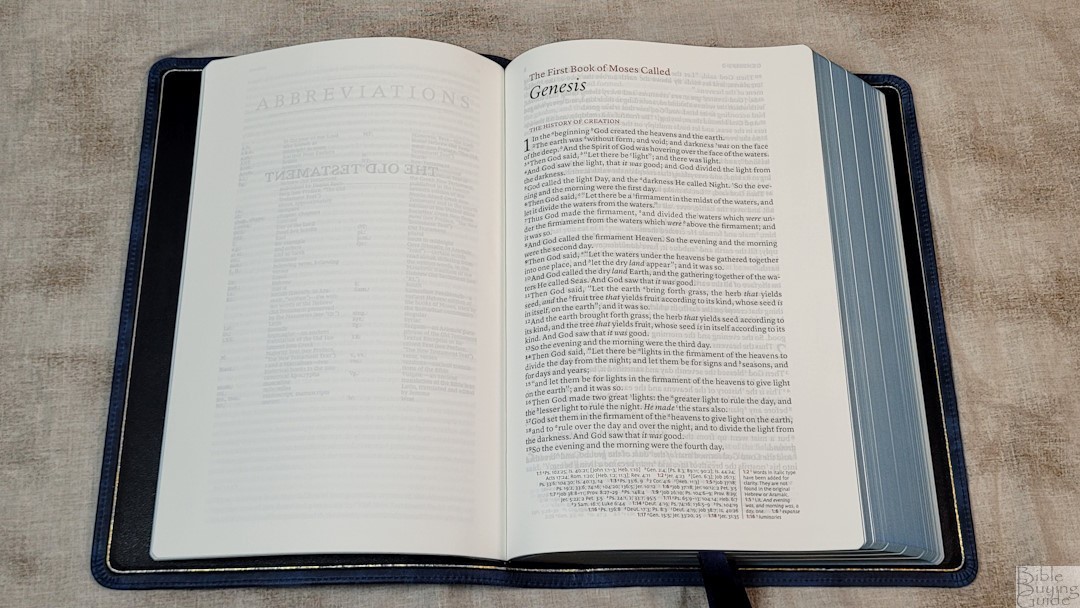
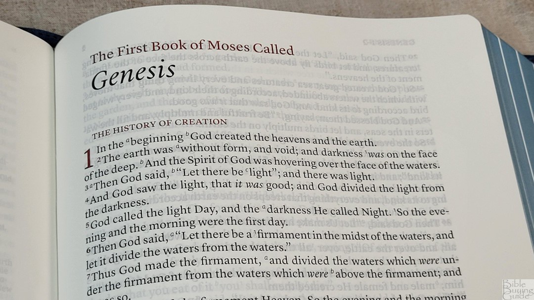
The NKJV Stridon has a single-column, verse-by-verse setting with poetry set to stanzas, letters indented, and small lists presented in a list format. The header shows the reference in the outer margin and the page number in the inner margin. The footer places the references and footnotes in two columns, keeping them separate. Section headings are in all caps. Paragraphs are marked with a bold verse number. The highlights are in a dark and bold red print that stands out. Books start on the page where the previous book ended.
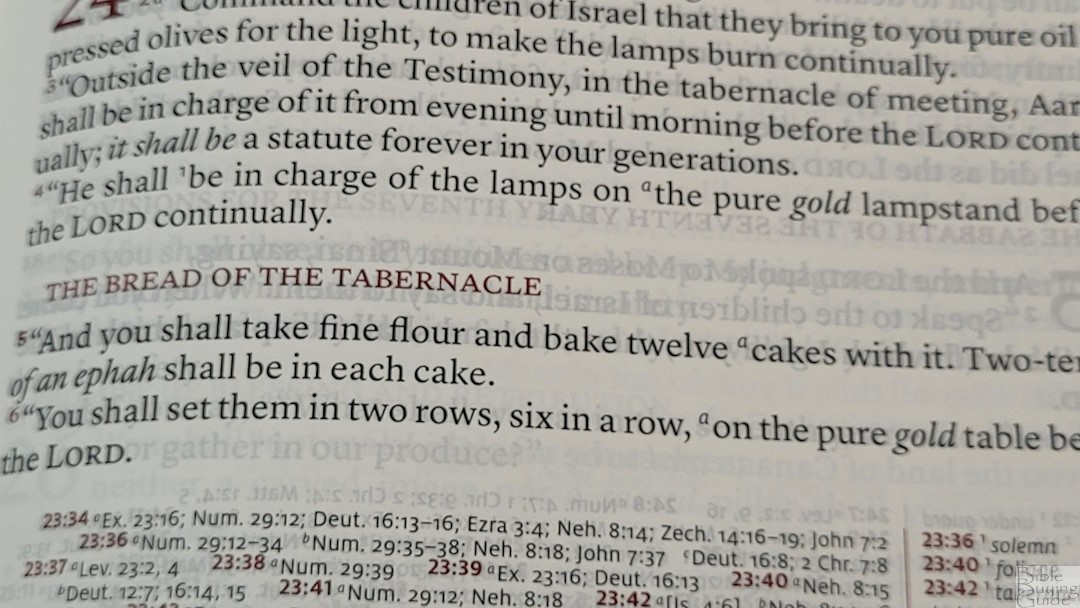
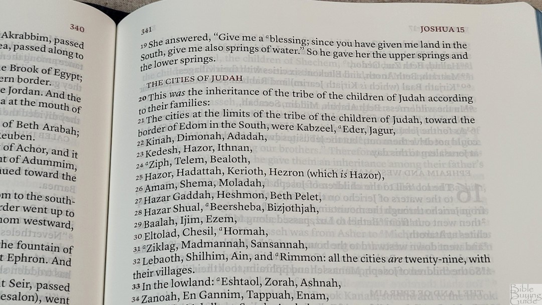
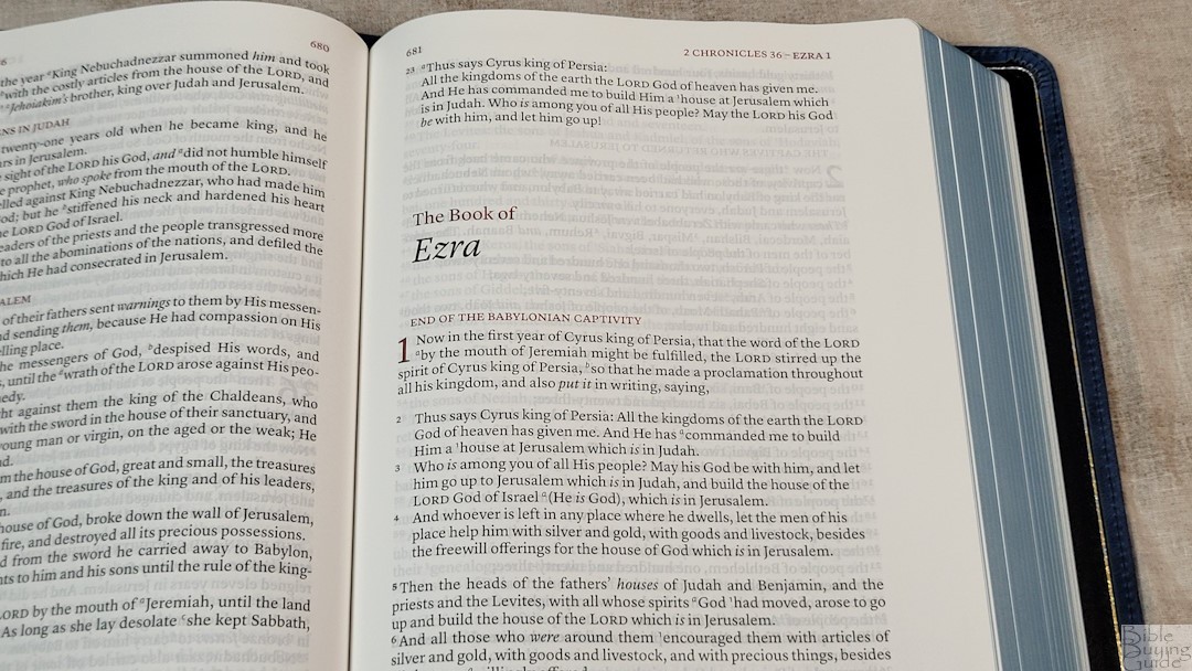
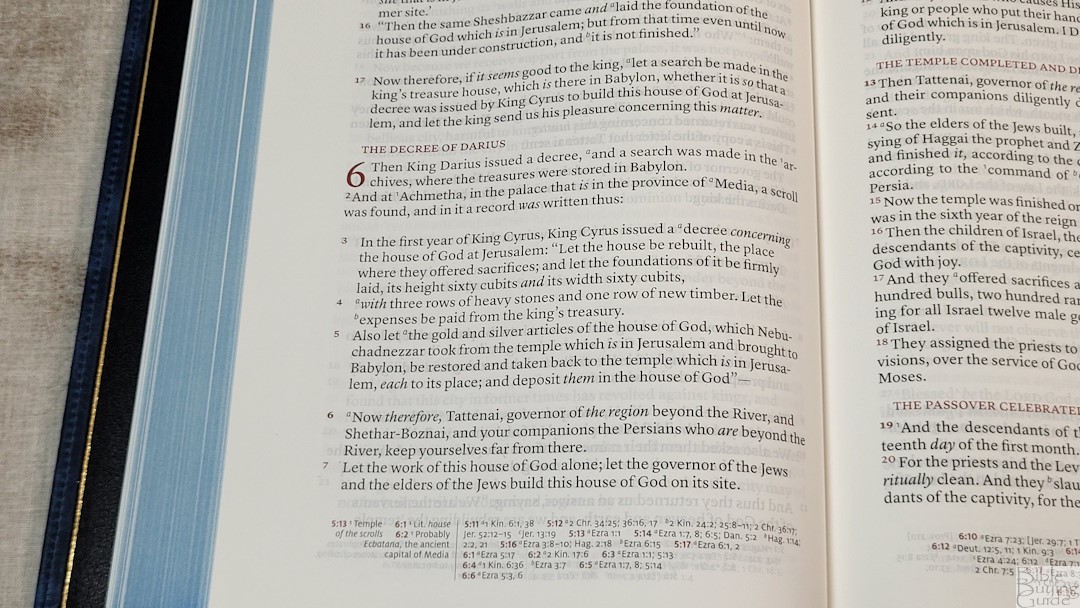
The typeface is 10-point, red-letter. The black and red are dark and consistent throughout. It has enough space between the lines to be easy to read. It is line-matched, which prints the text in the same location on both sides of the page. This improves readability. It does have some show-through, but it’s mostly only noticeable where nothing is printed on one side of the page. The line-matching for the section headings is off very slightly on some pages, but this doesn’t affect readability.

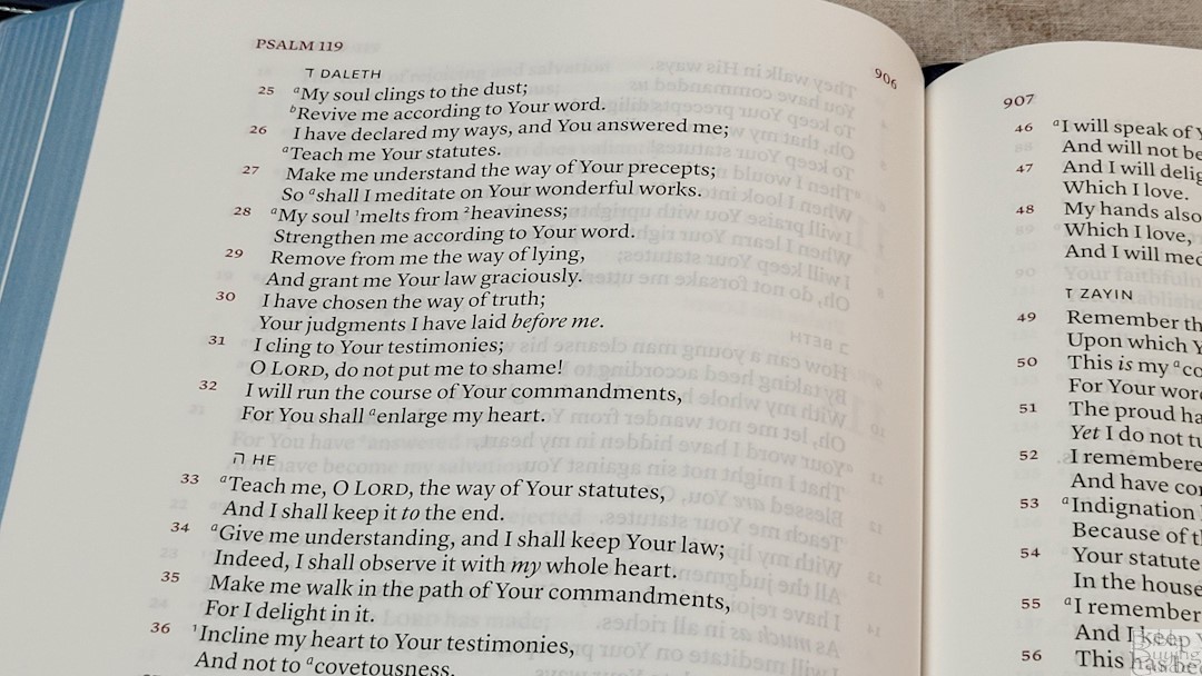
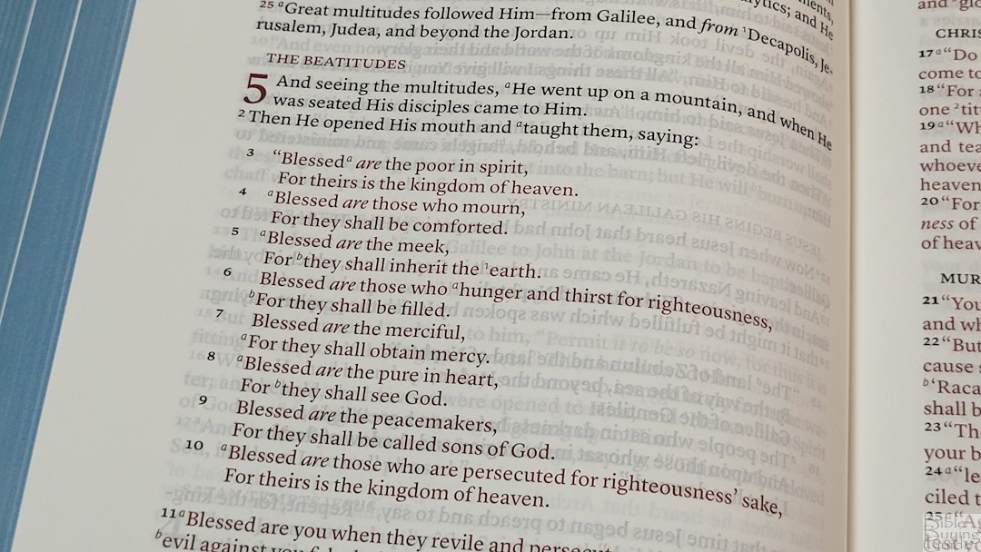
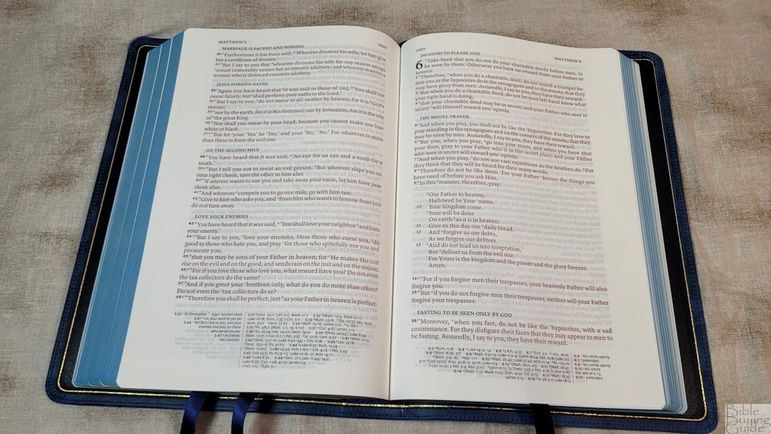
It has around 14 words per line. This is great for poetic settings, and it’s still good for prose because of the extra space in the inner margin. This brings the text out onto the flat part of the page, so it’s easy to keep my place when reading. Verse numbers are large. Footnote and reference keys are small and easy to ignore when reading.
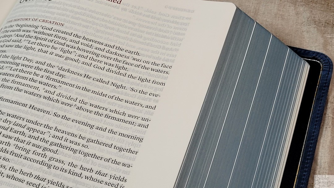
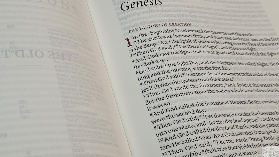
It has somewhere between 7/8-1″ wide outer margin and a 5/8-inch inner margin. This is ideal for small notes, references, etc. This is ideal if you want some writing space but don’t want to carry a large Bible. It’s also ideal if you don’t want to write in it. It doesn’t feel like carrying around a wide-margin Bible with empty space for no reason.
References and Footnotes
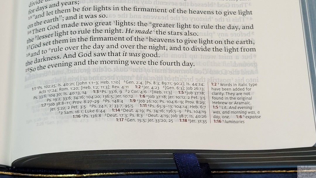
It includes over 70,000 cross-references. They match the NKJV Quentel and are excellent for study and sermon prep. They’re placed in the footer with references on the inside and footnotes on the outside, separated by a red line. The primary chapter and verse numbers are in red. There is enough white space between them to locate them easily. I find this design easy to use.
Here are some examples to help you compare:
- Genesis 1:1 – Ps 102:25; Is 40:21; Jn 1:1-3; Heb 1:10; Gen 2:4; Ps 8:3; 89:11; 90:2; Is 44:24; Acts 17:24; Rom 1:20; Heb 1:2; 11:3; Rev 4:11
- Deuteronomy 6:4 – Deut 4:35; Mark 12:29; John 17:3; 1 Cor 8:4, 6
- Isaiah 9:6 – Isa 7:14; Luke 2:11; John 1:45; Luke 2:7; John 3:16; 1 John 4:9; Matt 28:18; 1 Cor 15:25; Rev 12:5; Judg 13:18; Titus 2:13; Eph 2:14
- Matthew 17:20 – Mat 21:21, Mk 11:23, Lk 17:6, 1 Cor 12:9
- Mark 11:23 – Matt 17:20; 21:21; Luke 17:6
- Mark 12:29 – Deut 6:4, 5; Is 44:8; 45:22; 46:9; 1 Cor 8:6
- John 1:1 – Gen 1:1; Col 1:17; 1 John 1:1; John 1:14; Rev 19:13; John 17:5; 1 John 1:2; 5:20
- John 2:19 – Mat 26:61, 27:40, Mk 14:58, 15:29, Lk 24:46, Acts 6:14, 10:40, 1 Cor 15:4
- Acts 2:38 – Luke 24:47
- 1 John 1:1 – John 1:1; 1 John 2:13, 14; Luke 1:2; John 1:14; 2 Pet 1:16; Luke 24:39; John 2:27; John 1:1, 4, 14
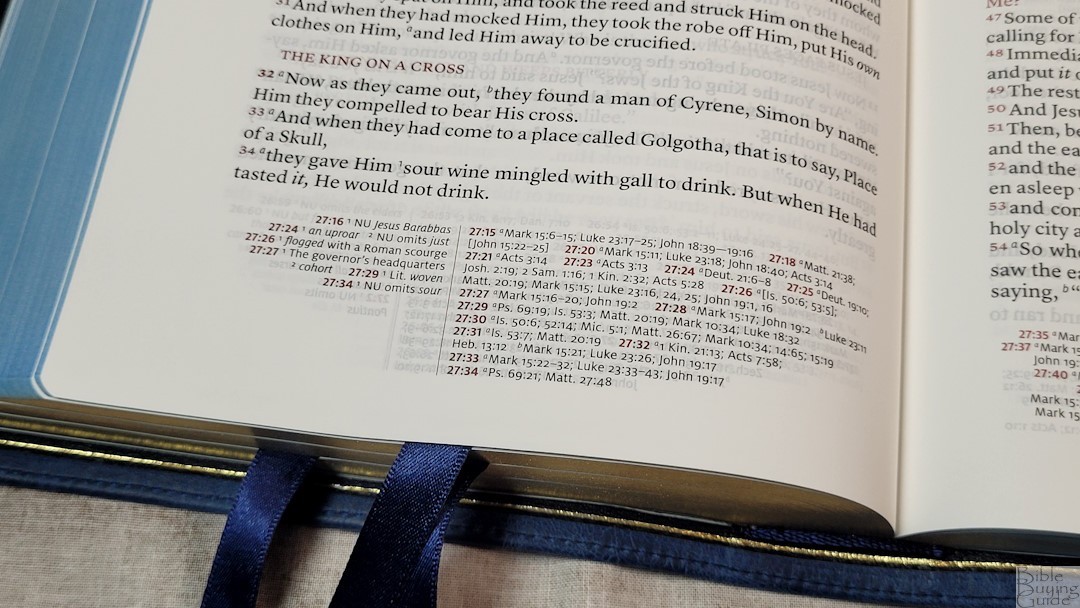
This is the full set of NKJV footnotes, which provide detailed information about manuscript variances from the Nestle-Aland/United Bible Societies, Majority Text, Septuagint, Targum, Vulgate, and Syriac. They include the literal renderings from Hebrew and Greek. The NKJV translation footnotes are some of my favorites.
Concordance
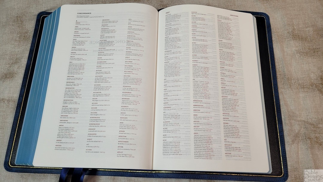
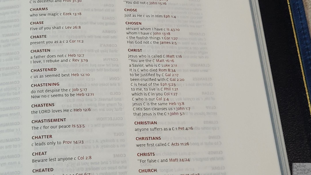
The concordance is 54 pages with three columns per page. Entries and references are in red. The font is small but it does have enough white space to make it easy to use as long as you don’t need a large print. It does not include names, but it has a lot of entries, making it good for study and sermon prep. This is the same concordance found in the NKJV Quentel.
Here are a few examples with the number of entries for each one to help you compare:
- Christ – 13
- Christian – 1
- Christians – 1
- Christs – 1
- Faith – 40
- Faithful – 20
- Faithfulness – 5
- Faithless – 2
- God – 38
- Goddess – 2
- Godhead – 2
- Godliness – 4
- Godly – 3
- Gods – 5
- Praise – 25
- Praised – 4
- Praises – 2
- Praiseworthy – 1
- Praising – 3
- Pray – 14
- Prayed – 2
- Prayer – 16
- Prayers – 5
Maps
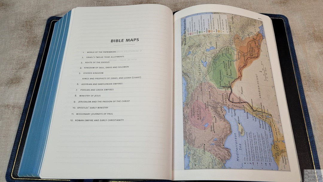
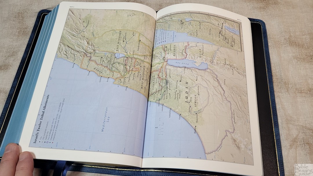
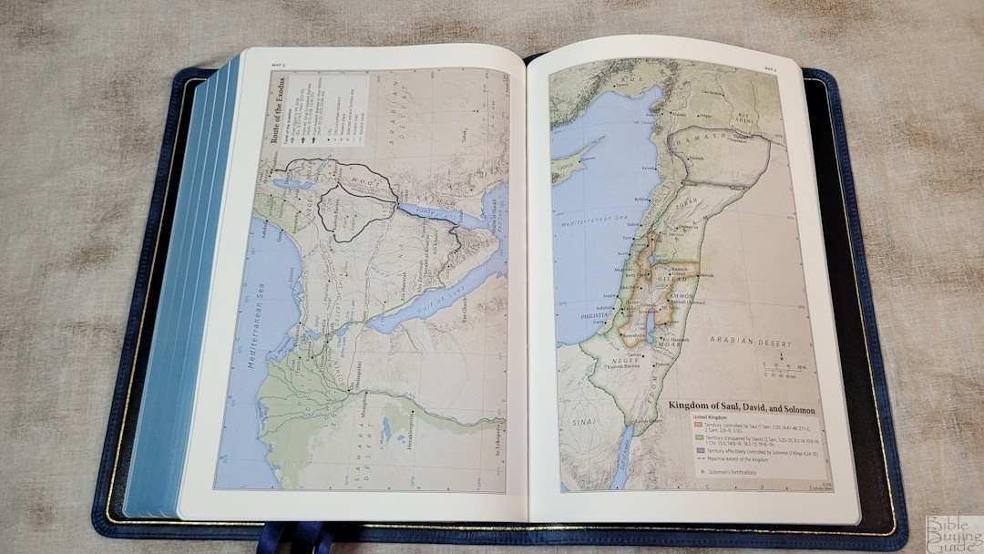
It includes the 12 Schuyler maps printed on thick non-glossy paper. They’re elegant and colorful. These are some of my favorite maps. They’re annotated well and include borders, cities, distance, topography, Scripture references, places of worship, capitals, water, roads, canals, seaports, ancient inscription sites, events of Jesus’ life, Apostles’ ministries, places of writings, etc. Two maps span two pages with no space between them, making them difficult to read in the gutter.
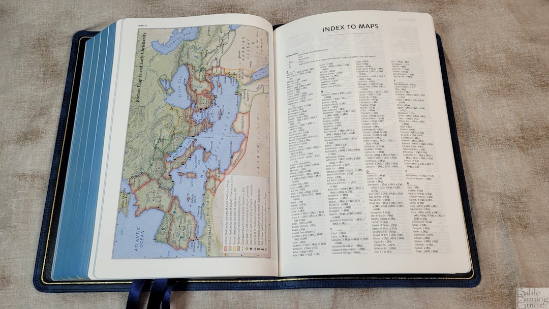
It also includes a 3-page index to maps with a short key to abbreviations. This makes the maps much easier to use. I’m glad to see the index included.
Here’s the list of maps (and one chart):
- World of the Patriarchs
- Israel’s Twelve Tribe Allotments
- Route of the Exodus
- Kingdom of Saul, David and Solomon
- Divided Kingdom
- Kings and Prophets of Israel and Judah (Chart)
- Assyrian and Babylonian Empires
- Persian and Greek Empires
- Ministry of Jesus
- Jerusalem and the Passion of the Christ
- Apostles’ Early Ministry
- Missionary Journeys of Paul
- Roman Empire and Early Christianity
Video Review
Conclusion
The NKJV edition of the Schuyler Stridon is an excellent v-b-v Bible. The size is great for carrying, reading, and preaching. The wide margins are enough for small notes, but not large enough to get in the way. The tools are great for sermon prep and personal study. If you’re interested in a premium v-b-v NKJV, the Schuyler Stridon is an excellent choice. If you want something a little different, I highly recommend the blue Marbled Sapphire.
_________________________________________________________
This Bible is available at Evangelicalbible.com
_________________________________________________________
Schuyler provided a discount for this Bible in exchange for an honest review. I was not required to give a positive review, only an honest one. All opinions are my own.





Thank you, Randy. But I think a Bible this large should have at least 32gsm paper – 28gsm is too thin for a Bible of this size and will tear too easily.
Hello Randy! Thank you so much for all of your detailed bible reviews… I have been waiting especially for this one! I am looking for a NKJV to use for my daily reading (with references and footnotes).
I watched and read your review on the Thomas Nelson Single Column Reference and nearly purchased the brown goatskin from their premiere collection for its opacity, large font and higher paper weight… BUT then I heard Schuyler was releasing the NKJV Stridon in these beautiful calfskins! So here I am 🙂
Would you be able to compare these two?
Readability is the most important for me. I have a Schuyler Canterbury, so I know their excellent quality and absolute beauty… I also have the TN KJV large print thin-line burgundy leather soft, so I know their large comfort print is dark and highly readable even on their non-premium bible paper! So I am really curious to see how these two compare before spending $100-$300.
Thank you again!
Ronda-Lee
Hi Ronda. Thanks for the suggestion. I’ll try to compare them soon.
Ronda, have you considered the Cambridge NKJV Topaz? It is dual column, has a large font and is v-b-v. The Stridon is beautiful, but the font is just a bit too small for me and the paper is too thin. Also, the 15 maps in Cambridge Bibles are wonderful and don’t go into the “gutter”.
Thank you so much, Randy! I really appreciate it!
Love the beautiful blue marbled goatskin. It is like looking into the ocean.