
The Thomas Nelson Premier Collection KJV Personal Size Large Print Reference Bible is a single-column King James Version Bible with end-of-verse references. This is the only single-column, end-of-verse, premium KJV that I’m aware of, and producing it was a wise decision by Thomas Nelson. This is ISBN: 9780785295143, printed in China.
Thomas Nelson provided this Bible in exchange for an honest review. I was not required to give a positive review; only an honest one. All opinions are my own.
_________________________________________________________
This Bible is available at (affiliate links)
and many local Bible bookstores
_________________________________________________________
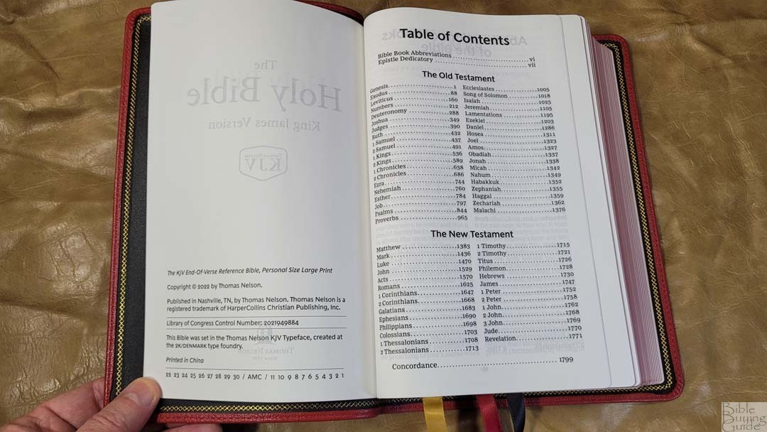
Table of Contents
- Video Review
- Binding
- Paper
- Typography and Layout
- References
- Footnotes
- Concordance
- Bible Atlas
- Comparisons
- Conclusion
Video Review
Binding
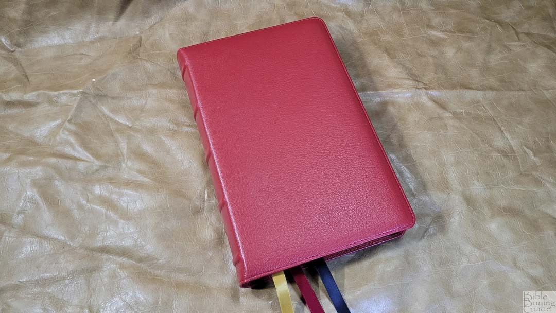
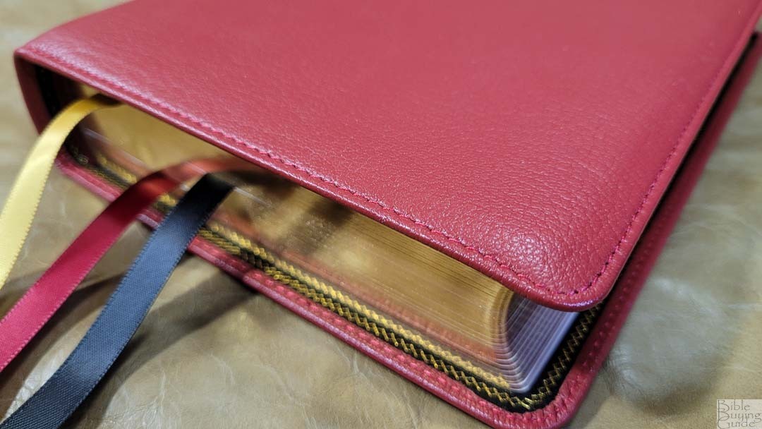
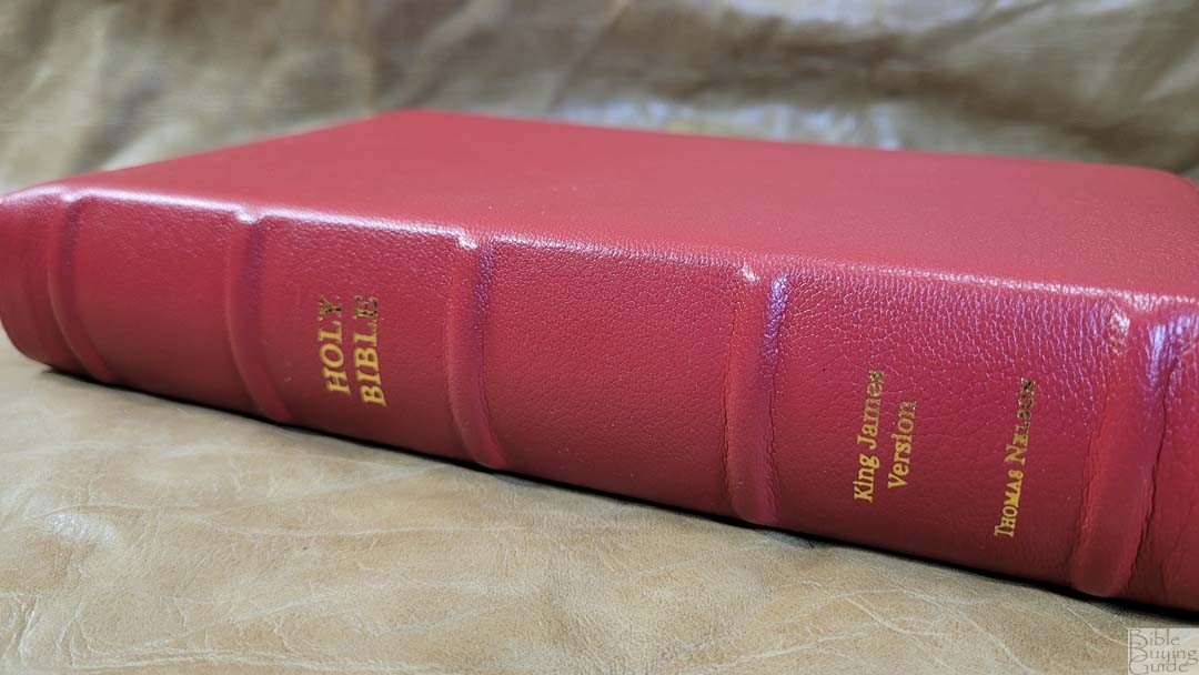
The cover is brick red goatskin leather. The goatskin is thick and has a soft feel with a semi-pronounced grain. The red is about a medium to dark shade. I love this color. It has perimeter stitching and a small yapp. The front has no writing. The spine has HOLY BIBLE, KING JAMES VERSION, and THOMAS NELSON printed in gold. It has 5 raised spine hubs. They’re large and look elegant. The spine is slightly rounded, which is my personal favorite design.
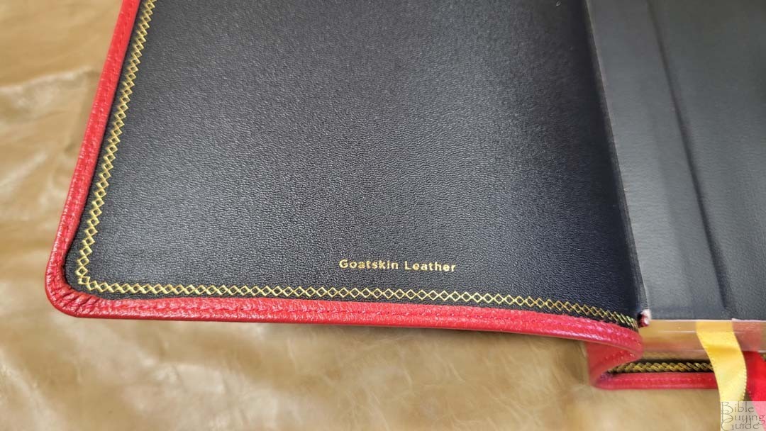
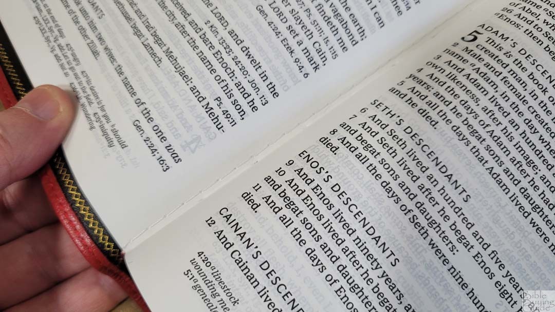
The liner is black edge-lined leather. A gold gilt pattern traces around the perimeter of the liner. This design stands out from the crowd and fits the Bible well. The text block is Smyth sewn and it has overcast stitching to give it more support for the first signature. The tab is stiff, so it will need to be broken in for a while before it will stay open in the beginning of Genesis. It has no trouble staying open around chapter 30.
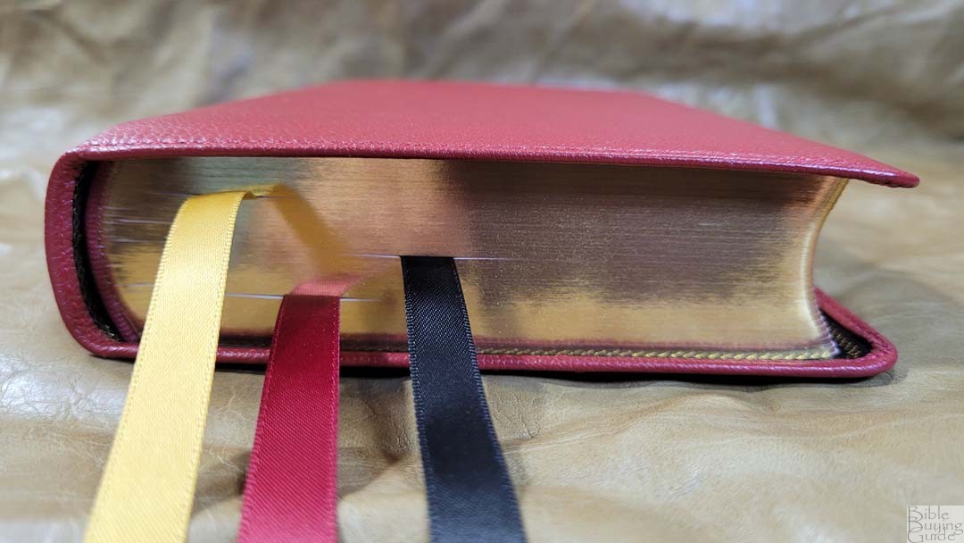
It has 3 3/8″ ribbons: gold, black, and red. They’re extra long and are cut at an angle. The overall size is 6 x 9.3 x 1.75″ and it weighs 2 lbs, 9.6 oz. This size is great for carrying, studying, reading, preaching, and teaching.
Paper
The paper is a premium 36gsm European paper that’s used in all the other Premier Collection Bibles. It does look and feel premium. It’s slightly off-white in color and it’s highly opaque. It has a smooth texture, but I find this paper easy to separate between my fingers and turn. It does have a slight touch of glare under certain lighting, but it’s only barely noticeable. I only saw it because I was looking for it. The page edges are art-gilt with red under gold.
Typography and Layout
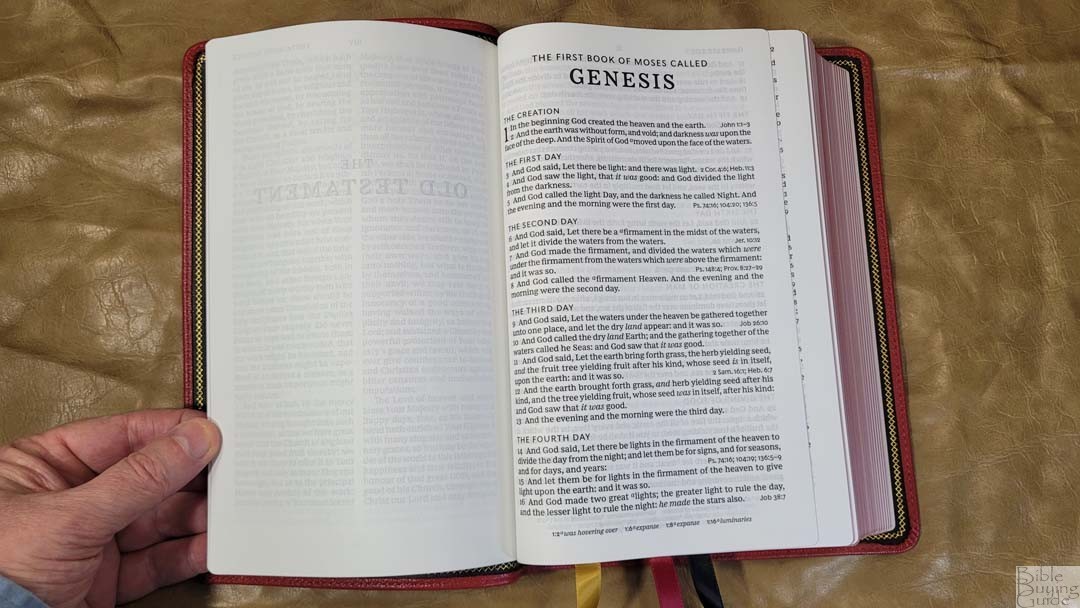

The text is set in a single-column verse-by-verse format with references at the end of the verses and footnotes in the footer. It has no special formatting for poetry, quotes, or letters. The header shows the book name, chapter number, and verse number in the outer margin and a page number in the center. Section headings are all-caps. Books start on the page where the last book ended.
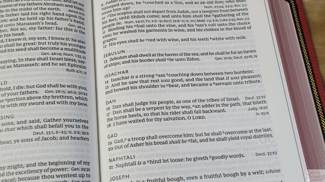
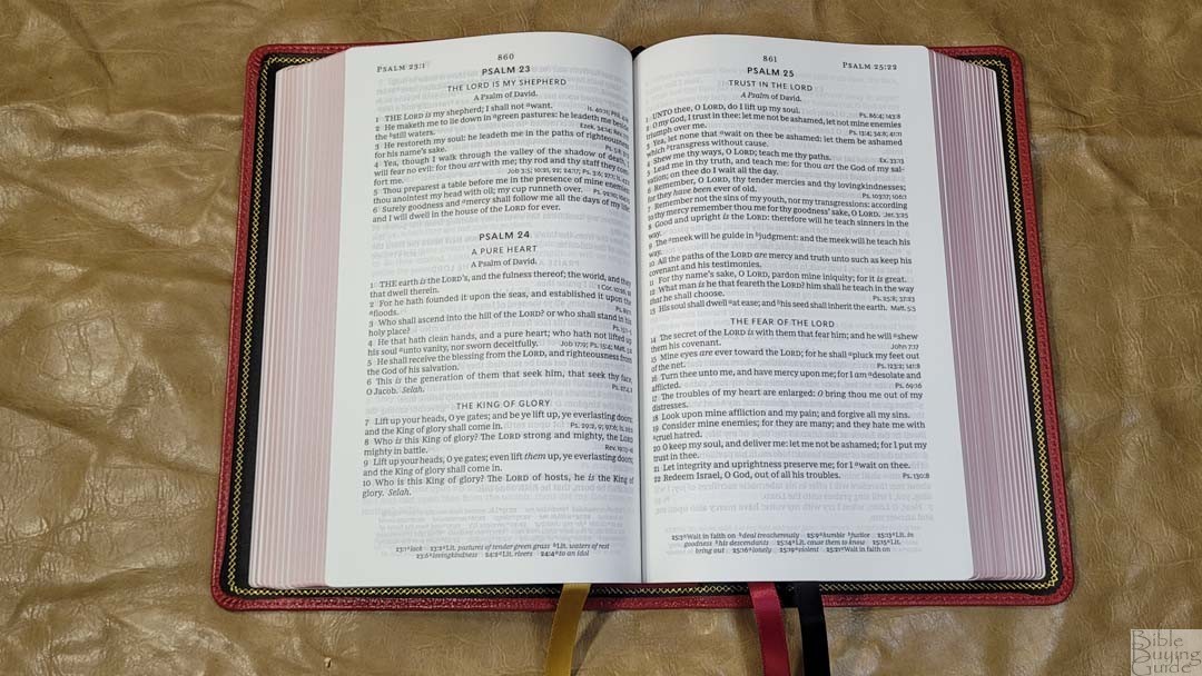
The 10-point font is the Comfort Print typeface designed by 2K/Denmark for the KJV. It has a dark black and red-letter text that’s highly consistent and easy to read. I love this red. Supplied words in italics. The text does include footnote keys, but no reference keys. The footnote keys are large enough to see, but they can be ignored when preaching or teaching. It’s printed with line-matching, meaning that the lines of text are printed in the same locations on both sides of the page to reduce the effect of show-through. The lines match well and the show-through is negligible. The verse numbers are left-justified, but the verses are indented. This makes the verses stand apart and makes the verse numbers easier to see.
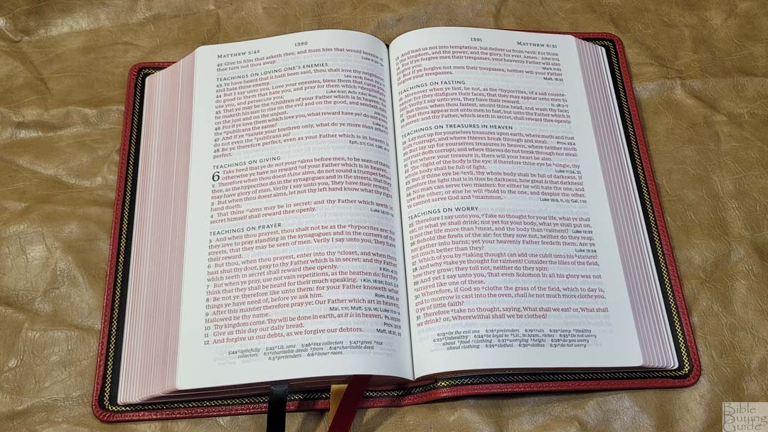
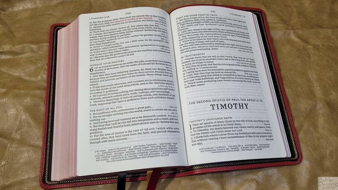
It has between 14-16 words per line on average. It has enough space between the lines and enough inner margin space to keep the lines straight to make it easier to find the start of the next line. I need to trace the line with my finger for preaching, but I usually don’t have any issues when just reading as normal. The extra space at the ends of the lines and the vast number of section headings help me keep my place. I find the references at the end of the verses easy to ignore when reading. They’re right-justified, so they’re usually away from the text. Also, they’re smaller, so they look different from the text.
References
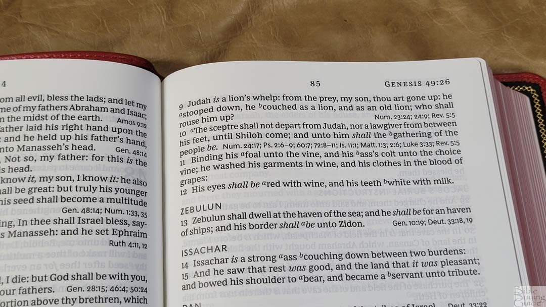
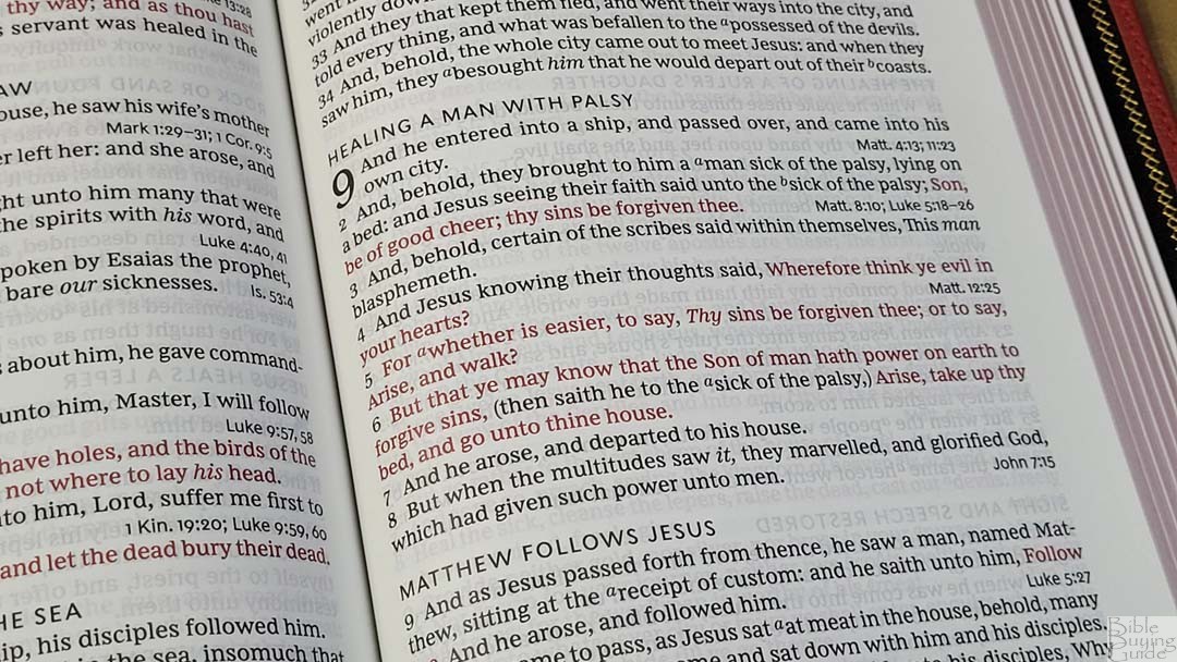
References are placed at the end of the verses. There aren’t a lot of references and they don’t include keys to the portion of Scripture they go to. This keeps the text clean, but it also requires you to look up the references to see if they’re what you’re looking for. I personally prefer this because it keeps the text clear of distractions. I use the references, but I read even more, so I like to have a cleaner text. They’re printed in a larger font than most references. This makes them easy to read.
Here are some example references to help you compare:
- Genesis 1:1 – Jn 1:1-3
- Deuteronomy 6:4 – 1 Cor 8:4, 6
- Isaiah 9:6 – Jd 13:18, Mt 28:18, Lk 2:11, Jn 3:16, Eph 2:14, Titus 2:13
- Matthew 28:19 – Mark 16:15, Luke 24:47
- Mark 12:29 – Dt 6:4, 5
- John 1:1 – Jn 17:5, 1 Jn 1:1, 1 Jn 5:20, Rev 19:13
- Acts 2:38 – Lk 24:47
- Romans 10:9 – x
- 1 John 1:1 – Lk 24:39, Jn 1:1, 4, 14, 2 Pet 1:16
Footnotes
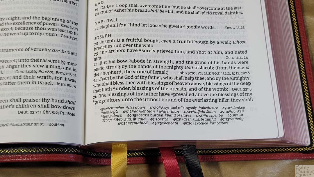
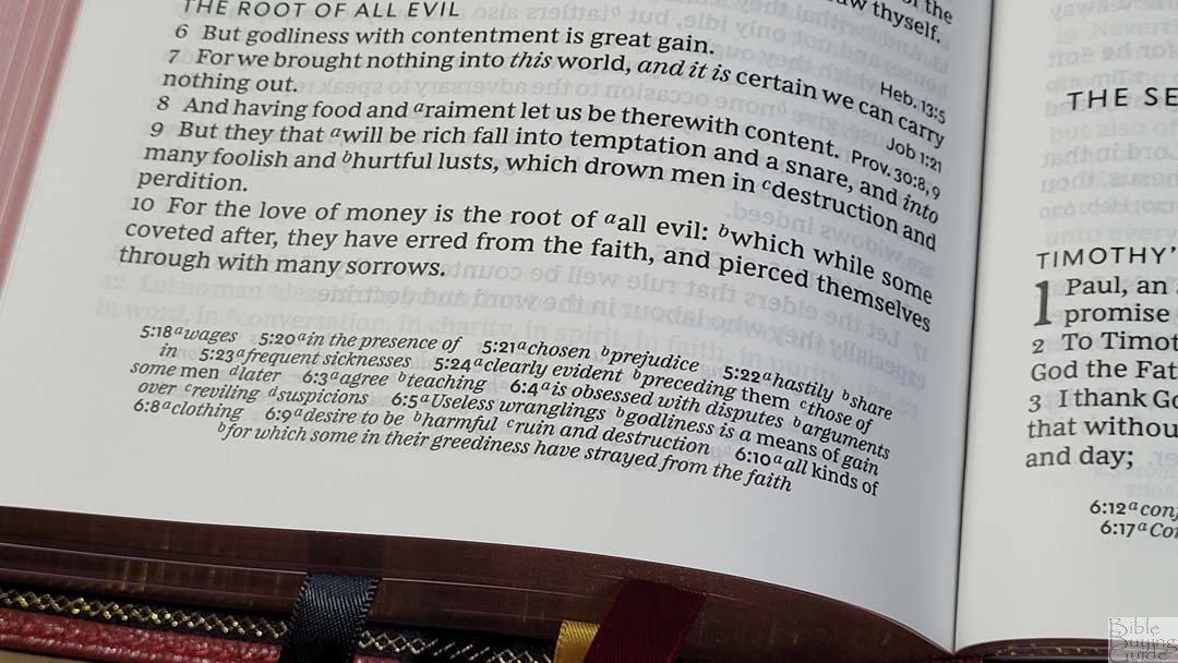
Footnotes are placed in the footer. I like that they’re separate from the references. This makes them easier to use. They include definitions for archaic words or words that have changed in meaning. I like having them on the page with the text. This makes them much easier to use. They also include some definitions of Greek or Hebrew words, including weights and measures. They’re excellent for reading, studying, and preaching.
Concordance
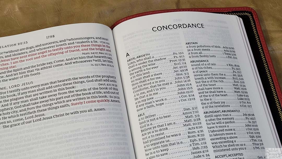
The concordance is 78 pages with two columns per page. It doesn’t contain proper names, but it does include parts of speech where there are multiple entries for the same word. This is a medium-sized concordance, which is helpful for basic study and sermon prep. Here are a few example entries when the number of references to help you compare:
- Christ – 15
- Christian – 3
- Faith – 94
- Faithful – 38
- Faithfully – 1
- Faithfulness – 4
- Faithless – 3
- God – 54
- Godhead – 3
- Godliness – 8
- Godly – 9
- Praise(n) – 30
- Praise(v) – 12
- Pray – 36
- Prayer – 34
Bible Atlas
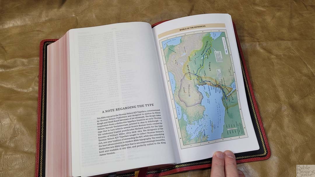
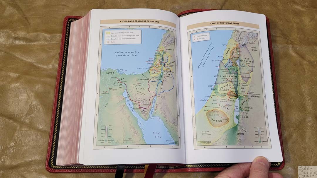
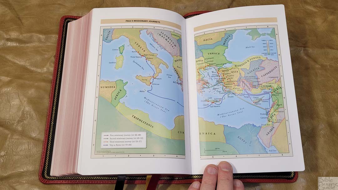
It includes 7 full-color Zondervan maps printed on 8 thick semi-glossy pages. It does not include a map index. The maps are annotated well, so they’re easy to use. They include topography, distance, routes, borders, possible locations of lost places, battles, elevation, cities, and locations for the events of Jesus’ ministry.
Maps include:
- World of the Patriarchs
- Exodus and Conquest of Canaan
- Land of the Twelve Tribes
- Kingdom of David and Solomon
- Jesus’ Ministry
- Paul’s Missionary Journeys
- Jerusalem in the Time of Jesus
Comparisons
This video shows a few comparisons that are not in this article.
KJV Sovereign
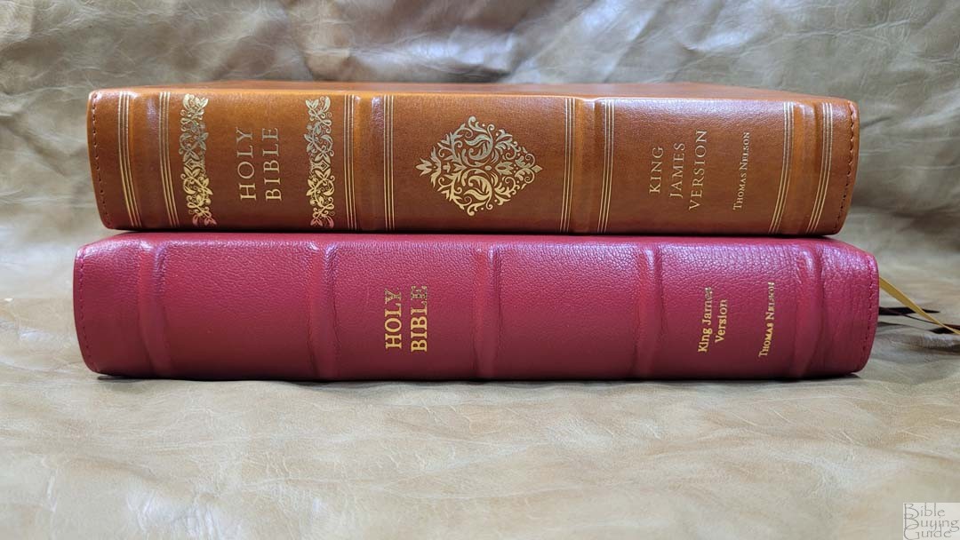
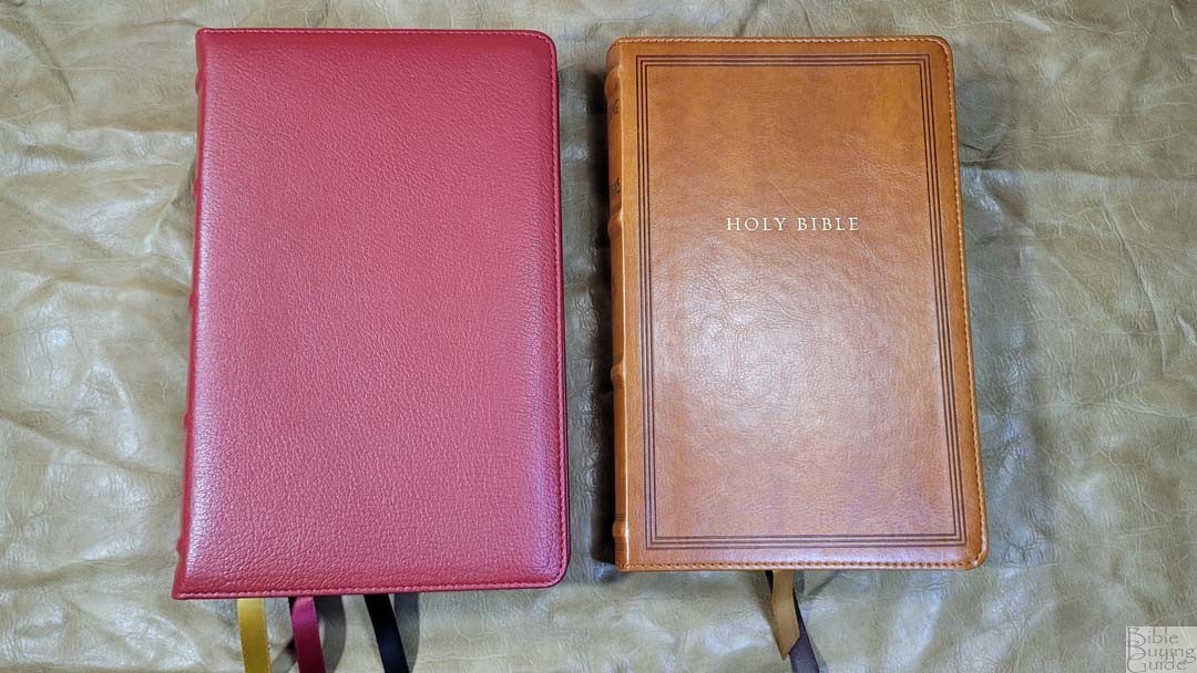

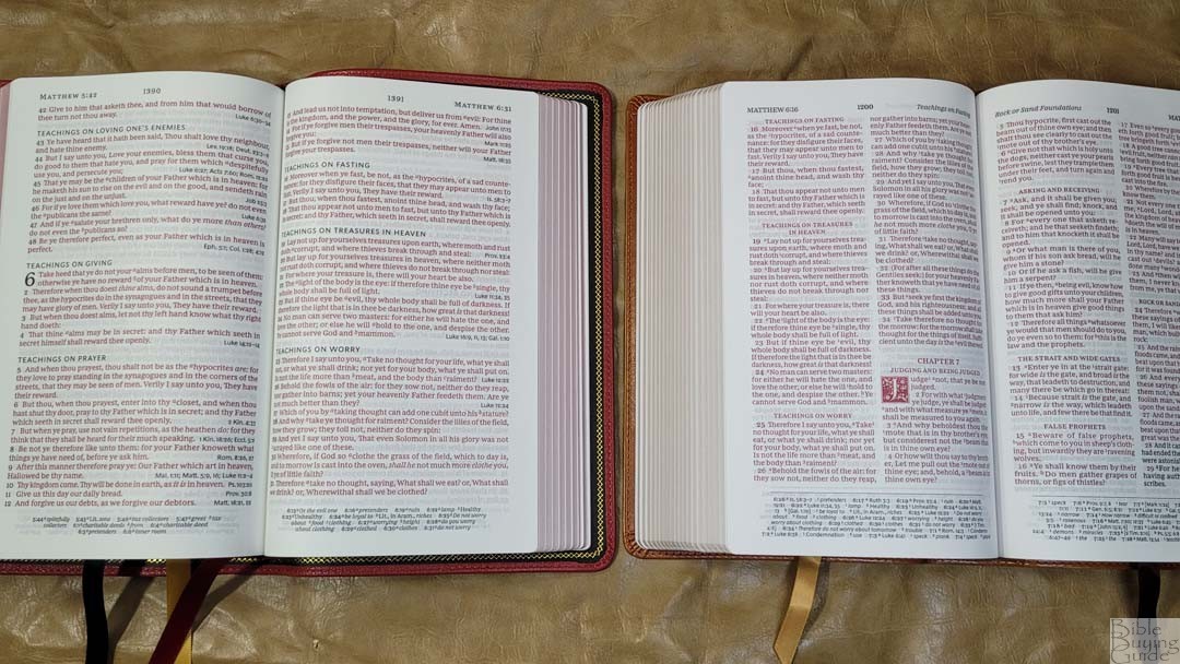
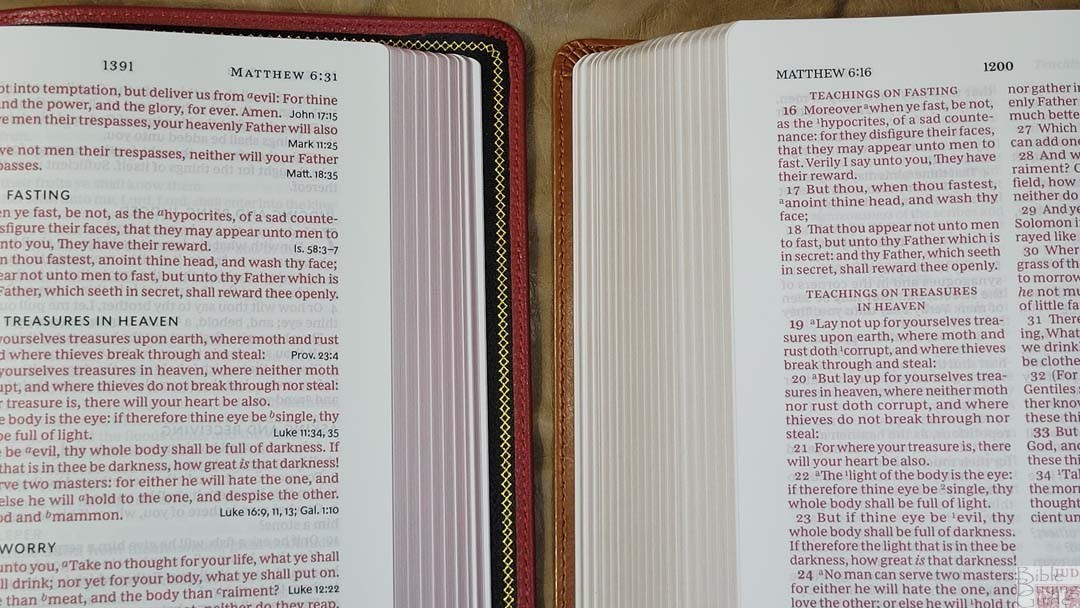
The KJV Sovereign is close to the same size. Its paper is whiter and the font is a half point smaller. It has more references and tools and presents Psalms and Proverbs in a single-column setting.
NASB Heritage


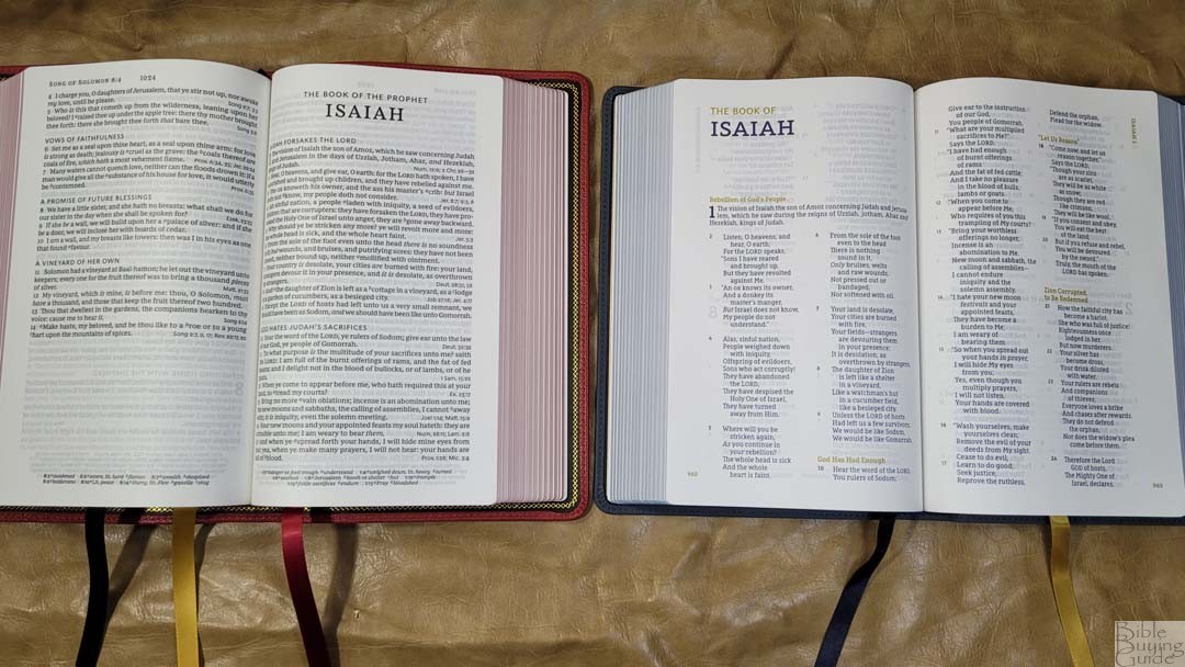

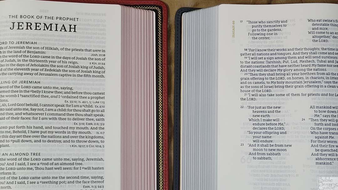
The Zondervan NASB Heritage Passoggio Bible is about the same size and presents prose in a single-column v-b-v setting. Poetry is in double columns.
Hendrickson’s Hallmark Reference Bible KJV


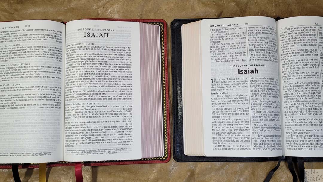
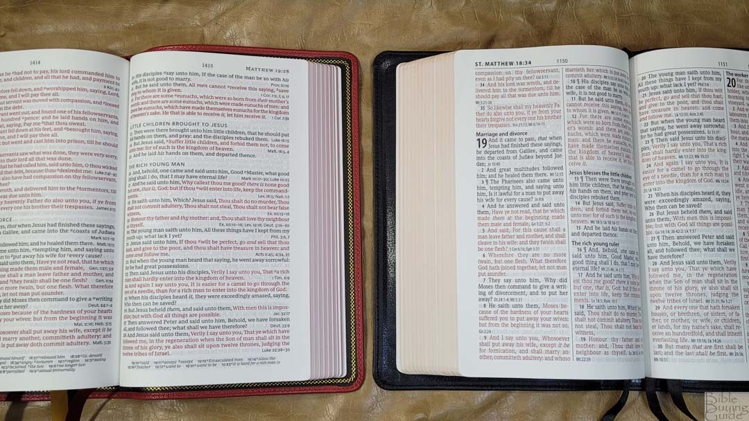
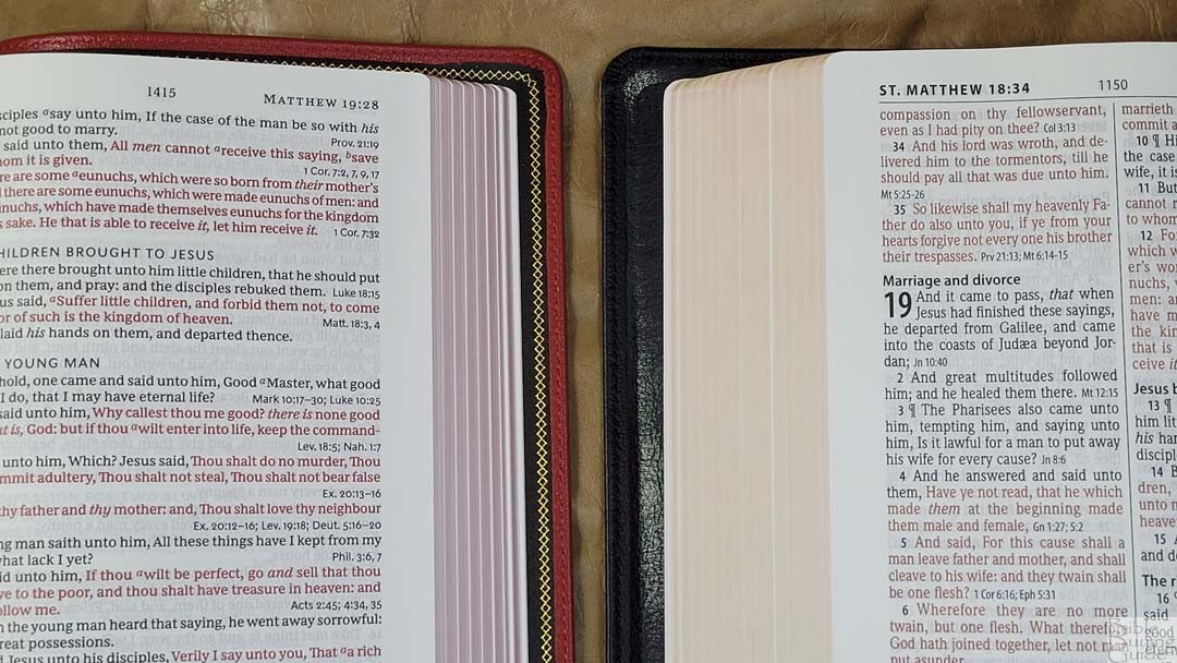
Hendrickson’s Hallmark Reference Bible KJV is the only other premium KJV with end-of-verse references that I’m aware of. It has premium paper and shares the layout with the lower-cost large print personal size editions. The print isn’t as dark as the Thomas Nelson.
Conclusion
The Thomas Nelson Premier Collection KJV Personal Size Large Print Reference Bible is easily one of the most interesting KJVs I’ve reviewed. It doesn’t have a lot of references, but that’s typically for end-of-verse references. The single-column layout does leave a lot of verses with blank spaces, but I find that this helps break up the text a little bit and it’s great for reading. The construction and materials are high-quality and the brick red goatskin stands out in a good way. If you’re interested in a high-quality single-column KJV, the Thomas Nelson Premier Collection KJV Personal Size Large Print Reference Bible is a great choice.
_________________________________________________________
This Bible is available at (affiliate links)
and many local Bible bookstores
_________________________________________________________
provided this Bible in exchange for an honest review. I was not required to give a positive review, only an honest one. All opinions are my own.




Thank you for the review. I love what you do.
How does this bible compare to the Single Column Handcrafted series from Holman? Which text block do you prefer? Which bible is better quality? Any recommendations?
Thank you! This one is by far better in materials and build quality. Unless the writing space is the goal, I recommend this one. I plan to compare them, but it will be a few days.
Definately go with Holman. Thomas Nelson, instead of printing the original KJV footnotes like they should have, has made a ridiculous amount of modernized footnotes which constantly “corrects” words and phrases throughout the KJV. There are so many of these that it feels like they are deliberately trying to smear the KJV. I don’t need a footnote telling me that “forsook” means “left,” or “nigh” means “near,” or “fowls” means “birds,” or “meat” means “food.” It’s obvious that most of these “corrections” come straight from the NKJV. If I wanted another NKJV I would buy one. The final insult are the incorrect, unauthorized book titles in the New Testament.