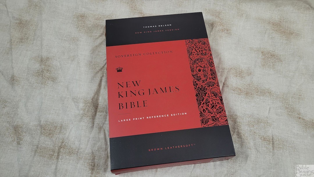
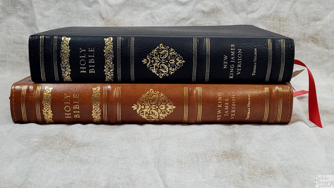
Thomas Nelson’s NKJV Sovereign Collection is now available in a large print edition. It matches the personal size and wide margin editions, presenting the New King James in an elegant format. The design blends classic and modern elements to create an interesting format that’s both elegant and usable. The NKJV Large Print Sovereign Collection is available in black or brown Leathersoft (imitation leather), with or without thumb-index. I’m reviewing the brown Leathersoft without thumb-index. This is ISBN 9781400344345, printed in India.
Thomas Nelson provided these Bibles in exchange for an honest review.
_________________________________________________________
This Bible is available at (includes some affiliate links)
and many local Bible bookstores
_________________________________________________________
Table of Contents
NKJV Sovereign Binding
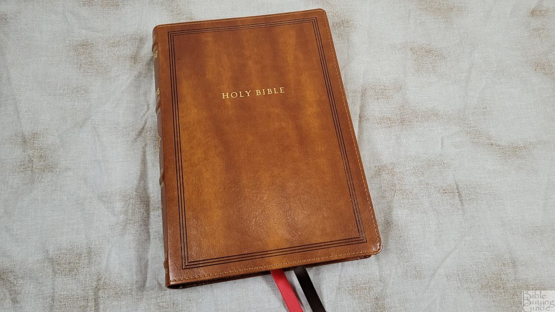
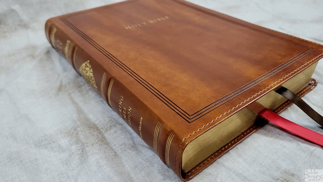
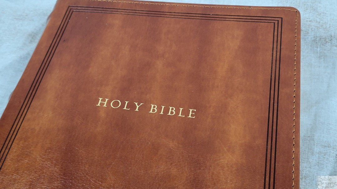
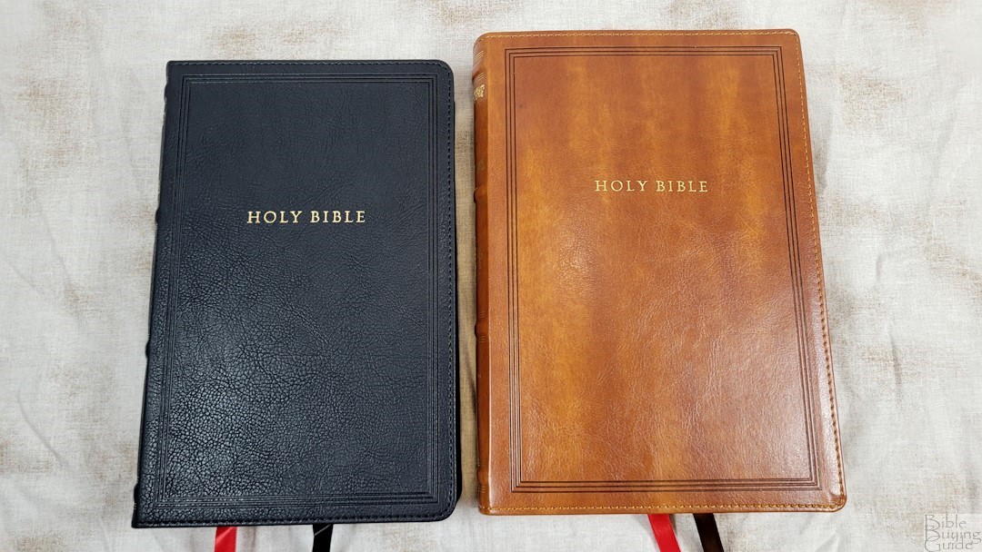
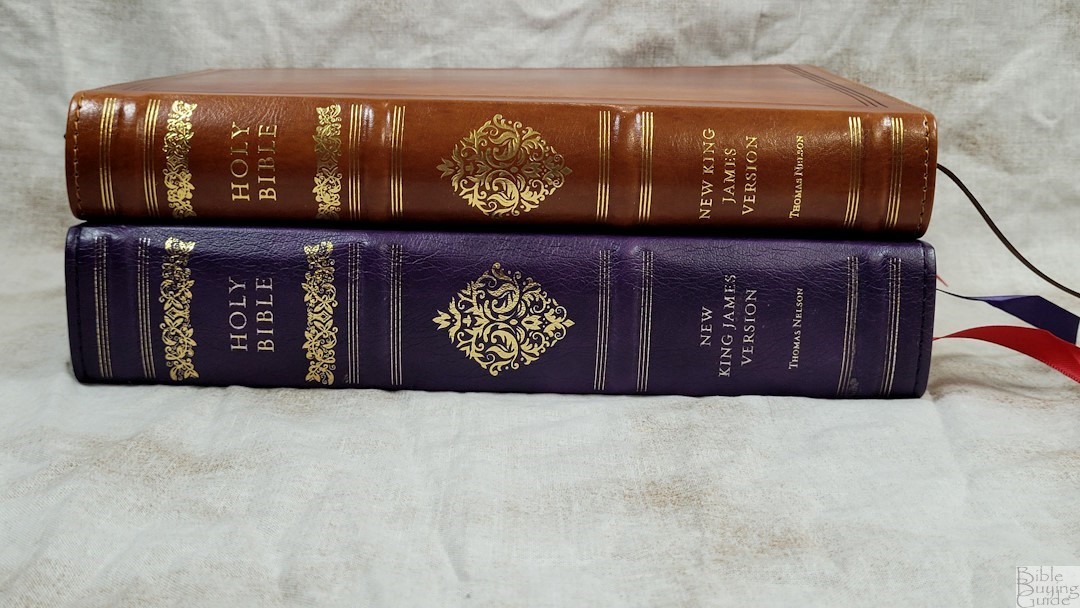
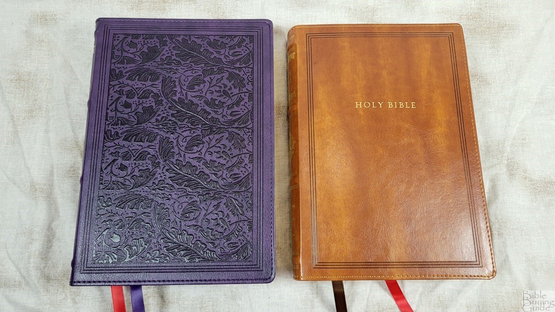
The brown Leathersoft has a subtle grain with a lot of color variation that looks good. It includes perimeter stitching, gold printing, and a decoration debossed into the front. The spine has four raised hubs with fancy designs printed in gold.
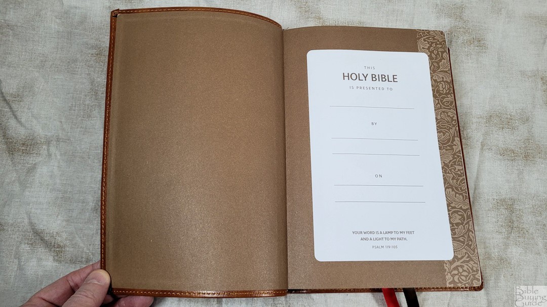
The liner is a brown paste-down paper that doubles as the presentation page. The back end sheet has a floral decoration down the outer edge. The cover breaks in and opens well at the end of Genesis. The block is sewn. It includes two 10mm double-sided ribbons: 1 brown and 1 red. The overall size is 6.75 x 9.5 x 1.375″, and it weighs 2 lbs, 5.8 oz. This is an excellent size that’s large enough without feeling like a large Bible. I find it easy to carry and hold.
Paper
The paper is the same used in the KJV edition, which I found to have too much show-through for the darkness of the print. That issue continues with this edition. This makes the text more difficult to read. Some lighting looks worse than others. It’s still usable, but I’d like to see more opacity. The paper is 30 GSM. It has a rough texture that’s easy to grab and turn. It’s bright white with gold-gilded edges.
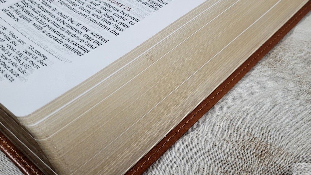
Unlike the KJV edition, I haven’t found any crinkles. Like the KJV edition, the gold edges do have a raised splotch that looks like glue.
NKJV Sovereign Typography and Layout
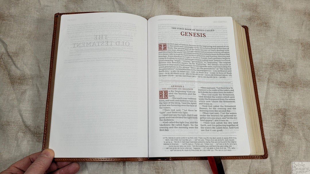
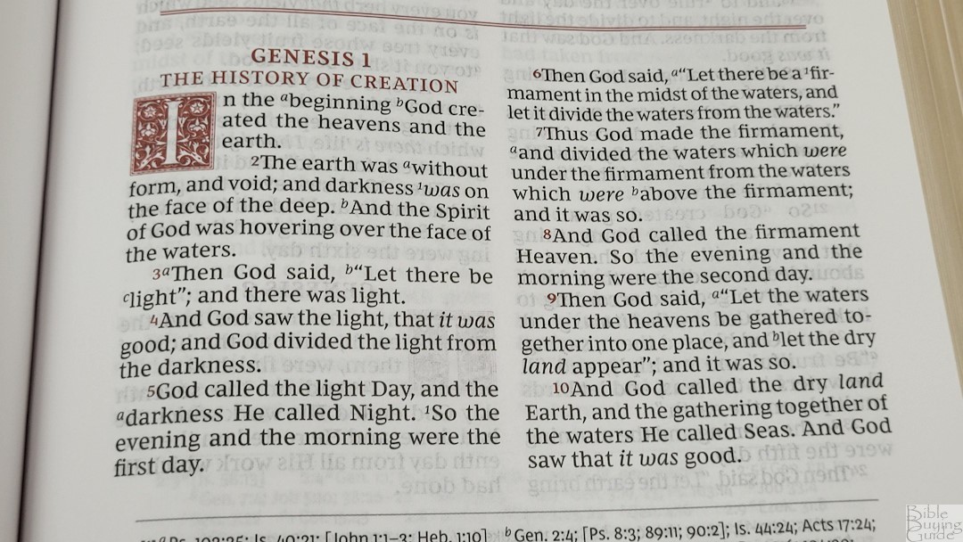
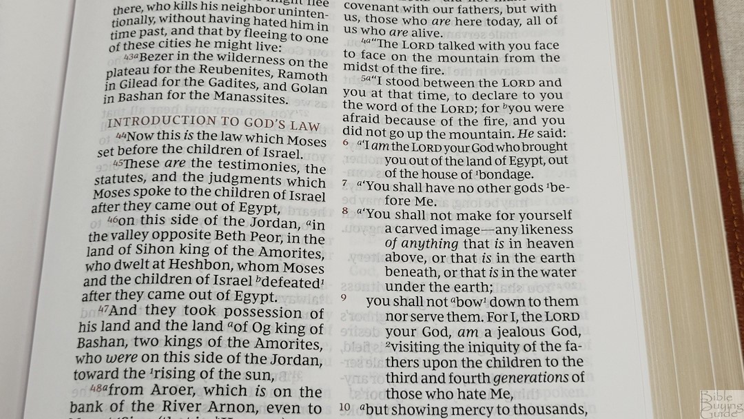
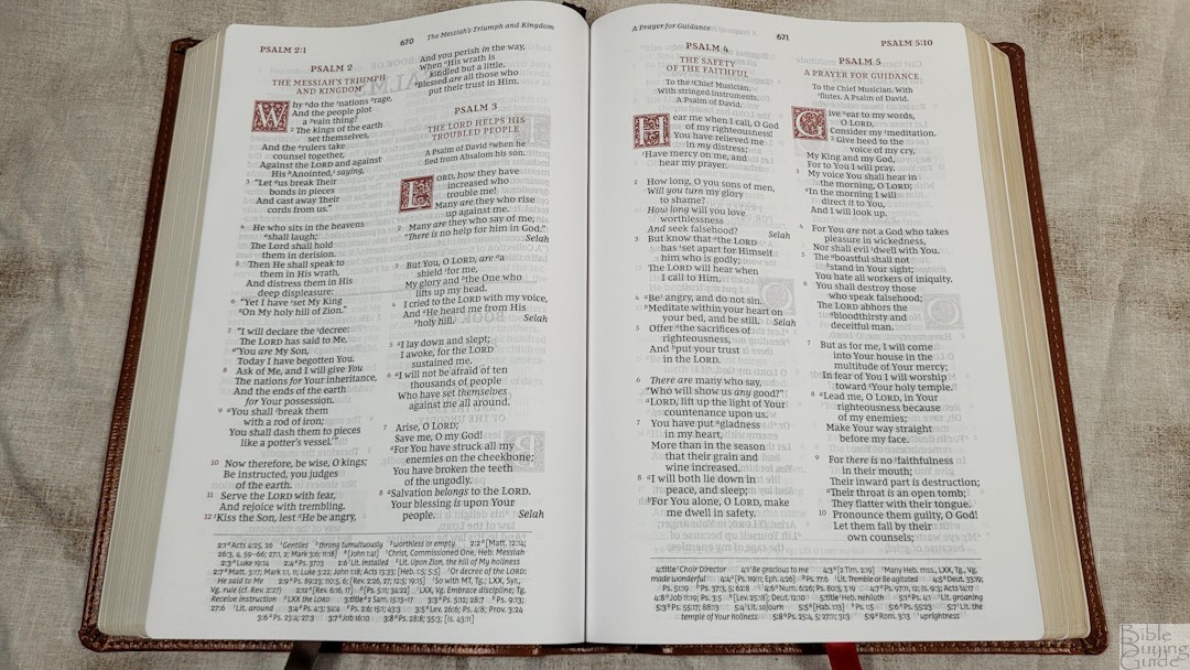
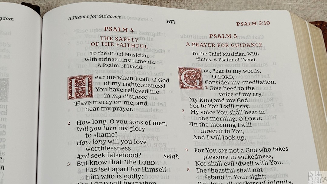
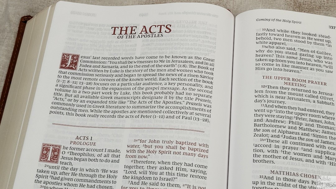
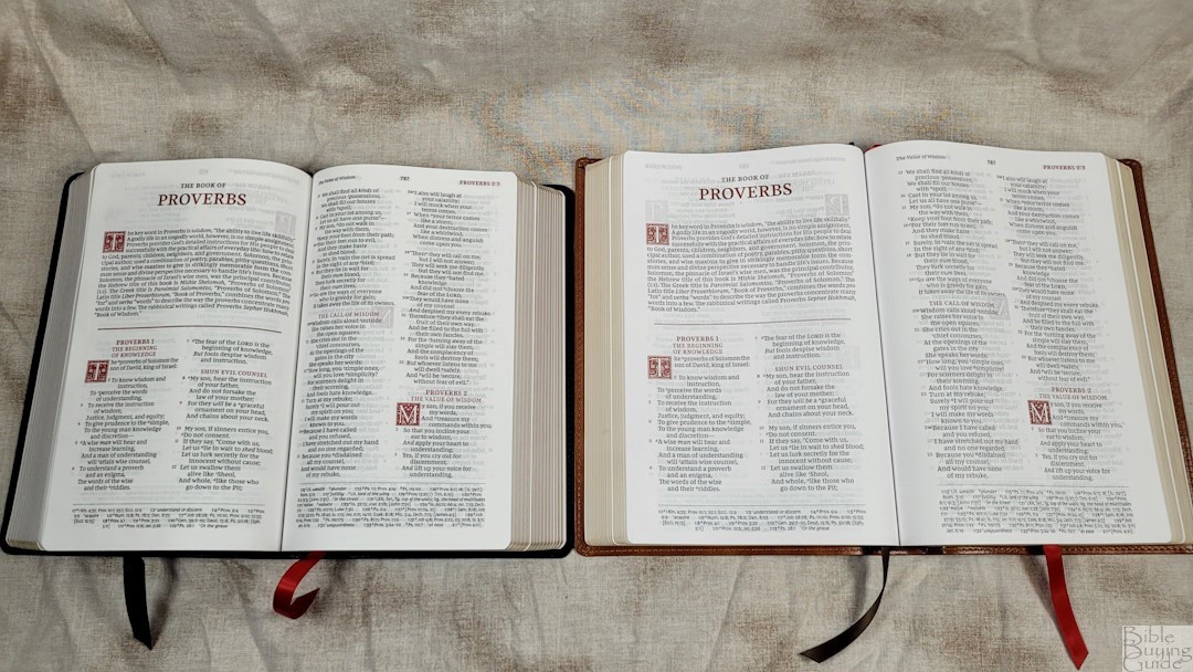
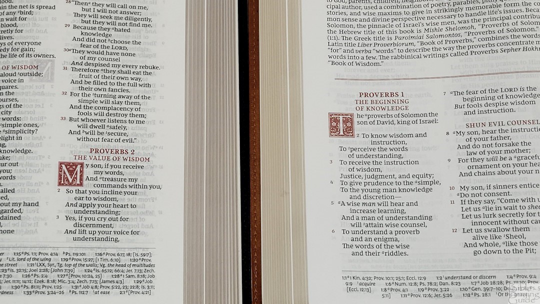
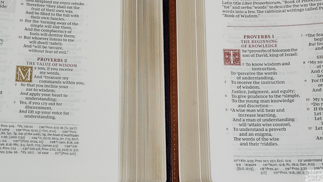
The NKJV text is presented in a double-column, verse-by-verse format with poetry set in stanzas. Unlike the KJV Sovereign Collection, the NKJV has Psalms and Proverbs in double columns. Personal letters are indented so they stand out. Cross-references and translation footnotes are placed in a single column in the footer. The header shows the book name, chapter, and verse number in the outer margin, the page number in the center, and a page summary in the inner margin. The decorative drop cap takes four lines. Most of the highlights in the text are in red, including the book name in the header, chapter and verse numbers, chapter numbers in the text, and section headings. Italics are used for supplied words. Books start on a new page.
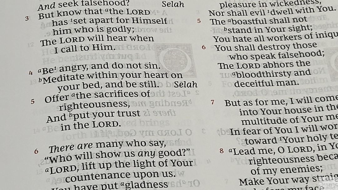
The font is a 10.5-point Comfort Print designed for the Thomas Nelson NKJV by 2K/Denmark. This is a red-letter edition. The black is highly consistent throughout. The red has a little bit of print variation. It is about a medium/dark in darkness. It’s printed with line-matching so the lines of text are printed in the same location on both sides of the page to improve readability. It still has show-through, and the text on the other side of the page makes the background of the text too dark.
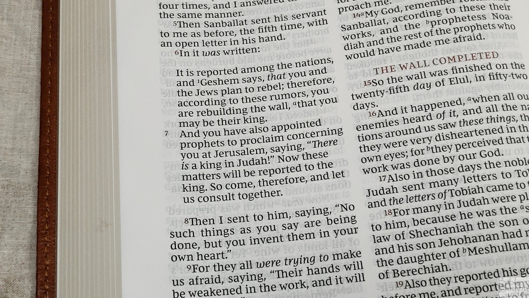
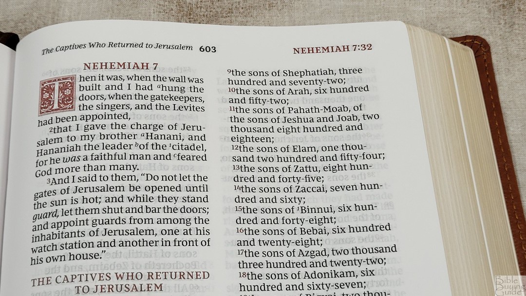
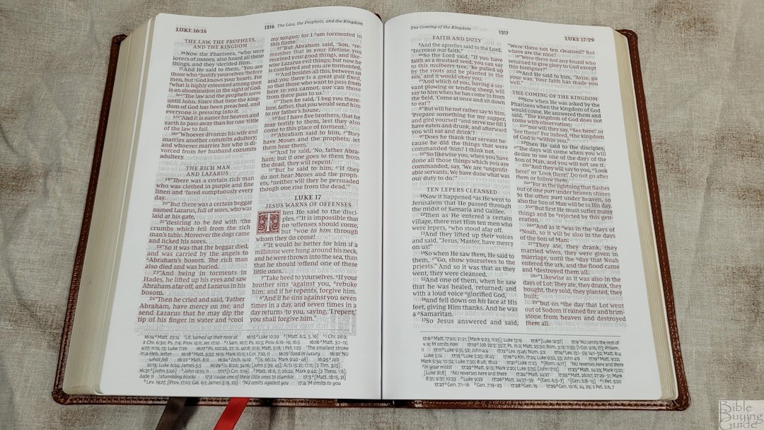
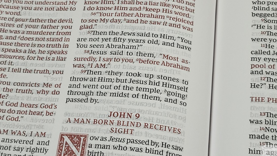
Paragraphs are marked with bold verse numbers. The drop cap has the first letter of the chapter, while the book name and chapter numbers are printed at the beginning of each book. It has between 6 and 8 words per line. The text looks clean and dark. It’s highly readable. Poetry is broken in good places and looks good. The inner margin is 7/8 inch, and the outer margin is 1/2 inch. This brings the text out onto the flat part of the page.
NKJV Sovereign References and Footnotes
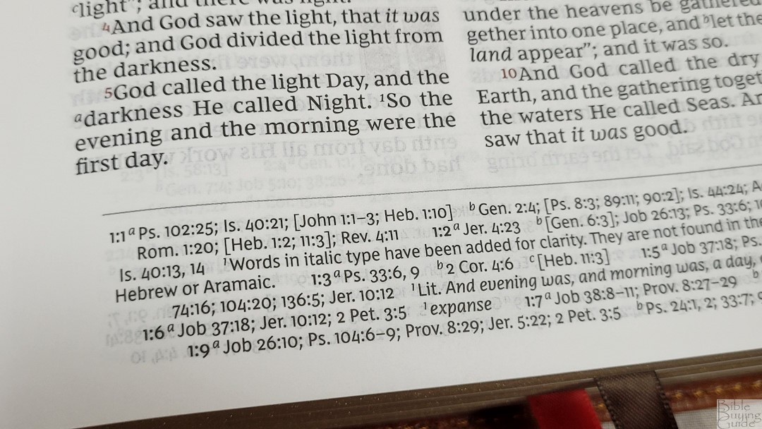
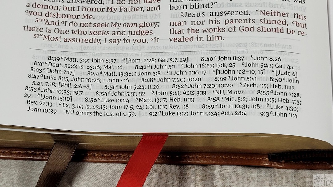
The cross-references and footnotes are placed together in a single column in the footer. They include the chapter and verse numbers they correspond to and the callers to identify them. Footnotes are in italics so they stand out. There is extra space between the main verses, making them easier to find. The footnotes are the standard full set of NKJV translation footnotes. I find them to be useful because they provide manuscript variations and identify the manuscripts.
Here are some example references to help you compare:
-
-
- Genesis 1:1 – Ps 102:25; Is 40:21; Jn 1:1-3; Heb 1:10; Gen 2:4; Ps 8:3; 89:11; 90:2; Is 44:24; Acts 17:24; Rom 1:20; Heb 1:2; 11:3; Rev 4:11
- Deuteronomy 6:4 – Deut 4:35; Mark 12:29; John 17:3; 1 Cor 8:4, 6
- Isaiah 9:6 – Isa 7:14; Luke 2:11; John 1:45; Luke 2:7; John 3:16; 1 John 4:9; Matt 28:18; 1 Cor 15:25; Rev 12:5; Judg 13:18; Titus 2:13; Eph 2:14
- Matthew 28:19 – Mk 16:15; Is 52:10; Lk 24:47; Acts 2:38, 39; Rom 10:18; Col 1:23
- Mark 12:29 – Deut 6:4, 5; Is 44:8; 45:22; 46:9; 1 Cor 8:6
- John 1:1 – Gen 1:1; Col 1:17; 1 John 1:1; John 1:14; Rev 19:13; John 17:5; 1 John 1:2; 5:20
- John 3:16 – Rom 5:8; Eph 2:4; 2 Thes 2:16; 1 Jn 4:9, 10; Rev 1:5; Isa 9:6
- Acts 2:38 – Luke 24:47
- Romans 10:9 – Mt 10:32; Lk 12:8; Ac 8:37; Rom 14:9; 1 Cor 12:3; Phil 2:11
- 1 John 1:1 – John 1:1; 1 John 2:13, 14; Luke 1:2; John 1:14; 2 Pet 1:16; Luke 24:39; John 2:27; John 1:1, 4, 14
-
Book Introductions
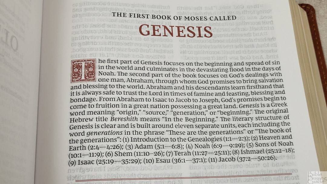
Each book has a 2-3 paragraph introduction with an overview, They cover the main characters, provide some interesting facts, and provide insights into the book’s name in Greek. Some include information about the author or other features of the book. They are simple but informative.
Concordance
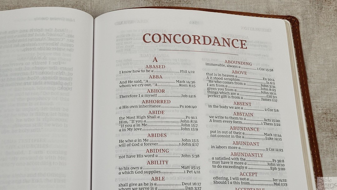
The concordance is 104 pages with 2 columns per page. This is a medium-sized concordance with enough entries for basic study. It’s not ideal for extensive study or sermon prep, but it’s good for general use.
Here are some example entries and the number of references they provide:
-
-
- Christ – 13
- Christian – 1
- Christian(s) – 1
- Christs – 1
- Faith – 40
- Faithful – 20
- Faithfulness – 5
- Faithless – 2
- God – 38
- Goddess – 2
- Godhead – 2
- Godliness – 4
- Godly – 3
- Gods – 5
- Praise – 25
- Praised – 4
- Praises – 2
- Praiseworthy – 1
- Praising – 3
- Pray – 14
- Prayed – 2
- Prayer – 16
- Prayers – 5
-
Maps
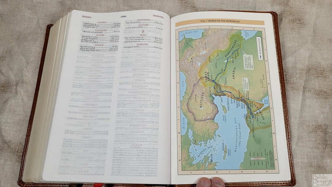
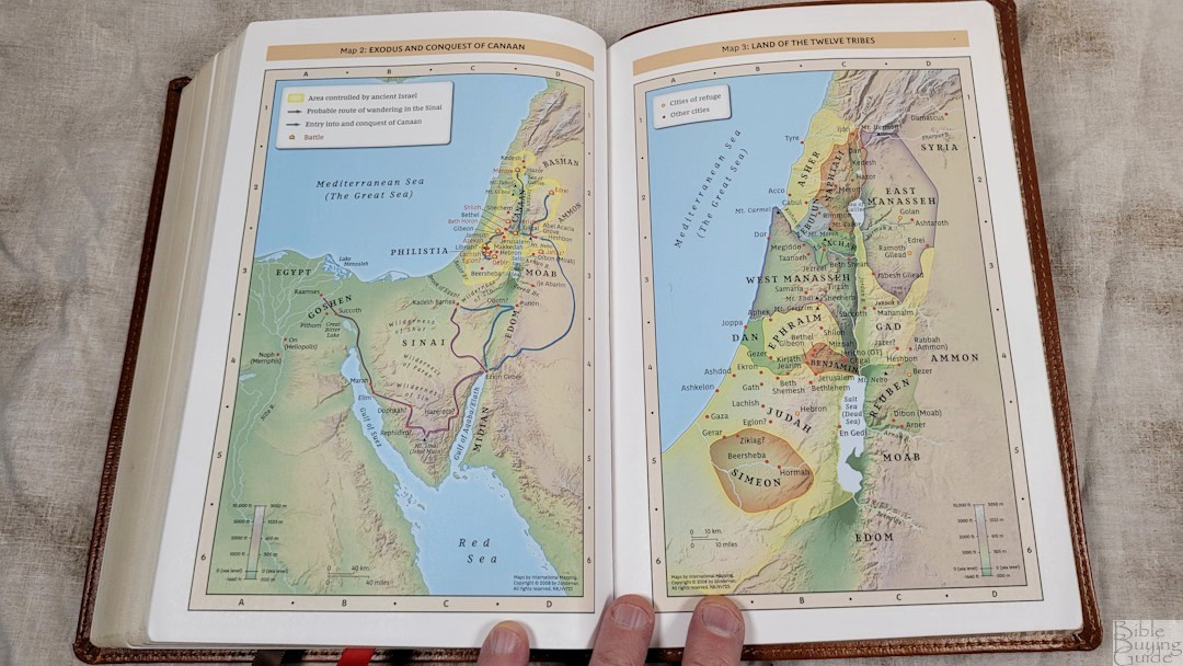
In the back are 7 full-color maps on 8 thick, non-glossy pages. The matte finish looks great. There isn’t an index, but they are annotated well. They include distance, elevation, topography, ancient cities, journeys, battles, events, dates, and Scripture references. They’re bright and colorful without being cartoonish.
Maps include:
-
-
- World of the Patriarchs
- Exodus and Conquest of Canaan
- Land of the Twelve Tribes
- Kingdom of David and Solomon
- Jesus’ Ministry
- Paul’s Missionary Journeys
- Jerusalem in the Time of Jesus
-
NKJV Large Print Sovereign Comparisons
Here’s how the NKJV Large Print Sovereign Collection compares with the personal size NKJV Sovereign Series and the NKJV Sovereign Wide Margin edition.
NKJV Personal Size Sovereign Collection
The personal size is smaller, but I prefer it. The paper’s opacity makes the smaller font easier to read. Of course, it’s a thicker Bible because of the 36GSM paper, but I’m willing to make that trade. I’d prefer the Large Print if the paper was more opaque.
NKJV Wide Margin Sovereign Collection

The footprint of the wide margin is the same as the large print. It’s thicker and has a smaller font, but I find it easier to read.
NKJV Large Print Sovereign Video Review
My camera won’t stay in focus for video recording. I’ll add this when I get a new camera.
NKJV Large Print Sovereign Conclusion
The Thomas Nelson NKJV Sovereign Collection Large Print Reference Bible is an excellent design. It’s similar to the Schuyler Quentel but adds Thomas Nelson design elements and is a verse-by-verse format. Like its KJV counterpart, it suffers from too much show-through, making it less desirable than the personal-size or wide-margin editions. The three editions make a great combo. This is a good option if you prefer a larger print. I can recommend this if you’re interested in a large-print Sovereign Collection and don’t mind the show-through.
_________________________________________________________
This Bible is available at (includes some affiliate links)
and many local Bible bookstores
_________________________________________________________
Thomas Nelson provided these Bibles in exchange for an honest review. I was not required to give a positive review, only an honest one. All opinions are my own.


Recent Comments