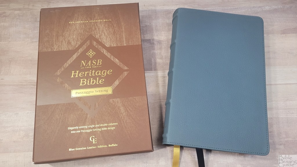
The Zondervan NASB Heritage Passaggio Setting Bible is Zondervan’s first high-quality Bible in the new Passaggio setting. Passaggio is a musical term that describes when the singer changes from one register to another. The Passagio setting does this by changing the layout between single-column prose and double-column poetry. In this Bible review, I’ll look at this edition and see how it’s different from the recent Passaggio in the Large Print Thinline. This is ISBN: 9780310456476, printed in China.
Zondervan provided this Bible in exchange for an honest review. I was not required to give a positive review, only an honest one. All opinions are my own.
_________________________________________________________
This Bible is available at (includes some affiliate links)
and many local Bible bookstores
_________________________________________________________
Table of Contents
Video Review
Binding
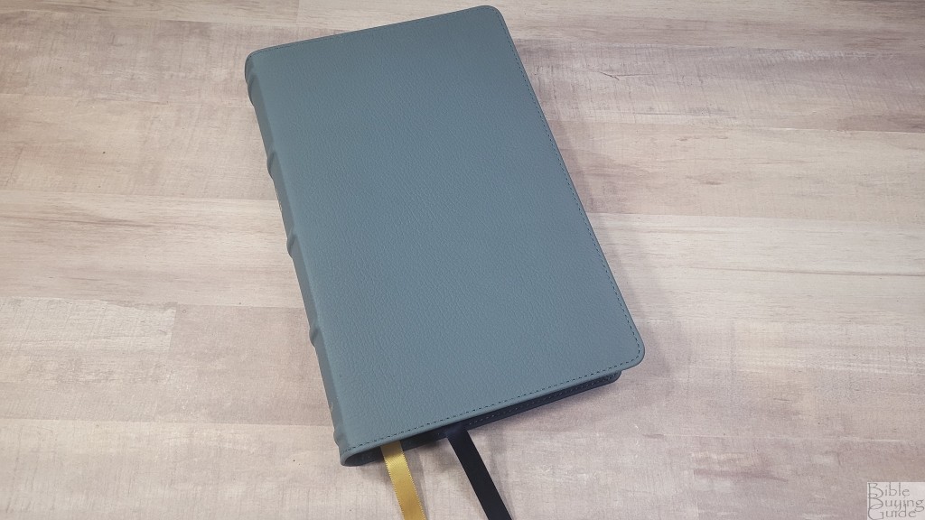
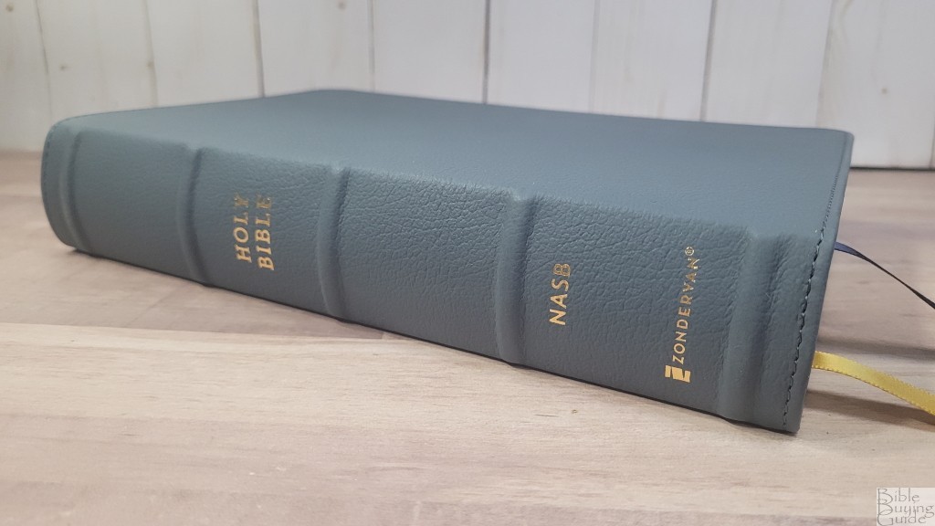
The cover is Blue Genuine Leather, which is actually water buffalo leather. It’s dusty blue and looks and feels similar to cowhide. Nothing is printed on the front. The spine has 5 raised hubs. Text on the spine is printed in gold. The cover includes perimeter stitching. This leather is soft to the touch. I like it a lot.
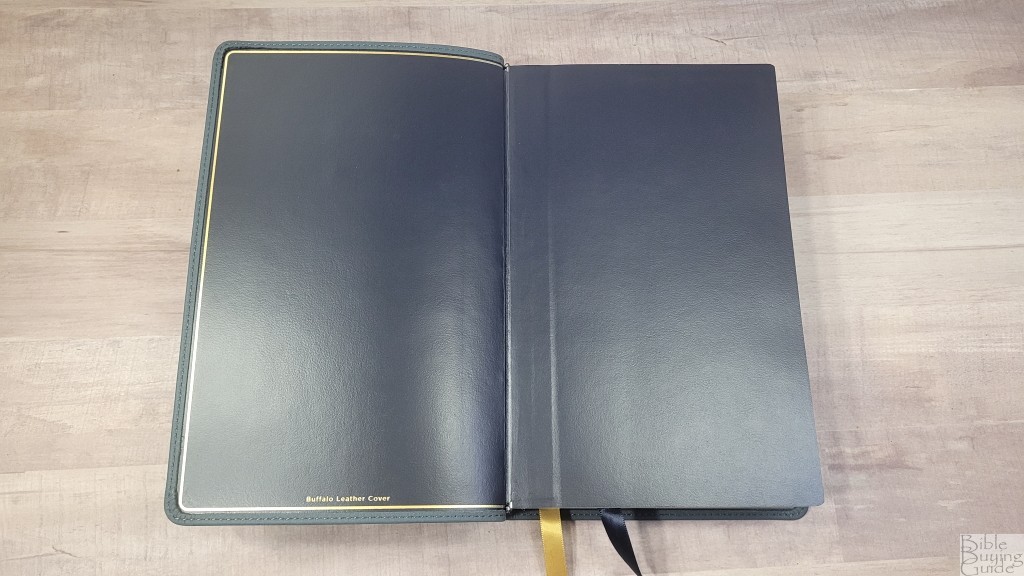
The liner is edge-lined with heavy-duty vinyl. A gold line traces the liner. The edge-lined tab is only a touch stiff and it stays open well in the middle of Genesis, which is better than many of the edge-lined editions I’ve seen with edge-lined vinyl. The block is Smyth sewn and includes overcast stitching for the first section.
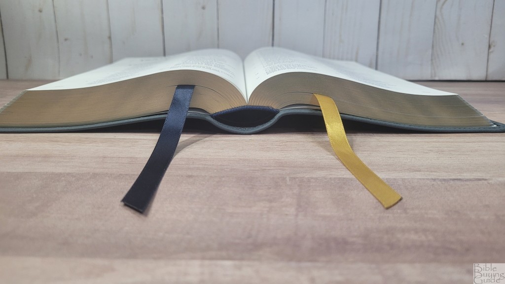
It has two 3/8″ ribbons: a navy ribbon for the Old Testament and a gold ribbon for the New Testament. They’re more than long enough to pull to the corner to open the Bible. The overall size is 5 3/4 x 8 7/8 x 1 1/2″ and it weighs 2 lbs, 7.5 oz. This is a good size for carry.
Paper
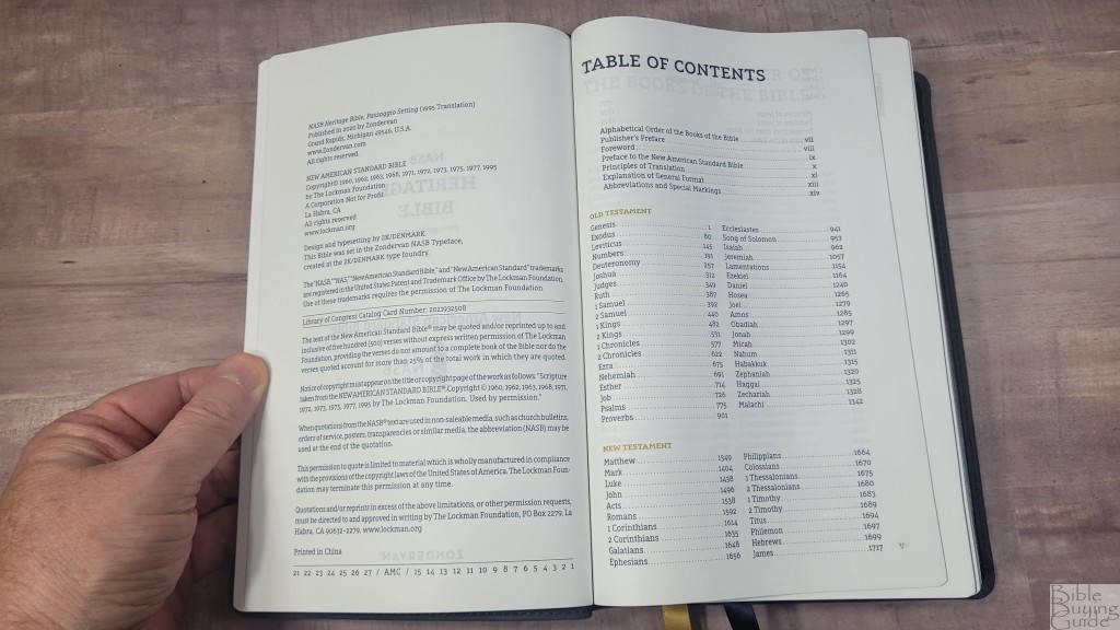
The paper is 36gsm European premium Bible paper. This is some of my favorite paper for Bibles. This is the same paper used in the Premier Collection. It’s just a touch off-white and it’s highly opaque. It’s smooth to the touch, but it has the right texture that makes it easy to turn. I like this paper for reading. Page edges are blue under gold.
Typography and Layout

The text is presented in the new and unique Passaggio setting with prose in single-column verse-by-verse layout and poetry in double-column stanzas. The header is empty in this one. The book name, chapter, and verse numbers are printed vertically in the outer margin, aligning with the first verse on the page. They’re printed in gold. The page numbers are also gold. They’re placed in the outer margin next to the last verse. This provides a 3/4″ outer margin for small notes. Footnotes are placed along the footer. Section headers are also printed in gold.
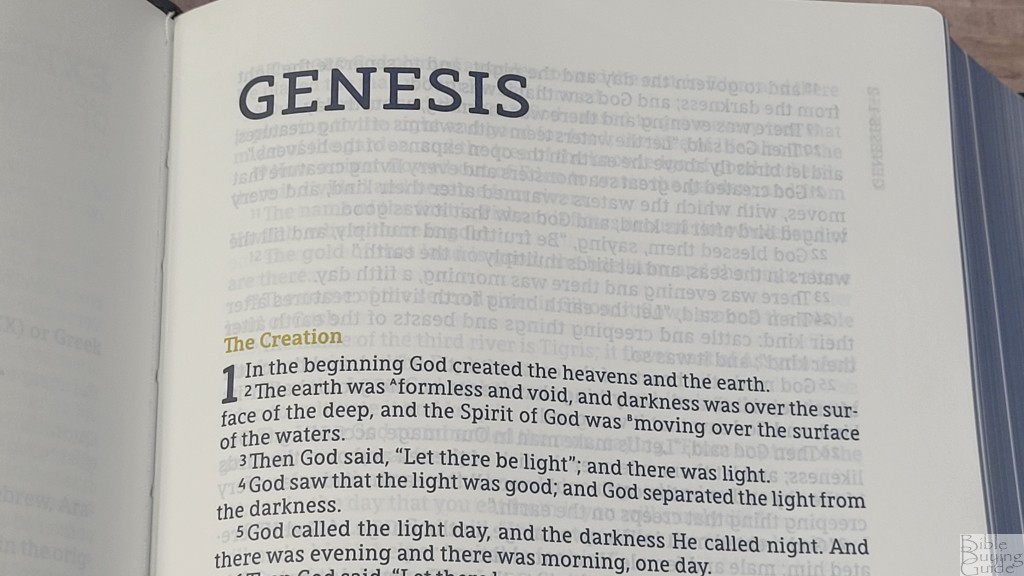
The typeface is a 10-point black-letter Comfort Print designed by 2K/Denmark for Zondervan’s NASB line. The font is dark and highly consistent. It’s printed with line-matching to reduce show-through. This means the lines of text are printed in the same location on both sides of the page. The lines do line up well. Paragraphs are marked with bold verse numbers.

The inner margin has a lot of space that brings the text out onto the flat part of the page. This keeps the lines of text straight, making them easier to read. The outer margin has 3/4″ of space which is good for small notes. Old Testament quotes are in all caps. The footnotes do not include the references they’re quoting, so you’ll need external resources to find them.
Passaggio Setting
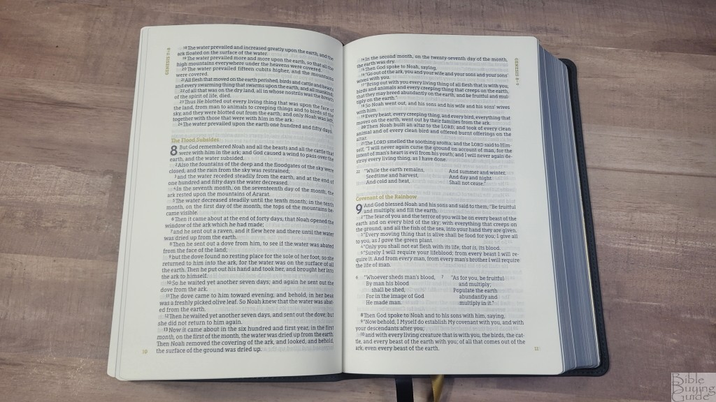
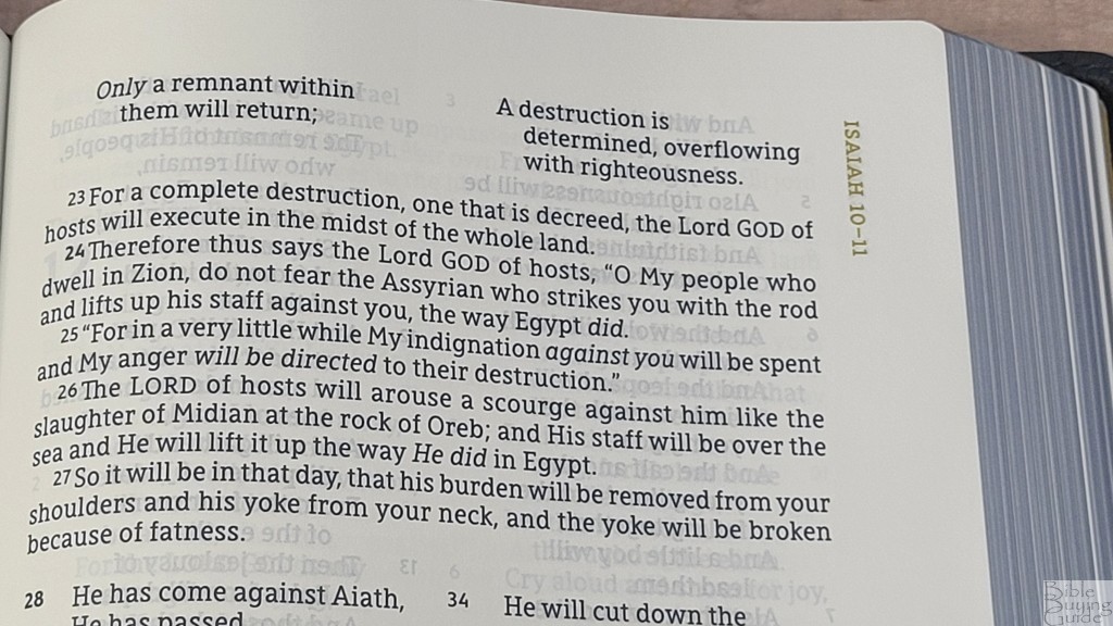
Just like a singer changes registers, the Passaggio setting changes the layout between prose and poetry. Both layouts are meant to be read as normal, whether in single or double columns.

The prose is in a single-column, verse-by-verse setting with 12-14 words per line. Since this edition has a wide inner margin, the lines of text remain straight. This makes it easier to keep your place and know which line to read next. In my opinion, verse-by-verse is not as nice for smooth reading, but it is readable. This edition excels for preaching.
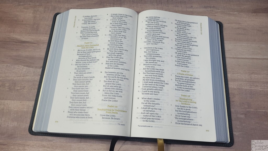
Poetry is in a double-column layout. The poetic lines are divided in good places and look great on the page. The double-column means there is less white space on the page than what we’d see if poetry is placed in a single column. This allows for a larger text. It works well. I prefer this poetry to the Large Print Thinline Passaggio Setting. It’s more uniform.
Footnotes
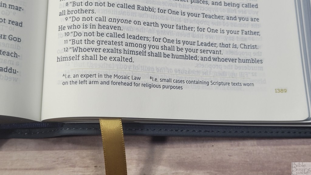
The translation footnotes are placed at the bottom of the page. There aren’t a lot of footnotes. Most pages have 2 or 3. They include information about Hebrew and Greek words and include alternate renderings. They are insightful and helpful for study.
Tools
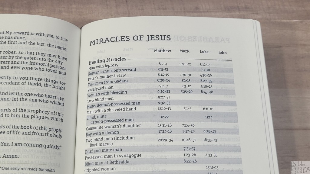
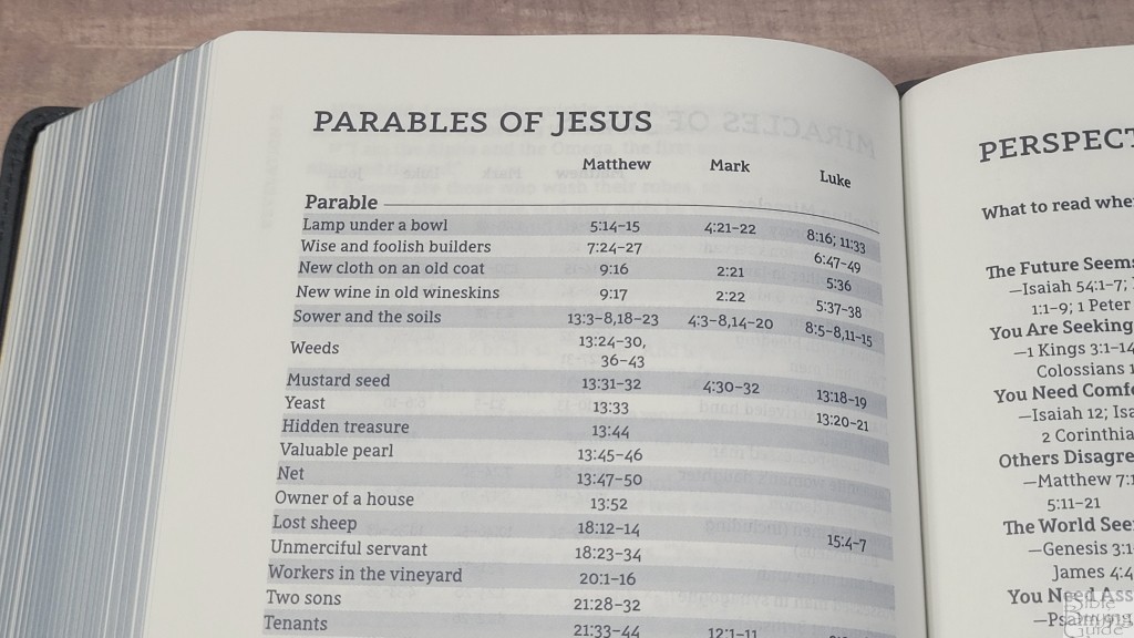
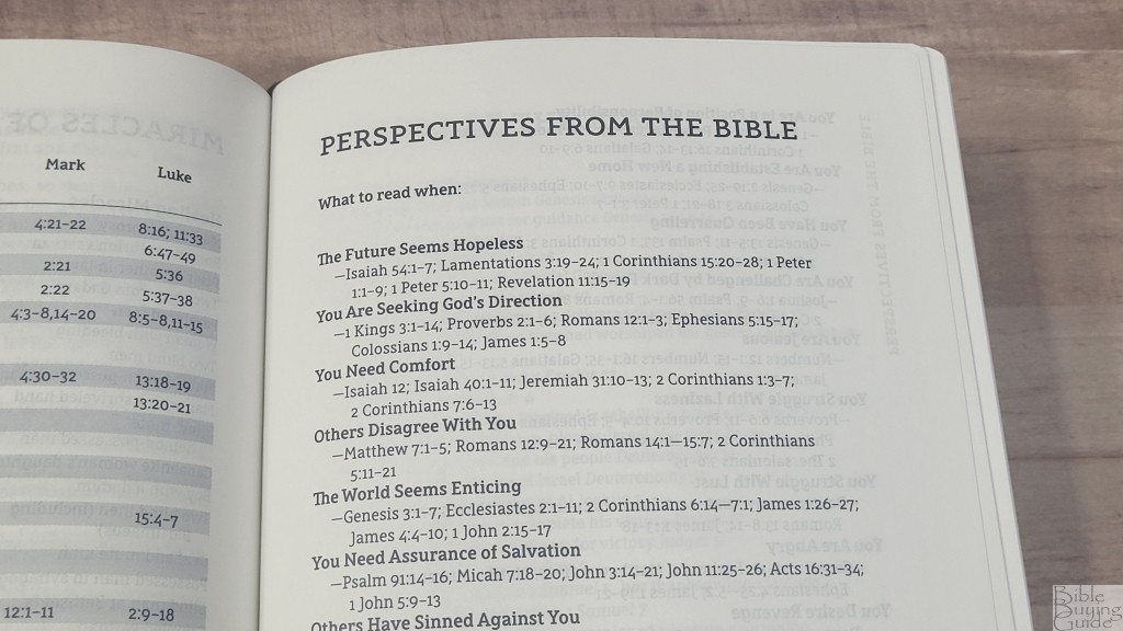
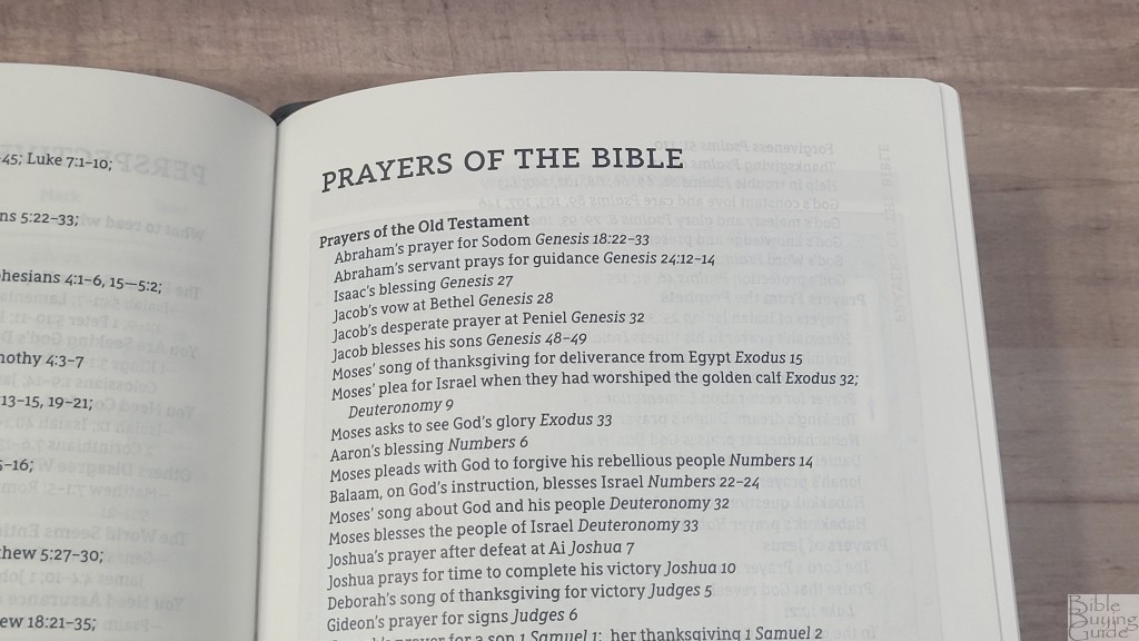
In the back are several lists to help with study. They’re short, but I find them helpful for study. I especially like seeing them include because this isn’t a reference edition. The tools include:
- Miracles of Jesus
- Parables of Jesus
- Perspectives from the Bible
- Prayers of the Bible
Maps
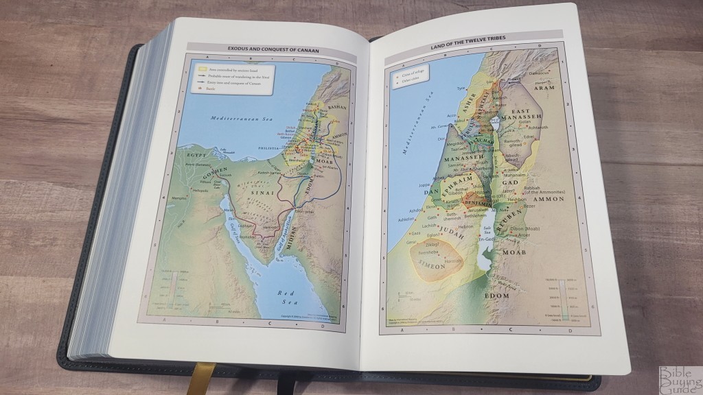
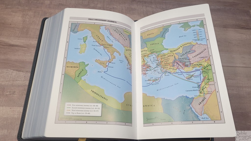
In the back are 7 full-color maps on 8 semi-glossy pages. It doesn’t include an index. The maps are annotated well, making locations easy to find. They include topography, distance, routes, borders, possible locations of lost places, battles, elevation, cities, and locations for the events of Jesus’ ministry. I find them easy to read and use.
Maps include:
- World of the Patriarchs
- Exodus and Conquest of Canaan
- Land of the Twelve Tribes
- Kingdom of David and Solomon
- Jesus’ Ministry
- Paul’s Missionary Journeys
- Jerusalem in the Time of Jesus
Comparisons
Here’s how the NASB Passaggio Setting Heritage Edition Bible compares to the Large Print Thinline in the Passaggio setting. I’ll also compare it to the other NASBs in the Passaggio series when they become available.
Zondervan NASB Passaggio Large Print Thinline Bible
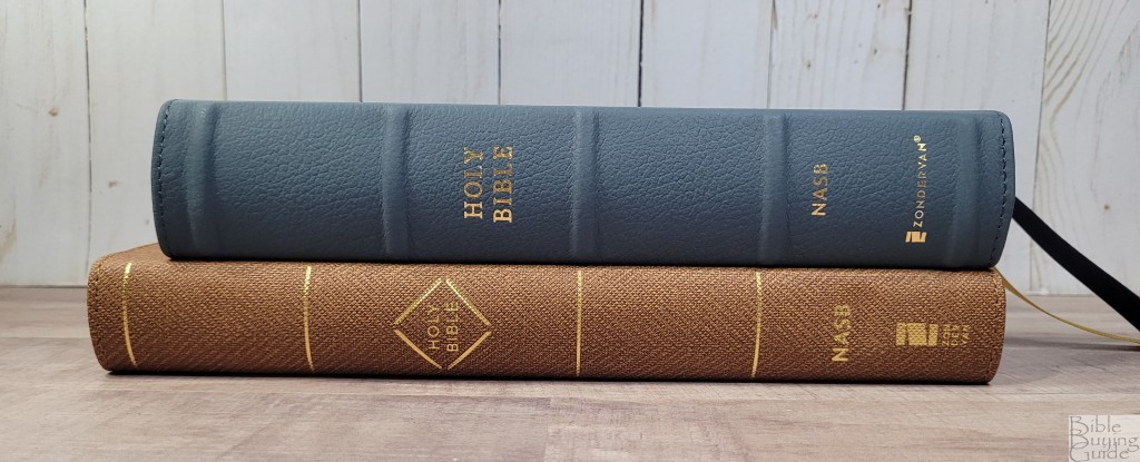
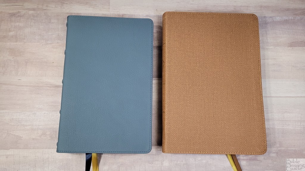
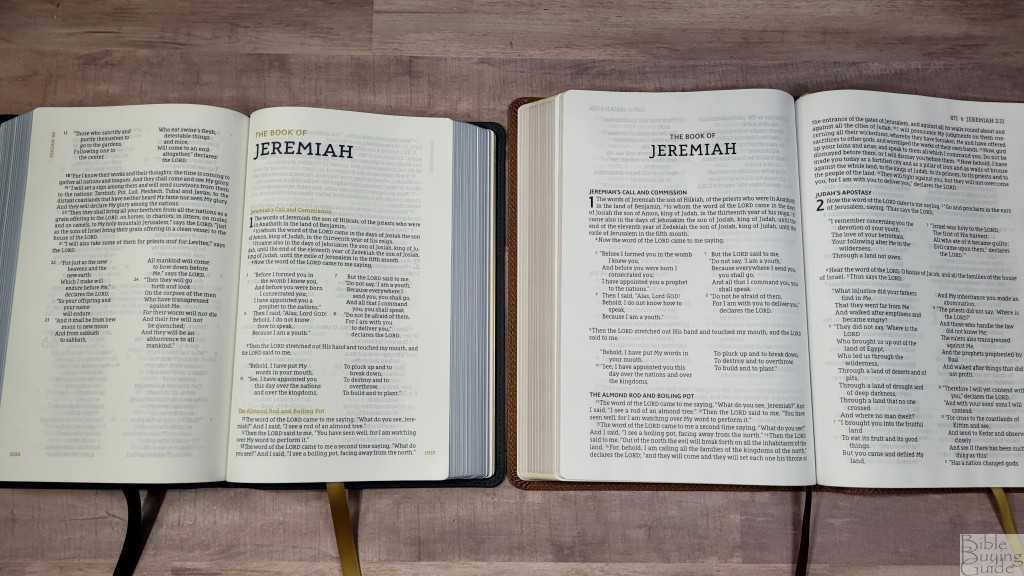
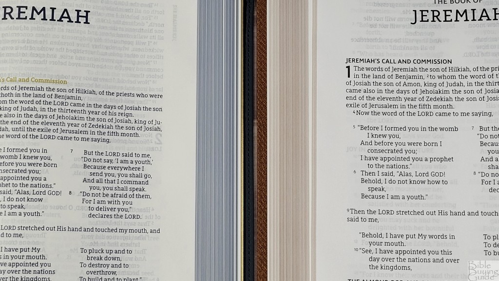
The Zondervan NASB Passaggio Large Print Thinline Bible is the other Passaggio NASB that’s currently available. It’s thinner but has a larger footprint. It also has a slightly larger print. This is a paragraph edition with Zondervan’s standard 30gsm thinline paper and includes the same tools in the back except for the maps. I prefer the thinline for reading and the Heritage for preaching.
Conclusion
Zondervan’s NASB Heritage Passaggio Setting Bible is my favorite of the NASB Passiggio Bibles. It has better materials and a better design for the poetic setting. I like that it has water buffalo leather and premium European paper. The print is dark and easy to read, The vbv layout and uniform poetry make this one easy to preach and study from. This is a good size for all-around use. If you’re interested in a verse-by-verse NASB, the NASB Heritage Passaggio Setting Bible is a great choice.
_________________________________________________________
This Bible is available at (includes some affiliate links)
and many local Bible bookstores
_________________________________________________________
Zondervan provided this Bible in exchange for an honest review. I was not required to give a positive review, only an honest one. All opinions are my own.




Do you know if they will do a hardcover?
Not that I’m aware of. I think they would consider it if it’s popular enough.
Hello Randy, excellent review. I am trying to decide between this and the KJV Maclaren. Your reviews are very informative and I know I can’t go wrong with either one… maybe I can get both if my wife will agree 😀 God bless and thank you for your honest reviews. Grateful to have come across your website and YouTube.
Thanks Kenneth! I’d get both. 🙂 I do prefer the size of the Heritage Passagio, but the Maclaren is an amazing Bible.
What would you recommend for something exactly like this, but paragraph format?
I want a premium NASB, basically exactly this bible, but paragraph format for reading more so than studying/preaching.
I think the type is blue on this edition