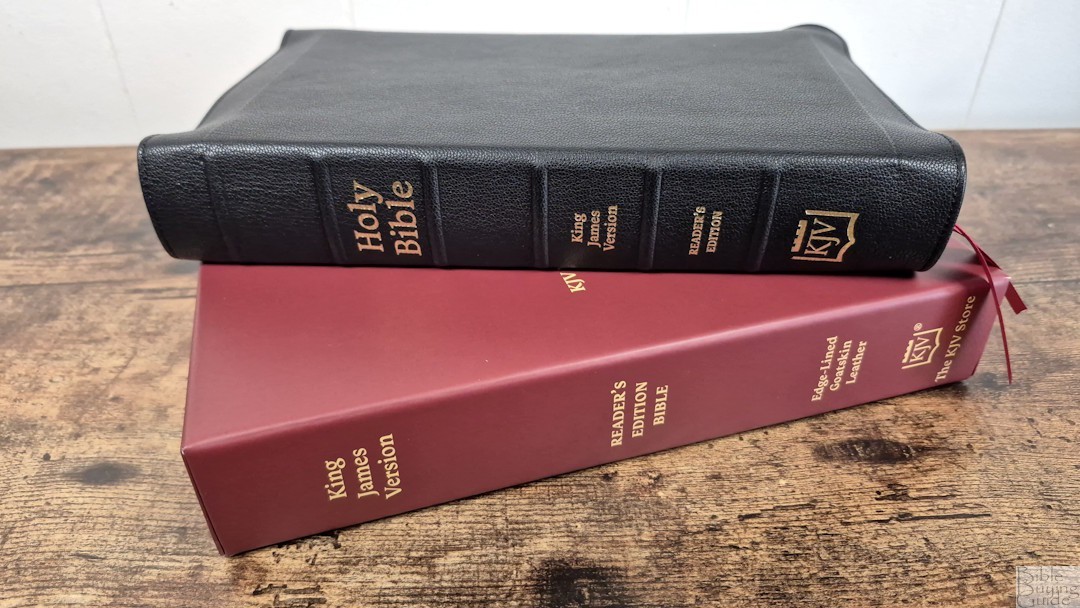
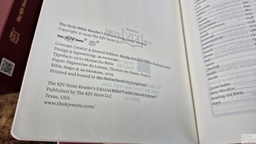
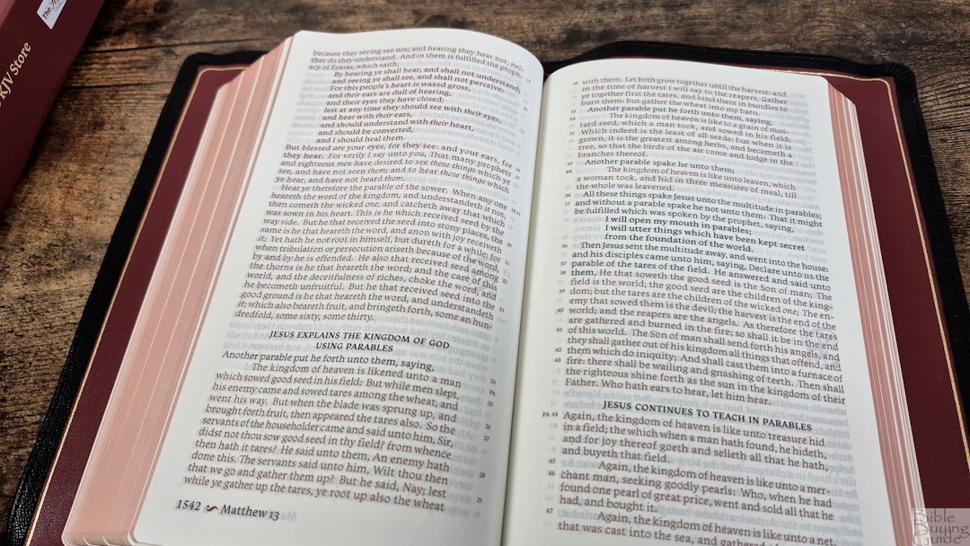
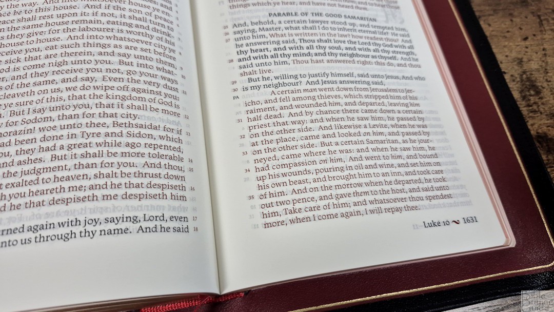
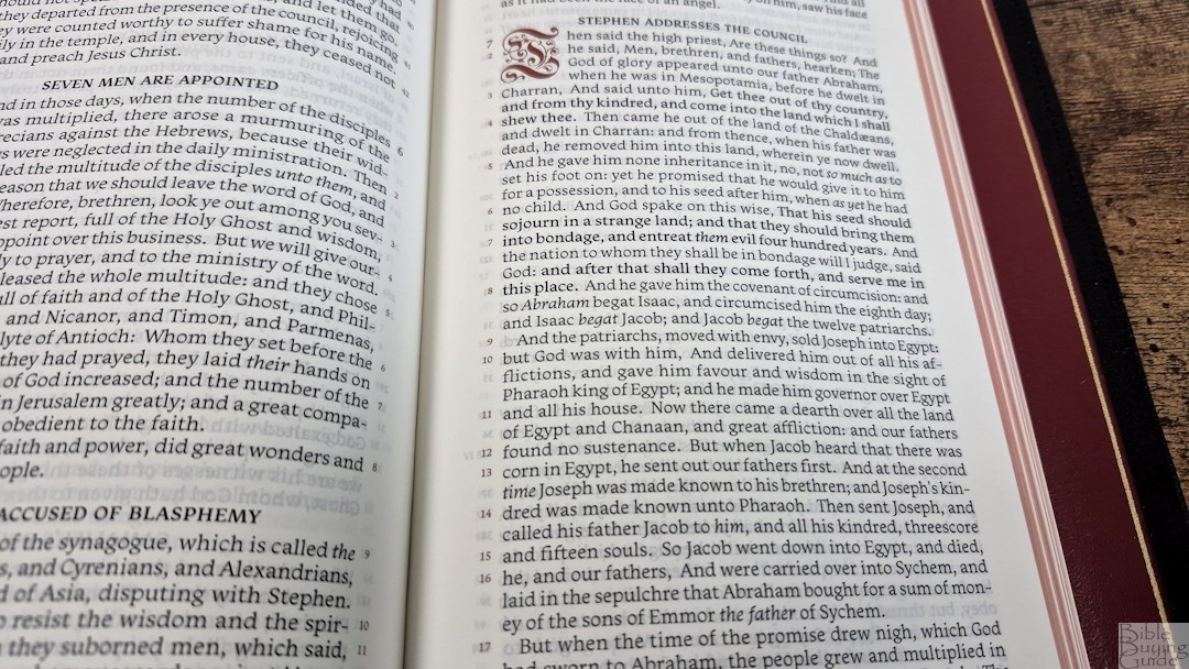
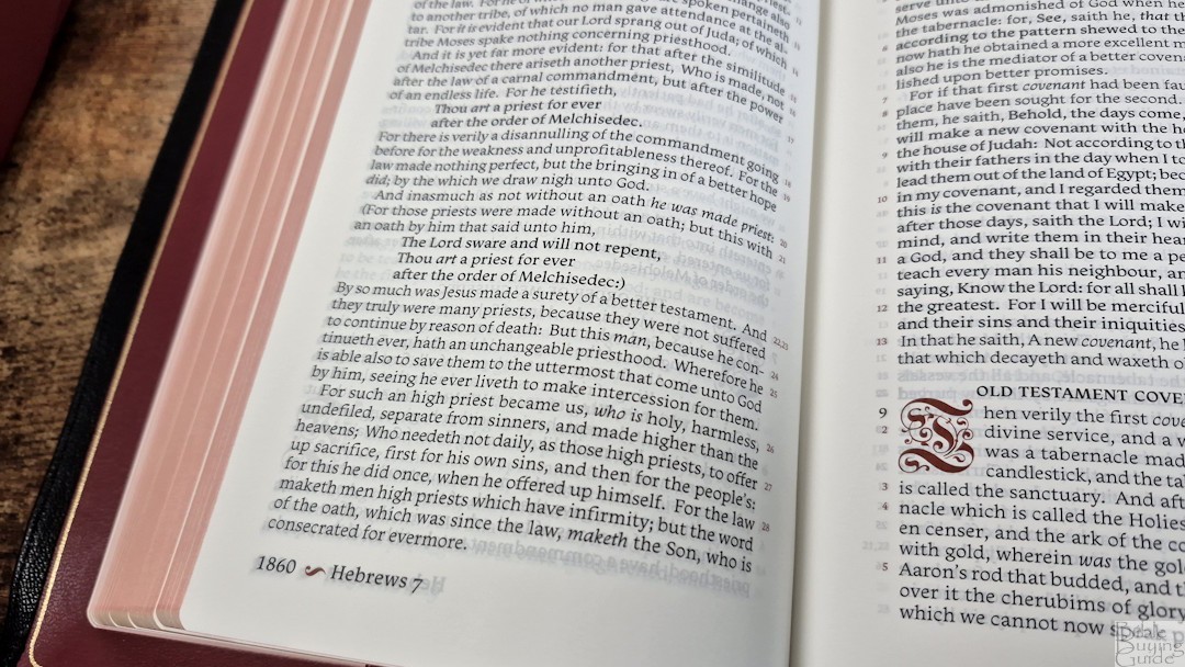
Here’s my first look at The KJV Store Reader’s Edition. I started this project with The KJV Store several years ago, along with 2k/Denmark. 2K took my concept ideas, designed the visual look, added even more ideas, and provided the typesetting. I spent 500 hours marking the design elements. It was proofread by Peachtree and printed and bound by Jongbloed. Photos are under the video.
The first run has sold out, but there is another run coming soon.
Purchase (when it’s available) KJV Store
Photos
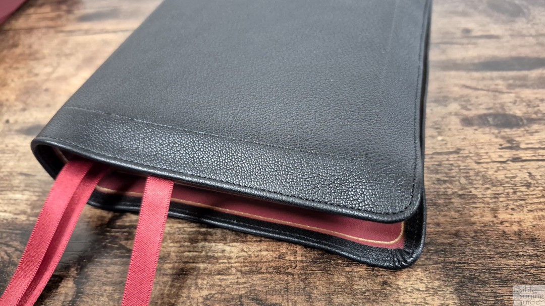
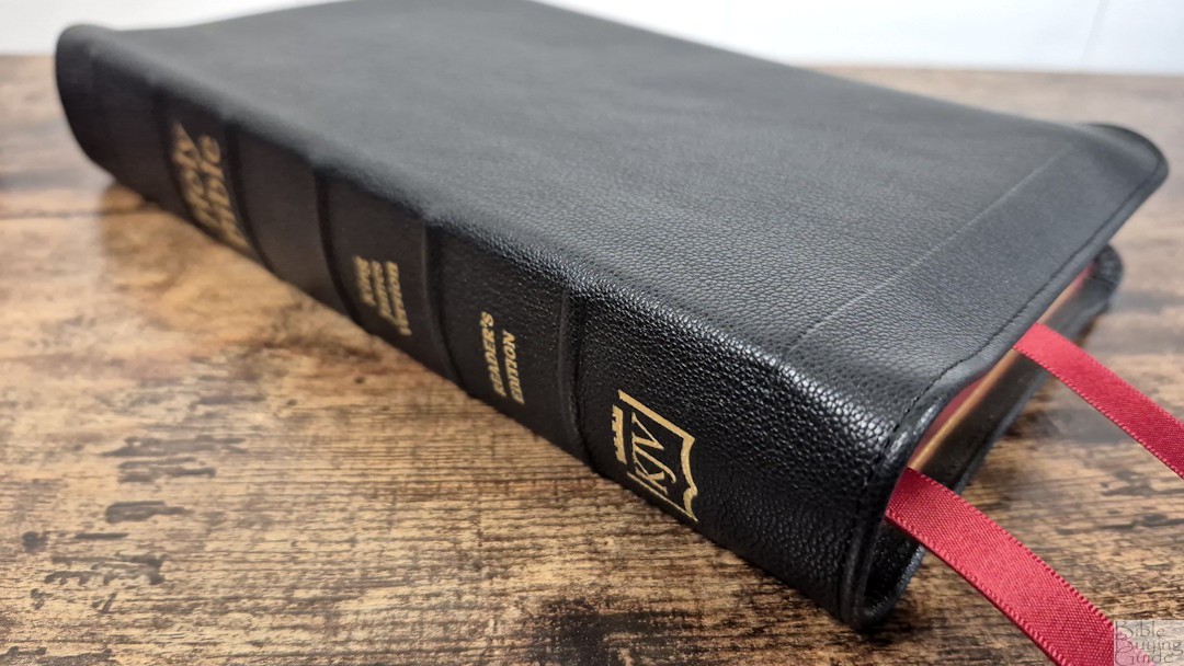
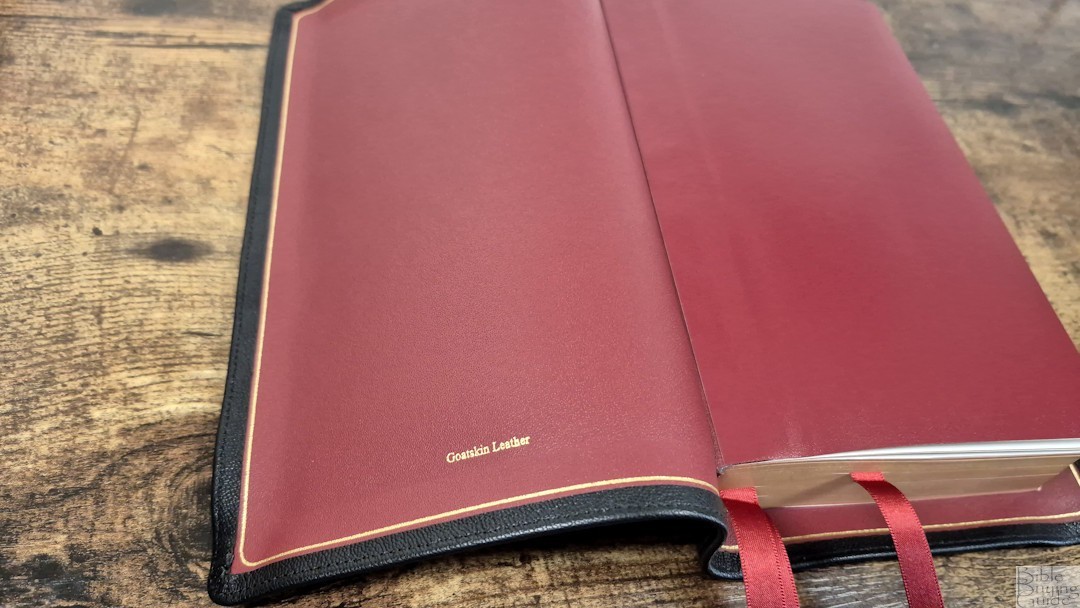
Here are the photos:


Thank you for your work on this! Reading this on my computer with my Reader’s Edition open in front of me!
This Bible will be fun to read!
It looks like a treasure. I will have to get a copy.
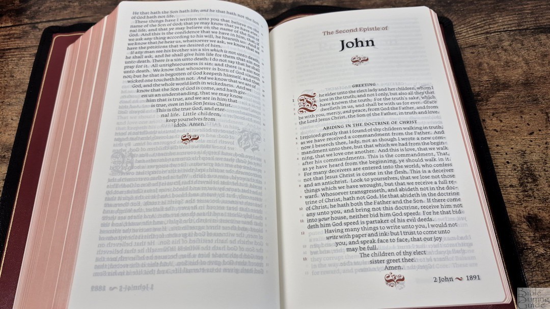
Thanks for your work on this, Randy and all the work you do on reviews! So helpful to us. Congratulations on getting this published after the hours you put into it. I’m curious as to why you chose red lettering for the words of Christ? I read on the Facebook page where one person found this a struggle to read where the entire page was in red letter. Red lettering tends to impair rather than improve the reading experience. Also why did you keep the italicised words, considering it’s a reader’s edition? Do you find this impairs the reading experience? Thank-you!
Thanks Richard! The red letter was The KJV Store’s choice. I didn’t want to make any changes to the KJV text, so it does have italics. I’m used to it, but I’ve read the KJV since the early 80s.
This is a gorgeous Bible and has a lot of great features. Any chance at this format in other translations?
Thanks! There is a chance of other translations if enough people ask for it.
I would absolutely love this format in the ESV, to be able to match the translation my church uses. If that’s ever on the horizon as a possibility!
Who should we send the request to? It really is quite an acomplishment.
You can send it here: https://www.thekjvstore.com/contact-us/
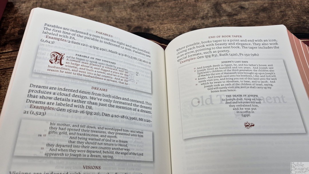
Really the beginning of a new era of bible however i’m not sure how I feel about the end of book taper I get the concept but I would prefer the normal structure. Overall an excellent display both literature and craftsmanship! I love the innovation.
Thank you!
Beautiful bible
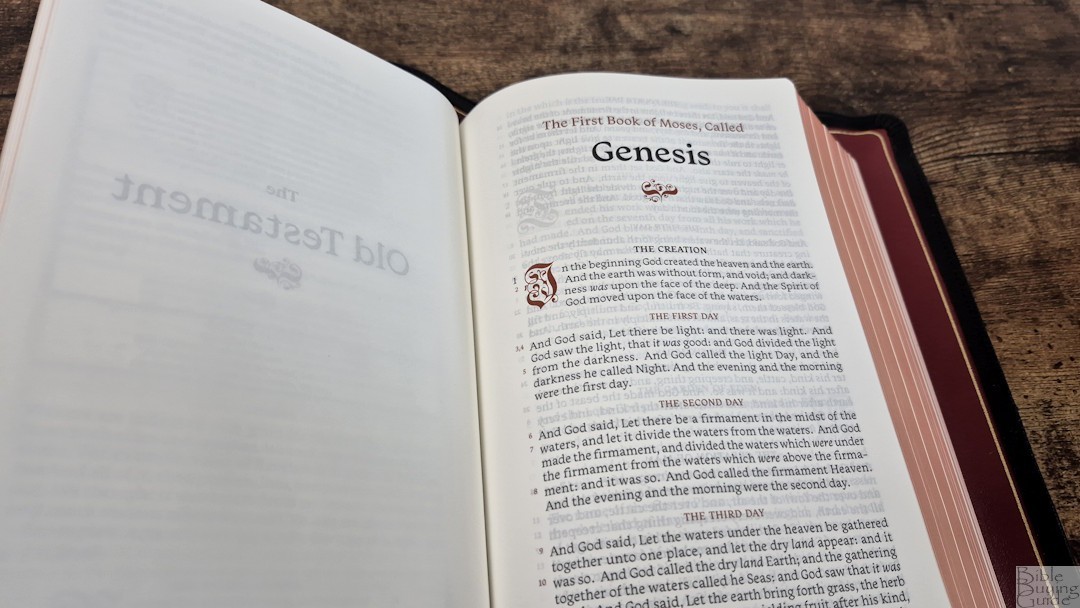
This is almost everything I want in a readers bible. Gorgeous typesetting, single column paragraph format, a good sized font, verse numbers present but not interrupting the flow of reading, etc. etc.
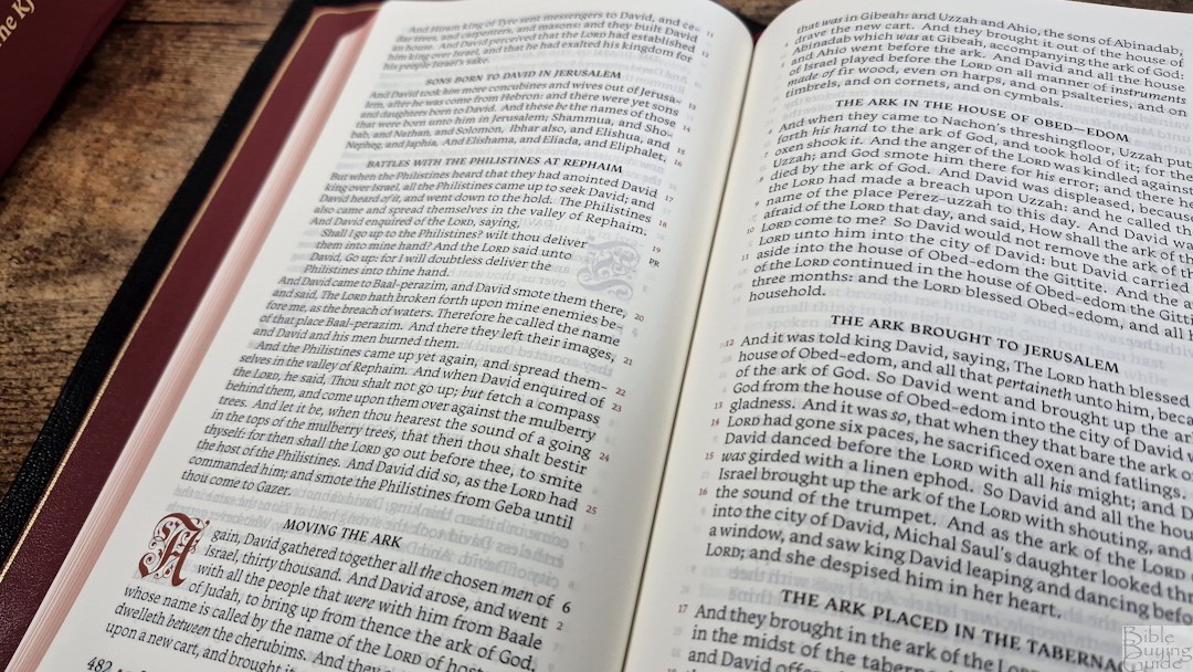
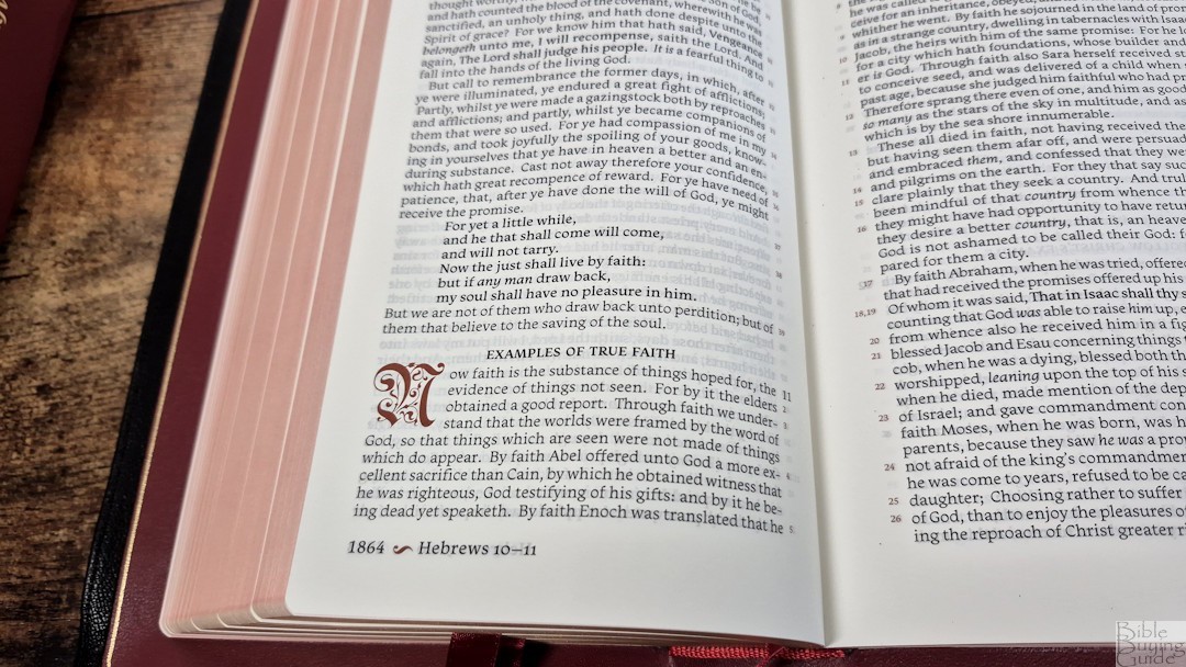
I wasn’t able to buy a copy before they sold out of the first print run. I hope a future print run will be black letter. I love use of the red highlights throughout the bible, but red letter text is hard on the eyes to read.
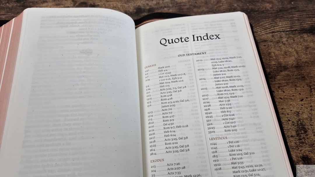
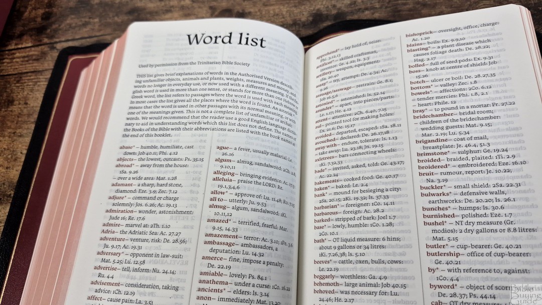
I wish it could have included 1-2 preface pages for every book, with a color photo of something or a map.
Prefaces to every book are great for taking a pause and reflecting on the area, time, etc.
What version of the KJV do they use for the KJV, and any chance of a cheaper version?
They call it a Cambridge text, but it’s not the Pure Cambridge Edition. I think it’s the 1769. There is a possibility of a cheaper version, but I don’t know when that could happen.