The 2019 Kindle Oasis is Amazon’s newest version of their top-of-the-line Kindle e-reader. This is a premium e-reader that’s made for those who want the highest quality reading experience for the Kindle platform and don’t mind paying the premium price to get it. It uses the same design as the 2017 Oasis but adds a new adjustable warm light to make the reading experience even better. In this review, I’ll take a look at the 2019 Oasis and the warn adjustable light to see how well it works.
Note – the 2017 Oasis is currently on closeout.
This Kindle Oasis was purchased for review.
_________________________________________________________
Purhase the Oasis (affiliate)
_________________________________________________________
Table of Contents
- Video Review
- Kindle Oasis Design
- Using the Kindle Oasis
- Screen
- Adjustable Warm Light
- Buttons
- Battery Life
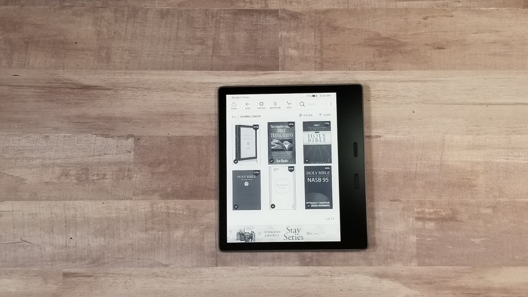
- Books and Bibles
- Comparisons
- Conclusion
Kindle Oasis Video Review
Kindle Oasis Design
The Kindle Oasis has a 7″ screen, page-turning buttons, an adjustable warm front light, 300 ppi screen, is waterproof and has Audible integration. It’s available in 8GB or 32GB, with WiFi or 3G (32GB only), in Graphite or Champagne Gold, with or without offers. I’m reviewing the Graphite 32GB model with WiFi and offers.
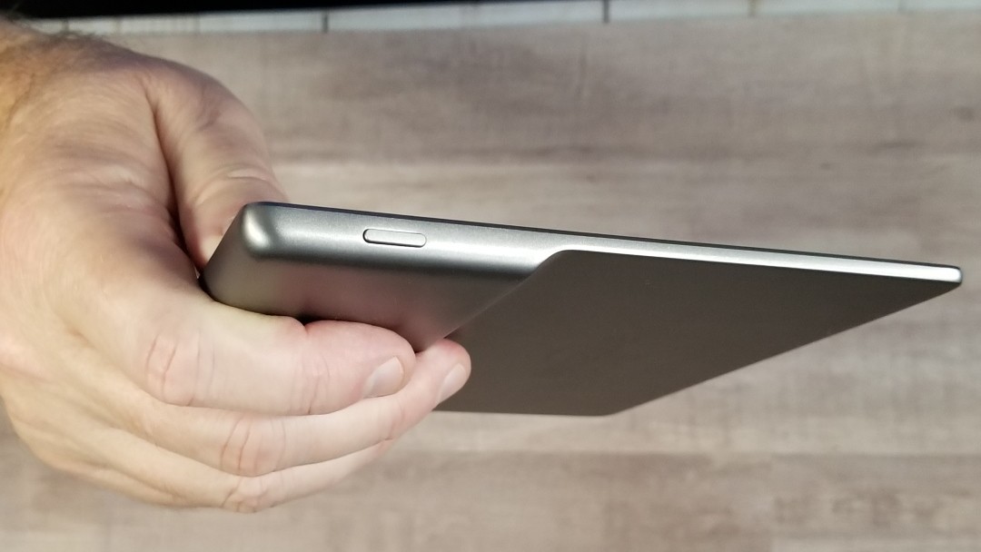
The overall size is 5.5 x 6.25 x .25 sloping to .125″. It weighs 6.6 oz. This is an excellent size and weight for carry and holding it to read for long periods of time. It will fit in a large coat pocket.
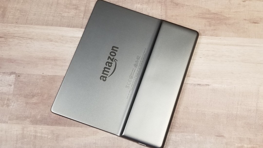
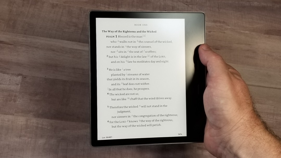
The Oasis truly is ergonomic. The shape looks odd since it has a larger block where you hold it. This is where the battery is placed and it actually makes it feel balanced in the hand.
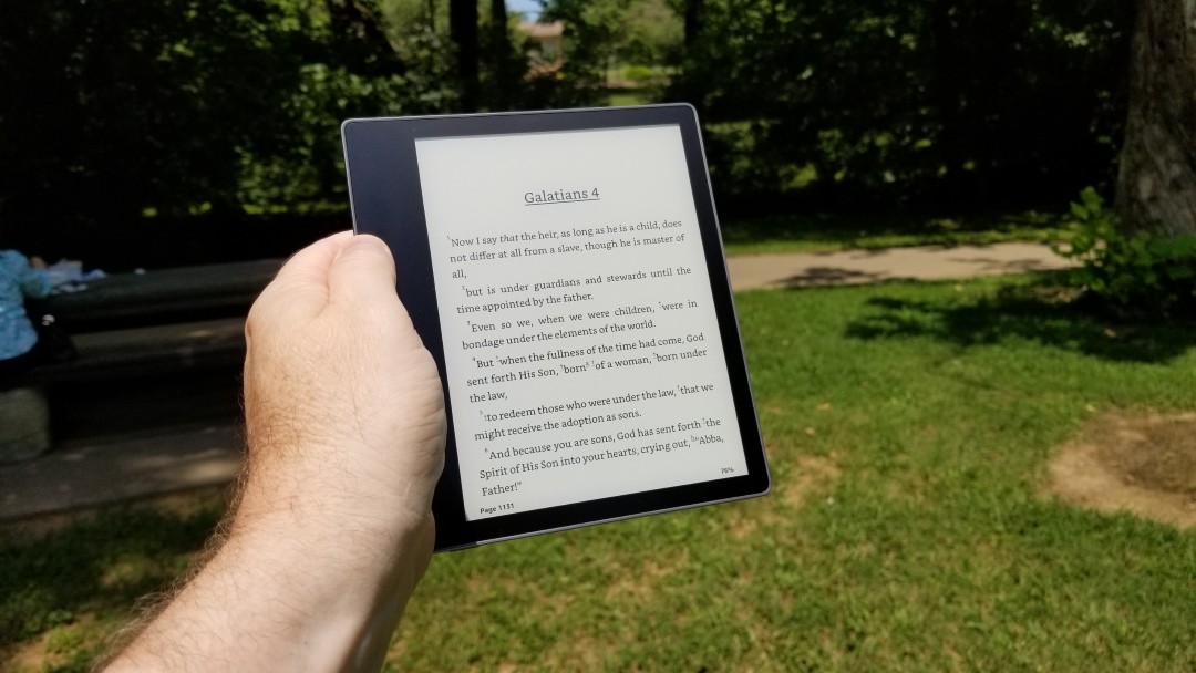
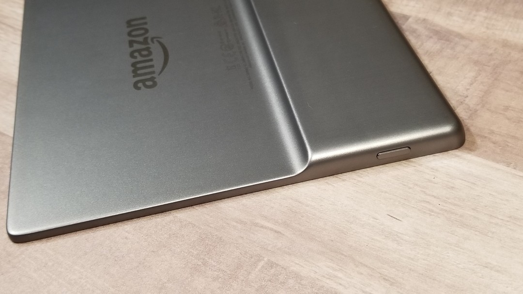
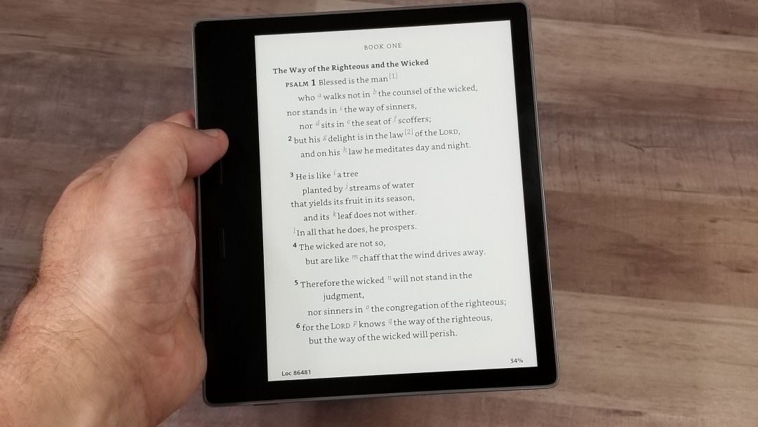
Holding the Oasis in one hand feels natural. The balance point seems to be where the cover on the back reduces from the larger portion to the thinner portion. My fingers naturally sit in this very spot and the side of the frame sits against my palm. My thumb naturally sits near the buttons. I don’t have to think about holding it in place. It just sits there on its own. When I want to turn the page I just press the button. There are no large movements. The Industrial Engineer in me is pleased with this design.
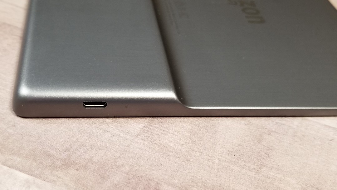
The power button is placed on the top and the Micro USB port is on the bottom. The metal case does feel noticeably warm or cool based on the temperature of the environment. It never felt too hot or cold to use. I had it in the hot car and was still able to use it. For me, it’s noticeable but not problematic.
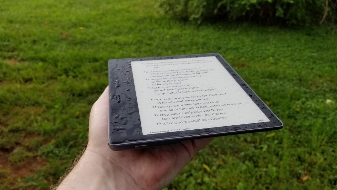
It’s IPX8 waterproof, so there are no issues with carrying it in the rain.
Using the Kindle Oasis
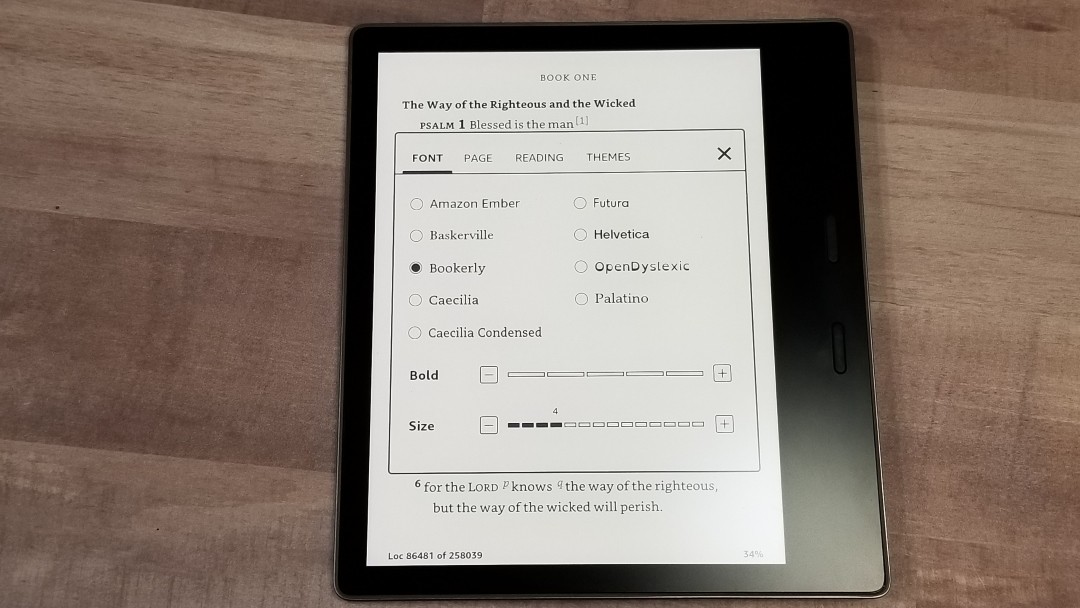
The user interface needs some work in my opinion. I have to click the screen 3 times just to get to the font adjustments. It takes another click to get to Page, Reading, and Themes (personalized settings) tabs within the menu. The Kindle app on other devices this is done with 2 clicks. The Kindle should set the standard that the Kindle app would follow. Instead, the Kindle app is more robust than the Kindle itself. Of course, it does have pinch zoom that will open a font size setting. You can adjust the spacing of the margins, and once you create a layout you like you can save it as a theme.
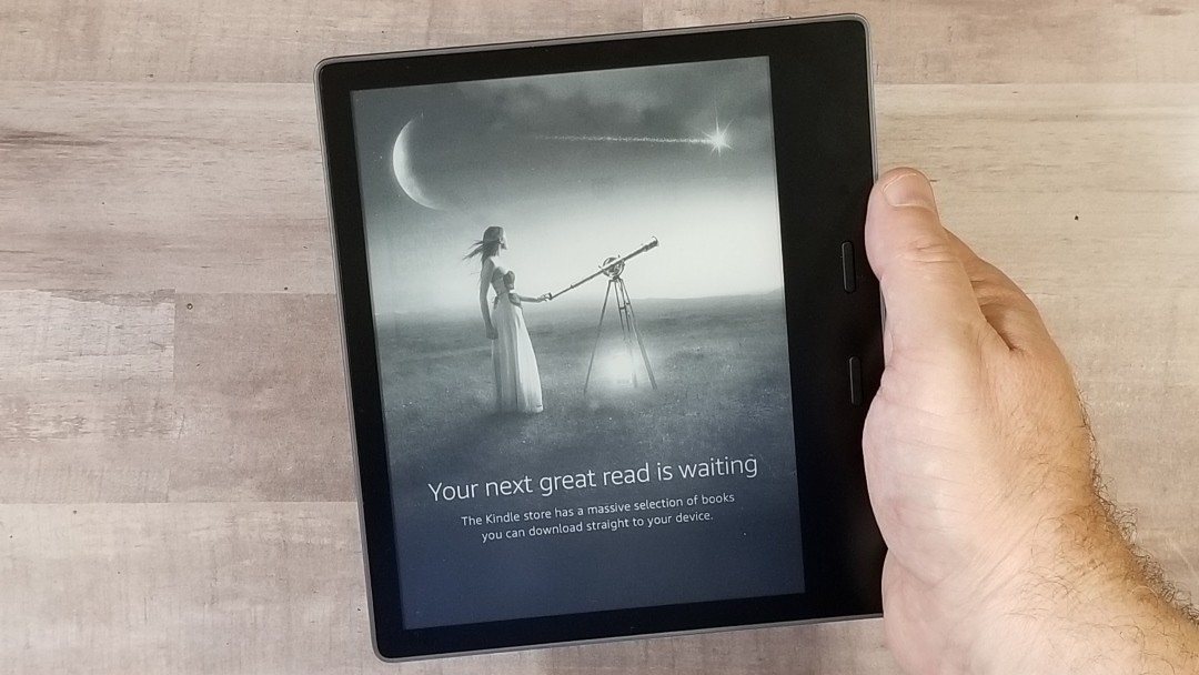
I bought the edition with offers. This means that Amazon places an ad on the screen in sleep mode. I don’t mind this at all, but there have been a few book covers that I felt were inappropriate. I’d like an option to not show books or covers that I don’t like. To remove the offers costs another $20.
I have had some issues with it restarting and freezing. We bought a Paperwhite during the Prime Day sale and it has the same problem. Since both have different hardware but the same software, this leads me to think the OS needs some work. It’s not enough to keep me from using it, though.
Screen
The screen is 7″ diagonal. Its overall dimensions are 4.18 x 5.5″. The resolution is 300 ppi (pixels per inch), which comes to 1680 x 1264. At this resolution, the text looks laser printed. It has 16 shades of gray. Although it’s black and white (monochrome), photos and art look amazing.
It’s not backlit (meaning that the light shines through the screen into your eyes through a diffuser). Instead, it’s front-lit (meaning the light shines across and onto the screen, more similar to a book light). The 25 LEDs give the screen a smooth amount of coverage. It’s extremely clean and consistent. I can read this screen for hours with no eye fatigue.
Adjustable Warm Light
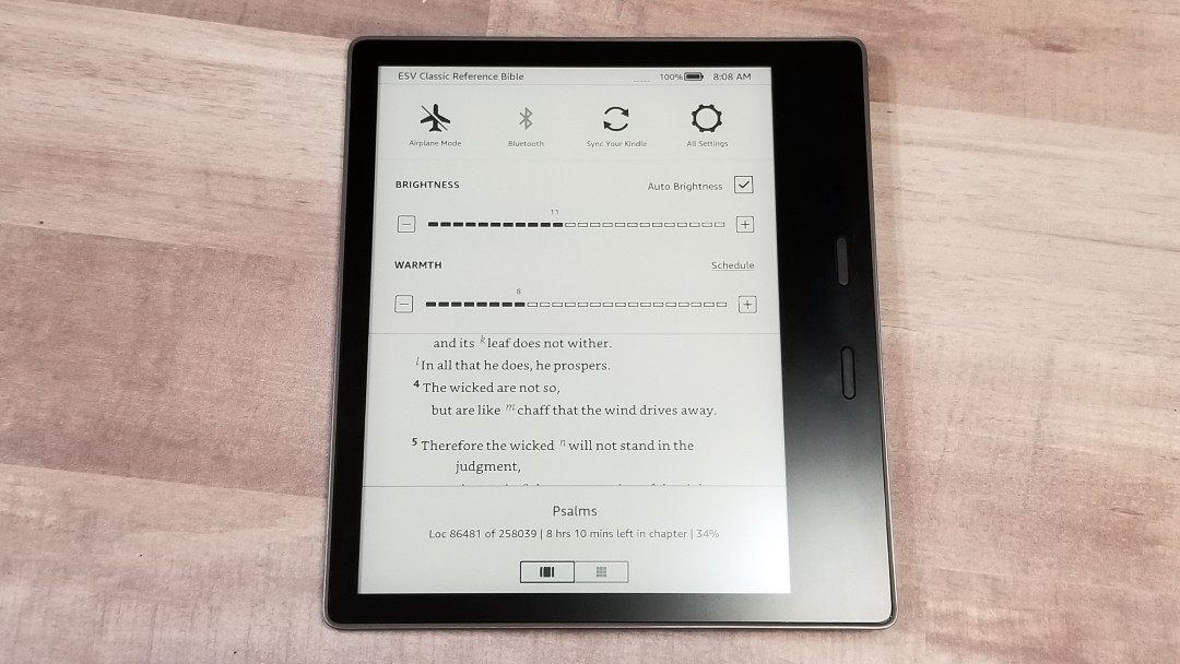
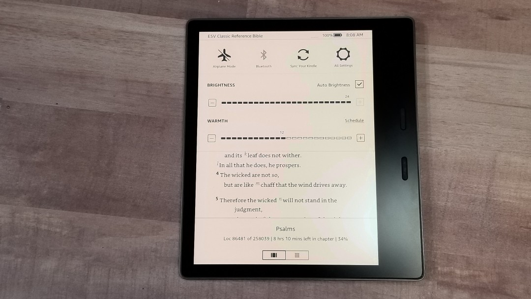
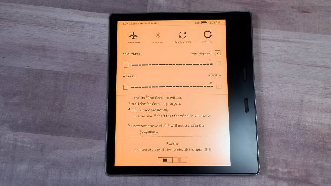
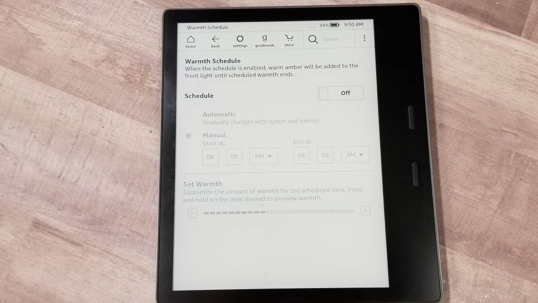
The lighting has two new features: Auto Brightness and Warmth. The Warmth setting allows you to blend the white and amber LEDs to get your desired warm tint. It doesn’t affect the e-ink screen itself – only the lighting. I am able to get that perfect amount of creaminess that I love in premium Bible paper. I prefer just a hint of warmth, around 7.
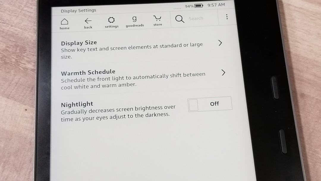
Both have scheduling features. You can set the warmth based on the time of day or adjust automatically with the sunrise and sunset. The screen brightness can be set to decrease brightness over time as your eyes are adjusting to the darkness.
The auto-brightness seems to take a few seconds to finish adjusting. While reading, it sometimes adjusts too often and sometimes not enough. I tend to like the screen brighter than it does. I don’t read on full bright, but I do like it close.
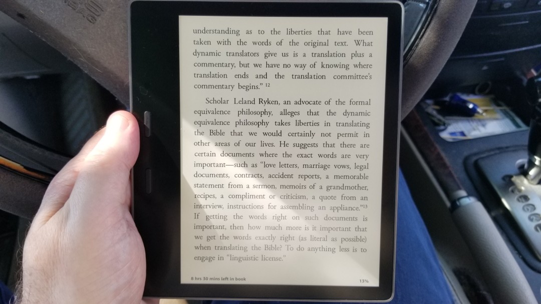
The light even works outside as long as you’re not reading in direct sunlight. Then, the light is overpowered by the sun and doesn’t affect the warmth of the screen. Of course, the light isn’t needed in direct sunlight and the screen is still just as readable. It has a slightly off-white color without the light or in direct sunlight.
Buttons
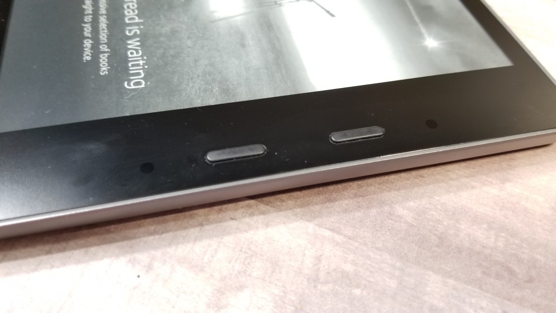
The buttons are easy to use and have a satisfying click to them. They’re not too sensitive. I can lay my thumb on the button and it doesn’t turn the page, but at the same time, it doesn’t take a lot of effort to click the button. By default, the top button goes forward in the book. This can be changed in the menu. When you turn the Kindle and place it in the other hand the buttons change to match. I find using the buttons to be easier to use than tapping the screen. It’s more ergonomic, plus I don’t accidentally click on a reference key or select a word to see its definition.
Battery Life
The battery life is reported as weeks, but that’s only if you use it for 30 minutes a day, without WiFi, and with the light set to low or off. If you’re a serious reader you won’t get anywhere close to weeks on your battery life. I use about a week’s worth in a day. That’s still excellent battery life, though.
Books and Bibles
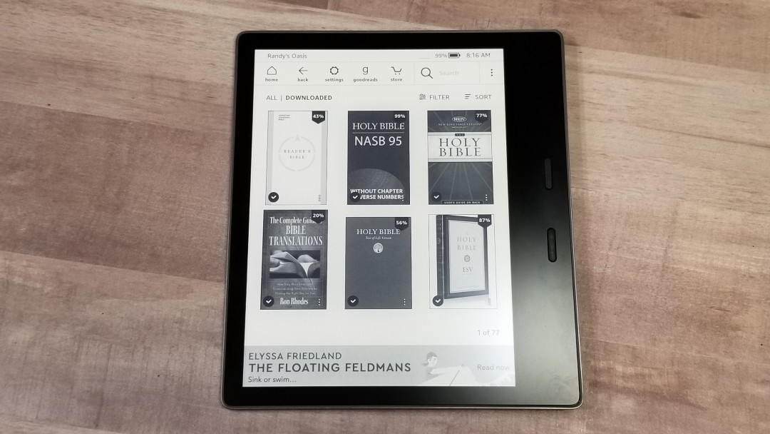
There are thousands of books available for Kindle and the Oasis displays them beautifully. Bibles include reader’s editions, text editions, references editions, and study Bibles. You can download a sample of any book or Bible you’re interested in to see how usable it is on Kindle. I found fiction and non-fiction to be a joy to read on Kindle as long as most of the content is text.
Navigation
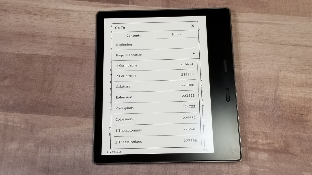
Navigation is up to the publishers and some know more about Kindle usability than others. Most have their table of content with the books of the Bible. Clicking on the book you want takes you to the beginning of the book where you can choose the chapter you want. Some make it more confusing than it needs to be, and there are a few that don’t even have navigation. Fortunately, navigation is included in all of the samples so you get to try it out before purchasing a book or Bible.
Footnotes and References
Most study Bibles add the notes within the text. Some include links that you can click on to see the notes. These allow you to ignore them easily and keep reading if you want. Some reference editions have the footnotes and references at the end of a chapter. This requires you to click a page or two to get to the next chapter. Others add them to the end of each book. This requires you to click so many pages that’s it’s easier to go back to the table of contents on most books. Others add them to the end of the Bible. This is the best choice for improving readability as all the other options interrupt the text.
Poetic Layouts
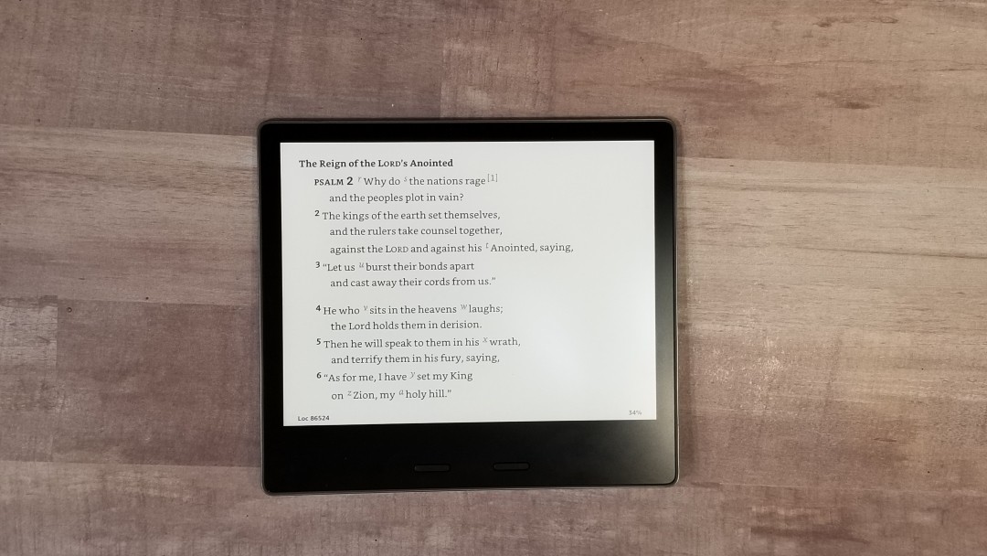
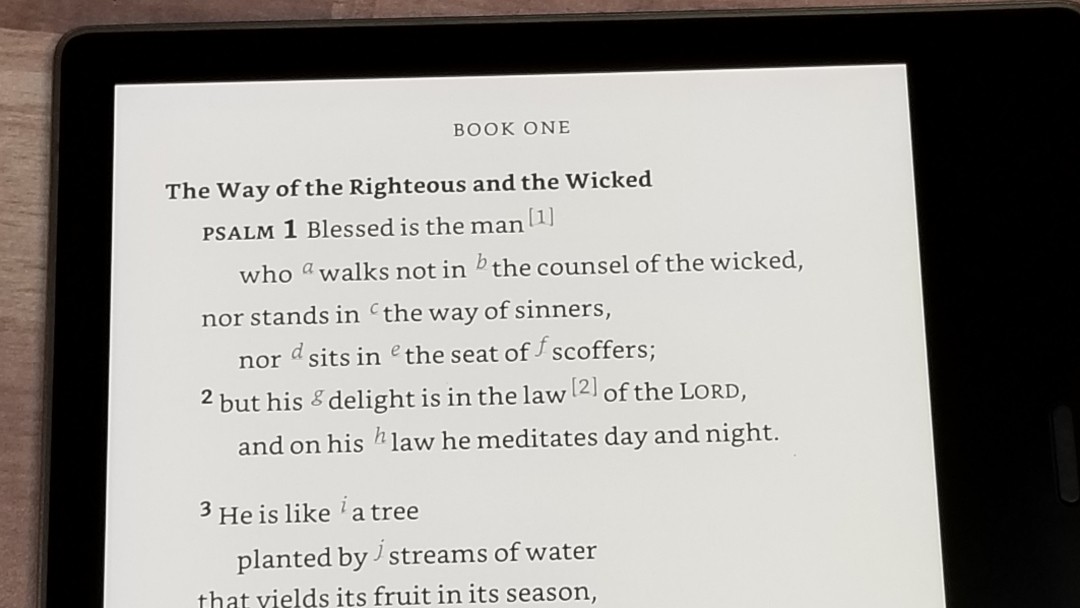
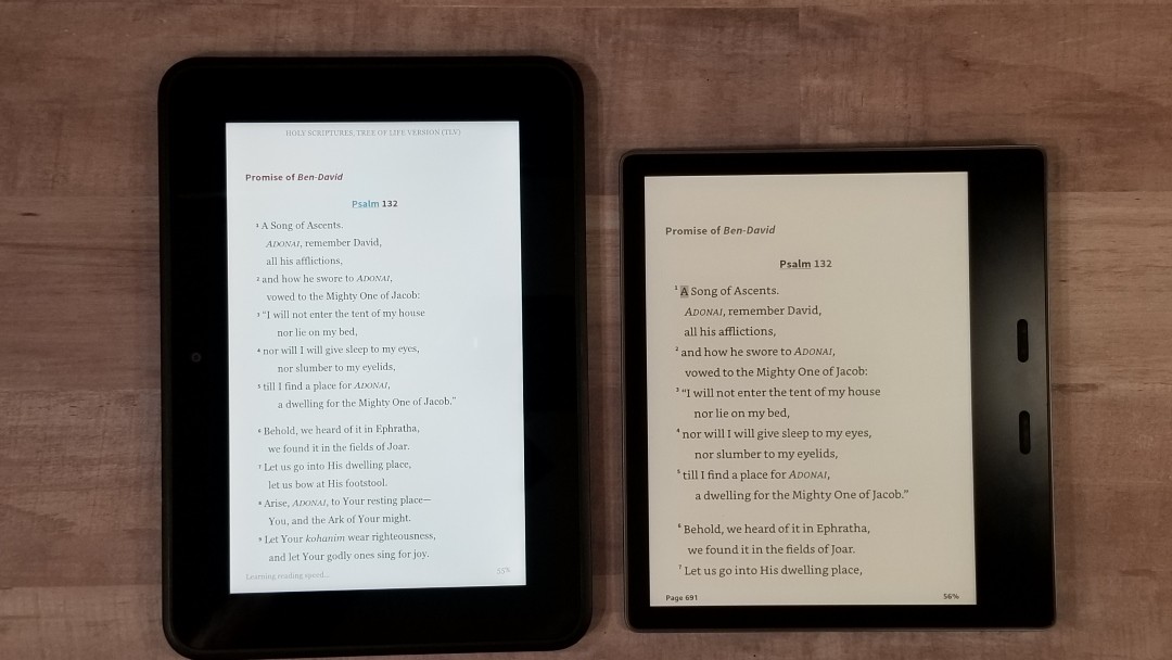
The larger screen of the Oasis is great for poetic layouts. The extra width of the screen means you can have a medium-sized font without the poetic lines breaking in awkward places. If you want a larger font you can place the Oasis in landscape mode. When the lines do break, most of them break in logical places in the sentence and some even indent the line so it stands apart from the next line and it’s obvious that it goes with the previous line. Fortunately, you can see the poetic settings in the samples in Genesis to give you an idea of how well they work.
Some of my Favorite Bibles for Kindle
There are a lot of good Bibles on Kindle, but I’d like to see some better designs. For example, there isn’t an NKJV in paragraph and many reference editions have the reference and footnote keys so large that they’re distracting. The designs can use some serious improvement. There are a few that I like a lot.
Some of my favorites for reading include:
- ESV Reader’s Edition
- CSB Reader’s Edition
- NASB 1995 without chapters and verses
- TLV text edition
- NLT Text Edition
- Immerse
- NIV Books of the Bible
Comics
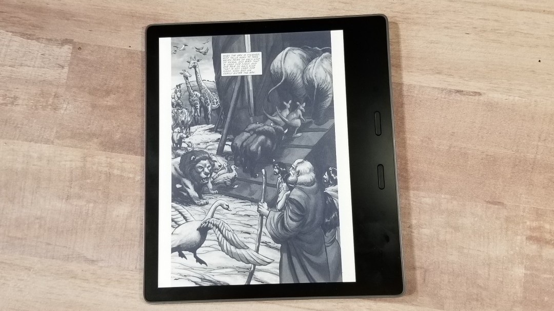
Comics (such as the Action Bible which is currently $2.99) do look good on the Kindle Oasis. Clicking on a panel enlarges the text. Swiping takes you to the next panel of text until you get to the end of the page. Then, it shows the page in full screen, changing back to the panel view when you swipe again. You can also pinch-zoom and swipe to scroll around the page.
I found comics a little tedious to read. I actually prefer reading them on a large tablet (or even a smartphone) using the Kindle app. I’d read them on Kindle if I didn’t have access to a color screen.
Comparisons
Paperwhite
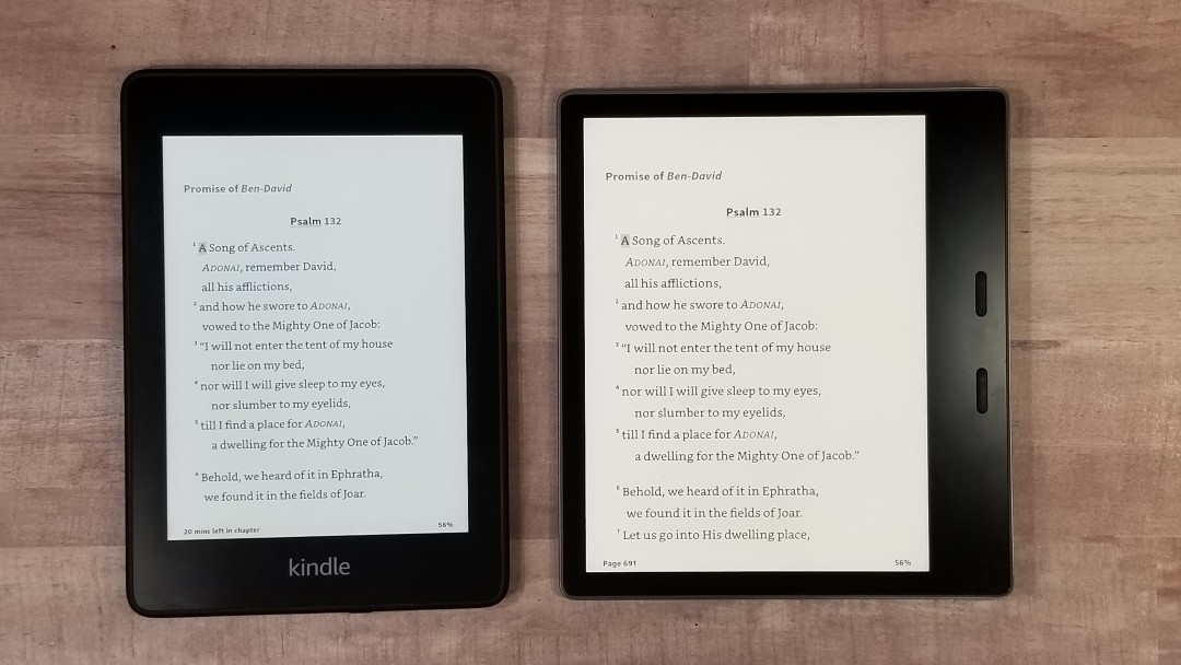
The Paperwhite is an amazing Kindle. It has the 6″ front-lit screen with 300 ppi, is waterproof, is available in 8 or 32 GB models, and has Audible integration. The only reason not to get it over the Oasis is if you really want the larger screen, turning buttons, ergonomic design, and warm lighting. It’s about half the price of the Oasis and it’s an excellent option.
Fire 7
The Fire 7 is larger and heavier. It has a backlit color screen but doesn’t have the resolution of the Oasis. It’s a good choice for casual reading (less than 30 minutes per day) and if you need to run apps. If reading is your goal, then get a Kindle of some kind.
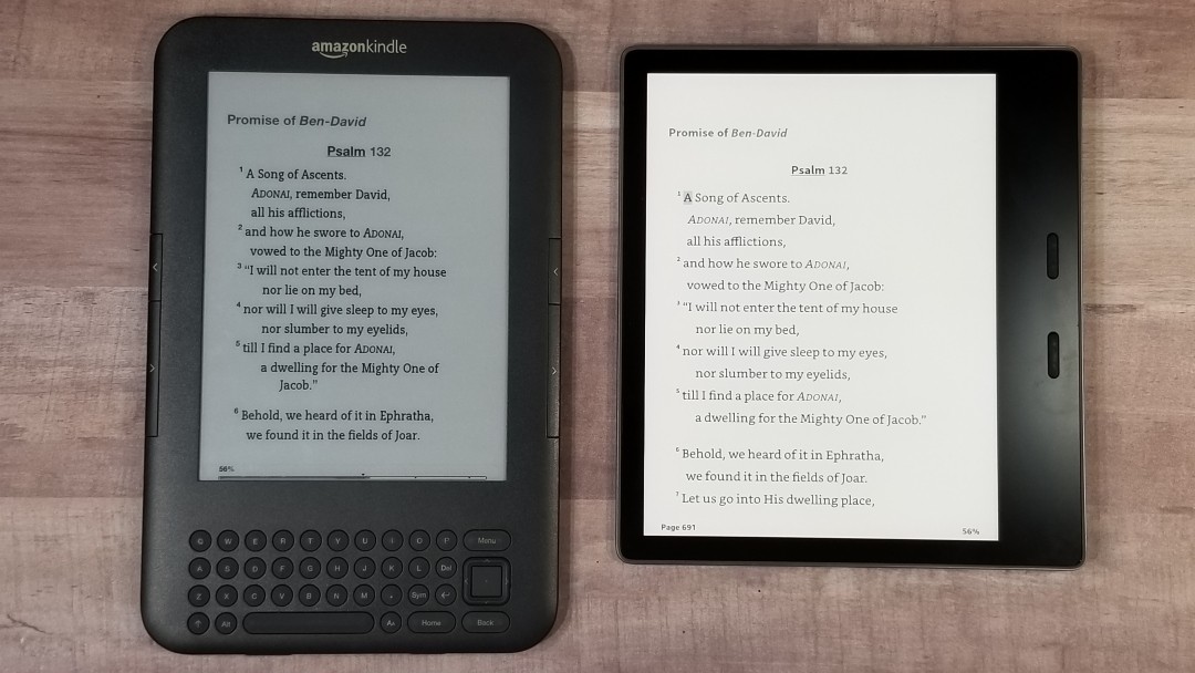
Kindle Keyboard
The old Kindle Keyboard is still an excellent reader, but the front-lighting and touch screen of the newer Kindles are a better option.
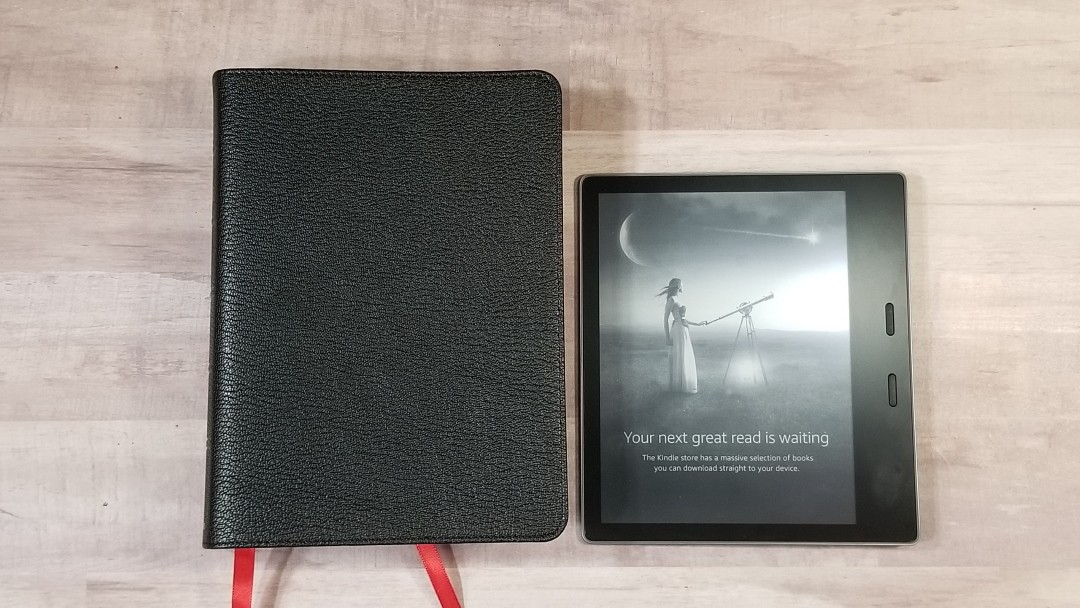
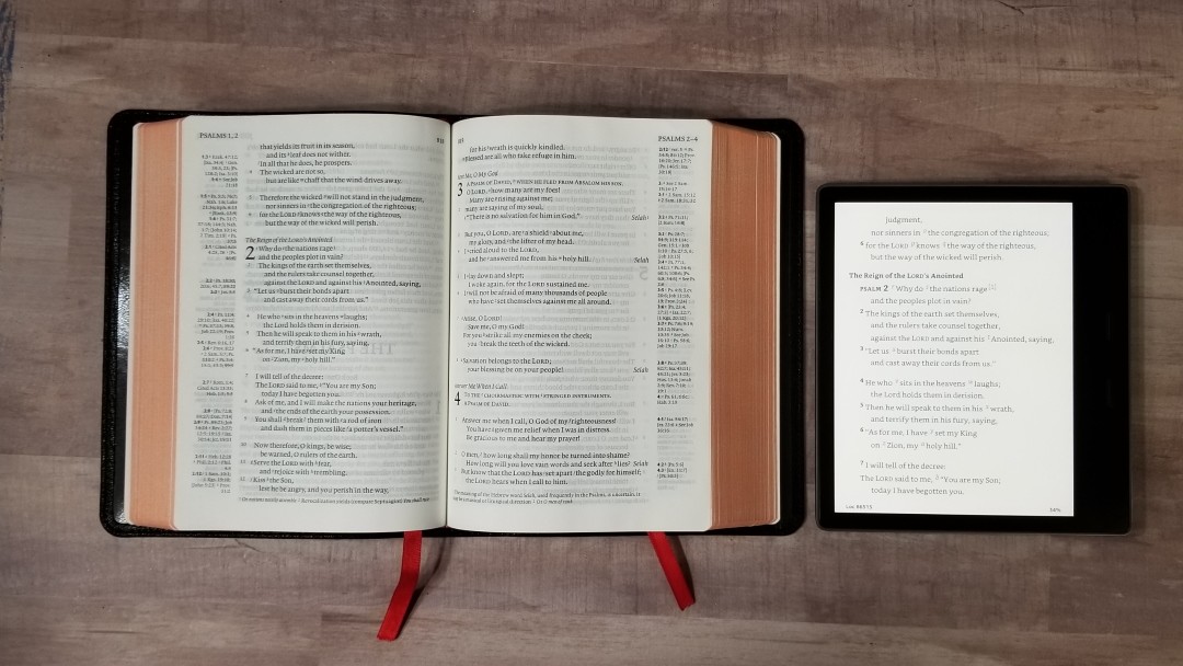
Clarion
Here’s how the Kindle Oasis looks against the Cambridge Clarion.
Conclusion
The new Kindle Oasis is the best Kindle so far. I love the size, buttons, color temperature controls, and how it feels in the hand. The ergonomic design of the Oasis and it’s lighting options helps me forget that I’m holding a device. The focus is on reading the content.
Electronic ink is by far the best choice for reading on a device. Tablets and phones fatigue and damage your eyes over time. If you’re serious about reading and you want a device, then I recommend an e-reader. Kindle is my personal favorite.
Which is best for you?
If you read a few hours per week, then I recommend the cheapest Kindle you can get. If you read for an hour per day and you don’t need physical buttons, a larger screen, or color temperature controls, then the Paperwhite is the best option. If you read for an hour or more per day, then you’d appreciate the extra features of the Kindle Oasis.
_________________________________________________________
Purchase the Oasis (affiliate)
_________________________________________________________
This Kindle Oasis was purchased for review.
Do you have a Kindle Oasis? Tell us how you like it in the comments.






Recent Comments