
I recently had the opportunity to interview Mark Ward of Faithlife. Mark writes and teaches about Bible design (one of my favorite topics), Logos software (one of my favorite apps), and the Bible in general (back to my favorite topic), so I wasn’t about to pass up the opportunity to toss some question his way. He was gracious with his time and provided some seriously detailed answers.
So we have for you today the complete unedited interview with Mark Ward. On to the interview…
Introduce yourself to our readers.
You’ve written and taught a lot about Bible layout design. How important is the layout to Bible reading and comprehension?
Bible design is more important than most people think to the main thing we’re supposed to do with the Bible, namely read it. And that’s why I write about it so often. There are many choices a compositor must make when laying out a page, and though any individual choice, taken by itself, may not be very significant for readability, they make a big difference in the aggregate. Many educated people—I just can’t say “most” given the prevalence of Comic Sans and Papyrus—realize that font choice is significant. They may even know that sans serif typefaces are not conducive to long-form reading. But I wonder if they’ve thought about line length, leading (the space between lines), kerning (the space between individual letters), justification (or lack thereof), white space, and—especially—paragraphing. I feel that Bible publishing was for a long time constrained by unhealthy traditions that ran counter to contextually sensitive Bible reading.
Do you feel that publishers are starting to take notice?
Yeah, I definitely do. I feel that Crossway, in particular, has taken a lead here and forced others to follow. People complain about capitalism’s nefarious effects on Bible publishing—as if the existence of tons of great Bible editions and translations is a bad thing! I’m speaking as an outsider here; I’m not privy to publishers’ internal counsels. But it has always seemed to me that someone over at Crossway had a Steve-Jobs like epiphany and saw that beautiful form is a necessary part of useful function.
One of my favorite Bibles right now, the one that’s sitting on my desk as I write, comes from Holman Bible Publishers. Their design, to my mind, clearly apes a previous Crossway edition—and I rejoice. Because Holman had a few innovative ideas, too, that I hope Crossway will now be forced to adopt. The overall trend in Bible publishing, it seems to me, is generally one of typographical improvement.
The value of good Bible design really hit the big time—and caused the entire Bible publishing world to take notice—when Adam Lewis Green’s Kickstarter project, called Bibliotheca, obliterated its funding goal just a few years back. Any naysayers out there, people who think careful Bible design is a fad, should watch Adam describe his vision—and note how many people were inspired by it. He had me at hello, of course.
You’ve also written a lot about the KJV and you recommend the New Cambridge Paragraph Bible. Can you expand on that?
I do care about beautiful typography for its own sake; beauty is its own reward. But when it comes to Bibles, I’m driven finally by readability—I’m motivated by the goal of making God’s words as accessible as possible to as many readers as possible. There are parts of the Bible that the Bible itself describes as hard to understand (Peter famously said this of Paul’s writings). But I want to remove all unnecessary roadblocks to understanding for contemporary readers.
For this reason I do not recommend the KJV for regular reading or, certainly, for use as a preaching text in churches. I’m convinced, as convinced as it possible to be, that no KJV readers today are getting everything the KJV translators intended to communicate. I know this because I have repeatedly asked questions of lifelong KJV users, and because I myself grew up reading the KJV. I’m also convinced that this failure of people to understand the KJV is not because today’s readers are dummies, nor is it because the KJV translators erred—nor is it because our mother tongue has degraded over time. I don’t speak Elizabethan English, so I may not be a fit judge, but I believe the KJV was an excellent translation in its day. I grew up on it, so I still love its cadences myself and will never—can never—forget them. But language changes. I’ve got my own book coming out on this very topic (see below).

I recognize, however, that many of my beloved brothers and sisters in Christ feel a deep attachment to the KJV and will never give it up. If that’s the case, then they ought to use the New Cambridge Paragraph Bible. It is typographically beautiful, with single columns and, yes, paragraphs. Cambridge did an excellent job on the text block. Editor David Norton also worked hard to give readers the KJV the translators originally intended, “blowing specks of dust” off a text which has been revised in minor ways multiple times over the centuries. He also added quotations marks and removed italics, both practices I wholeheartedly support for readability. Every choice made for the NCPB adds up to one result: this is the most readable KJV you can get that is still truly a KJV. I’m perplexed that it hasn’t taken off like wildfire among KJV-Only Christians.
What’s your opinion of the Cambridge Clarion series and its KJV in particular?
These are beautiful Bibles. They are among the best “compromises” I’ve seen between reader’s Bibles (more on this in a moment) and reference Bibles.
But anymore I find myself frustrated by the intrusion of chapter numbers, verse numbers, cross references, and superscript letters. I don’t want to be a partisan, a hobby-horse rider, or a weirdo-crank, but (ahem) I find myself really wondering how many people use all those features, particularly in portions of the Bible more conducive to big gulps than to fine-grained analysis.
I’m on record as proposing that Bible publishers establish a clear bifurcation in printed Bible editions: 1) reader’s Bibles and 2) study Bibles. I think the former ought to slowly overtake the latter in market share—because I think the former are more conducive to what most Bible reading should be, even when it is concerned with fine-grained analysis. I say this because there is no such thing as good fine-grained analysis that ignores context, and typographically speaking, the Bible layout format that best promotes sensitivity to context is the reader’s Bible. Chapter and (especially) verse numbers are arbitrary intrusions inviting users to place breaks in thought where the author may or may not have intended them to be.
So though the Clarion is a great compromise, I’m left wondering how often compromise is needed. For me, there’s one clear time when it is: preaching. For the foreseeable future, we’re not escaping verse references in expository preaching, and I like my Heirloom ESV Single Column Legacy Bible, given to me by my beloved home church in Greenville, SC, for giving me verse numbers in an otherwise very clean, paragraphed format.
(It is my dream some day to pastor a church and ask the congregation to use reader’s Bibles for a year to see how preaching and study on a church-wide scale changes, but alas I haven’t yet had the opportunity!)
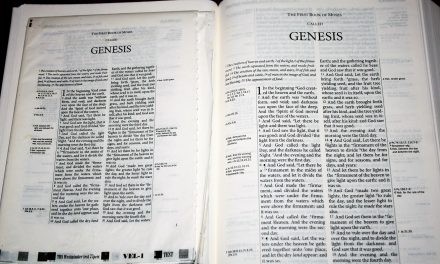
I’ve seen a lot of resistance to single-column layouts. What would you say to those who prefer double-column? What about those who prefer verse-by-verse?
First, let me make sure to acknowledge something: Bible typography is a terrible thing to divide Christians over. By God’s grace I will never, never act as if I’m a better Christian or Bible reader than someone else because of my study of and interest in Bible layout. How foolish and arrogant that would be. I am interested, however, in being a better Bible reader than my previous self! And my experience does lead me to prefer single-column layouts for readability. I take instruction, too, from the fact that the conventions in page layout for English books are pretty well established—and double columns typically indicate reference material (dictionaries, encyclopedias). With John Frame, I defend “prooftexting” when it is done with contextual sensitivity; and it would be impossible to do this good prooftexting without verse references. But verse numbers sometimes facilitate bad prooftexting, too—they invite treating the Bible as a compendium of separate sayings. I tend to think double columns further abet that tendency. But some small-size editions practically demand double columns so more text can fit on the page. I’m not an extremist: I think that’s just fine. Just like Bible translation itself involves a little give and take between languages, Bible printing involves give and take between formats.
There have been some ESV editions made for preachers, I believe, which manage to be verse-by-verse while still preserving visibly obvious “paragraphs.” I think that’s an elegant solution for those (preachers, typically?) who feel they need to be able to glance down and know precisely where each verse begins as they preach. But I’m left wondering who else is helped toward careful reading by such a format.
You’ve written a lot about reader’s editions. In your opinion, how important is this trend and do you think it will last?
I think the trend is very important, and I dearly hope it lasts. I pray it lasts. I’m working to help make it last. I hope Mike Bird—oh, that Mike Bird!—is wrong to mock it as a hipster fad. I laughed, I laughed… And he’s got a point. I’m concerned about my own tendency to get more excited about Bible typography than I am about the Bible. That’s the flesh for you.
As I’ve said, I actually hope that reader’s Bibles are a “fad” like internet usage in 1995 was a fad. I hope they’re the kind of fad that take over—I, for one, would welcome some new reader’s Bible overlords. There is nothing necessary about many of our Bible page layout traditions. Even though they feel so unremarkable and hardly get noticed, they’re not all good for all Bible reading purposes. They are also comparatively recent in the history God’s people have had with his word. For the great majority of that history, peppering the text with numbers would have seemed novel—and, presumably, unnecessary and intrusive. I’d like to recover some of that feeling, relegating the use of our verse-numbering traditions to computers and “study” editions of the Bible that we pull out like commentaries.
Which Bibles do you think are the best examples of good Bible design?
I care about beauty in Bibles, because I care about readability. Beauty serves readability, as well as being a worthy end in itself. My favorite Bible designs manage to serve both purposes.
First let me mention the trend of multi-volume reader’s Bibles.
 My favorite reader’s Bible overall is the brand new NIV Sola Scriptura project. It arrived in my mailbox today as I write, and it is the clear winner. It’s a multi-volume set, so it can have nicer paper—indeed it looks almost completely opaque to me. Because the paper is opaque, the lines on reverse and obverse are not matched—and this is good. It means the line breaks can be flexible. This is a great help in poetry, especially. It means that couplets—parallel verses—can be kept together without the necessity for indentation. The paragraph indentations are too large, I would increase the optical margin for quotation marks beginning a line, and the sans serif fonts in the headers at the top of the page feel a little inelegant to me, but I only say these things to preserve my typography snob status. This is an excellent edition. The best available.
The ESV Reader’s Bible is also elegant, but I was shocked at how much text I was seeing through the paper—I thought one of the whole points of a multi-volume Bible was that you could get thick paper. I also feel it doesn’t have quite enough text on the page, but older readers in particular may disagree. This is an excellent edition.
(Bibliotheca is also quite nice; it surely ought to be after all the hype…)
For single-volume reader’s Bibles, which really are more practical (for me at least), there’s a three-way tie between the thirteen-year-old TNIV Books of the Bible (BOTB), the brand new CSB Reader’s Bible, and the even more brand new NIV Reader’s Bible. The only reasons the TNIV BOTB isn’t my undisputed top choice are 1) the odd sans-serify font they chose and 2) the odd bindings. Otherwise I still feel that this edition worked “harder than they all” (I grew up on the KJV and it still comes out of me all the time) to use the typographical conventions available out there to serve meaning. I love, for example, the way the BOTB edition used blank lines to indicate section breaks: multiple blank lines mean a big break; one blank line means a smaller one. Makes complete sense once you see it, but for some reason it hasn’t caught on among other Bible editions (aside from the NIV Sola Scriptura). I also like the way they kept “verses” together within poetry: it’s elegant, useful, unique in my experience with Bibles, and readable. It serves meaning so well.
The CSB Reader’s Bible is beautifully simple, with a nice typeface and nice binding (here’s my review). It just feels a little too constrained by regularity: the flexible leading of the BOTB is absent.
As for good Bible design in other kinds of editions outside reader’s Bibles, I admit I’ve stopped paying attention. I do all my Bible study on my computer and in books. I want my Bible text to be a Bible text and nothing else (the only exception is one I’ve already mentioned: in preaching I do use a great ESV edition that minimizes typographical intrusions but does give me verse numbers). I recognize that others are at a different place in their journey with Bible study, and I myself received help from study Bibles as a teenager.
But permit me a minor rant: sometimes I get concerned that study Bibles undermine the Bible by surrounding it with so much helper text that they send a strong message: “this stuff is too hard to understand,” or “you need authoritative interpreters from your tradition to make certain you read the Bible according to that tradition, otherwise you won’t see that we’re right.” Now, we do need teachers: God gave them to us for the purpose of stabilizing us (Eph 4; 1 Cor 3). And when I teach, I teach according to my own (Protestant, Reformed, Baptist) tradition. I don’t condemn the wonderful people who put together the MacArthur, ESV, NIV Zondervan, and Reformation Study Bibles, for example. I just tend to want my teachers to teach me in books outside the covers of something that says “HOLY BIBLE” on it. And at the very least, I would prefer study Bibles that are like the ones I’ve just named: they clearly focus on the Bible text by constantly quoting it in bold—sending the implicit message that the big concern here is understanding all these statements of the text. I have a brand new study Bible I won’t name that fills the Bible with hundreds of full-page topical essays: it isn’t focused on the text. I find that odd and counterproductive, even though the text of the essays seems quite good from what I’ve read. Minor rant complete.
You work at Faithlife and specifically with Logos Bible Software. Can you discuss some of the projects you’re working on with Logos?
It’s all top-secret. =)
No, really, I can’t keep any secrets. I write them all down and publish them. Just about everything I do at Faithlife is put on display on the Logos Blog or in Bible Study Magazine.
I do get to hear about what’s coming up and, when I feel I have something to contribute, to offer suggestions. It’s a great company culture with easy communication in all directions. And it’s a place with plenty of Christians who actually care about the mission of the company: using technology to help the church grow in the light of the Bible. I love that.
I will say: I think pastors in particular should look at what Faithlife is beginning to do, namely collecting a number of software services into a single platform. Some of that really is secret, but I’m super excited—because I care a lot about church websites, online giving, cloud-based presentation software, and other ways technology can help churches without breaking the bank. Watch for what’s coming out on the Faithlife platform.
Can we expect the New Cambridge Paragraph Bible on Logos?
Yes. I wrote an article promoting it at the request of a Vice President (somewhat provocatively) titled “You’ve Probably Never Read the Real King James Version.” Hundreds of sales came out of that post. The New Cambridge Paragraph Bible is coming! It will come faster if more people pre-order it; it’s on pre-pub.
One of the things that draws me to the Logos mobile app is the ability to turn off distractions within the text such as chapter and verse numbers, section headings, and reference and footnote keys. Is this an attempt to create a digital reader’s edition, make the Bible more readable, etc.?
Yes. I love it, too! I use this feature all the time. I turn verse numbers on and off based on the task I’m performing. I tend to start without them and then add them back in as I get into the nitty-gritty of sermon prep.
You’re also an author. Tell us about some of your books. Do you have anything new in the works?
I was the lead author and general editor for a textbook that I hope will become a trade book soon, and already reads like one (the “textbook” features, such as study questions, are just a bonus): Biblical Worldview: Creation, Fall, Redemption. This was a very serious effort to put into readable-by-high-schoolers print the work of some of my most important mentors and friends. I worked on it full-time for two years. I’m so grateful to God for that opportunity; I wonder if I’ll ever again get to write something that feels so significant. The book is in Logos 7 base packages, and I’d love to hear from readers. I am praying that the book will make a real difference in the hearts and minds of Christian schoolers and homeschoolers around the world. I particularly enjoyed writing about worldview and epistemology, including a critique of scientist. I also love the creation-fall-redemption metanarrative of Scripture, because it provided the single greatest leap I ever took in my understanding of God’s word.
I’ve written a few other things, including a few other Bible textbooks, a dissertation on Paul’s emotions, some little ebooks on Bible software and Bible translation, and a co-authored book on pot.
But my latest book is just about to come out, and I’m super excited about it—and it’s more relevant to your readership. It’s called Authorized: The Use and Misuse of the King James Bible. It should be available in January 2018 on Kindle, in Logos, and in print. The book does not aim directly at KJV-Onlyism, but all the people out there who read the KJV simply because it’s what they were handed (I have reason to believe, based on a Pew Research Center study, that that’s a large group). I am attempting to help them see how much language change over the last 400 years has done to the readability of the KJV. It is no slight against the KJV translators—or against modern readers—to point out these difficulties, because the translators couldn’t tell the future and we shouldn’t be expected to keep track of our linguistic past. I want Bible readers to get everything they can out of Scripture, and changes in English can make that unnecessarily difficult in the KJV. My book is for the people in the pew: it uses no Greek or Hebrew and does not delve into textual criticism. The book is endorsed by D.A. Carson, John Frame, and Tom Schreiner, who were very kind to provide their endorsements.
How can our readers learn more about you and your projects?
Please do subscribe to the Logos Blog, or just to my posts on that blog.
And I’d love for the readership on my personal blog (here’s the feed) to grow beyond my mother and my mother-in-law. I write to serve the church; I write a great deal about Bible translation and Bible study—things I know are relevant to your readers.
Ending Thoughts
I am grateful to Mark (and Faithlife) for putting up with my questions and for his detailed answers. Please check out his books, website, articles at Faithlife, etc. I can’t wait for his book Authorized: The Use and Misuse of the King James Bible.
Mark talks extensively about Bible typography and particularly about reader’s Bibles. I’m pleased to hear that publishers are taking notice about Bible design and are providing Bibles with little to no distractions. This is exactly what we need to get into God’s Word the way He intended.
Like Mark, I grew up on the KJV. It’s the translation I use the most and I’ve wanted a readable design in large print. Unfortunately there isn’t one. I wasn’t able to get the New Cambridge Paragraph Bible in large print when it was released, but hearing that it will soon be available for Logos is music to my ears. I’m highly looking forward to this, and yes – I pre-purchased the NCPB for Logos and I highly recommend that you do to!
From what I’m hearing in the Bible publishing industry it looks like the future of Bible publishing will focus on excellent designs such as readers’s editions. It’s a great time to be a Bible reader.
What are your thoughts on this topics? Let us know in the comments below?


