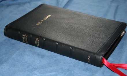
Holman has transitioned the HCSB to the newest version, called simply CSB, and now we can expect lots of new Bibles in this newest translation including this one: the Large Print Ultrathin Reference Bible. The LPUT is a staple format for Holman. It’s one they’ve perfected and I’ve reviewed several in other translations, but this one has one major difference from all the others: an edge-lined goatskin leather cover.
Note – This was an advanced copy, so there could be some minor editorial changes since it went to print.
____________________________
____________________________
Features
- CSB (Christian Standard Bible)
- Goatskin cover
- Edge-lined bonded leather liner
- Sewn
- 9.5-point black letter font
- OT quotes in bold
- Double-column paragraph format
- Center-column references
- Concordance
- 8 maps
- 2 ribbons
- 9.5 x 6.5 x 1.125”
- ISBN: 978-1433648434 (mine is 9781462743223)
- Made in China
Christian Standard Bible
The CSB is an update to the HCSB (although it doesn’t mention the HCSB anywhere). I’m still evaluating the translation, so I’ll save the comparison for a later article, but I like it so far. It’s still an optimal equivalence translation using the same translation philosophy as they used with the HCSB. Here are a few of the differences I’ve noticed so far:
- No HCSB bullets
- Yahweh is now LORD
- Pronouns for God are not capitalized
- “Brothers and sisters” is used when someone is speaking to a group
Binding
This edition is black goatskin. The liner is bonded leather and edge-lined. The tab in the edge-lining is too stiff but that could just be my copy since it’s from one of the first runs. This is one of the softest and most flexible covers I’ve seen. If you like covers that feel like water in your hands then you’ll love this one. It has a smooth grain that looks and feels nice.
It has an interesting stitching around the perimeter. The outside is black thread and the inside is red. It has three raised spin ribs. The spine also includes Holy Bible, Christian Standard Bible, and Holman printed in silver on the spine. The front of the cover is blank. It includes two ribbons: 1 black and one red.
I love the overall size – 9.5 x 6.5 x 1.125”. It doesn’t feel like a large Bible. This is partially due to not having much yapp. The edge of the page gets caught on the leather sometimes because of the small yapp.
Paper
The paper is thin but highly opaque. It has a white color with no glare. It has a slight red tint. I don’t mind the red tint. It looks better to my eyes than blue tinted paper that I have in several other Holman editions.
Typography
The text is presented in double-column, paragraph format. Poetry is set to stanzas and letters are indented without being right-justified to make them stand apart from the text. The poetic settings look especially good for a double-column layout. This is one of the best double-column layouts that I’ve seen.
The font is 9.5-point with a generous leading and printed with line-matching. It’s black letter and about a medium darkness. The printing is consistent throughout the text. OT quotes are in bold, but not hurt-your-eyes bold. It’s just bold enough to get the point across. I find this typeface to be highly readable.
It has around 42 characters per line with around 8 words per line. It will vary based on the number of footnotes, but most pages have around 56 lines. Section headings are bold and all caps. The header includes page numbers in the center and book names and chapter numbers in the outer corner.

Cross references are placed in the center column footnotes are placed in the footer. Cross references are keyed with italic letters and footnotes are keyed with capital letters.
References
The references are keyed to the text with small italic letters and are placed in the center column. The references for the left column are placed at the top of the column while those for the right are placed at the bottom. This leaves an empty space in the center of the column that can be used for notes. If there are too many to fit in the center column then the rest are placed under the last verse.
The center column only includes the reference keys, so the verse numbers are not shown. I personally like having the verse numbers because it makes the references easier to find, but that’s just my preference. Also, I find the letters to be small and it can sometimes be difficult to tell the difference between i and l.
It does have a good amount of references to help in study. Here are few example verses and their references to help you compare:
- Genesis 1:1 – Ps 90:2; 102:12; Is 40:21; Jn 1:1-3; Eph 3:21; Neh 9:6; Is 40:12-14; 43:7; Jr 10:12-16; Am 4:13; Rm 1:25; 1 Co 11:9; Col 1:16; Rv 4:11
- Deuteronomy 6:4 – Zch 14:9; Mk 12:29, 32; Rm 3:30; 1Co 8:6; Eph 4:6; 1Tm 2:5; 2:19; Mt 22:37; Mk 12:30; Lk 10:27
- Isaiah 9:6 – Is 7:14; 11:1-2; 53:2; Lk 2:11; Jn 3:16; Is 22:22; Mt 28:18; 1Co 15:25; Is 28:29; Dt 10:17; Neh 9:32; Is 10:21; 63:16; 64:8; 26:3, 12; 54:10; 66:12
- Matthew 17:20 – Mt 21:21-22; Mk 11:23; Lk 17:6; Jn 11:40; 1Cor 13:2; Mk 9:23, 29; 13:31
- Mark 11:23 – Ps 72:19; Rv 22:21; Ac 10:20; Jnmmn 3:16; Ac 1:43; Rm 10:19; 1Pt 1:8-10; Mk 9:23; Jn 11:22
- Mark 12:29 – Dt 6:4
- John 1:1 – Gn 1:1; Col 1:18; Jn 1:14; 1Jn 1:1; Rv 19:13; Jn 20:28; Php 2:6
- Acts 2:38 – Lk 24:47; Ac 3:19; 26:20; Ac 8:12; 22:16; Ac 3:16; 15:14
- 1 John 1:1 – Jn 1:1; 1Jn 2:13-14; Ps 119:25; Jn 1:1, 4; 5:24; Php 2:16
Footnotes
Footnotes are keyed to the text with upper case letters. They include weights and measures, manuscript variants, literal renderings, alternate renderings, alternate name spellings, where something was quoted from. The footnotes are great for study and also provide a quick reference for measures.
Table of Weights and Measures
This is a page and a half with tables for all types of weights and measures. It includes weight, length, dry measures, and liquid measures. It shows the biblical unit, language it’s from, biblical measure, US equivalent, metric equivalent, and various translations. This table is helpful for study to get a better understanding about the measures than what is shown in the footnotes.
Concordance
The concordance is 70 pages in three columns. For people and places it provides lots of facts with references, so it works like a topical index. I like this feature because it helps in study and sermon prep. Here are a few example entries with the number of references they provide:
- Christ (see also Messiah) – 35
- Christian – 2
- Faith – 34
- Faithful (see also faithful love) – 15
- Faithful Love – 8
- Faithfulness – 6
- Faithless – 1
- God – 77
- Goddess – 2
- God-fearing – 1
- Godless – 1
- Godlessness – 2
- Godliness – 6
- Godly – 4
- Jesus – 14 topics
- Praise (n) – 8
- Praise (v) – 5
- Pray – 14
- Prayer – 6
Maps
It includes 8 colorful maps on thick, non-shiny, paper. This is my favorite paper for maps. The colors are bright. They show the nations in different colors. They include lots of Scripture references. They show cities, capitals, mountains, seas, rivers, routes, borders, roads, territories, etc. They’re annotated well and it was easy to find anything I looked for.
Here’s the list of maps:
- The Migration of Abraham
- The Route of the Exodus
- The Tribal Allotments of Israel
- The Kingdoms of Israel and Judah
- Israel in the Time of Jesus
- The Ministry of Jesus Around the Sea of Galilee
- The Passion Week in Jerusalem
- Paul’s Missionary Journeys
Conclusion
The CSB Large Print Ultrathin Reference Bible in goatskin from Holman is a great entry into the new CSB line. I love the layout and the tools. The paper and print are excellent. The goatskin is ultra-flexible and even has a bonded leather liner. I would like to see a more flexible tab for the liner and a little bit of a yapp to bring the folded portion of the leather away from the paper. Those are minor complaints and won’t keep me from using and recommending this Bible. This is a great choice for anyone wanting a CSB.
____________________________
____________________________
Holman provided this Bible free for review. I was not required to give a positive review – only an honest review. My opinions are my own.


Great review Randy. It is a nice Bible.
Thanks Bob!
Randy, I too have this Bible and find you did an excellent job notIng the features of this Bible. Some people may question calling this “large print” since it’s only 9.5, but text block is done in a way that it reads like a larger font. I prefer large print Bibles and have no problem reading this one.
Thanks Steve! This is a great reader 🙂