Crossway has filled the ESV large print void with their recently released ESV Large Print Thinline Reference Bible. It’s a true thinline at one inch thick, but still has a 10.5 font and manages to find room for 80,000 cross-references. The unique layout sets the cross-references away from the text, improving readability.
Pros
- Large print
- Line matching
- 1 inch thick
- Sewn binding
Cons
- References are small- may be difficult for some readers needing a large print Bible
Features include:
- 2011 ESV text
- Family Records section
- Preface to ESV
- Explanation of Features
- 10.5 font
- Red-letter
- TruTone cover
- Sewn binding
- Ribbon marker
- 8 Maps
- 80,000 cross-references
- Translation notes
- 2 column text
- Table of Weights and Measures
- Gilted edges
- 1248 pages
- 9.5 x 6.5 x 1
- ISBN: 978-1-4335-3281-8
- Lifetime guarantee
Available from:
Christianbook: Crossway ESV Large Print Thinline Reference Bible
Amazon: Crossway ESV Large Print Thinline Reference Bible
Cover and Binding
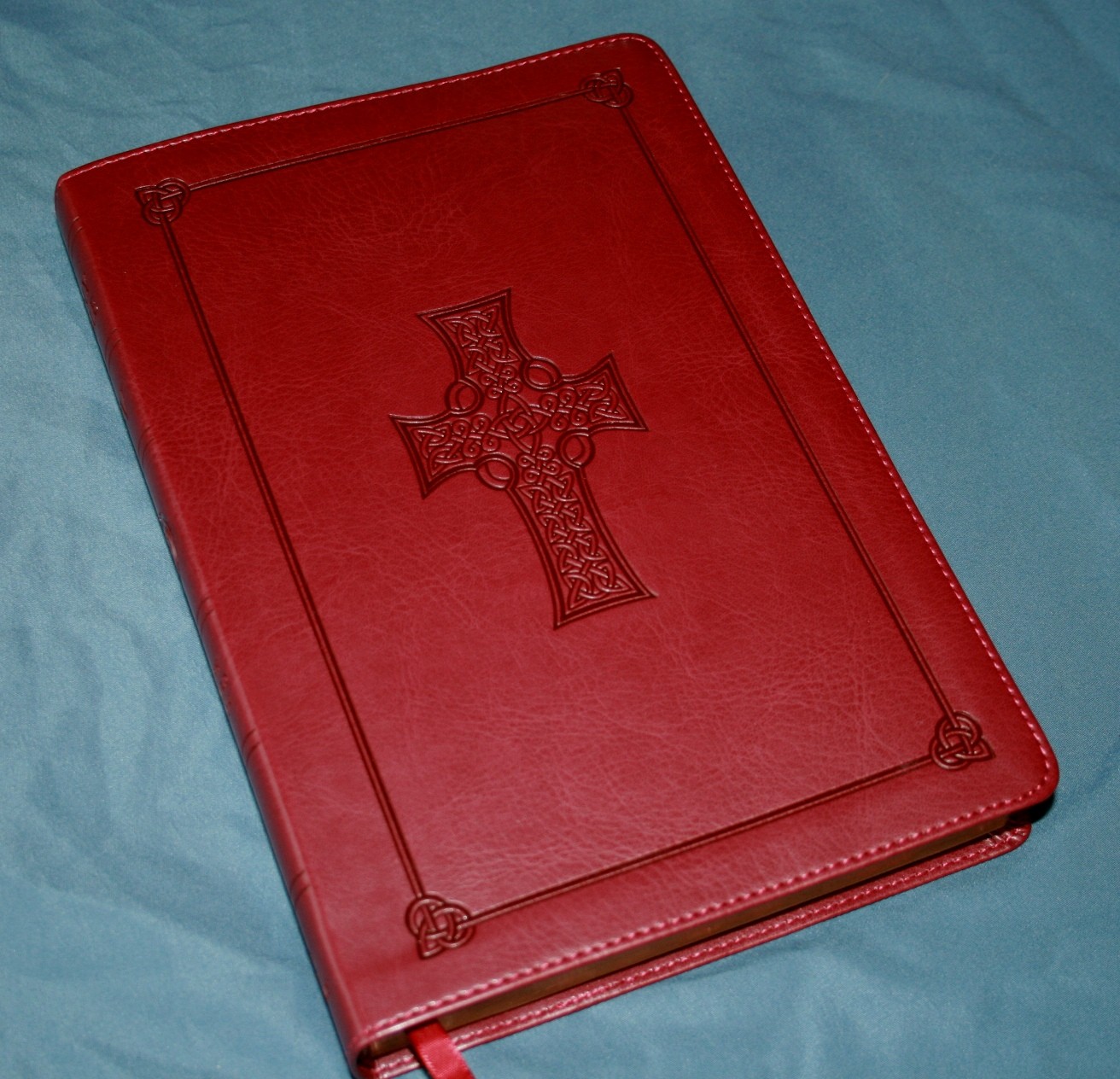
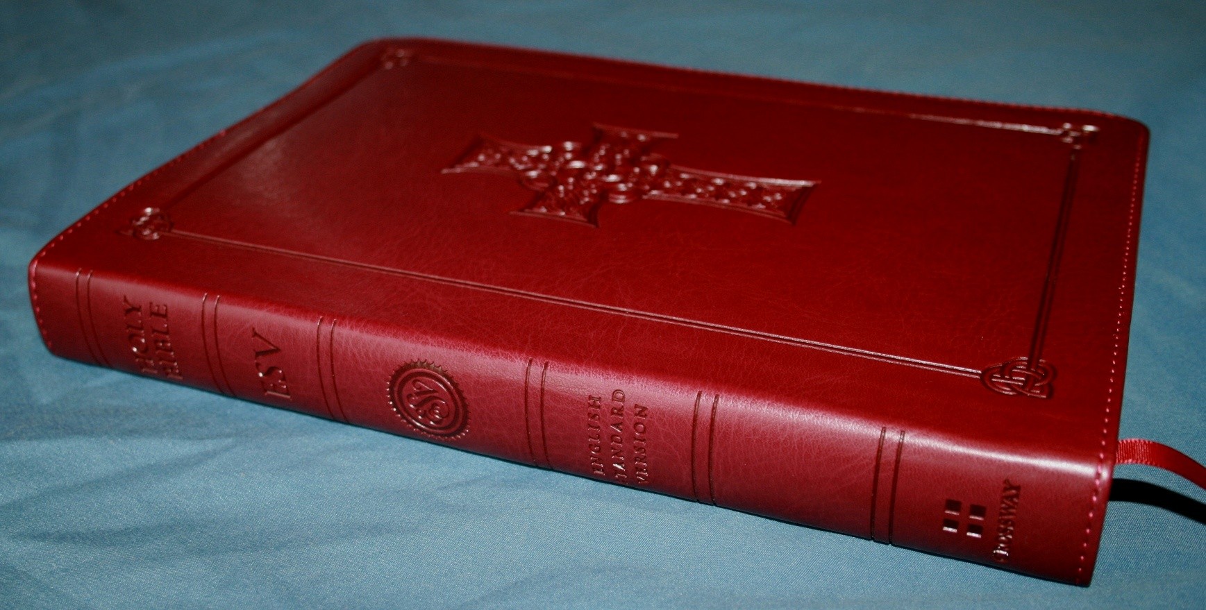
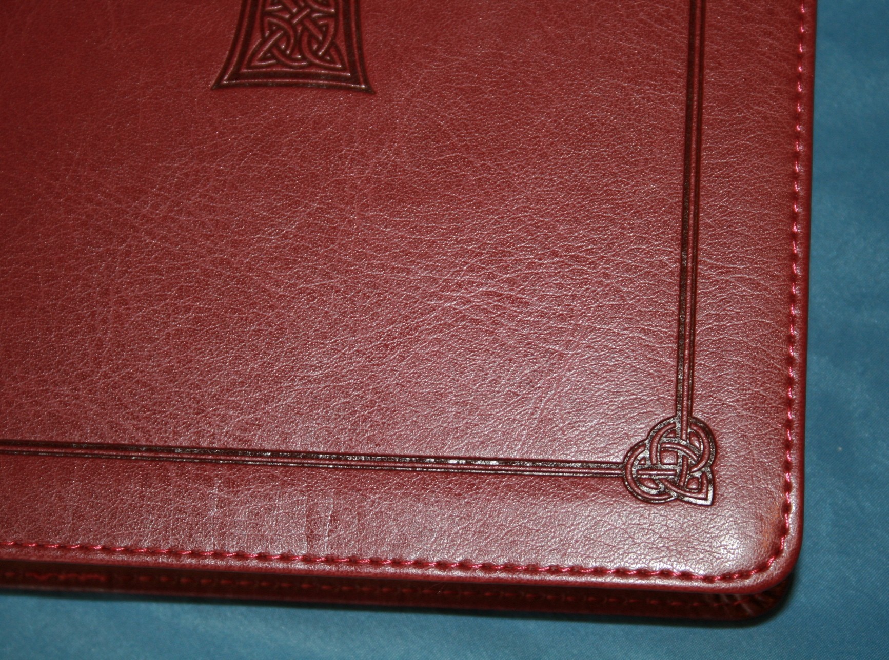
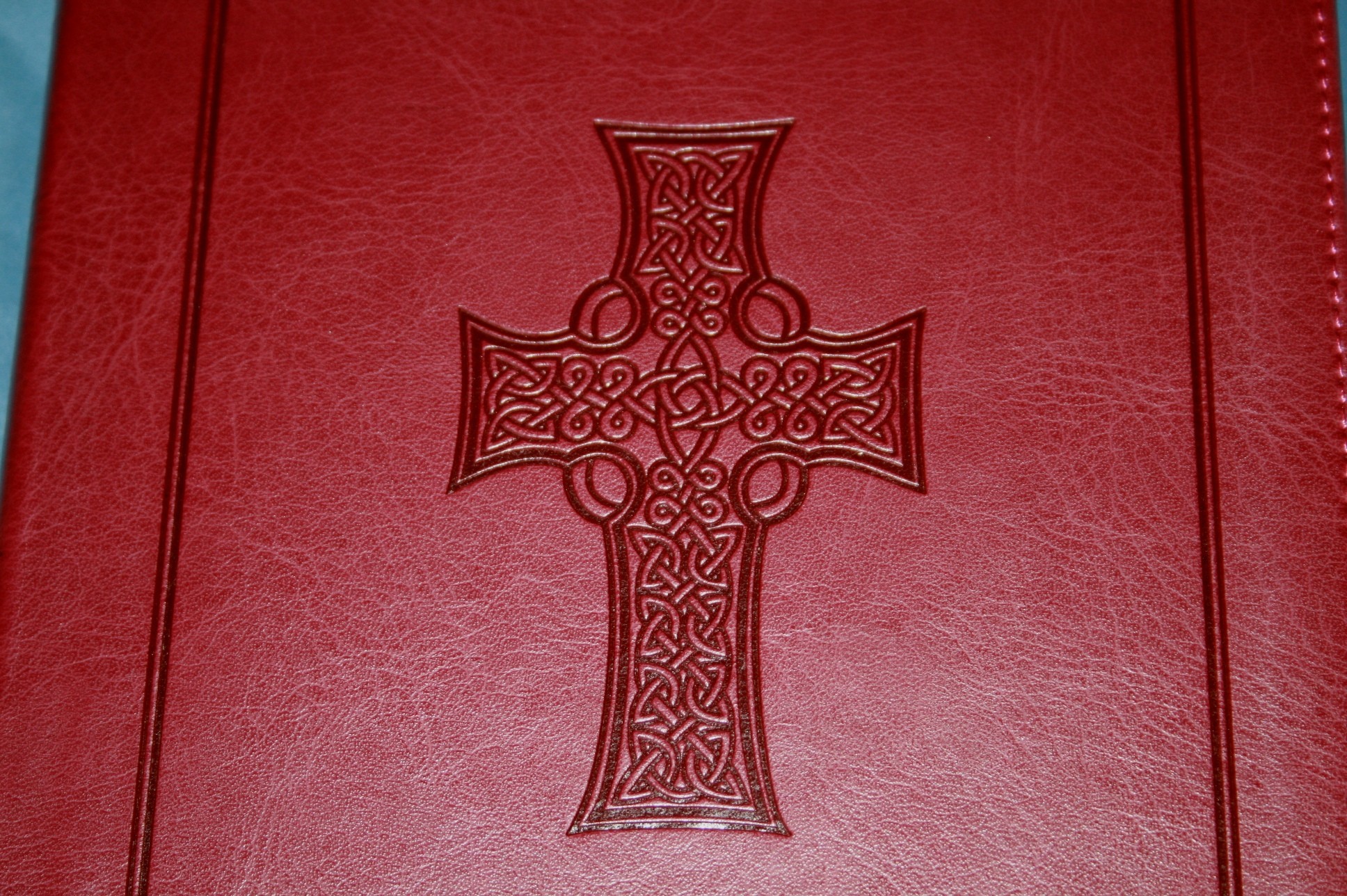
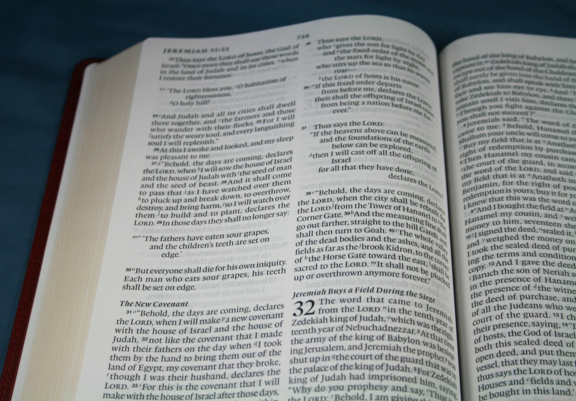
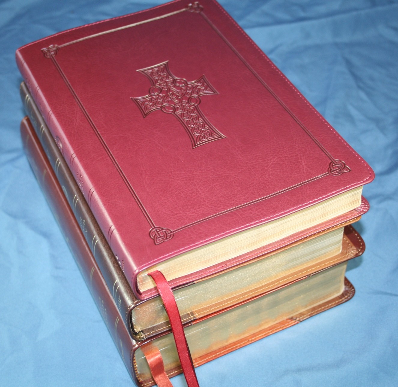
The cover of this edition is an imitation leather known as TruTone. I really like Trutone. It’s economical and has a great look and feel. I like how they press designs into the cover. The cover feels soft to the touch. It has a smooth grain- kind of like calfskin. The edges of the cover are stitched. This helps improve the quality of the cover construction, making the Bible last longer. It is paper lined, which makes the cover slightly stiff. The binding is Smyth sewn but it does have some difficulty lying flat in Genesis and Revelation. I suspect it will be OK once I’ve used it for a while and broken it in. I’ve already noticed it’s softening up as I use it. It’s available in several colors and styles. The edition I’m reviewing is Burgundy with Celtic Cross Design.
Paper
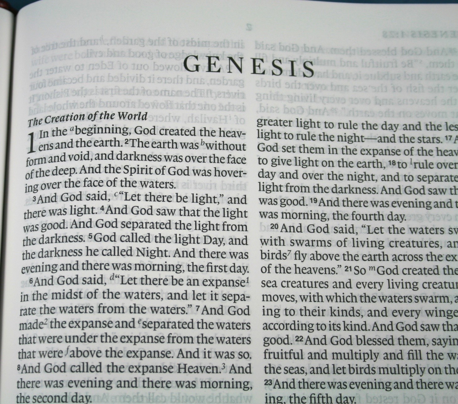
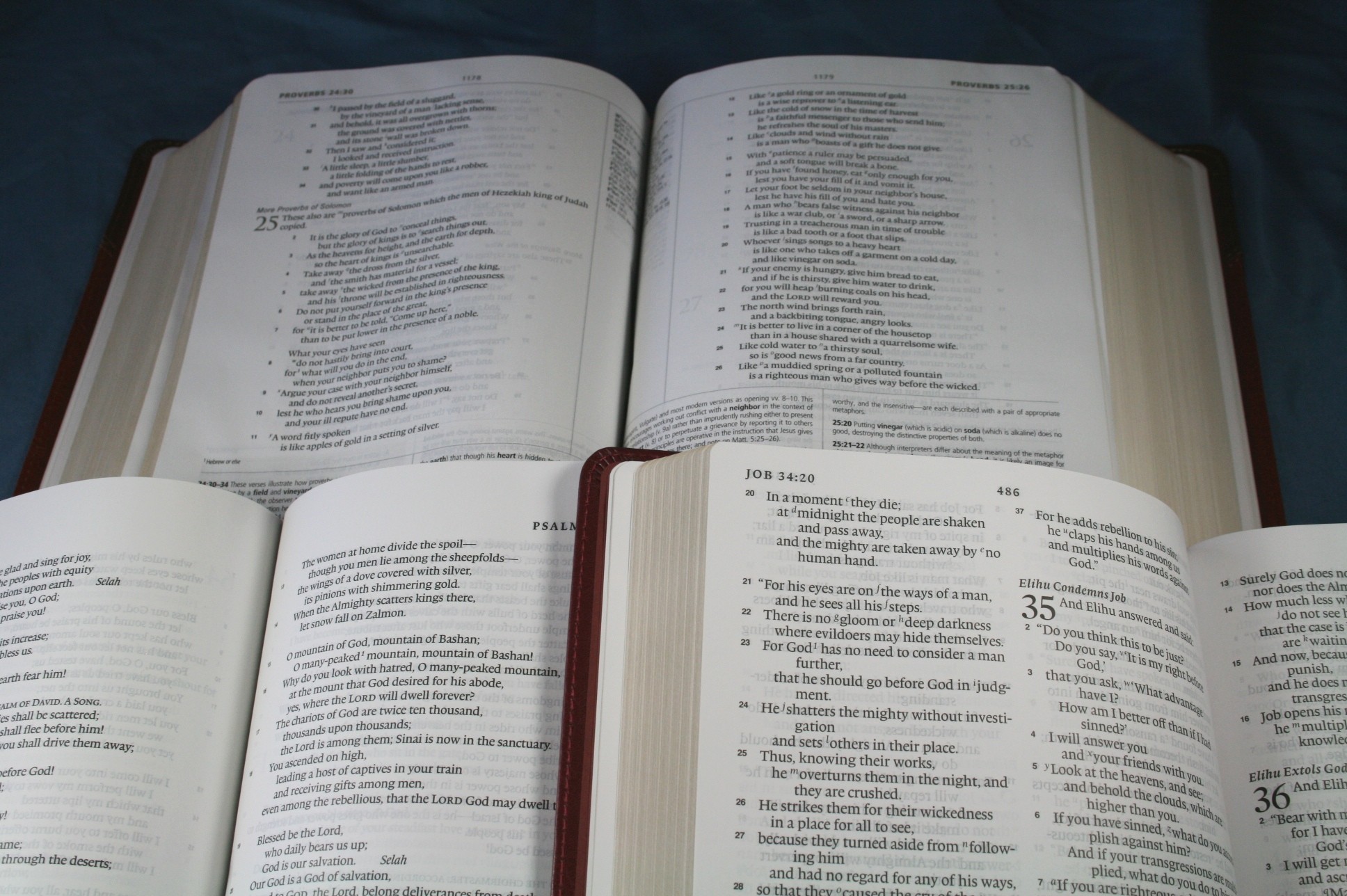
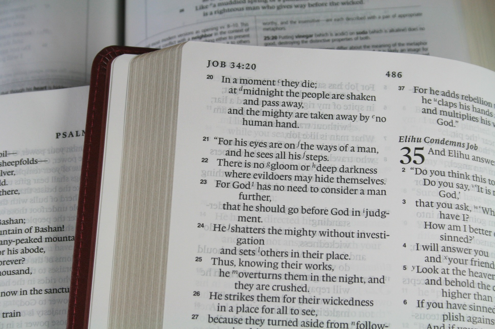
The paper is thin and does have some show-through but it’s not as bad as I expected (it’s not as bad as it looks in the pictures- that’s due to the increased lighting for the camera). Some show-through is to be expected in a slim-line of only 1 inch thick, but this paper is more opaque than many Bibles with thicker paper. The paper is white without any tinted shade (such as cream).
Text
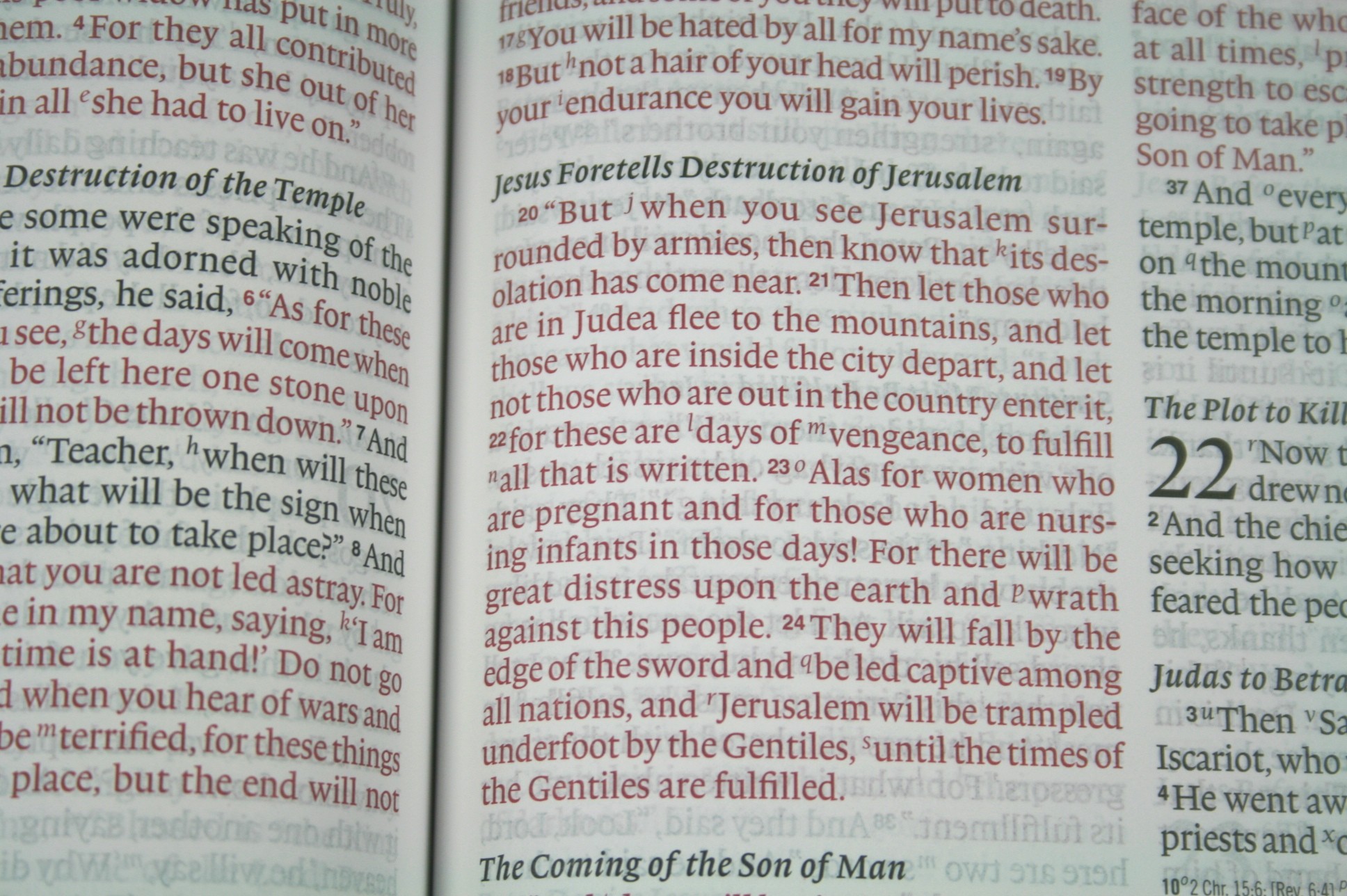
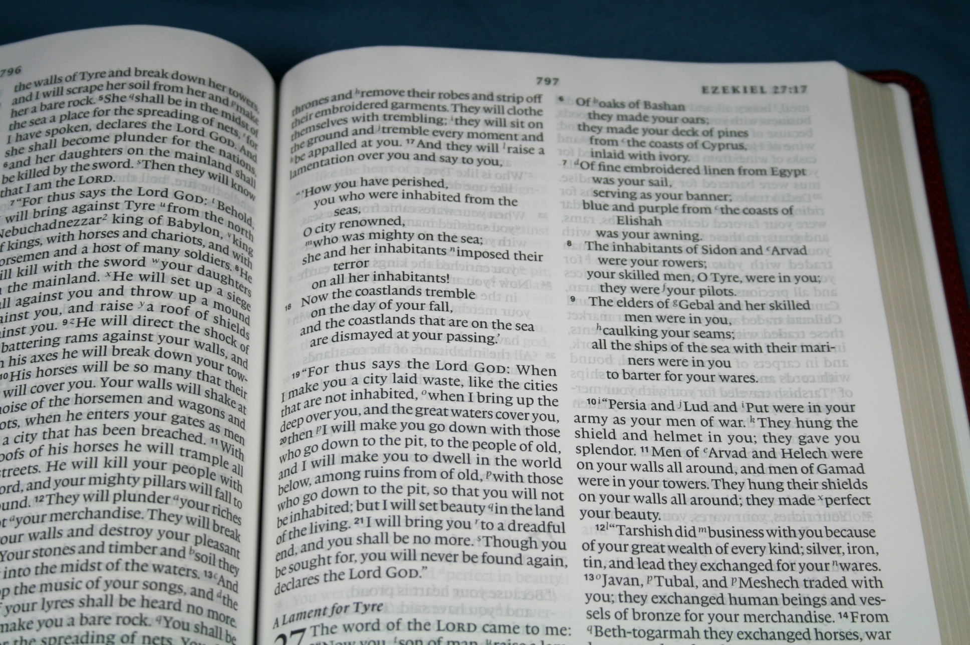
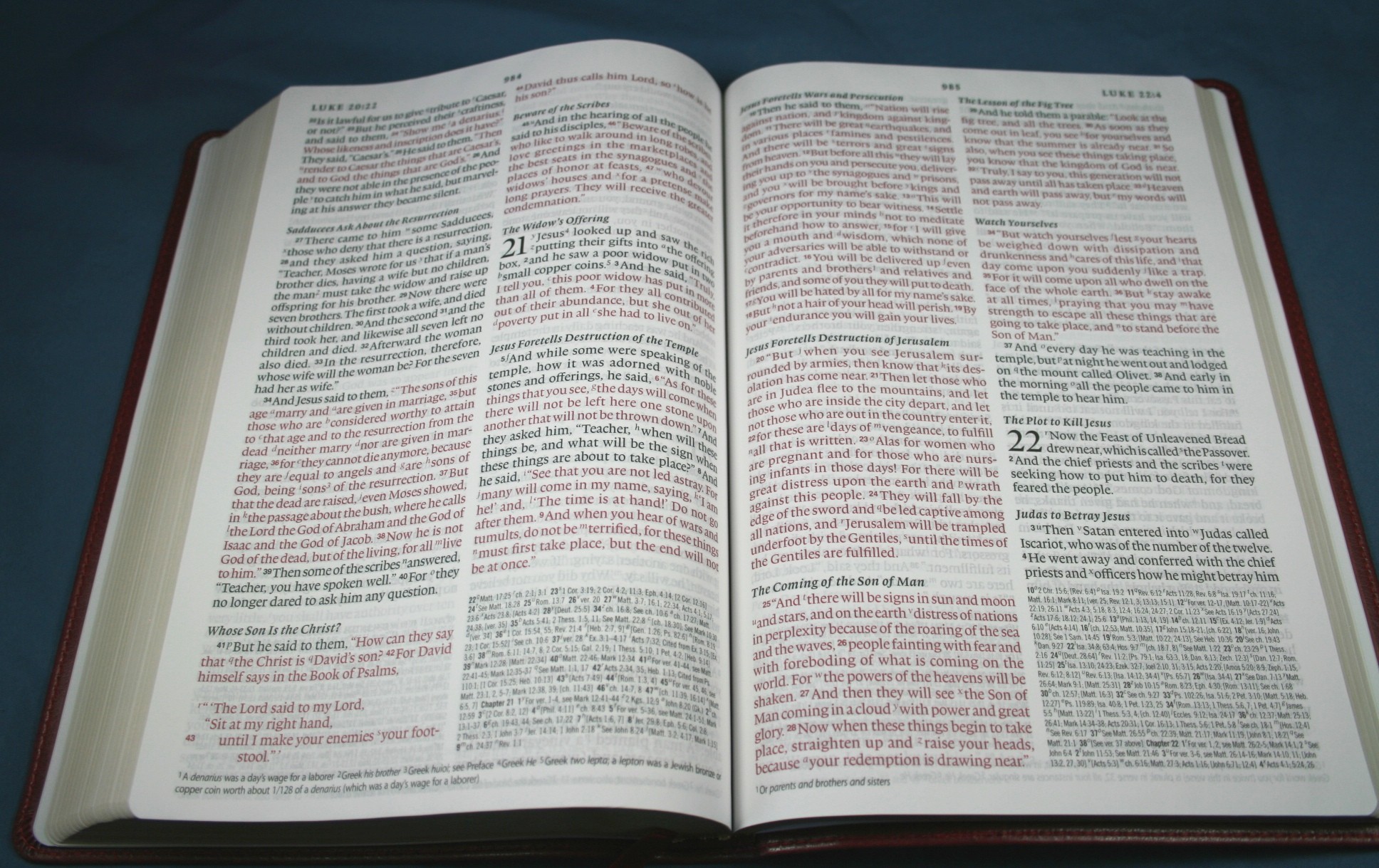
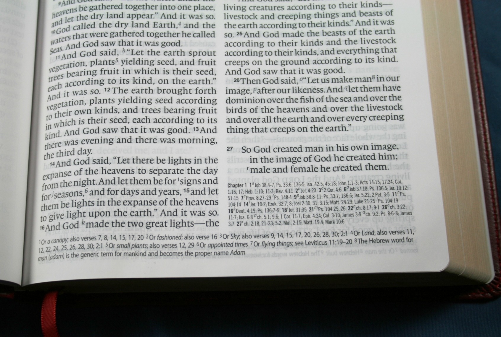
The font is a sharp and readable 10.5. In my opinion it has just the right amount of boldness to be comfortable to read for long periods of time. It’s about a medium darkness.
This is a red-letter edition. The red letters continue throughout the New Testament, on into Revelation. I wish all red-letter texts would do that. The red text is about a medium shade. I found it easy to read.
The text includes the time-honored line-matching printing style of the renaissance. I love this printing style because there’re no distractions between the lines of text. This gives the page a cleaner look and improves readability.
Verse numbers are smaller but just a little bolder than the text. They’re not bold enough to be distracting, but just enough to make specific verses easier to find in the paragraphs.
Headings
The headings are in italics. To my eye they look slightly bolder than the rest of the text. Not much- about the same as the verse numbers.
References and Notes
This edition has over 80,000 cross-references. References and notes are located in different locations, away from the text. This helps make the page more readable. References are placed in the right column after the last verse on the page. The references have bold verse numbers and then the standard letters keying the reference to the text. If I were to voice one complaint it would be the size of the fonts of the references. The font is tiny compared to the large print font of the Bible text. I didn’t have any trouble reading it, but it was smaller than I would have liked; especially when you go from reading a nice comfortable-sized text to the small font of the references.
The translation notes are located at the bottom of the page and span both columns. They are keyed to the text with numbers, keeping in line with standard Bible publishing. The fonts for the translation notes are larger than the references and are much easier to read.
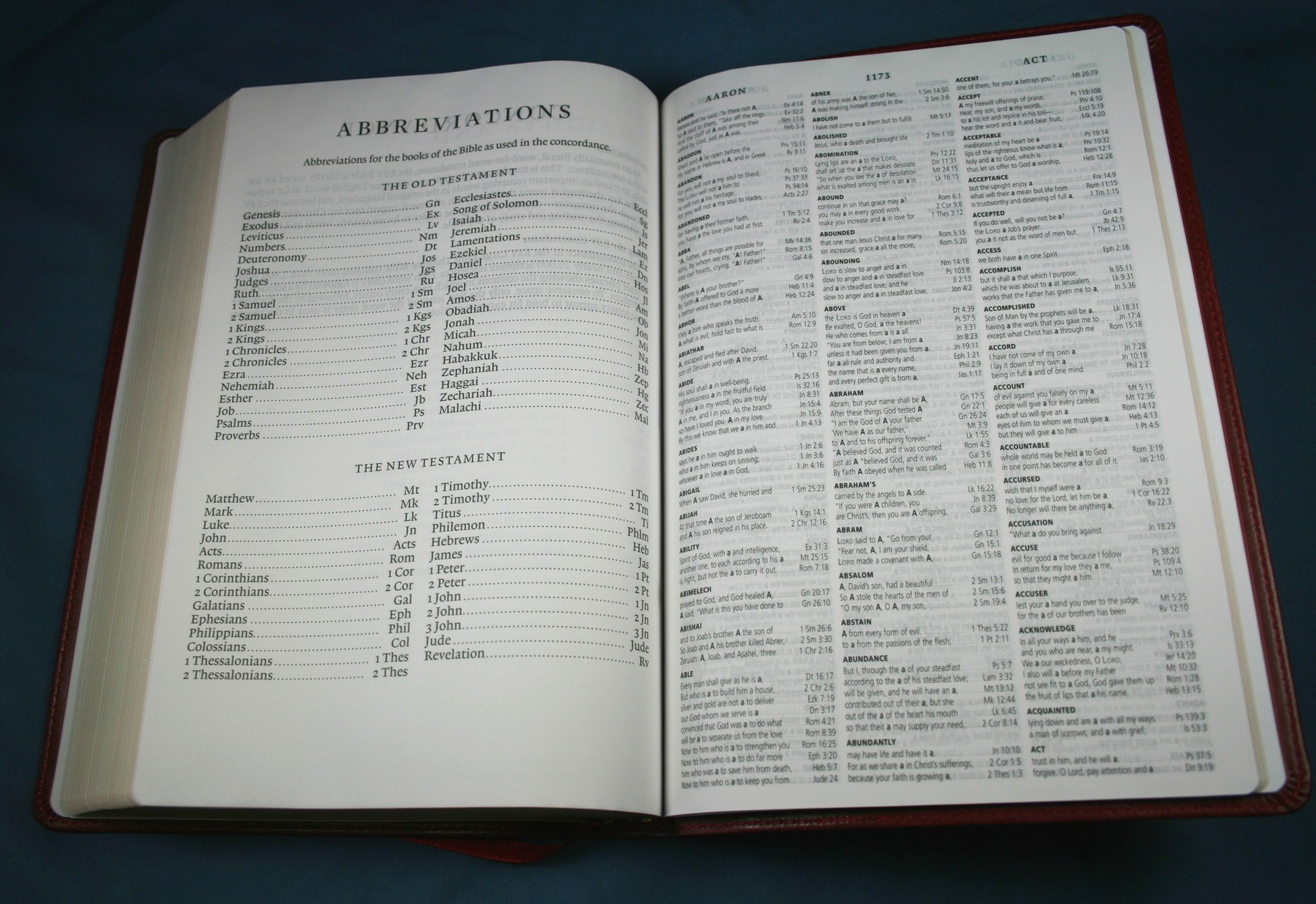
Concordance
The concordance is 60 pages and has 3 columns per page. There are more entries than I expected. It has 52 entries for “God”.
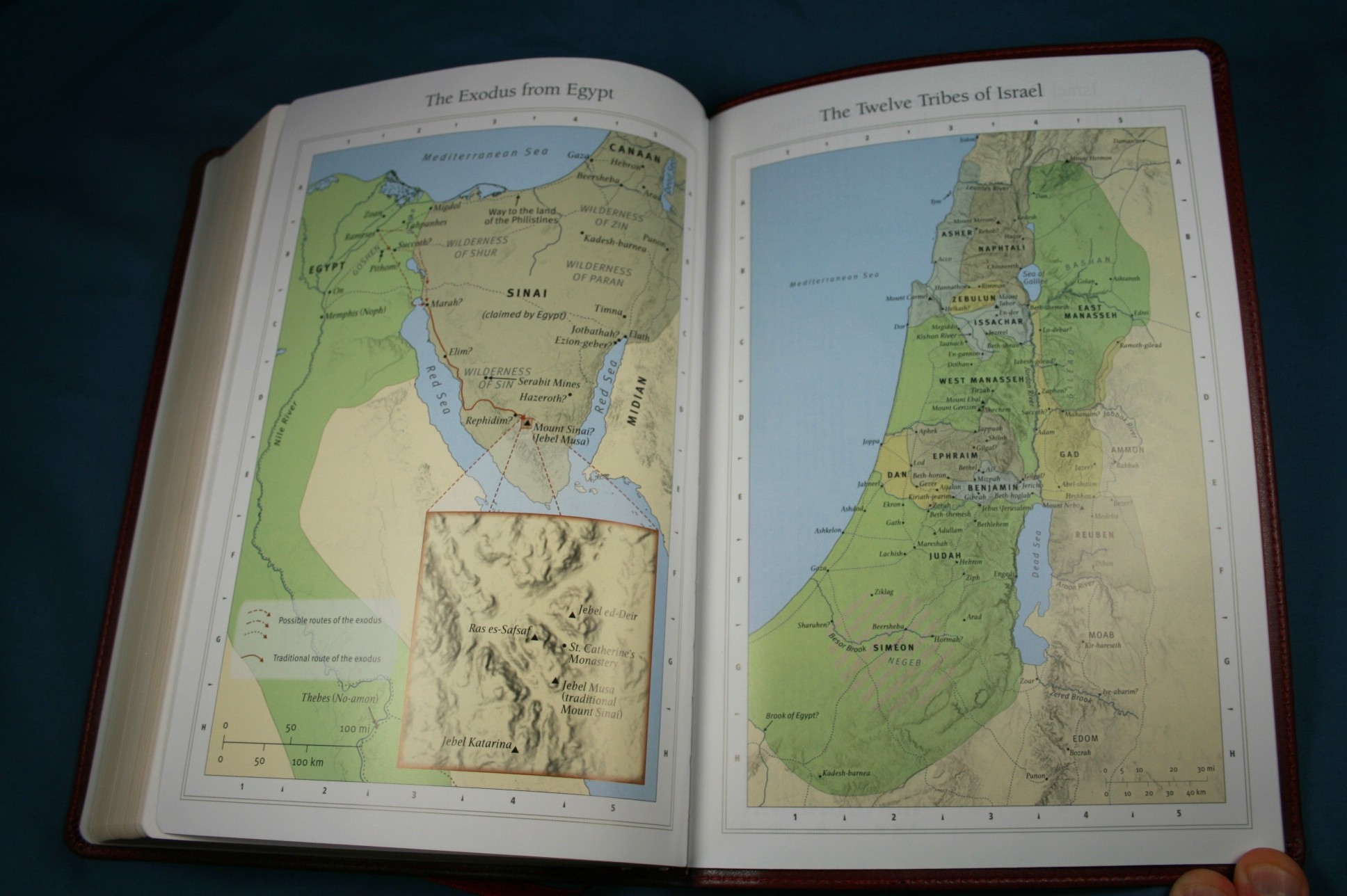
Maps
There are 8 color maps on thick glossy paper. The colors are more like earth-tone shades. One addition I would like to see would be an index to maps. This would map the maps more functional. The maps are labeled really well and I didn’t have any trouble finding anything I was looking for.
Ribbon
There is one ribbon. It is burgundy, .25 inches wide, and sticks out about 3.5 inches. It’s plenty long enough to be usable.
Comparisons
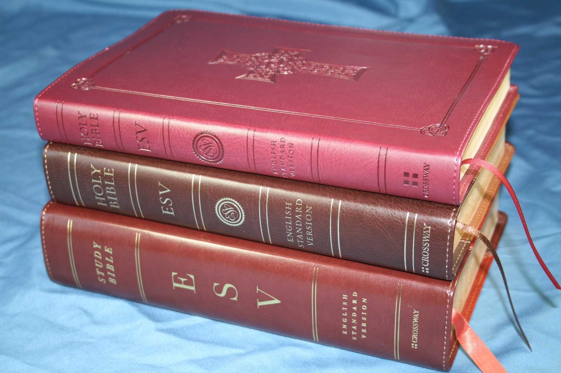
Here’s a few comparisons with the Single Column Legacy and the ESV Study Bible.
Conclusion
Crossway’s Large Print Thinline Reference Bible has a great layout. By placing references and notes in specific locations away from the Bible text they’ve made the text more readable. The fonts look great. If you only have one ESV edition in your library, the Large Print Thinline Reference is a great choice to consider. It’s my favorite size for a Bible. It would make a fine reading and carry Bible.
Available from:
Christianbook: Crossway ESV Large Print Thinline Reference Bible
Amazon: Crossway ESV Large Print Thinline Reference Bible
Crossway provided this Bible free for review. I was not required to give a positive review- only an honest review.





THanks for the review! Can you tell us where it was printed?