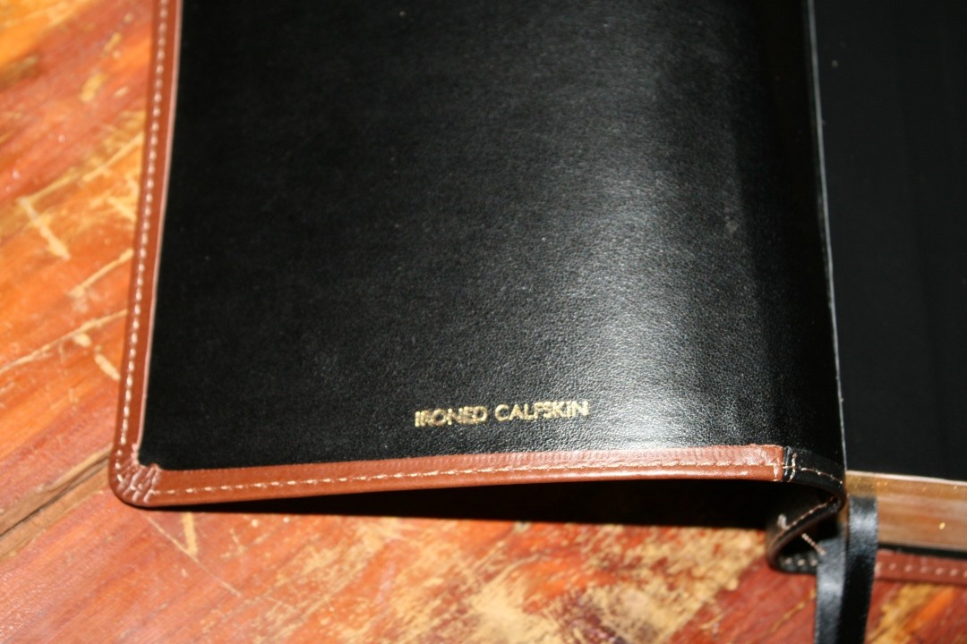
The Church Bible Publishers KJV Notetakers was made for serious note-taking. It provides a 2.5-inch margin in the outer margin of every page and presents the text in large print, making it ideal for study and preaching. It’s available in several covers and colors, and in black or red-letter editions. I’m reviewing the ironed calfskin in 3-piece black and brown in black letter, item # 400 C3BR.
Church Bible Publishers provided this Bible in exchange for an honest review. I was not required to give a positive review, only an honest one. All opinions are my own.
_________________________________________________________
This Bible is available directly from Church Bible Publishers
_________________________________________________________
Video Review
Cover and Binding
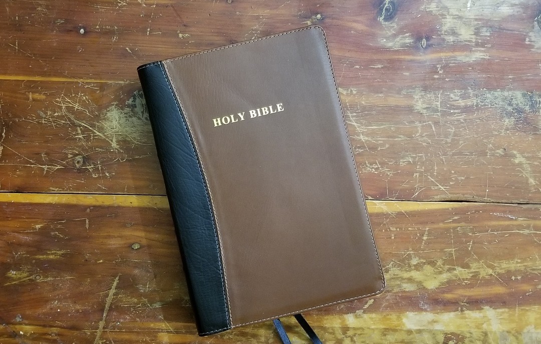
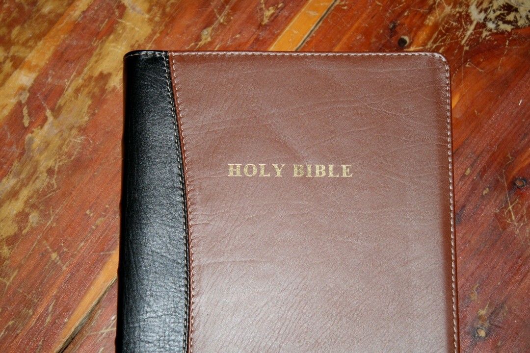
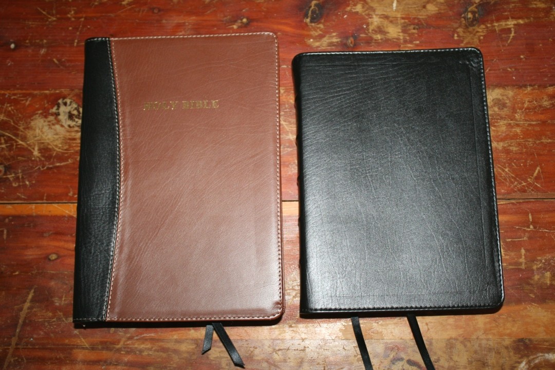
The cover is the 3-piece black and tan ironed calfskin. I love this color combination. Even though it’s ironed it does have some grain and texture. The black on the spine has the most grain. I like the look and feel of this cover. It’s flexible but not too floppy to handle. The 3 pieces are stitched together with tan thread. It’s also stitched around the perimeter.
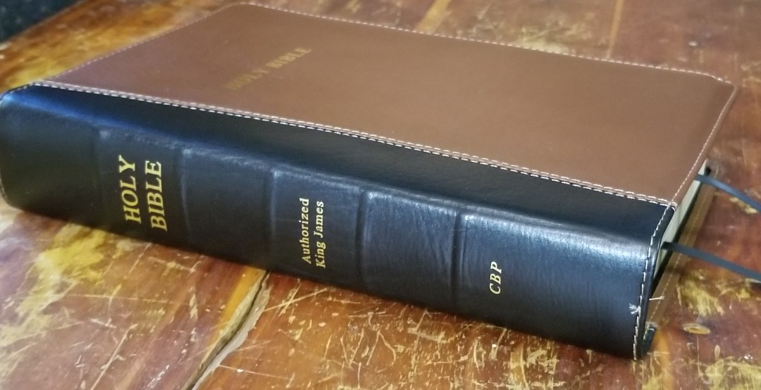
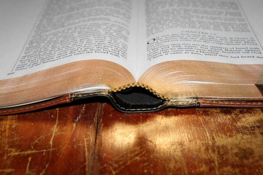
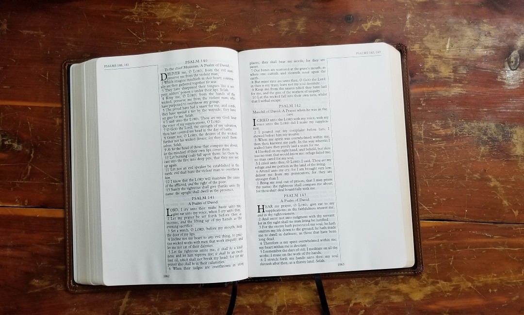
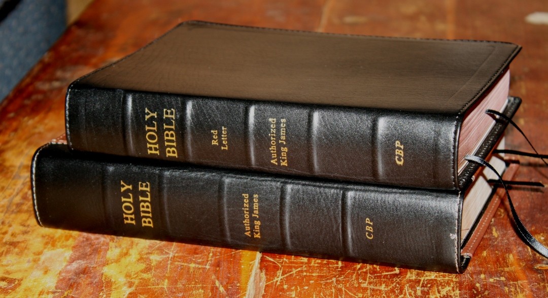
The front of the cover has HOLY BIBLE printed in gold. The spine has HOLY BIBLE, AUTHORIZED KING JAMES, and CBP printed in gold. The spine includes 5 raised ribs. The ribs have a little flex to them, which helps bring the text block upward when the Bible is opened, allowing the page the lay flatter than I’ve seen in other editions of the Notetakers. The spine looks amazing with the black leather. The leather is a little soft, so if you lay something on top of it it’s possible that it will leave an indention. I’ve had this happen more than once, but it goes away after a few days.
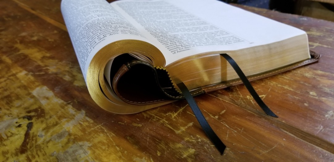
The liner is synthetic and is edge-lined. The binding is Smyth sewn. The edge-lined tab wasn’t too stiff out of the box. It had no trouble staying completely open in Genesis.
It includes two black ribbons and black and gold head/tail bands. The ribbons are thin and long, making them easier to use. They don’t get in the way for reading or preaching. The overall size is 9.8 x 6.8 x 1.75″. It weighs 3 lbs, 4.6 oz. It’s about the size of a study Bible. It’s great for laying on the table or in your lap for reading and preaching from the pulpit.
Paper
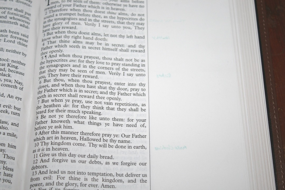
The paper is 22# Domtar Vista Opaque, which is around 33+ gsm, has a brightness of 80, and an opacity of 83. It’s very opaque. It’s ivory in color and has a smooth texture. Even with the smooth texture I had no trouble turning pages. I was even able to rub the pages together with one hand to turn them easily. This paper has a smoother feel and is more opaque than the Domtar TitaniumJET used in other CBP editions. The edges are a shiny gold-gilt.
It does have a little bit of glare under direct light, such as a desk lamp or reading light. It has no glare under natural light. I had no issues preaching from it.
Typography
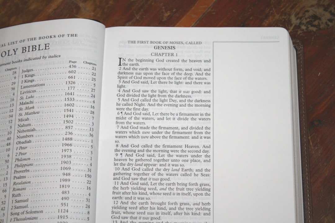
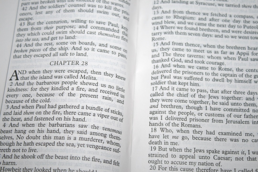
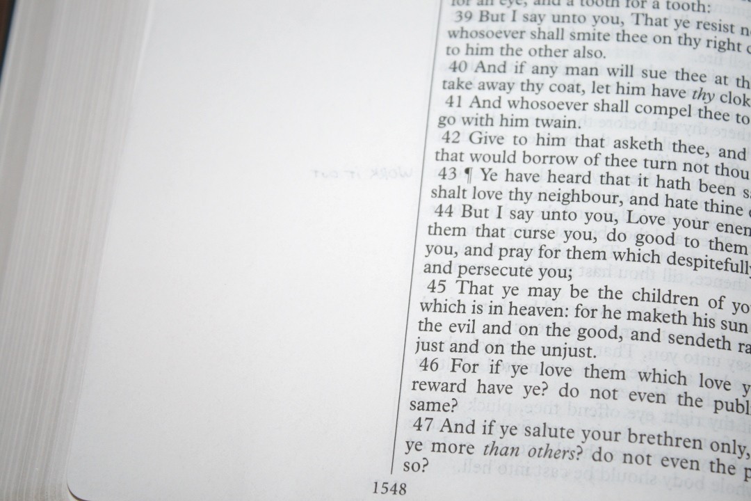
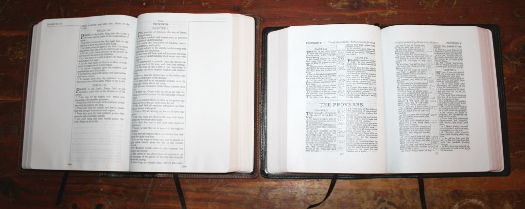
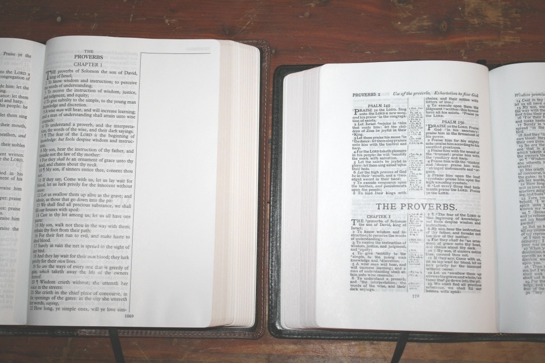
The text is presented in a single column verse-by-verse that’s placed in the inner column. The outer column is blank for notes. A verticle line separates the two columns. The header shows the book name and chapter number in the outer margin. Page numbers are placed in the footer under the column-separation line.
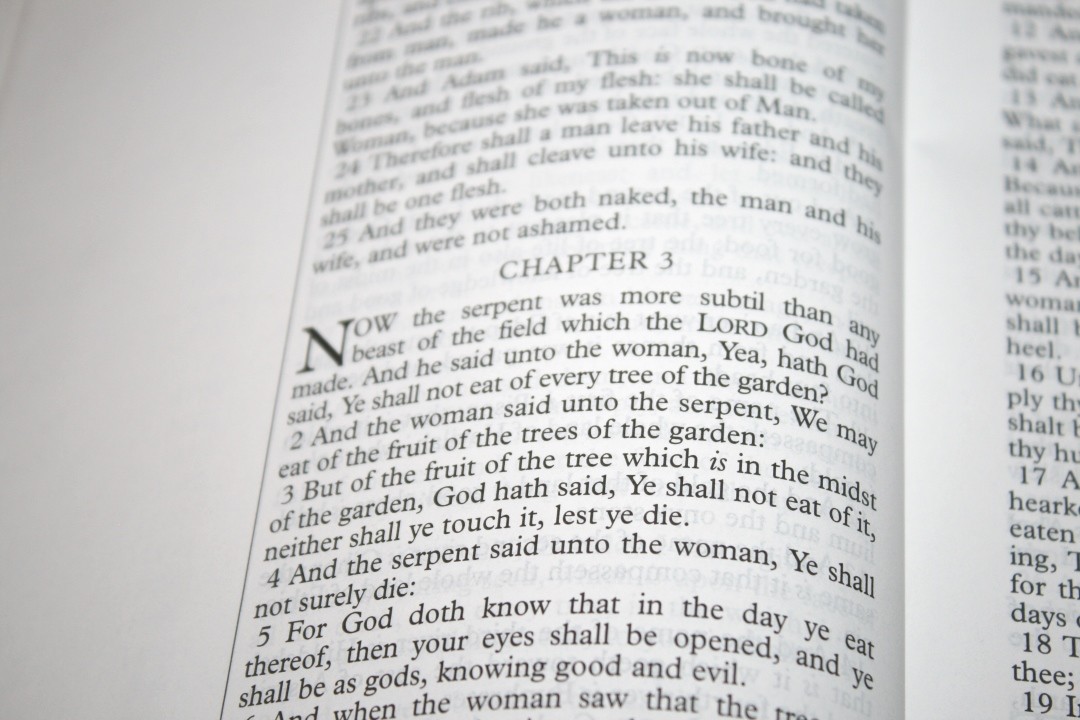
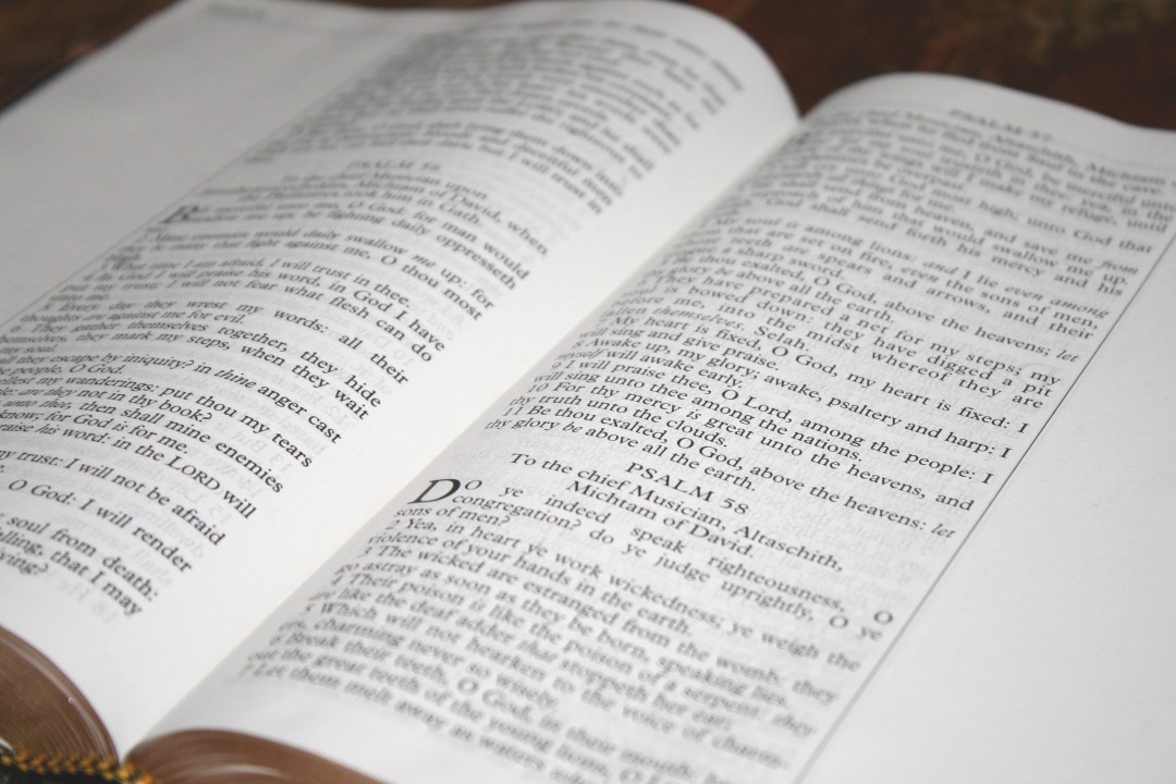
The typeface is 11 point. It’s sharp, dark, and highly consistent throughout the Bible. This is the black-letter edition. It’s also available in red-letter. Verses are indented. It doesn’t have self-pronunciation marks, so the text is clean. It does have italics for supplied words. I find this text to be excellent for preaching or public reading.
The lines on both sides of the page seem to match, but I don’t think that’s on purpose. Where a new chapter starts, the lines no longer match. Either way, the paper is opaque enough that the lines don’t show through much at all. It has around 48 characters across with around 10 words per line. The text never feels cramped or crowded. It’s more likely to have extra spaces than not enough. It does have a few extra spaces, which are noticeable, but it doesn’t look too awkward.
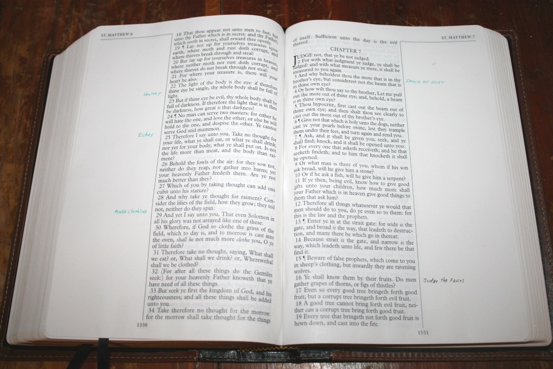
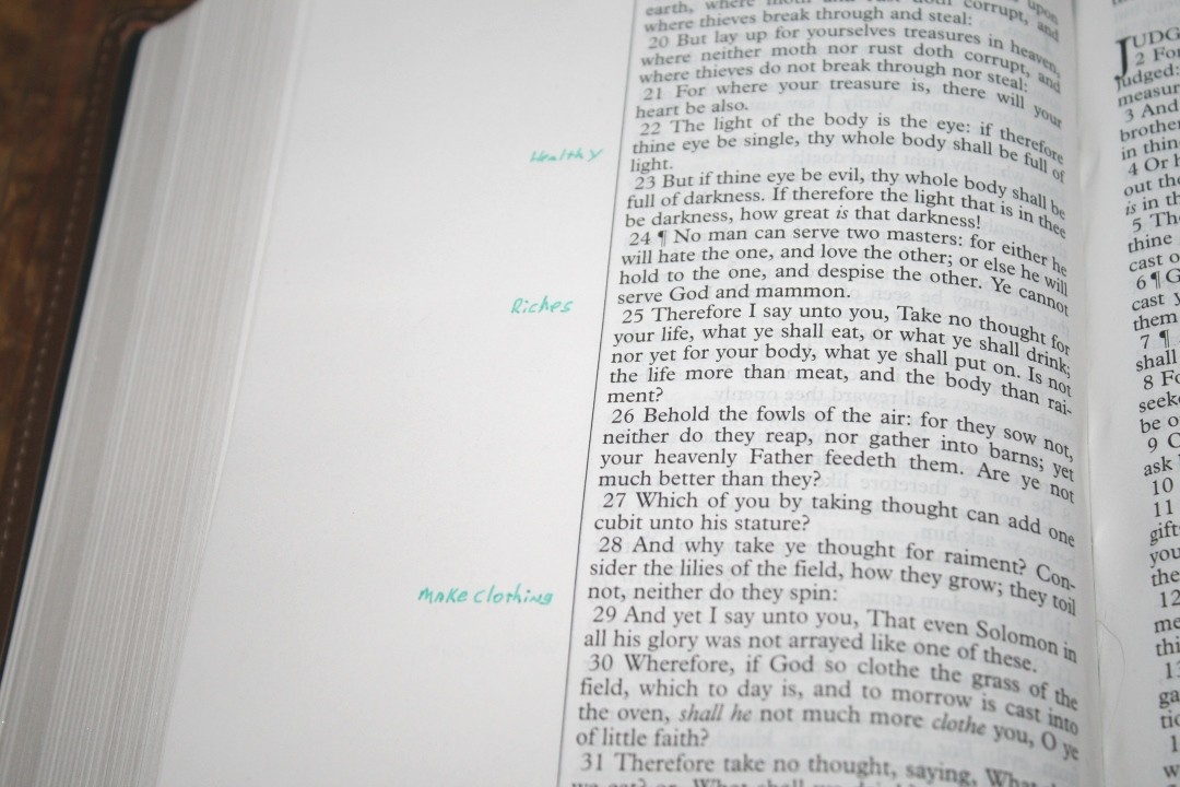
The outer margins are 2.5″. This makes the Notetakers among the best Bibles for preaching, writing insights, creating your own cross-references or chain references, journaling, adding sermon notes, sermon outlines, bulleting your notes or thoughts, adding your own commentary, add your own studies, etc. This is my favorite layout for wide margin Bibles.
The inner margin is .375″. This helps bring the text out of the gutter so it doesn’t get lost in the bend. It has .5″ margins for the top and bottom. This is enough room to write notes such as definitions, topics, or page summaries.
This edition does have some noticeable cockling in the gutter in the second half of the Bible. It won’t keep me from using it, but it is noticeable.
Marking
This is good paper to Pigma Microns or similar markers. I used a 005 fine tip black and a Zebra Sarasa .8mm in green. I’m impressed with how well it takes the ink and how little show-through it has.
Other Pages
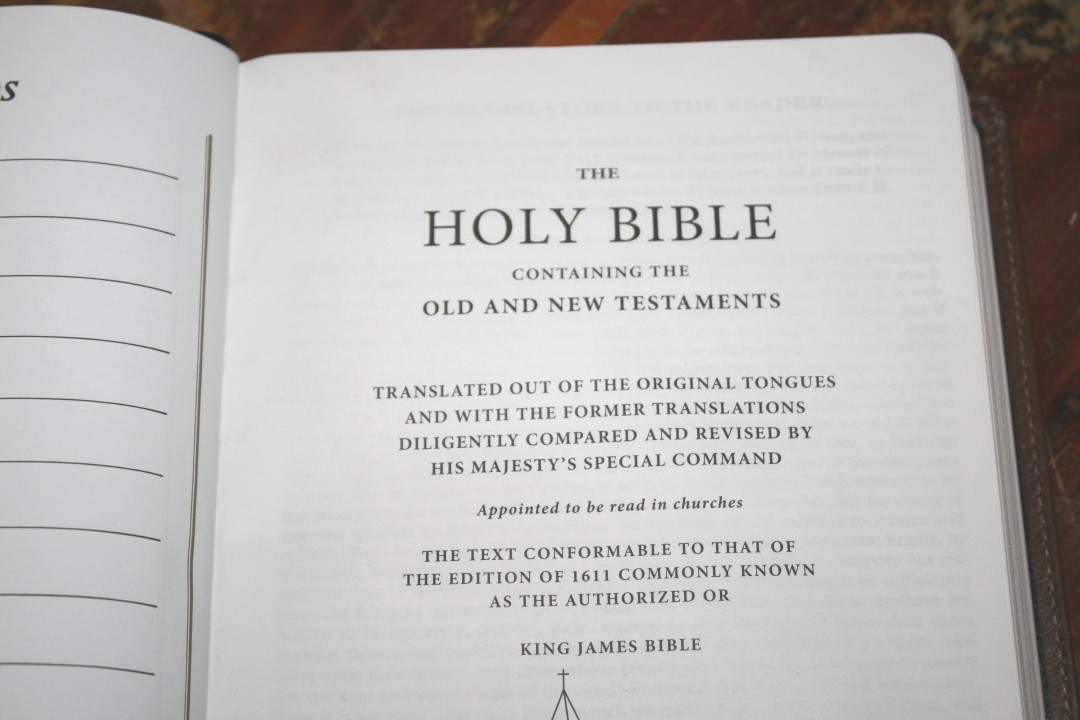
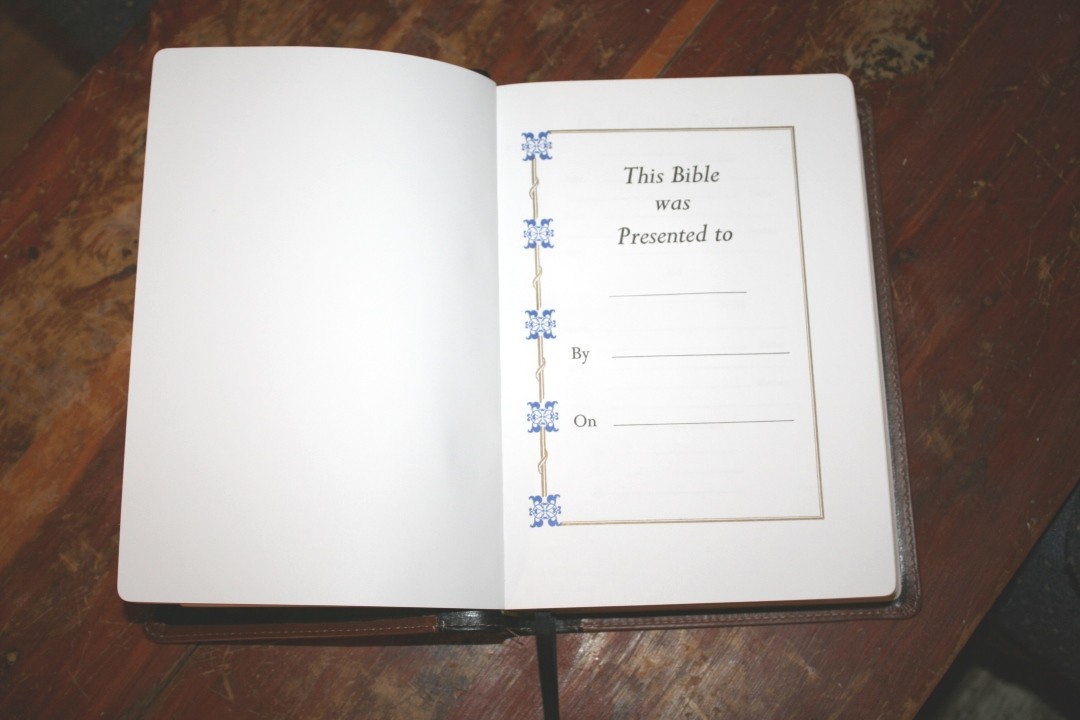
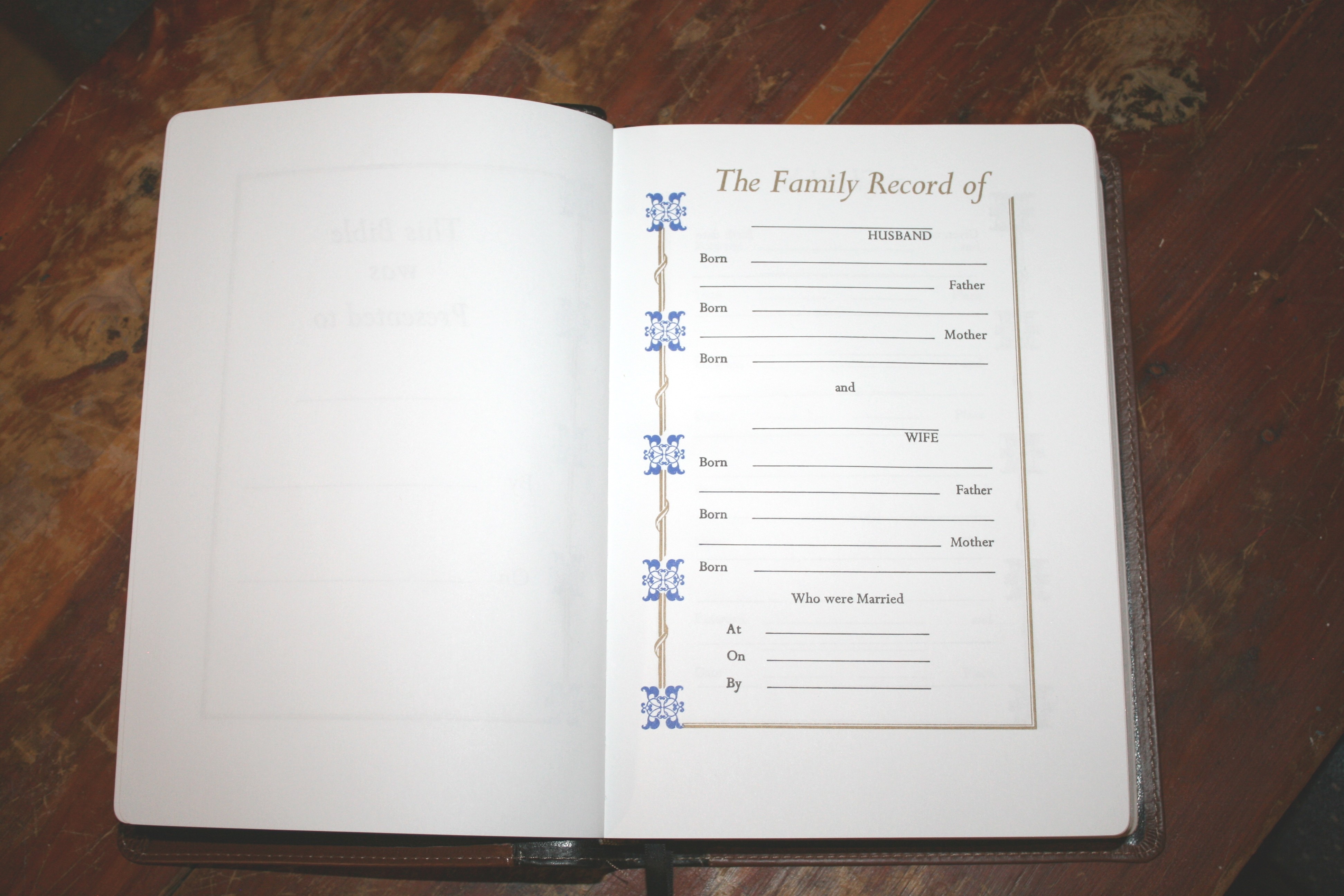
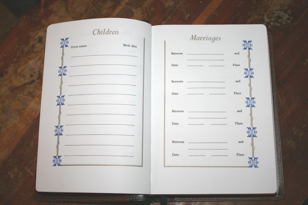
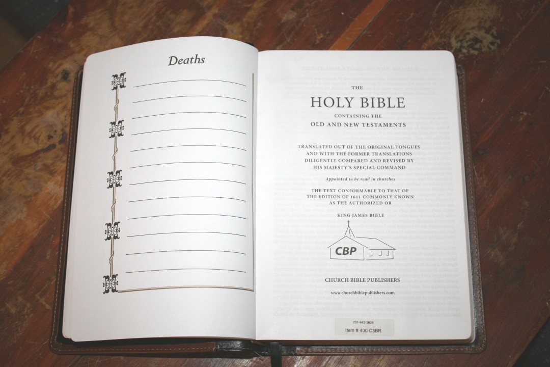
In the front are the presentation and family pages. They’re printed on thick paper. Family pages include the family record of the husband and wife, children, marriages, grandchildren, and deaths. Most have blue and gold highlights. The deaths page has black and gold highlights.
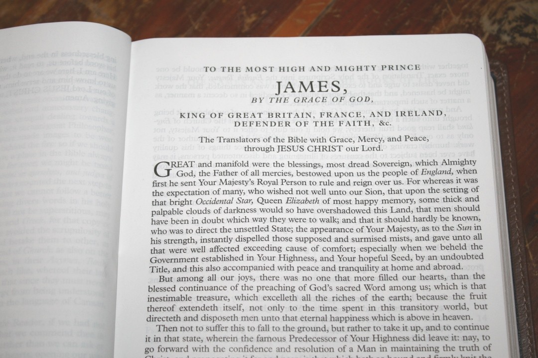
It also includes the Translators to the Reader and the Epistle Dedicatory to James. I’m especially grateful to see the Translators to the Reader included. It’s starting to be removed from editions that used to have it and I believe it’s an important document that should be read be every KJV reader.
In the back are 4 pages for notes using the regular Bible paper. I’d like to see 32 or more pages for notes. That would increase the size and cost, but I’d be willing to make that trade. This would make this Bible even better for study, preaching, and teaching. It does have several thick end-sheets in the front and back that can be used for notes. These help build structure too, which is always a plus.
Maps
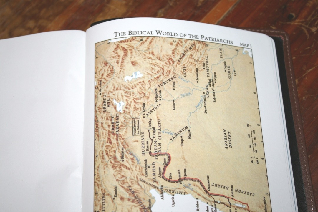
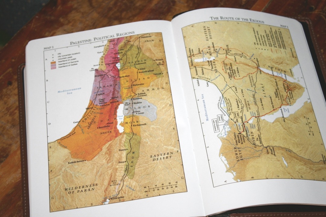
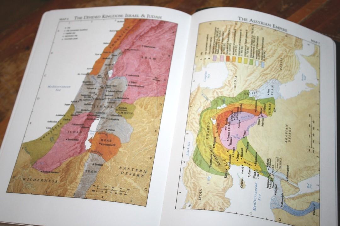
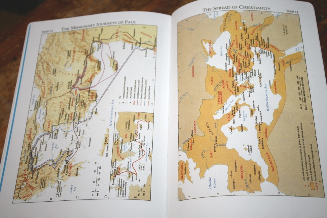
It has 15 full-color Cambridge maps printed on thick non-glossy paper. These are the maps that Cambridge used just prior to the current generation. Other editions from CBP that include these maps have an 8-page index, but this one does not. I always prefer an index and I’d like to see it included. They include cities, routes, Scripture references, distance, mountains, territorial expansions with dates, topography, kingdoms, battle sites, locations of events, addressees of Pauline epistles, etc.
The annotations on the maps are bold and dark. They can be a little difficult to read against the bold colors of the maps. I still prefer them to the older maps.
Maps include:
- The Biblical World of the Patriarchs
- Palestine: Political Regions
- The Route of the Exodus
- The Twelve Tribes of Israel
- Kingdoms of Saul, David & Solomon
- The Divided Kingdom: Israel & Judah
- The Assyrian Empire
- The Babylonian Empire
- The Greek Empire
- Old Testament Jerusalem
- New Testament Jerusalem
- The Ministry of Jesus
- The Missionary Journeys of Paul
- The Spread of Christianity
- Modern Israel
Comparing with the CBP 120
The CBP 120 is a much smaller Bible with a much smaller typeface. It has a double-column layout with center-column references and wide margins in both the inner and outer margin. It’s a modified reprint of the old Cambridge Cameo wide margin. It’s a great choice for carry and for smaller notes. The Notetakers is a better choice if you need a larger print or more note space.
Conclusion
This is an excellent Bible at an excellent price. It’s not so expensive that I have a hard time using it. I don’t have to worry about scratching the gilted edges or scuffing the cover. The margins are great for sermon outlines. This edition does not include a concordance. This does bring the size and weight down a little.
I would like the see the cockling problem fixed. This is a non-issue for some, a minor issue for others, and it will cause others to avoid it. I’d also like to see a different paper used. This paper wouldn’t keep me from using this Bible. I do light it’s brightness and opacity level, but I would prefer it to be less shiny and less noisy as you turn the pages.
In my opinion, the Notetakers is one of the best deals in Bibles. I think of it as the CBP flagship Bible and a must-have for preaching. It’s a unique edition that has no equal. If you’re serious about taking notes, the CBP Notetakers should be at the top of your list.
_________________________________________________________
This Bible is available directly from Church Bible Publishers
_________________________________________________________
Photography by hannah C brown
Church Bible Publishers provided this Bible in exchange for an honest review. I was not required to give a positive review, only an honest one. All opinions are my own.













DOES ANY OF YOUR BIBLES HAVE RED LETTER? IF SO WHICH ONE.
Hi Kenneth. Are you interested in red-letter editions from Church Bible Publishers? If so, you’ll need to ask at their website: https://www.churchbiblepublishers.com/
Randy, thank you for another great review. One question: currently, how does the paper quality differ from the Note Takers from LCBP compared to the ones by CBP? I noticed you have review of both but they are several years apart and things can change over time. Thank you.
Hi Emerson. Sorry for taken so long to get back with you. My most recent LCBP Notetakers is a couple of years old, but I think the paper is the same between the LCBP and CBP.
I bought one of these Bibles some years ago. The signatures began separating from the binding after less than a year of moderate use. I was wondering if I just got a lemon or if others have had this problem?