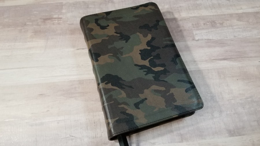
CBP Handsize Text Bible is a red-letter text-only edition that is a smaller reprint of the Cambridge Large Print Text with several added features that you won’t find in the Cambridge edition. As mentioned, it is a red-letter edition. It’s still a large print text, but CBP has also added a concordance, maps, and an edge-lined calfskin cover. CBP provides this Bible in several covers, but they’re now producing it in camouflage. In this review, we’ll take a look at the Camo Print Calfskin, model 180RLCamo, made in the USA.
Church Bible Publishers provided this Bible in exchange for an honest review. I was not required to give a positive review, only an honest one. All opinions are my own.
_________________________________________________________
Where to buy
This Bible will be available from ChurchBiblePublishers.com in the first week of May.
We’ll update this link when this Bible is available.
_________________________________________________________
Table of Contents
Video Review
Cover and Binding
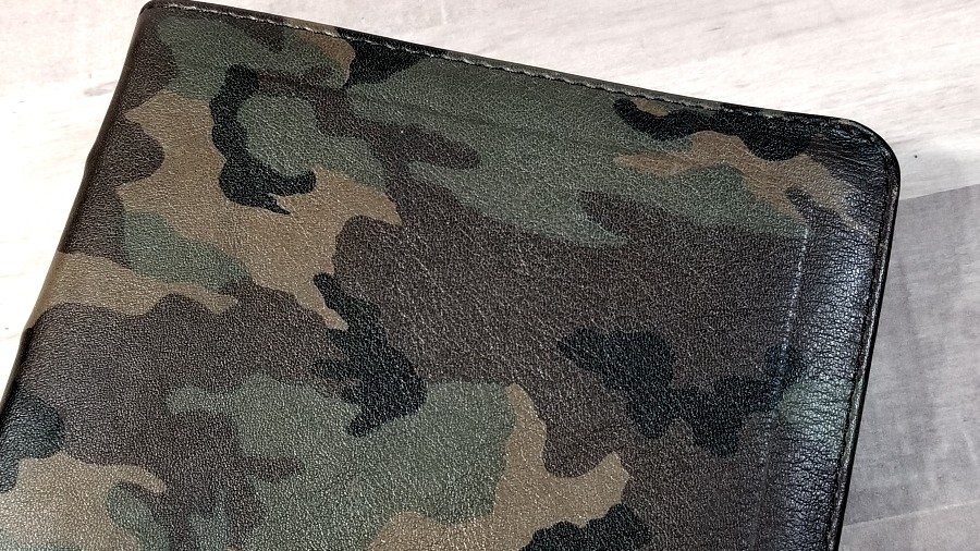
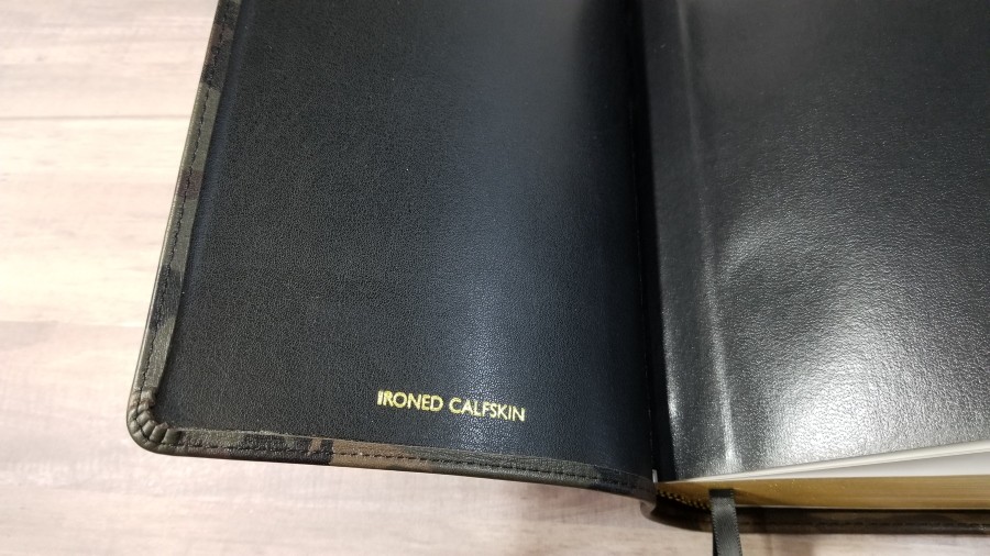
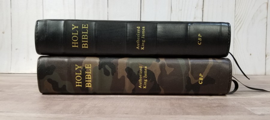
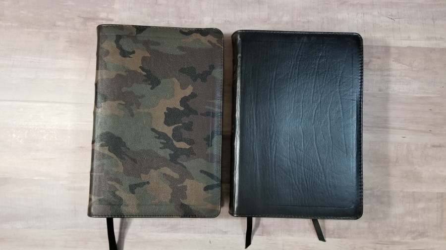
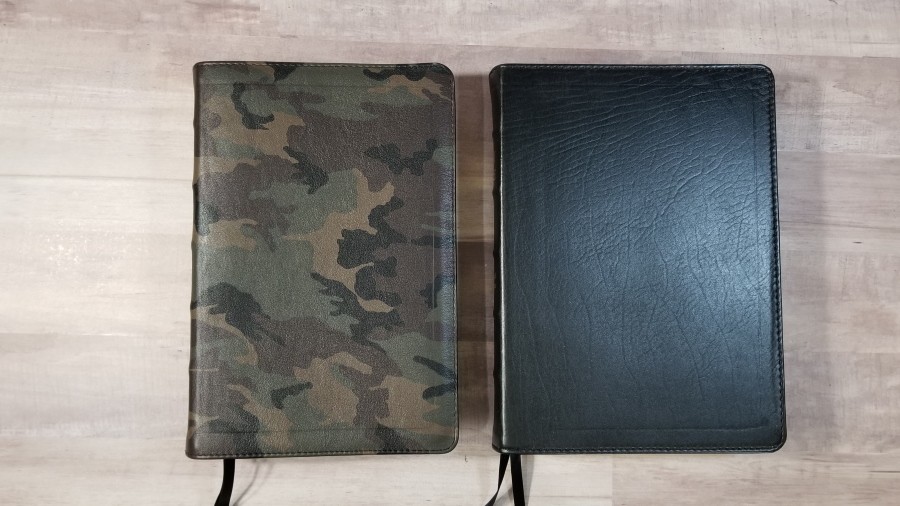
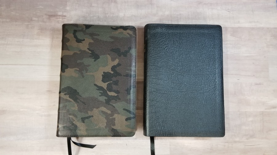
This cover is camo ironed calfskin. The camo looks realistic with shades of green and brown. Update – it is a Woodland Camo Pattern from the US military. The grain is deeper and rougher than the standard ironed calfskin that I’ve seen from CBP. I actually prefer this to normal ironed calfskin. It’s thicker, doesn’t warp or scratch as easily, and feels more rugged. It has perimeter stitching.
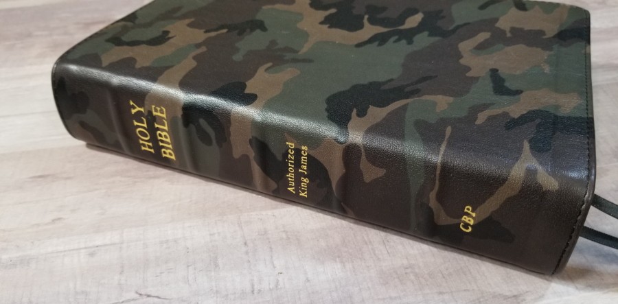
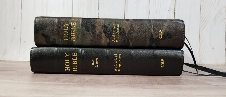
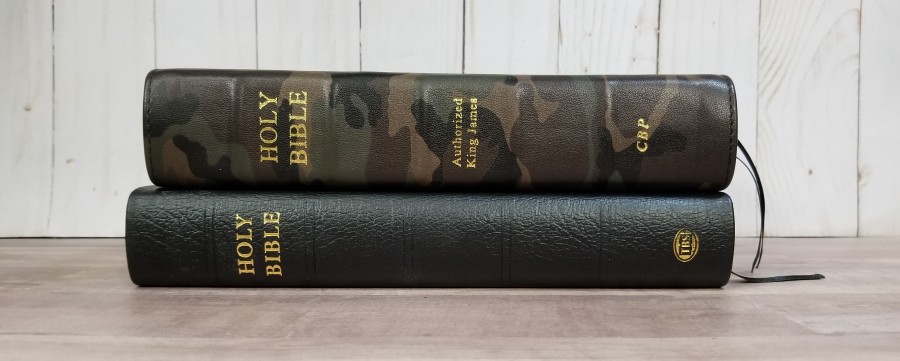
The cover has no printing. The spine includes 5 raised ribs and Holy Bible, Authorized King James, and Church printed in gold. The liner is edge-lined with synthetic leather, but it looks and feels like real leather to me. The edge-lined tab is a good size for this Bible.
It’s Smyth sewn. The edge-lined tab is a touch stiff, so it might take a while to lay completely flat in Genesis. I’m sure it will break in with more use. It includes 2 black ribbons and black and gold head/tail bands. The overall size is 5.75 x 8.75 x 1.5″. It weighs 2lbs, 3.6oz. This is an excellent size and weight for carry, holding to read, and preaching.
Paper
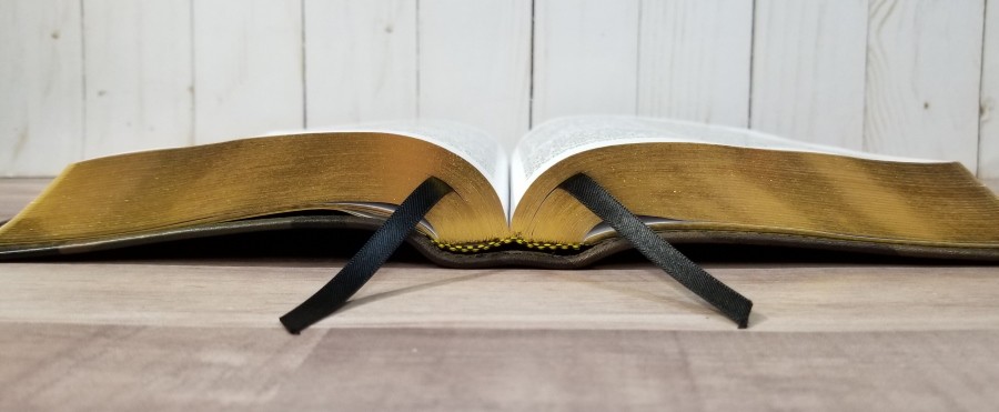
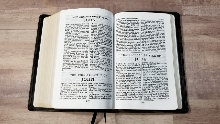
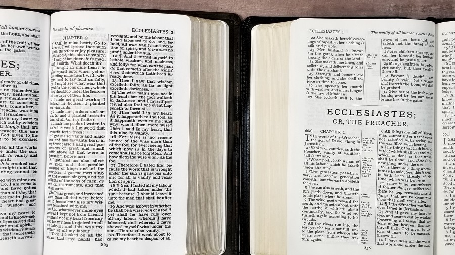
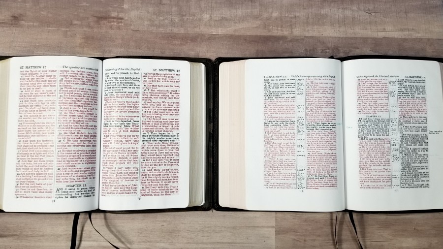
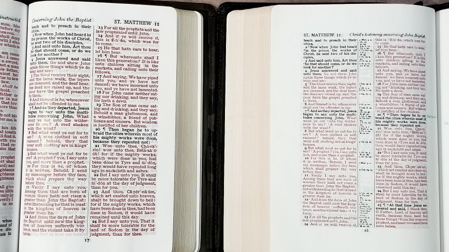
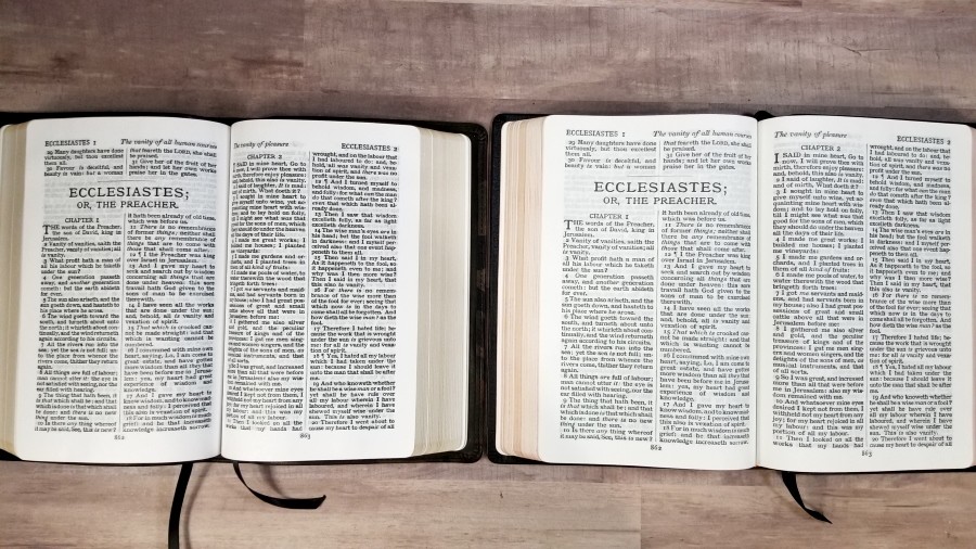
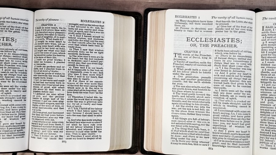
The paper is similar to the 22# that CBP uses in other Bibles. It’s somewhere in the low to mid 30’s in gsm. It’s white in color and decently opaque. It does have a little bit a show-through that’s more noticeable in certain lighting. It also has noticeable glare under direct lighting. It isn’t enough to keep me from using it, but I wanted to mention it. The paper has a rough texture that makes it easy to separate with one hand. The page edges are gold gilt.
Typography
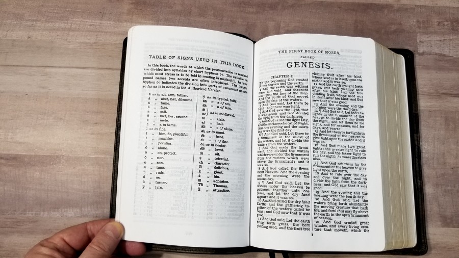
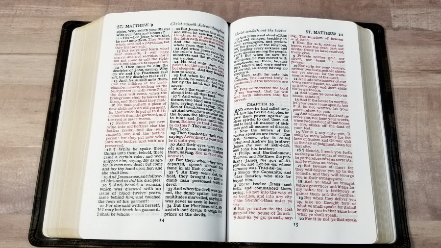
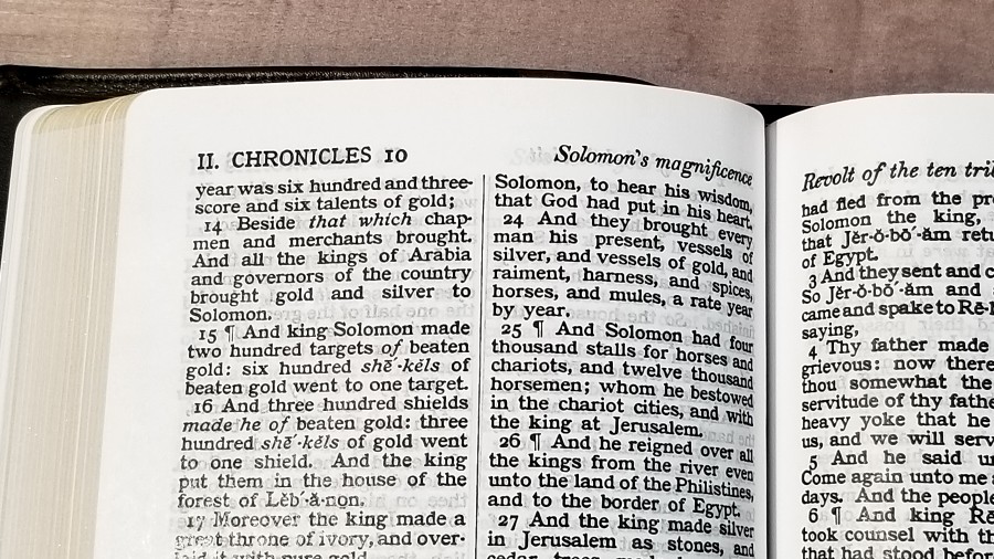
The text is presented in double-column verse-by-verse. Each verse is indented. The header includes the chapter number in the outer margin and a page summary in the inner margin. The footer displays the page number.
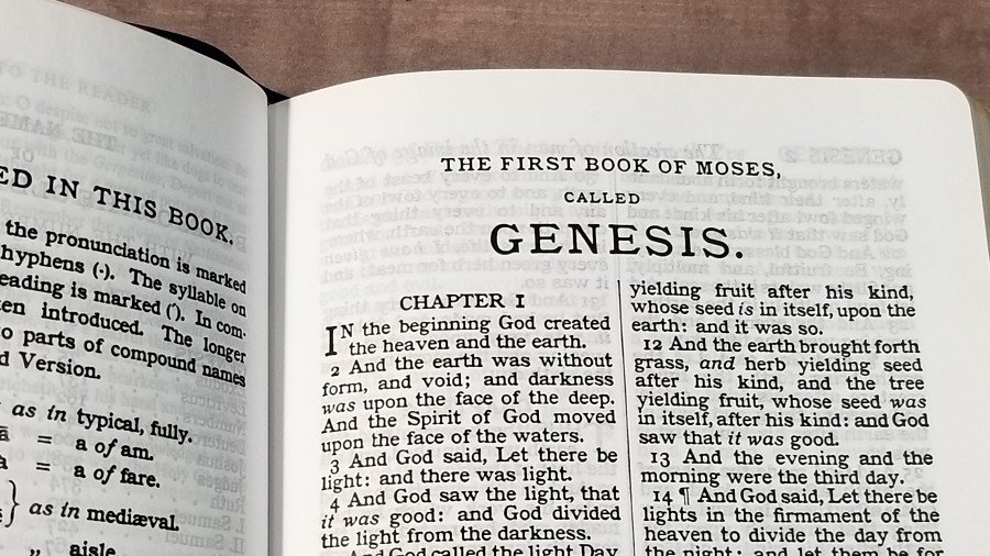
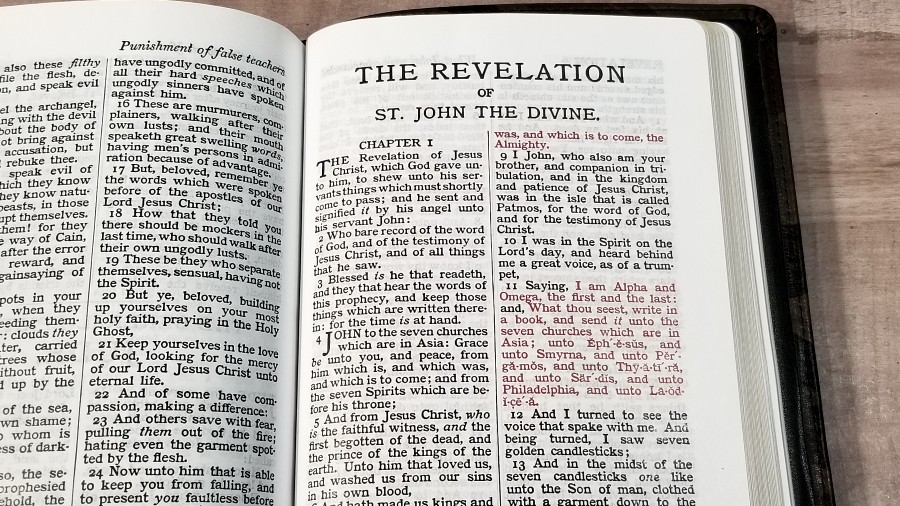
The font is 10-point. It’s a reprint of an old metal press setting that’s much heavier and darker than most modern digital fonts. This is a red-letter edition. The red letters continue through Revelation. The black and red letters are dark and consistent throughout. I don’t know why, but this red is easier to photograph than most.
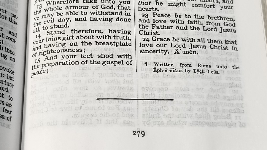
It has self-pronouncing marks within the text for difficult names and italics for supplied words. A guide in the front shows how to use the pronunciation marks. Paragraphs are marked with pilcrows. Like most KJV’s, there aren’t any pilcrows after Acts 20.
Since this is an older layout that was typeset by hand, there are a few places where the words are close together and almost look like oneword. I still find it easy enough to read, though. If there is enough room on the page, each book starts where the last book ended. The epistles contain the Cambridge book endings, telling who the book was written to and from.
It has ½” of space in the outer margins and the footer. This leaves enough space for references, symbols, or small notes.
Other Pages
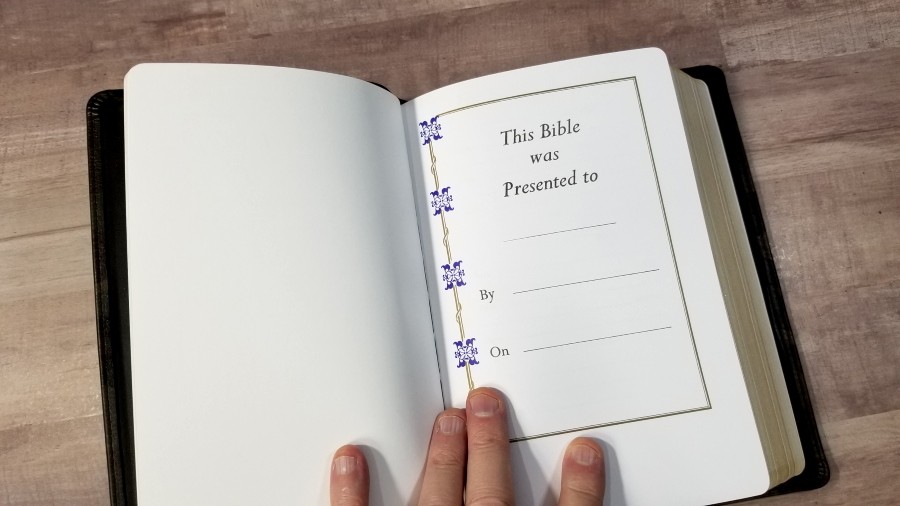
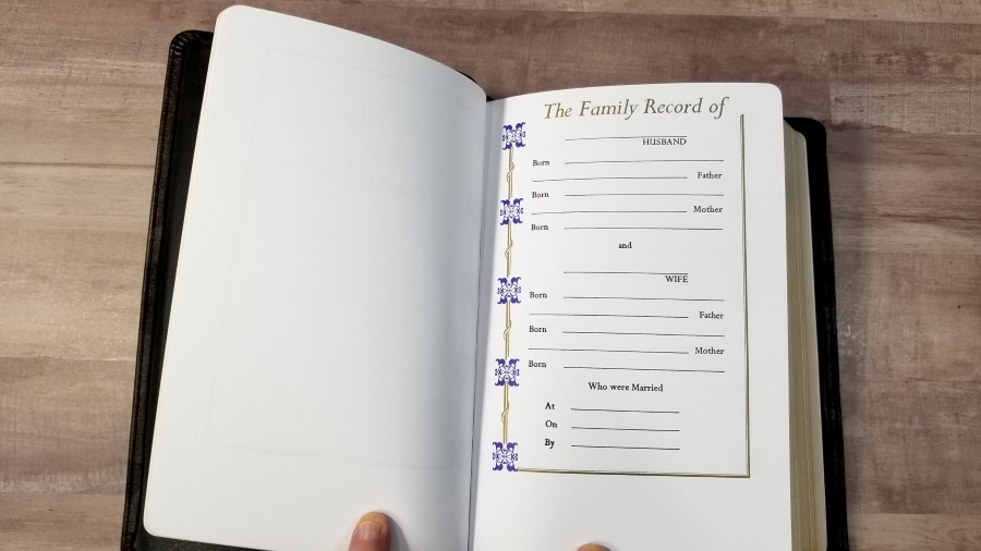
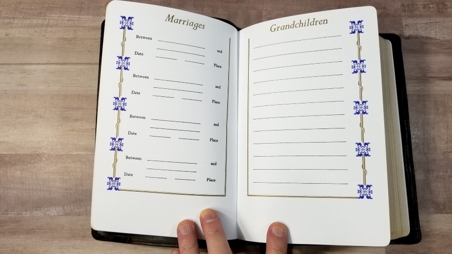
In the front are presentation and family pages printed on thick paper. They include the family record of the husband and wife, children, marriages, grandchildren, and deaths. Most include blue and gold highlights, while the page for deaths has black and gold highlights. They’re printed high on the page, so there’s a lot of extra space at the bottom.
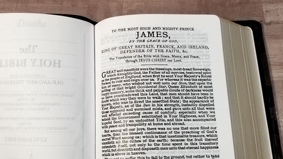
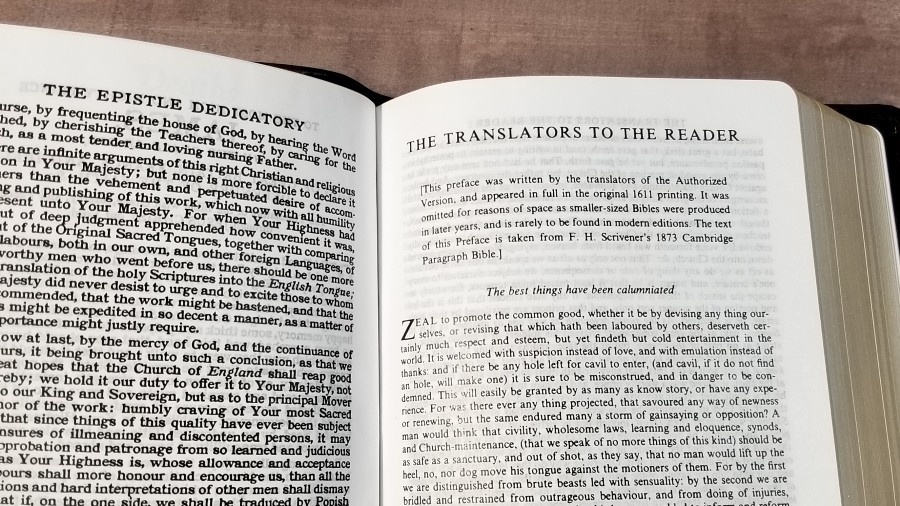
It also has the Translators to the Reader and the Epistle Dedicatory to James. I like that the Translators to the Reader is included. This is a fascinating and important document that every KJV reader should read, as the translators provide insights into their work.
Concordance
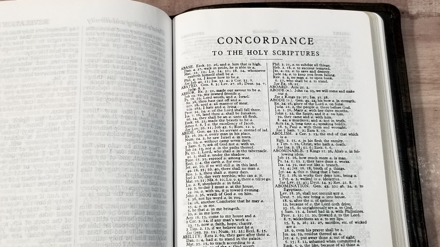
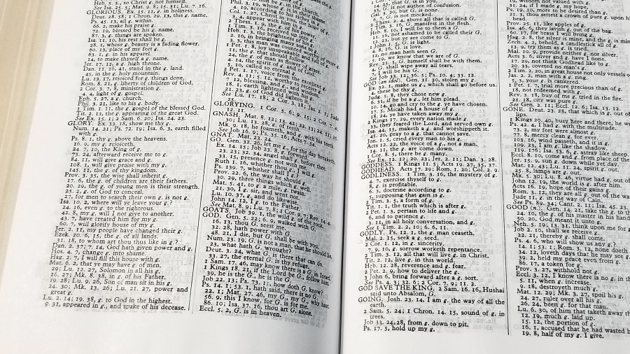
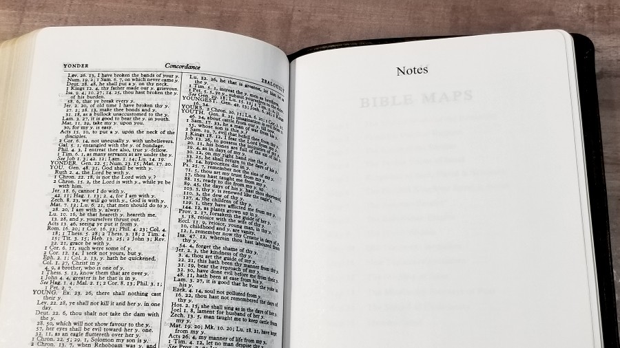
The concordance is the same that’s used in the CBP Journaling Bible I reviewed recently. It has 196 pages with two columns per page. They include the excerpt as a list that’s easy to read. Many entries include a few more references without the excerpt. This is an excellent concordance for study and sermon prep.
Here’s a list of example entries with their number of references to help you compare:
- Christ – 14
- Christian – 3
- Faith – 122
- Faithful – 57
- Faithfully – 4
- Faithfulness – 10
- Faithless – 4
- God – 61
- God (an idol) – 20
- Goddess – 4
- Godhead – 3
- Godliness – 14
- Godly – 14
- God Save the King – 1
- Praise (n) – 41
- Praise (v) – 26
- Pray – 45
- Prayer – 39
Maps
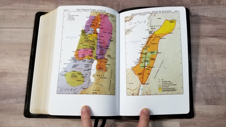
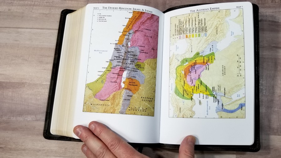
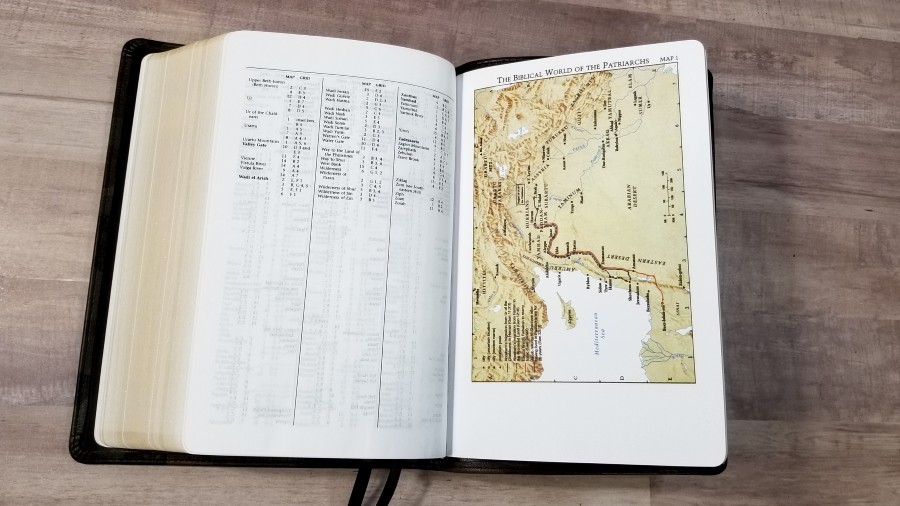
It has 15 full-color Cambridge maps printed on thick non-glossy paper. The annotations on the maps are bold and dark. They can be a touch difficult to read against the bold colors of the maps, but they are usable. They include cities, routes, Scripture references, distance, mountains, territorial expansions with dates, topography, kingdoms, battle sites, locations of events, addressees of Pauline epistles, etc.
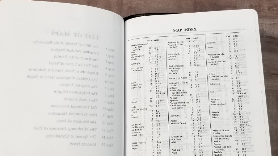
Unlike the Journaling Bible that I recently reviewed, this one does include the index to maps. I’m glad to see it included because I think a map index is a helpful tool. I like and use maps a lot and I’m more inclined to use them when I have an index. I’m grateful to see it included.
Maps include:
- The Biblical World of the Patriarchs
- Palestine: Political Regions
- The Route of the Exodus
- The Twelve Tribes of Israel
- Kingdoms of Saul, David & Solomon
- The Divided Kingdom: Israel & Judah
- The Assyrian Empire
- The Babylonian Empire
- The Greek Empire
- Old Testament Jerusalem
- New Testament Jerusalem
- The Ministry of Jesus
- The Missionary Journeys of Paul
- The Spread of Christianity
- Modern Israel
Comparisons
CBP Handsize Center Column Reference Bible
The CBP Handsize Center Column Reference Bible is a reprint of the Cambridge Turquoise that’s been reduced in size. The overall size is about the same for both Bibles. The font is smaller, but it’s still dark and readable. I actually prefer the paper in the Turquoise because it has more of an ivory color and doesn’t have glare. They have the same maps. The Turquoise has the Cambridge concordance. The two Bibles make an excellent combo.
CBP 120RL Wide Margin Cameo Bible
The CBP 120 RL Wide Margin Cameo Bible is a reprint of the Cambridge Cameo Wide Margin. It has a much smaller font, but it’s a wide margin edition that isn’t that much larger overall, so that makes sense. They seem to have the same paper. Both have dark print and the red is about the same. It looks to be a touch darker, but that could be because of the larger font. It has the same maps but doesn’t have a concordance. These also make an excellent combo.
Cambridge Large Print Text
The Cambridge Large Print Text is the Bible that the CBP 180 is a reprint of. I’m comparing it to the TBS Family Bible, which has the Cambridge text-block and is one of my favorite Bibles. The CBP is darker and the size difference isn’t that noticeable. The Cambridge paper seems to have less water content. It doesn’t have glare and I like the color just a touch more, but I prefer the cover of the CBP and I like the CBP enough to make the trade.
Conclusion
CBP’s Handsize Text Bible in Camo Print Calfskin is my favorite version of the 180 that I’ve seen. The leather is the best I’ve seen from them. It looks and feels like a well-made Bible that I can use for years without worrying about wearing it out. The print quality is amazing. The overall size and font size makes it ideal for just about any use. The price (around $65) makes this a great choice for a well-made Bible that I’m not afraid to use. The CBP 180RL in camo is an excellent Bible for carrying, reading, and preaching.
_________________________________________________________
Where to buy
This Bible will be available from ChurchBiblePublishers.com in the first week of May.
We’ll update this link when this Bible is available.
_________________________________________________________
Church Bible Publishers provided this Bible in exchange for an honest review. I was not required to give a positive review, only an honest one. All opinions are my own.









OK, I give up. Why in the world would a Bible be published with a camouflage cover?
As a U.S. Marine, I can understand it. Different preferences for different people. It’s not too hard to get is it?
wow that page glare is pretty bad. I had a bible like that once. Really made my eyes burn while reading it.
Hello Randy,
I have two editions of Cambridge French Morocco Leather large print text Bibles. The one is a Burgundy French Morocco old edition printed in the United Kingdom, and the other is Black French Morocco new edition printed by L.E.G.O. in Italy; and both contains the same typos in Nehemiah 10:32 where it reads ‘skekel’ instead of ‘shekel’, and in Jeremiah 49:5 where it reads ‘LORD GOD of hosts’ instead of ‘Lord GOD of hosts’. Could you please let me know if these typos are found in the text of this Bible being an exact reprint of the Cambridge Large Print text as I have been thinking of buying one.
Kind regards.