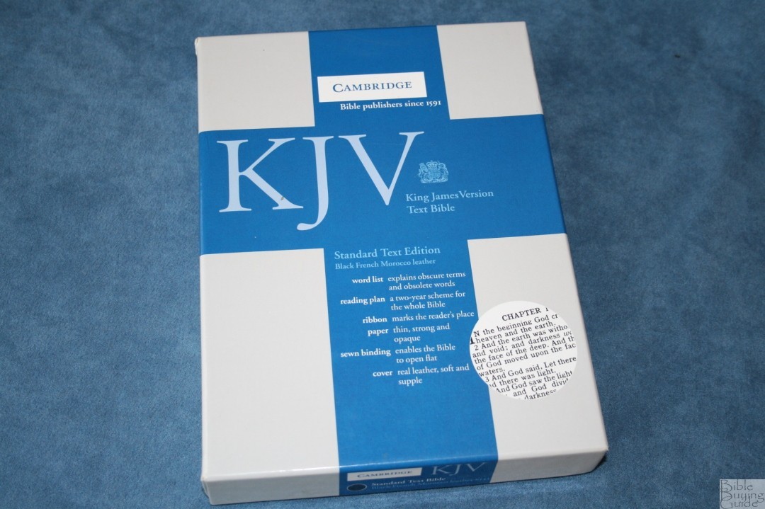
The Cambridge Standard Text is a hand-sized Bible that’s been around for many years. It’s also known as the Emerald, and is an enlargement of the Royal Brevier from the 1950’s by Eyre & Spottiswoode. The model I’m reviewing is KJ43. It’s black-letter and French Morroco and was printed in the UK in Belarus. It’s also available in red-letter and in hard cover (which would make a great pew Bible).
| Pros | Cons |
| Hand Size | Not available in edge lined leather |
| Thin | |
| Dark font | |
| No distractions in the text | |
| Glossary | |
| Reading plan | |
| Light |
Binding
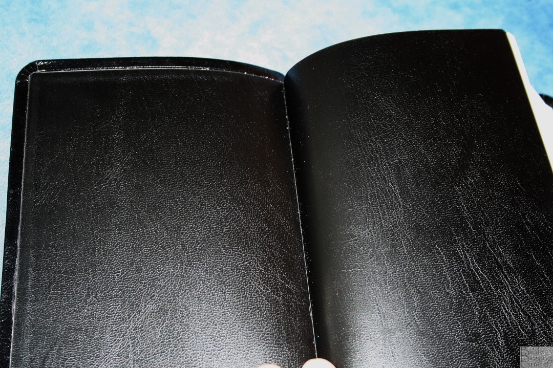
This edition is French Morocco with a vinyl paste-down liner. This is the softest French Morocco that I’ve seen. I have several Cambridge Bibles in French Morocco (Concord Wide Margin and Personal Size Concord) and they don’t come close to the flexibility of this cover. Even though it’s flexible, it isn’t floppy. I can still hold it flat in one hand with no effort. This is the level of stiffness that I prefer in a Bible cover and this one strikes the balance between stiffness and flexibility perfectly.
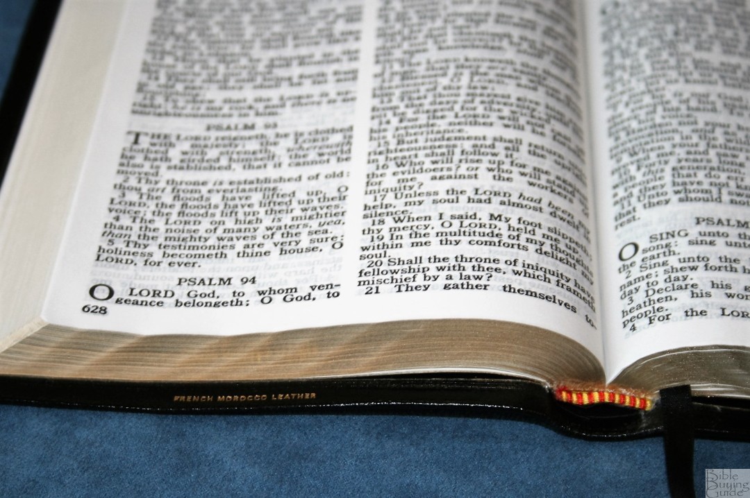
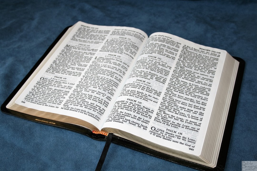
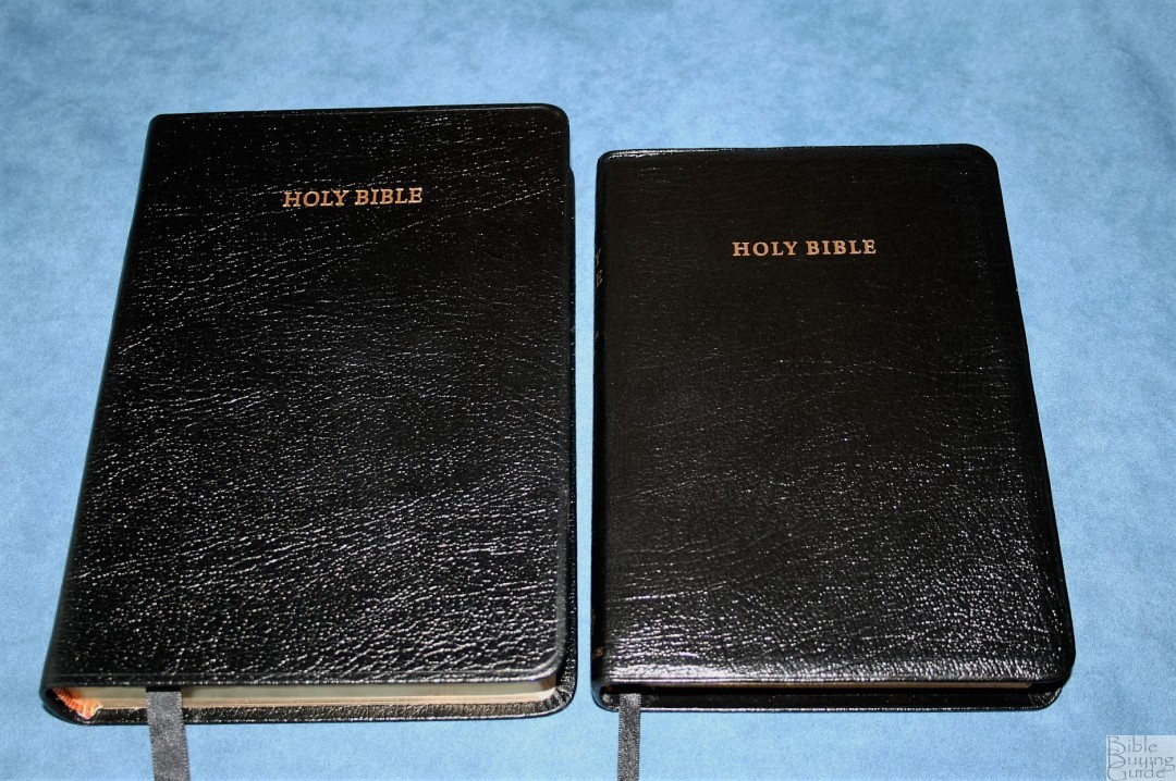
The cover is shiny with gold lettering. French Morocco grain isn’t natural but looking at this Bible I wouldn’t know it. It’s sewn and lies flat easily. The overall size of the cover is 5 ½ x 8 1/8 x 1. The text block is 5 ¼ x 7 ½ x 7/8. This size is one of its strengths. Another is its weight: 1lb 3.7oz. It’s small and light enough to be a primary carry Bible. It includes head a tail bands and one ribbon marker.
Paper
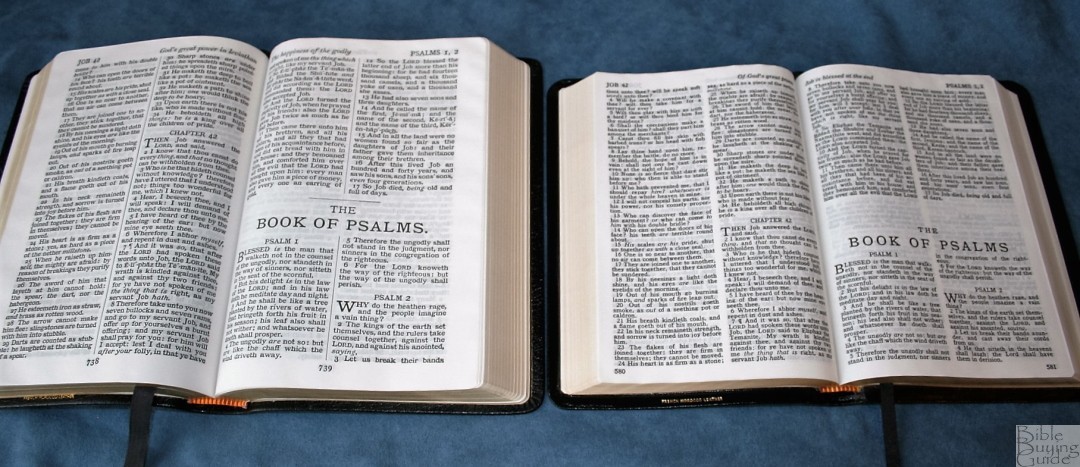
The paper is around 32gsm. It has very slight off-white hue and is very opaque. The show-through is very slight and considering how dark the font is I would have expected even more show-through. It doesn’t have a shine or glare. I think it would be good paper for highlighting and marking.
Typography
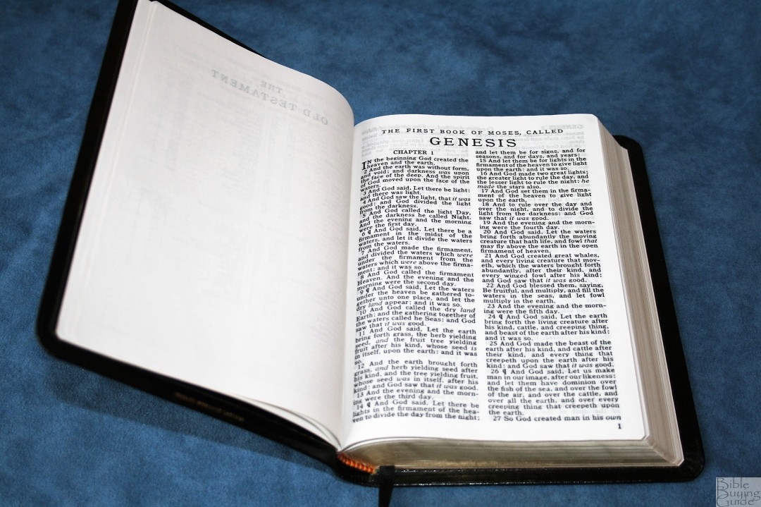
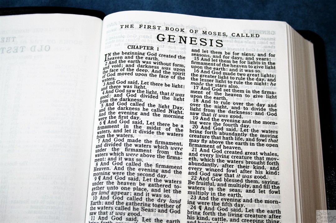
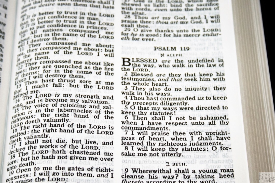
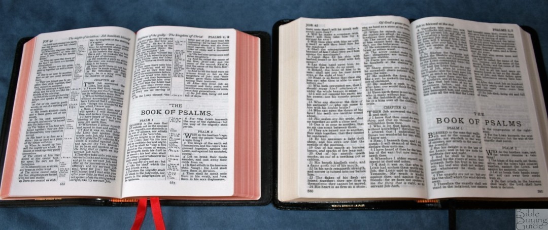
This is a double-column text-only Bible set in verse-by-verse format. The text is clean with no pronunciation marks. It does have italics for supplied words (which I prefer). The font is a bold 8-point black letter Antique Old Style Number 3. It’s a very dark and readable font. It’s the older style fonts from the era of moveable type. It’s not as elegant as the Windsor, but the font is darker which can be easier to read. Even though it’s an 8-point I can read it easier than many larger fonts. I can read it in just about any type of lighting with no issues. The print quality is consistent throughout.
The columns are 2 3/16” wide and have 36 characters across. Rather than increasing the number of hyphens, some words have extra spaces between them where it doesn’t create awkward spacing. It doesn’t have words that are too close together, so the text never feels too crowded. The margins are too narrow for notes. Fortunately the inner margin is wider than the outer margin and bring the text out of the gutter. This is a big help for reading and preaching. It lays flat enough to help bring the text out of the bend of the gutter.
The verse numbers are indented. I prefer this because it helps locate verses. If verse numbers are right-justified they can blend in too much. The pilcrow (paragraph marker) stands out more than average. It’s large and has a lot of space around it. The header includes page summaries, and the book name and chapter numbers of all the chapters that appear on that page. The footer shows the page number.
Bible Word List
This is a 14-page glossary of more than 600 words that have changed meaning or are no longer in use. It gives you the word, the modern equivalent, and the verses where you can find it. Sometimes a word has more than one meaning. With this is the case, it gives a definition with references where it applies, and then the next definition with references where it applies. I appreciate that this is included. A lot of people are not aware that words have changed meaning. I know to look up words that I don’t know the meaning of. I don’t know to look up words that I don’t know the meaning of but think I do. I recommend glancing through this word list to get a better understanding of the text. In my opinion all KJV’s should have this. I’d especially like to see this added to the Cambridge Large Print Text.
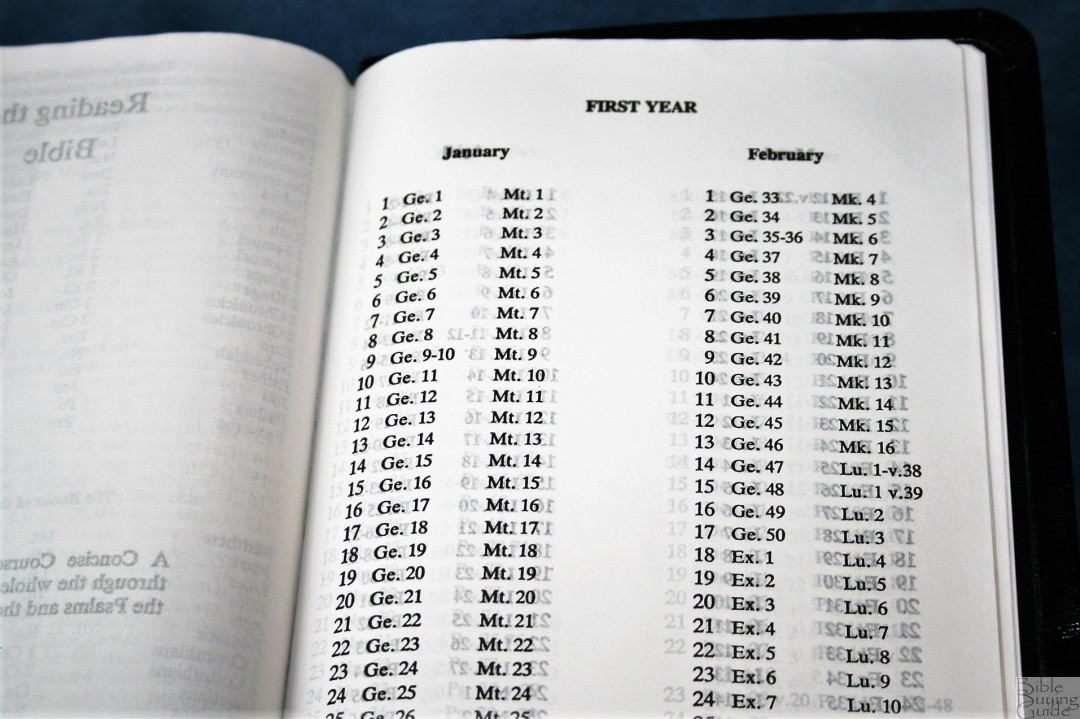
Reading Plan
It includes a two-year reading plan that will take you through the New Testament and Psalms twice. As a two-year plan you’ll have two readings per day that includes the OT and NT or Psalms. Alternately you can read both years together and have four readings per day. This is the exact plan (the M’Cheyne reading plan) that my family uses. There are four of us and each of us reads from the plan aloud every night. I’d like to see this reading plan as a standard feature in Bible publishing.
Thoughts on Using It
The font size and overall book size has a perfect balance that makes it an excellent choice for carry, reading, and preaching. It’s smaller than a thin-line and has a far better print and paper.
It’s easy to preach and teach from. The clean and bold text helps for public reading. I might end up pronouncing a word wrong (according to the British pronunciation anyway) but I won’t have awkward pauses that the pronunciation marks sometimes cause.
The size of this Bible is perfect for carry and holding. It’s not enough smaller than the Concord to buy it instead, but it is enough cheaper – it comes in at less than half the price. It feels like a thin-line but even shorter than most, and its font is much larger and bolder than every thin-line that I’ve ever seen.
It feels strong and rugged. I would throw it in a backpack and take it on a missionary trip and not worry about it. It’s a very light Bible. It makes the Windsor feel heavy (and it’s not). It stays open better than the Personal Size Concord or the Windsor. I don’t have to worry about it trying to close while I’m holding it open in my hand or while it lays open on the pulpit or on my table.
Preachers often like to carry small Bibles for preaching away from home, preaching funerals, etc. I hear a lot of complaints about having to use a small font. This one helps overcome that problem with a dark font. This font is easier to read than many larger fonts. There’s no room for notes, but with this paper you can highlight and underline with your Bible marking tools. There are no other study tools, but that’s what smartphones and tablets are for.
I love everything about this Bible. If I wanted to pick up a text-only edition to read or take with me I could take this one with no reservations. It’s made to be used and it’s made to last. I can see this being your one Bible.
If I Could Change One Thing
I’d like to see this Bible available in a premium edition complete with edge-lined goatskin, art-gilt edges, and two luxurious ribbons. I’d buy that Bible. This Bible is worth buying and having it rebound if you prefer edge-lined leather to paste-down liners.
Comparisons
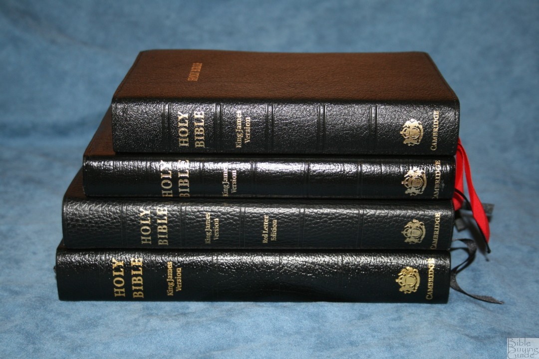
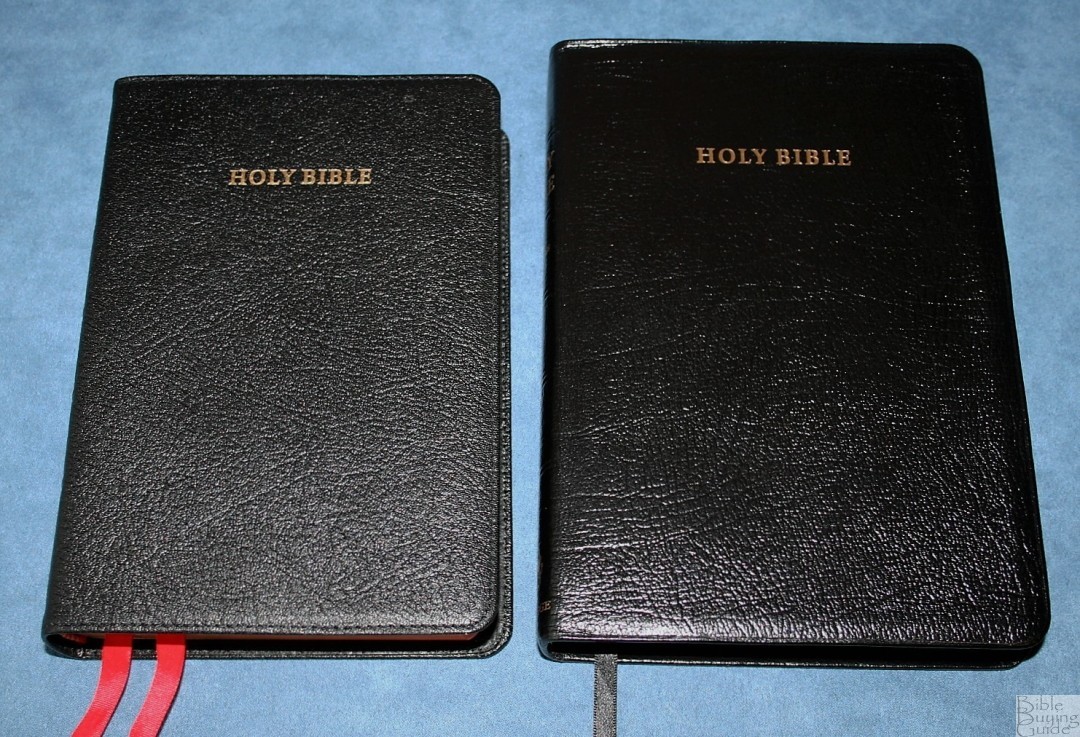
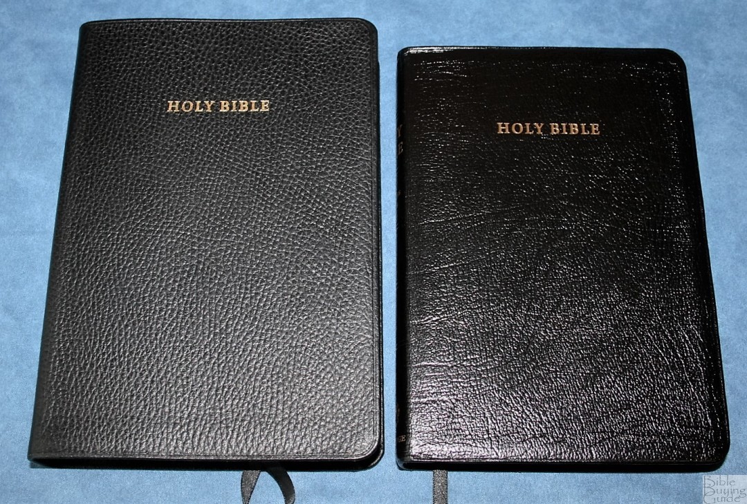
Here’s how looks compared to a few Cambridge KJV’s. From the top down we have the Cameo, Standard Text, Concord, and Large Print Text.
Cameo
The goatskin on the Cameo is soft and the Cameo is noticeably smaller. The darkness and size of the text is about the same. The Standard Text is easier to read.
Concord
I’m very fond of the calf split of the Concord. The Concord is just a touch larger but not enough to care. The Concord’s font is the same size but not quite as dark. They’re both easy to read. The Concord is more elegant.
Large Print Text
The Large Print Text is not a larger version of the Standard Text. The use the same style of font, but the Large Print Text has self-pronunciation marks and it’s text gets squished in places. They’re both easy to read. The Standard Text is cleaner.
Conclusion
There’s a reason the Cambridge Standard Text KJV has been around for as long as it has. It’s a solid text-only Bible that has a perfect balance between overall size and readability. Once you pick it up and start using it it’s really hard to use anything else. I can’t get over the overall size and weight. It’s very lightweight and easy to handle, and the size of the font doesn’t suffer for it. It’s lighter and thinner than the Windsor and the font is bolder. It doesn’t feel elegant and stylish, but it does feel like the kind of Bible I can use and not worry about it. It’s perfect for reading, carry, and preaching.









This is one of the Bibles I have been recommending, as well as purchasing for gifts, as a text only Bible. The other for us with aged eyes is the Large Print, also mentioned. Primarily this is because in the UK the KJV is still copyrighted. It can be trusted not to have changes, such as “bewrayeth” not “betrayeth” in Matthew 26:73. I am a firm adherent that every believer should have both a text only (for reading w/out distractions) and a reference and/or wide margin edition of the Holy Scriptures. My only wish is that publishers would use pages with rounded corners in their hardback editions, the same as the leather. That would benefit those of us that would like to have one done with a custom leather cover & liner. Electronic helps are OK at home or church. However, I have had an opportunity to witness when I was seen reading the Word while waiting in a public place. I use the tiny edition by World Publishing either under or over my bifocals. I have no use for a NT w/Psalms & Proverbs, because I have needed access to the entire OT for witnessing. I pray that someday Cambridge or Local Church Bible Publishers will reprint the Turquoise/Presentation Reference edition.
Just saw this review! If you were looking for a reader (which I do need) would you prefer this or the Windsor? How do the 2 compare? The Windsor’s price is hard to beat but this is a Cambridge! Size-wise I love my Pitt but the font has become an issue. The Cameo is too pricey but the size is perfect.
Hi Stephen. That’s a tough one. Both are excellent Bibles. The Cambridge is slightly thinner and has a darker font. The Windsor is more elegant and has a cleaner font. I think the darkness of the font is how I would choose between them. I use them equally, but I tend to grab the Cambridge more when reading at home (I have a dark house) and I grab the Windsor more when I’m visiting a Church.
Randy thank you very much for your review and advice. I have had this Bible for a couple of days now and it is everything you said. The perfect size for carrying and very easy on the eyes. I love the font! It’s worth trading a slightly smaller size for such a bold and readable font. The cover is very soft and the Bible is very very well made. I love it! Thank you again!
That’s awesome Stephen! I’m glad you like it! It’s one of my all-time favorites. I love the overall size and the dark print.