
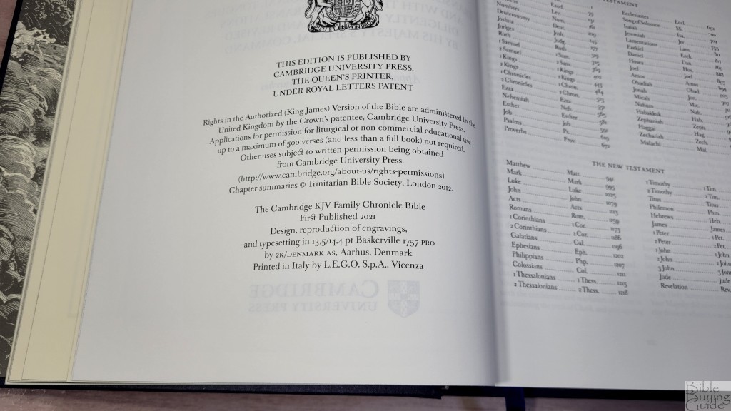
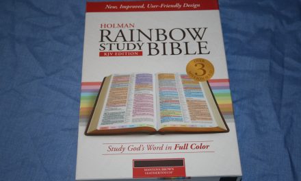
With over a decade in the making, the Cambridge Family Chronicle Bible is a beautiful family heirloom Bible designed for those that want to chronicle their family tree. It combines the highest quality design and materials to create a Bible that will last for generations. Over two hundred engravings by Gustave Doré have been reproduced with the highest level of detail available in a Bible. It’s perfect for a family library. The Cambridge Family Chronicle Bible is available in three cover options. I’m reviewing all covers, each with its own article. In this article, I’m looking at the blue hardcover edition, ISBN 9781108826822, designed by 2K/Denmark, printed in Italy by L.E.G.O.
Cambridge loaned this Bible in exchange for an honest review. I was not required to give a positive review, only an honest one. All opinions are my own.
_________________________________________________________
This Bible is available at (includes some affiliate links)
and many local Bible bookstores
_________________________________________________________
Table of Contents
- Video Review
- Binding
- Paper
- Typography and Layout
- Family Chronicle
- Chapter Summaries
- Illustrations
- Pamphlet
- Conclusion
Video Review
Binding
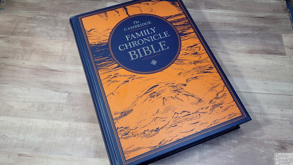
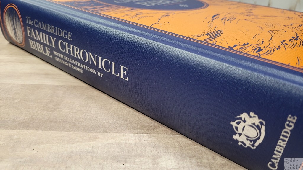
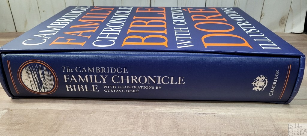
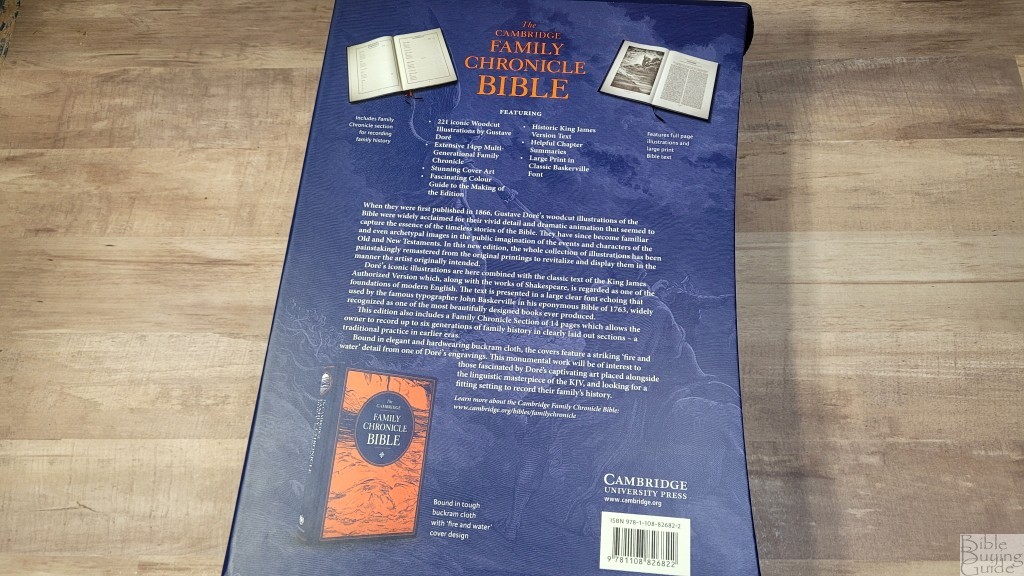
The blue hardcover is bound in buckram cloth. the front and back include a “fire and water” design from one of Gustave Doré’s illustrations. It’s printed with a bright orange that looks striking against the blue. It stands out. I like these colors. The text on the front and the spine is printed in a silver metallic foil.
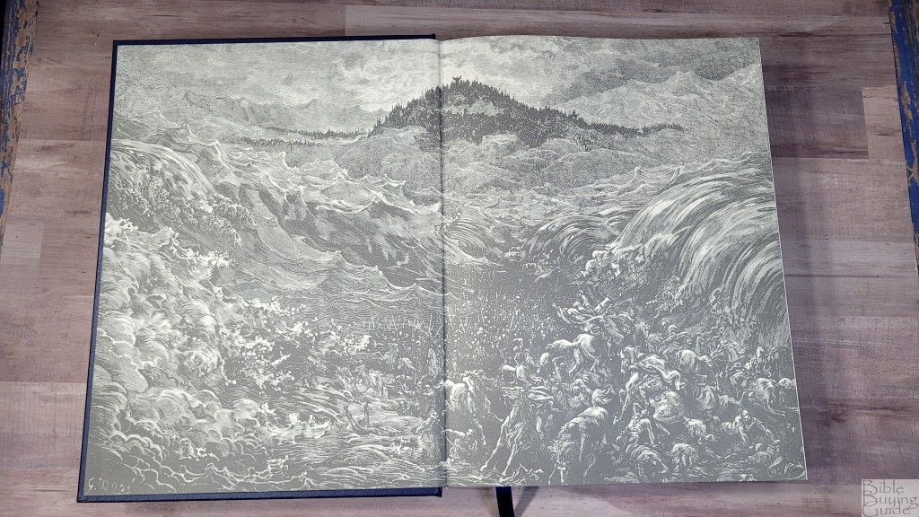
It’s lined with a thick endpaper that includes a large Gustave Doré illustration.

It includes a single 3/8″ blue ribbon and blue and white head/tail bands. The overall size is 9.75 x 12.5 x 2.25 and it weighs 8 lbs, 0.3 oz. This large size is ideal for showcasing in a family library.
Slip Case
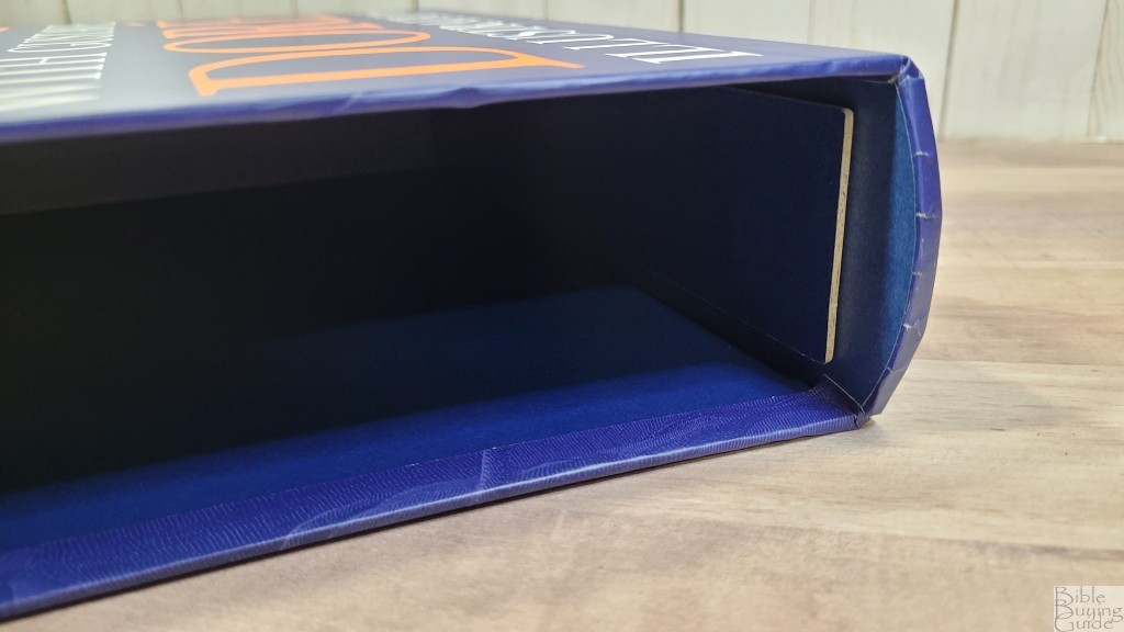
The blue hardcover comes with a thick slipcase. Inside the slipcase is a board that keeps the pages from sagging. It shows all the information about the Bible. This is a sturdy case that’s great for holding the Bible. The top of the slipcase is shaped so that it covers the spine of the Bible at the top and bottom. The sides curve inward, making it easy to grab the Bible.
Paper
I’d guess the paper to be 50gsm. It feels elegant and has a slightly rough texture that’s easy to grab and turn. It’s off-white and extremely opaque. The main show-through that’s visible is the illustrations on the other side of the page. Even that is just noticeable and doesn’t have much impact on readability. It has a matte finish and is great for reading.
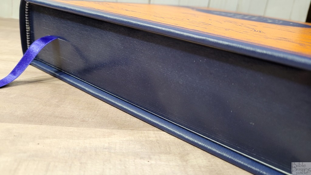
The page edges for the blue hardcover are blue under gold. This is a dark blue.
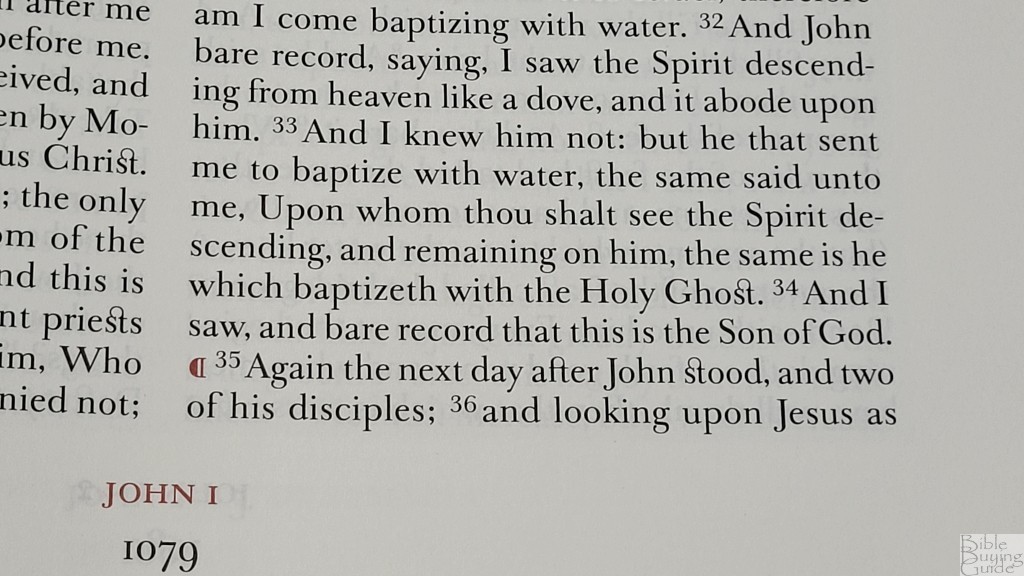
Typography and Layout
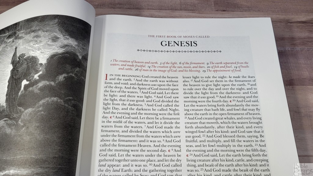
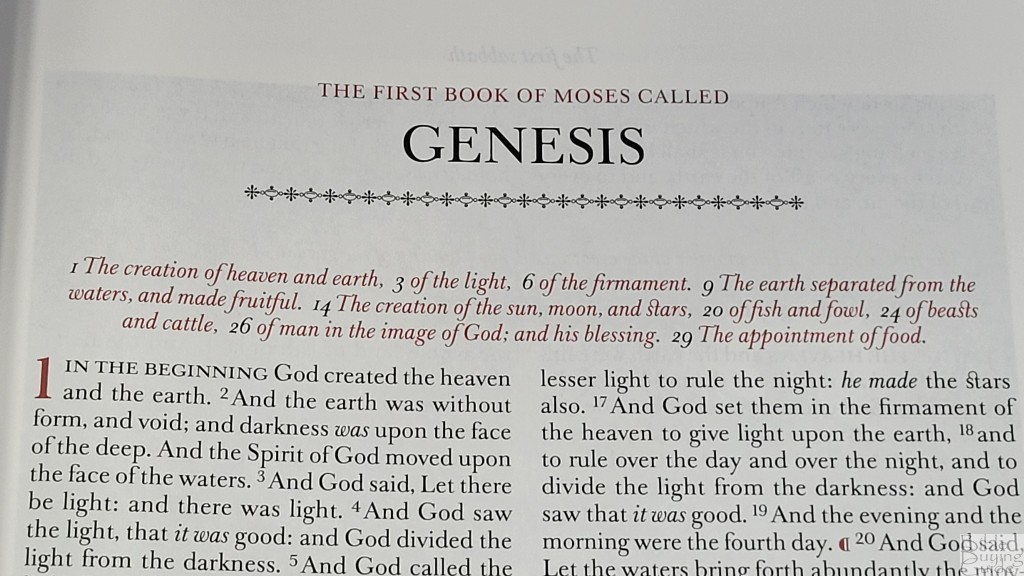
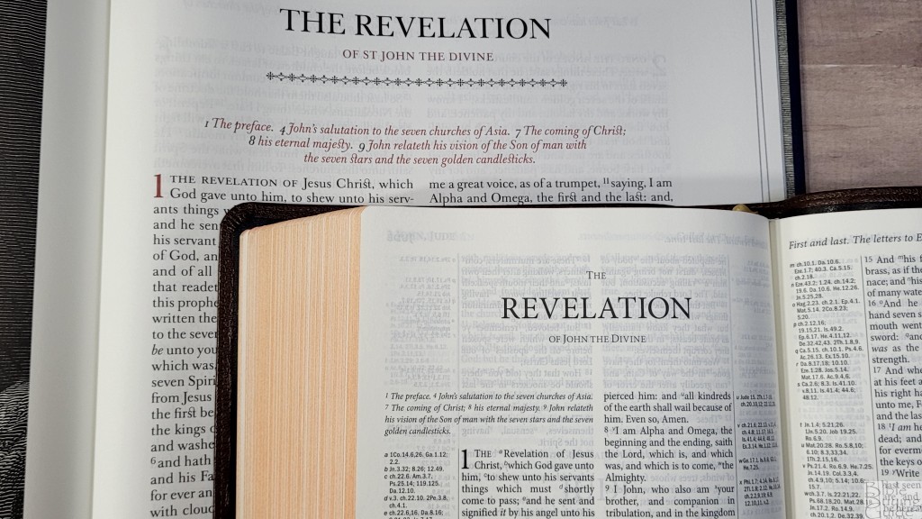
The KJV text is presented in a double-column, paragraph layout. The columns do not include paragraph breaks or any other formatting. The chapters include summaries that span both columns, so each chapter is divided from the others. The chapter summaries, chapter numbers, and pilcrows are printed in red. The header includes the page summaries centered across the top. They’re printed in black italics. The book name and chapter numbers are printed in red in the footer. They’re centered with the page number in black at the bottom. The headings for Psalms are also printed in red. The book titles have a styled line under them. The books end with a similar, but smaller, styled line.

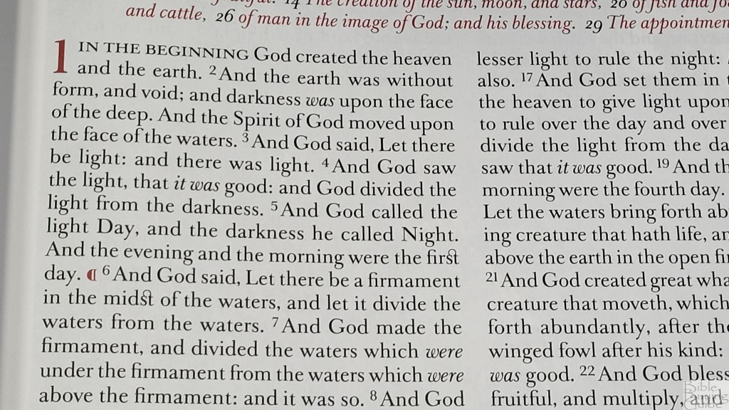
The typeface is a large print Classic Baskerville. It looks elegant. It’s based on the typeface that John Baskerville used in his Bible in 1763. He was a famous typographer and his Bible was recognized as one of the most beautiful books ever published. Considering the beauty of the Family Chronicle Bible, it makes sense that they would use Classic Baskerville. The typeface includes several unique design elements. A loop connects the letters s and t. The first few words of every chapter are in all caps. The red for the highlights is dark.
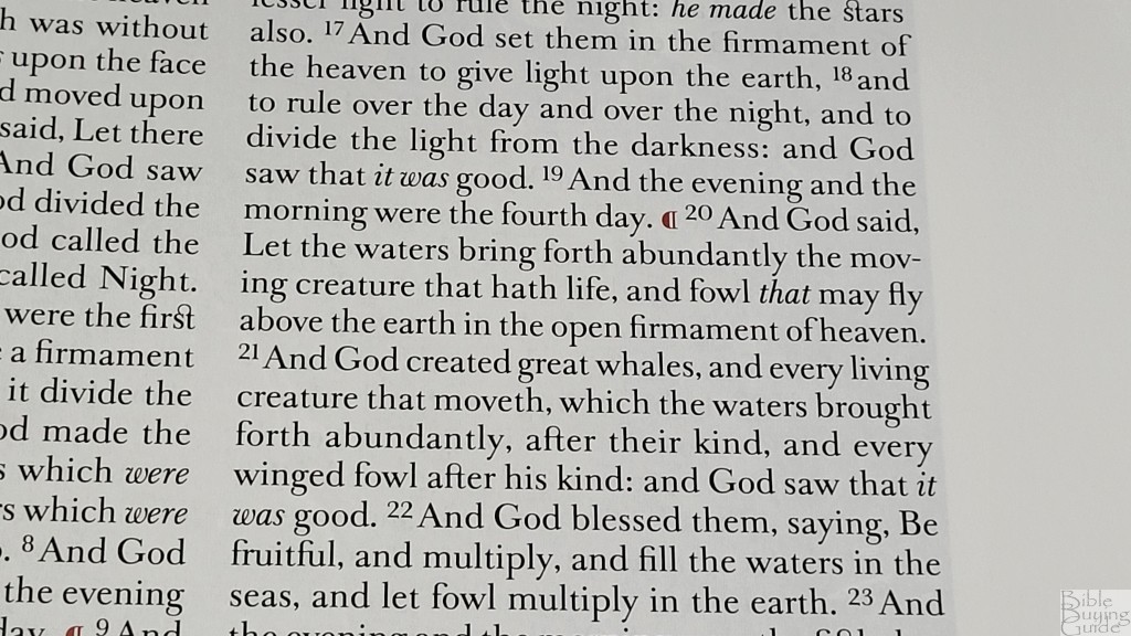
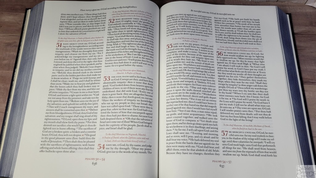
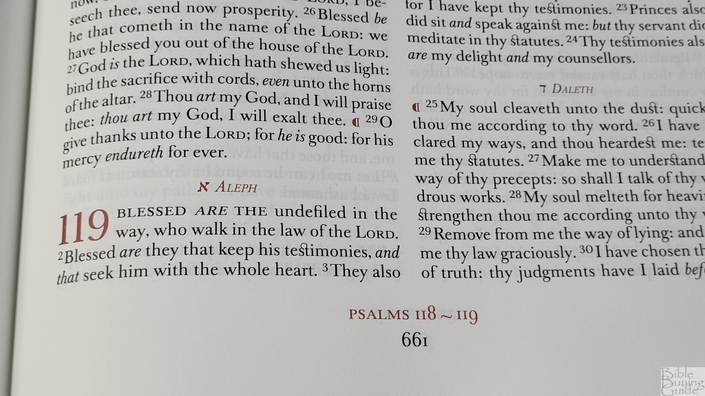
The font is 13.5-point. It’s sharp and consistent. It has 8-10 words per line. There are no paragraph breaks. The pilcrows that mark the paragraphs are placed within the columns. It’s printed with line-matching, but the paper is so opaque it’s not needed. The margin space brings the text out of the gutter and highlights the text. The margins measure: outer 1.25, inner 1, top .75, bottom .75″.

They couldn’t format the text because of the vast number of pages dedicated to the illustrations. I’d at least liked to have seen paragraph breaks. Even without them, this is a highly readable text.
Chapter Summaries
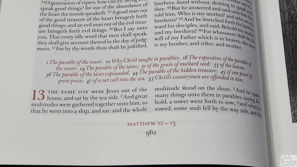
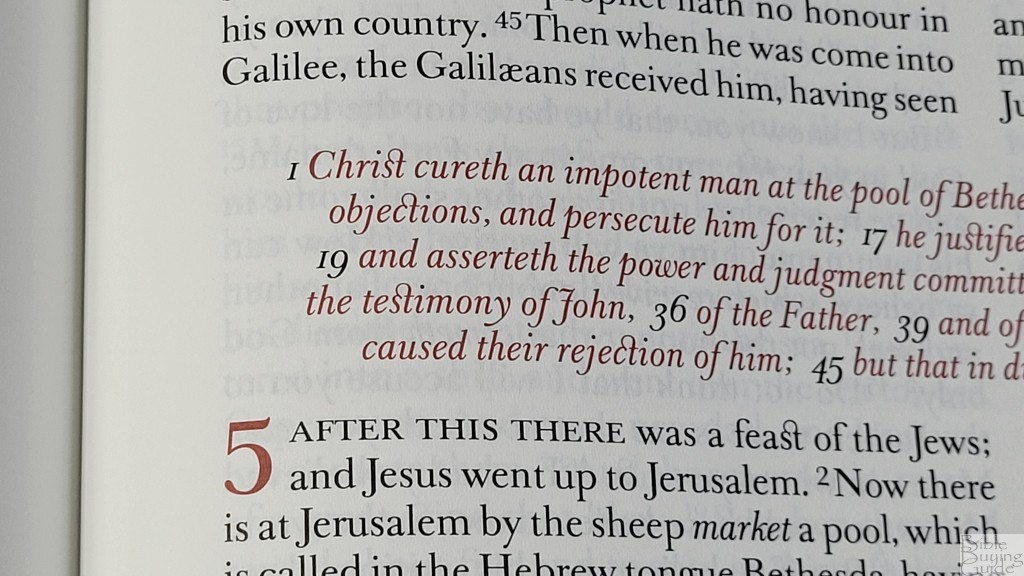
The chapter summaries are from the Trinitarian Bible Society. These are the same chapter summaries used in the Westminster Reference Bible. They’re centered at the top of each chapter. They’re printed with the same size font as the text, but they’re in red italics.
Family Chronicle
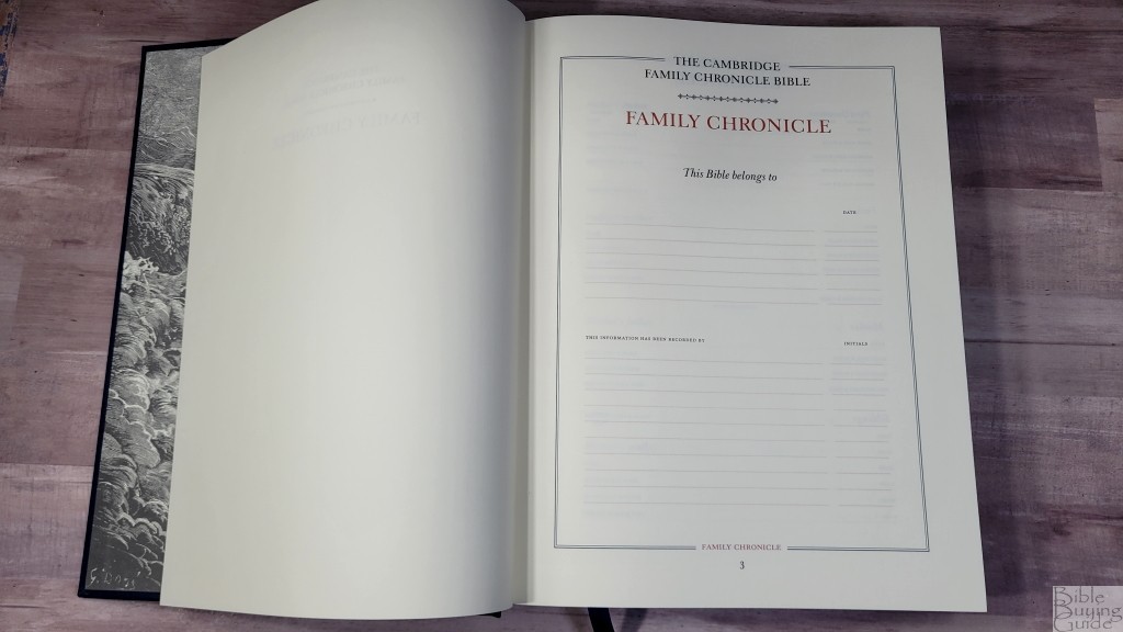
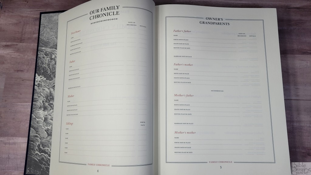
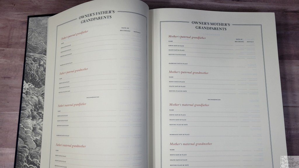
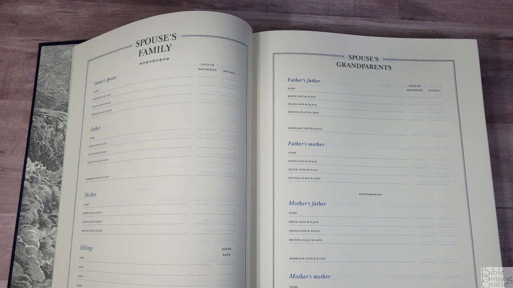
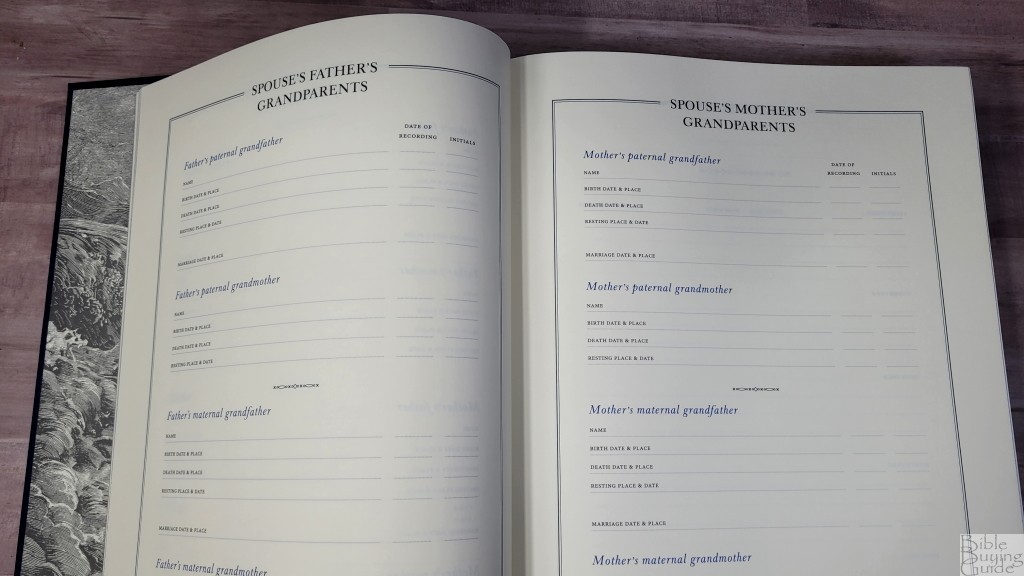

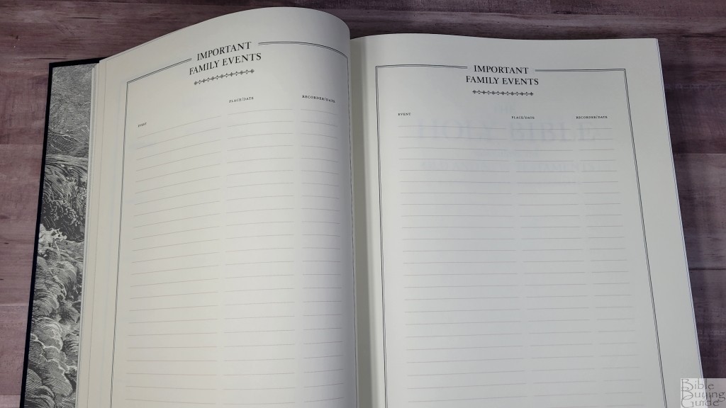
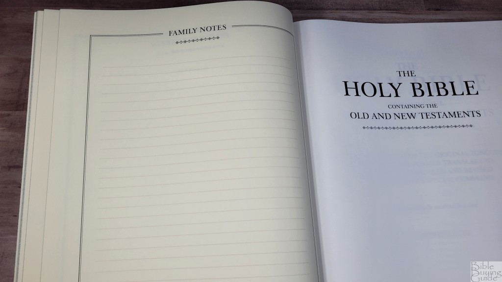
In the front are 14 pages to record 6 generations of family records. This is printed on a thicker paper than the rest of the Bible. It has a slightly cream color. A page is included inside the cover with information about how to write the notes and what types of writing implements you can use. I think this feature is what will appeal to families the most.
Records include who this Bible belongs to, who recorded the information, first owner, father, mother, siblings, grandparents, father’s grandparents, mother’s grandparents, spouses family, children of, grandchildren, important family events, and family notes. Each includes the name, birth date and place, death date and place, and resting place and date. Grandparents and parents include marriage place and date. The titles for the owner’s information are printed in red, while the spouse’s information is printed in blue. The records include fields for the date of recording with their initials.
Illustrations
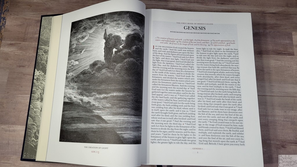
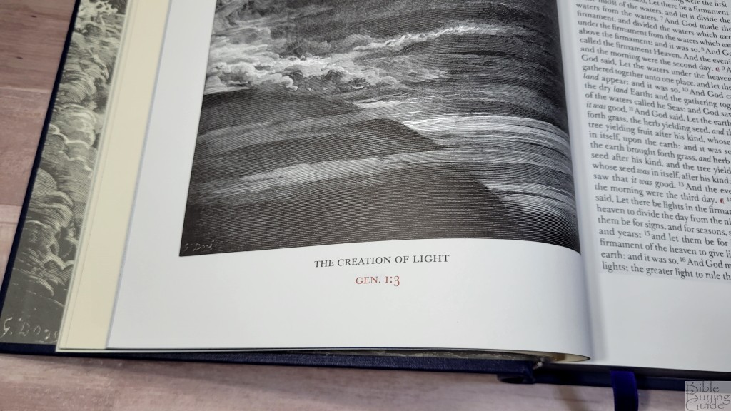
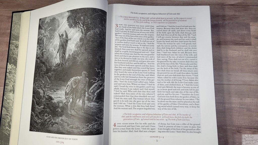
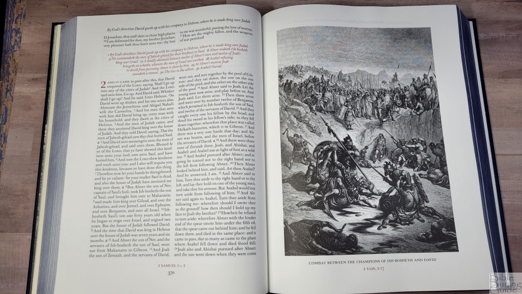
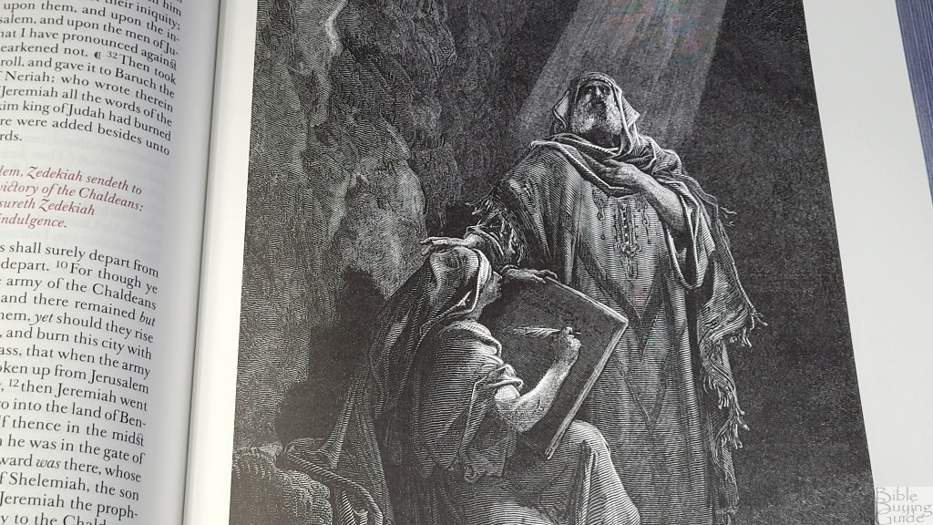
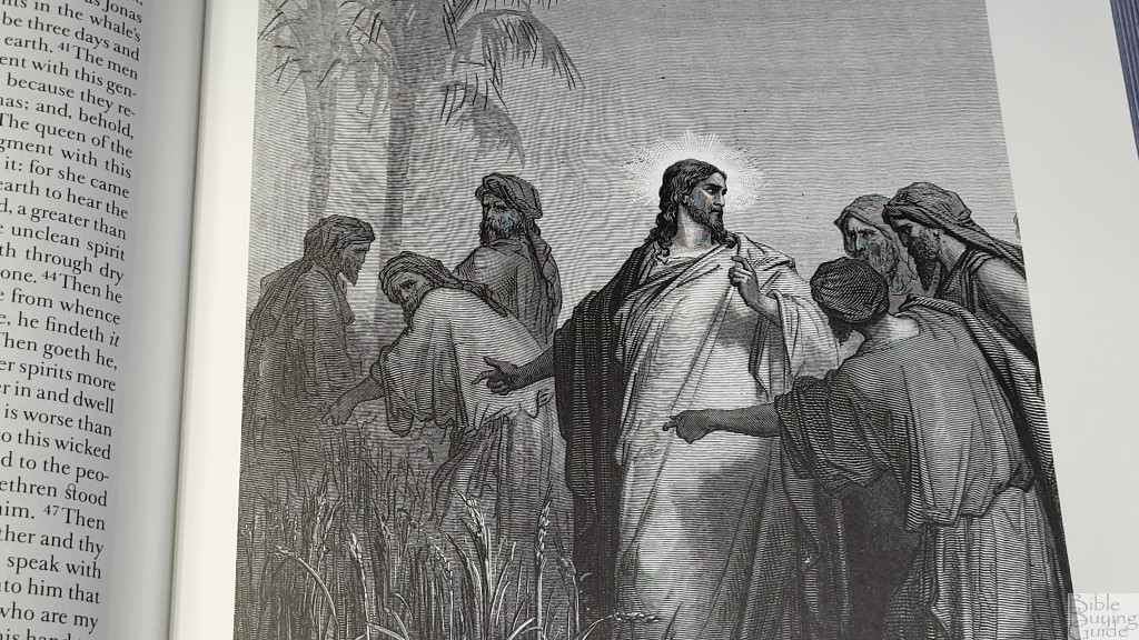
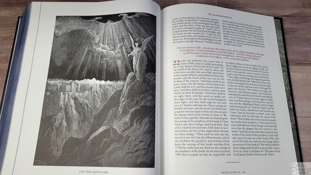
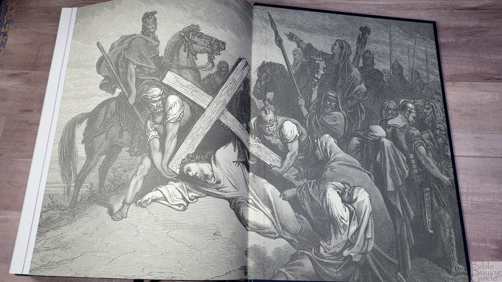
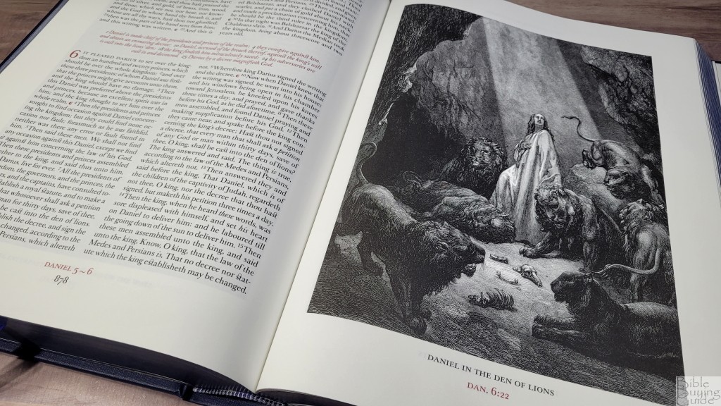
Throughout the text are all 221 of Gustave Doré’s woodcut illustrations. These illustrations were first published in 1866 and are considered some of the most famous images related to Scripture. They’re placed on the pages where the events are discussed and help the reader to visualize the setting. These illustrations are the star feature of this Bible. They’ve been remastered from the original printings for the most detailed and accurate printing possible. They look great on this paper. They take a full page. The title of the illustration is placed at the bottom along with the Scripture references they correspond to. It’s hard for me to imagine that these images were carved in wood.
Pamphlet
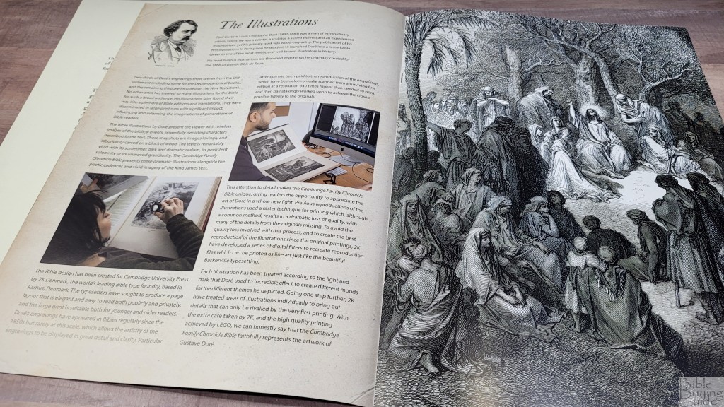
A pamphlet is included that shows the making of this edition and a page with information on how to use it. The pamphlet includes color photos of the designers and provides lots of detailed information. I like having this type of information about a Bible. I do wonder if any of it could have been printed in the Bible itself, but I’d rather have it separately than not have it.
Conclusion on the Cambridge Family Chronicle Bible in Blue Hardcover
The Cambridge Family Chronicle Bible in blue hardcover is the most affordable of the three cover options. The design, materials, and print are ultra-high quality. The font design matches the elegance and the red is about the best I’ve seen. The text is pretty, but I’d love to have seen paragraph breaks rather than red pilcrows within the text. These are the highest quality printings I’ve seen of the Gustave Doré illustrations and the paper is perfect for their detail. The 14-page chronicle makes this Bible a great addition to any large family library.
I’ll place links to the black and brown editions as I post them.
_________________________________________________________
This Bible is available at (includes some affiliate links)
and many local Bible bookstores
_________________________________________________________
Cambridge loaned this Bible in exchange for an honest review. I was not required to give a positive review, only an honest one. All opinions are my own.


It looks like an ‘absolutely gorgeous’ volume! But my only ‘question though’ is this: does ‘this Bible’ supposedly being the Text of the KING JAMES VERSION (AUTHORIZED VERSION) contain not only the ‘Texts/books’ of the Old & New Testaments of the KJV/AV but also the ‘Texts/books’ of the Apocrypha of the KJV/AV…?
I had ‘the opportunity & privilege’ about ’40 or so’ years ago to ‘handle and and examine and experience’ a copy of ‘the Dore Bible’ housed in ‘the main branch’ of the Rochester, NY ‘public libraries’.
That copy of ‘the Dore Bible’ did include the Text of KJV/AV translation of the Apocrypha with accompanying ‘Dore illustrations’. Does this new edition ‘follow suit’…?
If not…I would have ‘to give careful consideration’ before deciding to purchase this ‘newest offering’ from CAMBRIDGE UNIVERSITY PRESS. If as you say ‘the volume’ was ten years ‘in the making’ and includes all ‘221 illustrations’ by GUSTAVE DORE…then it should.
For ‘the [$$$] price’ CAMBRIDGE UNIVERSITY PRESS is ‘asking/demanding’ for the volume ‘nothing less’ can or should be expected. After all…’a [] book’ musn’t be judged by ‘its’ cover…but rather by ‘its’ content.
Otherwise…’this [] book’ will only have ‘limited appeal’ to ‘hardline’ Protestants…inevitably excluding Roman Catholics, Eastern Orthodox, and other ‘independent thinkers’.
Again…for ‘the [$$$] price’ CAMBRIDGE UNIVERSITY PRESS is ‘asking/demanding’ this is ‘a fair and very relevant observation…kahpeesh.