
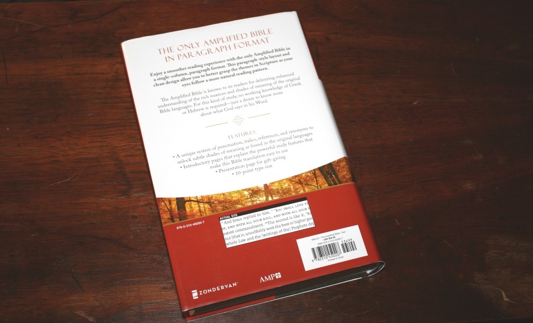
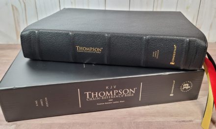
The Amplified Reading Bible from Zondervan is a new edition designed with reading in mind. It includes a single-column paragraph layout and presents the text in the cleanest setting possible. I’m reviewing the hardcover edition, ISBN: 9780310450207, made in China.
Zondervan provided this Bible in exchange for an honest review. I was not required to give a positive review, only an honest one. All opinions are my own.
_________________________________________________________
This book is available at (includes some affiliate links)
and many local Bible bookstores
_________________________________________________________
Video Review
Cover and Binding
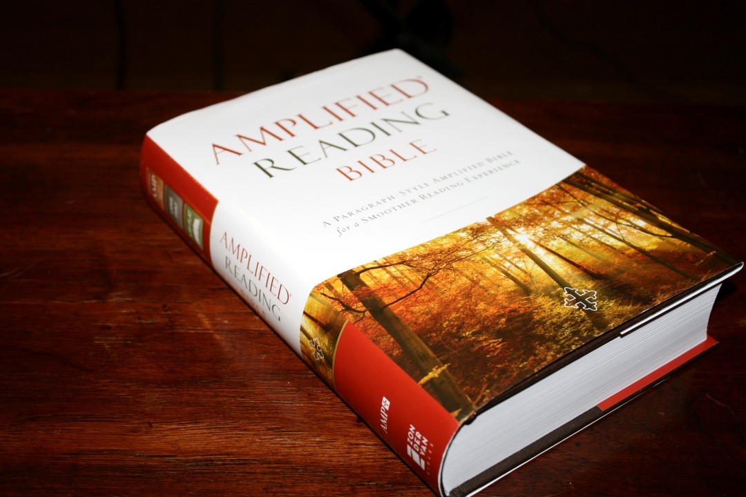
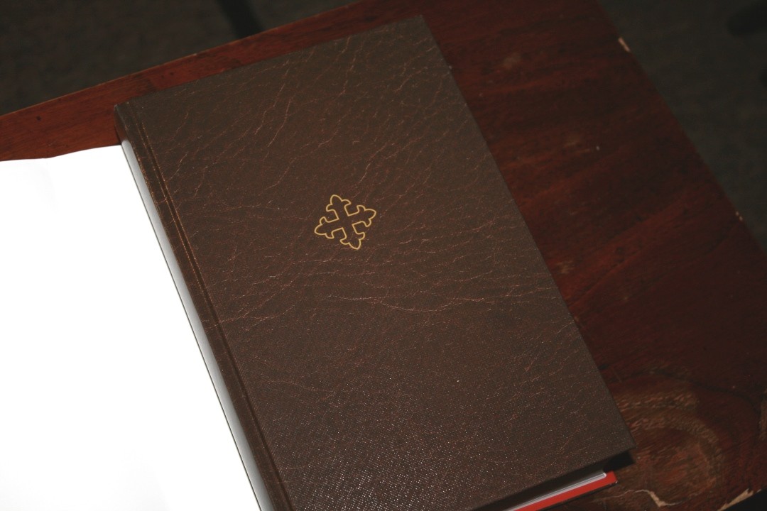
This is a hardcover edition with a dust jacket. The dust jacket includes all of the marketing info. The actual cover itself has a marbled brown look that I like.
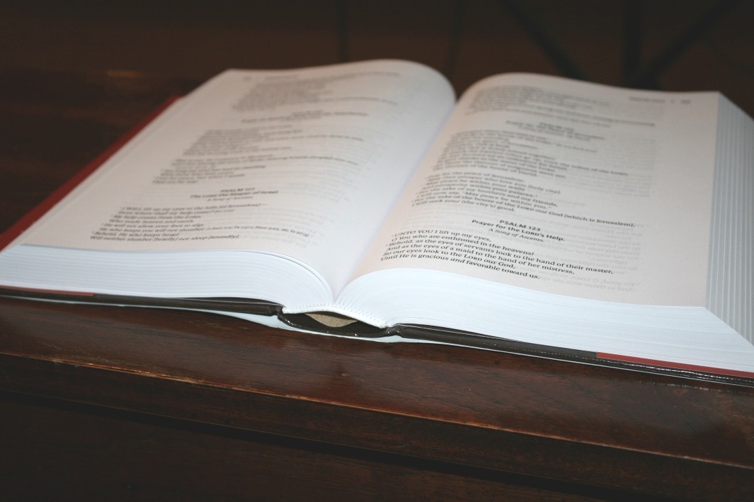
The text block is sewn and has no issues lying flat on any page. The overall size is 9.25 x 6.5 x 1.75″. It doesn’t feel like a large Bible.
Paper
The paper is smooth and is white in color. It has a slight red tint under certain lighting. It doesn’t bother me at all and I only noticed because I was looking for it. This is some of the most opaque paper I’ve seen in a Bible (it looks much better in person than in my photos). I’m not sure of the gsm but to my fingers it feels like 38gsm (I’ve now gotten the info from Zondervan. It’s 39gsm). It has a smoother texture, but the thickness feels the same as the Cambridge wide margin series.

It has no glare under direct light. I had no issues turning pages and the readability is amazing. This is some of my favorite paper in any Bible. It has 1680 pages.
Typography
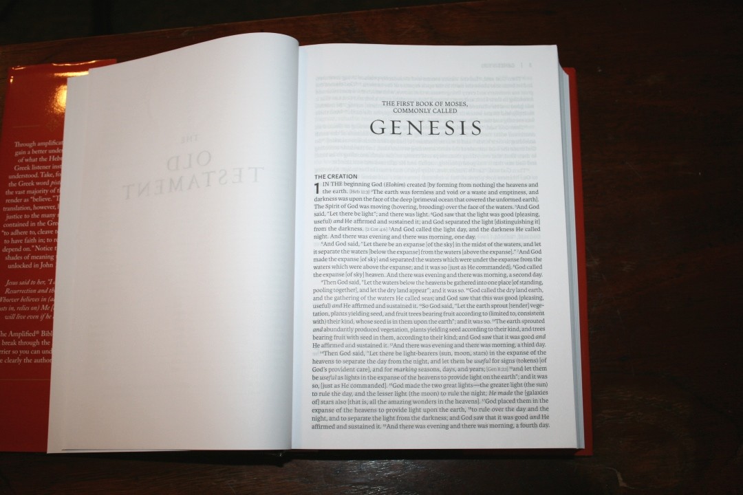
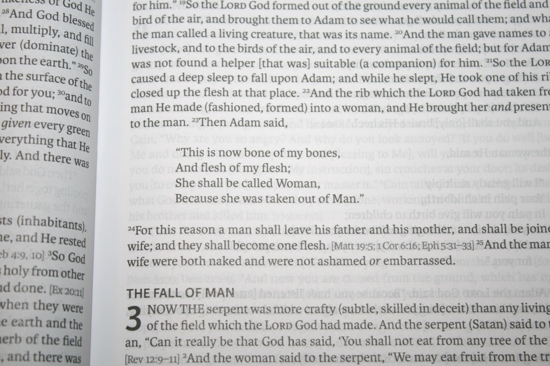
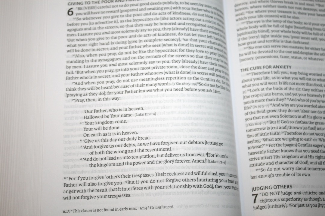
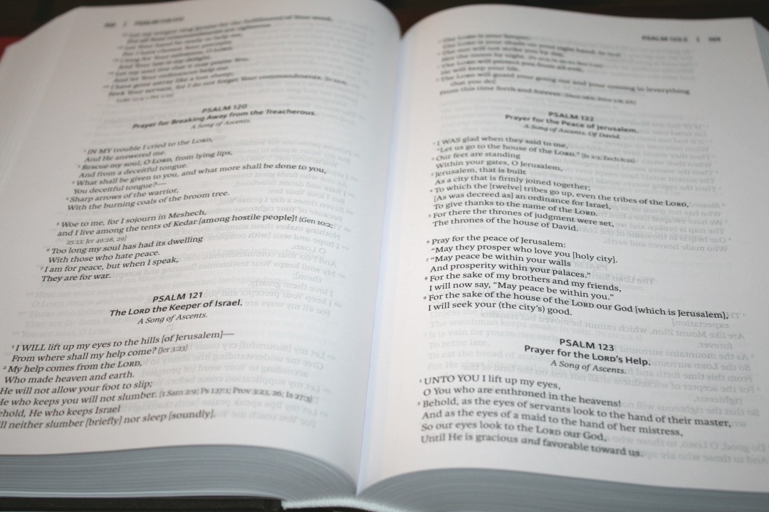
The text is presented in a single column paragraph layout with poetry set to stanzas. The header shows the page number in the outer margin and the book name, chapter, and verse number next to the page number separated by a bar. The text includes bold section headings in all-caps. Footnotes are placed in the footer.
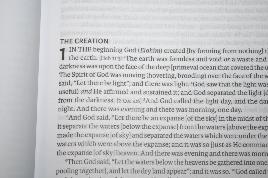
The font is 9 point with a 10 point leading (meaning the font is 10 point when you include the space to the next line). It’s black letter and it’s nice and dark. It’s printed with line-matching. The typeface is highly readable.

It has around 90 characters across and around 18-20 words per line. This is a little more than I find to be comfortable for pros, but this makes for some of the best looking poetic settings that I’ve seen. Fewer words per line would be ideal, but that would make this Bible much larger. This is a perfect example of the tradeoff between font size, layout design, and book size. You can change one and the other two are affected.
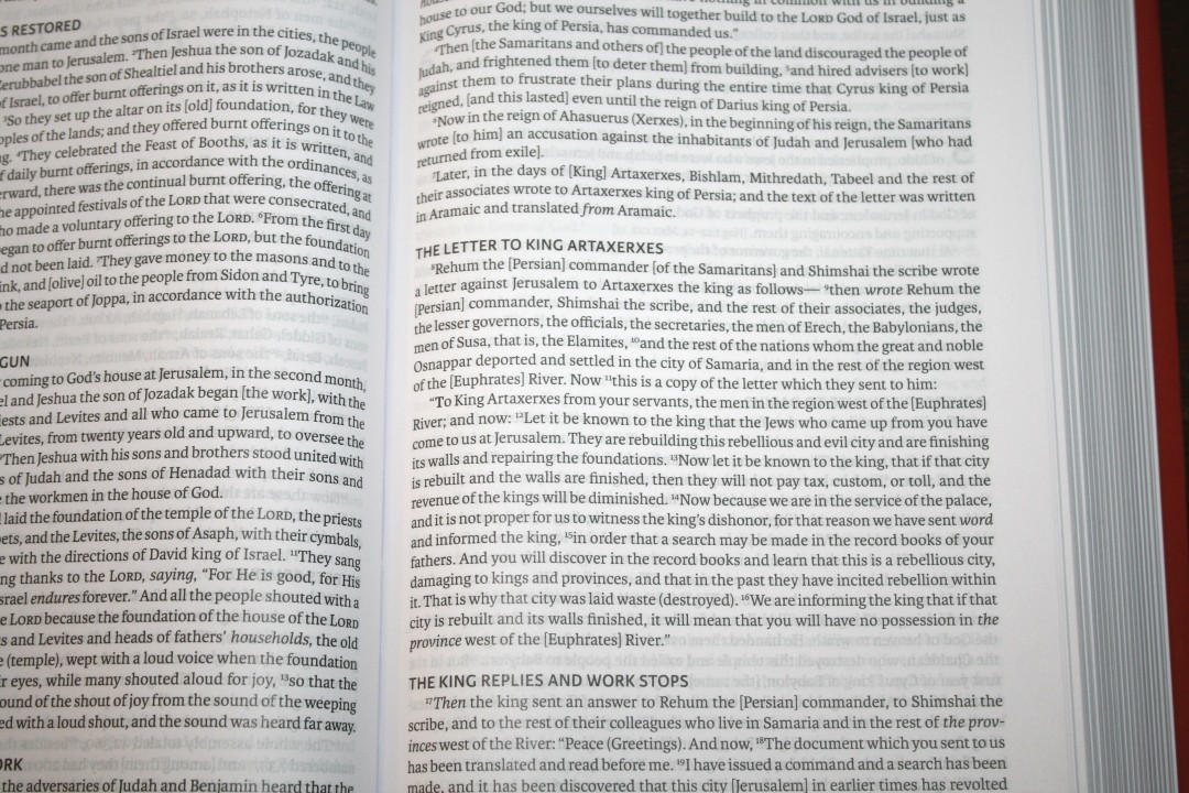
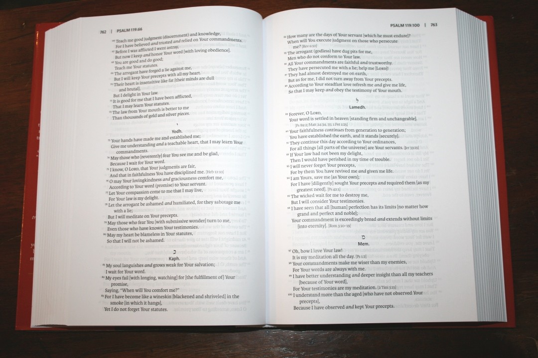
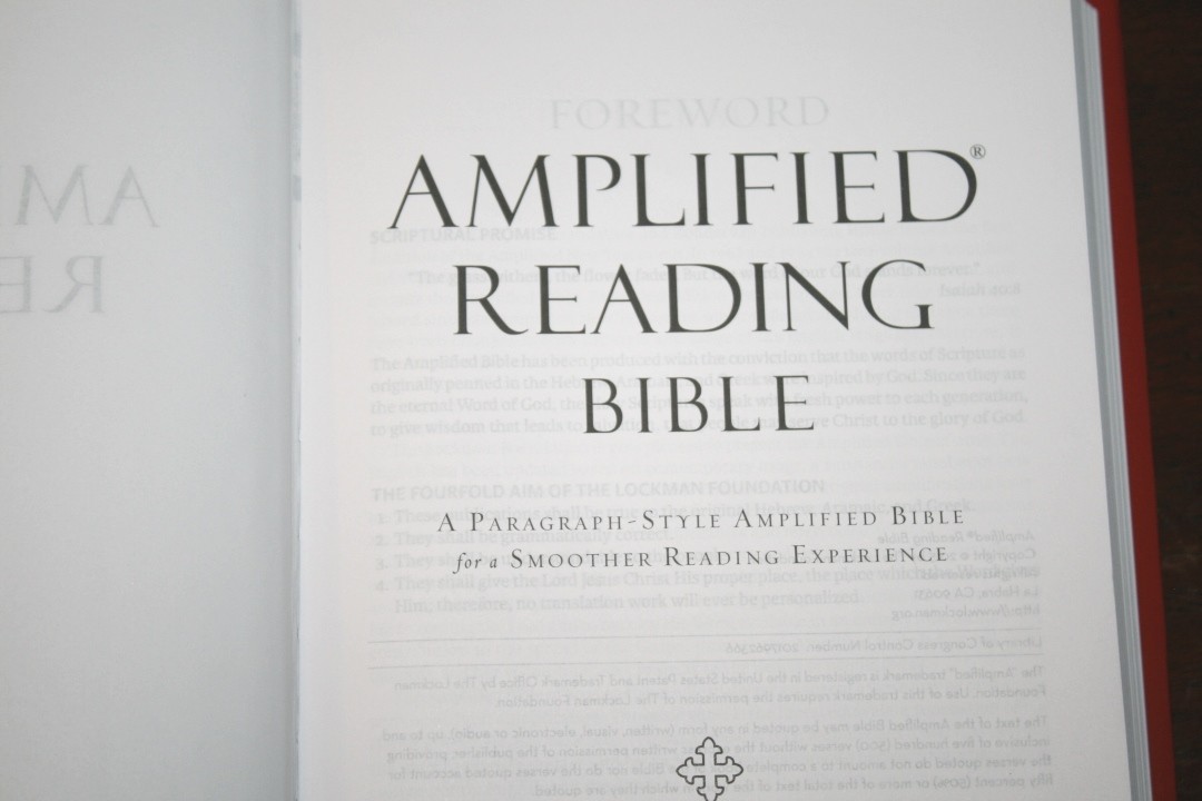
This isn’t a pure reader’s edition, as it does still include chapter and verse numbers within the text. As is expected from an Amplified edition, it includes the Amplified portions in parenthesis and brackets and references where something is quoted from in a smaller text in brackets. It also has section headings that stand out. There are a few pages in the front that explain what it all means and how to use it.

Even though I wouldn’t call it a pure reader’s edition, it is very readable and I consider it an excellent design. I find this more helpful for study than a reader’s edition. I also find the verse numbers easy enough to ignore for reading. They are small and it might be a little difficult to find when you’re trying to follow along with someone or if you’re searching for a specific verse. I taught from it and it was easier to find verses than I expected, so it is doable.
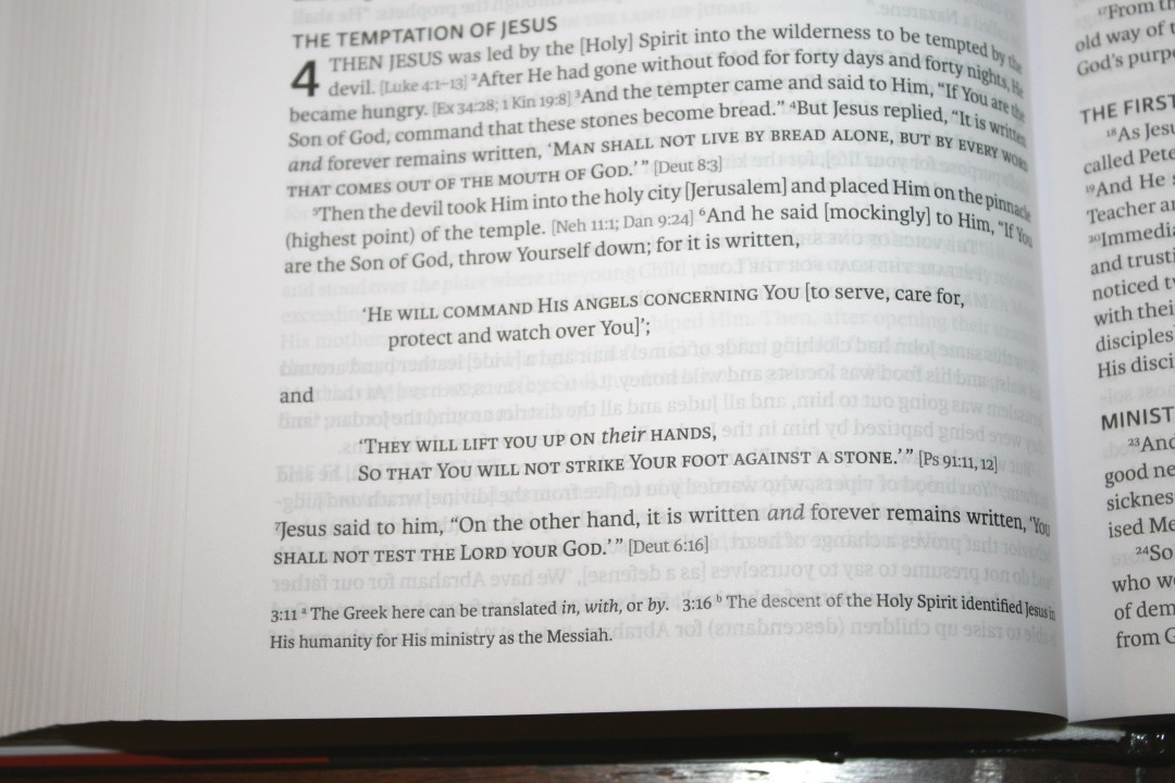
Footnotes are placed at the bottom of the page and are keyed to the text with letters. There aren’t many of them, but they are helpful for getting insights into the original languages.
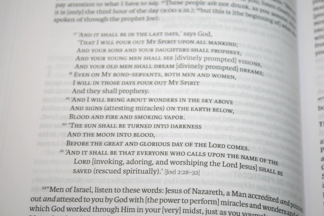
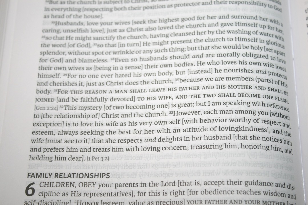
Old Testament quotes in the New Testament are in all-caps. I like this because you can know something is a quote at a glance. Supplied words are in italics. This is helpful for study.
Promises and Perspectives From the Bible
It has a few tools in the back for study. They’re topical lists that provide a topic and a few references on that topic.
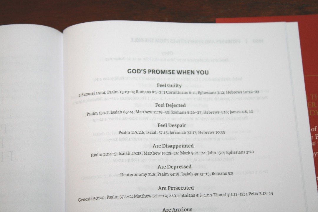
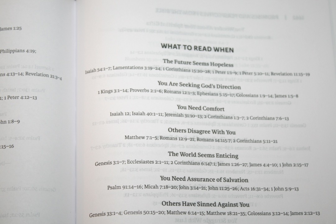
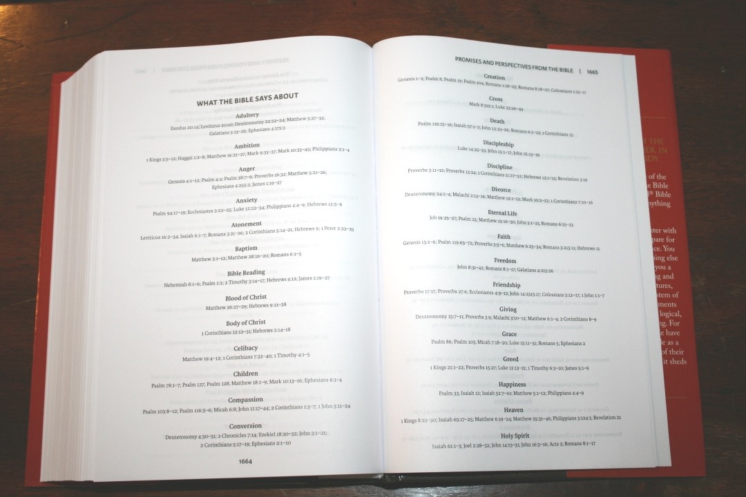
The lists include:
- God’s Promises When You
- What to Read When
- What the Bible Says About
Reading Plans
It has 4 different reading plans. None of them are for the entire Bible. Instead, they’re topical. They provide the day, a description, and the passages to read. I like that these are included. I’d still like to see a yearly plan that takes you through the whole Bible.
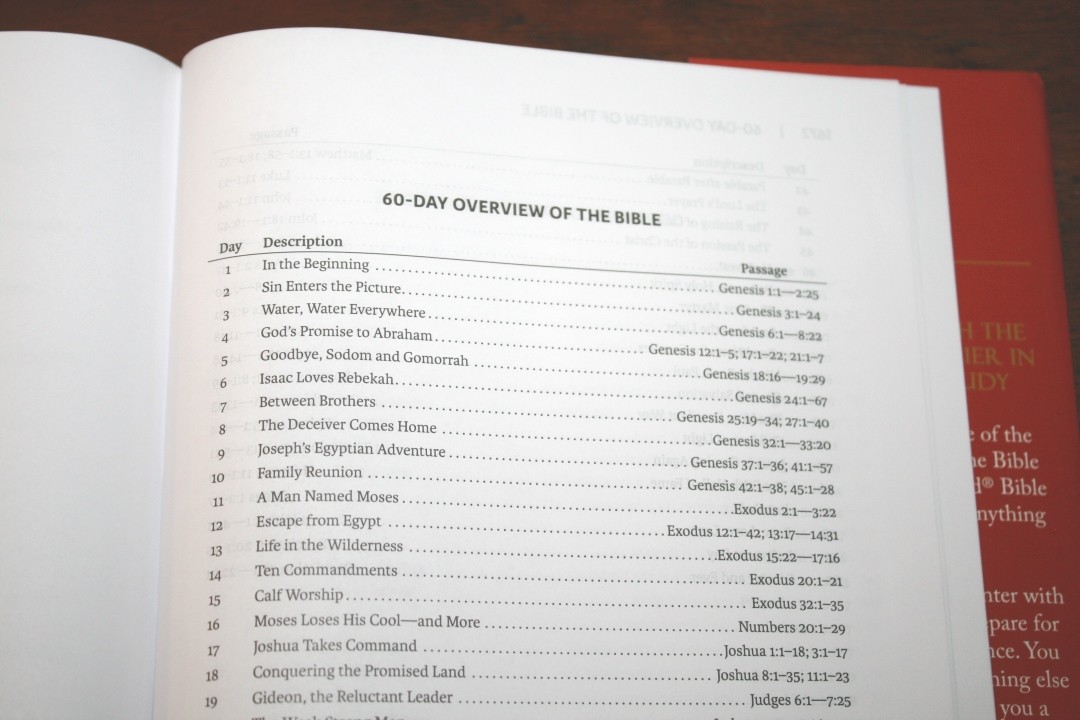

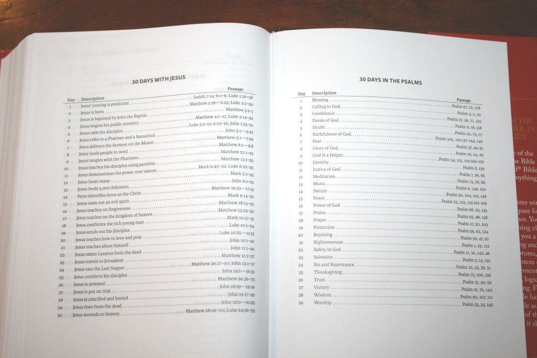
Reading plans include:
- 60 Day Overview of the Bible
- 30 Days of Getting to Know God
- 30 Days with Jesus
- 30 Days in the Psalms
Conclusion
This is a beautiful Bible. The word-count per line is more than I prefer and the inclusion of chapter and verse numbers, section headings, and the amplified text doesn’t really make me think of this as a readers Bible, but it is the most readable Amplified Bible I’ve seen and I do think it’s a great choice for reading during study rather than regular reading. This design does make for a good reading experience. I highly recommend the Amplified Reading Bible to any user of the Amplified Bible.
_________________________________________________________
This book is available at (includes some affiliate links)
and many local Bible bookstores
_________________________________________________________
Zondervan provided this Bible in exchange for an honest review. I was not required to give a positive review, only an honest one. All opinions are my own.


Am I the only one who finds it ironic that this Bible is being marketed as “A Paragraph Style Amplified Bible For A Smoother Reading Experience” when they insert so much in bracket, parentheses, etc. which makes it harder to read. I’ve never cared for the Amplified Bible as it seems to me that it is trying to add to God’s word in violation of Deut. 4:2; Rev. 22:18-19.
That said, great review as always Randy.