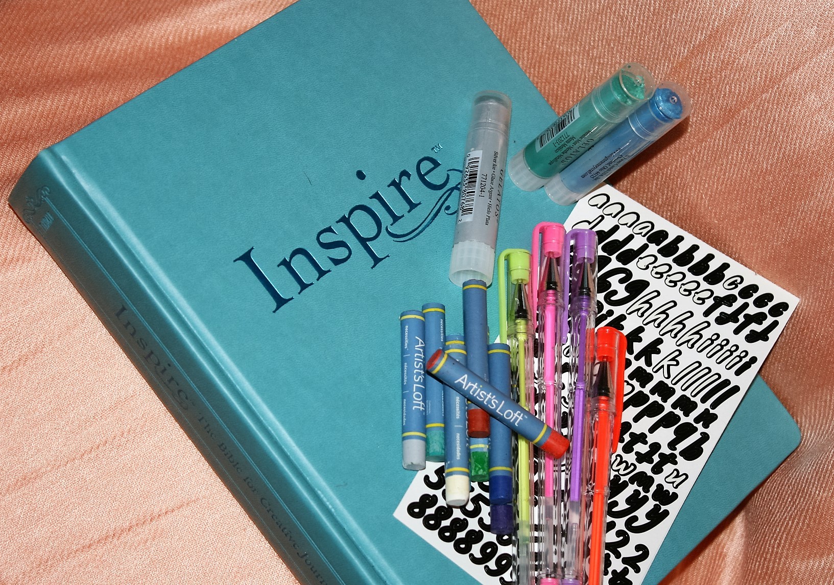
Today I’m showing various art mediums in the large print Inspire Bible. This is the larger version of the Inspire Bible with all the same drawings (just larger versions) and a larger font. Since it’s the same paper all the same products (like from a previous Art Mediums post) will or won’t work. For more details on the NLT large print Inspire you can check out the review here.
PENCIL, GEL PEN, (and a tip in)


This was done with gel pens for the words “LORD” and “GOD” and the gold ring and the rest of it is colored pencil. The gel pen shows through a little and so does the darkest pencil (the pencil is no worse then the printing) but no bleed through. I was surprised that the watercolors didn’t bleed through the index card I used for my tip in. A more detailed explanation of this project is available here.
GELATOS & STICKERS


This is gelatos over gesso. I used the metallic mint, metallic blueberry, and silver ice gelatos put on in strips and blended them together. Gelatos don’t usually show through so the reason I gessoed is to make it easier to blend the gelatos. I was able to fit in one more line of this verse then I did in the regular Inspire using the same size stickers.
WATERCOLORS & COLORED PENCILS


I started this one at the Illuminated Journaling workshop I attended. The buildings were traced on using graphite paper and an image traced onto vellum. Then the large blocks of color were put in with watercolor. Detail and shading was added on top of the watercolor with colored pencil. Then I went over the outline of the picture with my pigma micron pen and added the lettering with my calligraphy pen. There is a bit of show through but the only bleed through is the red on the one building. This happened partially because I didn’t get up to dry my picture often enough and partially because red is one of the colors that bleeds through the easiest anyway.
Jeremiah 2:4 was not my first choice for this picture but the Inspire already had an illustration at both Joshua 24:15 and Proverbs 24:3. (the only problem with a Bible that already has illustrations). If I was doing it again the main change I would do (besides drying more often) is to make the words “Hear ye the words of the Lord” bigger. My daughter put her houses in at Deuteronomy 6:9 (write these on your doorposts).
A few notes on technique. When copying images into your Bible be sure to use graphite paper not carbon paper. Graphite is a little more expensive and a little harder to find but graphite erases and carbon does NOT. Also when using watercolors use a medium amount of water (too little you tend to scrub it into the page, too much and it soaks in before it can dry) and dry quickly and often (most easily achieved with a heat gun). This method is the one most likely to allow you to use watercolors without gesso and without bleed through.
ACRYLIC PAINT, GEL PEN, & SHARPIE


Yes that does say Sharpie. Normally I would say never let a Sharpie anywhere near your Bible unless you want to have your drawing bleed through the paper 4 or 5 pages deep but this technique is an exception. Acrylic paint is actually a form of plastic. So if you lay down a layer of acrylic paint it acts as a barrier between anything you use on top of it and the paper. Of course not all art products work well on top of a thin sheet of plastic so you might have to experiment (or research) to see what can go on top of the acrylic.
This is another technique I learned at Jann Gray’s Illuminated Journaling workshop. (I never would have been brave enough to try the sharpie on my own). It’s three different colors of acrylic paint (full bodied or high viscosity works best) spread on thinly with a plastic card in a random pattern to cover the entire margin. Then I drew in wavy lines with the sharpie and then lettered between the lines. Since I had used such dark background colors white gel pen was used to highlight the letters and decorate the lines to make them easier to see. On the back of the page you tell that the margin area is darker then where the text is but the only bleed through is a couple of dots of black ink where I didn’t have the acrylic fully covering my paper near the top of the page.
GEL PENS


This is Lolliz gel pens. The darker colors do have a bit of show through (especially in this lighting) but no bleeding. I really like using gel pens in my illustrated Bibles because of all the metallic, glittery, and neon colors you can get them in.
GELATOS AS PAINTS


I used my gelatos as paints for this one with no gesso underneath. Since my gelatos are metallic they either look flat or really shiny depending on how the light hits them. I was surprised I had any show through at all on these since all my experiments had gelatos not bleeding through and gesso only necessary to move the color easier on the page. I think the main reason I got a little ghosting is that I accidentally made my pinkish paint way too thin. I’ll have to try and use less water next time.
OIL PASTELS


I used my Artist’s Loft oil pastels for this one. I used a q-tip to blend my colors on the clouds and the waves and also to spread the color a little more evenly in the thicker letters. Again in the right light there is some show through (especially of the redder colors) but no bleeding and so far no transfer to the page opposite.
I really like the way this turned out but i will caution this product will probably work better in the larger Bible. since my pastels don’t really have a sharp point this would have been a lot harder to keep neat if the drawings were any smaller. (I got outside the lines a little in a couple of places even with the larger pictures)
CONCLUSION & PRODUCT LIST
If you want to know exactly what products I used for these pictures: (the clickable ones are affiliate links) No picture this time since I don’t have a few of them to photograph because they were from the workshop.
- Inspire Bible: Large Print Edition
- LolliZ Gel Pens 48 Gel Pen Tray Set
- CaseMate Metallic Marker – Gold
- Prismacolor Soft Core Colored Pencil, 48 pack
- FolkArt Craft Stencils, Backgrounds
- Oxford 4″ x 6″ Index Cards, Blank
- Artist’s Loft Watercolors Pan Set
- Darice Multi-Purpose Heat Tool
- Water Brush Pens By Recollections
- Pigma Micron Inductive Bible Study Kit 8pk
- The Paper Studio Bright Skinny Washi Tape Pack
- Illustrated Faith Journaling Bible Mat
- Prima Marketing Art Basics Gesso, 8.5-Ounce, Clear
- FaberCastell Gelatos Set – Metallics
- the Paper Studio Alphabet Stickers – Script 7/16″ Black
- Stick-A-Bilities – Church Foil set
- Black Pen from Pigma Micron Inductive Bible Study Kit 8pk
- hampton art Calligraphy Marker – Black
- Vellum or Tracing Paper
- Graphite Paper
- Full-Body Acrylics (I’m not sure of the color names, a bright pink, royal purple and silver)
- Sharpie Marker, Fine Point, Black
- White Signo Uniball Pen
- Artist’s Loft Oil Pastels, 48 piece
- Q-tips
With a few minor exceptions (which were primarily my fault) all of these products performed well with this Bible paper. Since they don’t show through any worse then the drawings themselves I can recommend any of them for this (or the smaller Inspire) Bible. Just maybe be a bit more cautious with a couple of them then I was.
To see more examples of how well art products work with Bible paper check out my other art journaling posts. As Jann says Bible journaling should be more about the heart than the art and I tend (especially in this style post) to talk mostly about the art. Would you prefer I include my thoughts on what verses I chose or do you prefer the various mediums posts be mostly about the art? Do you have a favorite art medium I’m not including? Is there a particular product or brand of a product (like Crayola watercolor) you’d like to warn other art journalers not to use? Do you have a favorite art style? Let me know in the comments.
Photography by hannah C brown.


