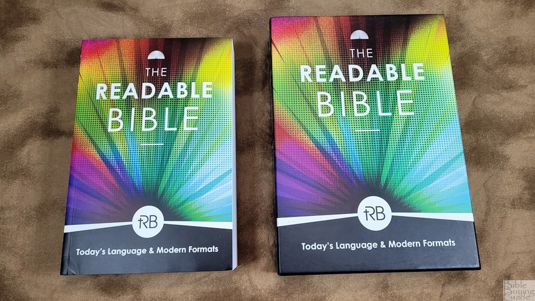
The Readable Bible from Iron Stream seeks to make complex text in the Bible easy to read and use. It’s a new translation that takes a middle approach, very much like the CSB, and includes lots of formatting never seen in a Bible. Many of the lists, laws, etc., are presented in modern formats that today’s readers can easily understand.
Iron Stream provided this Bible in exchange for an honest review. I was not required to give a positive review, only an honest one. All opinions are my own.
_________________________________________________________
This Bible is available at (includes some affiliate links)
_________________________________________________________
Table of Contents
Translation
This is a new translation that one person developed. I’m always cautious when a single person does a translation. However, this one is more transparent than the others I’ve seen. It includes information about the translation process and notes on translation choices. The translation is mostly literal, but it’s thought-for-thought where needed. It’s similar to the CSB. When thought-for-thought is used, the literal translation is placed in the footnotes. The usage permissions follow those of the most popular translations.
Cover and Binding
Iron Stream provided two review copies with different covers.
Leatherette
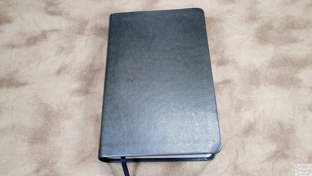
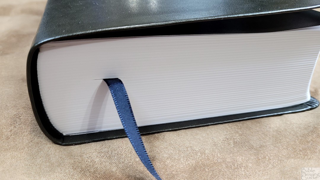
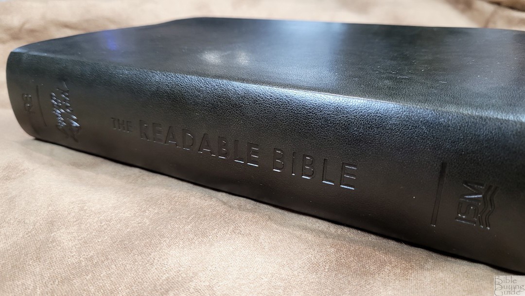
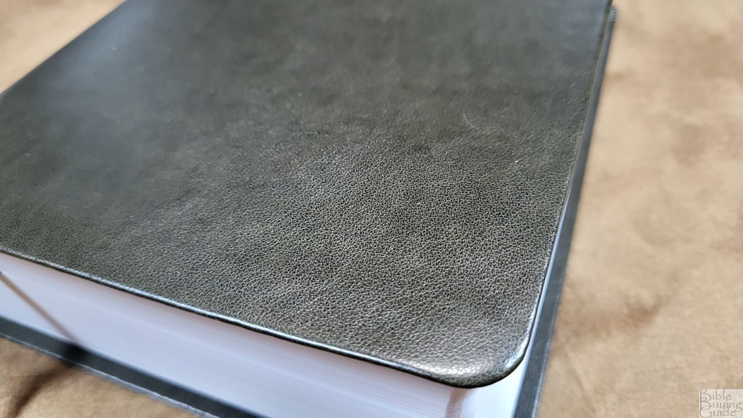
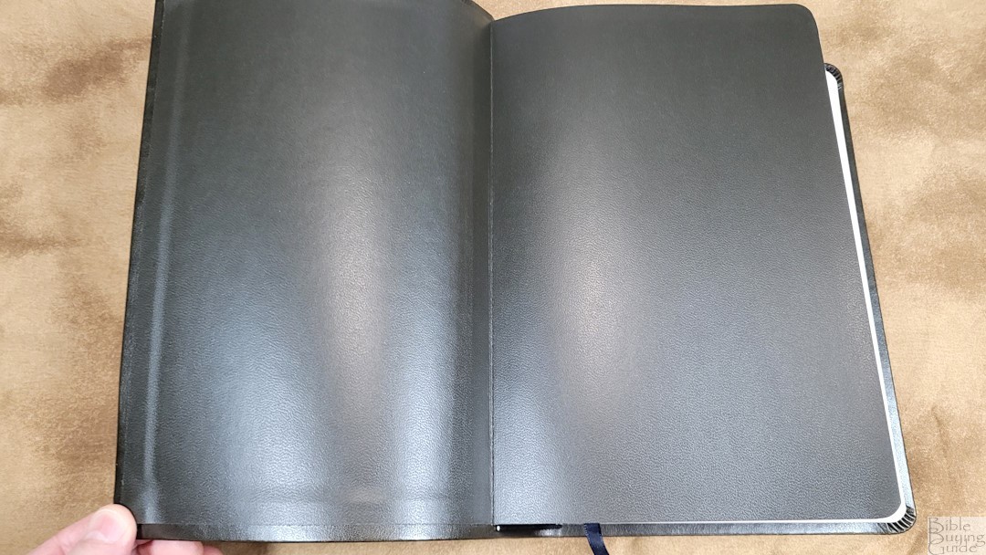
The Leatherette edition is an imitation leather that looks like calfskin. It has a grain that looks real. The leatherette folds over the edges. Nothing is printed on the front. The spine has the text debossed in black. This cover has a paste-down vinyl liner. The block is sewn, and it will stay open on the first page in Genesis. It has one black ribbon. The overall size is 6.25 x 9.8 x 1.8 inches, and it weighs 3 lbs, 1 oz. The page edges are white.
Paperback
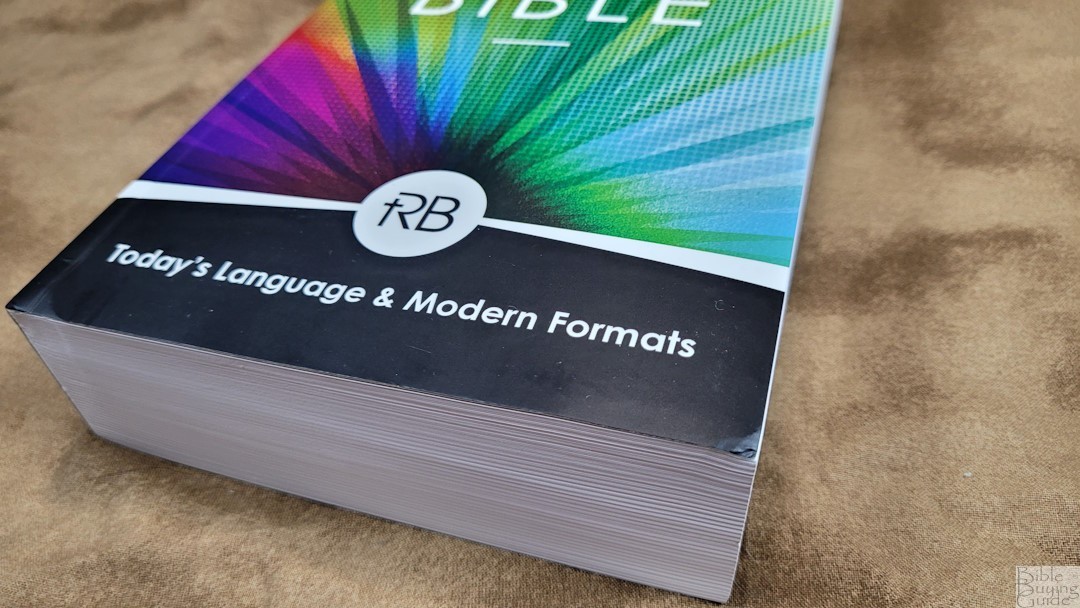
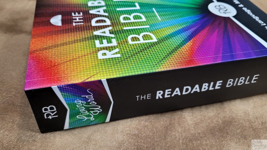
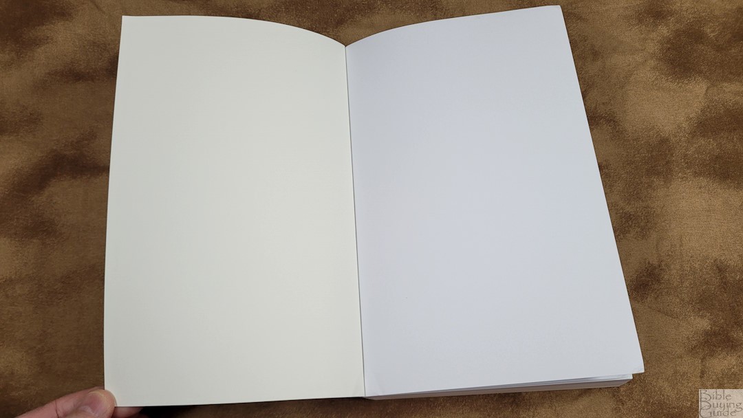
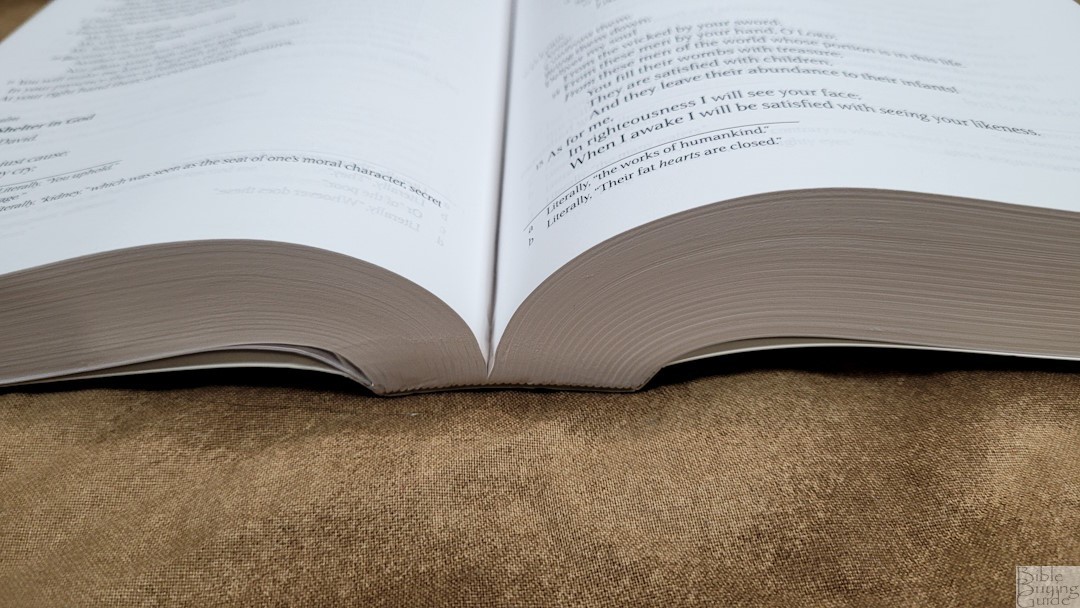
The paperback edition has thick card stock for the cover. It has the graphics on the front cover, while the back shows the product information. This edition is glued in sections. It doesn’t have a ribbon.6 x 9 x 1.75 inches. The overall size is It weighs 2 lbs, 15 oz.
Paper
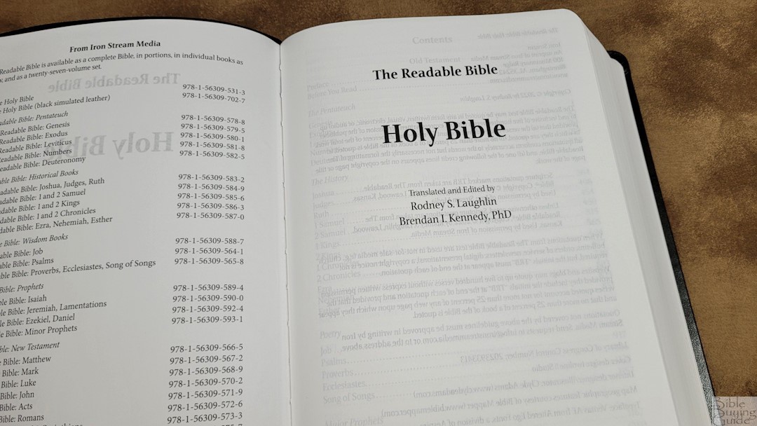
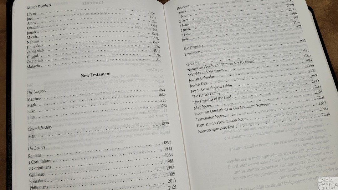
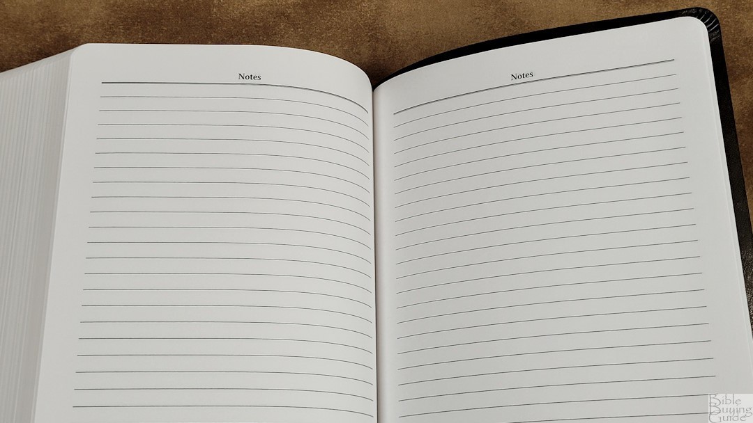
I’m not sure what the paper is, but I like it. I’d guess it to be in the low 30s in GSM. It’s white in color and has a rough texture that’s easy to grab and turn. The show-through is noticeable, but it’s not bad. There are 10 lined pages in the back for notes.
Typography
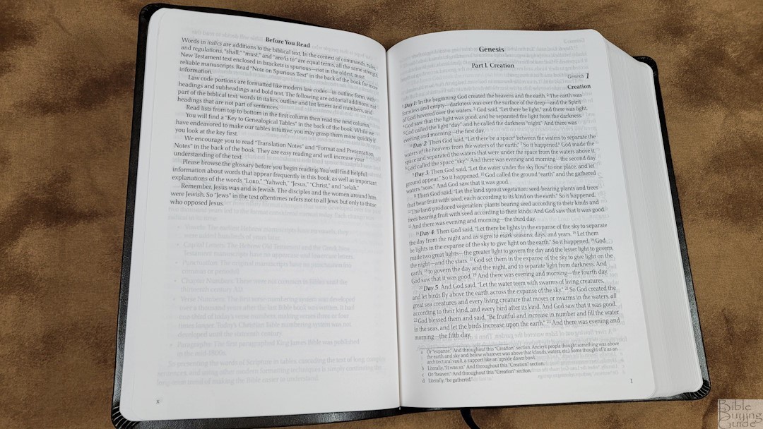
The text is presented in multiple formats that we’d see today in presentations including single-column paragraphs, charts, tables, lists, timelines, letters (with dark backgrounds), multi-layered (nested) poetry, laws, quotes, and more. Much of the text is divided into sections with an outline format. I like the formatting. The text is easy to understand at a glance.
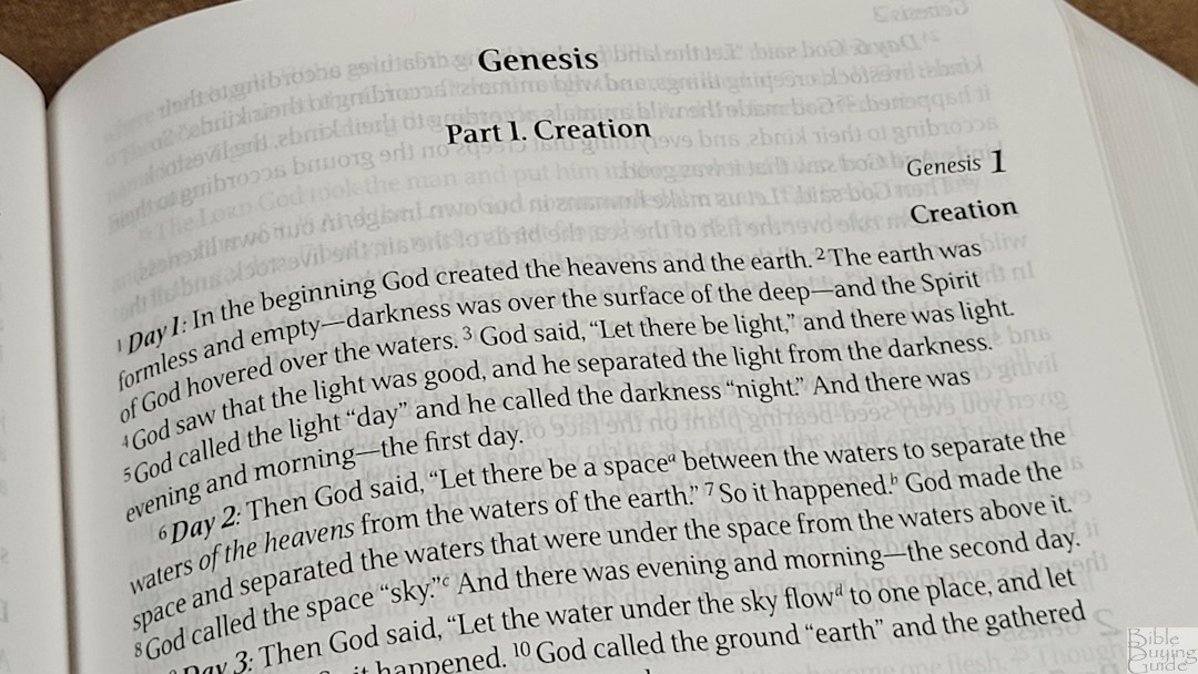
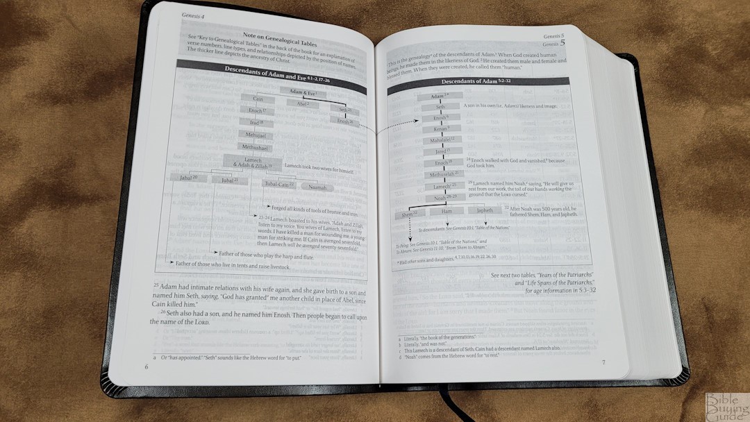
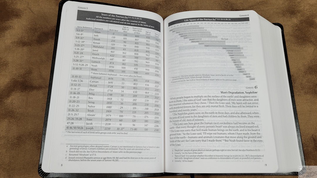
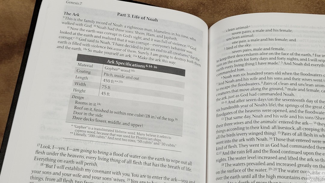
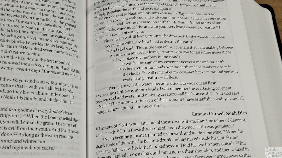
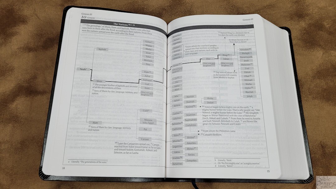
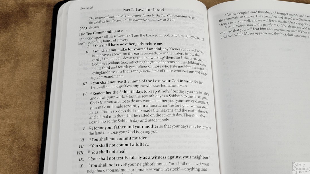
The font is around 10 point. It’s black letter, dark, and consistent throughout. The text has a ragged right edge with around 14-16 words per line. There is lots of white space in the text to help make it easy to read. The font design is good for reading.
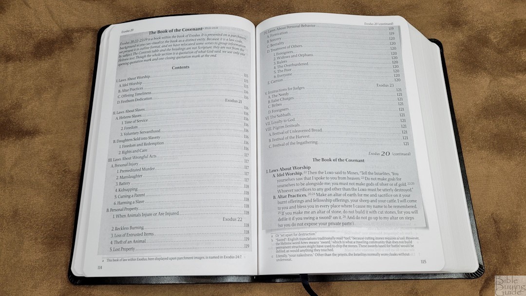
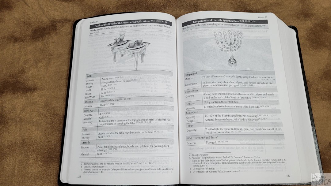
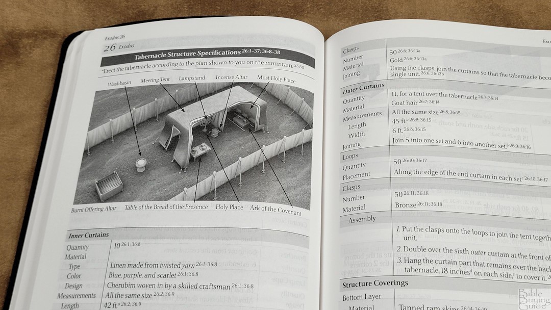
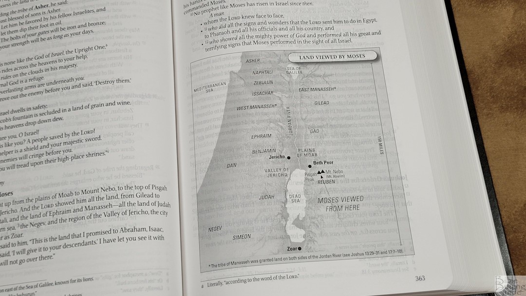
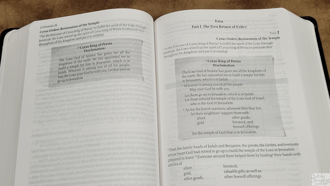
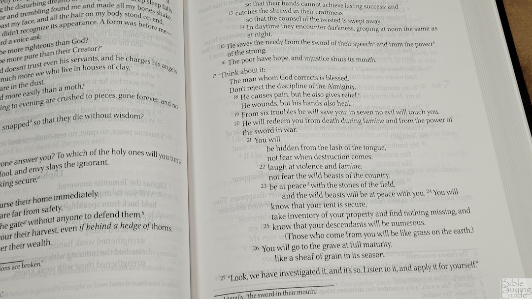
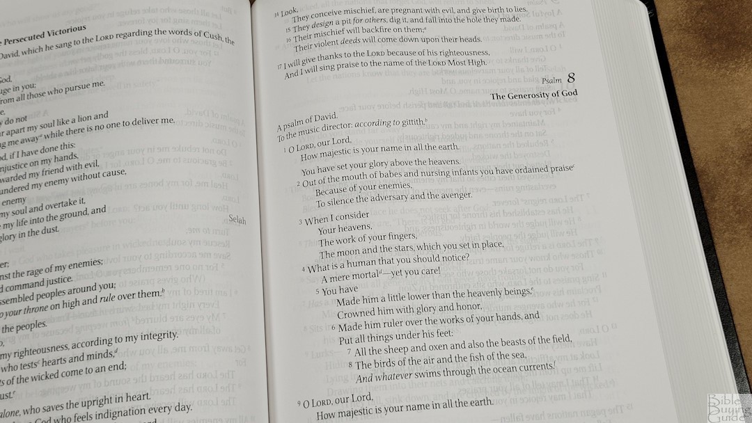
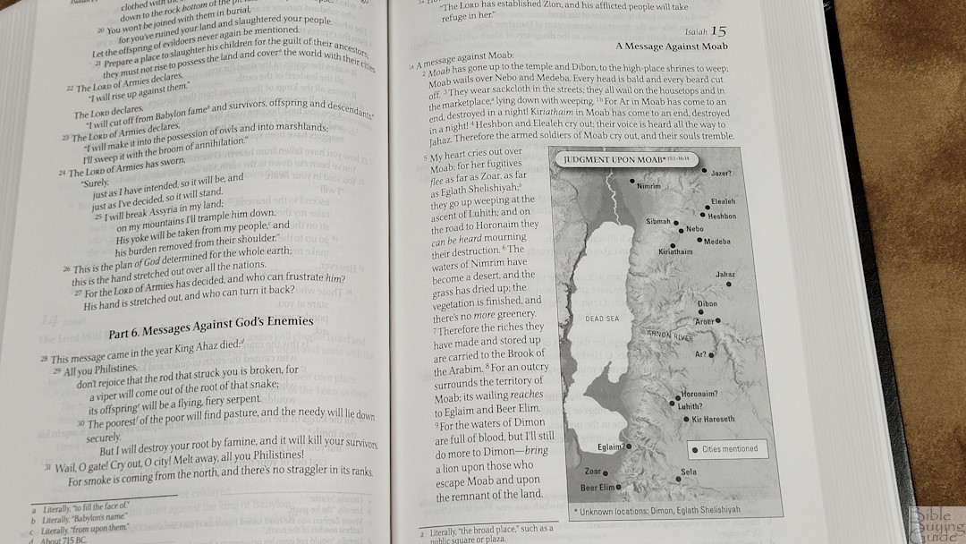
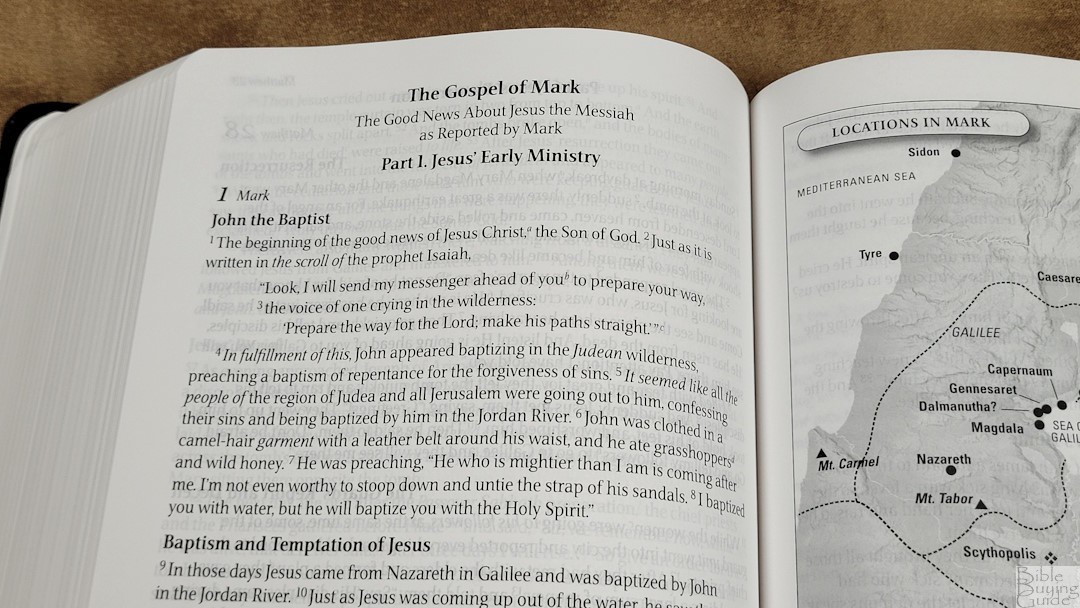
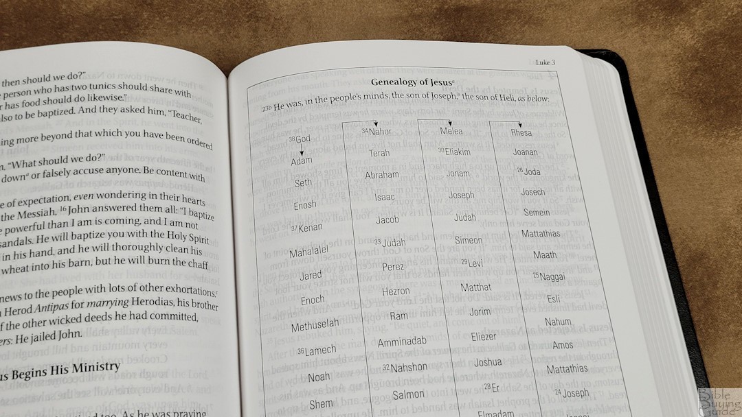
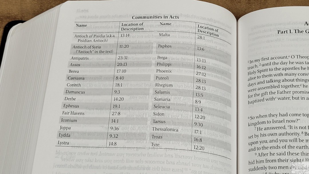
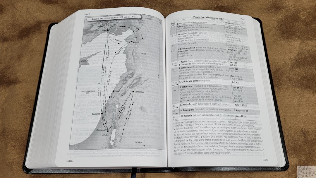
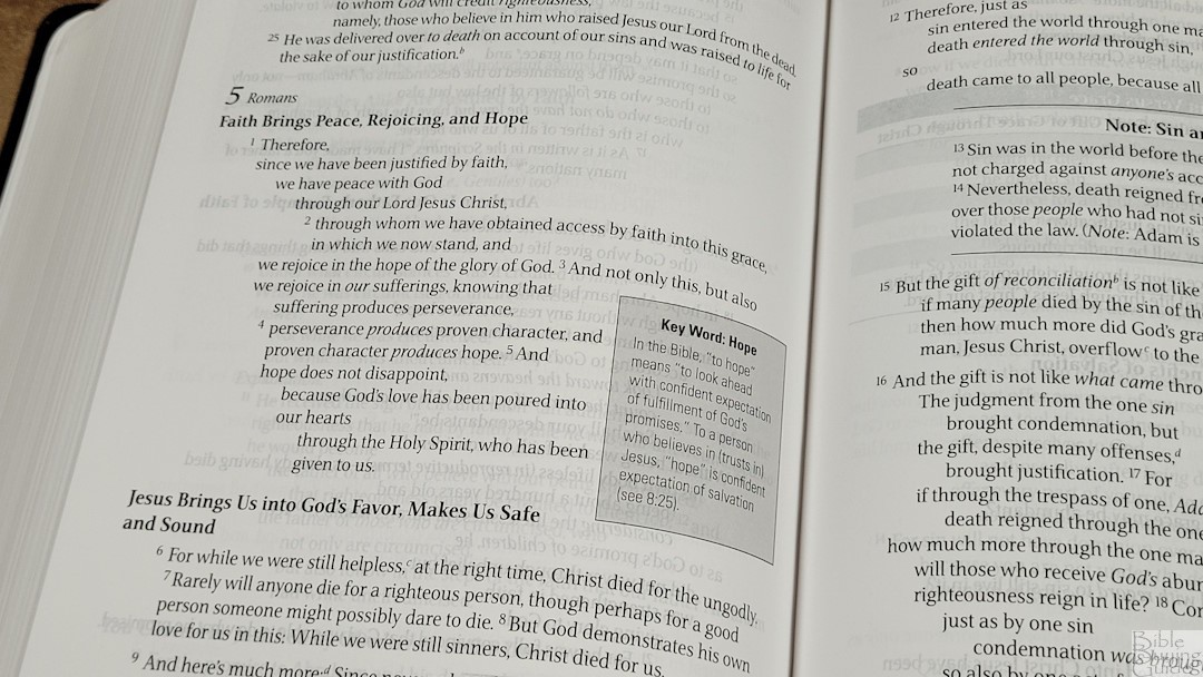
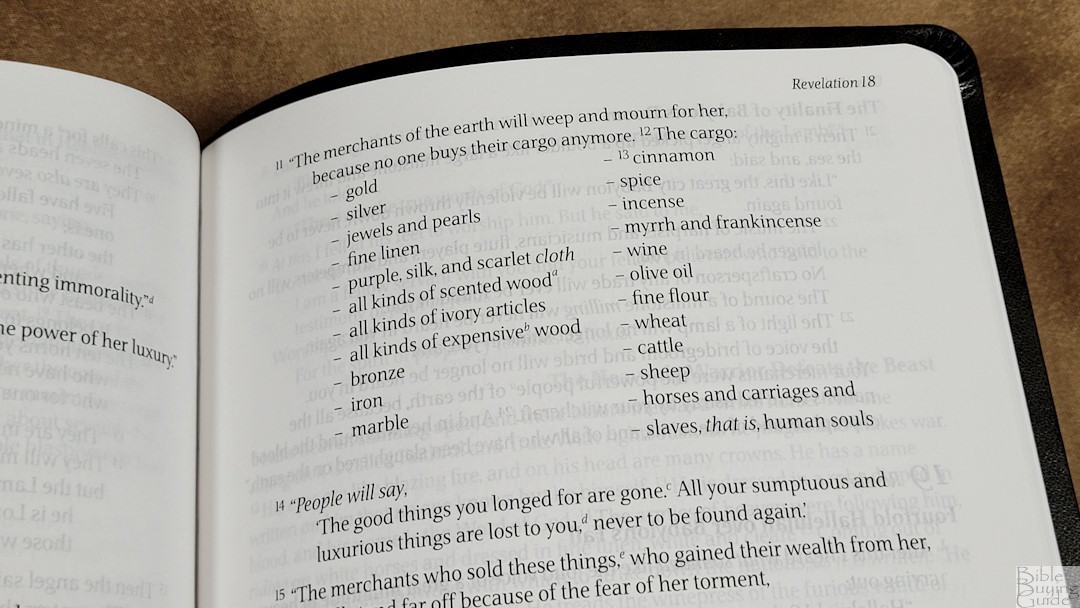
The charts, tables, and timelines are easy to understand, but they’re not always readable as text. It’s meant to present information in the way it’s described in the text. In some cases, the text is presented as a chart or table, while in other cases it’s presented as regular text and shows a chart or table as extra information. Genealogies are shown as family trees, census numbers are in tables, OT law is in an outline format, building designs are shown in tables, and cascading text simplifies long passages. Maps and tables are keyed to the text to make it easy to understand what happened.
Footnotes
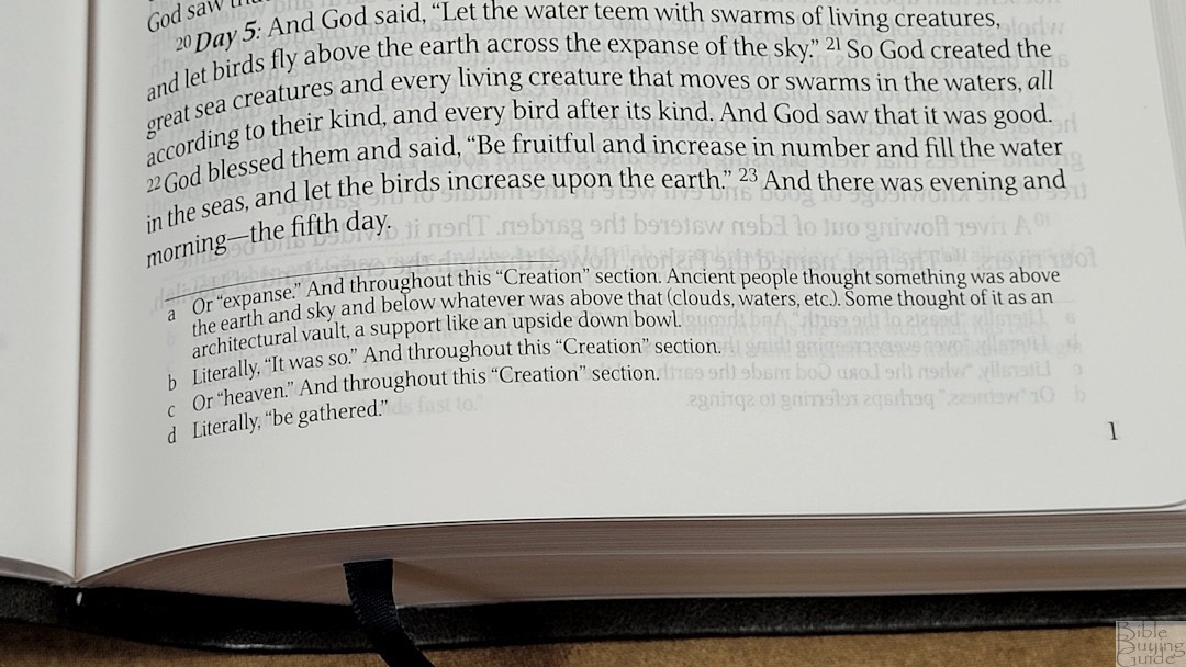
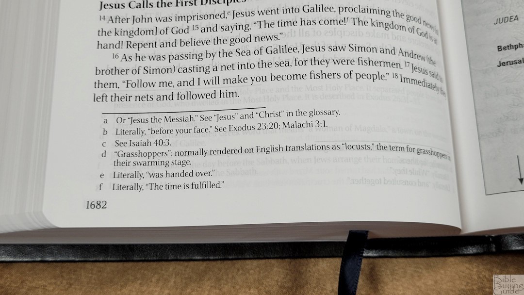
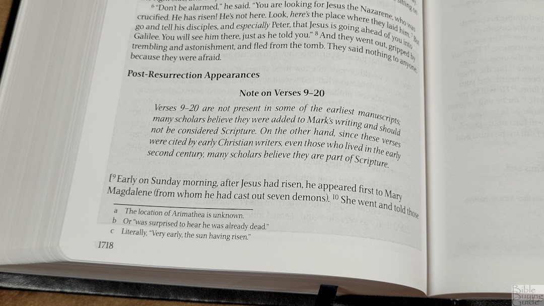
The translation footnotes are placed in the footer and separated from the text with a line. They include references, literal translations, explanations, information on the original languages, and more. These are excellent notes. I would like to see the manuscripts identified rather than just saying “some manuscripts,” “many manuscripts,” etc.
Extra Material
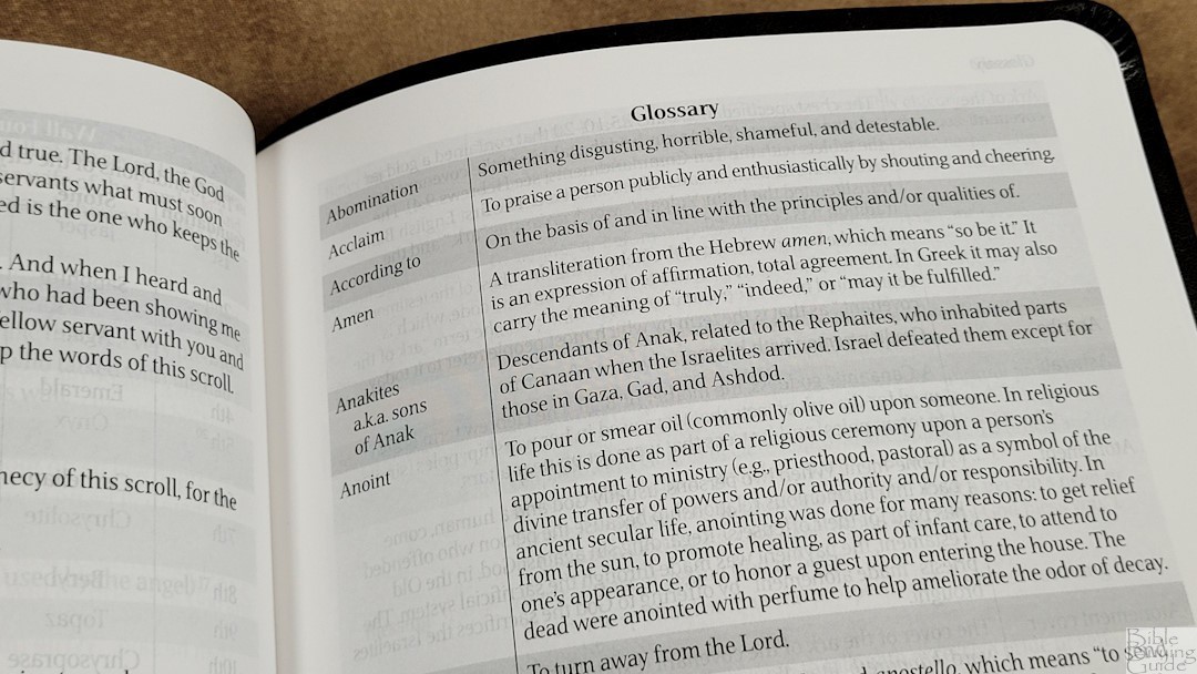
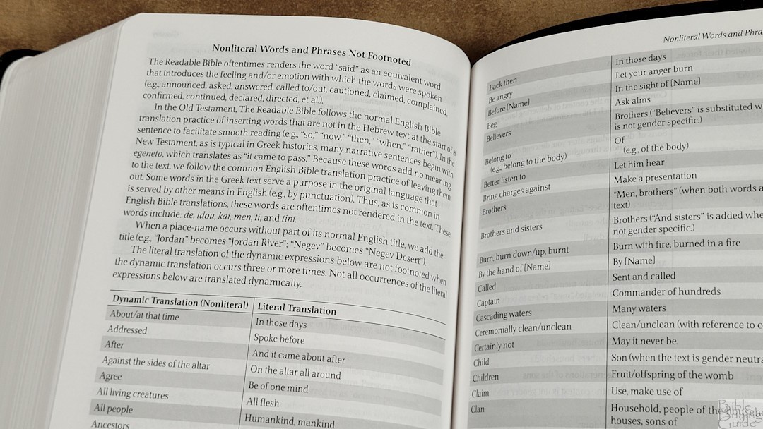

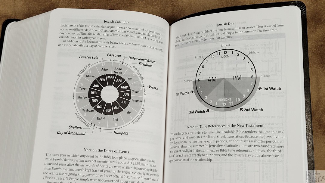
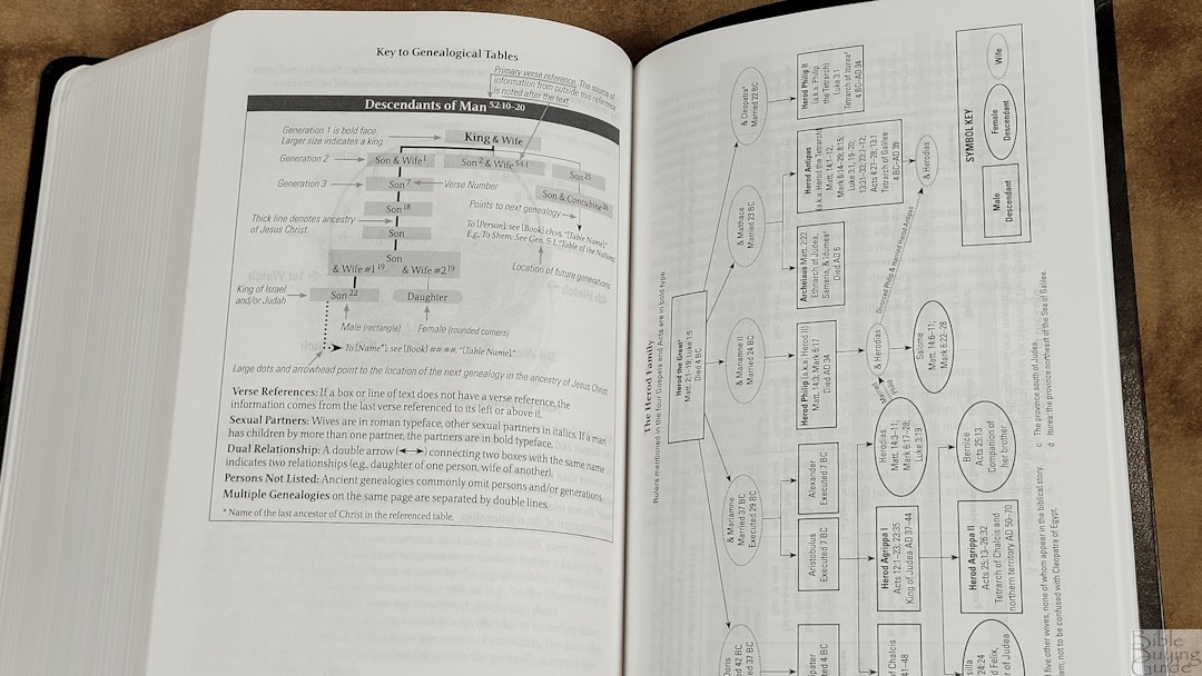
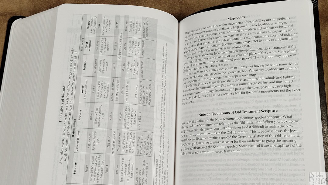
There is lots of extra material throughout the text and in the back of this Bible. The material includes:
- Maps
- Glossary
- Nonliteral Words and Phrases Not Footnoted
- Weights and Measures
- Jewish Calendar
- Jewish Day
- Key to Genealogical Tables
- The Herod Family
- The Festivals of the Lord
- Notes on the maps, quotations, translation, format and presentation, and spurious text
Conclusion
The Readable Bible’s goal was to make the Bible easy to read and understand. It accomplishes a lot of this through its unique formatting, which is interesting. It includes lots of charts, tables, in-text maps, and a few illustrations. I like that it has maps in the text where it discusses the locations. All of these are elements you’d expect to see in a study Bible, but it’s more readable. I’d say the Readable Bible has met its goal.
_________________________________________________________
This Bible is available at (includes some affiliate links)
_________________________________________________________
Iron Stream provided this Bible in exchange for an honest review. I was not required to give a positive review, only an honest one. All opinions are my own.





Dear Randy,
1. Happy Christmas and New Year!
2. Thank you for your excellent review of a very interesting translation!
3. I can see that I’m going to have to get a copy to examine thoroughly!
4. Do you yet have UK affiliate(s) for purchasing of your recommendations?
Every Blessing,
Alex.