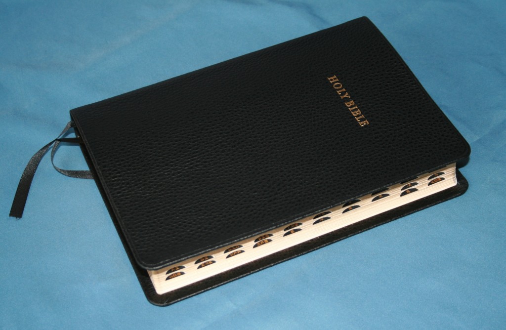
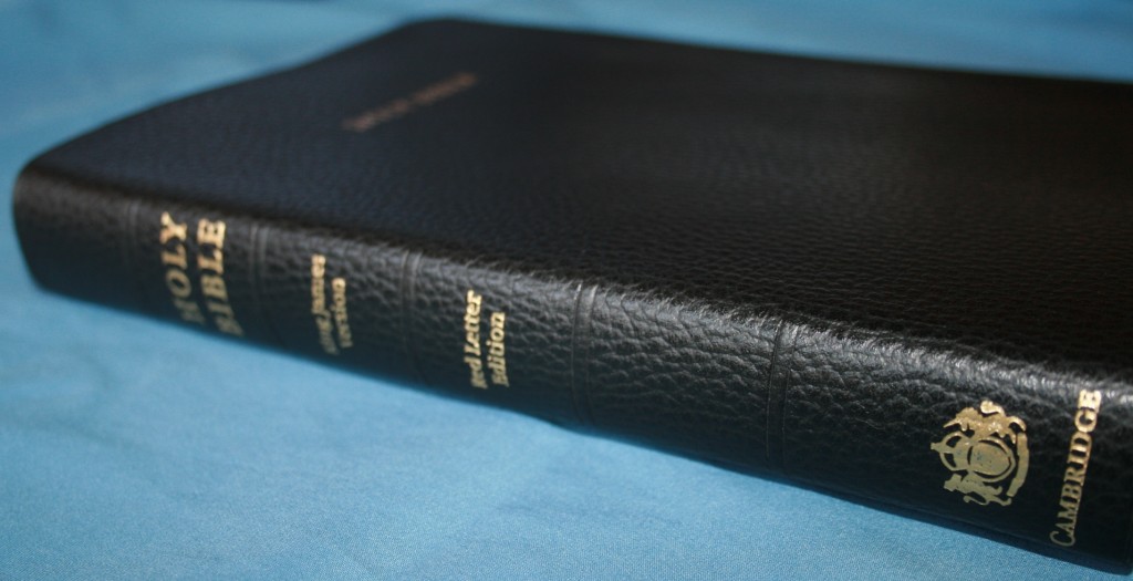
Cambridge has been busy bringing out new editions. Their newest edition is an old classic in a new package. The Cambridge Concord is a classic setting that has been around for many years, but now it’s available in calf split leather.
The Cambridge Concord has a nice layout and set of features that works:
- 9-point semi-bold font
- Red letter
- Self-pronouncing text
- Translators to the Reader
- Center-column references
- Thin opaque paper
- 15 maps
- Sewn binding
- Gilded edges
- 2 ribbon markers
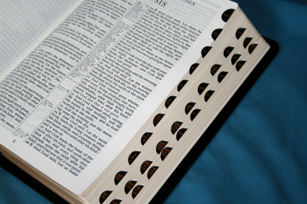
- Thumb index
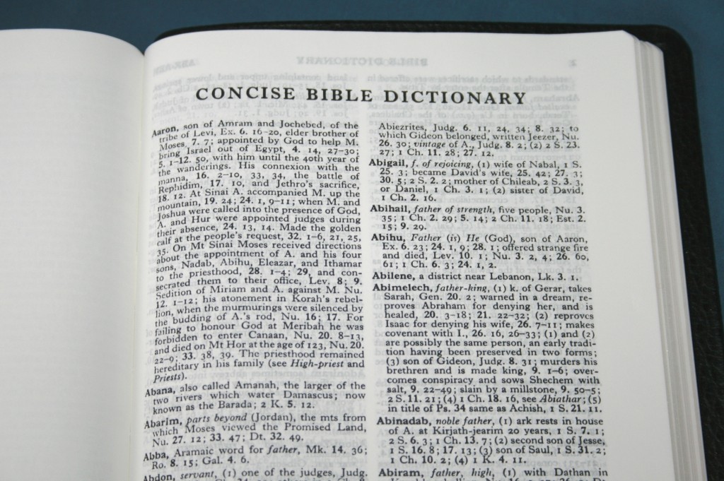
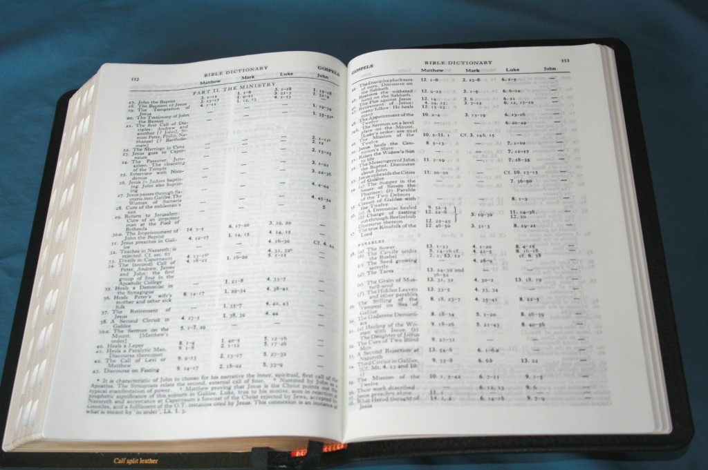
- Bible dictionary
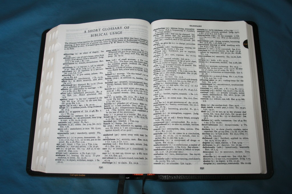
- Glossary
- Concordance
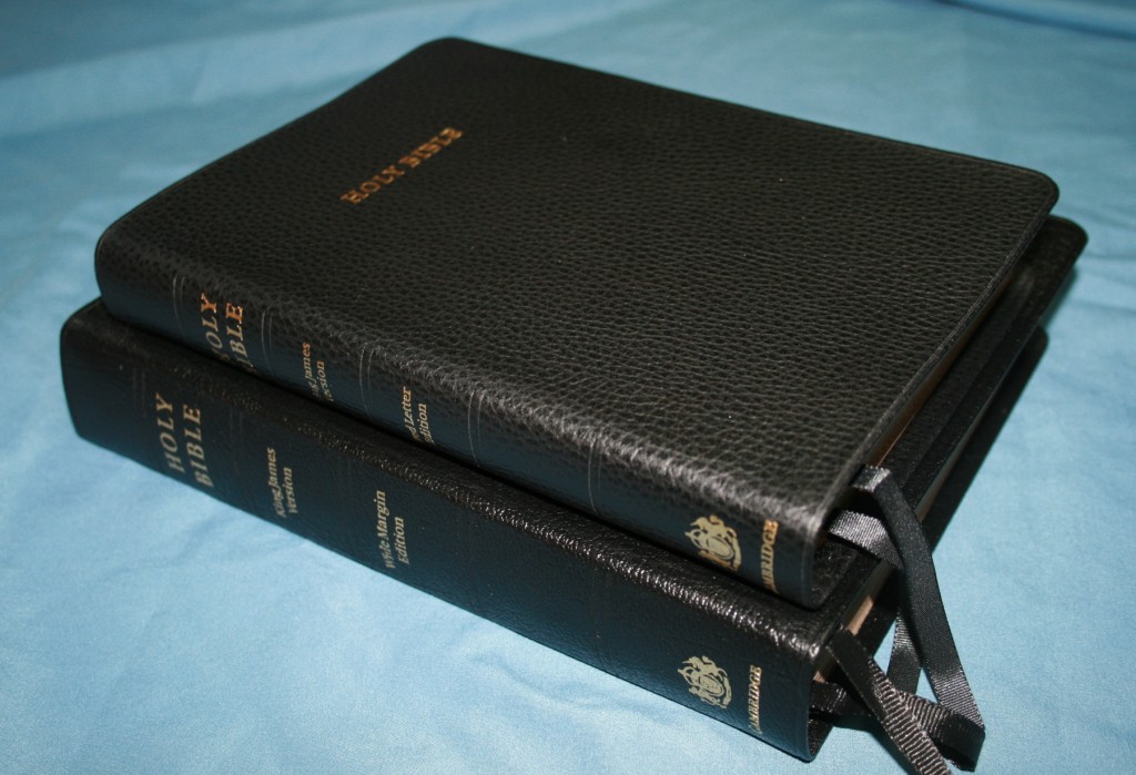
- Calf split leather cover
- 8.25×5.5×1.25
Cover
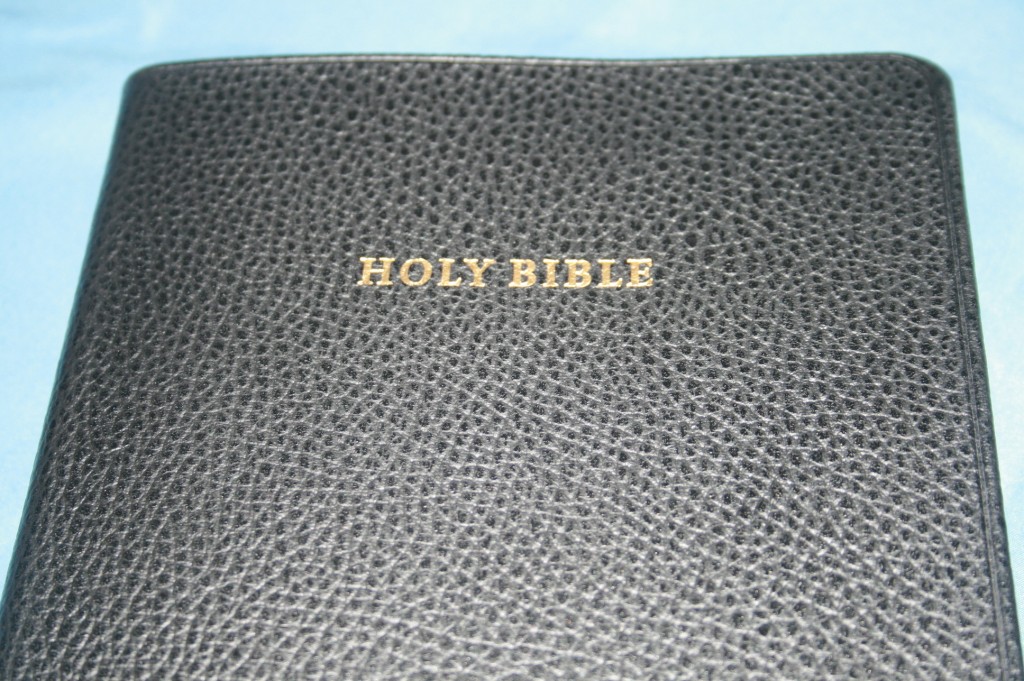
This new edition comes in calf split leather. Calf split is a higher quality leather than French Morocco. It is thicker than French Morocco and has about the same stiffness, but the finish is not as shiny. It might loosen up with use. It has a fine pebbly grain that looks like calf-skin. It is very pretty.
Binding
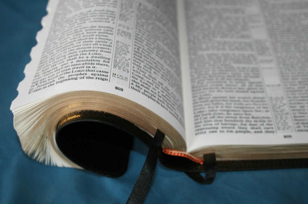
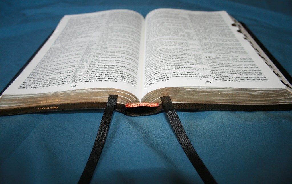
The Concord is Smyth sewn. This allows the Bible to lay flat, even at the beginning or end of the Bible. It has the same construction as the French Morocco edition.
Paper
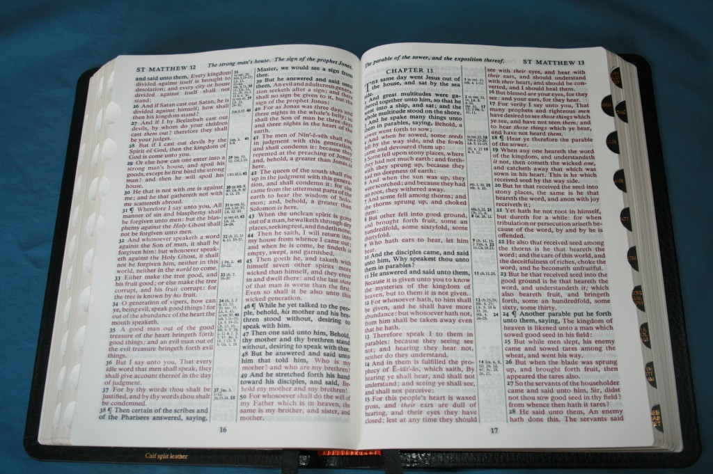
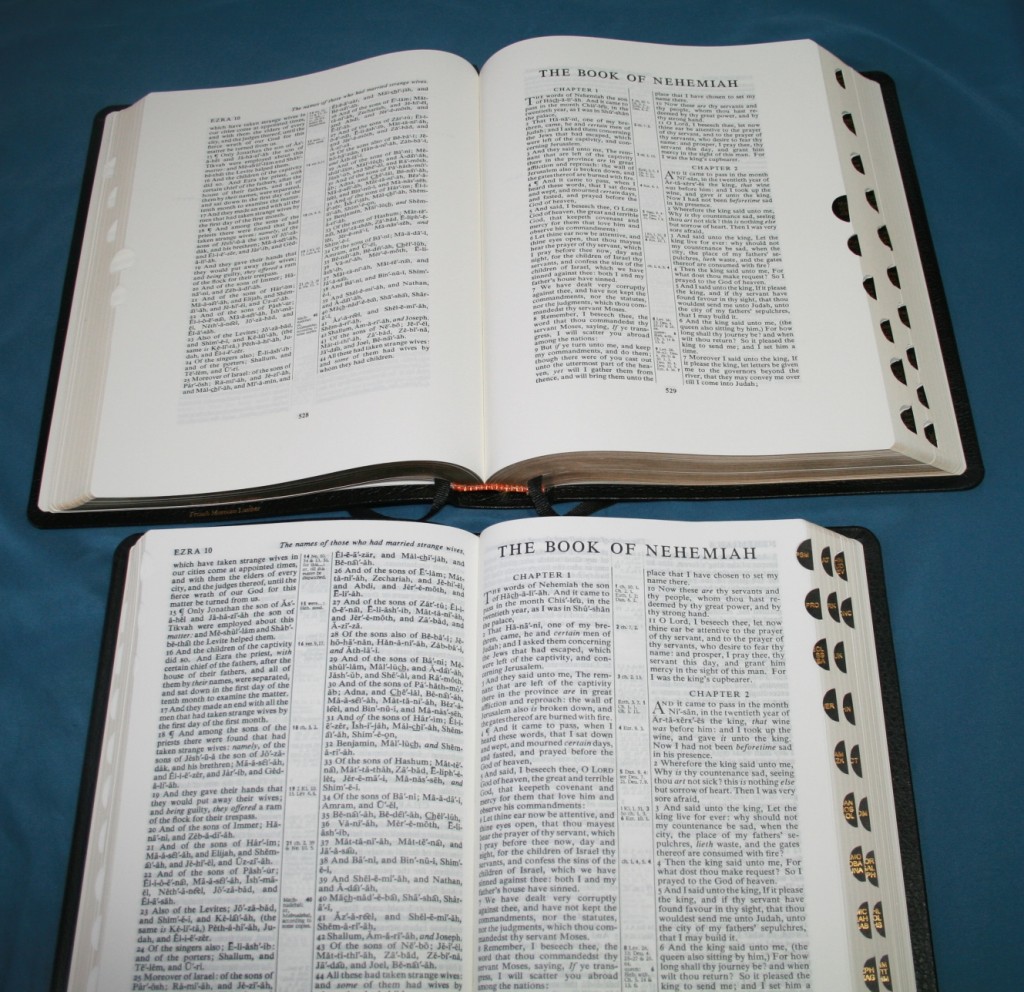
The paper is an opaque India paper. It is thin, but it’s not easy to see through. It is more opaque than most Bibles that I’ve seen. It has a slight cream tint, which makes it easier to read for long periods of time.
Cross-References
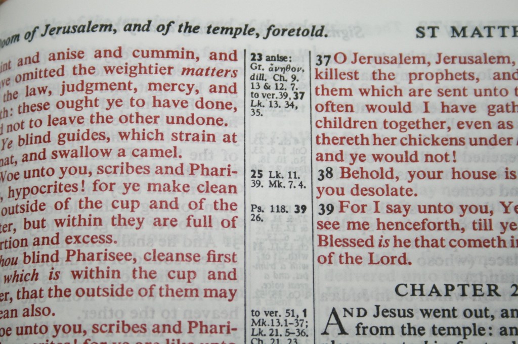
There are plenty of cross-references and translation notes in the center-column. The references have a unique system in that they are not keyed to the text with letters and numbers. Instead, they have the verse number on the side of the column that contains the verse, and then the references and notes. The translation notes give you the word or phrase that the notes refer to. There’s no way to know which portion of the verse the references refer to.
Text
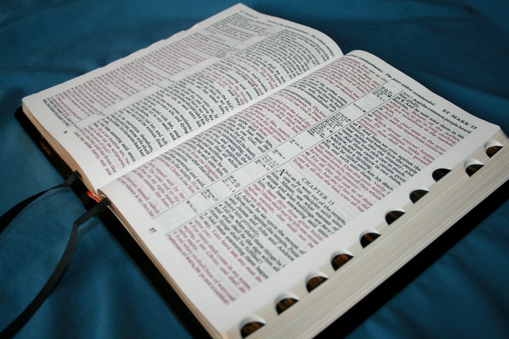
The font is around 9 point and is semi-bold. It is clean and easy to read. The red is bold, but not too bold. It’s really red and not brown or pink. It’s a deep, rich red that looks nice. This is my favorite red-letter. The text is clean and unobstructed from cross-reference and translation note keys, making it a very readable text. One thing I like about all Cambridge Bibles is the consistency of the print- even in the red-letter text. With most publishers, the text will be dark on one page and light on another. The red goes from red to pink and then red again. Not so with Cambridge, and this Concord is no different. The boldness of the print remains constant no every page (as you would hope with a Bible in this price range).
Concordance
The Concord’s concordance is the same concordance that is found in the wide-margin edition and the Cameo. There are lots of entries- more than most Bibles, but I find this concordance to be confusing. Most concordances have one verse per line of text. This one starts the next verse directly after the last verse (on the same line). This causes you to read through the entries more closely to see where one verse starts and another ends. To make it more confusing, some of the entries are out of order because they relate to another verse that is similar. This makes me think I’m looking at verses in one book when I’m actually looking at verses from a completely different area. If you can get used to it, it has plenty of entries to be a great study tool.
Glossary
There is a seven page glossary that explains the meaning of words that have either changed meaning or are no longer used since the KJV was first translated. The definition includes the part of speech and a few of the most prominent verses where the word is used.
Bible Dictionary
The real jewel in this edition is the Bible Dictionary, which is one of my favorite features. At 128 pages, there are plenty of entries on many topics including people, places, objects, information about each book of the Bible, harmony of the Gospels, names and titles of Jesus, chronological tables, quotes and the verses where they are quoted, and more. There is a wealth of study information in the dictionary. I like having a dictionary this handy in my carry Bible.
Maps
The Concord has the same standard 15 maps as the wide-margin and Cameo. They are four-color and look great.
Translators to the Reader
This edition still has the Translators to the Reader. I feel that this is an important document that should always be included with the KJV. Many publishers have excluded it from their Bibles, but it’s important to know the thoughts of the translators for any translation.
Thumb Index
It’s good to see this Bible being offered in thumb-index. This thumb index is different from those found in other Cambridge Bibles. All of the index tabs are facing the same direction. I like that many books have their own tab. I can go straight to Mark instead of having to find it once I’m in the ballpark. It is also available without thumb-index.
Ribbons
There are two black ribbon markers. They are 5/16 wide and are more than long enough to pull to the corner and open the Bible with. They are longer than the markers in my Concord wide-margin. Now that I’ve had Bibles with two markers it’s hard to go back to just one. I think two markers should be standard in all Bibles.
Size
I like the size of this Bible. It’s around 8.25×5.5×1.25, making it a hand-sized Bible. It is much smaller, thinner, and lighter than the wide-margin and still has slightly larger text. The text is not much larger, but it is larger. This is the size Bible I want to be holding when we’re standing and reading the Bible for a long period of time. It is easy to hold in one hand and read.
Conclusion
The Cambridge Concord reference edition in black calf-skin (with red-letter and thumb-index) has a lot to offer in a hand-sized Bible. The calf-split is a good compromise between goat-skin and French Morocco without sacrificing quality. It has a superior paper and print combination. The only paper that is better is in the wide-margin edition. With thumb-index, red-letter, and a Bible dictionary, the Concord in black calf-split leather makes a great carry and study Bible.
Baker Publishing provided this Bible free for review. I was not required to give a positive review- only an honest review. My opinions are my own.
To purchase from Amazon click here:











Dear Randy:
This Bible is apparently the full size, no doubt, original edition that the Personal Concord comes from. I really like the Personal Concord because of the way it handles for reading, and the way it rests easily on my lamp table always tempting me to pick it up every time I sit down, it has smaller type I think about a font size of 7 which is its only fault. The Concord is by your measurement: 8 1/4″X5 1/2″X1 1/4″. My Personal Concord measures: 7 1/4X5 1/8X1 3/8″, cover size dimensions. I’m not sure what your measurements are of, are they page size or cover size? In any case they are close enough that I can gain about 1 point font size for very little in physical size therefore making my reading a little easier for lengthy sessions. What is your opinion, will the difference in size affect the ease of handling in any significant way? All other features are the same.
Yours in Christ
Don Denison
Hi Don. My measurements are the cover. It’s difficult for me to say which would be better because I’m used to carrying and reading larger Bibles (the Thompson was my carry Bible for years and now I carry the Concord Wide Margin), so this Concord feels small to me. I prefer a larger print, so I think I would prefer the regular Concord. It feels great in my hands and doesn’t feel too big to hold or carry. I haven’t seen the personal size and I know it’s Cambridge’s best selling Bible, so I plan to review it as soon as I can. I might end up liking it better.
Randy
Which bible would you recommend between the Cambridge Concord Reference Black Calf Split Leather KJV thumb index red letter or the Cambridge Concord Reference Goatskin Red letter?
Hi Brandon. I haven’t seen the goatskin edition. For me it would depend on how I wanted to hold it. I like the calf split because it lays flat in one hand. That’s how I hold my Bible, so that’s a good choice for me. If I rolled one side under so that I only see one page at a time I would have to have the goatskin. Jonathan Ammon of Bible Reading Project reviewed the goatskin edition:
https://biblebuyingguide.com/cambridge-concord-in-black-goatskin-kjv/
They’re both made well. I think the goatskin is stronger built and will probably last longer. It comes down to whether you want your Bible cover stiff or floppy.