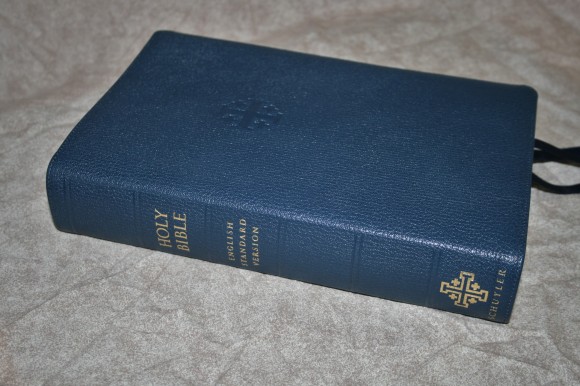
Schuyler’s high-end line of Bibles, the Quentel, now has a new edition – the ESV. The Quentel was designed to be the most elegant Bible on the market. It’s one of those extremely rare cases (especially in modern day publishing) when elegance and beauty are placed above size and price. In this review I take a close look at its features and see if it lives up to the hype. The edition I’m reviewing is the Imperial Blue with blue under silver art-gilt edges and gold stamping on the spine.
Pros
- Large print
- Thick, opaque paper
- Goatskin cover
- Elegant
Cons
- Large
- Heavy
- Expensive
Features
- 2011 ESV
- Goatskin cover and liner
- 11 point Milo serif font
- 84 ISO opaque paper
- 80,000 cross references
- ESV footnotes
- ESV section headings
- 63-page concordance
- 14 Oxford maps
- Tervakoski 38 gsm Paper
- Typesetting designed by 2K/Denmark
- Art gilt edges
- 3 Berisford ribbons
- 6.5 x 9.75 x 1.875 (cover dimensions)
- 6 1/8 x 9 1/8 (page dimensions)
- 3lbs, 2.5oz. (approximate)
- Printed and bound in the Netherlands by Jongbloed
Click here to buy from EvangelicalBible: Schuyler ESV Quentel
Click here to visit the publishers’ website: Schuyler Bibles
Photography notes: photos were taken with two different cameras under several different lighting conditions in order to highlight various features. All photos are high-res, so you can click them to see it close up.
First Impressions
While holding the box it was shipped in, my first thought was that it didn’t really feel too heavy. On opening the box my first thought was it didn’t look too large. I actually expected it to be larger and heavier than it is. It is on the large side, but it’s no larger than an average study Bible and I’m used to carrying Bibles that size.
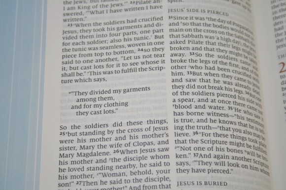
On opening the Bible I was immediately drawn to the paper and print. This paper, font, and layout is what I’ve been looking for in a Bible. I didn’t hear the creaky sound that I heard in the Schuyler KJV.
Cover and Binding
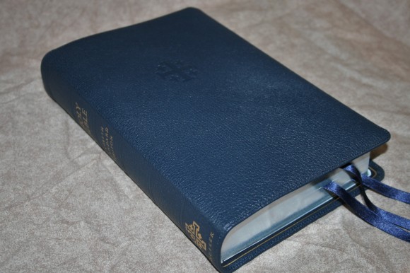
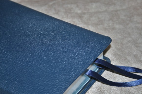
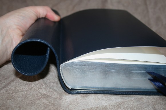
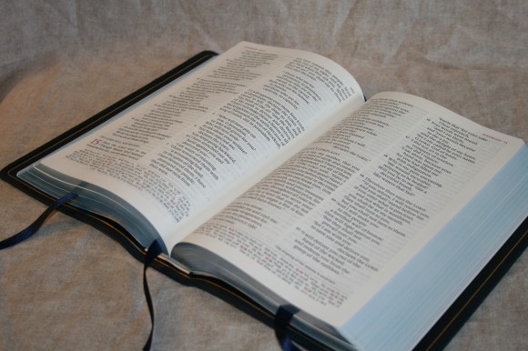
The cover on my review copy is Imperial Blue goatskin with a darker blue edge-lined liner that is stitched around the perimeter. The liner is also leather and has a gold gilt-line around the edges. I’m glad they included the gilt-line. It gives an extra flare that most publishers have gone away from.
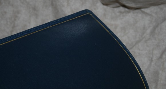
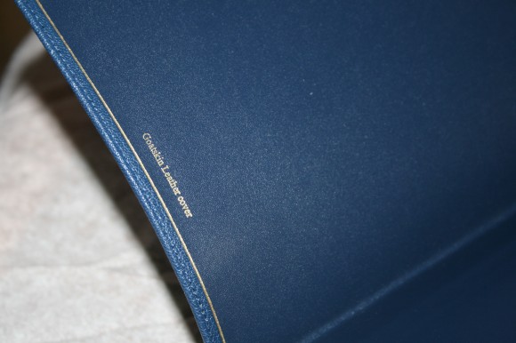
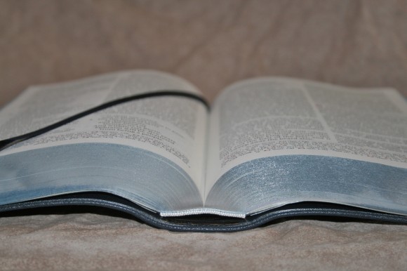
The cover is soft and flexible, and the grain is pebbly and pronounced. I like the feel and flexibility of the leather. It is thick and feels perfect for the size of the Bible. The blue is gorgeous. Combined with a Smyth-sewn binding, it will lay open anywhere I want it to. The white head and tail bands blend well with the blue under silver art-gilt.
After using it for a while it does have a slight leather creaky sound, but I usually don’t hear it when I open it. It’s usually when I rub the cover against the end sheet inside or if I squeeze the spine. It’s not that loud and I actually like the sound.
This edition is unique in that it has gold stamping on the spine – just like all the other ESV Quentel’s – but instead of having a matching gold art-gilt edging, the art gilt is silver. Later editions will have silver stamping on the spine. I chose the blue because I knew it would look great even with the gold and silver. Now that I’ve seen it I’m glad it was made with gold stamping. I’m sure the silver will look great too, but I really like this gold on blue. I’d like to see it stay around.
Speaking of the spine, there are 6 embossed spinal ridges that separate out various sections. They look nice. I would like to see them raised just a touch for a more elegant look, but it might make the spine too rigid. It might be better the way it is. The spine curves outward when opened.
Paper
The paper is 38 gsm Tervakoski Thinopaque from Finland. It has an opacity rating of 84 ISO. What’s that mean in English? It’s very thick and you can’t see through it. I like thick paper. It’s extremely opaque. It looks and feels like the paper from a wide margin Cambridge. I always wanted a regular Bible with this paper. It not only looks amazing, but it’s also easy to turn. It has a slight off-white tint that looks great for reading. The paper is excellent for writing. It has a dull finish, which I prefer.
The art-gilting on the blue edition has blue under silver. This gives it a cool (as in temperature) look. It’s not distracting while reading and gives a soothing visual frame around the text. It’s consistent and looks great.
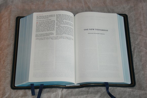
The text is a black-letter 11-point Milo serif font with around a 12-point leading and line-matching. The spacing between the words looks natural. Some Bibles will have words that are too close together to get more on a line, and right-justification can make too much space between words giving them an annoying amount of spacing. This isn’t excessive in the Quentel. All of the spacing looks better balanced.
I really like this font. As I get older I’m moving toward larger fonts. This is the kind of font I can read for hours. It looks modern but it doesn’t look out of place in a Bible. It’s very crisp and easy to read for long periods of time. It has the right amount of boldness, which is dark but not burn your eyes dark. It’s comfortable. And of course it’s every bit as consistent in its print quality as I expected it to be. There are no print issues of any kind.
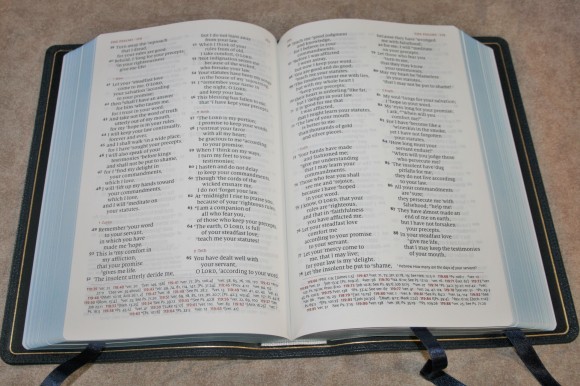
Chapter numbers are in a two-line drop-cap and they’re printed in a brick red. I love this red. It’s dark and makes the chapters stand out and it looks amazing. I love highlighted features like this because it keeps the pages from just being a sea of black text. The formatting for text also helps break up the verses so they don’t all run together. Psalm 119 uses this red for the Hebrew letters and names. This looks really nice. I would like to have seen this carried out for the other acrostic Psalms.
References and footnotes are keyed to the text with letters and numbers. I can read this text without having to look at every single footnote. Some Bibles are worse for that than others. I can’t read a Clarion or a Westminster without looking at the footnotes. I can ignore these, which for me is saying a lot.
Layout
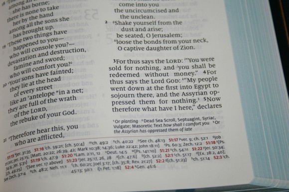
I love the modern layout. It presents the text in double-column, paragraph format with translation notes under the last verse in the outer column, and references across the footer. Poetry is set to poetic verse (but never with a single word on a line), and Old Testament quotes are also in a poetic setting.
The columns are 2.375” wide and contain 35 characters. This is within the ideal. I’m glad this is a double-column layout as a single column the width of the page would be too wide for reading and preaching. The width of the columns means I don’t have to move my head from side to side while I read. Double-column is just easier with my bifocals.
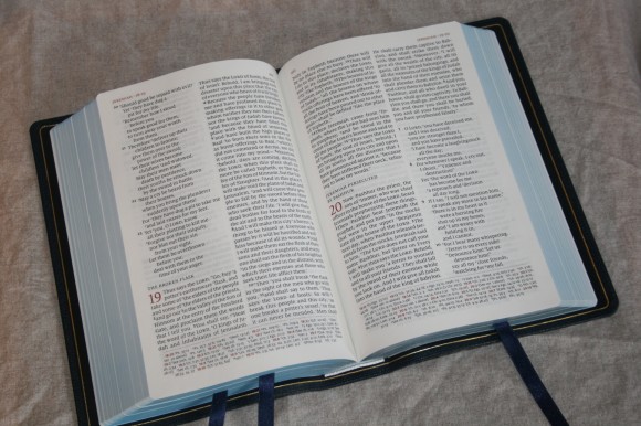
The inner columns come away from the gutter by .5 inches. This brings the text out where you can see it without it wrapping into the gutter. This is especially important on a Bible this thick. The outer margin is .375”. I find it impressive that it has a larger inner margin than outer margin. This was an intentional design element to improve readability. Other publishers should take note of this. I’ll take a larger inner margin than outer margin every time.
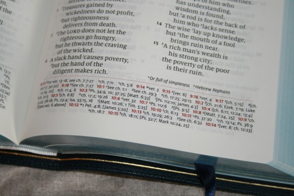
I like that the references and notes are separate from the text. The notes are under the outer column and the references go across the page in the footer itself, separated by a red line. I also like that they’re separate from each other. I can read the text without having to look through references and notes, but when I do want them they’re easy to find. The closer the notes are to the text the easier they are to find and use, but being more conveniently located also makes them more of a distraction and makes the layout look too busy. Placing them in the footer helps with that a lot. I can read the text just as a text. I also like the notes under the outer column. It gives a symmetry that my eyes like to see. The page feels well-balanced and it looks great.
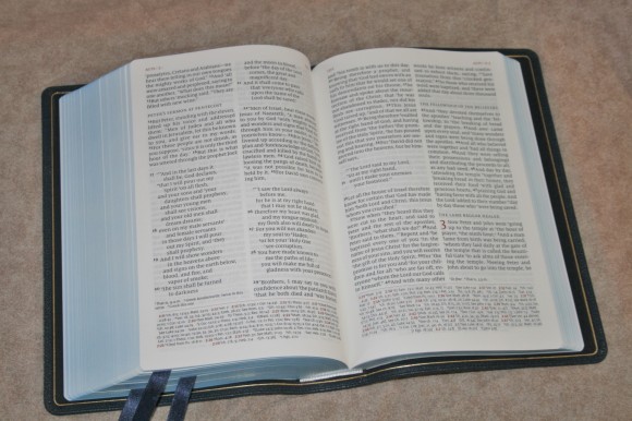
The two columns of just text make the best use of space. The text isn’t scrunched up to make room for a center or side column. There is enough room between the text and the footnotes that they don’t blend together.
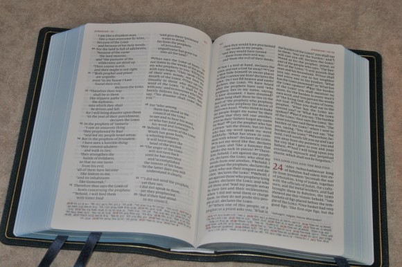
The header shows the book names and chapter numbers that appear on that page and the page number. They’re printed in the same dark red highlight as the verse numbers.
The standard ESV section headings are in all caps. I would have liked for them to have been printed in the same red as the chapter numbers. Instead, they’re in black and they tend to blend with the text. That would have looked nice, but it might have been too distracting, so I understand why they didn’t. They chose to keep them the same color so they don’t become too much of a distraction. This is something that I can appreciate. The headings do have some breathing room away from the text, so that helps keep them set apart.

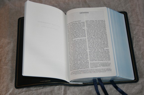
Books start on a new page. I wish all Bibles did this as this space is great for adding your own notes, lists, sermon outlines, etc. If you’re the kind that writes in your Bibles, it makes sense to use this space; especially considering how nice the paper is for writing.
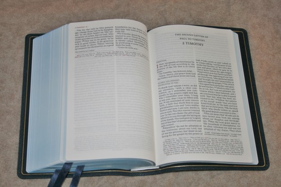
Book names are small compared to the space given for them. This makes them really stand out. Some will like the amount of space available and use it to write information about the book, such as author, date, setting, key verse, and key points.
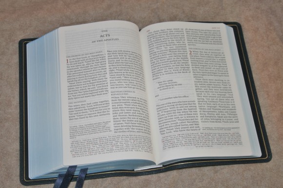
I love the look and feel of this page layout. It has the perfect balance between reading and study. It’s easy to read without distractions, and still easy to use the study tools. It is obvious the 2K/Denmark has put a lot of work into the design. Every design element was painstakingly and deliberately placed – from the width of the inner margin to the space between the words to the symmetry of the page to the tapering of the cross references; and it shows. There’s enough white space that the text never feels cramped. It’s been given the right amount of breathing room.

For more information about 2K/Denmark and the Quentel project, see the article Schuyler Quentel Reference Bible NASB by Andreas Krautwald, which is an interesting and fun read with insights into the Bible design world.
Cross References
Although I haven’t counted them to confirm, there are over 80,000 cross-references. They are the standard ESV references. They are keyed to the text with letters. They appear in the footer in Milo sanserif, which makes them match the font of the text, still lets them stand apart, and keeps them readable at their smaller size. The chapter and verse numbers are printed in brick red highlight. The font is very readable, making them actually usable rather than just there. If I had to guess the size of the font, I’d say it’s between 7-7.5, but keep in mind that is just a guess.
There are 18 references for Genesis 1:1 (counting a few passages that span multiple verses). John 1:1 has 15, and 1 John 1:1 has 10.
I like the quality of the content in the references. They give you useful information like pointing out where the verse is cited. I really like this.
Footnotes
These are the standard ESV footnotes, and like the cross-references they’re printed in Milo sanserif. The numbers are visually different from the verse numbers. I really appreciate this. I can’t tell you how many times I’ve searched the margin of a Clarion trying to find the note only to realize that I was seeing the verse number. That’s not an issue with the Quentel. The numbers are easy to see and yet easy to ignore at the same time.
I love the detail of information in the footnotes. They include notes from Greek, Hebrew, Aramaic, the Dead Sea Scrolls, Syriac, Masoretic Text, Vulgate, Septuagint, variant spellings of names and places (includes references), manuscript variants (including alternate renderings and omissions), etc. It also shows where a name is spelled differently somewhere else by giving you the reference and the alternate spelling (excellent for reducing confusion). Notes from the original languages show when a word could more than one meaning. It also shows if a Psalm is an acrostic. I like little details like this, especially since it doesn’t show up in English.
Concordance
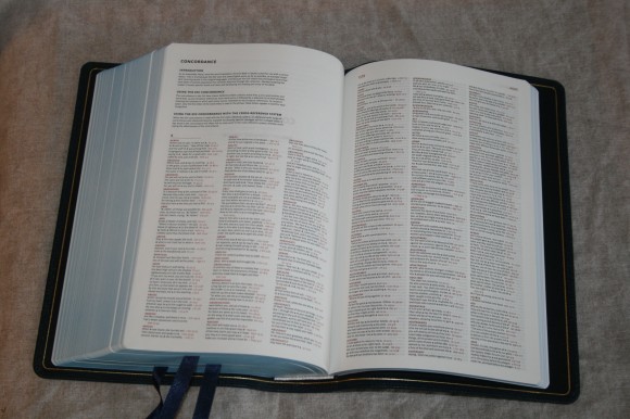
The concordance is 63 pages. There are 3 columns per page. The text is smaller in the concordance. The entries are in red. The portions of the verses are black, and the references themselves are in red. Even the concordance has line-matching.
The font in the concordance is very small. I’m guessing it to be around 5-point. It’s almost a shock to your eyes to go from that large of a font in the text to that small of a font in the concordance. I wear bifocals and didn’t have any problems using the concordance. I understand why it’s so small, since a concordance is one of the least used features of a Bible, but when it is used it needs to be useful enough to find most of what you need. We only have two other options:
- Make the font larger and remove some of the entries to keep the page-count the same.
- Make the font larger, keep the same number of entries, and add pages.
I vote to keep the smaller font because I don’t want any entries removed and if there are any pages added I want them for notes.
The concordance helps make this an amazing Bible for study and sermon prep. With a Bible this size I can see how it would be tempting to leave the concordance out; especially in a time when there are so many other tools available for free online. I still know a lot of preachers that don’t have a computer or a smartphone. I always look at my physical Bible before searching on my phone. I am very glad that it was included. It means I can do more of my study just from this one Bible.
Here are a few entries that I looked up while I was studying with the Quentel. This includes the variations on the word and the numbers of entries is given in parenthesis:
- Bold (3), Boldly (3), Boldness (3)
- Faith (36), Faithful (12), Faithfulness (7), Faithless (2)
- God (56), Goddess (2), Godliness (6), Godly (4), Gods (4)
- Praise (11), Praised (4), Praises (3), Praising (4), Pray (13), Prayed (5), Prayer (11), Prayers (7), Praying (4)
It contains names such as Caiaphas, Gamaliel, Seth, and many other names that do not appear very often in Scripture. It also contains lots of common words, such as loss, made, prepare, prove, prize, restore, rebel, rend, same, and lots more.
This is a very detailed concordance, making this Bible a great tool for study without having to go to other tools. It is helpful for study and basic sermon and class prep.
Maps
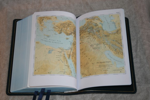
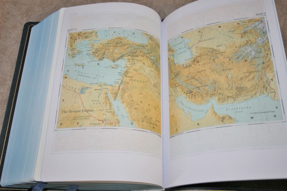
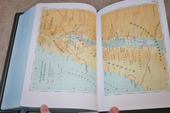
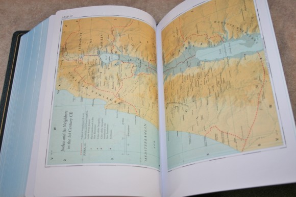
The Quentel does not skimp on maps. There are 14 full color Oxford maps on 27 pages, plus a detailed 4-page index! I always want to see an index with the maps and this one knocks it out of the park. The index uses the same font as the concordance. The maps and the index are printed on thick paper that isn’t shiny (another plus in my book). These are some of the nicest maps I’ve seen in a reference Bible.
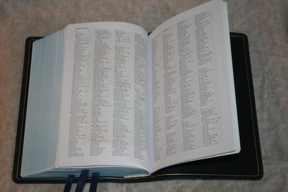
Here’s the full list of maps:
- Jerusalem in the First Millennium BCE
- Jerusalem in the Late Second Temple Period
- The Land of Canaan
- The Setting of the Exodus and Wilderness Traditions
- The Setting of the Narratives of Joshua, the Judges, Samuel, and Saul
- The Setting of the Narratives of David and Solomon
- The Kingdoms of Israel and Judah
- The Assyrian Empire
- The Persian Empire
- Judah/Yehud/Judea and Neighboring Regions in the Persian and Hellenistic Periods
- The Empire of Alexander and His Successors
- Kingdom of Herod and His Successors
- Judea and Its Neighbors in the 1st Century CE
- Places Mentioned in the NT
- The Roman Empire
- The Setting of Early Christian Missions
Ribbons
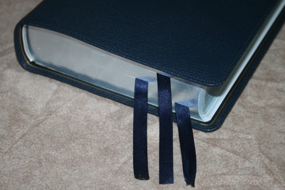
There are 3 Berisford navy ribbons. These ribbons are some of the most elegant ribbons I’ve seen in a Bible. They’re wide, which I prefer, and the feel silky to the touch. They’re very long – enough to pull them to the corner and still have plenty of material to hold on to. The navy blue looks amazing against the blue cover and blue under silver art-gilting. The ribbons naturally angle toward the bottom outer corner of the page.
3 ribbons are amazing, but I got spoiled with having 4 ribbons in the Schuyler KJV, so now I always hope for 4 ribbons. I can live with 3, but 4 is better. I would also like for each one to be a different shade of blue.
Using the Schuyler ESV Quentel
Carry
This is a large and heavy Bible. If you’re used to carrying around something the size of a study Bible then carrying this one will be fine because it is no different. I’m used to carrying wide margin editions, so I have no issues with carrying it to Church. On shorter trips I like carrying smaller, hand-sized Bibles, but I had no issues carrying it.
Reading
Reading from this is amazing. The layout, print quality, line-matching, and opacity of the paper make for a fun reading experience. It lays open on its own with no trouble. Due to its size, I did most of my reading with the Quentel either sitting in my lap or on the table, although I did hold it in my hands and read while walking around. This Bible makes me want to read it. When I did hold it I noticed that I used both hands most of the time. This had as much to do with size as it did weight. That’s typical for me for a Bible this size.
Study
With the extensive cross-references, translation notes, concordance, and maps, there are a lot of tools to do your own study. These are the types of tools that I prefer (rather than commentary). These resources make it a good Bible for personal study and sermon prep.
Highlighting
The 38gsm paper feels just like the paper found in Cambridge wide margin Bibles. This means it’s writable. There is a little bit of space in the margins (3/8”) if you want to write something. You can also write in the blank space at the end of books. I haven’t written in it, but I would think I could use my Pigma Microns and PrismaColor pencils on this paper with no trouble.
Tips on Marking
If you do decide to mark in your Schuyler ESV Quentel, I recommend using Pigma Micron markers and PrismaColor pencils. These are my favorite marking tools. Of course you can use dry highlighters as well. Just make sure you buy highlighters that are made for writing in Bibles. Always test your pens, pencils, and highlighters out on a lesser important page before marking within the Biblical text to make sure they won’t case problems in your Bible.
One way you can use color is to develop your own color code. Here’s an example of a color code for topical study:
- Purple – God
- Red – Salvation
- Green – Personal Growth
- Blue – Second Coming
- Yellow – Promises
For the actual marking, you could underline the verse and highlight over the keywords (this is my current method using a color code with 20 colors). Other options are to highlight over the verse, underline the verse, draw a box around the verse, draw a line down the side of the verse, or just draw a box in the margin and use colors to indicate what you want them to be.
Whichever method you use, I recommend using one of the thick pages in the front to create a key to your markings. This way you or someone else can pick up your Bible and know what all the colors and symbols represent.
Preaching
It fits on the pulpit perfectly. The font is easy to read from by glancing down instead of having to hold the Bible close to my eyes. The pages are easy to turn. Verses are fairly easy to find due to the size of the verse numbers. Verses in paragraph format always takes me longer to find, but these were faster than most. The range of chapters are shown in the page corners. These help in finding the verses, but I usually like to have the verses included along with the chapters. My guess is they wanted to keep it as clean as possible – and it does look clean and neat.
This is a great preaching Bible and it looks at home on the pulpit. If you like to carry your Bible while you preach or teach from it, just imagine doing this with a 3lb study Bible and you’ll have an idea if this one would work for you. You can use the blank portion at the end of books for sermon outlines, lists, points, etc. Since this is such an amazing pulpit Bible, I would love to see a few more pages in the back for notes. Even better – place them between the testaments.
Teaching
Teaching is often a lot like giving a presentation in Powerpoint. It helps to have images, notes, bullet-points, and keywords. Study Bibles and wide margin Bibles can be great for this. The Quentel doesn’t have much margin space, but you can use color-coding and the empty space at the end of books. There is enough margin space to write a symbol or small reference if you need to create a chain. I mostly use other materials for teaching from, such as pamphlets and notebooks, and just use the Quentel to read the Scriptures from. For that the Quentel is excellent. The Quentel is excellent for developing the Scripture portion of the teaching materials due to the vast number of references, footnotes, concordance, and maps.
Conclusion
The goal of the Schuyler Quentel was to place elegance and beauty above size and price, and in the Quentel this really shows. The Schuyler ESV Quentel lives up to my expectations for a premium Bible. Everything about this Bible shines. It is crisp, clean, sharp, and a joy to read. It makes me want to pick it up and spend the day with it. I love reading it and studying from it. My favorite attributes are the paper, print, and layout. If I could change one thing I would like four ribbons that are different colors. If I could add anything it would be a few pages for notes.
This is an expensive Bible, but it’s not just expensive for the sake of being expensive. Every aspect of the Quentel is made to give you the best reading experience. The paper and print alone make me want to read it. The tools ensure that I will get a great study and sermon prep experience. The cover and binding will ensure that it lasts me a lifetime. I’m drawn to it. It makes me want to pick it up and read it. Every reading experience should be this good. It is well-designed and well-made.
If you’re looking for a large print premium ESV, the Schuyler ESV Quentel is my number one choice. I can’t think of a single disappointment with this Bible. Now I can’t wait for the NKJV and KJV editions to be produced. I will be buying them both when they’re released and the KJV edition will be “my” Bible.
Bottom Line
The Schuyler ESV Quentel is a luxury edition that places quality above price, and its elegant design and quality materials make it worth every penny.
Comparisons
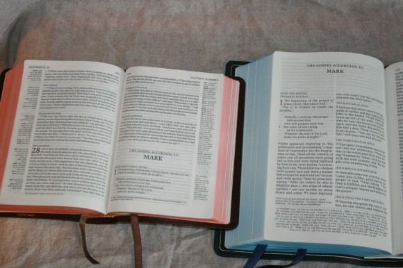
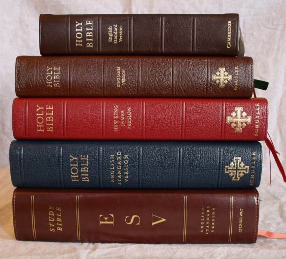
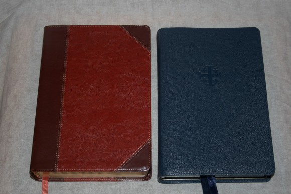
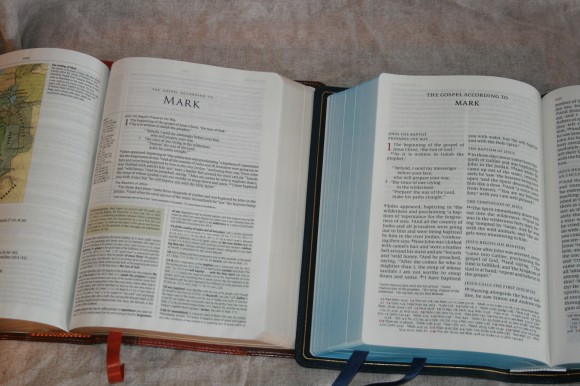
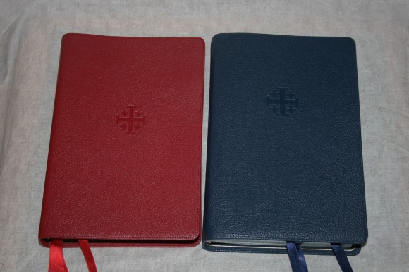
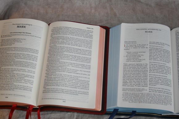
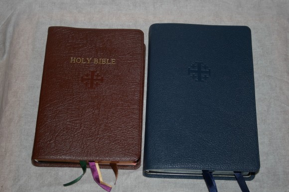
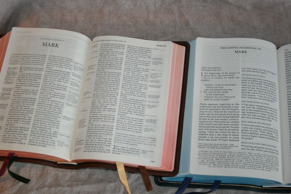
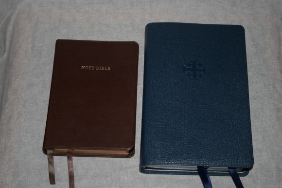
Here are some comparison photos. From the bottom up: ESV Study Bible, Schuyler ESV Quentel, Schuyler NKJV, Schuyler KJV, and ESV Cambridge Clarion. The comparisons are in that order.
Click here to buy from EvangelicalBible: Schuyler ESV Quentel
Click here to visit the publishers’ website: Schuyler Bibles
Schuyler Bibles provided this review copy for free for this review. I was not required to give a positive review- only an honest review. My opinions are my own.
Now it’s your turn. Do you have a Schuyler ESV Quentel? Was your experience similar to mine? Do you have anything to add? I’d like to hear about it in the comments below!











Dear Randy:
You do such a good job of communicating the good and sometimes the bad points in a new bible. As a seller and a publisher, Schuyler is definitely top notch. When I began the process of replacing my fathers old 1954 Schofield Reference Bible, I turned to Evangelical Bible to get started. I spoke to a gentleman named Paul, and after taking much more time with me than the sale warranted, I ended up with the Cambridge Personal Concord. This humble little bible has served me well as my primary reading bible, it is the king of the lampstand. I have since bought several products from EVB for gifts and for study. My experience with this firm has been without problems of any kind, the more I do business with them the better I like them.
Having seen their versionn of the Westminister Reference Bible, I am convinced that their expertise in getting a product to market, selecting a printer etc. are every bit as good as their general business plan indicated.
This bible looks to be a fine example of what a top drawer study/reference bible should be along with the quality that will provide long life and pride of ownership. The ESV is not for me, but it does have a good reputation. I am perfectly happy with the Authorised version, especially the Westminister Reference Bible. It is unnecesary to get into why I don’t like the modern translations, it is sufficient that I don’t like them. Aside from my preference for the Authorised translation, I find the paragraph format annoying. It is fine for reading, but if I want to look up a verse by number, it is a bother to find the verse number in a variety of locations, not against the left hand column margin. Many do not find this a problem, but I do. I expect that I will be purchasing two bibles more during my lifetime: One will be Schuyler’s version of the Westminister, and the other the Cameo by Cambridge, their Vachetta Calfskin edition. I have found that the Personal Concord from Cambridge adequate with strong light, but in dim light in a sanctuary or any other place without bright light, it gives me a headache from trying to read the small print. From the experience I have had with EVB, and your review, I would have sufficient information to cause me to go out and buy this fine bible if I wanted one in ESV. It is so good to have a company that we can rely on to do business well and honestly.
Yours in Christ
Don Denison
Thanks Don. I do love the Schuyler Westminster. I recently got a Personal Size Cambridge Concord (review coming soon). I see why you like it so much. Even though it has a 6.5 font, it’s still an easy font to read (with my glasses) compared to some fonts that are larger. I used it while reading the Quentel. It was almost a shock to the eye to go form the 11-point in the Quentel to the 6.5-point in the Concord, but it was doable. What impresses me the most is the size and readability, and the reference material. I can’t wait the Quentel in KJV.
Dear Randy:
Do you find the paragraph format annoying when you are looking for particular verses? I know that the verse numbers are there, but my experience has been that I sometimes have difficulty finding them.
I’m glad that you’ve found time to review the Personal Concord it has, I think, all the features of the Concord in a package that makes it easy to read while seated. It does not do well in dim light, but the font even at 6.5 works well with a lamp shining on it. I’m trying to get used to the Westminister’s size, and may do that yet, but for now the Personal Concord remains the King of the Lampstand. When I have enough saved for the Cameo, it’s larger type may make a difference, but it lacks some of the features the Personal Concord has. I bought the Personal Concord as a using bible for less than $50.00 while I learned what I really wanted, but it has turned out to be hard to beat. If the type size were at least 8, I wouldn’t want anything else for a reading bible, but for a study bible, there are others more appropriate.
Yours in Christ
Don Denison
Hi Don. The verse numbers in paragraph format are usually hard for me to find. They’re not difficult in the Quentel. These verse numbers are large and stand out just the right amount that I can find them easily.
waiting for the KJV…2017-18 is unacceptable.
Schuyler needs to pick up the pace already.
Me Too Sam. That’s the Bible I’ve been waiting for since they announced the Quentel series. Now that I’ve seen one, the wait is even worse. The KJV Quentel will be my primary Bible.
Why do you prefer the KJV? You have studied the fact that things are there that shouldn’t be right? Just curious. God Bless.
Hi Travis. Is your question for Don?
I noticed you said this has 38 gsm paper, but in the listing for it at Evangelical Bible (https://evangelicalbible.com/product/schuyler-quentel-esv-imperial-blue-preorder/) it says 28 gsm. Is this a special edition of some sort? I prefer thicker paper and looking for something similar to this with thicker paper.
Hi Brian. This is an older edition. They changed to 28gsm for the next edition.
Where can I buy this Bible?