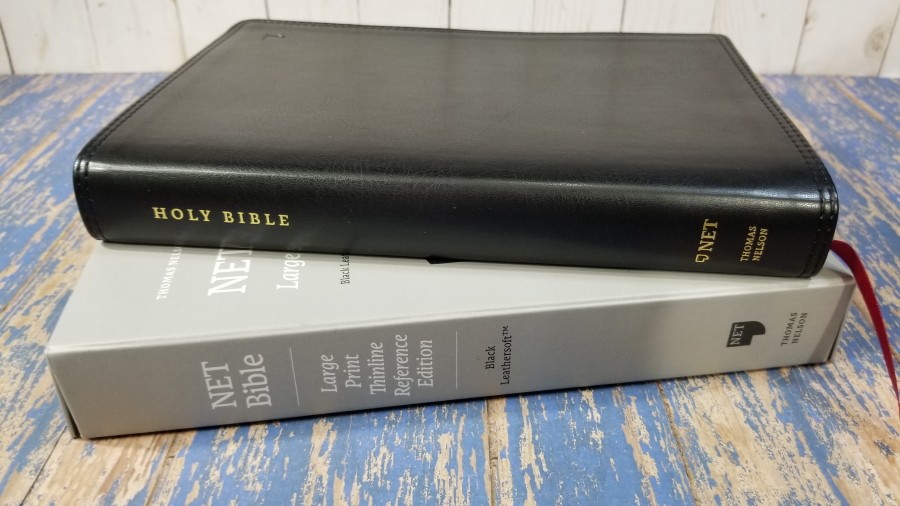
The NET Bible, Large Print Thinline Reference Edition from Thomas Nelson is a reference edition that’s highly readable while remaining easy to carry and study from. Its large font, layout design, tools, and price range make it a good choice for an all-purpose Bible. I’m reviewing the black LeatherTouch, ISBN: 9780785229155, made in China.
Thomas Nelson provided this Bible in exchange for an honest review. I was not required to give a positive review, only an honest one. All opinions are my own.
_________________________________________________________
This book is available at (includes some affiliate links)
and many local Bible bookstores
_________________________________________________________
Table of Contents
- Video Review
- Cover and Binding
- Paper
- Typography
- References and Footnotes
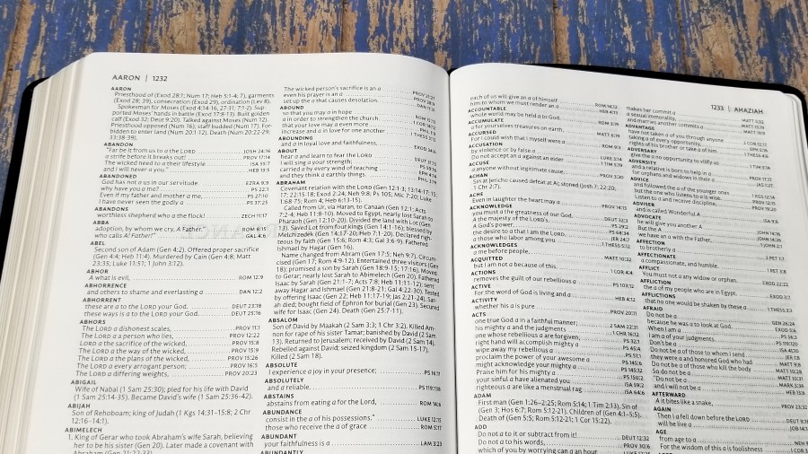
- Concordance
- Reading Plan
- Maps
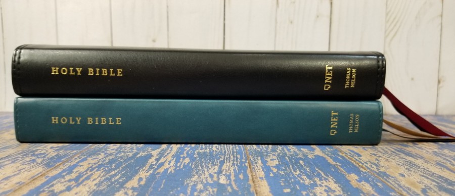
- Comparisons
- Conclusion
Video Review
Cover and Binding
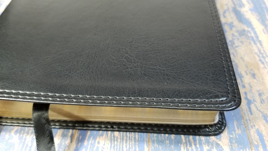
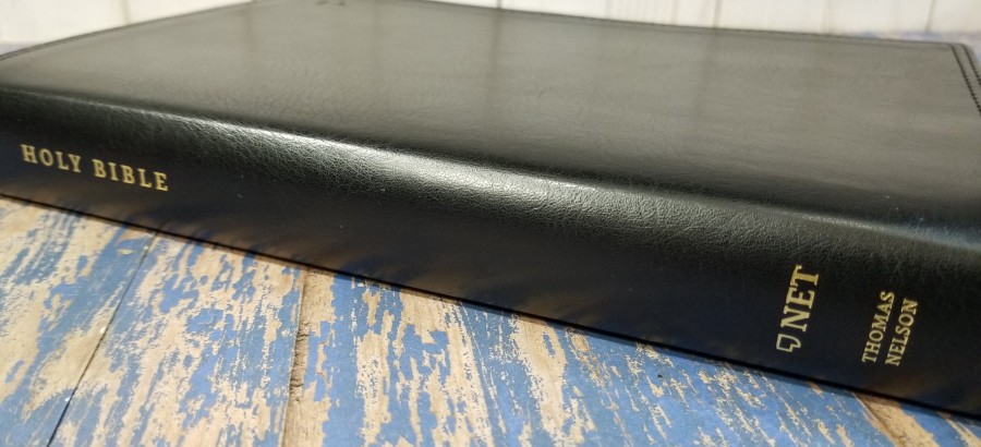
The cover is black Leathersoft (imitation leather). It has an interesting grain, so it doesn’t look flat or bland. I like the look of this Leathersoft. The upper right corner has the NET Bible logo debossed. It has double perimeter stitching. The spine has the text stamped in gold.
The liner is a pasted-down paper that doubles as the presentation page. There are no other thick end sheets. It’s Smyth sewn and has no trouble staying open to any page.
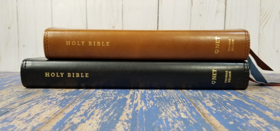
Two double-sided satin ribbon markers are included: 1 black for the Old Testament and 1 red for the New Testament. The overall size is 6 1/2 x 9 5/8 x 1 1/8″ and it weighs 1 lb, 14.3 oz.
Paper
The paper is thin but decently opaque. I’m not sure of the gsm, but it’s at least in the lower 30’s. It’s something I’d expect to see in a study Bible and the thinline editions. It has an off-white color and a rough texture that’s easy to grab and separate with one hand to turn. It has no glare under direct light. I found the pages easy to turn and read from. The show-through is noticeable, but it isn’t bad.
Typography
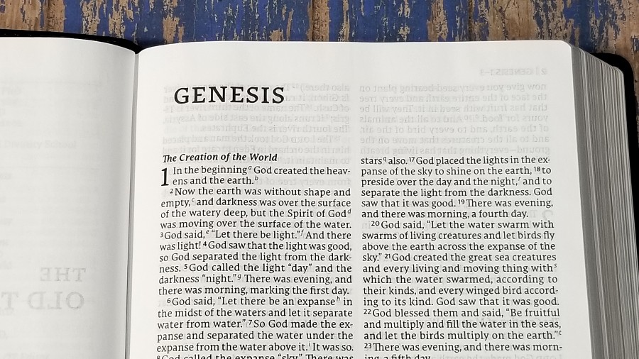
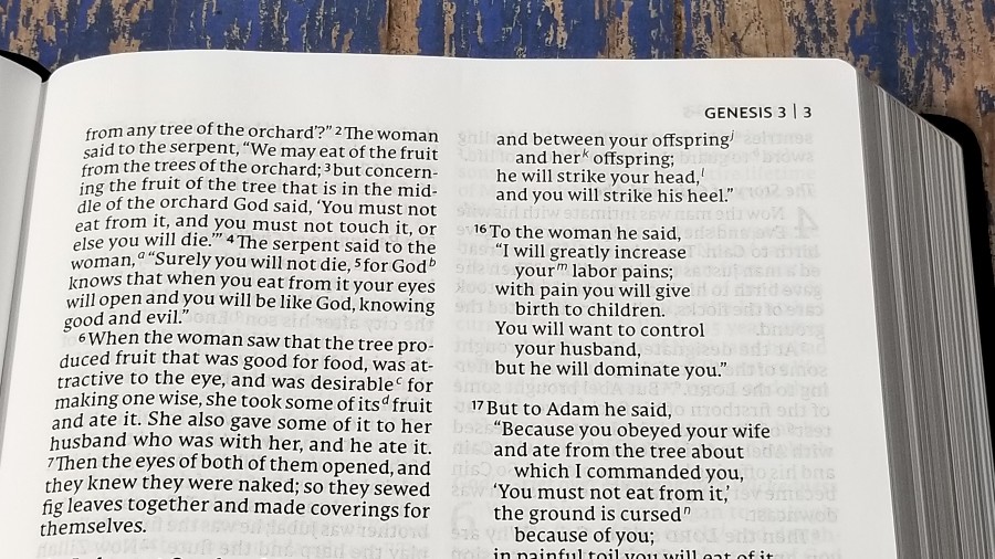
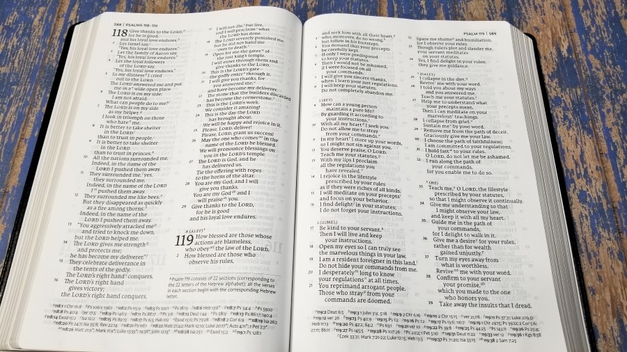
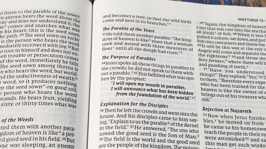
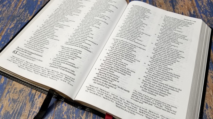
The text is presented in a double-column paragraph format. Poetry is set to stanzas. Section headings are large print and in bold italics. Old Testament quotes in the New Testaments are also in bold italics. Verses that are allusions to other verses are in italics and include the reference in the footnotes.
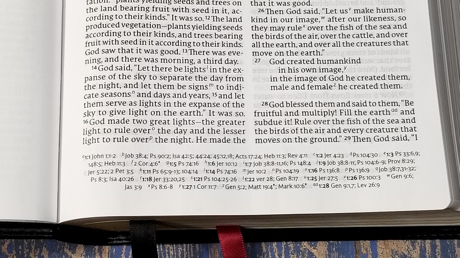
Footnotes are placed under the last verse. Cross-references are placed across the footer horizontally. The header displays the page number, and chapter and verse number in the outer margin.
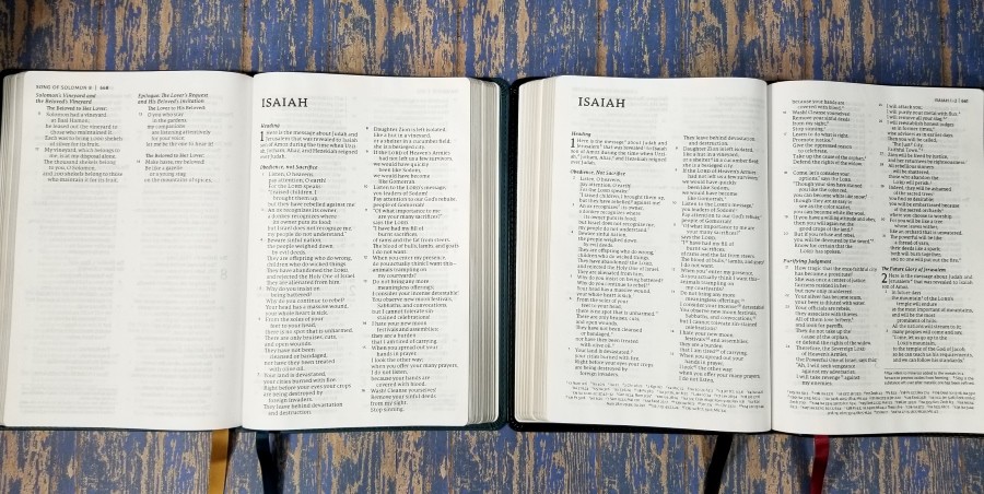
The typeface is 10-point Comfort Print. This typeface was designed for the Thomas Nelson NET by 2K/Denmark. It’s dark and consistent throughout. It has around 8 words per line and has a good amount of leading, creating enough space between the lines to make it comfortable to read and provide enough space for underlining.
It’s printed with line-matching to improve readability. Even with line-matching (meaning that the lines of text on both sides of the page are printed in the same location on the page), the text does not become gray because of show-through. The verse numbers aren’t small, but they can be difficult to find. This layout is a joy to read.
References and Footnotes
I’m not sure of the number of cross-references, but it has less than the standard in the NKJV. It’s similar in number to the NKJV Thinline Large Print Reference edition. The set isn’t extensive, but it is helpful for basic study and sermon prep. Like the NET Large Print Thinline, it has an abbreviated set of footnotes.
Here are a few example references to help you compare:
- Genesis 1:1 – Jn 1:1-2; Job 38:4; Ps 90:2; Is 42:5; 44:24; 45:12; Ac 17:24; Heb 11:3; Rev 4:11
- Deuteronomy 6:4 – Mark 12:29; 1 Cor 8:4, 6
- Isaiah 9:6 – Isa 53:2; Lk 2:11; Jn 3:16; Mt 28:18; Isa 28:29; Isa 10:21; 11:2; Isa 26:3, 12; 66:12
- Mark 12:29 – x
- John 1:1 – Rev 19:13; John 17:5; 1 John 1:2; Phil 2:6
- John 3:16 – Rom 5:8; Eph 2:4; 1 Jn 4:9, 10; ver 36; Jn 6:29, 40; 11:25, 26
- 1 John 1:1 – John 1:2; John 1:14; 2 Pet 1:16; John 2:27
Concordance
The concordance is 83 pages with 2 columns per page. It has a lot of entries and it an excellent tool for study and sermon prep. It also includes biographical information. The concordance is one of the strengths of this Bible. Here are a few example entries with their number of references to help you compare:
- Christ – 78
- Christ’s – 2
- Christian – 2
- Christians – 1
- Faith – 58
- Faithful – 19
- Faithfully – 2
- Faithfulness – 21
- God – 4 columns
- God’s – 19
- Godliness – 5
- Godly – 4
- Gods – 2
- Praise – 34
- Praised – 4
- Praises – 5
- Praiseworthy – 1
- Praising – 2
- Pray – 17
- Prayed – 3
- Prayer – 8
- Prayers – 6
- Praying – 3
Reading Plan
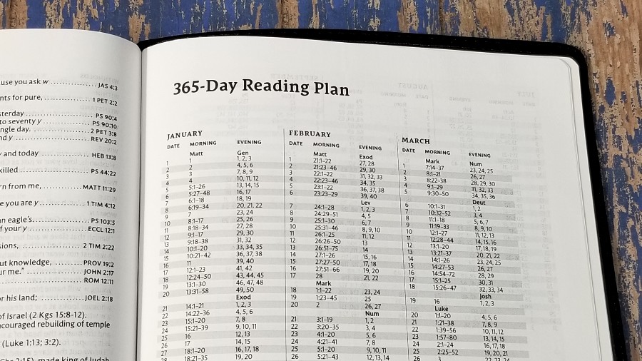
It includes a 365-day reading plan. Each month shows the date and a morning and evening reading. The morning reading is from the NT (starting with Matthew) and the evening reading is from the OT (starting with Genesis). It takes you through the Bible once. It’s printed like a spreadsheet so the lines are easy to follow.
Maps
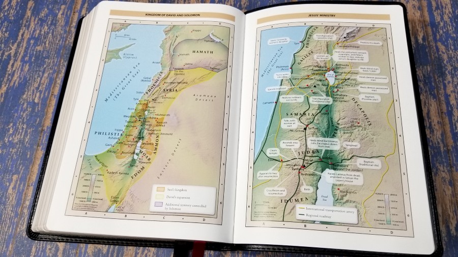
The maps are the standard 7 full-color Thomas Nelson maps printed on 8 thick glossy pages. They’re printed in bright earth-tone colors. They show topography, distance, routes, borders, possible locations of lost places, battles, elevation, cities, and locations for the events of Jesus’ ministry. It doesn’t include a map index, but the maps are annotated well, so they’re still easy to use.
Maps include:
- World of the Patriarchs
- Exodus and Conquest of Canaan
- Land of the Twelve Tribes
- Kingdom of David and Solomon
- Jesus’ Ministry
- Paul’s Missionary Journeys
- Jerusalem in the Time of Jesus
Comparisons
Here’s how the NET Large Print Thinline Reference Bible compares to a few other NETs from Thomas Nelson.
NET Large Print Thinline
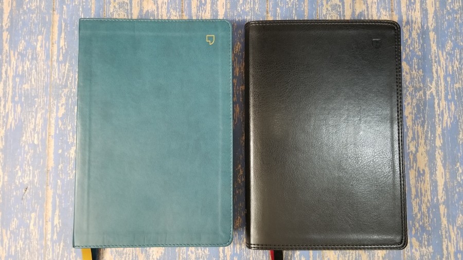
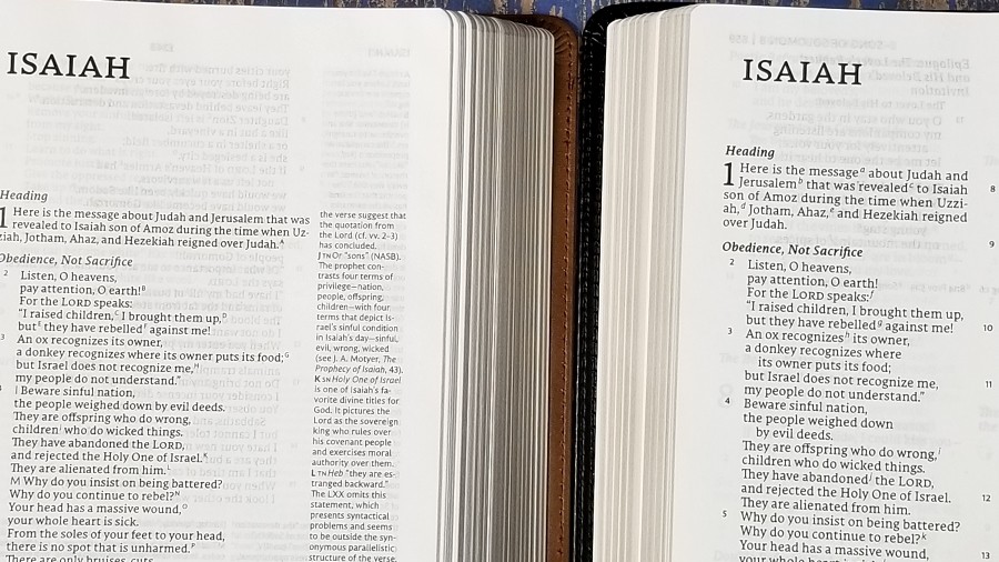
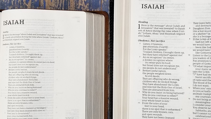
The NET Large Print Thinline has the same overall size. Since it doesn’t include references the font is larger. It doesn’t have the concordance, but it does include maps. The materials are the same.
NET Full Notes Edition
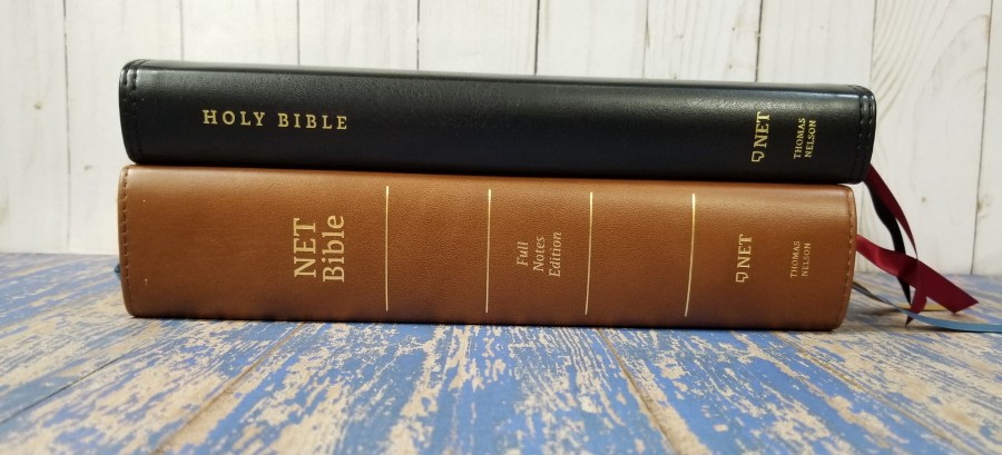
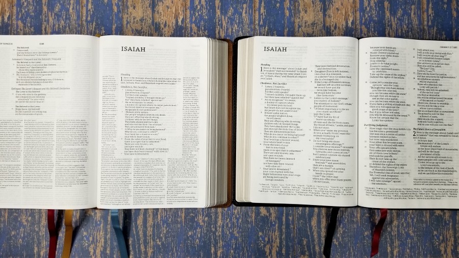
NET Full Notes Edition is a much thicker Bible due to the translation footnotes. It’s a single-column edition with a smaller font. It doesn’t include references or a concordance, but it does have maps. The materials are the same.
NET Single Column Reference Edition
The NET Single Column Reference Edition has a much smaller footprint. The thickness is the same. It has the same references, concordance, and maps. The reference layout is easier to use because they’re stacked rather than placed in a wide column across the page. The layout is similar to the NKJV single-column reference edition. This is one of my favorite Bible designs.
Conclusion
Thomas Nelson’s NET Bible, Large Print Thinline Reference Edition is a good all-purpose Bible. It’s not too large to carry and use, but the font is large enough for most readers. The materials match the price range, making it a good choice for a Bible that can be used without worrying about damaging a family heirloom. The tools are great for study and sermon prep. It doesn’t have as many references as their NKJV and KJV editions, but it does have enough for most needs. If you’re interested in a NET reference edition that won’t break the bank, this one is good choice.
_________________________________________________________
This book is available at (includes some affiliate links)
and many local Bible bookstores
_________________________________________________________
Thomas Nelson provided this Bible in exchange for an honest review. I was not required to give a positive review, only an honest one. All opinions are my own.

















I really like this edition. I am one of those odd people who likes the NET as a translation by itself. The extensive notes is a serious bonus. I got a copy of this about a year ago and ended up gifting it to my wife, who also loves it. Now I am thinking about getting one for myself again…