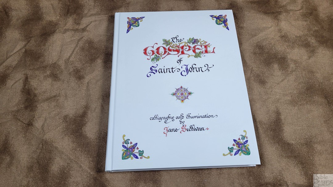
The Illuminated Gospel of John from Cambridge is a fine art edition of the Gospel of John, illuminated by artist-calligrapher Jane Sullivan. It was inspired by Celtic art and the illuminated manuscripts of the Middle Ages and presents the KJV text handwritten in calligraphic script and illuminated with original illustrations. This is ISBN: 9781009482615, printed in the Netherlands by Wilco, Amersfoort. It will be available November 7th, 2024.
Cambridge Bibles provided this Bible in exchange for an honest review. I was not required to give a positive review, only an honest one. All opinions are my own.
_________________________________________________________
This Bible is available at (includes some affiliate links)
_________________________________________________________
Table of Contents
Materials and Construction

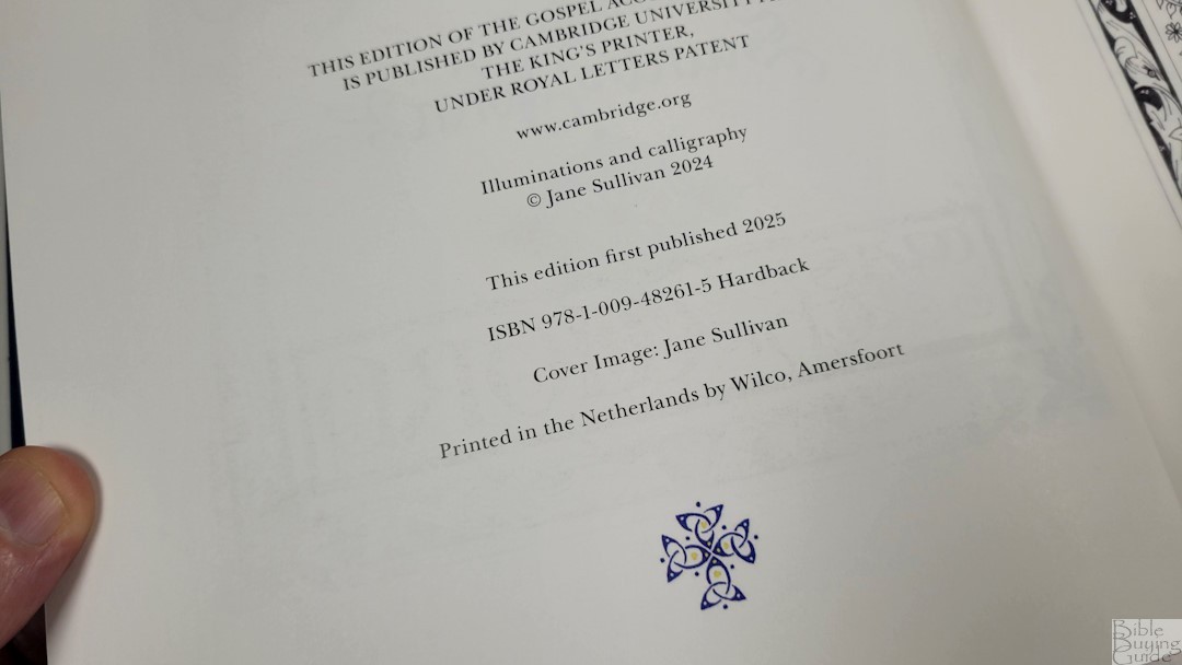

This is a hardcover edition with artwork by the author. The back shows the description with samples. The text block is sewn. It has high-grade woven paper. It’s ivory in color and has a matte finish that works perfectly for this Bible. The paper is extra-thick, which causes the book to close. This means we have to hold the book open to read it. It’s made well and feels like a premium book. The overall size is 8.5 x 10.8 x .75 inches and it weighs 1 lb, 14.8 oz.
Typography
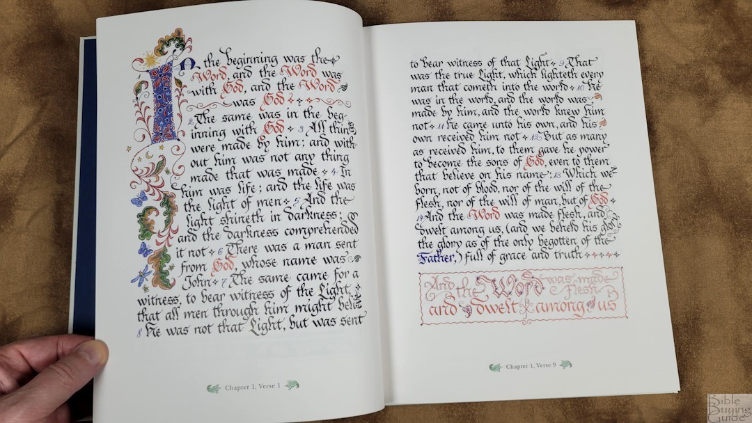
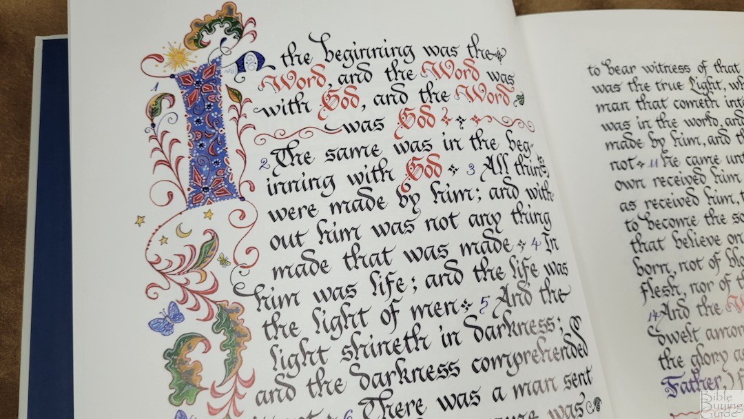
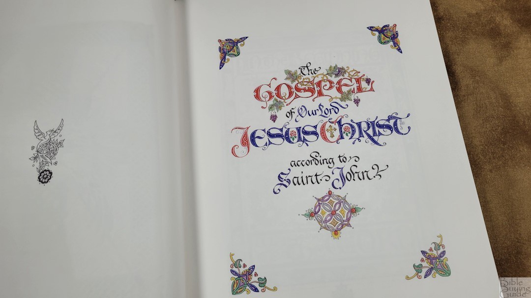
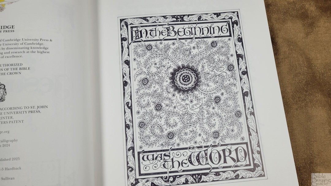
Each page design is inspired by medieval Celtic designs. The text is calligraphy, hand-written in French Bâtarde. The author has adapted her tastes to the typeface to make it more readable. It’s easy to tell that every word is hand-written. While all of the letters follow a consistent design, they’re just different enough not to be the same letter copied and pasted. The ink smears from one letter to another, causing the natural variation you’d expect to see in calligraphy. She adjusts the text to fit the space, often adding flourishes to the letters themselves.
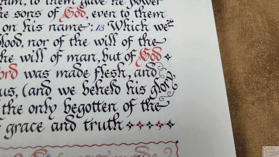


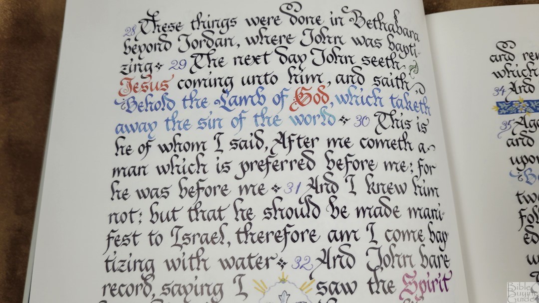
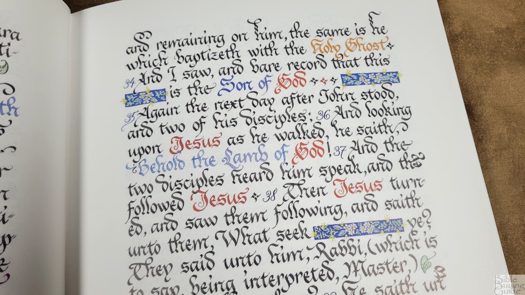
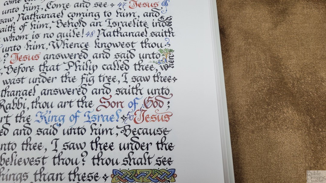
This is a single-column paragraph layout with around 8 words per line and 19 lines per page. It’s around 36 points for upper case letters and 20 points for lower case letters. The typeface has a Gothic look and feel, but it’s easier to read. Reading does take some extra concentration, though, but that’s to be expected since it isn’t a modern typeface.
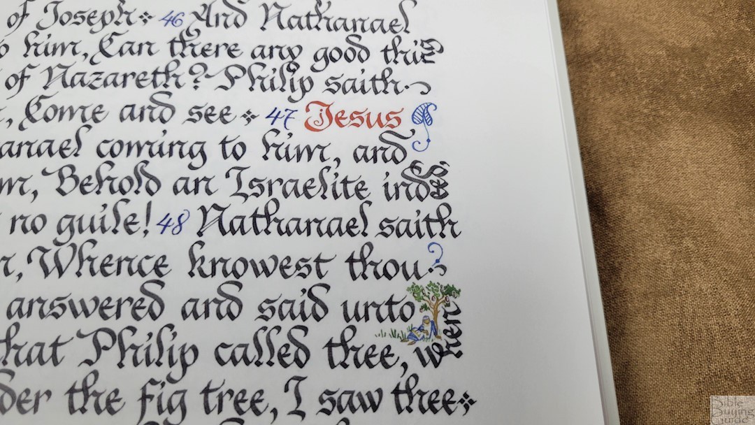
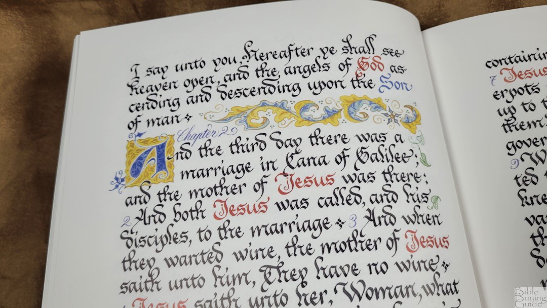

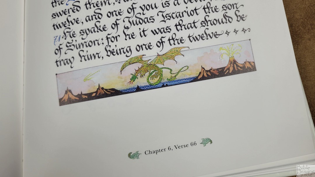

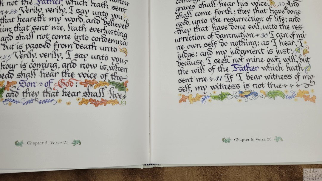
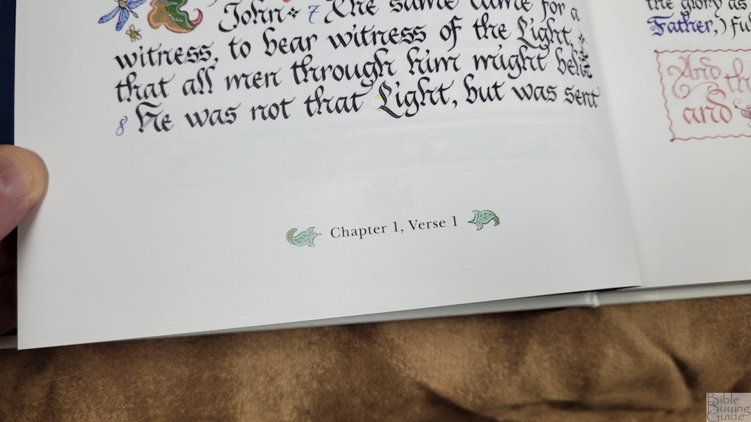
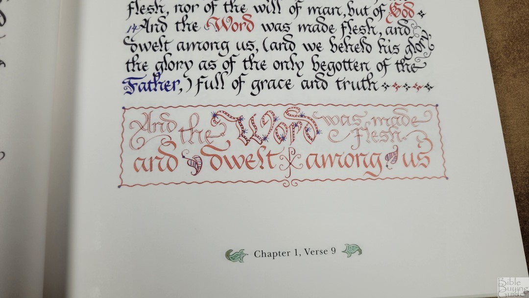
The color on each page is beautiful. Certain words are written in color. This includes references to God, titles of Christ, and peace. Verse numbers are written with a thinner line and in a different color. All page decorations are in color. Chapters are divided by a decoration with vines, leaves, animals, or other flourishes. A few chapters include a highly decorated drop-cap. Extra space at the bottom of the page sometimes includes full-width drawings. The chapter and verse are centered at the bottom of the page surrounded by decorations.
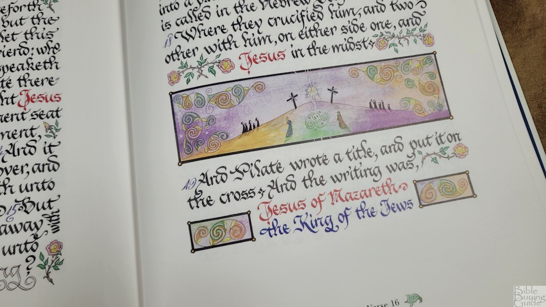
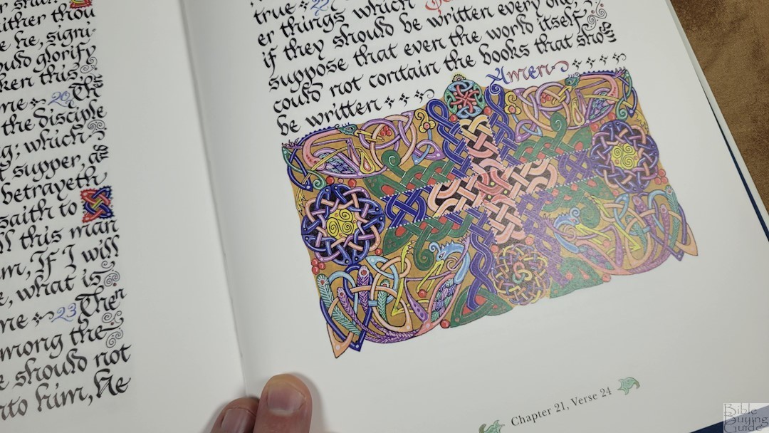


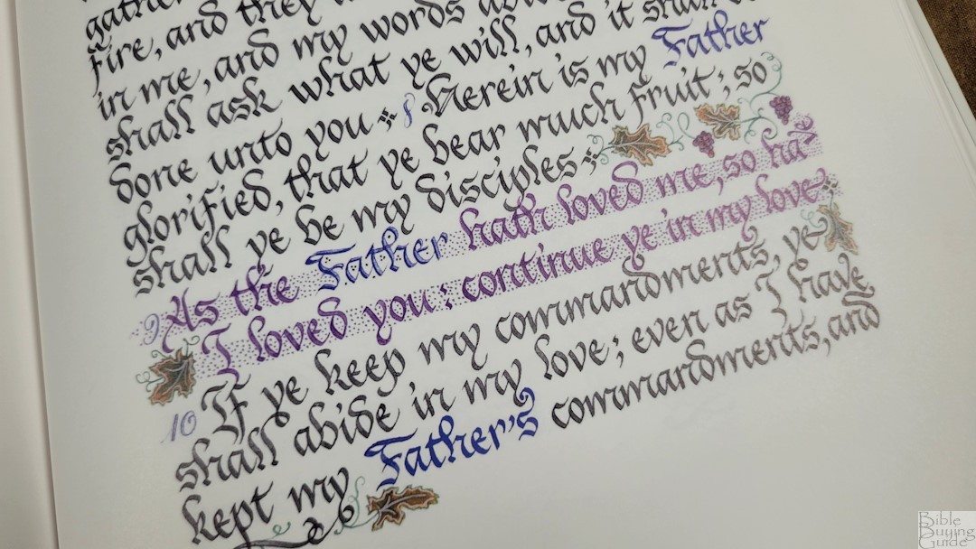

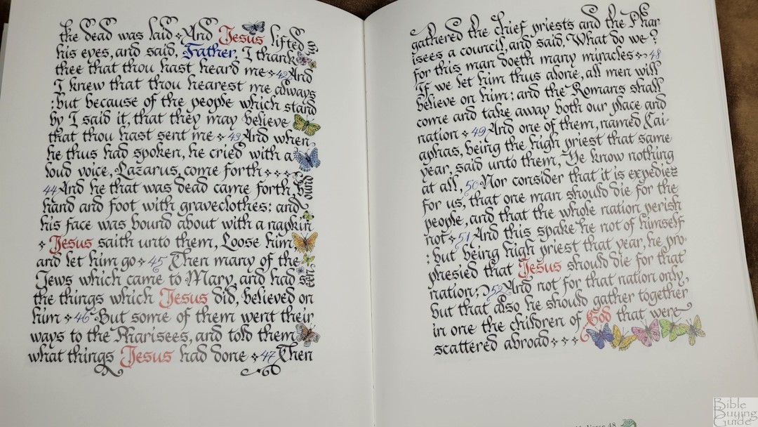
Sometimes, when there isn’t enough space at the end of a line to fit a word, the last few letters are turned sideways. This is my least favorite of the author’s liberties she’s taken with her calligraphy. There’s almost always enough room on the next line that the extra letters would fit without any problems. Not that it looks bad. It’s just not my taste. Other times, a double hyphen is used. The hyphens look much better. If a little space is left on a line, or between verses, the space is usually taken up by a small flourish. I love these. Some of the flourishes include detailed drawings such as butterflies or dragons.
Artist’s Afterword
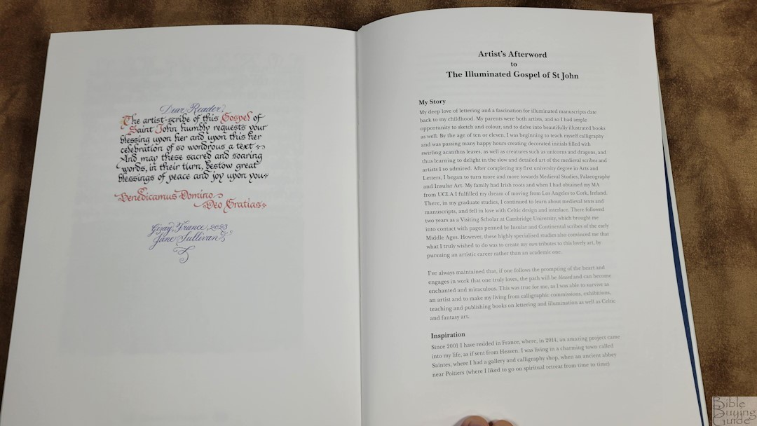
In the back, you’ll find the Artist’s Forward to The Illuminated Gospel of John. I found this fascinating and I’m glad to see it included. The forward covers her story, the inspiration for this project, why she chose the Gospel of John, calligraphy and illumination, and why she chose the KJV. She chose the KJV for its beauty.
She also talks about the art of handwriting and mentions that handwriting allows for unintentional flourishes. I am aware of accidental design, but this is an aspect of design that I hadn’t considered. It makes sense and would let me create something I didn’t know was possible. As she describes, “for when you write very, very slowly, the song of the letters hums in the silence!” That’s a beautiful thought.
Video Review
Conclusion
The Illuminated Gospel of John is beautiful. It’s fun to read, but I think it works better as a coffee table book. I love thumbing through the pages and just stare in awe at the detail. I highly recommend the Illuminated Gospel of John to anyone who loves illuminated manuscripts and books.
_________________________________________________________
This Bible is available at (includes some affiliate links)
_________________________________________________________
Cambridge provided this Bible in exchange for an honest review. I was not required to give a positive review, only an honest one. All opinions are my own.




Recent Comments