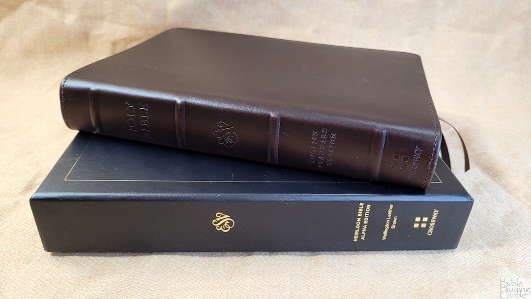
The ESV Heirloom Bible, Alpha Edition is a high-quality hand-size ESV from Crossway that’s both portable and readable. It’s available in black goatskin and brown Wellington leather. I’m reviewing the brown Wellington edition, ISBN: 9781433591143, printed and bound in the Netherlands by Jongbloed.
Crossway provided this Bible in exchange for an honest review. I was not required to give a positive review, only an honest one. All opinions are my own.
_________________________________________________________
This Bible is available at (includes some affiliate links)
and many local Bible bookstores
_________________________________________________________
Table of Contents
- Video Review
- Binding
- Paper
- Typography and Layout
- Footnotes
- Extras
- Bible Atlas
- Comparisons
- Conclusion
Video Review
Binding
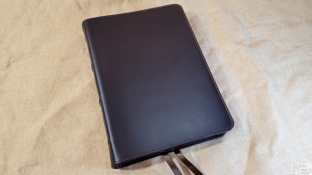
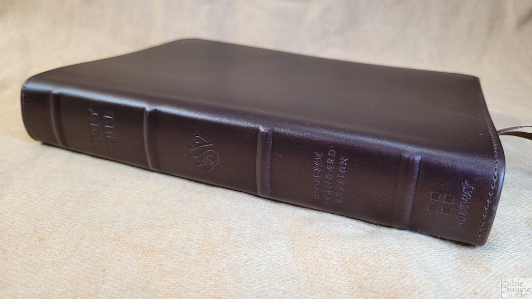
The cover is brown Wellington leather from Valencia, Spain by Cromwell. This is a high grade of cowhide. It’s smooth to the touch and looks and feels elegant. It’s dark brown and has a little bit of color variation. The leather does seem to take scratches easily, so it’s similar to Horween leather. The cover is stiff enough to hold flat in the hand. There is no printing on the front. The spine includes the standard ESV text dry stamped with no color on the spine. It has four raised hubs. The cover also includes perimeter stitching.
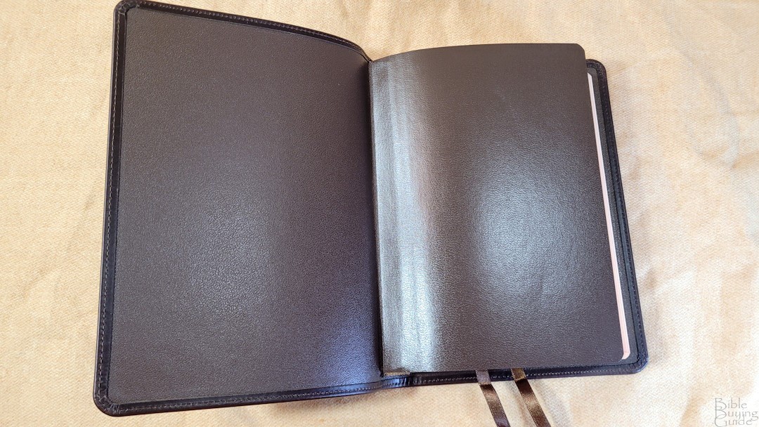
The liner is edge-lined leather. The tab isn’t as stiff as most Bibles of this size. The block is sewn. Due to the small size of the text block, it will take some use before it will stay open in Genesis. It includes two 1/4″ brown ribbons. They’re angle-cut and long enough to pull to the corner to open the Bible easily. The overall size is 5.5 x 7.6 x 1.25″, and it weighs 1 lb, 4.5 oz. This is the perfect size for carrying and reading.
Paper
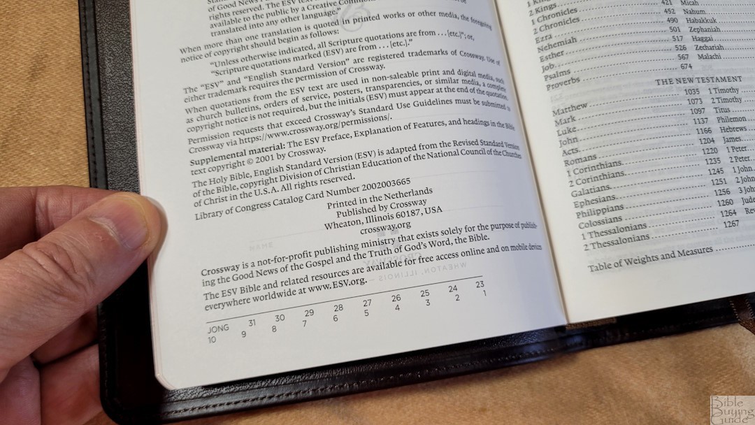
The paper is a high-quality European Bible paper. It’s 28GSM and has a premium coating. It’s smooth to the touch and is highly opaque. The color is slightly cream, which is my personal favorite color for Bible paper. There is no glare under direct light find it great on the eyes for long periods of reading. It can take an extra second to turn the pages, but it’s not too difficult. The page edges are red under gold. It has more of a salmon color when the Bible is opened.
Typography and Layout
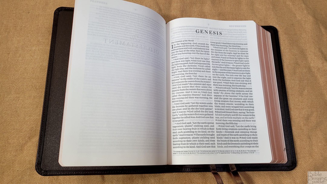
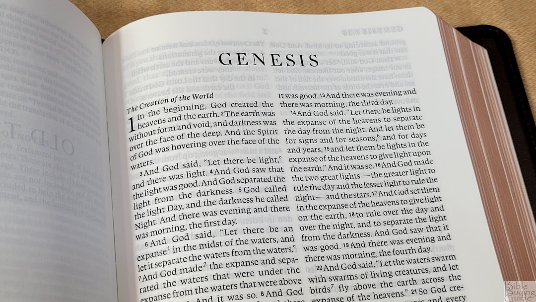
The 2016 ESV text is presented in a double-column, paragraph layout. It follows the standard ESV formatting with poetry set to stanzas and section headings that are semi-bold italics. The header shows the book name and reference in the outer margin and the page number in the center. Footnotes are placed in the footer starting on the left side of the page.
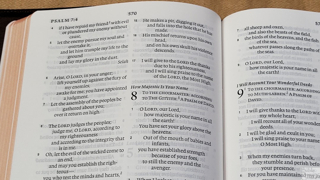
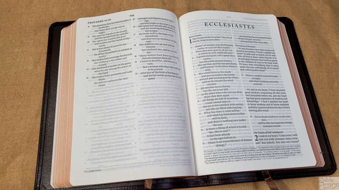
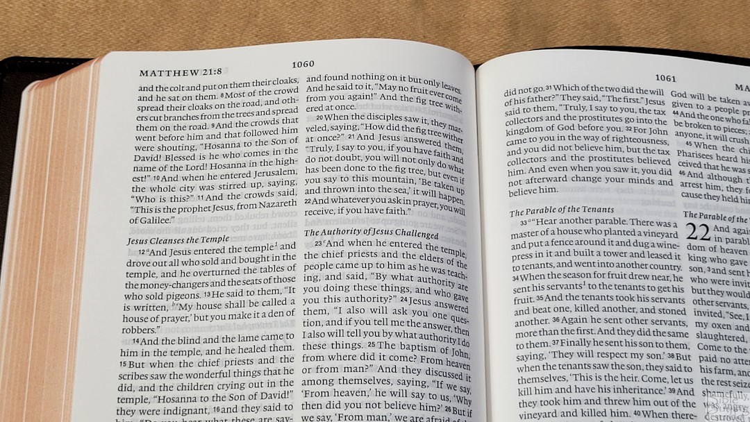
The typeface is 8-point, black letter. The text is dark and consistent throughout. It has extra whitespace in the text to make it highly readable. It was printed with line-matching, meaning that the lines on both sides of the page are printed in the same location to reduce show-through. Verse numbers are larger than normal to help make them easier to find. They’re not bold, so it will take an extra second to find them, but I did find the verses easy to locate. Footnote callers are large and bold, but they don’t stand out too much. I find the text to be highly readable.
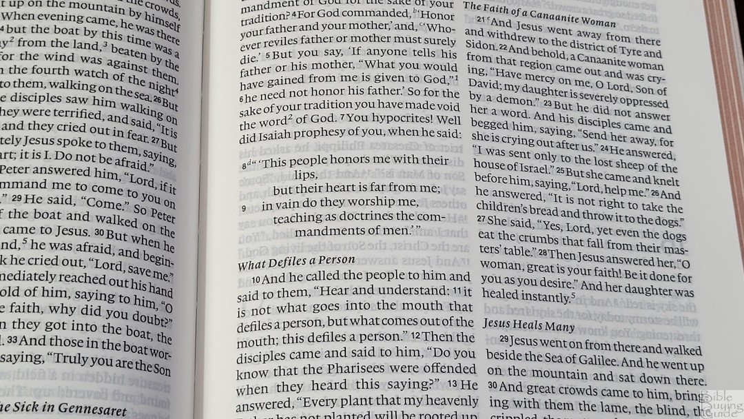
Poetry follows the standard ESV method of heavily indenting when the text wraps to the next line. It also runs the line all the way to the end before wrapping. This causes the lines to have hyphens and many poetic lines have one word.
Footnotes
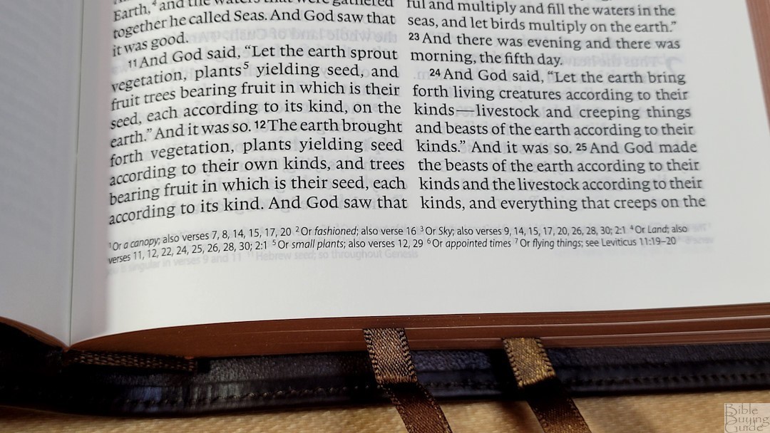
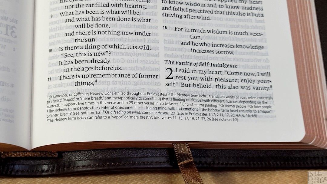
The standard ESV footnotes are placed at the bottom of the page and include the footnote number. References to parallel passages and quotes include letters. I prefer the footnotes to include references like these. The footnotes include Hebrew and Greek explanations, manuscript variations (without identifying the manuscript), information about objects, places, names, money, references where something is quoted, etc. The footnotes and their numbers are small, so they might be difficult to read.
Extras
Presentation and Family Pages
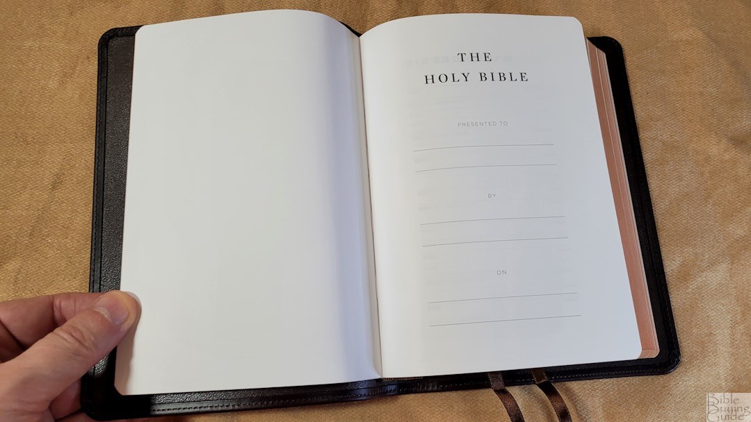
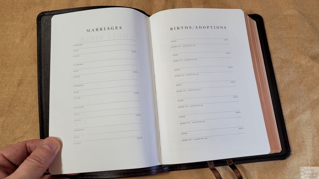
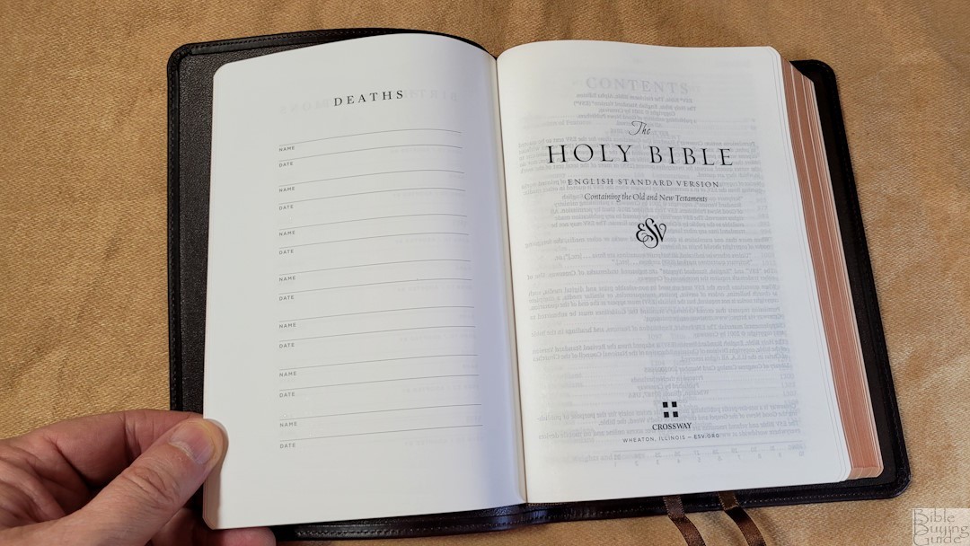
In the front is a presentation page and several family pages. These are printed on thick paper and include marriages, births/adoptions, and deaths.
Table of Weights and Measures
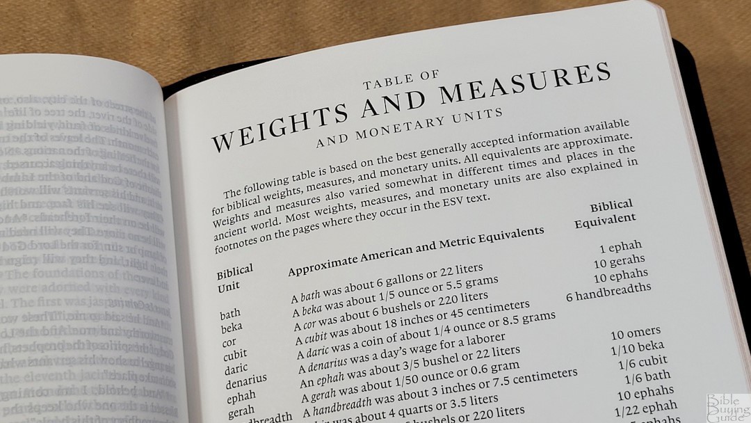
In the back is a small table of weights and measures. It shows the biblical unit, approximate American and metric equivalents, and biblical equivalents. This information is also covered in the footnotes, but I find the table handy to use.
Bible Atlas
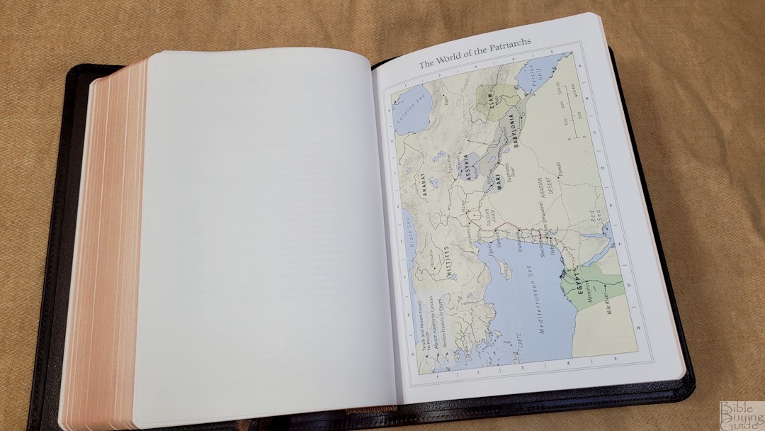
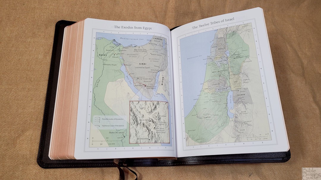
In the back are the 8 Crossway maps printed on thick semi-glossy paper. They are printed with earth-tone colors and include distance, topography, borders, routes, rivers, kingdoms, etc. It doesn’t include an index to maps, but the maps are labeled well and are easy to use.
Maps include:
- The World of the Patriarchs
- The Exodus from Egypt
- The Twelve Tribes of Israel
- Israel Under Saul, David, and Solomon
- Jerusalem in the Time of Jesus
- Palestine in the Time of Jesus
- Paul’s First and Second Missionary Journeys
- Paul’s Third Missionary Journey and His Voyage to Rome
Comparisons
ESV Heirloom Heritage
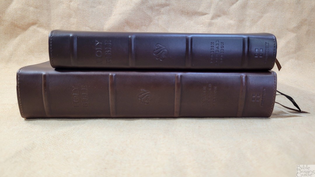
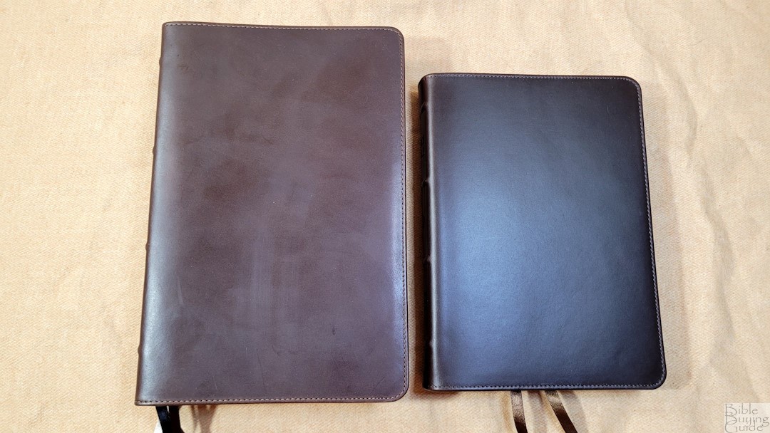
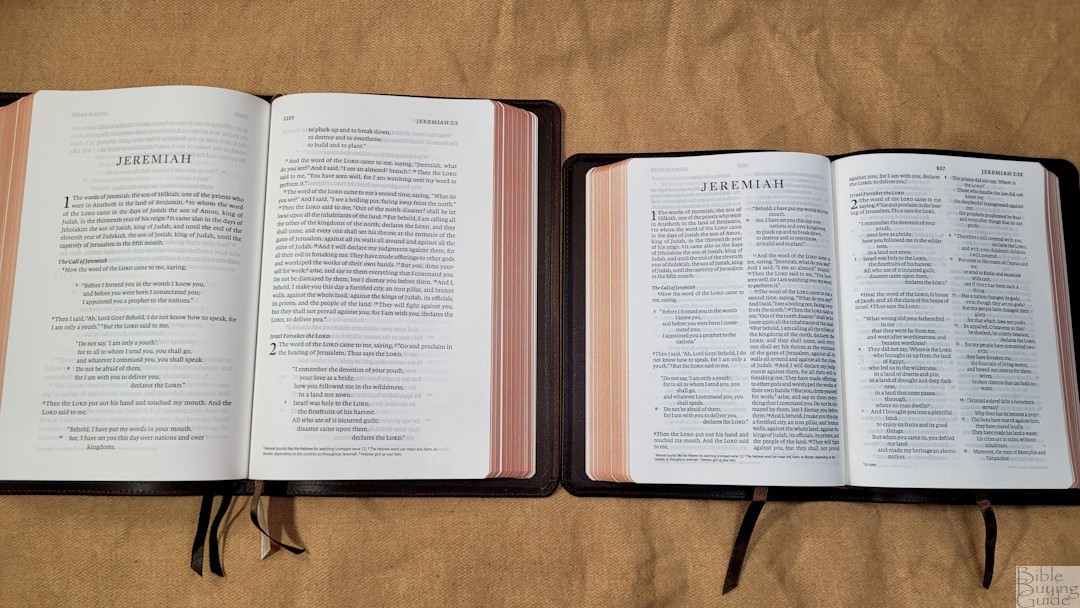
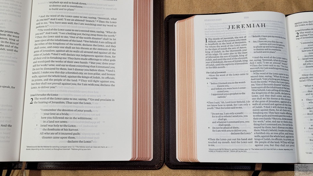
The ESV Heirloom Heritage is a much different Bible. It’s a single-column layout, but its brown Horween leather is similar. It’s slightly lighter in color, which I could only see by sitting them side by side. The texture is the same. I actually can’t tell the difference between them.
ESV Thinline
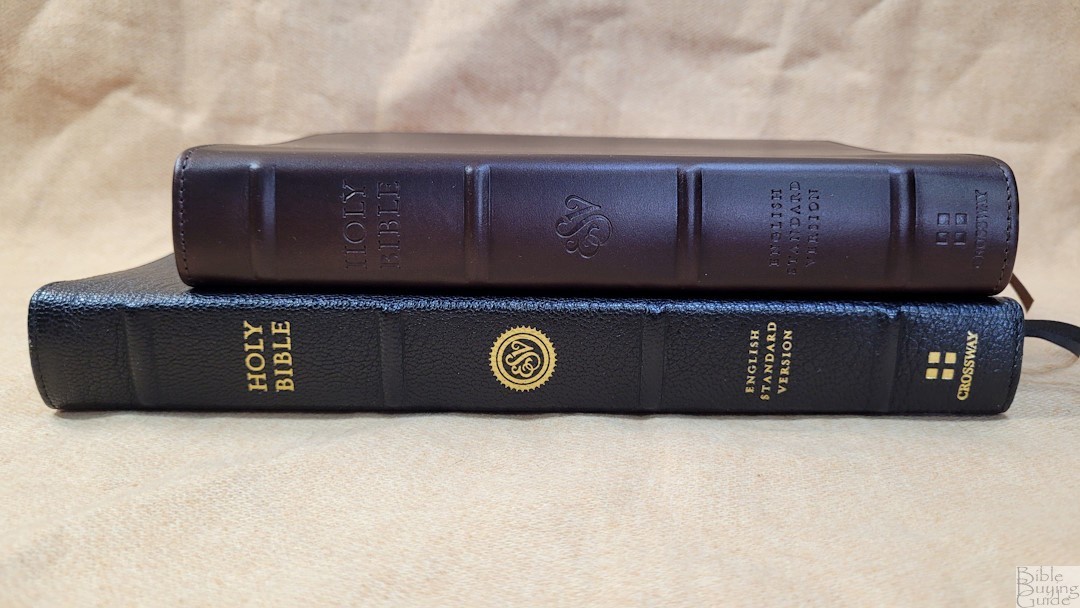
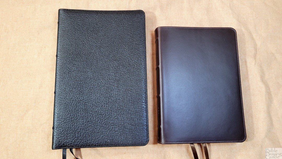
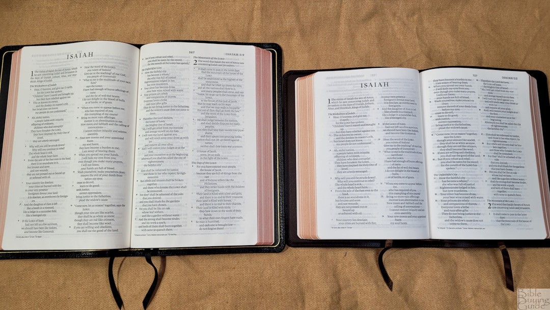
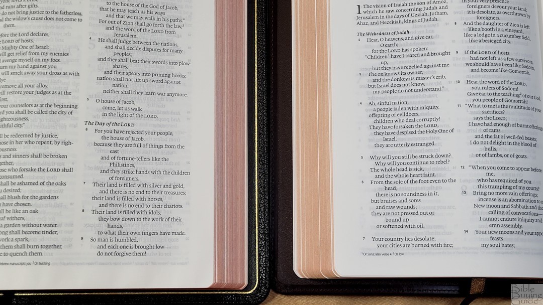
The ESV Thinline is also a hand-size, text edition with 28GSM paper. The font is about the same size, but it has slightly more space between the lines. It wasn’t printed with line-matching.
ESV Diadem

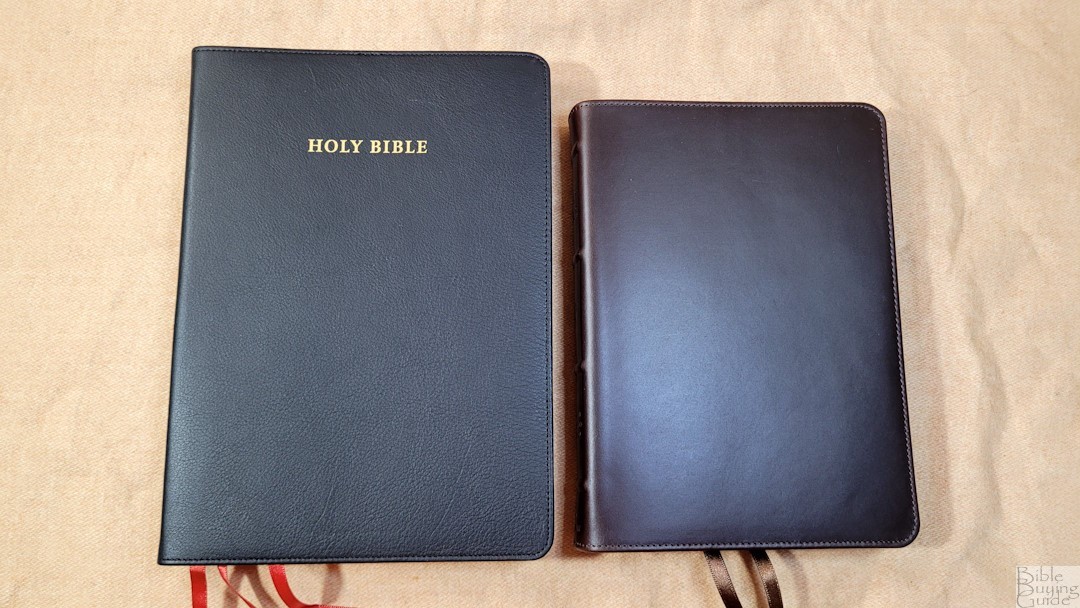
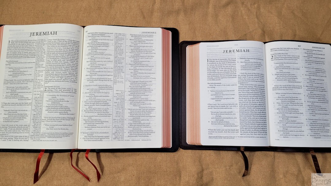
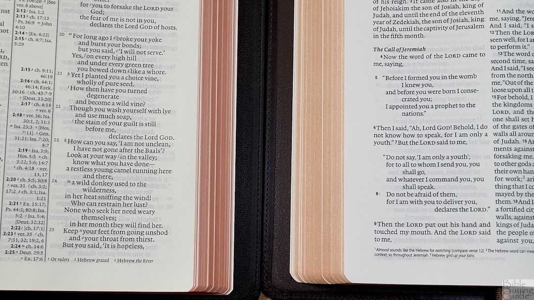
The ESV Diadem is the same thickness, but it has a larger footprint. The font is about the same size, but it has less space between the lines. Of course, this is a reference edition. Both have 28GSM paper. The Diadem has slightly more show-through.
ESV Personal Size Quentel
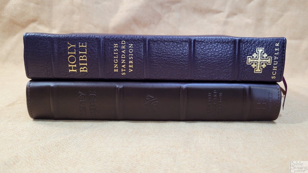
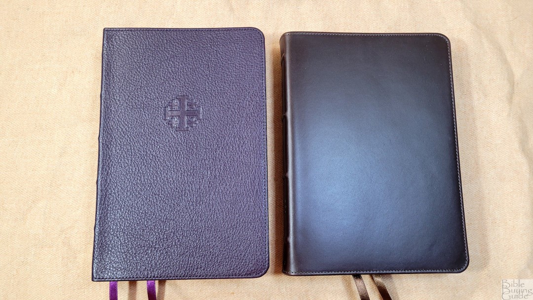
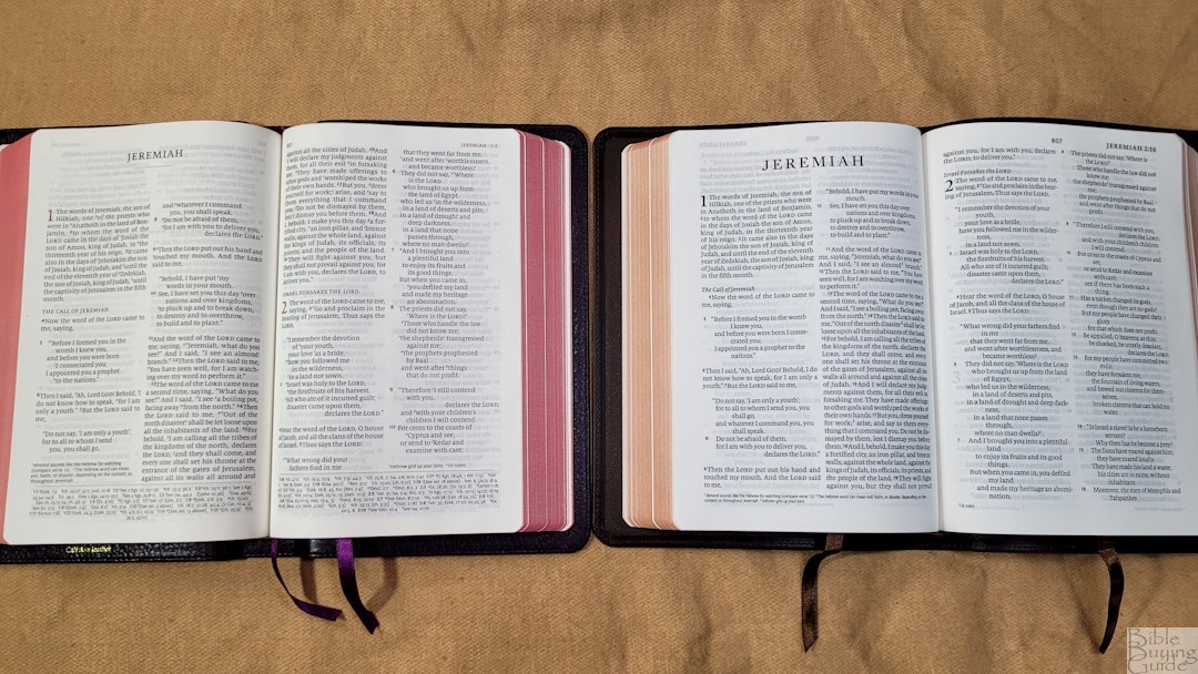
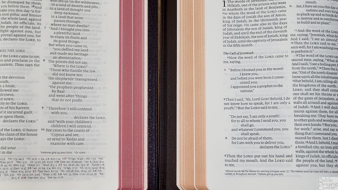
The ESV Personal Size Quentel is another reference edition but is similar to the Alpha. The footprint and thickness are similar. Both have the same paper. The PSQ font is slightly larger, but it’s also slightly lighter.
Conclusion
The The ESV Heirloom Bible, Alpha Edition is an excellent hand-sized Bible. The build quality and materials are as good as it gets. It’s a small Bible, but the text is as large as some of the larger reference editions. It’s pricey, but the quality does match the price. It’s an excellent choice for anyone who wants a small ESV that will last a lifetime.
_________________________________________________________
This Bible is available at (includes some affiliate links)
and many local Bible bookstores
_________________________________________________________
Crossway provided this Bible in exchange for an honest review. I was not required to give a positive review, only an honest one. All opinions are my own.

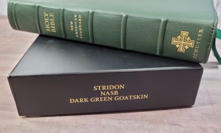



What is your overall opinion of the Crossway Alpha versus the Schuyler PSQ as far as readability and smaller size for carrying? I already own the PSQ, but I do tend to lean toward the Lexicon font and always a smaller footprint. I agree with your assessment of the Crossway Heritage, but I love it for reading at home, not carrying.
Thank you for your Bible reviews. They are very helpful and spot on, and I like that you include the good and the bad.
Thanks Denise! I prefer the Alpha for everything except the poetic layout. I especially like the darker font and thinner block in the Alpha. Even though the font is slightly smaller, I find it easier to read. If I could change one thing, I’d match the poetic line breaks of the PSQ.
Thank you for the review!
How does the Alpha compare to the Pitt Minion?
The footprint is almost the same. The Alpha is about 50% thicker. The Alpha’s font is a lot larger and it has a lot more whitespace in the text.