
The 1611 King James Bible – Super Deluxe Facsimile Edition from The Bible Museum is a reproduction of the first edition KJV. This is a facsimile of an original 1611 KJV and includes Gothic typography, woodcut designs, extras in the front, and the Apocrypha. It’s designed to provide the authentic 1611 KJV experience and looks like the original. This Bible is ideal as a display piece for museums, churches, offices, and home libraries.
The KJV Store provided this Bible in exchange for an honest review. I was not required to give a positive review, only an honest one. All opinions are my own.
_________________________________________________________
This Bible is available at (includes some affiliate links)
_________________________________________________________
Table of Contents
- Binding
- Paper
- Typography and Layout
- References and Footnotes
- Extras
- King James Bible Leaf
- Comparison
- Conclusion
- Video Review
Binding
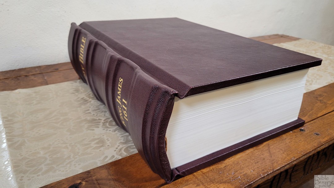

This is a hardcover with birch wood that’s covered in genuine leather. It has a pebbly grain and color variation. Nothing is printed on the front or back. The spine has four extra large hubs with gold stamping that says Holy Bible and King James 1611.
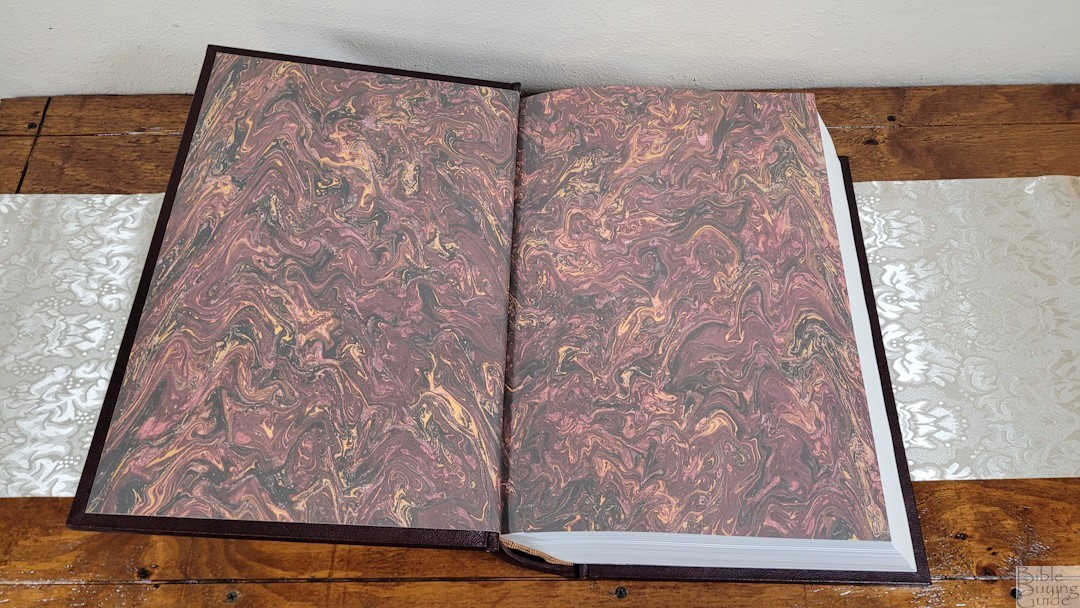
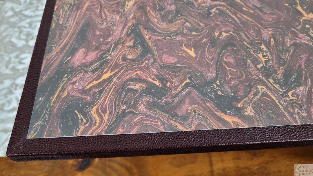
The liner is paste-down with an extra-thick paper with a burgundy marbled design. The block is sewn and the cover has no trouble staying completely open to any page. This is a large Bible at 17-1/2 inches x 12 inches x 5-1/2″, and it weighs almost 30 lbs. At this size and weight, it’s ideal for display in a church, office, library, museum, or home with a large enough location to store or display it. This is not made for general use.
Paper
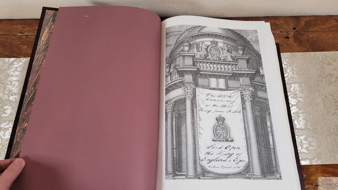

The paper is an archival-grade, 100% acid-free, premium paper. It’s extremely opaque and has a texture with a heavy tooth that reminds me of watercolor paper. I found it easy to turn. I’m not sure of the GSM, but I think it’s between 60-80 GSM. This might be my favorite paper.
Typography and Layout
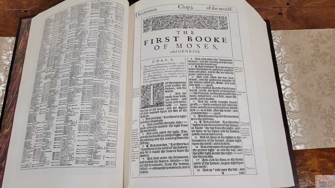
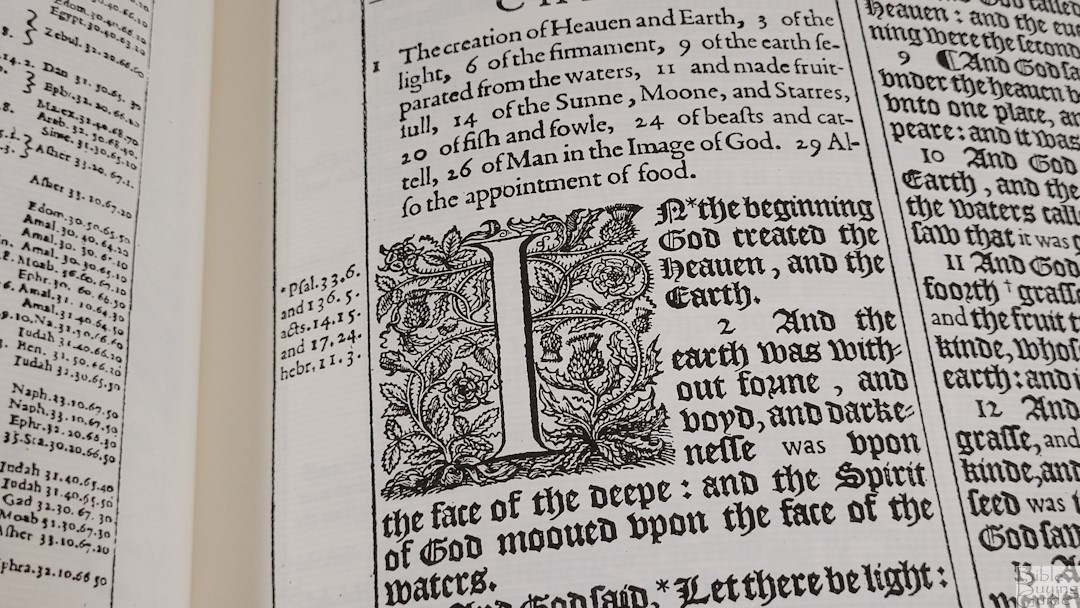
The 1611 KJV text is presented in a verse-by-verse format in a wood-cut Gothic Blackletter type with supplied words in Roman type. It includes chapter summaries in Roman type, a 9-line decorative drop cap at the beginning of the book and a 5-line drop cap for each chapter following the first one, pilcrows to mark paragraphs, and footnotes and references in the outer margins. The header shows the book name in the center on the left page and the chapter number in Roman numerals in the center on the right page. Both pages show a summary over each column.
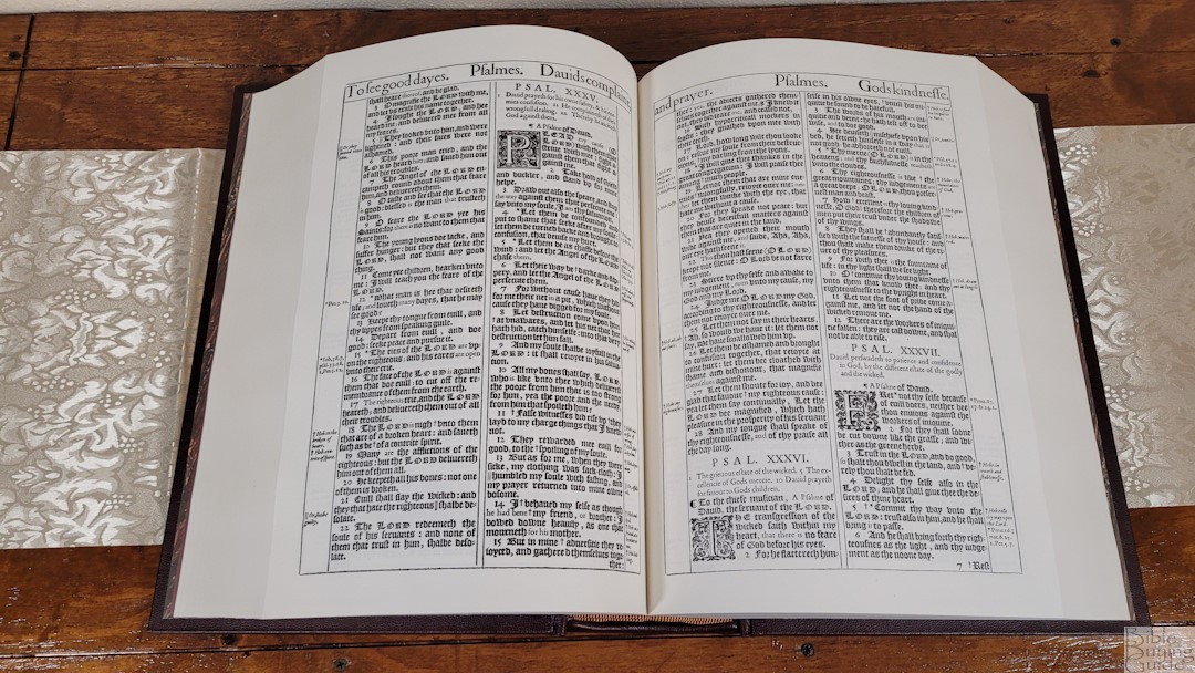
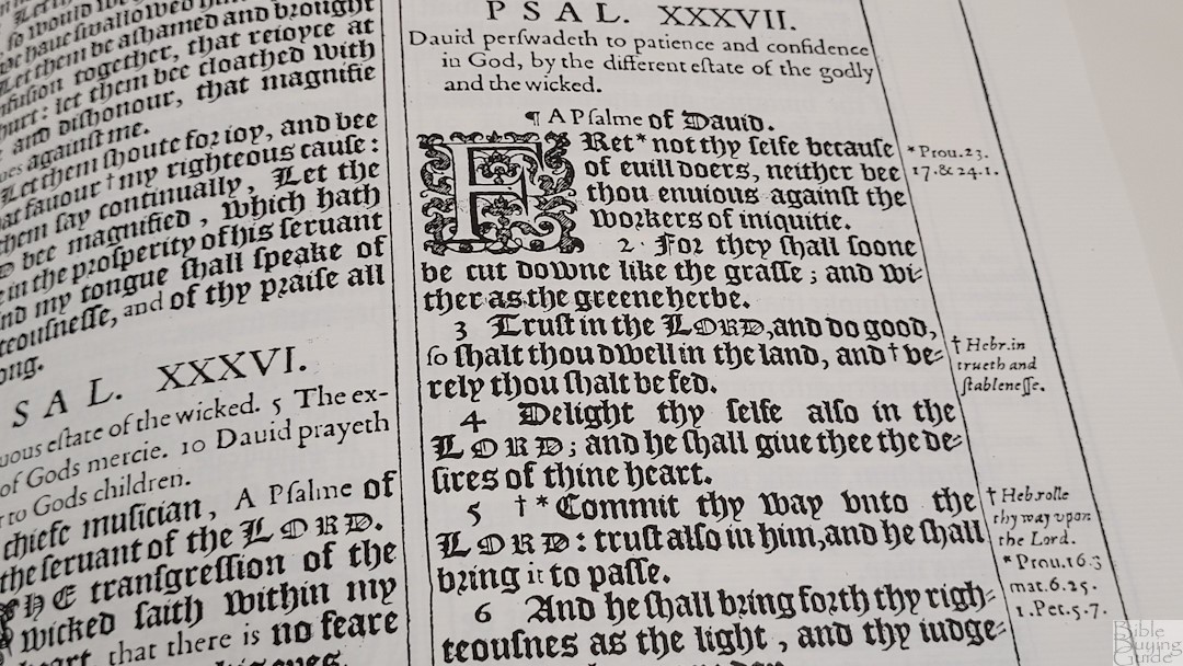

The text is around 18-point It’s bold and consistent throughout the text. An asterisk shows that there are references available for the portion of text in the margin. Books start on the page where the previous book ended. The title for each book includes a fancy design.
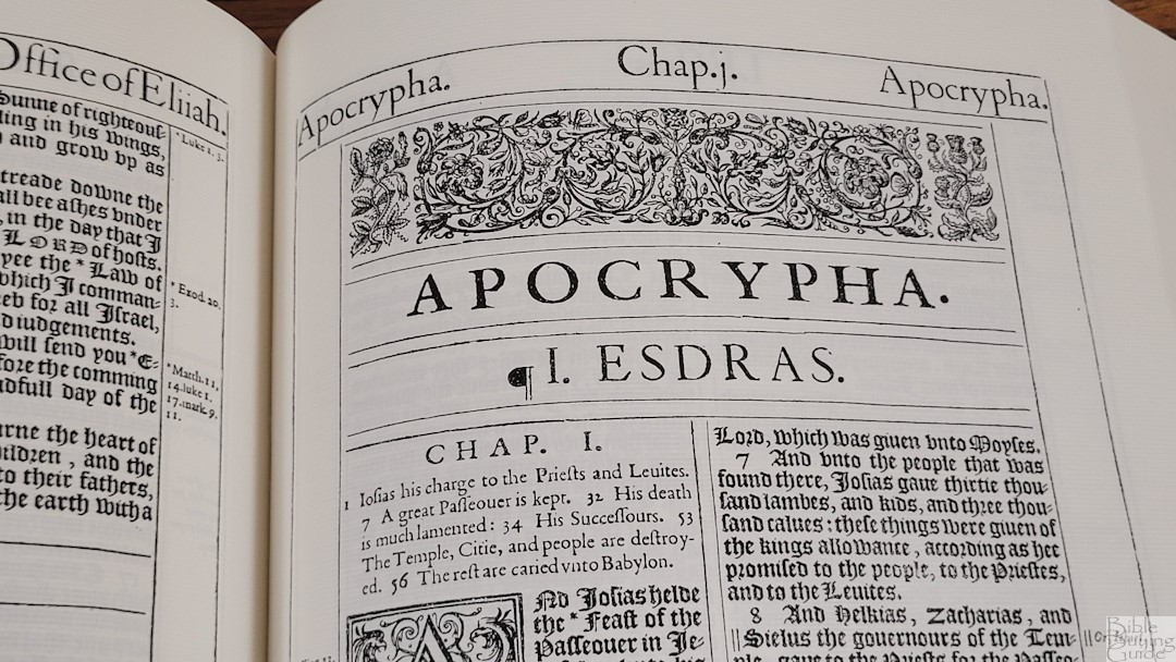
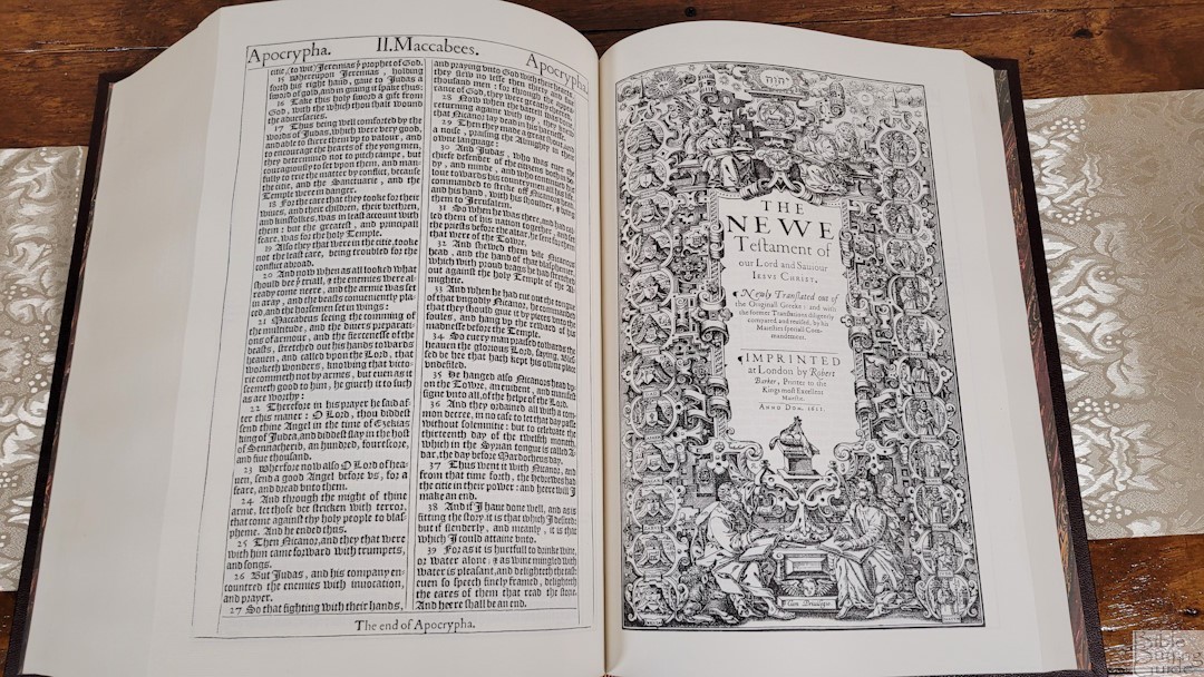
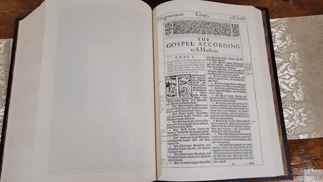
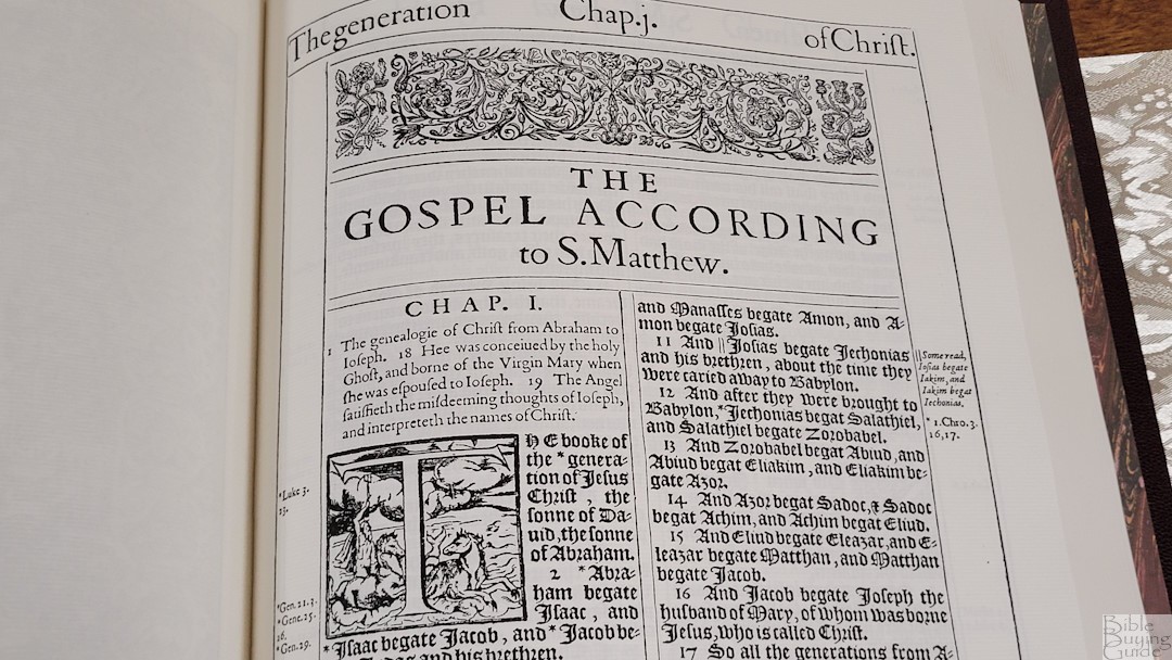
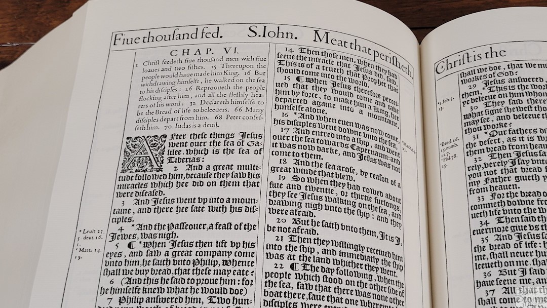
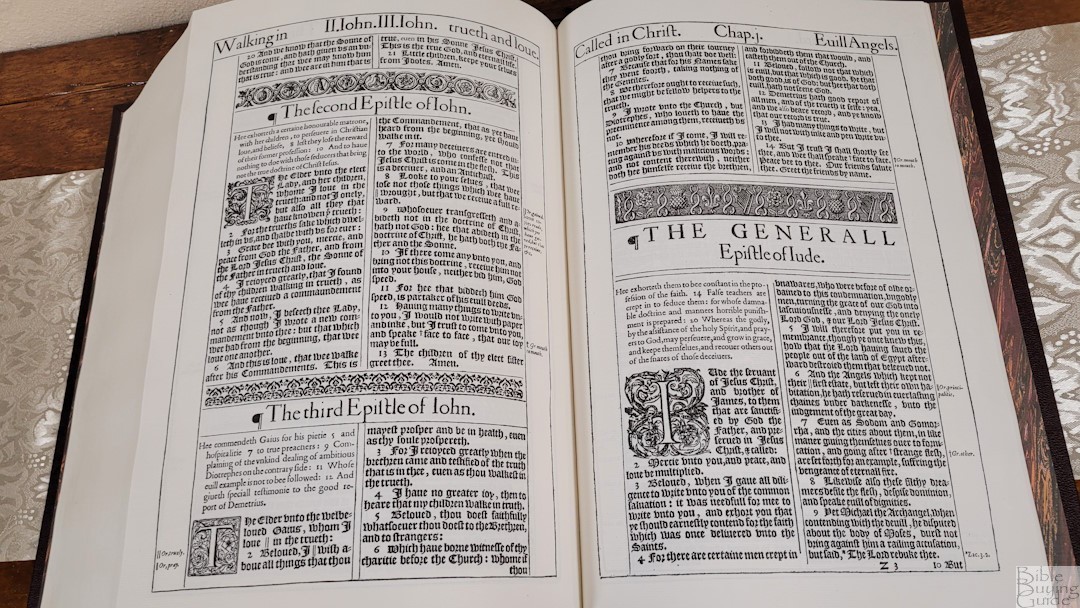

The Gothic typeface is dark and sharp, but the style is difficult to read. The Roman typeface is noticeably easier to read. Some of the letters used in 1611 aren’t the same as those we use today, such as the letter “s” looking like an “f”.
References and Footnotes
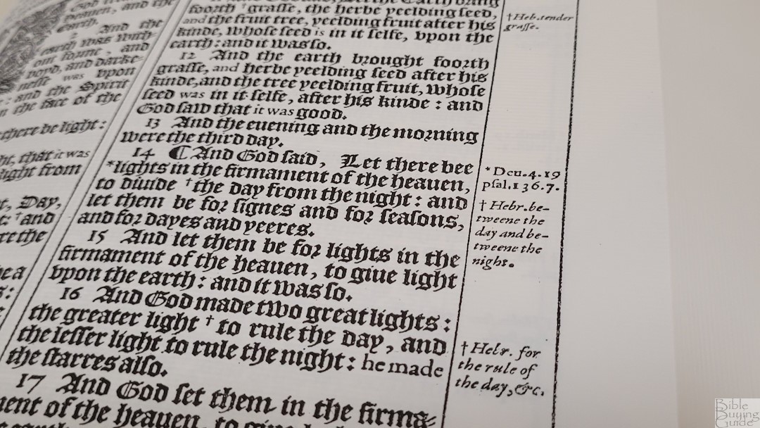
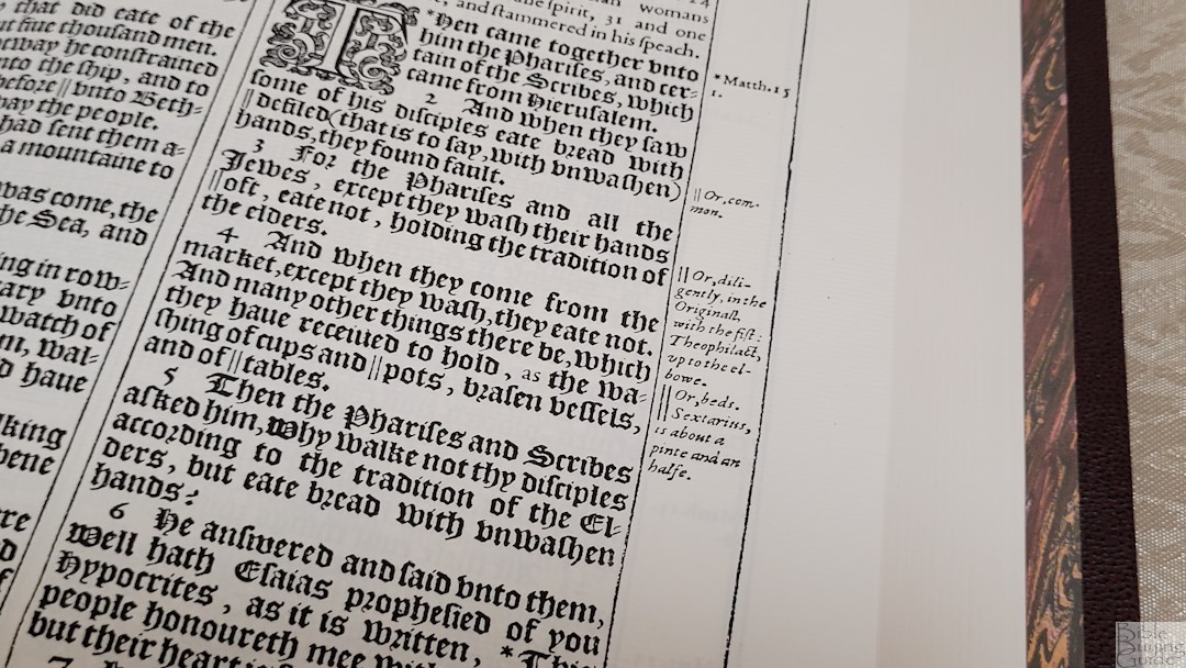
The references and footnotes are placed in the margins next to their verses. They’re marked in the text with an asterisk. The footnotes are those from the translators. There aren’t a lot of references.
Here are a few example references to help you compare:
- Genesis 1:1 – Ps 33:6, 136:5, Ac 14:15, 17:24, Heb 11:3
- Deuteronomy 6:4 – x
- Isaiah 9:6 – Jn 3:16
- Matthew 28:19 – Mark 16:15
- Mark 12:29 – x
- John 1:1 – Gen 1:1
- John 3:16 – 1 Jn 4:9
- Acts 2:38 – x
- Romans 10:9 – x
- 1 John 1:1 – x
Extras
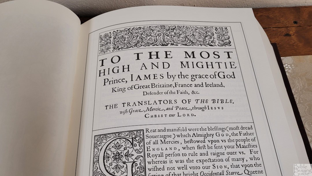

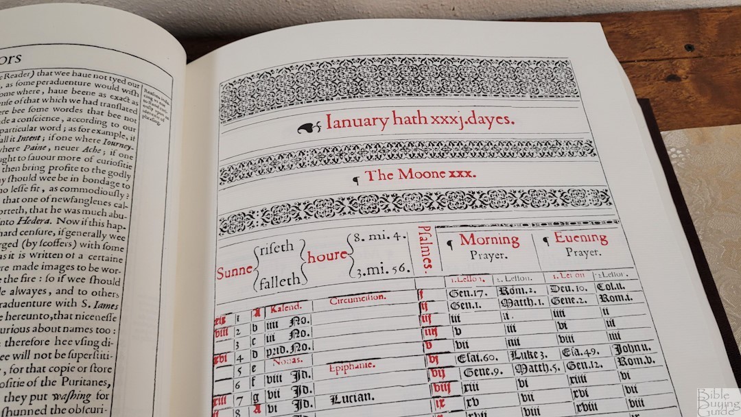
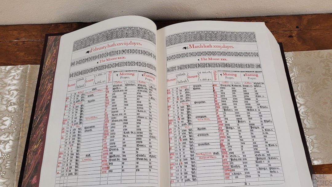

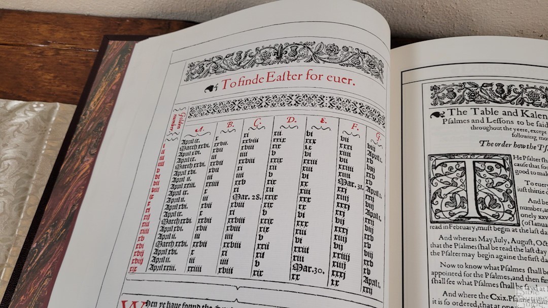
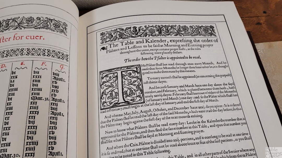

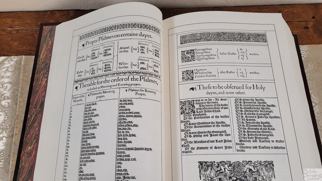
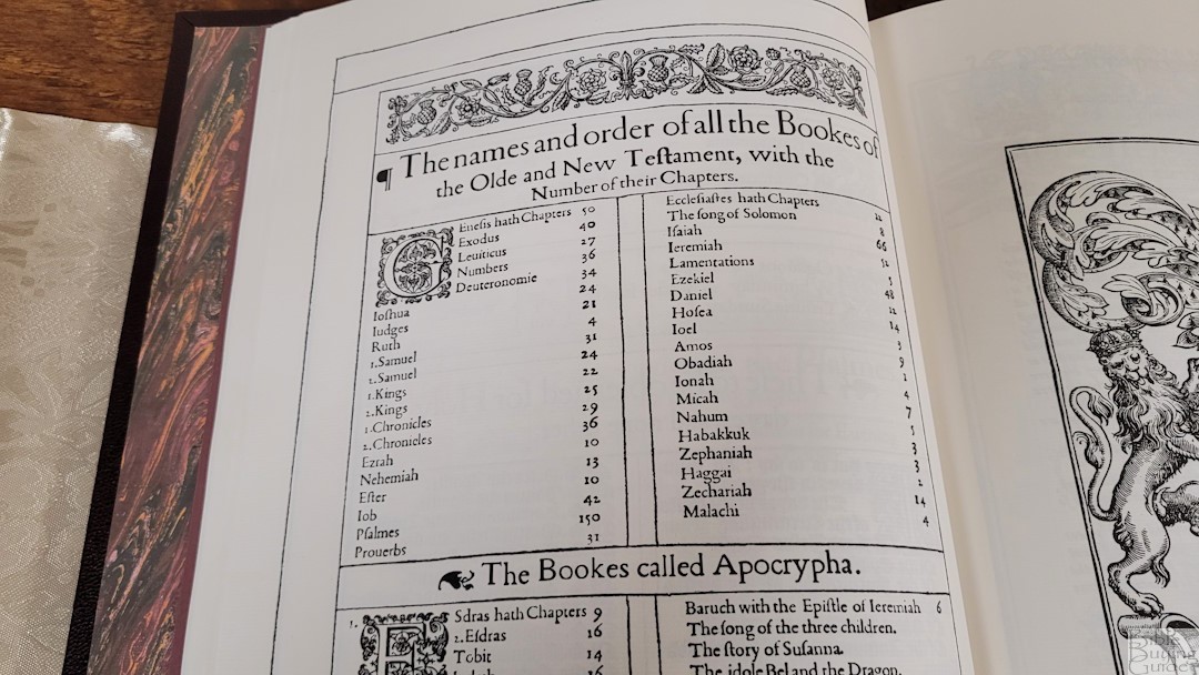
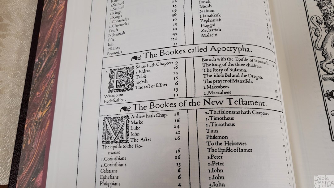
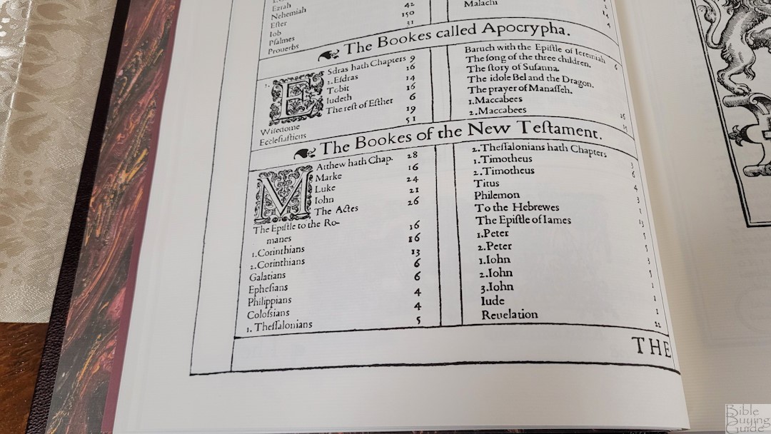
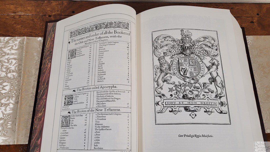

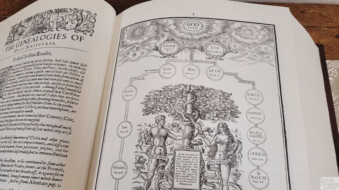
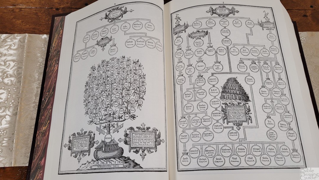
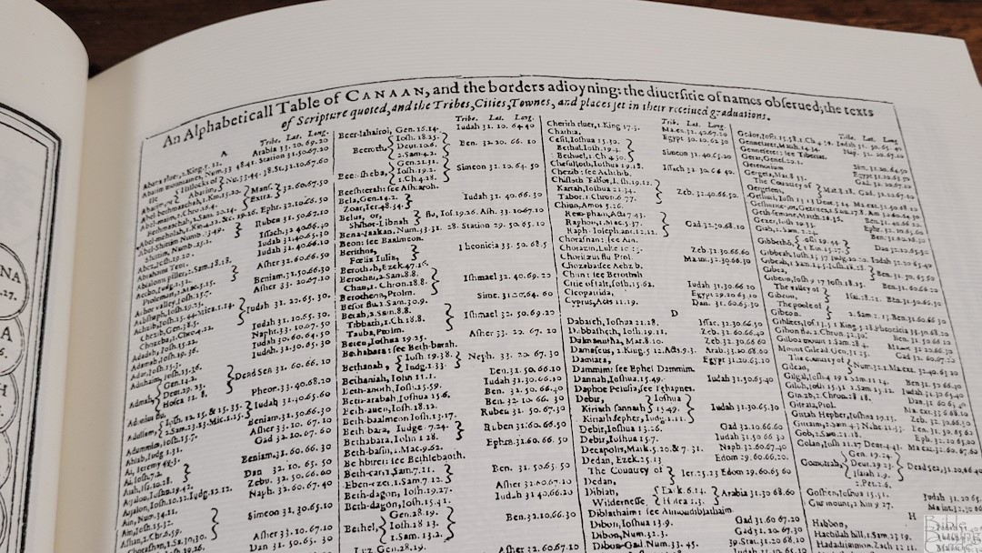
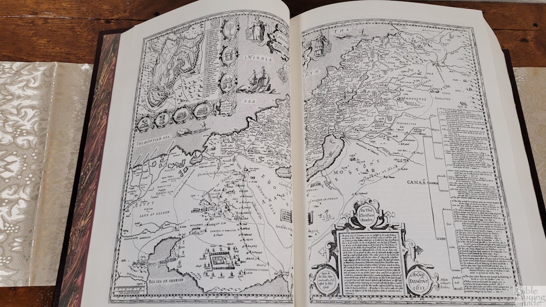
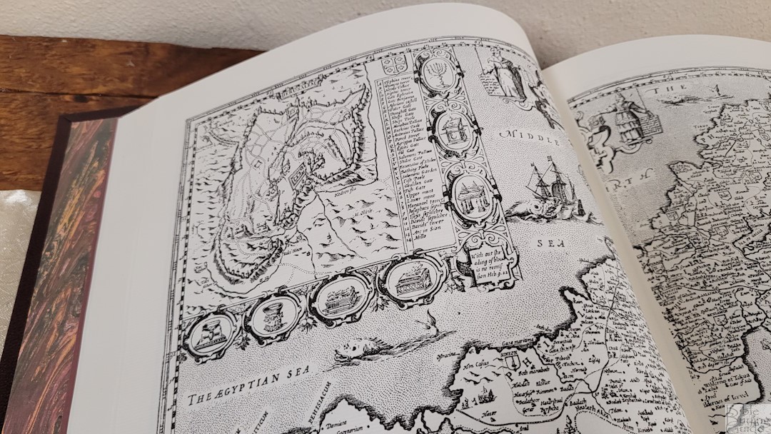
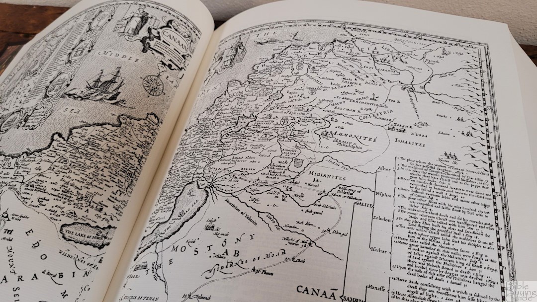
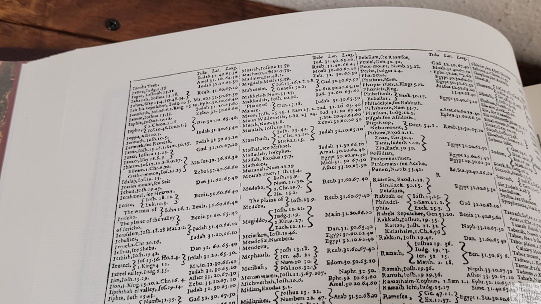
In the front are all of the original 1611 King James Bible prefatory materials. It’s mostly reference tables that include a reading plan, charts of holy days, genealogies, and a map with an index. It also includes the Translator’s to the Reader. They are difficult to use because of the Gothic typeface, but it is interesting to see the types of material that were included in the 1611 edition of the KJV.
The materials include:
- The ornate 1611 Dated General Title Page
- The Dedication to King James / Epistle Dedicatory (3 pages)
- The Translator’s To The Reader Preface (many pages)
- The Calendar (one page for each month of the year)
- The Almanacke
- The Chart to Find Easter Forever
- The Lesson To Be Read For Morning & Evening Prayer
- The Table of Canaan
- The Map of The Holy Land (2 page spread)
- The Table of Psalms
- The List of Holy Days
- The Table of Contents
- The Coat of Arms of King James
- The Genealogies of Mankind (34 pages)
King James Bible Leaf
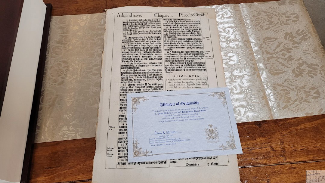
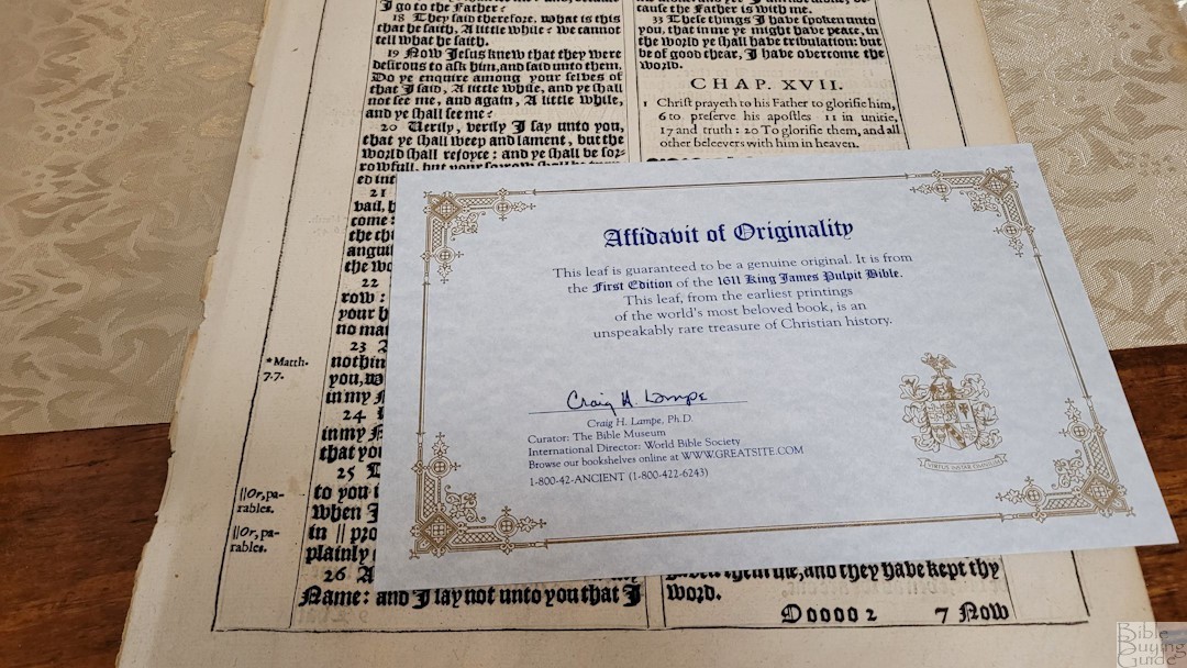
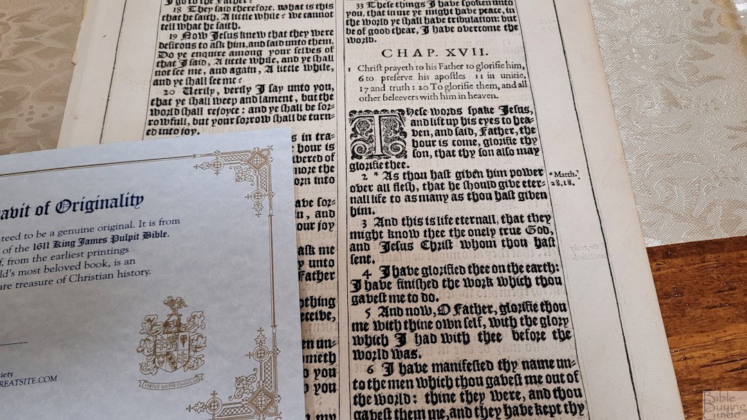
As a bonus, this Bible includes a leaf (an actual real page) from an original KJV. They normally cost $59, but they’re included for free. Mine was printed before 1650 and is from a smaller Quarto size, which was intended for personal ownership. It comes with a pamphlet that discusses the KJV and its development and includes information about the leaf.
Comparison
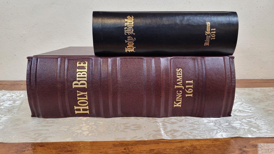
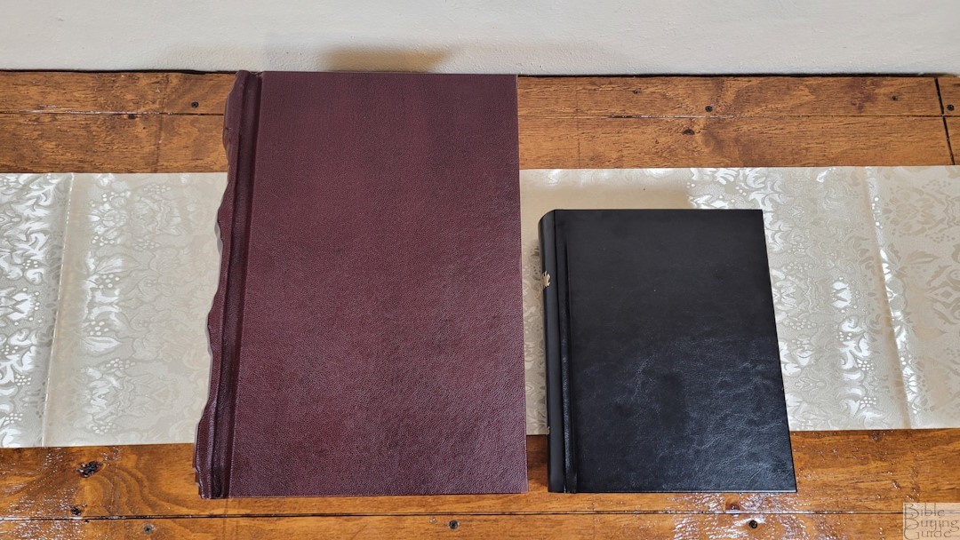
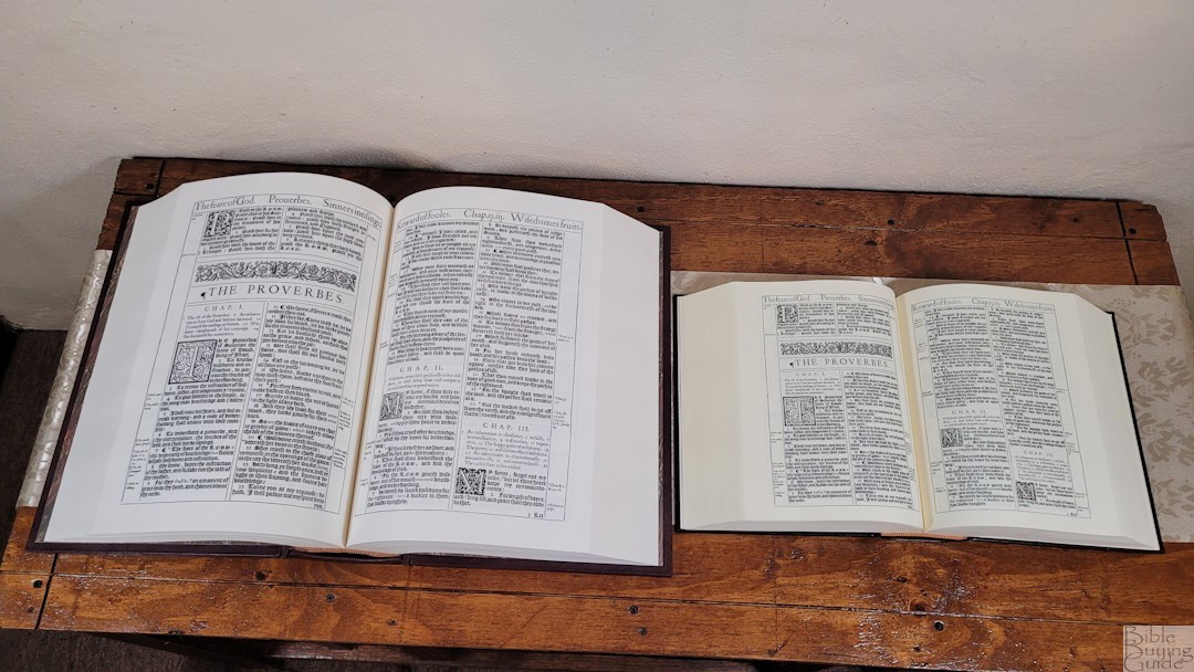
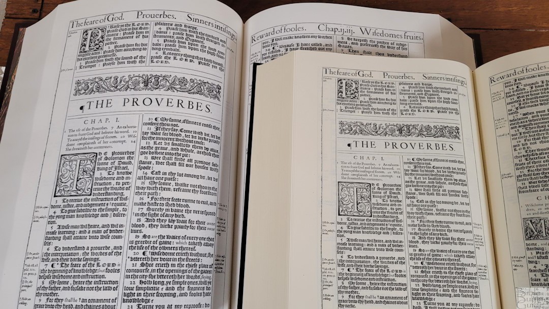
Here’s how the Super Deluxe edition compares to the regular 1611 KJV Facsimile edition from The Bible Museum. The Super Deluxe is the size of the original 1611, so it’s a lot larger and its materials are more expensive. The pagination is the same.
Conclusion
The 1611 King James Bible – Super Deluxe Facsimile Edition from The Bible Museum is an excellent reproduction of this important historical Bible. It’s well made and the scans of the original make for a convincing facsimile. I like that it also includes the extras that were printed in the front. It even has a few references, the original translator’s footnotes, chapter summaries, and lots of woodcut decorations. Just like the original, this reproduction includes the Apocrypha. If you’re interested in a 1611 KJV that looks and feels authentic, this is an excellent choice.
Video Review
_________________________________________________________
This Bible is available at (includes some affiliate links)
_________________________________________________________
The KJV Store provided this Bible in exchange for an honest review. I was not required to give a positive review, only an honest one. All opinions are my own.




That’s an incredible KJB. I have the Hendrickson published edition that is much easier to hold. LOL!
MUCH easier! I thought the regular facsimilie edition was large. This is a beast. I’ve seen this one in museums and still had no idea how large it was until I held it myself.
It’ll take a while to get used to the Gothic font. I was able to read (with some pauses in between to interpret the words that looked unusual because of the font) some of the extracted portions that appear on this webpage of yours. Thanks for the excellent review. I now have a good understanding of what this Bible is like. I’ll buy it in the near future.