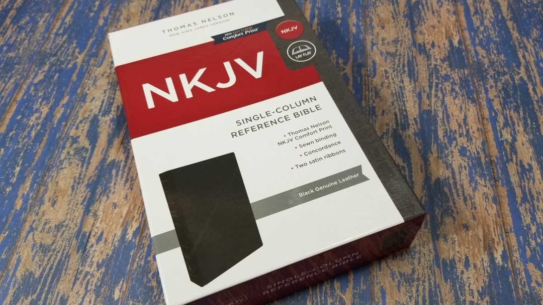
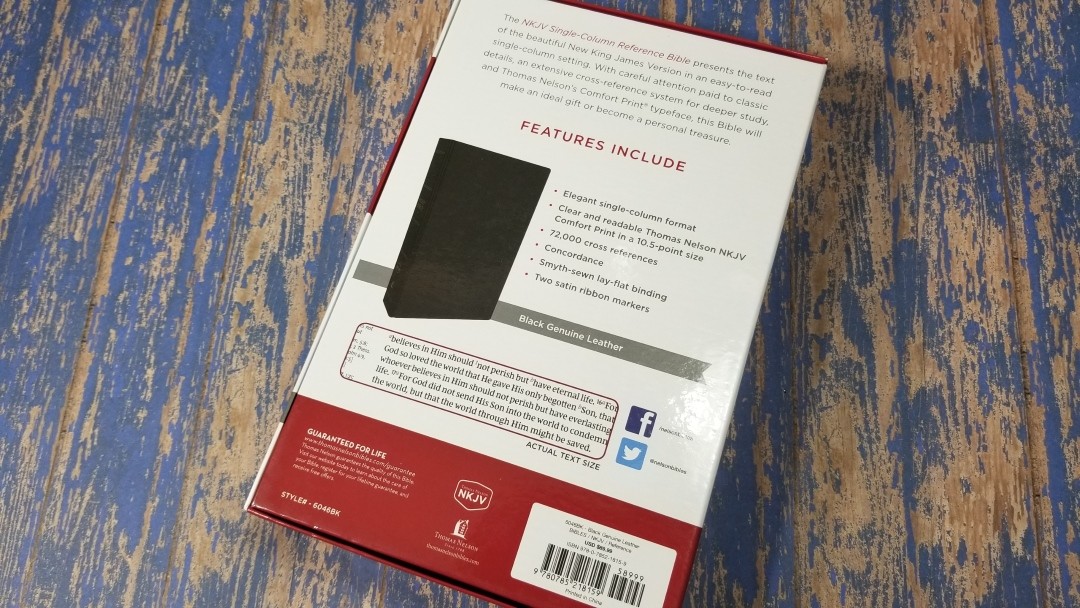
Thomas Nelson’s NKJV Single Column Reference Bible is a genuine leather edition in the same setting as the Premier Collection NKJV Single Column Reference Bible. It includes the Comfort Print text designed by 2K/Denmark. ISBN: 9780785218159. It was made in China.
Thomas Nelson provided this Bible in exchange for an honest review. I was not required to give a positive review, only an honest one. All opinions are my own.
_________________________________________________________
This Bible is available at (includes some affiliate links)
and many local Bible bookstores
_________________________________________________________
Video Review
Cover and Binding
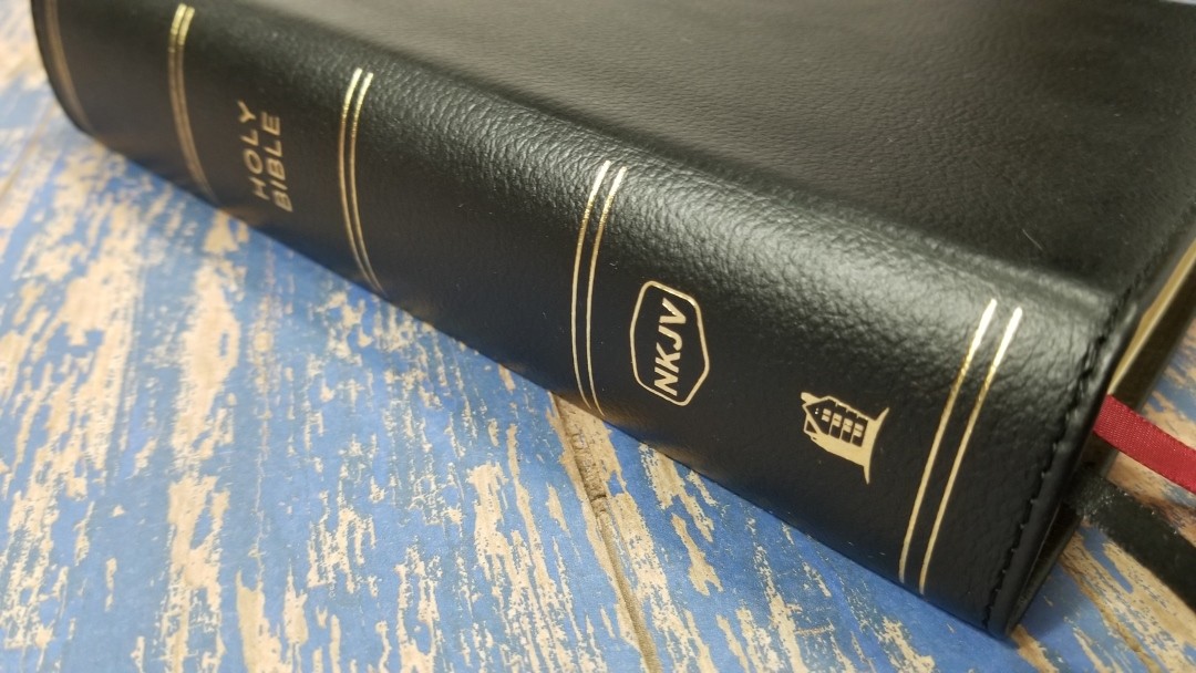
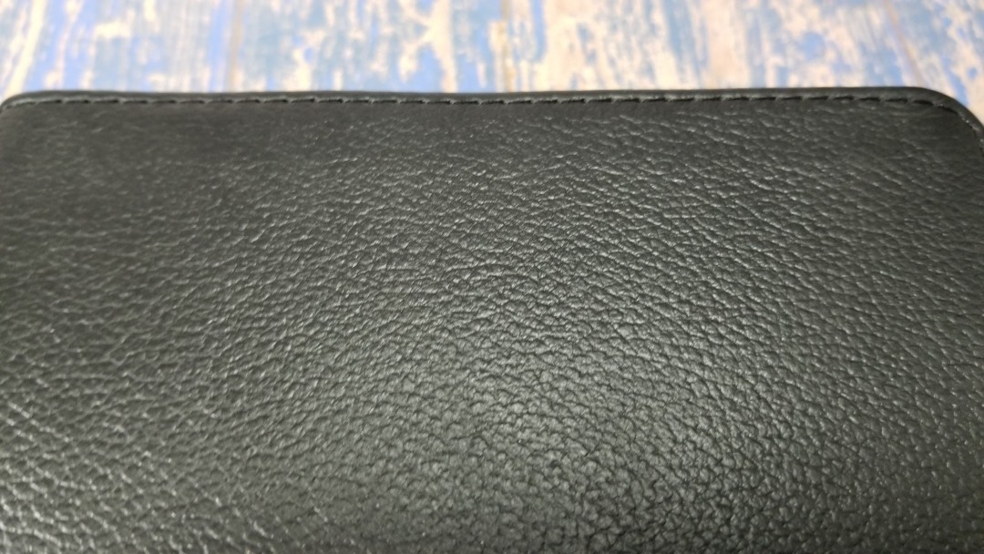
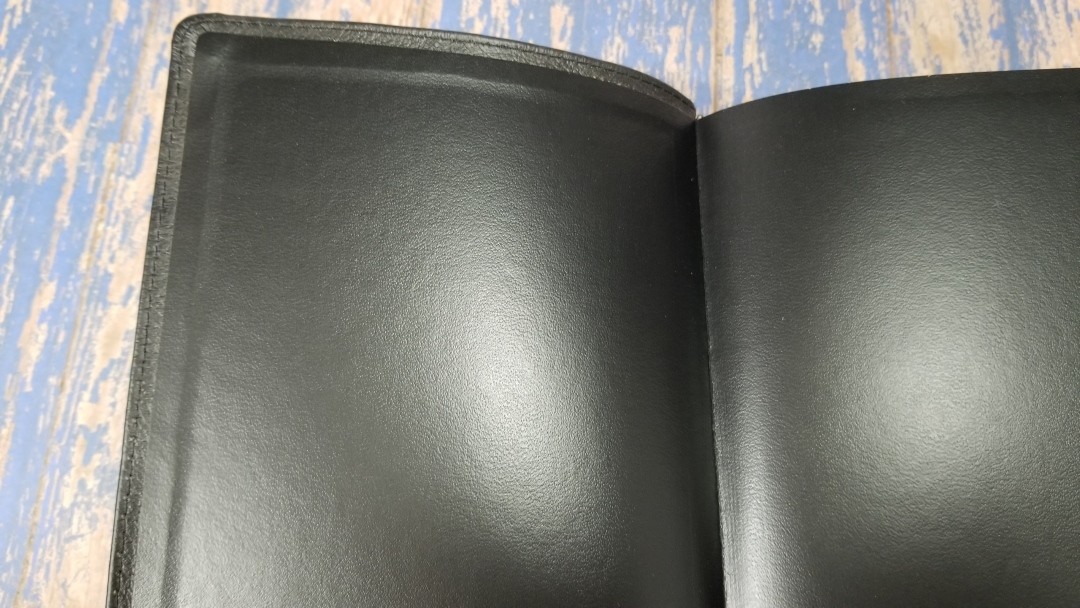
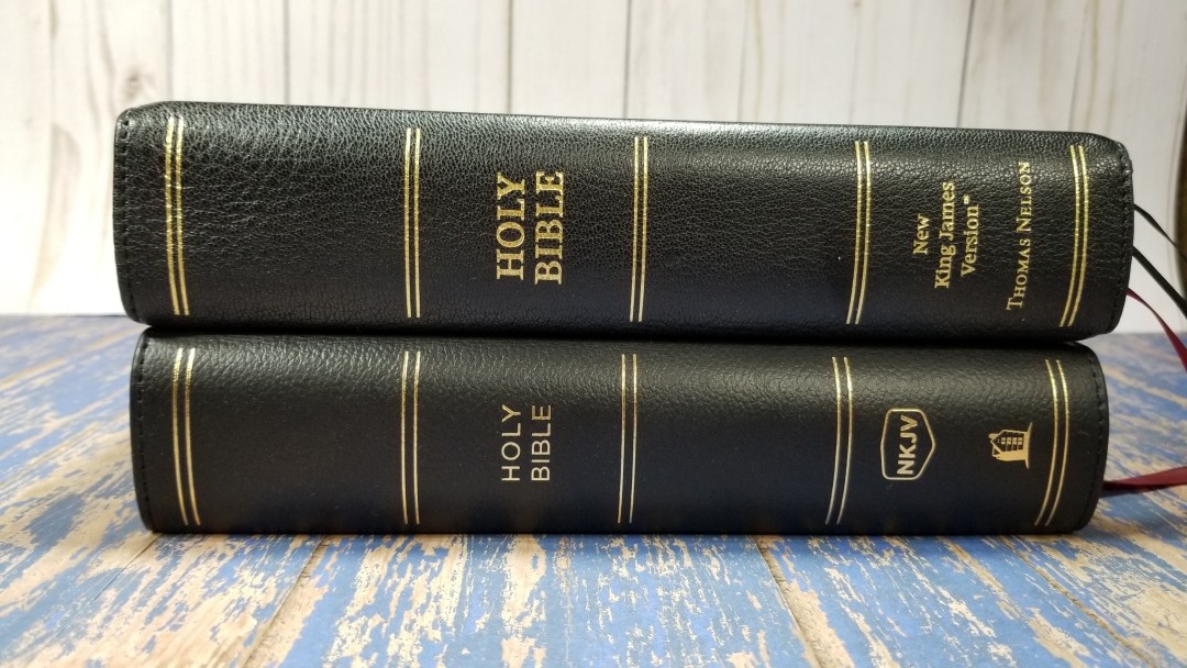
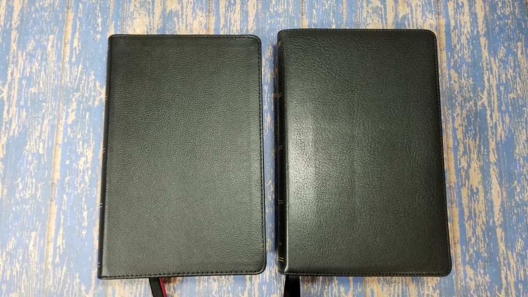
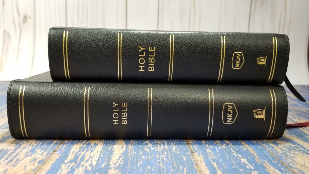
This edition is black genuine leather with a paste-down vinyl liner. It’s soft to the touch and has an embossed grain that looks nice. The front has no writing. The spine has HOLY BIBLE, the NKJV logo, and the Thomas Nelson logo printed in gold. It has 5 spine indications printed in gold. It’s Smyth sewn, but it is a little stiff. It will need to break in before it will stay open in Genesis.
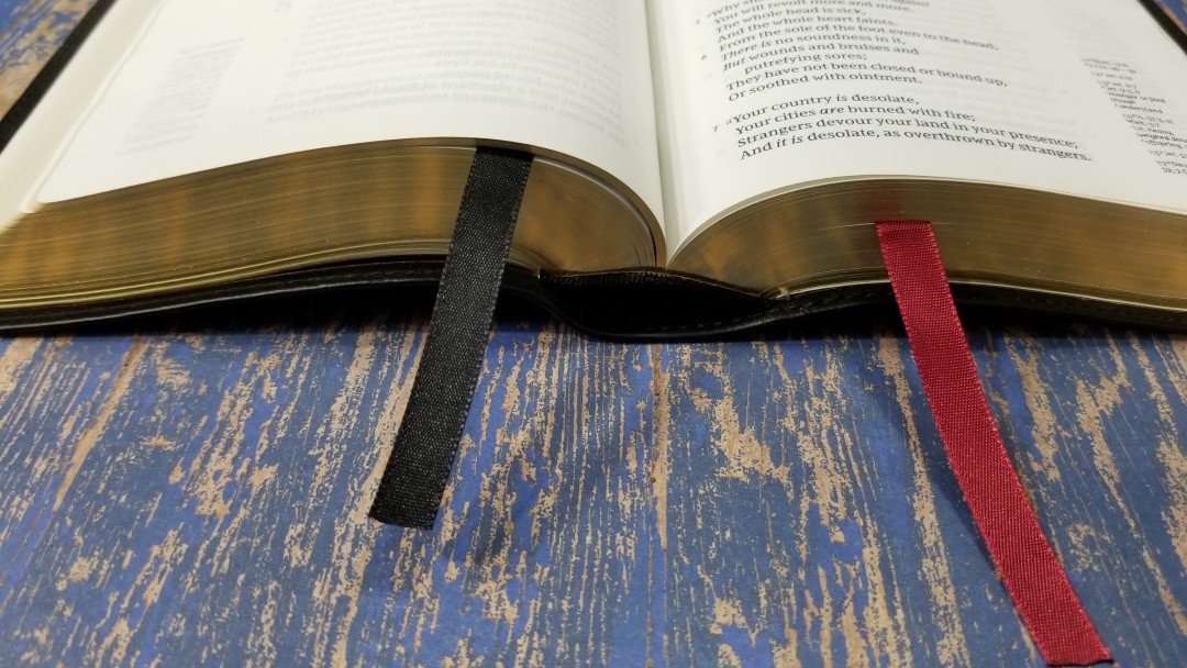
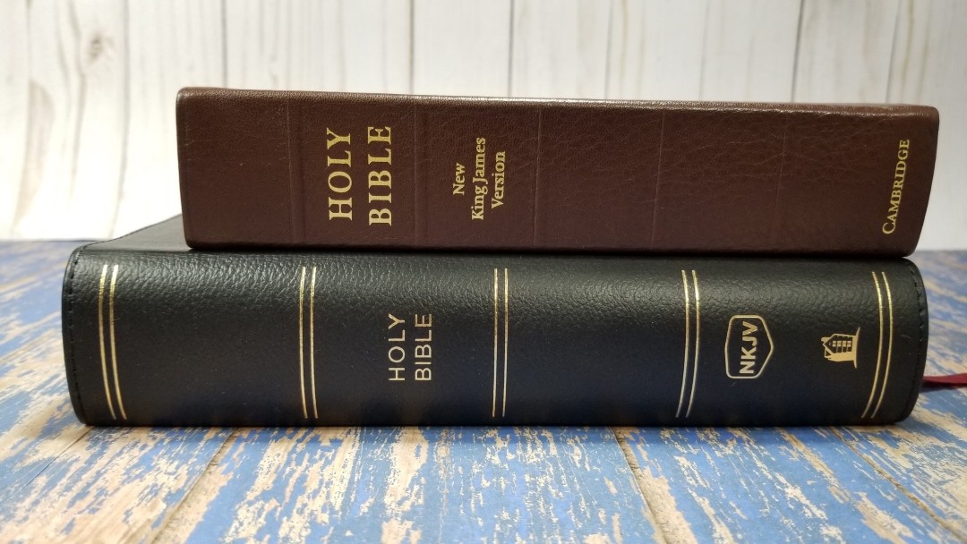
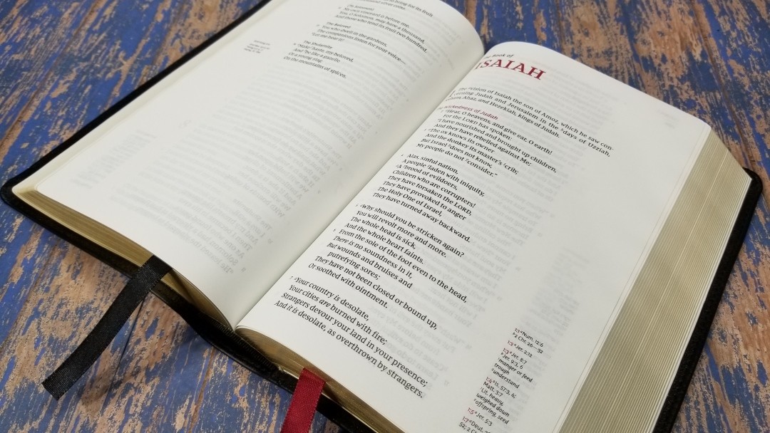
It weighs 2 lbs, 10.5 oz. It does feel a little heavy for my taste, but it isn’t so heavy that I wouldn’t carry it around. The overall size is 8.75 x 5.75 x 1.875″. It is thick for its footprint, but I had no issues holding and carrying it around. It includes two satin ribbons, one black, and one red, at 3/8″ each. They’re extra long and look nice.
Paper
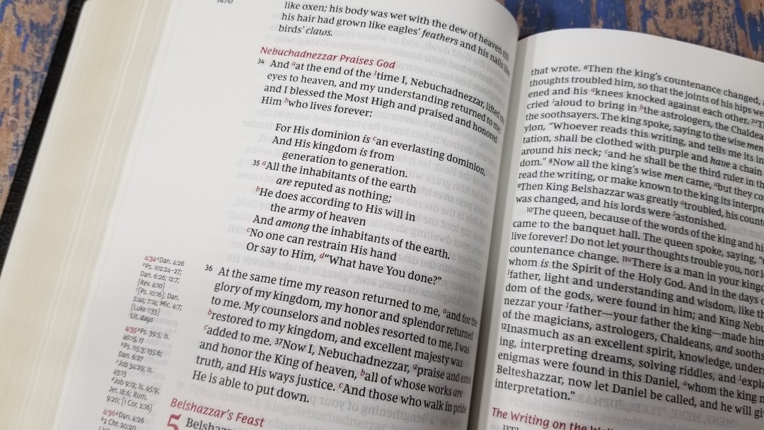
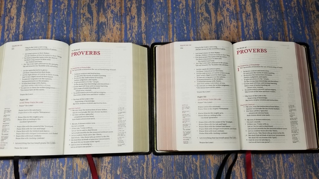
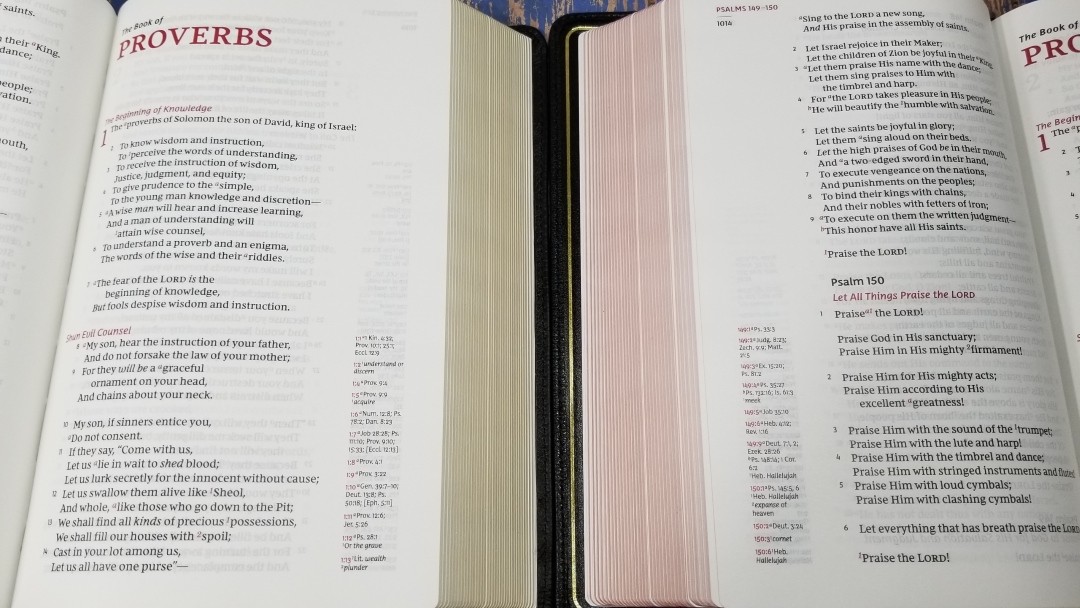
The paper is a 36gsm premium European Bible paper. This edition has the same paper as the Premier Collection, but there’s no guarantee the next run will include it. It’s white in color. It’s highly opaque and has a smooth texture. I find the pages to be easy to turn. It’s easy on the eye, making it great for reading for long periods of time. Page edges are gold gilt. The page cut is slightly wavy, but that’s only noticeable when the Bible is open.
Typography
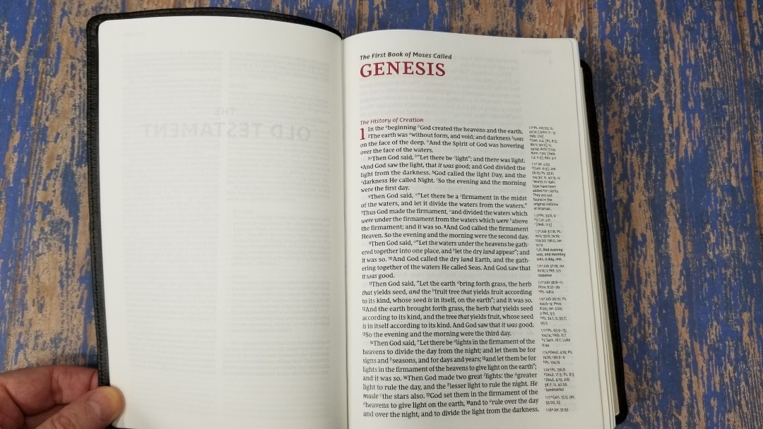
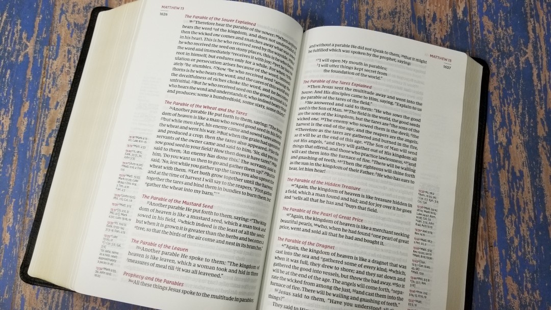
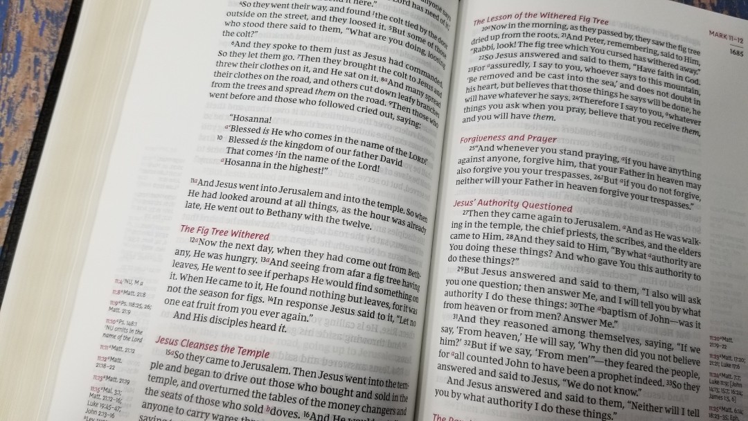
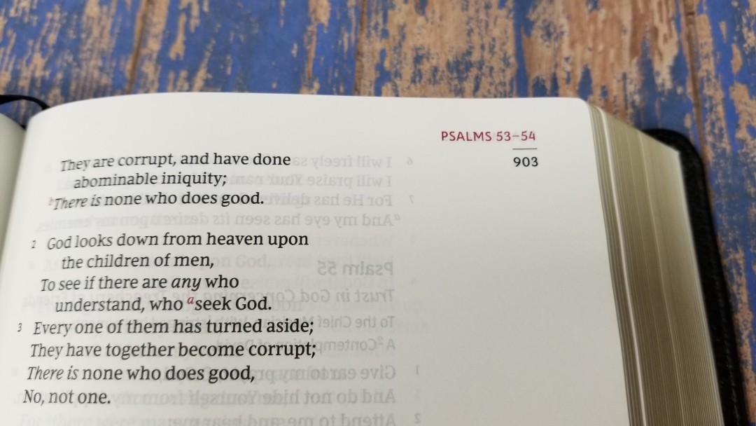
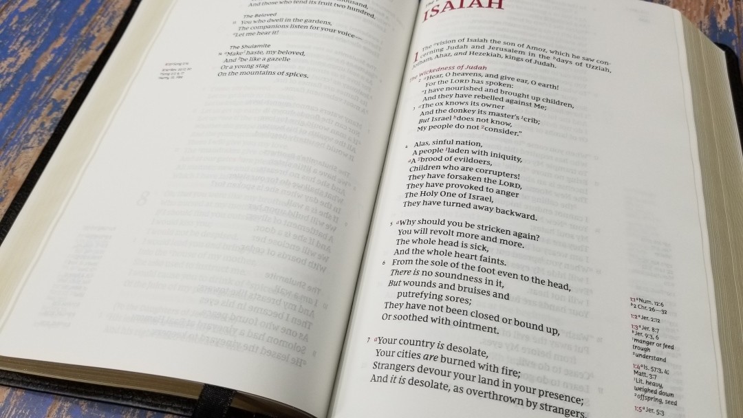
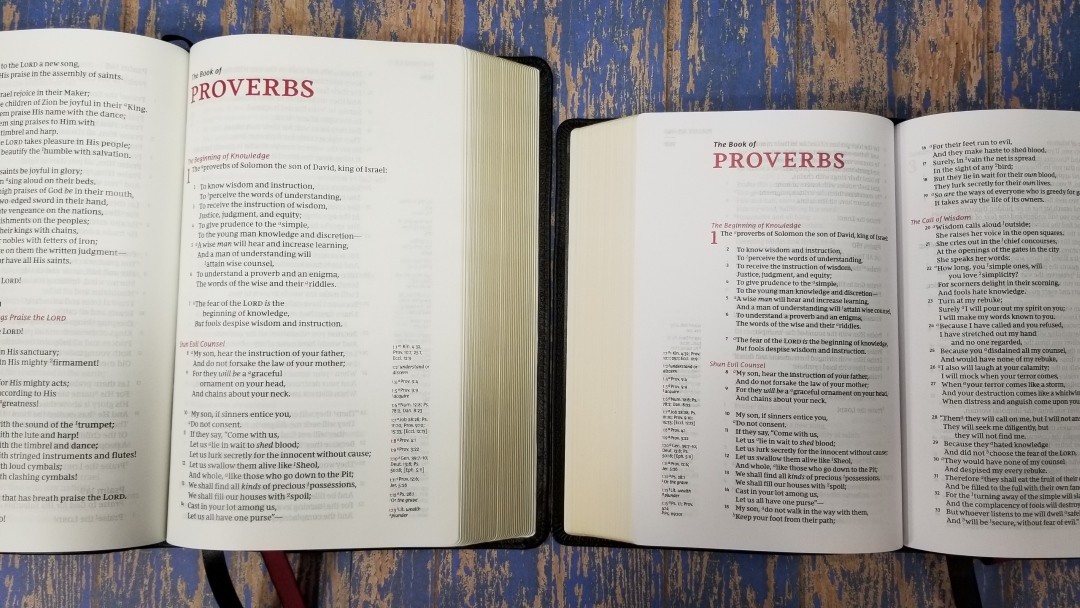
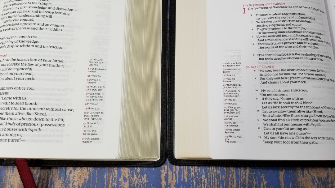
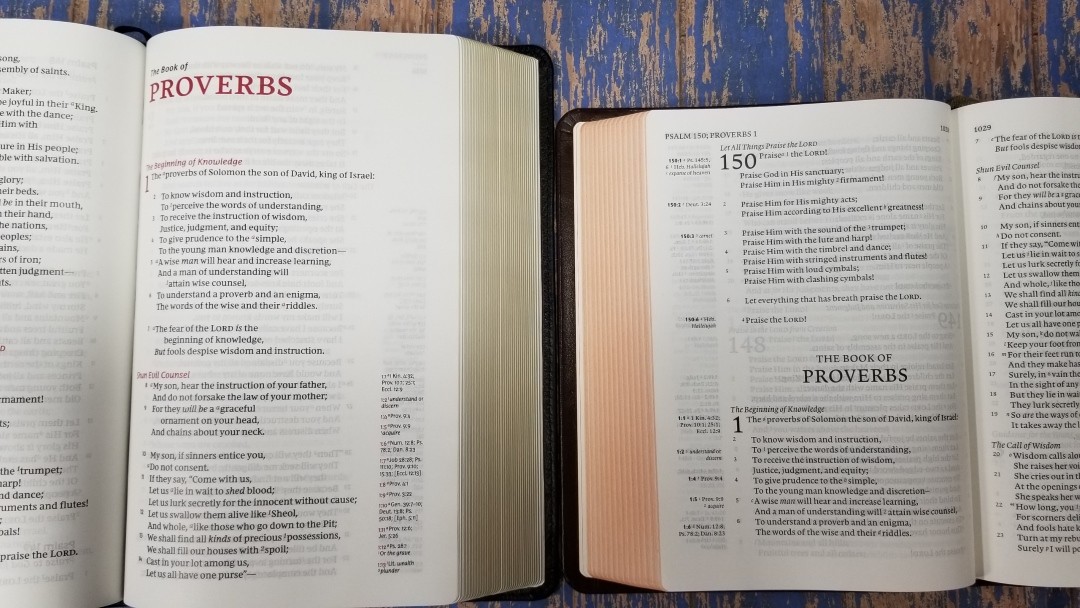
The New King James text is presented in single-column paragraph format. Cross-references are placed in the outer margin as far down the page as possible. The header includes the book name and chapter numbers are printed in red and they’re placed in the outer corner. Under this is a black line followed by the page number in black. The red highlights set this design apart.
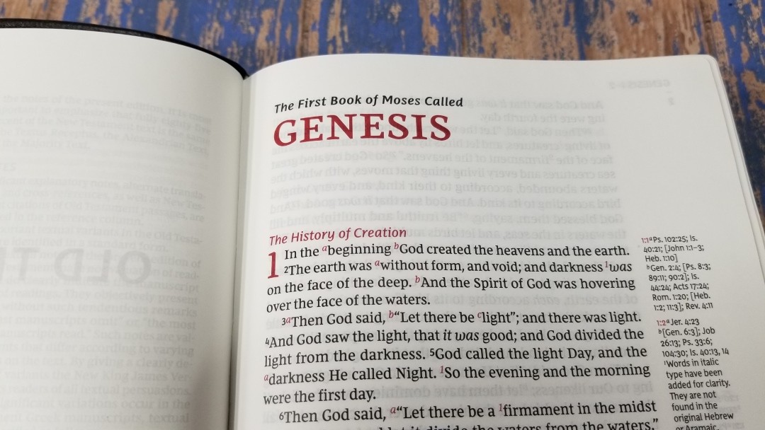
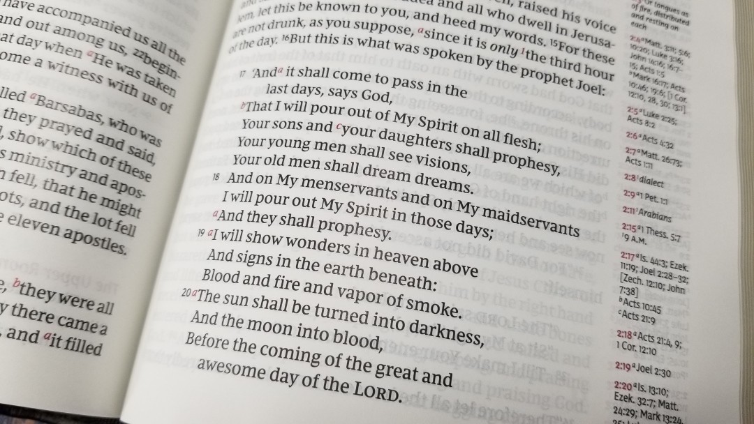
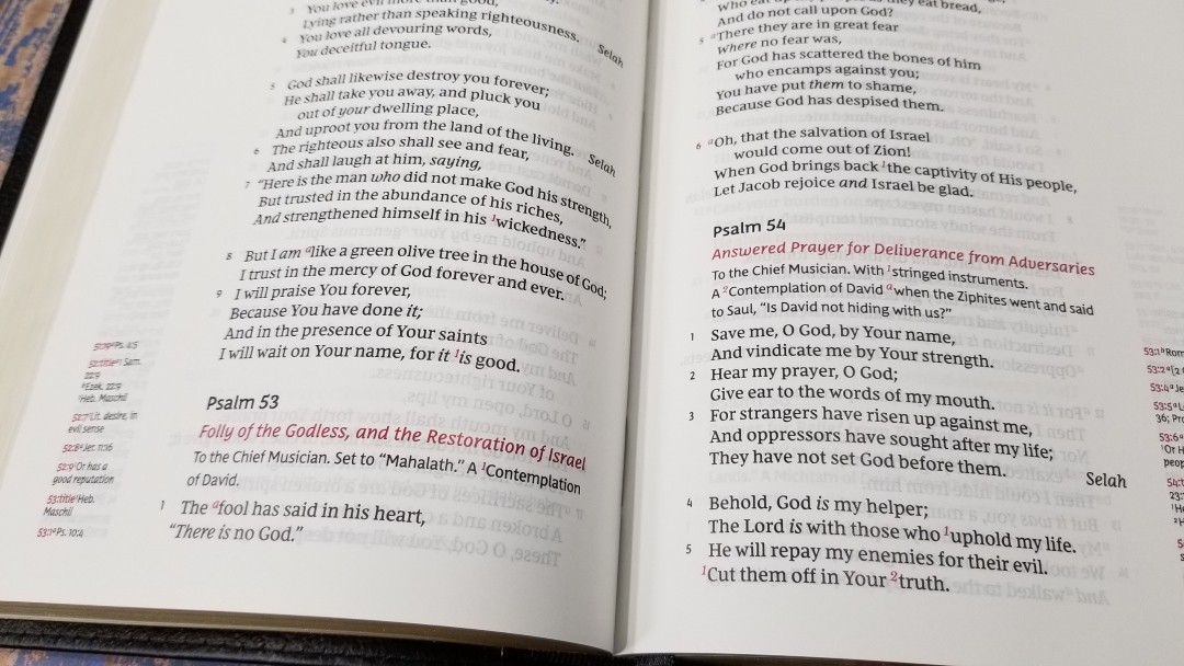
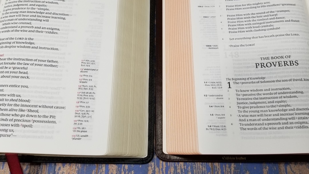
The typeface is the Comfort Print designed for the New King James by 2K/Denmark. It’s marked as 10.5. It looks a little small for its size, but it is great for reading. The font is black letter. It has red highlights throughout the text within the page titles, section headings, drop caps, cross reference and footnote keys, header, and the reference keys in the margins. The red looks amazing. They chose the right shade of red.
It has around 62 characters across, which provides space for around 10-12 words per line. I love this character and word count. This is perfect for my tastes and makes one of the best layouts available. The text is clean and easy to read and the poetry looks elegant. The Old Testament quotes use the newer NKJV style rather than the oblique type. The text is printed with line-matching to improve readability.
Cross-References and Footnotes
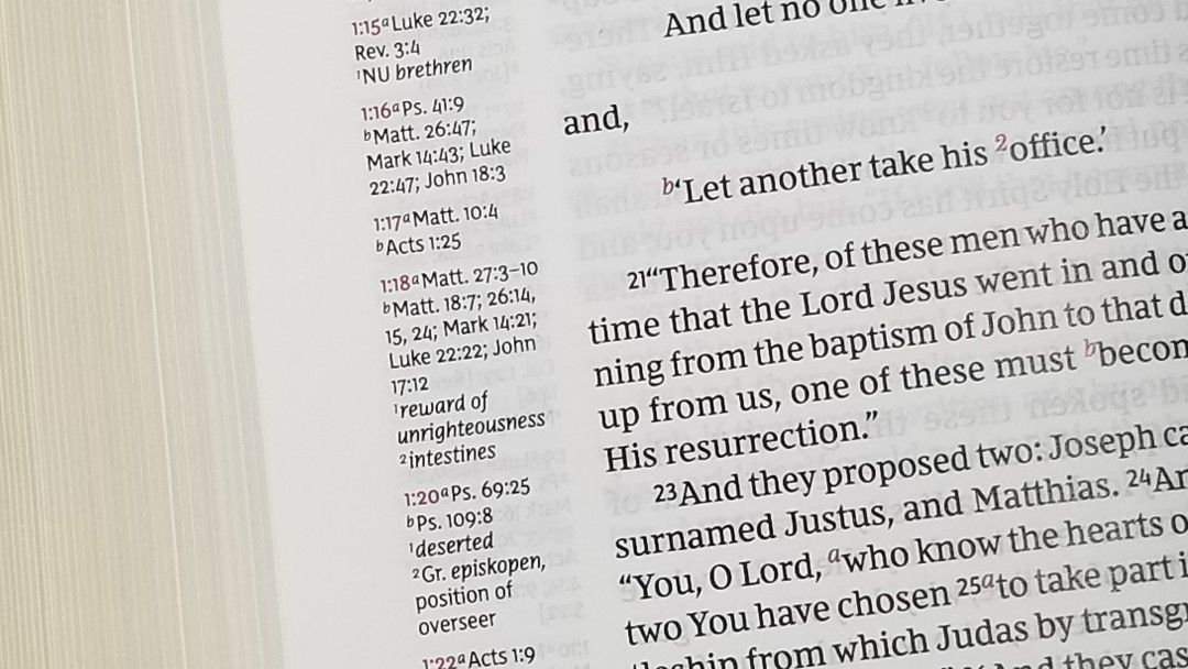
The cross-references and footnotes are placed on the outer margin. Rather than placing them next to the verses they correspond to, they’re placed as far down the page as possible. Cross-references and footnotes are placed under the pilot numbers and they’re left justified. The pilot chapter and verse numbers are in red. This looks great in the margin, but it’s the opposite of the red letters in the text, so the advantage of the color is almost lost. It still looks great, though. If they do make a layout like this of the KJV I’d like to see the verse numbers in the text be red instead of the cross-reference and footnote keys.
Here are some example references to help you compare:
- Genesis 1:1 – Ps 102:25; Is 40:21; Jn 1:1-3; Heb 1:10; Gen 2:4; Ps 8:3; 89:11; 90:2; Is 44:24; Acts 17:24; Rom 1:20; Heb 1:2; 11:3; Rev 4:11
- Deuteronomy 6:4 – Deut 4:35; Mark 12:29; John 17:3; 1 Cor 8:4, 6
- Isaiah 9:6 – Isa 7:14; Luke 2:11; John 1:45; Luke 2:7; John 3:16; 1 John 4:9; Matt 28:18; 1 Cor 15:25; Rev 12:5; Judg 13:18; Titus 2:13; Eph 2:14
- Matthew 17:20 – Mat 21:21, Mk 11:23, Lk 17:6, 1 Cor 12:9
- Mark 11:23 – Matt 17:20; 21:21; Luke 17:6
- Mark 12:29 – Deut 6:4, 5; Is 44:8; 45:22; 46:9; 1 Cor 8:6
- John 1:1 – Gen 1:1; Col 1:17; 1 John 1:1; John 1:14; Rev 19:13; John 17:5; 1 John 1:2; 5:20
- John 2:19 – Mat 26:61, 27:40, Mk 14:58, 15:29, Lk 24:46, Acts 6:14, 10:40, 1 Cor 15:4
- Acts 2:38 – Luke 24:47
- 1 John 1:1 – John 1:1; 1 John 2:13, 14; Luke 1:2; John 1:14; 2 Pet 1:16; Luke 24:39; John 2:27; John 1:1, 4, 14
The footnotes are the standard NKJV translation footnotes, which are my favorite footnotes. I find them to be useful because they provide manuscript variations and identify the manuscripts.
Concordance
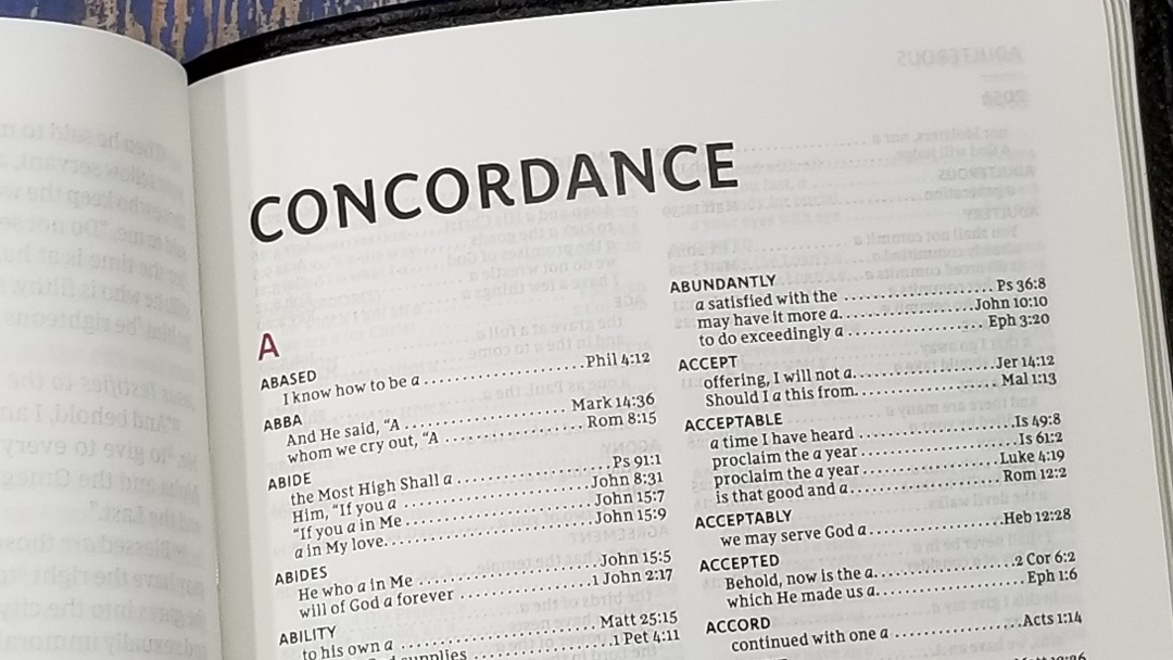
The concordance is 76 pages and it has 2 columns per page. The words in the header are printed in red. It includes a lot of entries. This a good concordance for study. It doesn’t include other common names. It does have Jesus, though.
Here are a few example entries and the number of references they provide to help you compare:
- Christ – 13
- Christian(s) – 2
- Faith – 40
- Faithful – 20
- Faithfulness – 5
- Faithless – 2
- God – 38
- Goddess – 2
- Godhead – 2
- Godliness – 4
- Godly – 3
- Praise – 25
- Praised – 4
- Praises – 2
- Praiseworthy – 1
- Praising – 3
- Pray – 14
- Prayed – 2
- Prayer – 16
- Prayers – 5
One Year Reading Plan
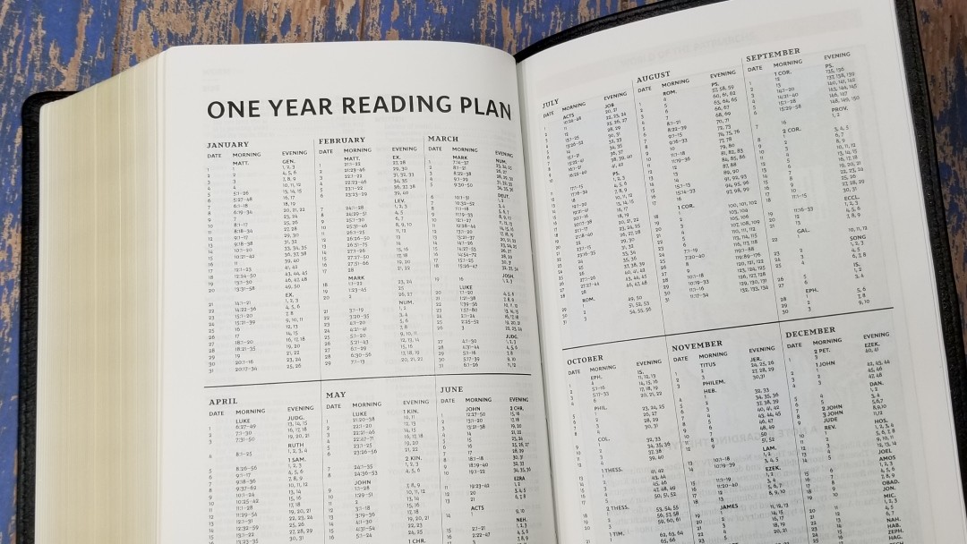
In the back, it has a one-year reading plan with two readings per day. The readings include Morning, which takes you through the New Testament, and Evening, which takes you through the Old Testament. A table shows the month, date, and both readings. The readings follow the standard biblical order.
Maps
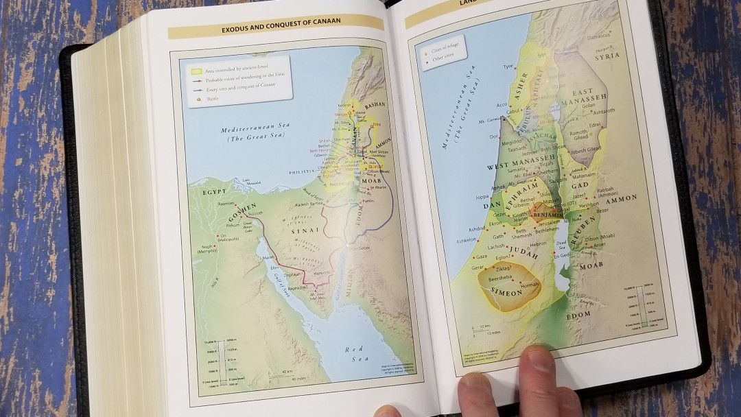
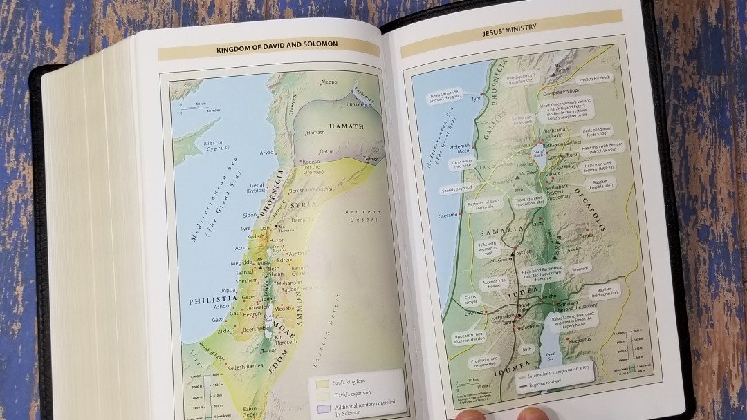
It includes 8 pages with 7 full-color Zondervan maps printed on thick glossy paper. They’re printed in bright earth tones, which are some of my favorite colors for maps. It doesn’t have an index but the maps are annotated well and I find them easy to use. They include topography, distance, routes, borders, possible locations of lost places, battles, elevation, cities, and locations for the events of Jesus’ ministry.
Maps include:
- World of the Patriarchs
- Exodus and Conquest of Canaan
- Land of the Twelve Tribes
- Kingdom of David and Solomon
- Jesus’ Ministry
- Paul’s Missionary Journeys
- Jerusalem in the Time of Jesus
Comparisons
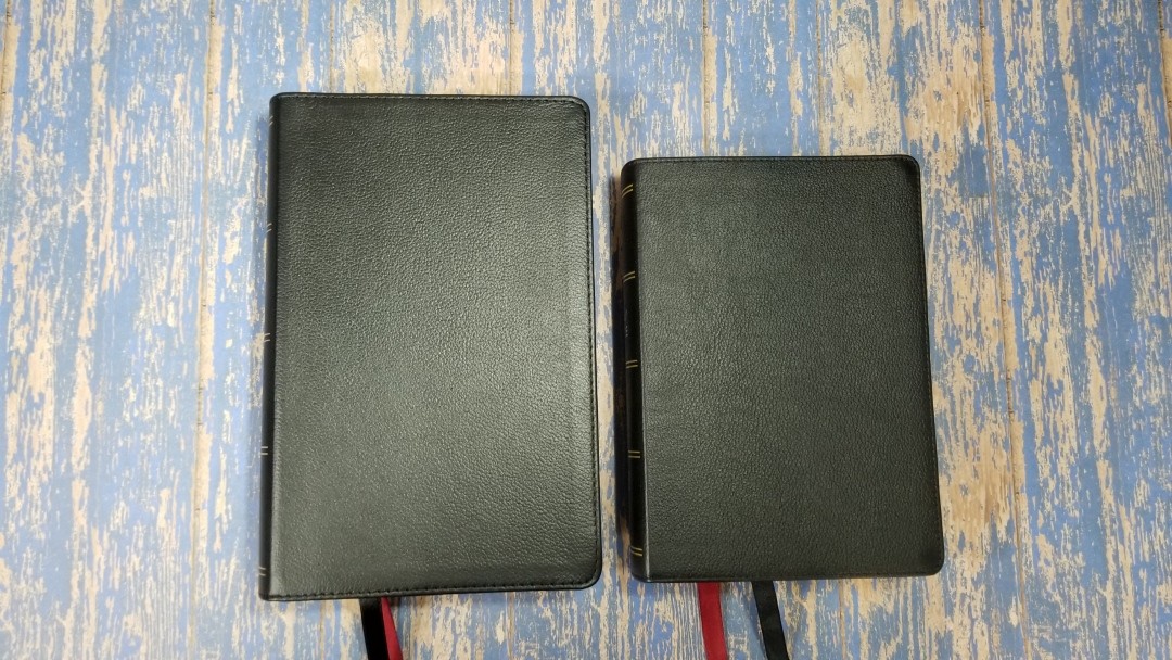
Here’s a look at the NKJV Single Column Reference Bible next to the Premier Collection NKJV Single Column Reference Bible, NKJV Compact Single Column Reference Bible, and the Cambridge Clarion.
Premier Collection NKJV Single Column Reference Bible
The paper is the same between the two (at least for this run). The Premier Collection is just slightly larger overall, but I wouldn’t notice that unless they were side-by-side. It also has three ribbons. The goatskin is softer and it’s edge-lined. It has a gilt line in the liner and art-gilt edges. Other than that, the two are exactly the same. They make a great pair if you want to use two of the same edition in different price ranges.
NKJV Compact Single Column Reference Bible
The Compact edition has a different pagination, but the layout and design are similar. The cover materials are the same. The Compact does not include a reading plan, but all of the other features (references, concordance, maps, etc.) are the same. I love carrying the Compact edition, but the regular edition is easier to read.
Clarion
The Clarion has a slightly smaller footprint and a smaller text. The paper is thinner and not as opaque. The layout looks nice, but it isn’t as elegant as the Thomas Nelson. It’s noticeably lighter, making it easier to hold and read for longer periods of time, but the Thomas Nelson isn’t so heavy that I won’t use it.
Conclusion
Thomas Nelson’s NKJV Single Column Reference Bible in black genuine leather is an excellent hand-sized Bible. The construction and materials are outstanding and the design is elegant. I love the print quality and red highlights. The paper has the right shade of white to create a good contrast with the text while remaining easy to read. It’s also easy to turn and highly opaque. The font is sharp and dark. It’s a touch thicker than I prefer, but it’s still easy enough to use. This is an easy Bible to recommend for any NKJV reader.
_________________________________________________________
This Bible is available at (includes affiliate links)
and many local Bible bookstores
_________________________________________________________
Thomas Nelson provided this Bible in exchange for an honest review. I was not required to give a positive review, only an honest one. All opinions are my own.










I really like this Bible. I like single column and the number of words per line make this layout really easy to read. However, this isn’t my preferred translation. Do you know of any other Bible that is similar to this one? I would like to own it in NASB, ESB, CSB and more.
Greetings, Randy! I’ve already bought and been using the Compact edition recommended by you, and now I have ordered the big brother! [Curious that the editions have different pagination!]