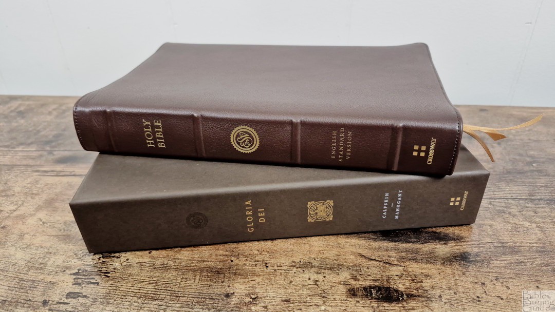
Crossway’s ESV Heirloom Legacy is one of the most popular ESVs available. It has now been renamed Gloria Dei and updated in the 2025 edition of the ESV. I’m reviewing the mahogany calfskin, ISBN 9798874904470, made in the Netherlands by Jongbloed.
Crossway provided this Bible in exchange for an honest review.
__________________________________________
This book is available at (includes some affiliate links)
___________________________________________
Table of Contents
Cover and Binding
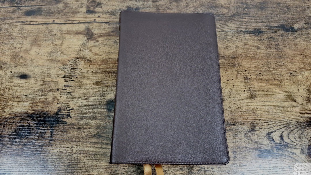
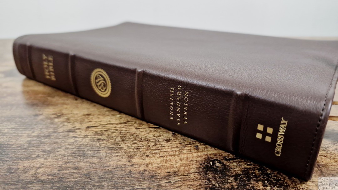
The cover is mahogany calfskin. It’s a dark brown with a pebbly grain. The only printing is the gold text on the spine, which also includes four large raised hubs. It’s extremely soft and flexible, which can be a challenge to hold flat in one hand. I still find it easy enough to use, though.

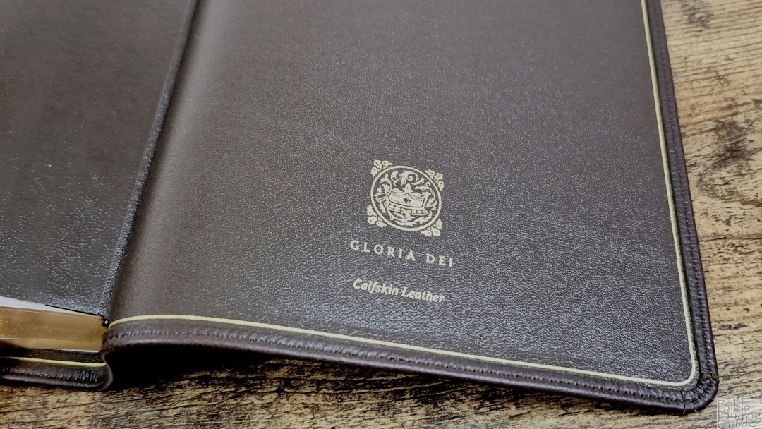
The liner is edge-lined leather and includes a gilt line. The tab is not stiff, allowing the pages to open almost flat. It’s Smyth sewn and has no trouble staying open in Genesis 1. This makes it great for preaching and reading. It also includes a thick end-sheets to give it structure. This edition includes three 10mm ribbons in mahogany. The overall size is 6.1 x 9.5 x 1.4 inches, and it weighs 2 lbs, 5.4 oz. This is an excellent all-around size for carrying, reading, and preaching.
Paper

The paper is Jongbloed-exclusive 28 gsm French milled Indopaque. It is slightly cream in color and highly opaque for its thickness, although the show-through is a little more noticeable than in previous editions. This could be due to the dark font. There is no glare under direct light. Even though it’s thin and smooth to the touch, I still find it easy to turn. The page edges are art-gilt red over gold.
Typography
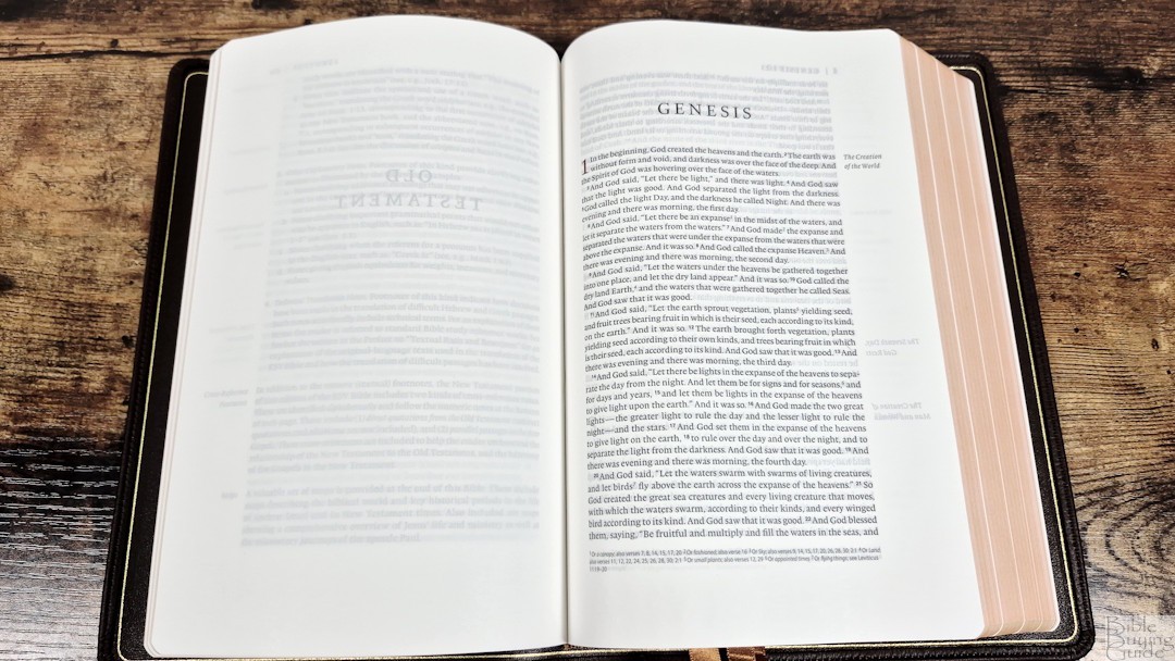

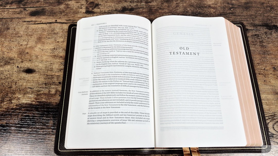
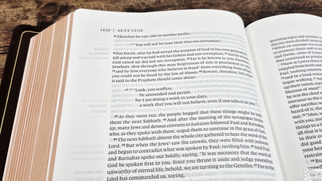
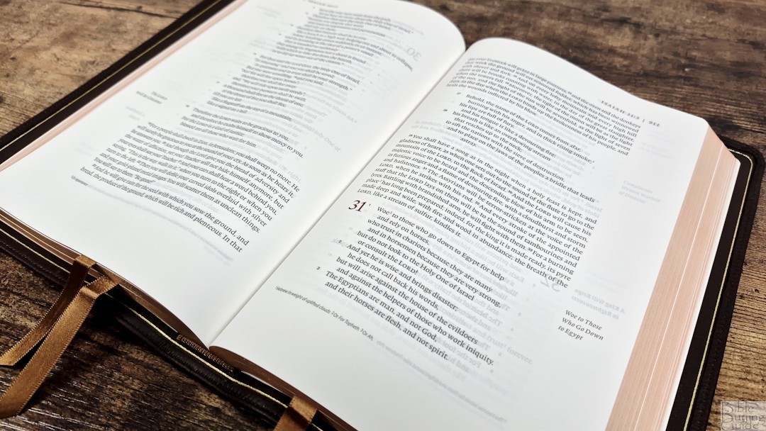
Its design comes from Renaissance book design directives to create the perfect layout that provides a 2:3 ratio page geometry. It does look appealing to my eyes. This layout is excellent for reading. The 2025 ESV text is presented in a single column with poetry set to stanzas. Section headings are placed in the outer margin, keeping the text clean. The header includes the page number, the book name, and the chapter and verse number in the outer margin, all printed in dark red. Chapter numbers are also printed in dark red. Translation footnotes are placed in the footer.
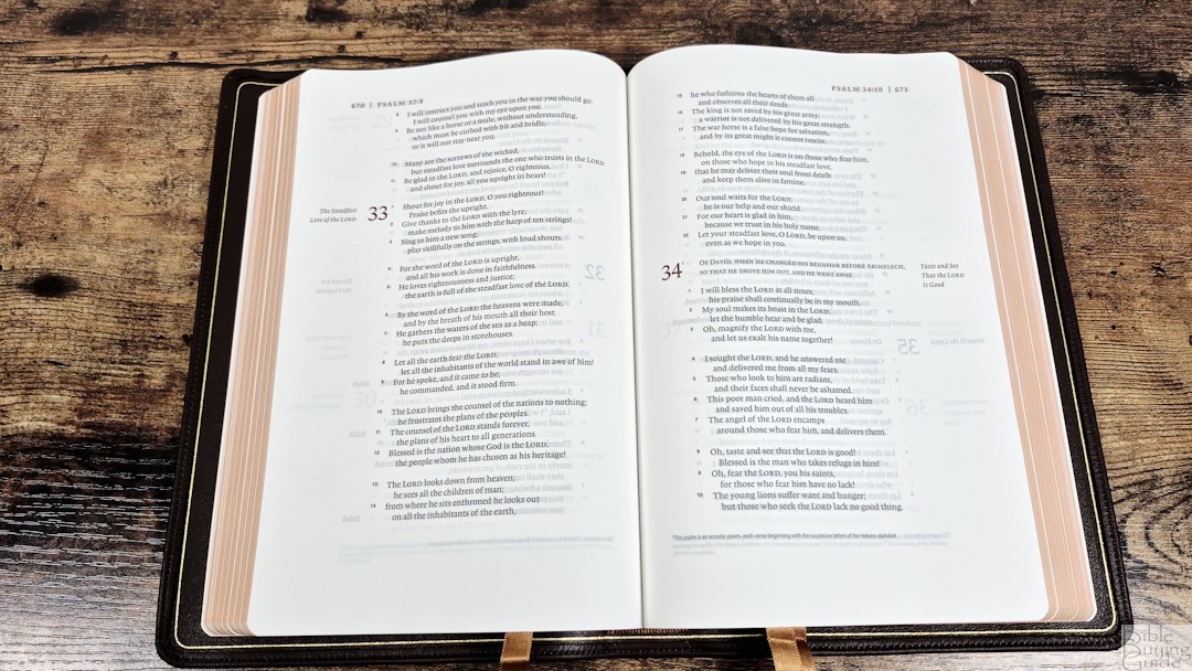
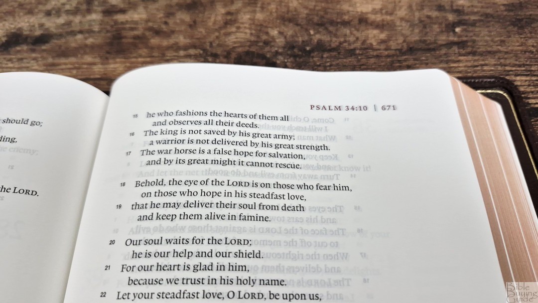
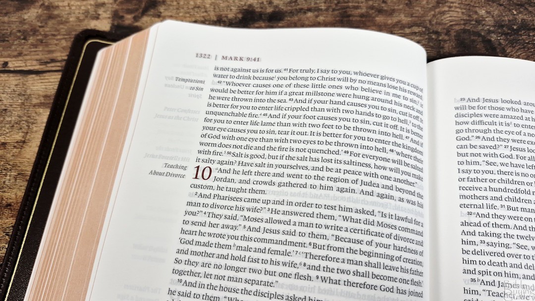
The Lexicon typeface is 9-point with a 10.75 leading. This is a black-letter text, and it’s dark and consistent throughout. It has around 14 words per line. Poetry looks perfect with this word count. It’s printed with line-matching, so the lines are printed in the same location on both sides of the page to reduce show-through and make the text more readable. Show-through is mostly visible in the poetic sections. Verse numbers are small enough to ignore when reading, but still easy to see when searching for them.
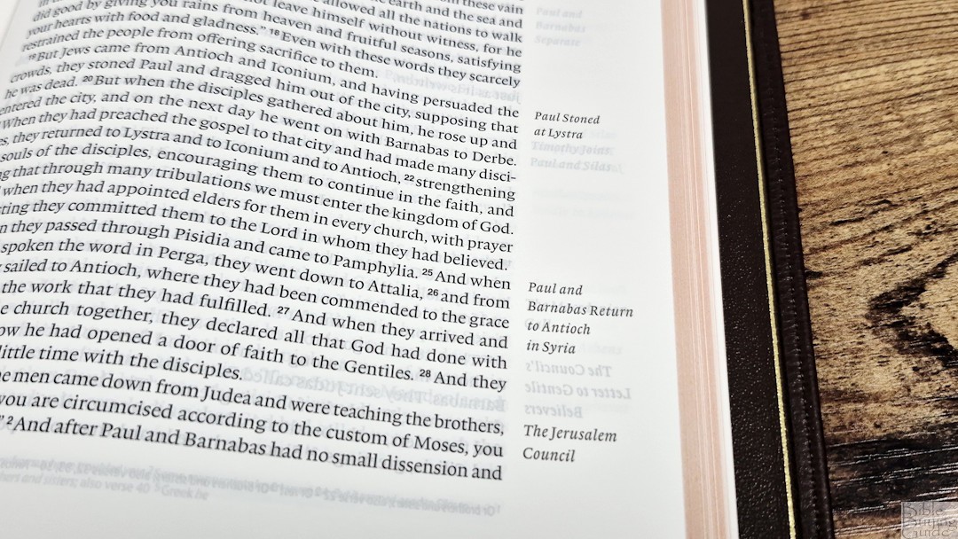
The outer margin has 1.25″, the inner has .625″, the top has 1″, and the bottom has .875″. This is a good amount of space for notes if you want to write on this thin paper. This inner margin brings the text out of the gutter onto the flat part of the page. The outer margin contains the section headings, so you have them if you want them, but you can ignore them if you want to read without distractions.
Footnotes
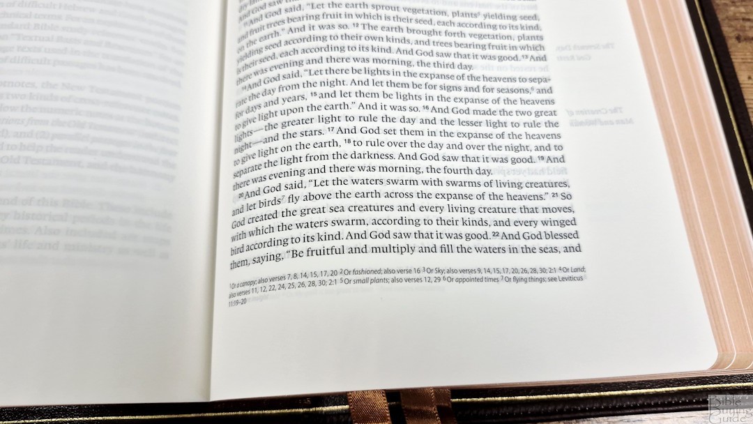
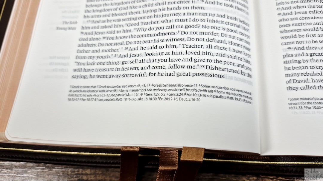
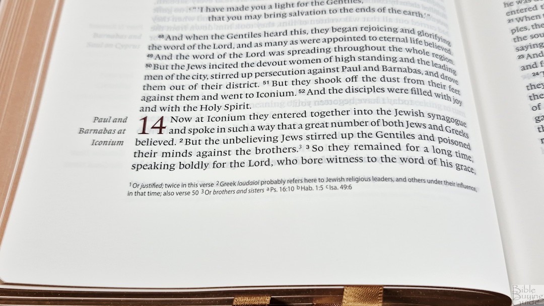
Translation notes are placed in the footer in a smaller font than the text, probably around 4-point. They will be too small if you need a large print. They don’t show the verse numbers, but they do have the footnote key found in the text. They include information on the Hebrew, Greek, Septuagint, weights and measures, parallel passages, OT references in the NT, translation variants, and more.
Other Pages
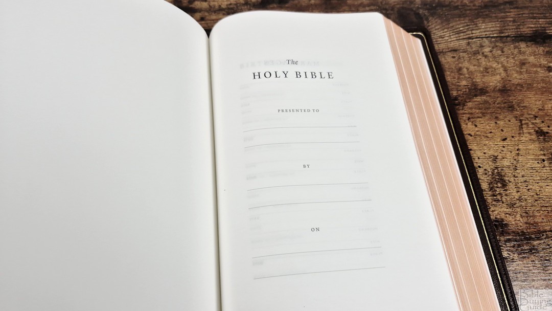
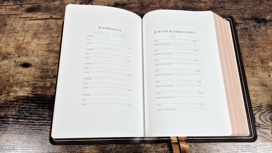
In the front are presentation and family pages printed on thick, glossy paper. They include Marriages, Births/Adoptions, and Deaths. They’re simple and all are printed in black.
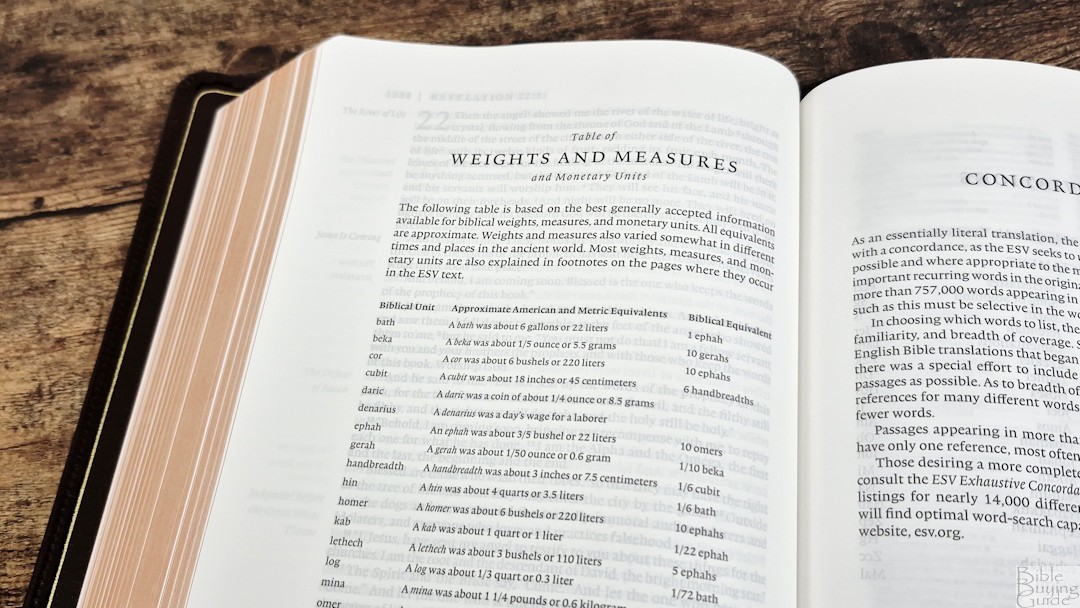
In the back is a one-page table with weights and measures. It includes the biblical unit, approximate American and metric equivalents, and the biblical equivalent. These measures are also placed in the footnotes, but it’s still helpful to have them in one place.
Concordance
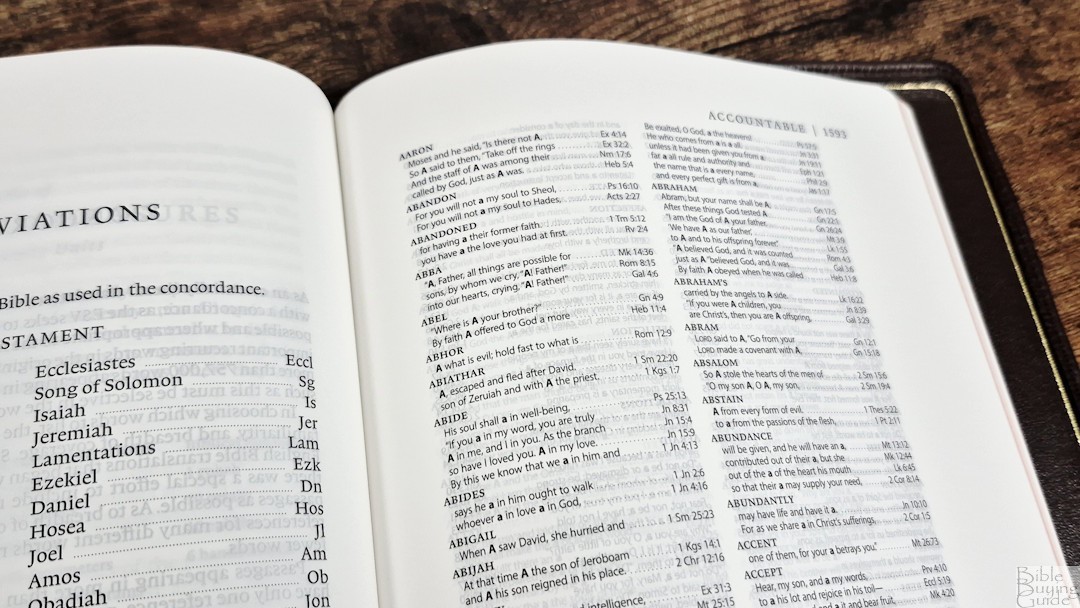
The concordance is 72 pages and has 2 columns per page. There are a lot of references, and they include proper names. The concordance also has wide margins, which is helpful if you want to add more references, word studies, etc. This is a good concordance for sermon prep and study. Here are some sample entries and the number of references given:
- Christ – 16
- Christ’s – 4
- Christian – 2
- Faith – 28
- Faithful – 10
- Faithfulness – 6
- Faithless – 1
- God – 49
- Godliness – 4
- Godly – 3
- Gods – 2
- Praise – 19
- Praised – 2
- Praises – 2
- Pray – 11
- Prayer – 10
- Prayers – 6
- Praying – 3
Maps
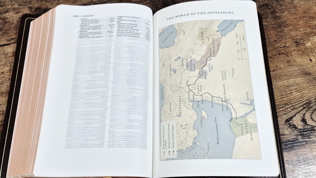
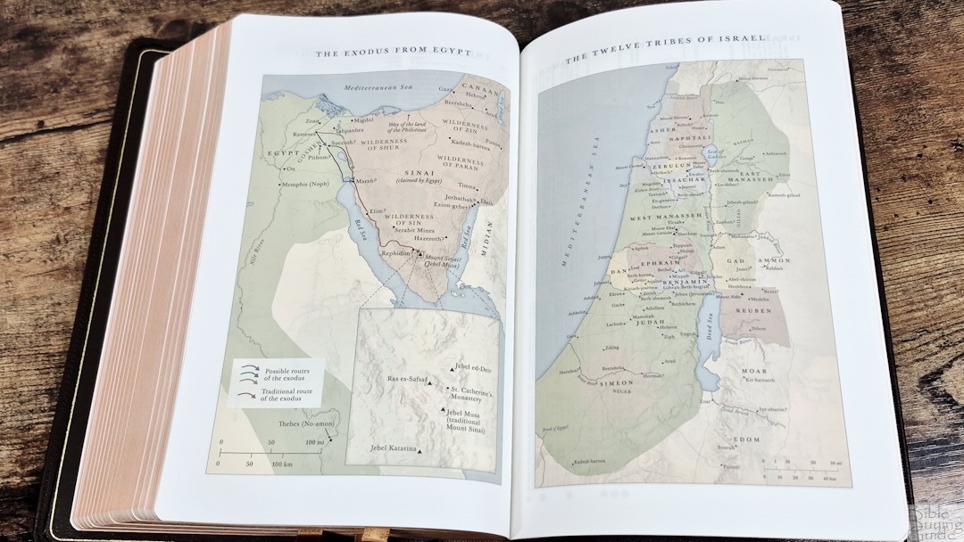
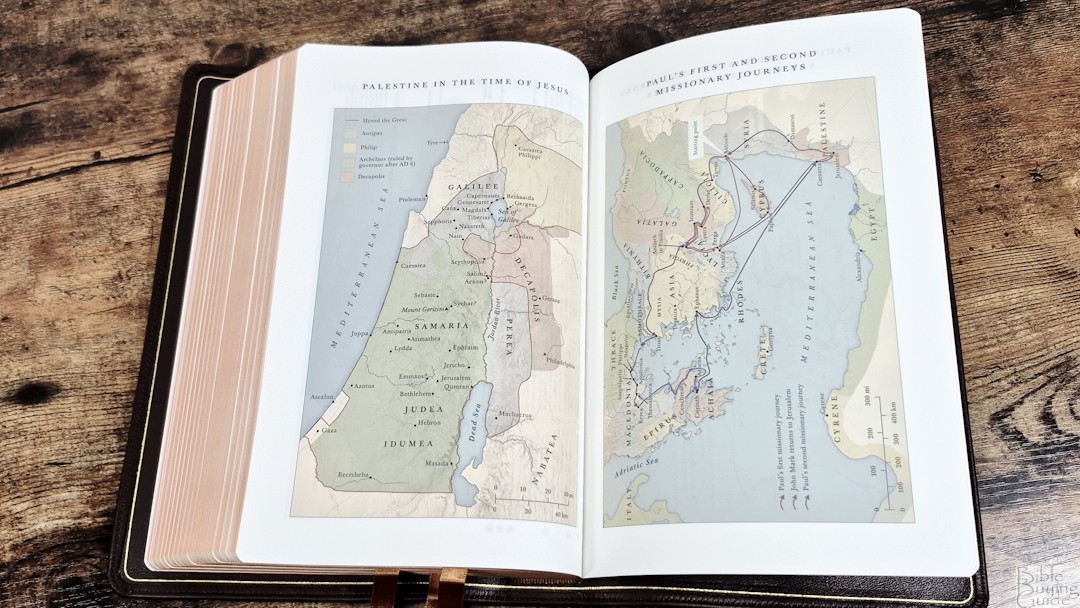
In the back are Crossway’s 8 pages of maps printed on thick matte paper. They’re printed in muted colors with lots of light green and tan. It doesn’t have an index, but the maps are annotated, making them easier to use. They include routes, distance, borders, rivers, kingdoms, references, dates, and simplified topography.
Maps include:
- The World of the Patriarchs
- The Exodus from Egypt
- The Twelve Tribes of Israel
- Israel Under Saul, David, and Solomon
- Jerusalem in the Time of Jesus
- Palestine in the Time of Jesus
- Paul’s First and Second Missionary Journeys
- Paul’s Third Missionary Journey and His Voyage to Rome
Video Review
Conclusion
The ESV Heirloom Gloria Dei is an excellent update to the Heirloom Legacy. It’s mostly the same, but now has different cover options and better ribbons. The materials are high quality, and the design is still one of my favorite Bibles. The ESV Heirloom Gloria Dei is easy to recommend.
_________________________________________________________
This book is available at (includes some affiliate links)
_________________________________________________________
Crossway provided this Bible in exchange for an honest review. I was not required to give a positive review, only an honest one. All opinions are my own.


Thanks for this excellent review Randy! I am seriously considering getting the Gloria Dei. Either in the Grenada calfskin or the black goatskin. Just wanted to ask you please if you have any thoughts (positive or negative or anything else) about the Grenada calfskin vs. the black goatskin? I like both colors and both colors seem to match the red accents inside? The calfskin seems to be softer but the goatskin more durable? Is that more or less fair to say? Any other thoughts on these two colors and skins? Thanks in advance good sir!
Thanks Mike! I prefer the calfskin. It feels softer, but still durable. The goatskin is a touch stiffer. Other than that, it’s hard to tell the difference. For the color, I prefer the Granada. It’s brown with enough red to make it look different.