


The Zondervan Thinline Large Print KJV is meant to be an everyday go-to Bible in large print. It’s meant to be a travel Bible that you can carry where ever you need to without sacrificing print size or having to settle for an overly large book-block. Something of course has to be sacrificed in order to keep the book-block thin enough and still retain the large print. What was sacrificed, and is the sacrifice worth it? Let’s take a look and see.
Price $17-23 (depending on color) | Buy from Amazon
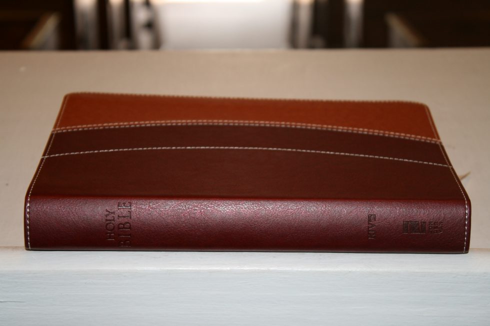
Binding
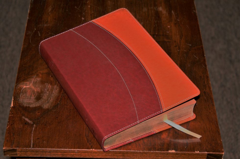
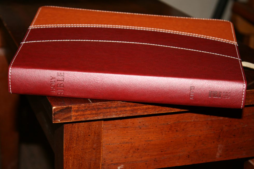
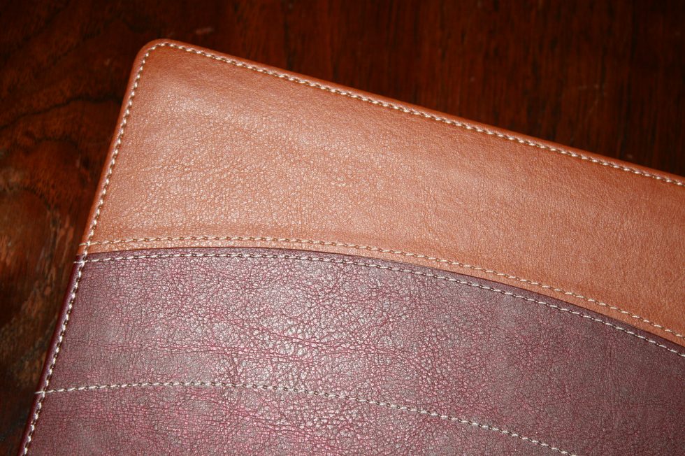
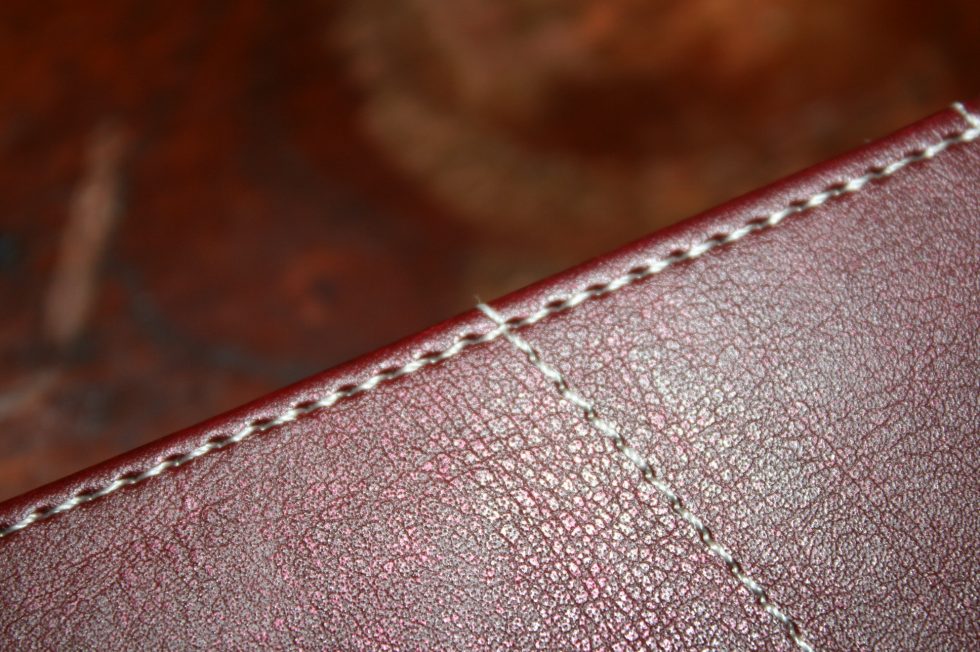
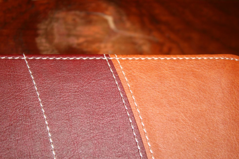
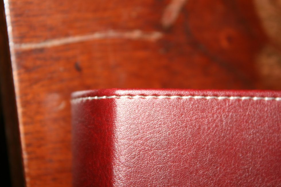
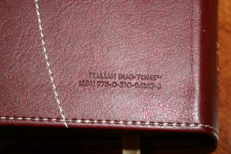
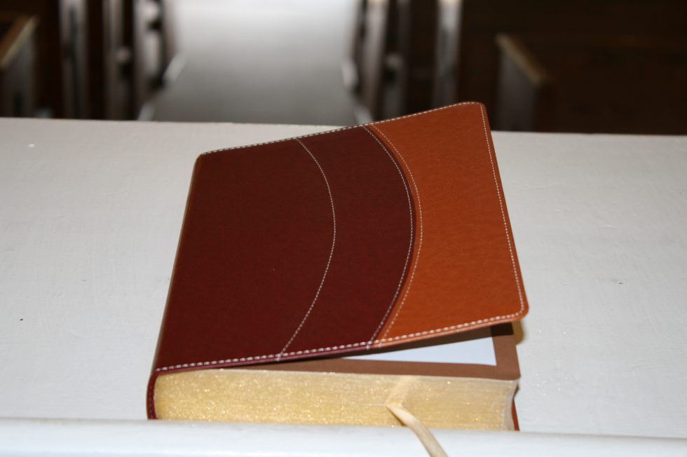
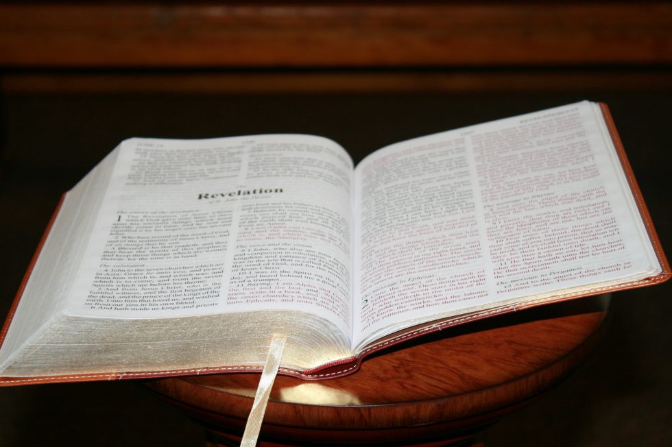
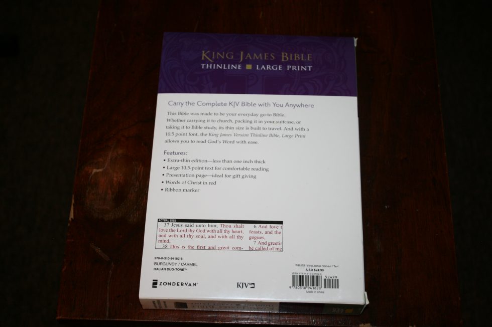
The cover is burgundy / carmel (tan) Italian Duo-Tone. The colors are stitched together with tan thread, making an arched pattern across the front and back, and around the parameter. The colors and texture look nice. They provide a tactile feel and keep it from looking plain. The liner is paper and doubles as the presentation page. I like the feel of the cover even though it is stiff. Of course leather would be a better choice for a Bible you want to keep for a long time, but this does the job for an inexpensive Bible.
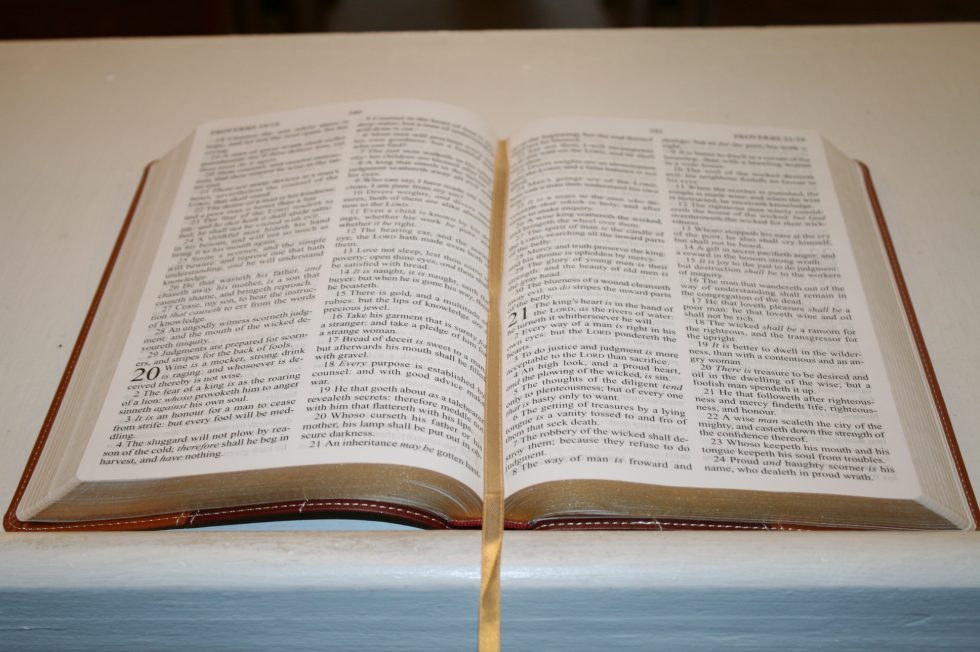
The text-block is sewn and lies open anywhere you want it to after the cover has broken in. It lies flat out of the box, but will take some time before it lies open in Genesis. I’m glad to see that it’s sewn. Having a sewn binding makes it a candidate for a rebind once the cover tears up.
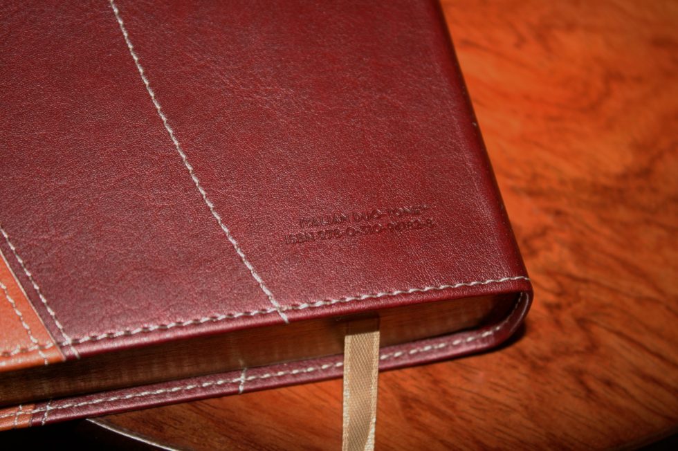

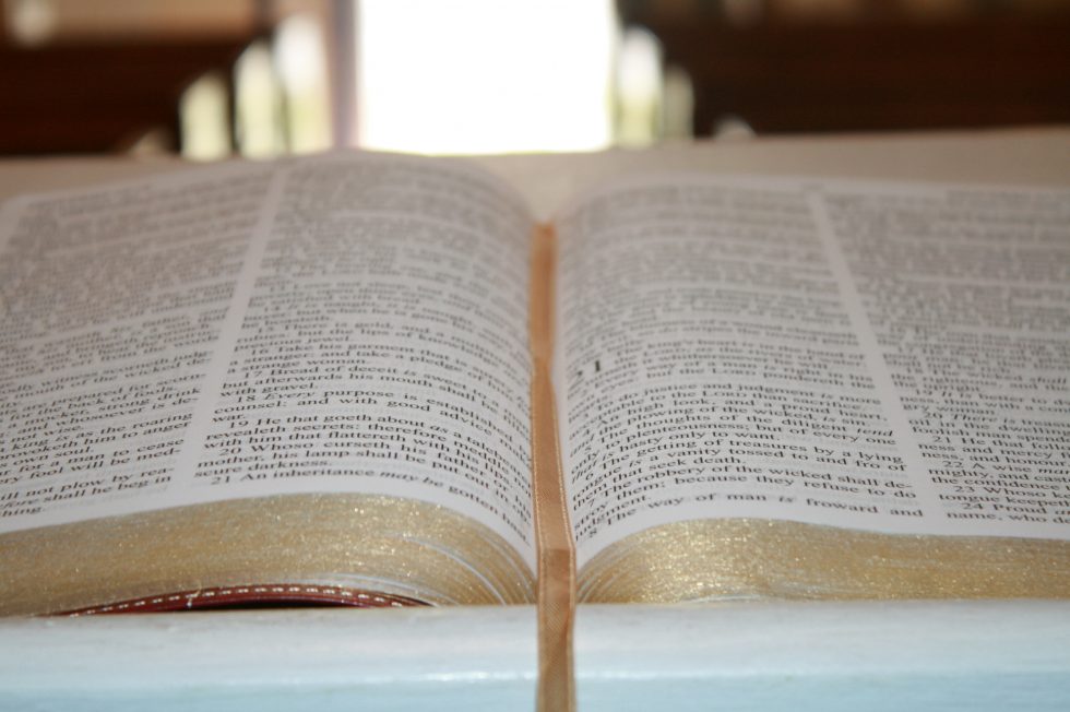
The overall size is 9 5/8” x 6 ¾ x 1 ¼. It feels light for its size. It has a single light gold ribbon.
Paper
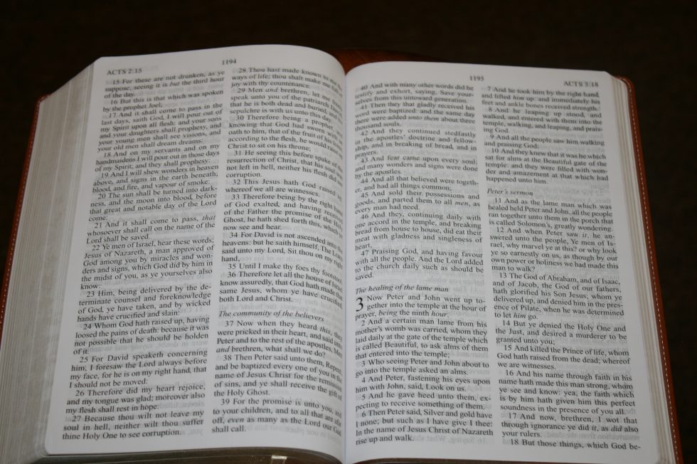
Since this is a thinline the paper is on the thin side. It has a white tone. It has a rough texture that makes it easy to grab and turn, so I don’t mind how thin it is. It could be a little more opaque though. The show-through isn’t bad enough to make me not use it. I noticed it, but didn’t find it too distracting. On the pages where the lines match it isn’t distracting at all.
Typography
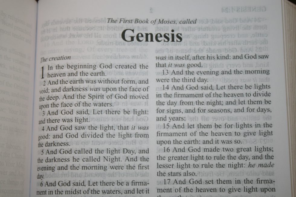
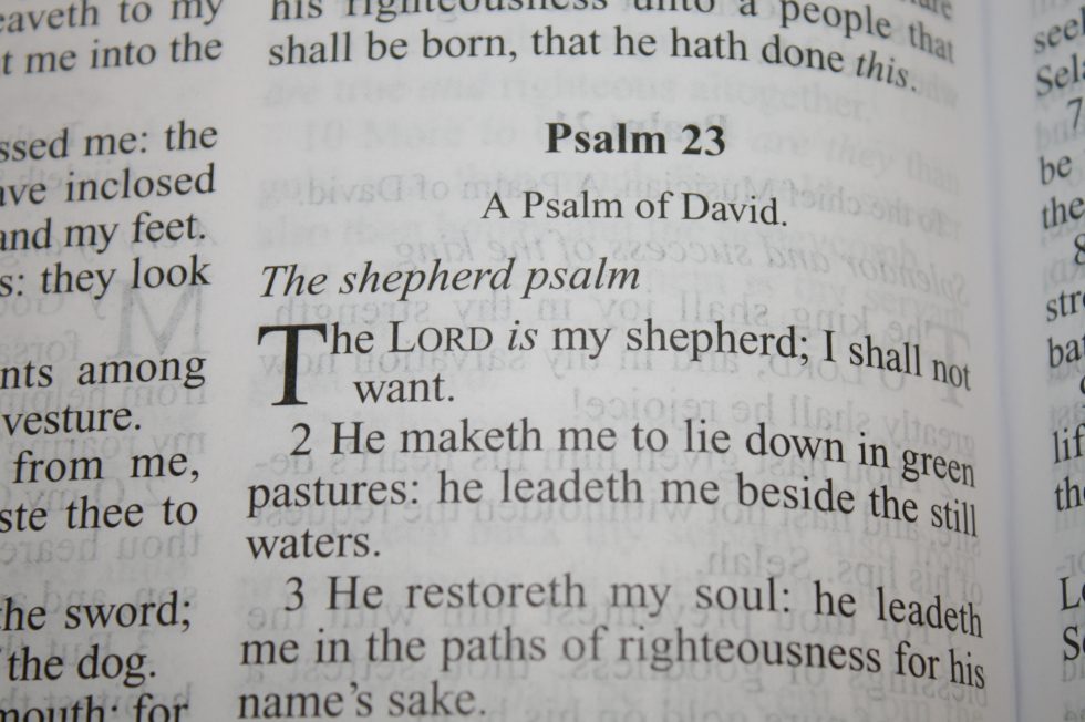
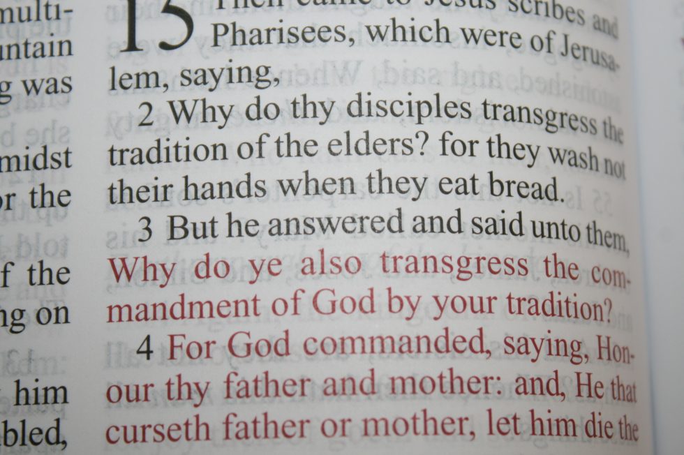
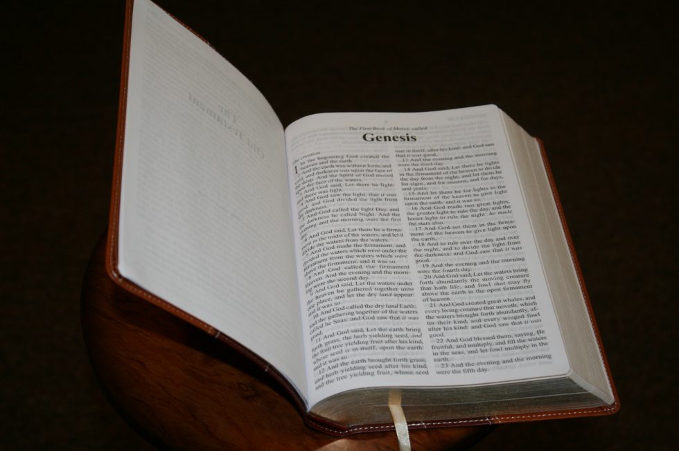
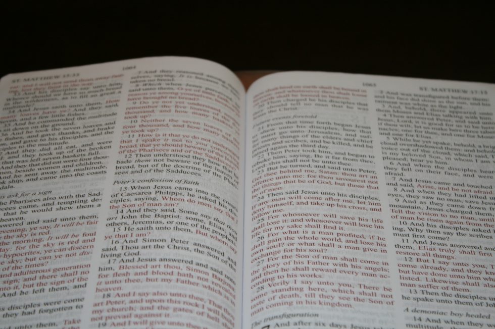
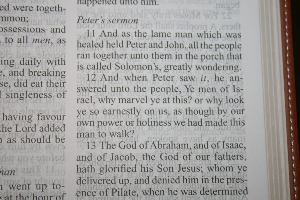
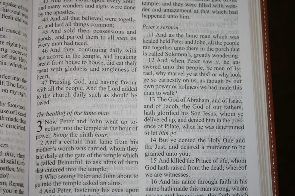
The layout is simple – two columns, verse by verse, section headings in italics, page numbers in the center of the header, and book names, chapters, and the first or last verse on that page in the upper corner. Verse numbers are indented so they’re easier to find when scanning the page. The drop-cap is the chapter number. Books start on the same page that the previous book ended.
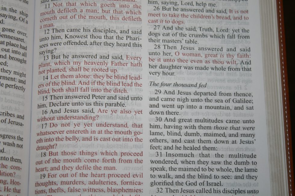
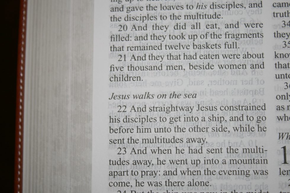
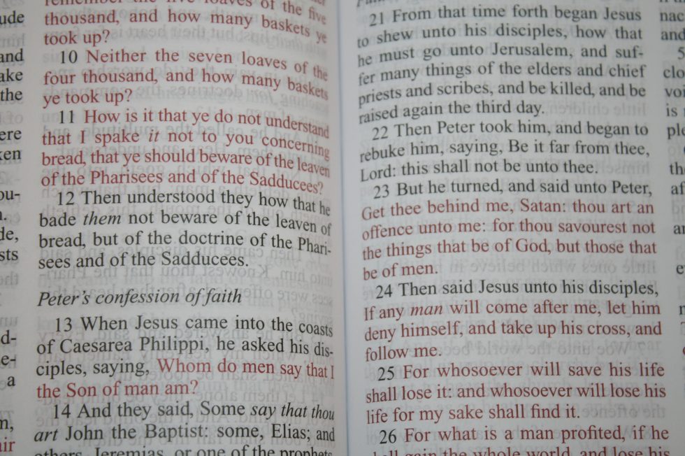
The font is 10.5 with serif. It actually looks larger than that to me and it holds up well when compared to larger fonts. It’s sharp and has a clean design that’s easy to read. The text doesn’t have to share space with anything. This is a design that I’ve come to prefer – the focus is on the text. There are no pronunciation marks but it does have italics for supplied words. It has a generous leading that gives plenty of room for underlining and helps improve readability.
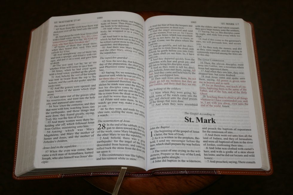
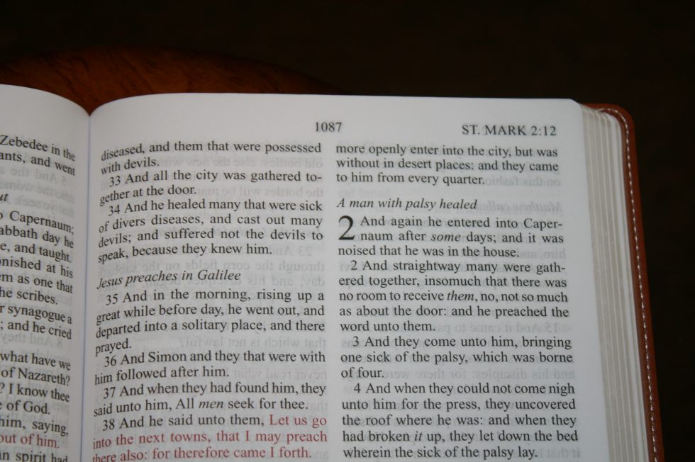
The red letter is a medium darkness and goes through Revelation. The black and red letters are highly consistent throughout. The print quality is much higher than I expected from a Bible in this price range.
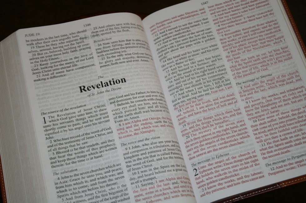
The columns are 2 5/8” wide with 40-42 characters across, making each line around 7 or 8 words. The text never feels cramped. There aren’t any words too close together or any extra spaces between words. There’s enough inner margin that text doesn’t get lost in the gutter. There isn’t enough margin space for notes though.
Section headings are in italics. They stand out enough to be usable but not so much that they’re distracting. They’re more noticeable in the red-letter sections. I wish there were a few more of them. Genesis 1 only has one. At least they don’t feel overdone and separate the text too much.
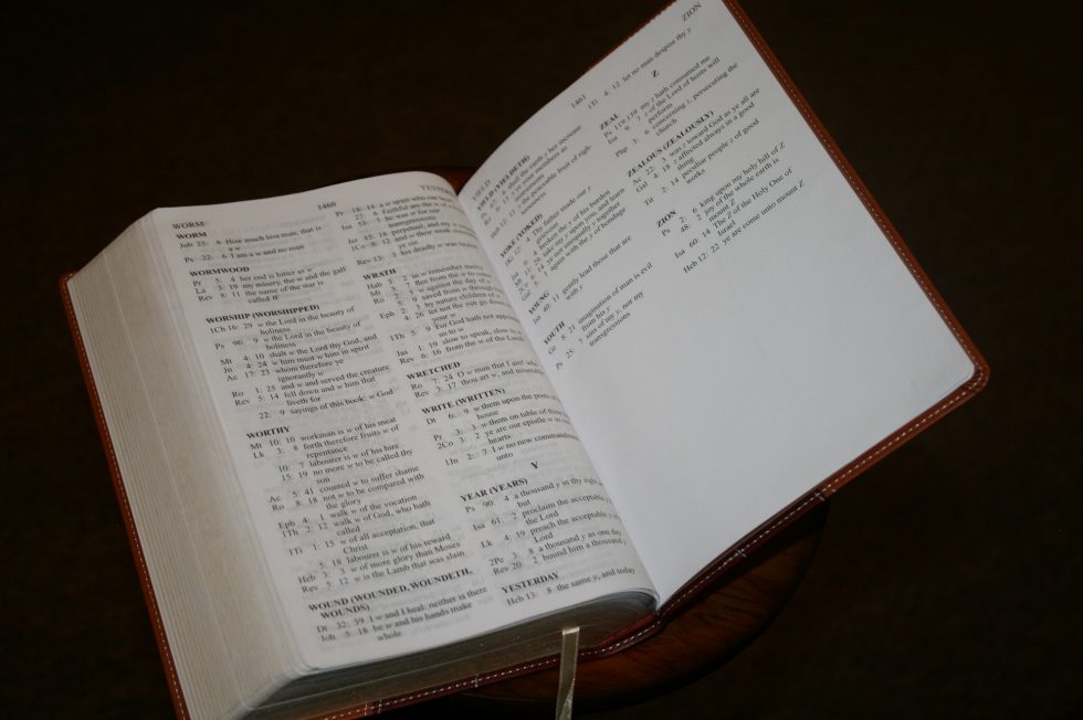
Concordance
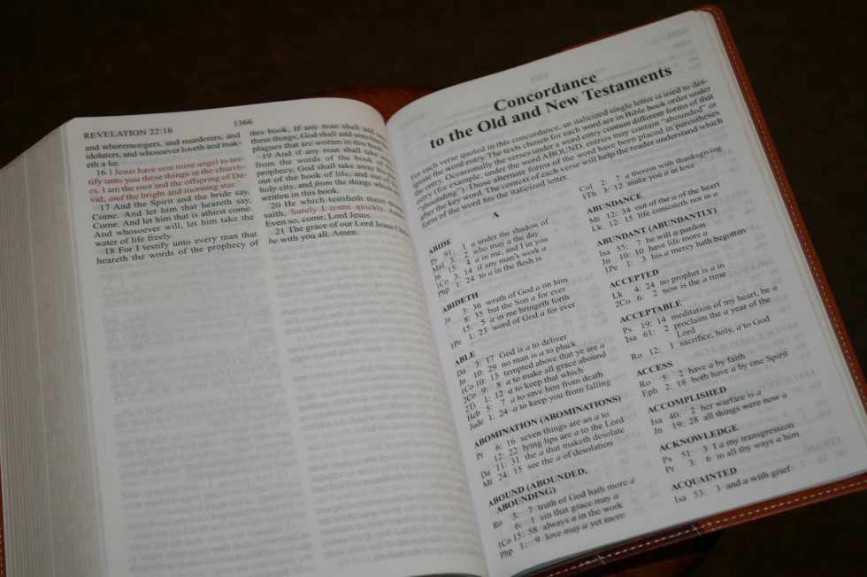

The concordance is the only study tool in the back of this Bible. It has 95 pages in two columns and large print. It works for basic keywords and simple searches. I wouldn’t want to use it for deep study but it might come in handy if you don’t have access to other tools. The keywords include alternate forms of the words which are placed in parenthesis.
Here are a few example keywords with the number of references given:
- Christ – 17
- Christian (Christians) – 2
- Faith – 50
- Faithless – 1
- Faithful – 15
- Faithfulness – 4
- God – 12
- Godhead – 2
- Godly – 2
- Godliness – 4
- Praise (praised) – 9
- Praises (praising) – 3
- Pray – 13
- Praying (prayed) – 3
- Prayer (prayers) – 14
Using It
This is a light Bible. It was no problem to carry and hold for long periods of time. The typeface is comfortable enough for long periods of reading. I enjoyed reading from it as the clean text made it great for reading without all the distractions.
I also loved preaching from it. I didn’t worry about sweat and spit getting on it and the pages were always easy to turn. The show-through was noticeable but I was always able to read the text with no problems. I wouldn’t mind if the section headings stood out a little more though.
- The thinline large print format works well for carry, reading, and preaching.
Conclusion
I enjoyed reading and using the Zondervan Thinline Large Print KJV. It was easy to carry, read, and preach from. It’s an easy Bible to use and toss around without having to worry too much about it. It doesn’t have references, lists, maps, etc., but I don’t need those in every Bible. I especially don’t want to carry tools that I’m not using. Sometimes it’s better to just have a good Bible that focuses on the text and is easy to handle without sacrificing print size. That’s exactly what this Bible is.
In my opinion the sacrifice of all the extras was worth the large print and size of the book block. If you need an inexpensive Bible with large print that’s light-weight and don’t care about extra tools then this is a great choice.
Photography by hannah C brown
Price $17-23 (depending on color) | Buy from Amazon
Zondervan provided this Bible free for review. I was not required to give a positive review – only an honest review. My opinions are my own.