
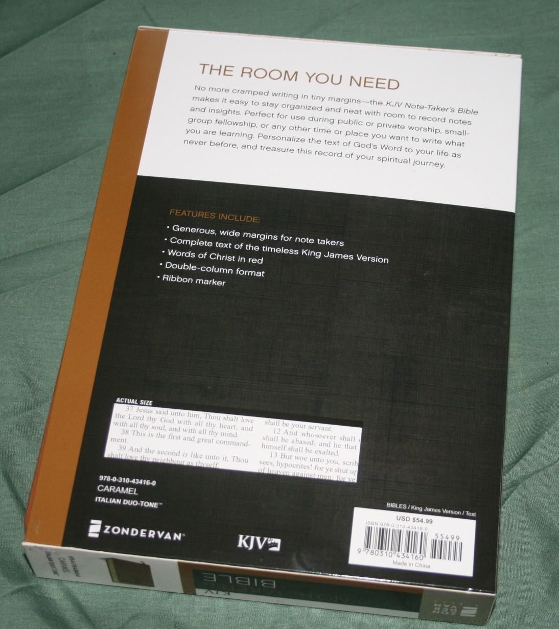
Zondervan’s Note-Takers series presents the text in two columns with a wide outer margin for writing, and good quality writing paper to go with it. I like writing in Bibles that are made for writing. They have better paper than your normal everyday thin paper. This Bible is great for writing, but it’s also great for just reading.
Pros
- Thick paper
- Nice print
- Wide outer margin
Cons
- The only Note-Takers edition without translation notes
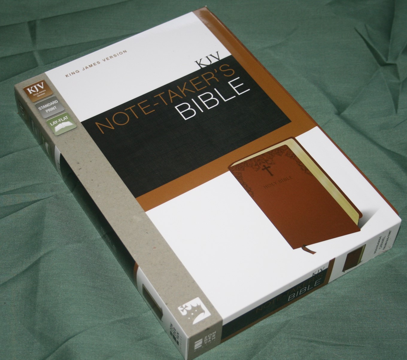
Features
- KJV
- Duo-Tone imitation leather
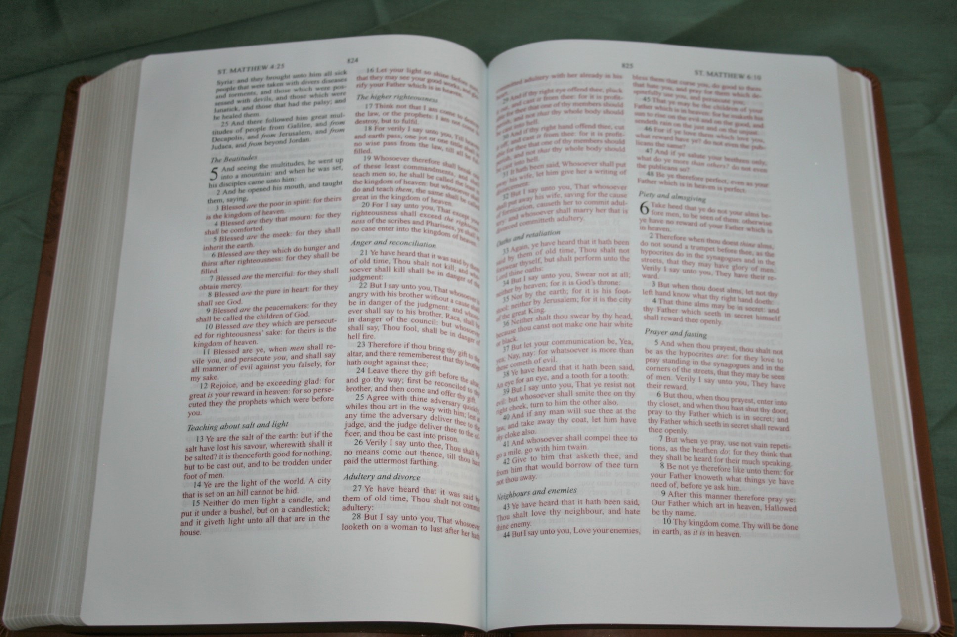
- 1 1/8” outer margin
- Red-letter
- 8-point font
- Thick paper
- Section headings
- Concordance
- One brown ribbon
- Gilted edges
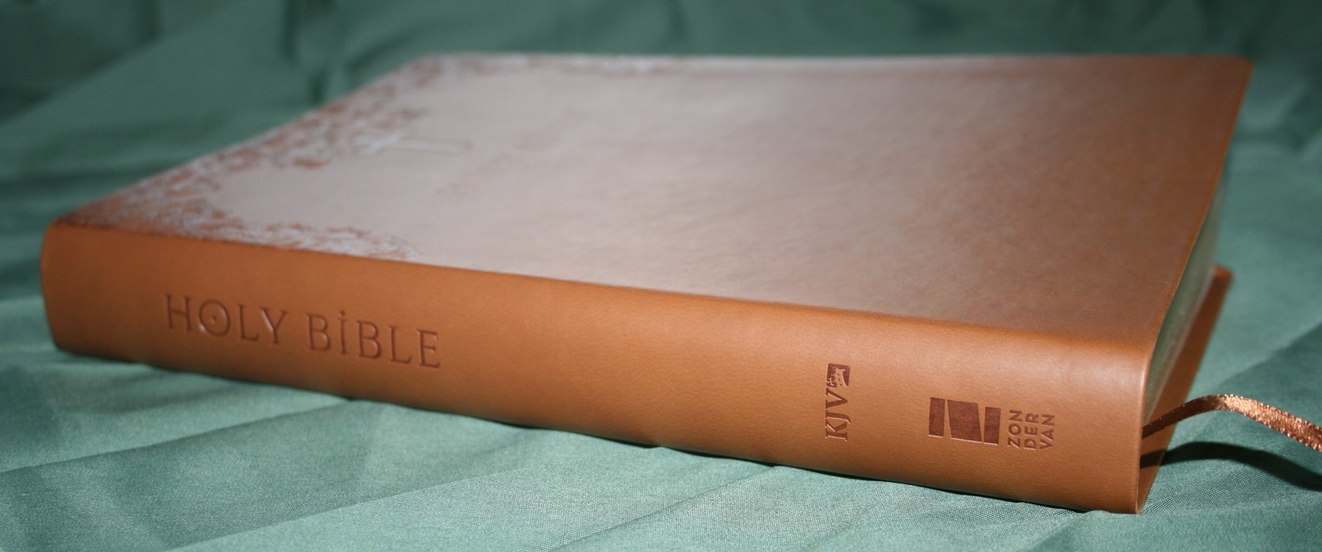
- 9.5 x 6.5 x 1.25
- ISBN: 9780310434160
- MSRP $54.99
- Amazon: Zondervan KJV Note-Takers Bible
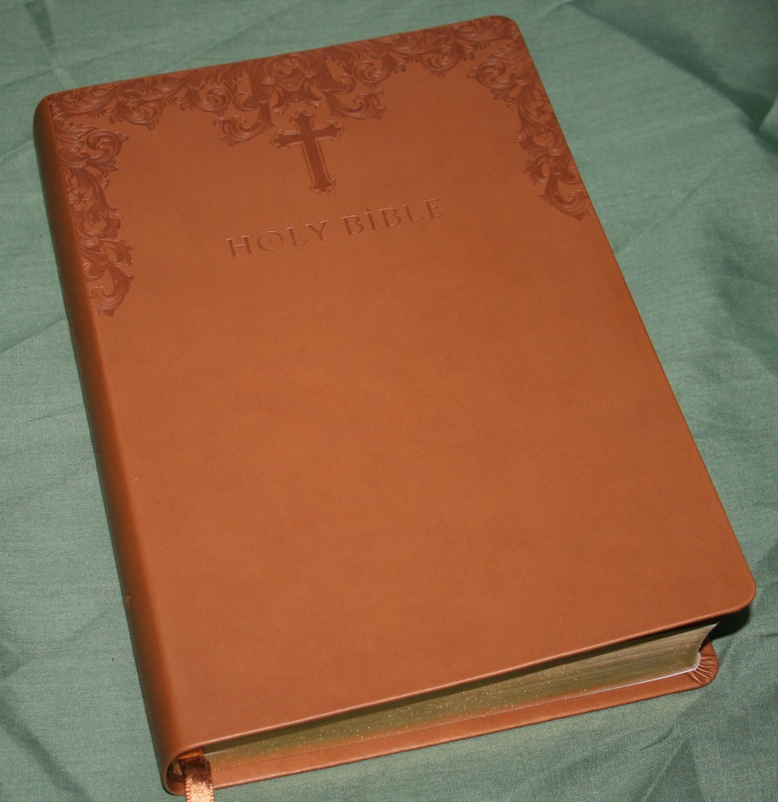
Cover and Binding
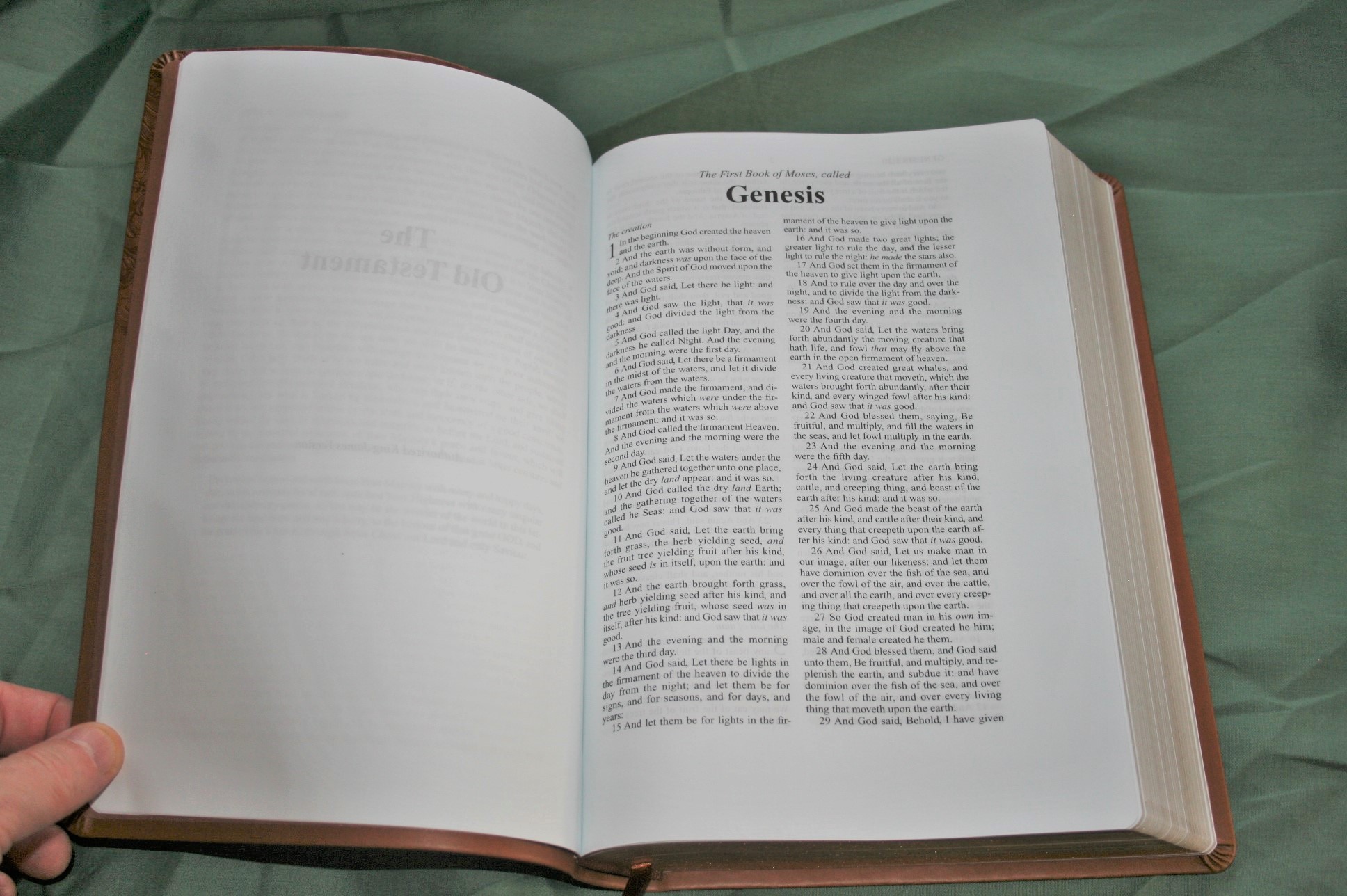
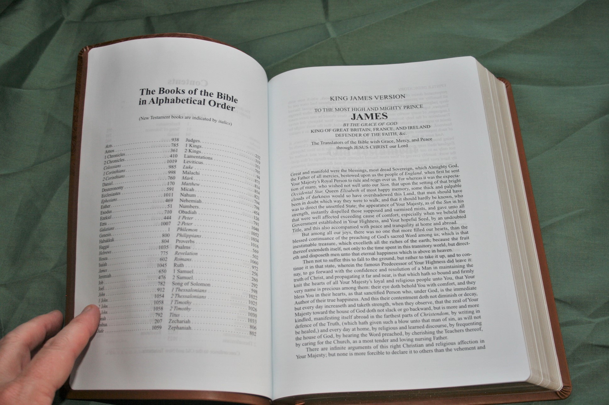
The cover of this review copy is caramel Italian Duo-Tone imitation leather. It has a stylized design across the top with a cross over the words Holy Bible. The cover itself is stiff and bends upward after it’s been used for a while. It’s nothing special. The liner is paper. One thing I fond odd is the very first page is the presentation page. The binding looks to be signature sewn. The cover doesn’t allow it to stay open in Genesis but it does lay flat anywhere else with little or no trouble. Once it’s broken in it should be fine.


Paper
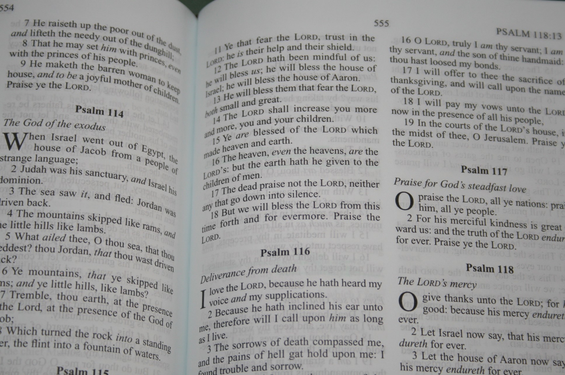
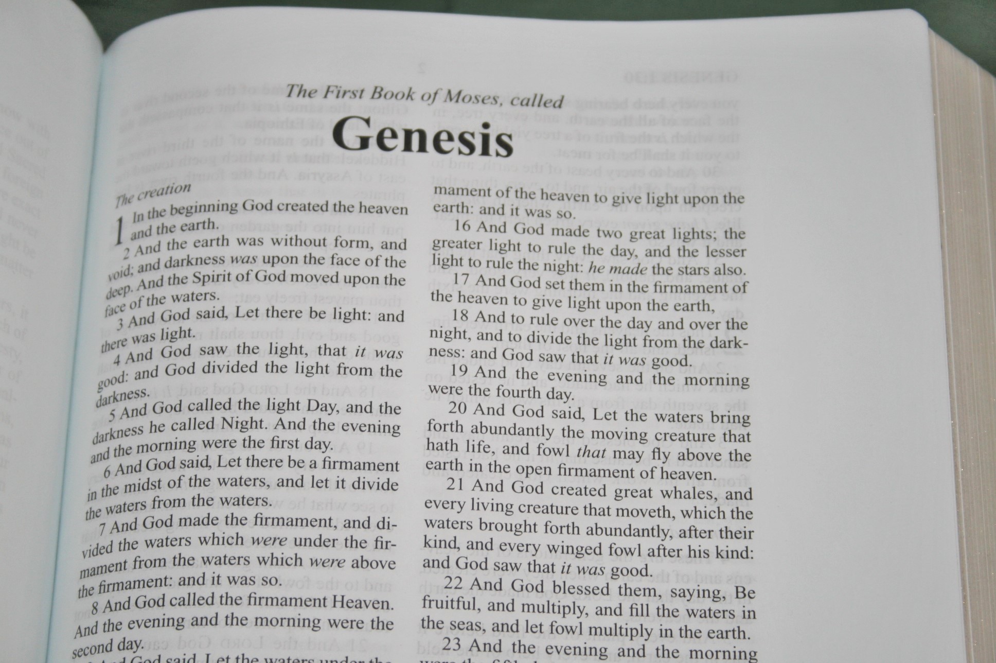
Where this Bible really shines is its paper. It’s about the thickest paper I’ve seen in a Bible. It feels great to the touch. It feels like I can write with a pencil and not worry about it. It is extremely opaque and has very little show-through. I’ve used color pencils and a regular mechanical pencil and I’m very happy with how it looks. The paper takes color really well. Of course you don’t have to write in it. It would make a great reading Bible. It does have a slight blue hue. Blue is not my favorite color-tone for paper (I prefer cream or ivory). This doesn’t affect readability in a negative way at all. I preached from it today and it was a joy to read. There are 4 pages in the back for writing. I would have liked more for sermon outlines or personal notes.

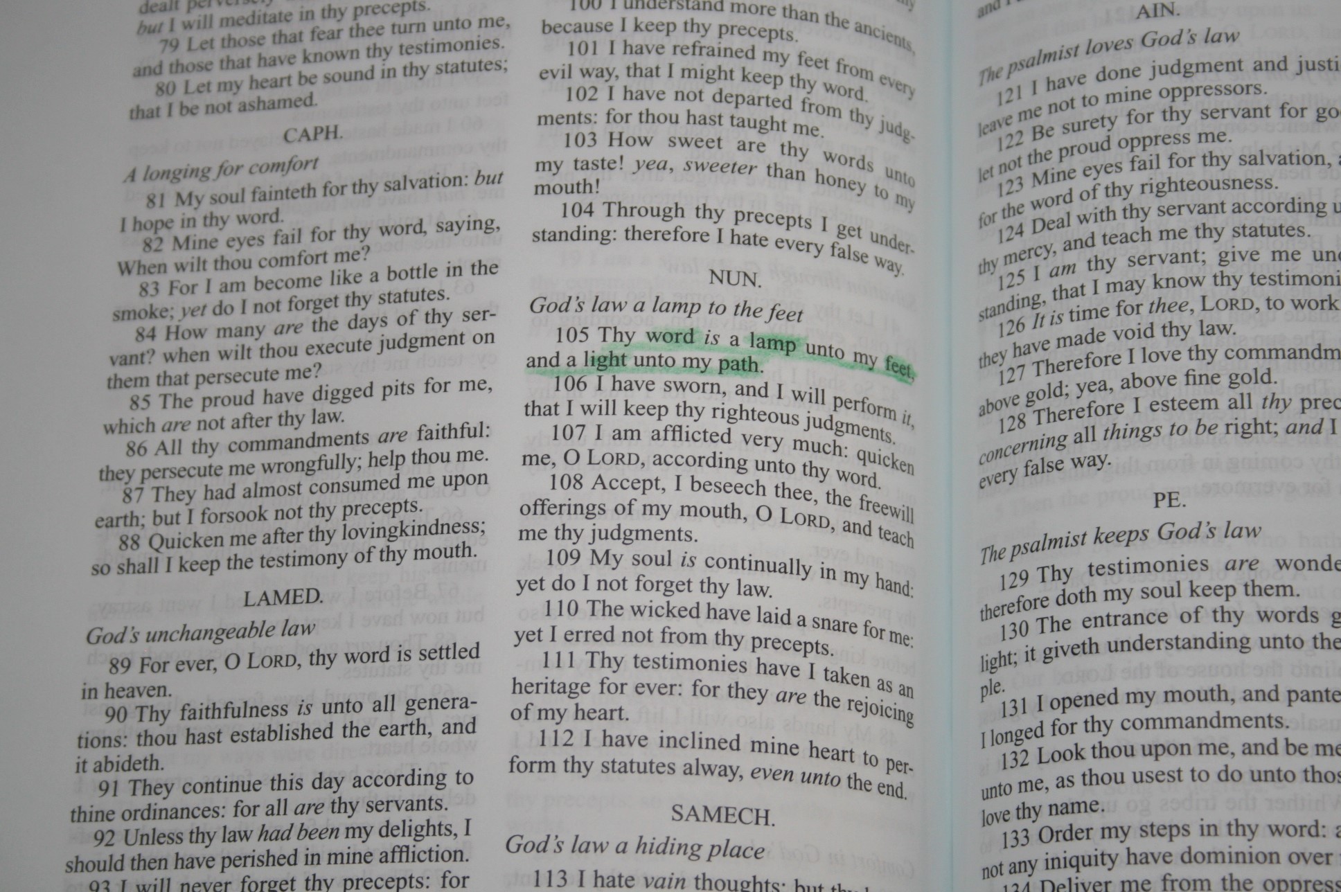
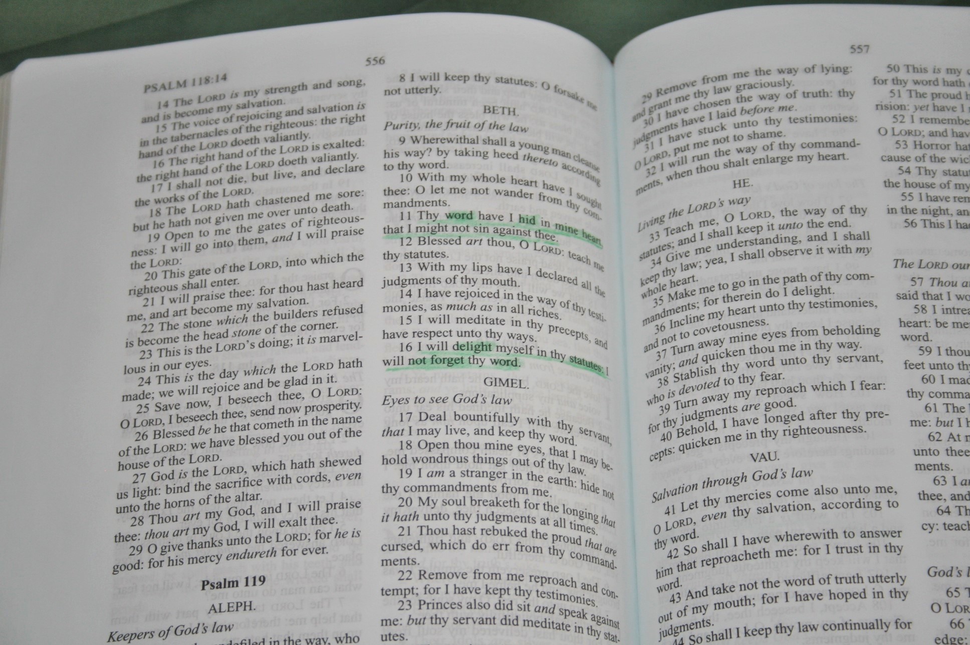
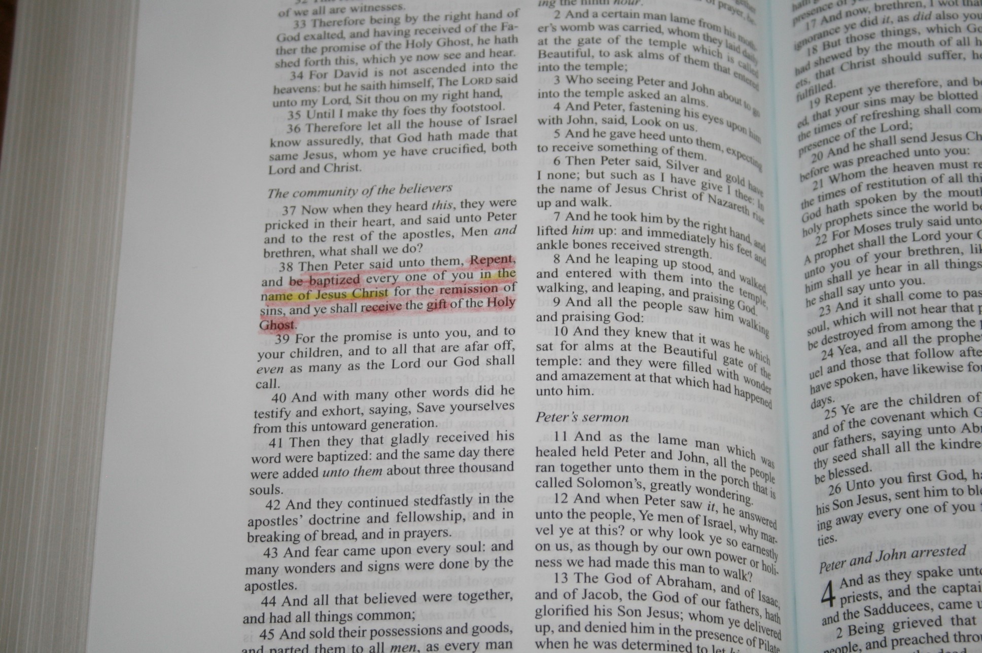


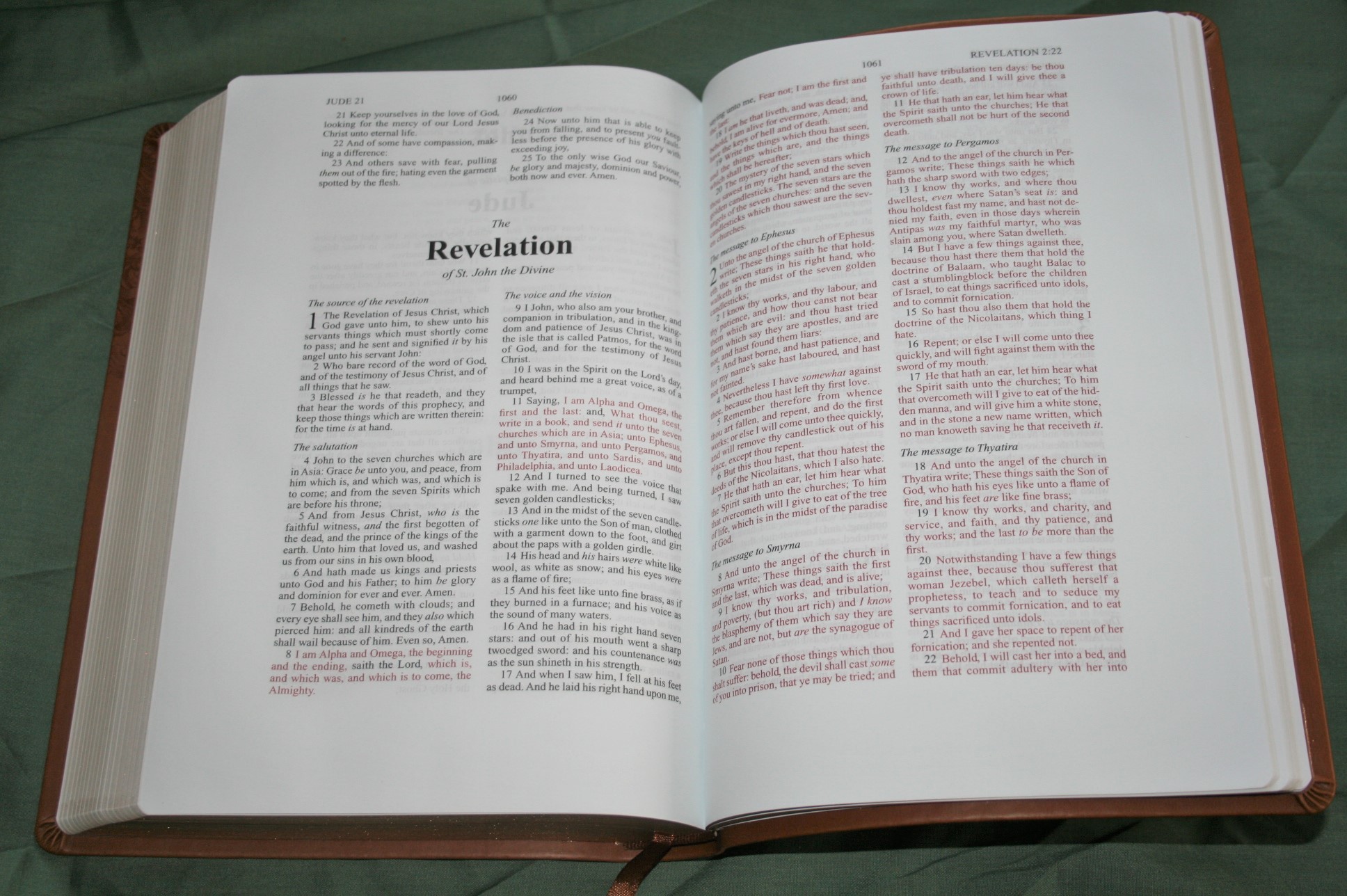
The font is probably an 8-point with a 9~9.5 leading; but that’s just a guess. It’s about a medium boldness and is sharp and consistent. The red letters have a nice shade of red. I actually enjoy reading this shade of red. The red is not as consistent as black, but the variation is only slight.
Layout
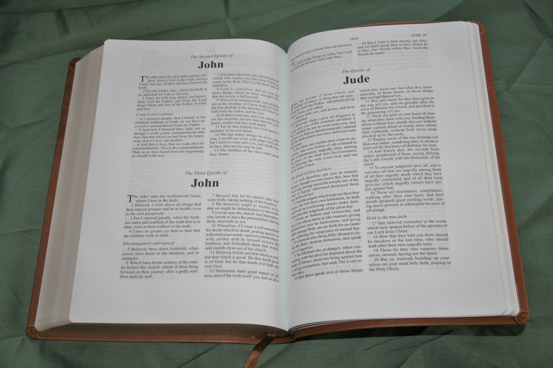
The setting is double-column, verse-by-verse, with a 1 1/8” margin on the outside. The header contains the chapter and verse number for the first verse that appears on the left page, and the last verse on the right page. Section headings are in italics. Other than section headings this is a text only edition. Unlike all the other editions of the Zondervan Note-Takers, the KJV edition does not have translation notes. What’s bad is the KJV needs them the most. Books start on the same page the previous book ends. Starting them on a new page would have given a little more writing space, which is a good place to add notes for preaching and teaching.
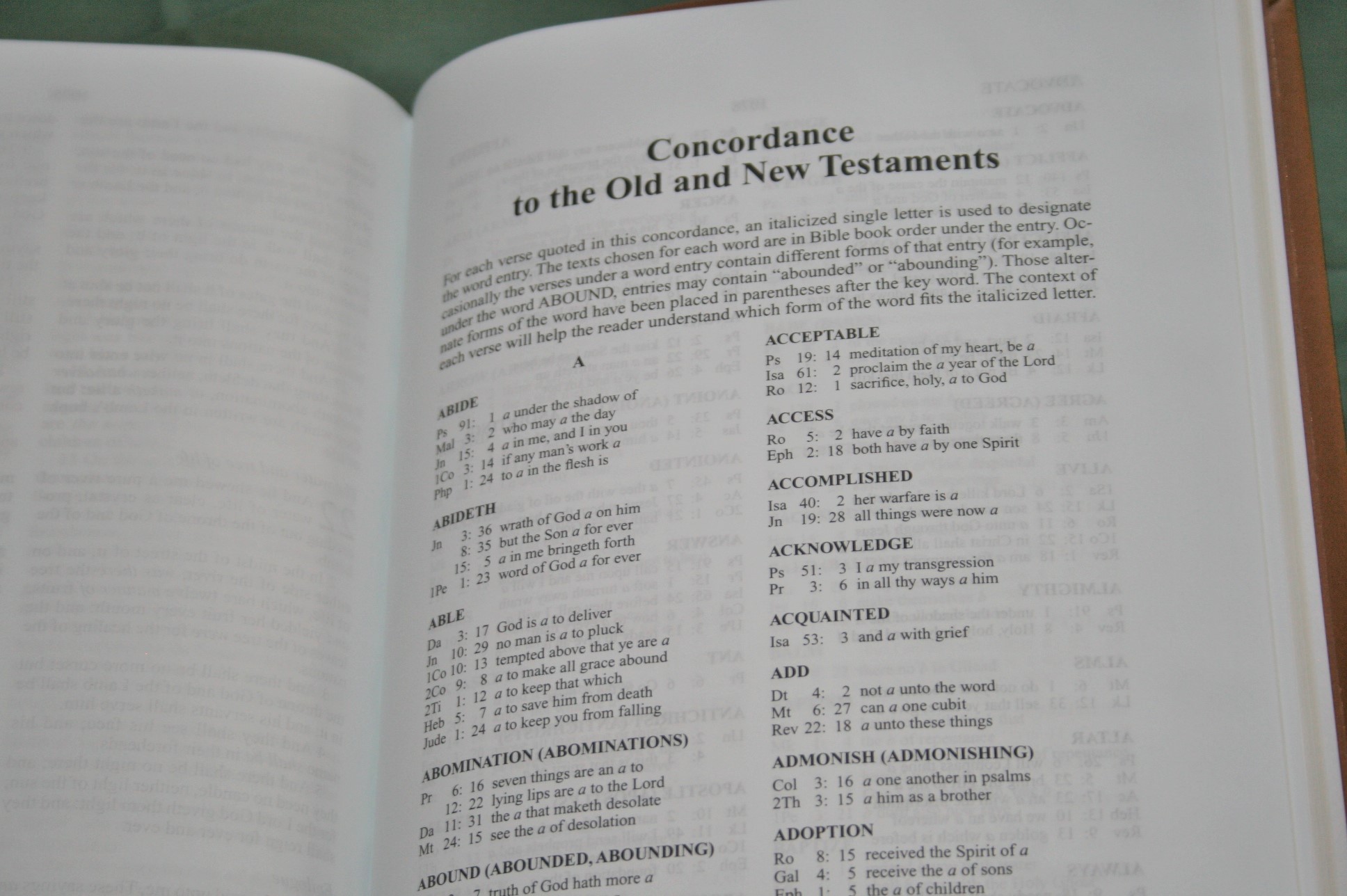
Concordance
The concordance is 64 pages with 2 columns per page. It has 12 verses for God. It might be enough to help if you’re out somewhere or for basic study.
Conclusion
Overall Zondervan’s KJV Note-Takers is a good choice for writing and reading. I do wish they had included the translation notes. If I could make one change that would be it. Its size and weight are good for carry. I like the thick paper and the print is sharp. It makes a great Bible to preach or teach from or for personal journaling and note-taking. The opaque paper, overall size, and legibility of the text make it a fine reading Bible.
Comparisons
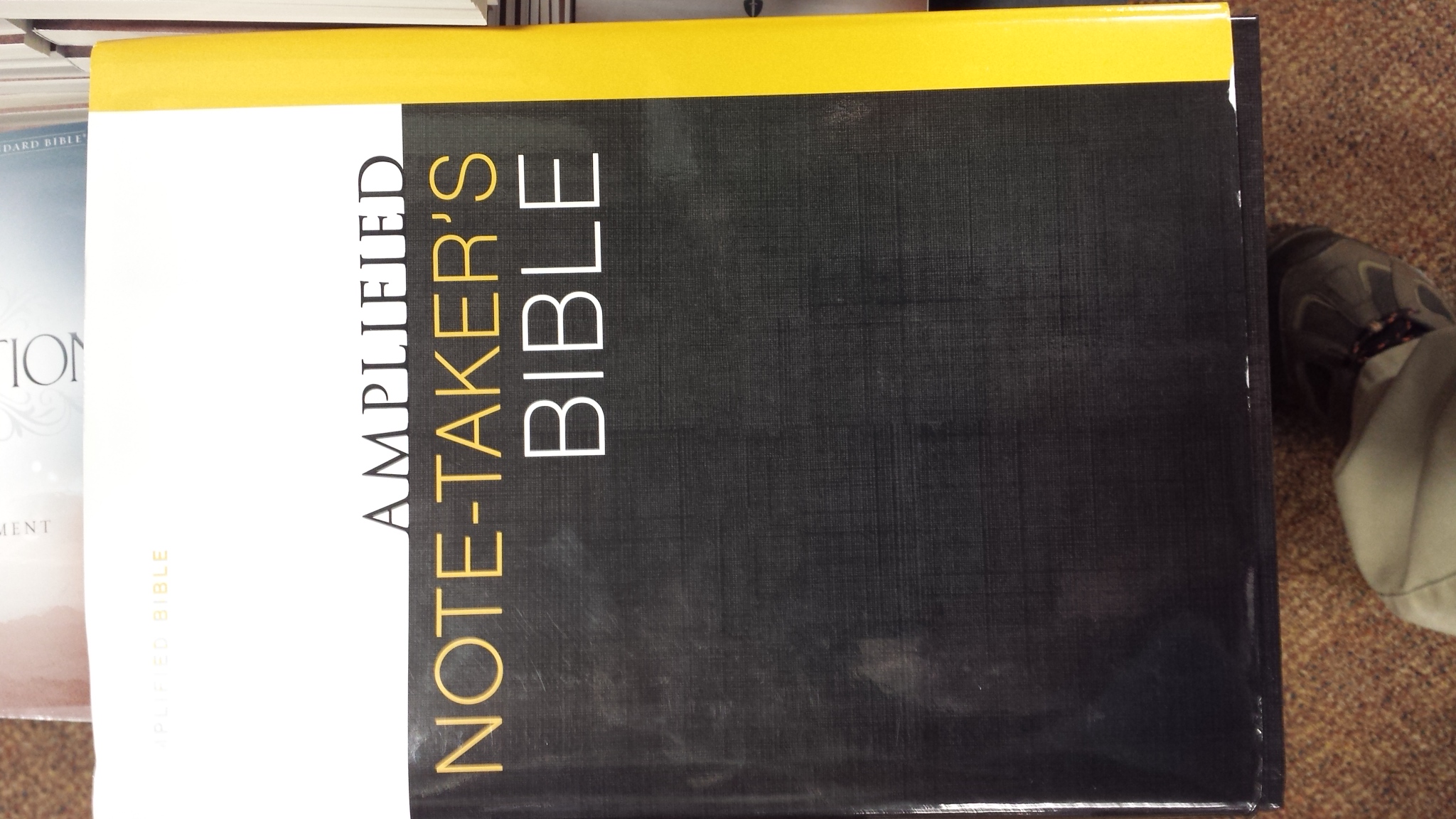
Below are photos of the NKJV, NASB, and Amplified editions. For the NIV, see the review here: Zondervan’s NIV Note-Takers Bible Review


Zondervan provided this Bible free for review. I was not required to give a positive review- only an honest review.