Warner Bibles KJV New Testament in Goatskin Review
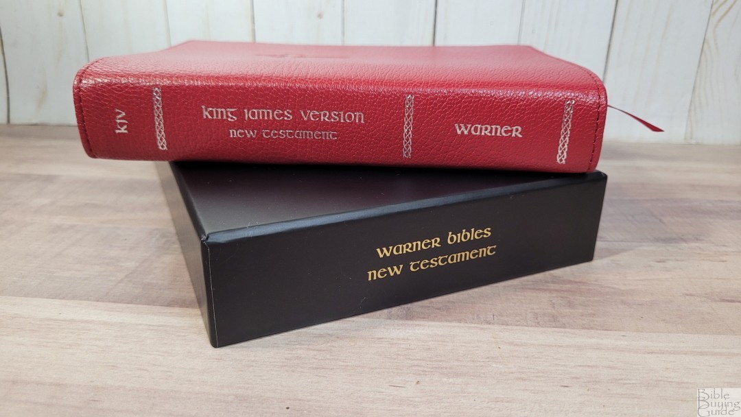
The KJV New Testament in goatskin from Warner Bibles is a premium NT designed for reading and everyday carry. It has a small form factor while presenting a large and reading text. This is SKU: 364215376135191, designed in the US, printed, and assembled in Hong Kong. It comes in a sturdy two-piece box with gold printing that matches the look and quality of Schuyler.
Warner Bibles provided this Bible in exchange for an honest review. I was not required to give a positive review, only an honest one. All opinions are my own.
_________________________________________________________
This Bible is available at Warner Bibles website
_________________________________________________________
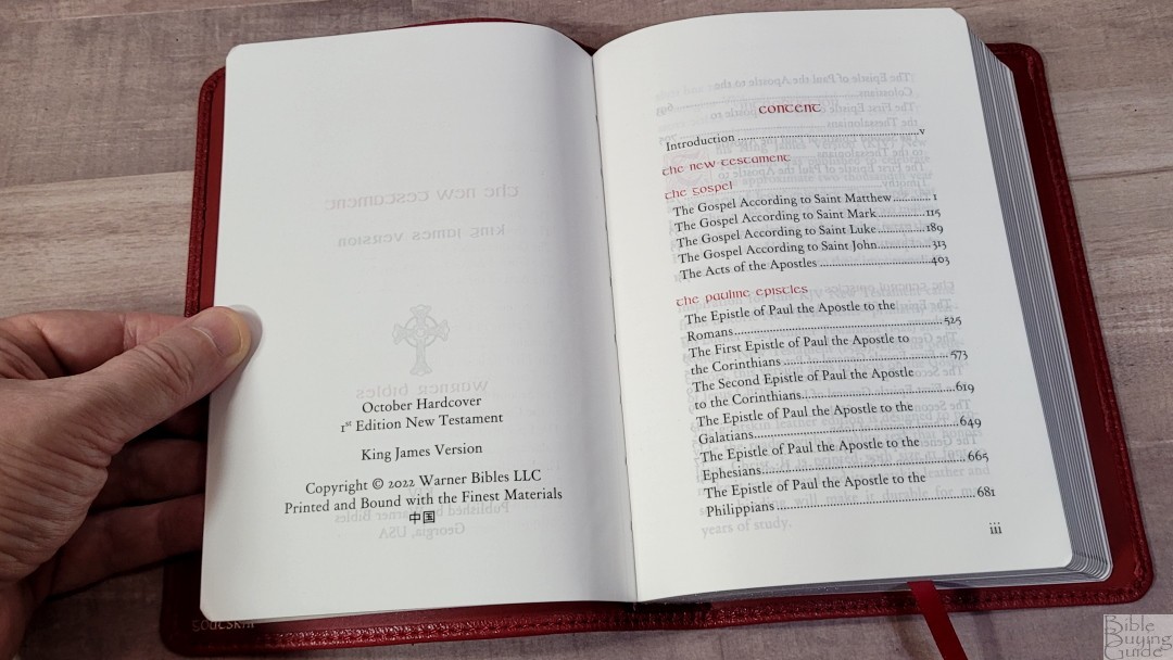
Table of Contents
Video Review
Binding
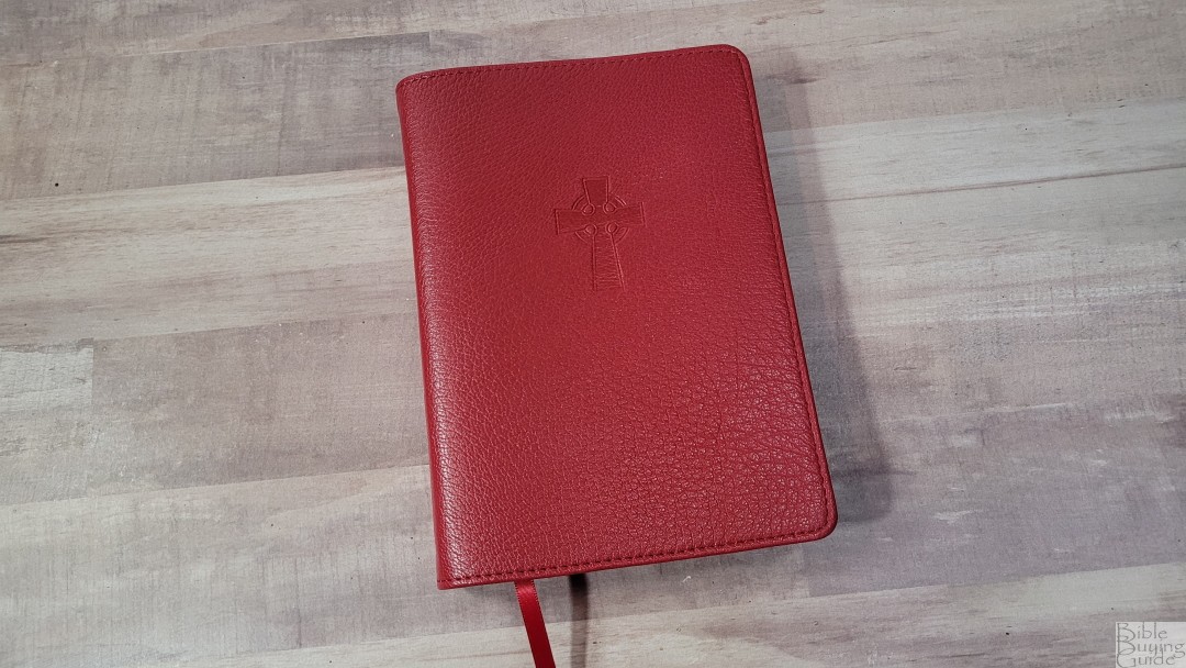
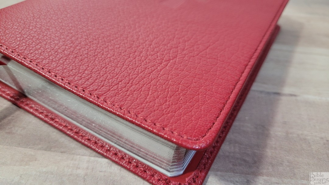
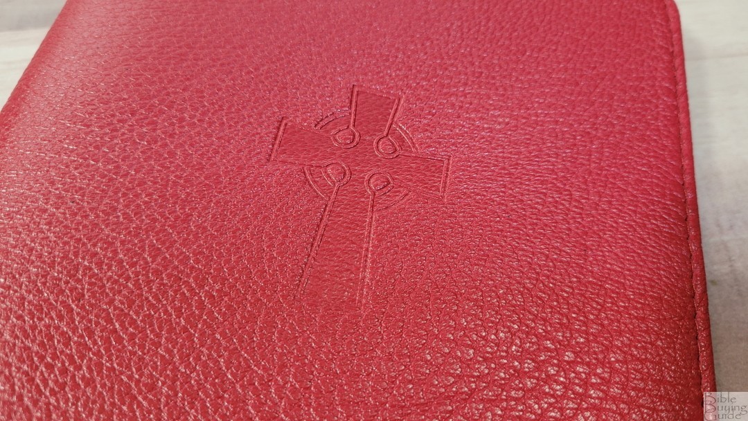
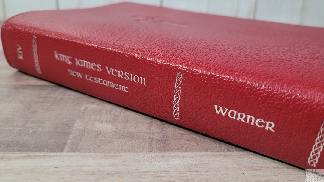
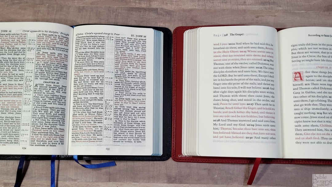
The cover is top-grain goatskin in burgundy. The color is solid with no variation. I love this color. This is some of the softest goatskin leather that I’ve seen. It has a raised pebbly grain. It has perimeter stitching. The front has a debossed Celtic cross that looks elegant and interesting. All the text on the spine is printed in silver. The Spine has the title and the publisher’s name printed so it’s upright when lying on its back, KJV printed upright when standing, and three designs as spine indications.
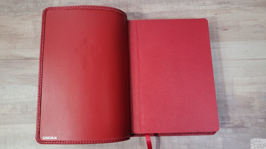
The liner is also goatskin. It’s smooth, so it doesn’t have a grain. The edge-lined tab is stiff at first. It wanted to close up to around page 95. The text block is sewn.

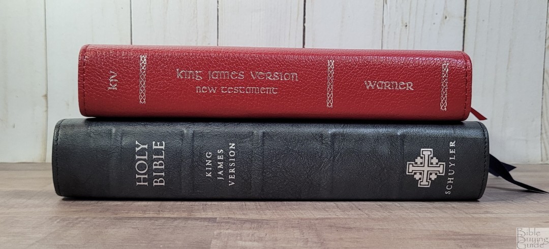
It includes one 1/4″ red ribbon. It’s just long enough to pull to the corner to open. The overall size is 5 1/4 x 7 5/8 x 1 1/4″. It weighs 1 lb, 2.7 oz.
Paper

The paper is 40gsm. It has a slight cream tint that’s great for reading. The texture is slightly rough, making it easy to grab and turn. It has no glare under direct light. I’m not sure what type of paper it is, but it looks and feels like premium paper. It does have slightly more show-though than I’d like for its thickness, but it only stands out in certain lighting. The page edges are silver.
Typography and Layout
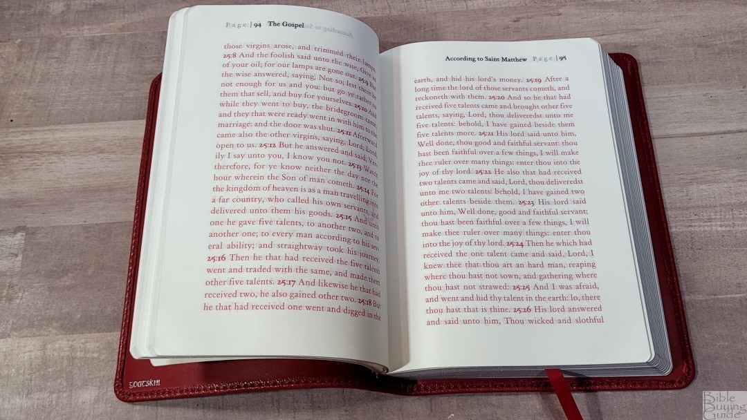
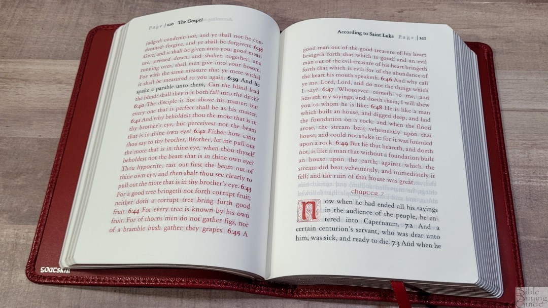
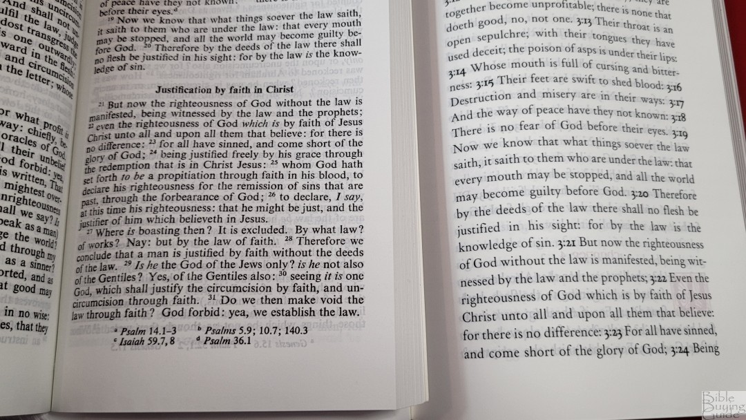
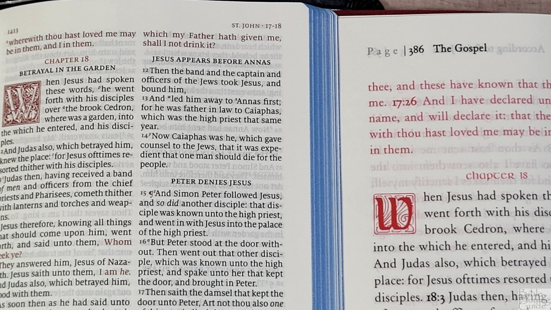
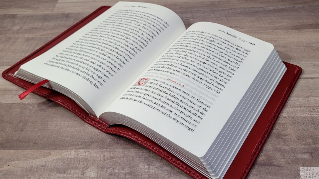
The KJV text is presented in a single-column paragraph layout. It does not include other layout features, so all poetry, letters, quotes, etc., are in paragraphs. Rather than short paragraphs, each chapter is one paragraph. There are no other paragraph breaks or markers within the text. The header text spans both sides of the page. The left page shows the word Page in fainted text, a divider, the page number in bold, and the first part of the description in bold. The right page contains the rest of the description and the page number matches the left page. The margins are extra wide at 3/4″ on both sides, bringing the text out onto the flat part of the page. Books start on a new page and are always on the right.

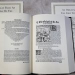
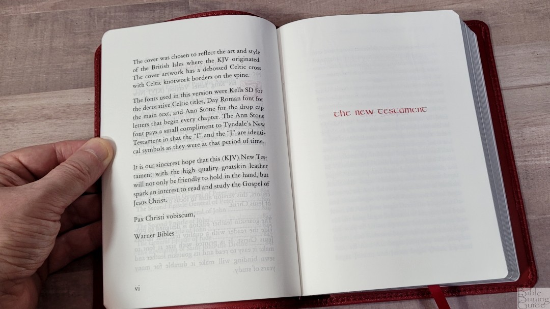
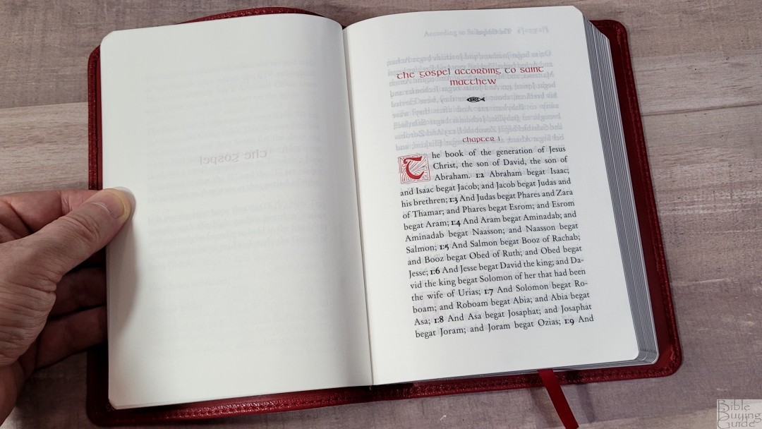
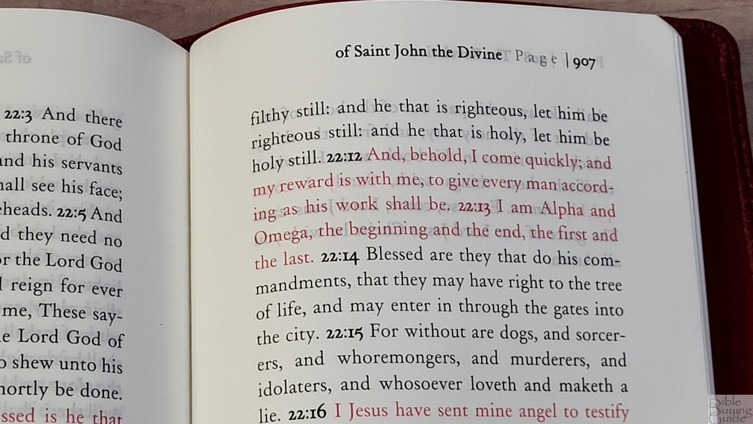
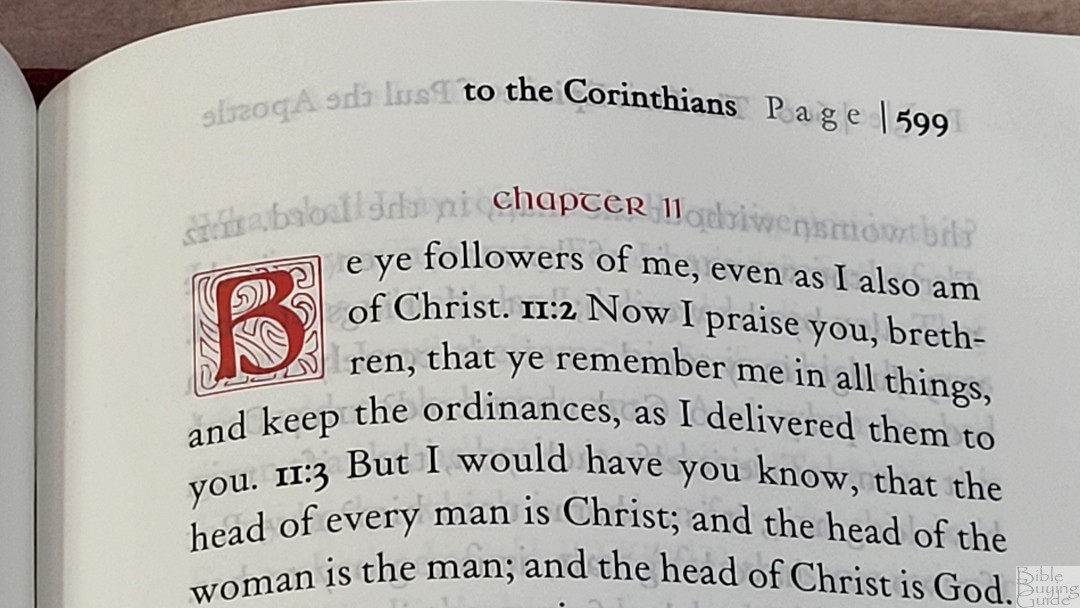
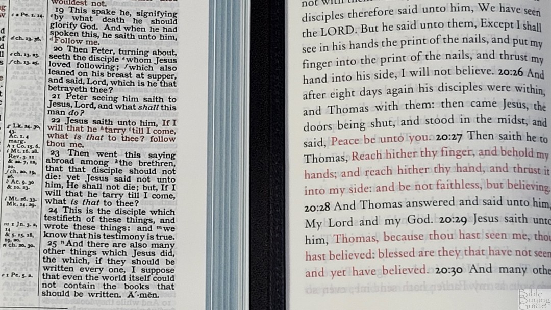
The typeface is 11-point with lower-case letters taking about half the height of the upper-case letters. This is a red-letter edition. The black is dark. The red is about a medium shade of red. Both are highly consistent throughout. The main text uses the Day Roman typeface. Kells SD was used for the decorative book and chapter titles. They’re printed in red and have a Celtic look and feel.
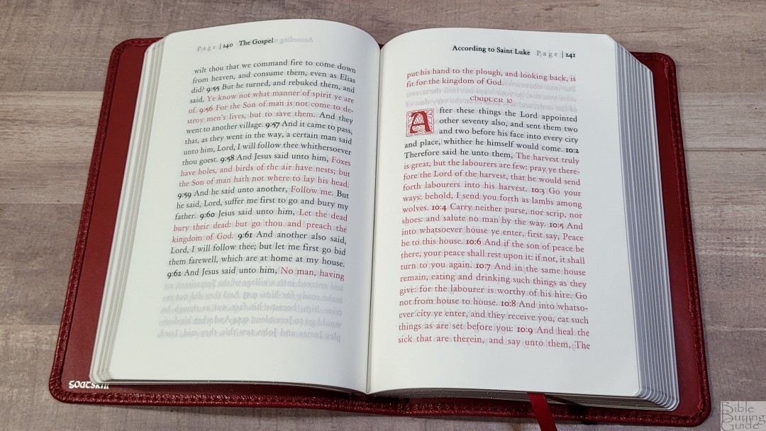
On average, it has 8-9 words per line with a lot of space between the words and the lines. The text never feels cramped or crowded. It’s more likely to have extra space than not enough. I’m not sure if it was line-matched on purpose, but most lines do match on both sides of the page. The first page of a book sometimes doesn’t line up. I do find the text on the other side of the page slightly distracting.
Drop Caps and Verse Numbers
The verse numbers in the text are the same size as the text. They’re bold and they also include the chapter numbers. I expected to not like this, but I was able to ignore them when reading and I found them helpful when preaching. There have been times in other Bibles when I’ve read the wrong verse and adding the chapter numbers made it easy to find the right verse every time. I wouldn’t mind if they were a little smaller, but that’s me being picky.
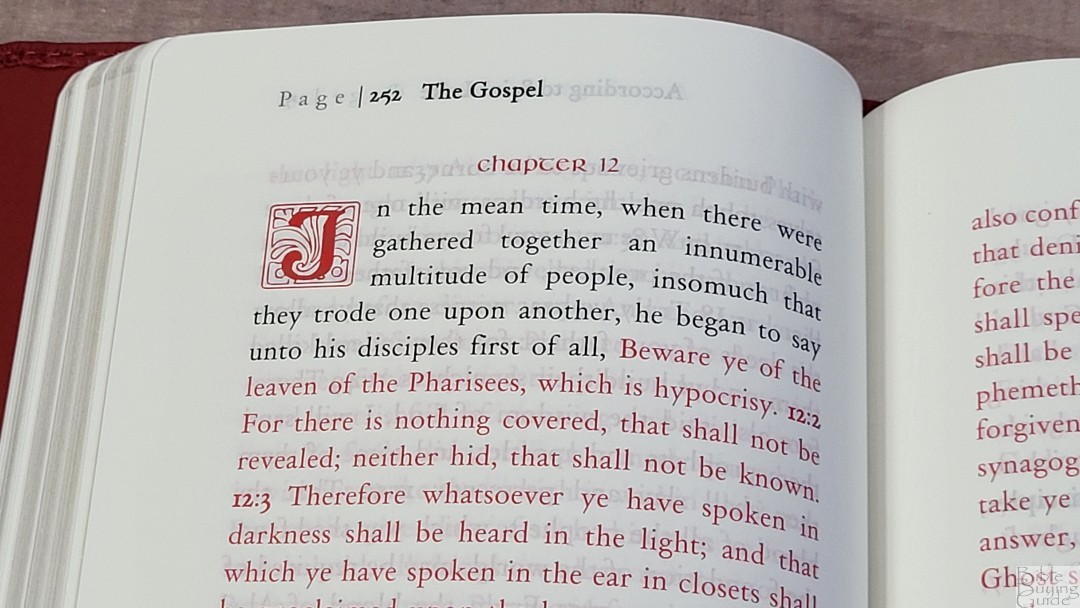
Decorative drop caps are created with the Ann Stone typeface. The decorative drop caps take three lines. This looks and feels natural to me. The I and the J look the same. This matches Tyndale, which I can appreciate, but I’d prefer they look unique, but they do look great. The letter itself is dark so it’s easy to see within the design.
Large Paragraphs
A few pages don’t print anything on the last line. Instead, the text starts on the next page. This leaves the pages slightly imbalanced, but it’s easy to ignore in most cases. Sometimes the chapter and verse number appear at the end of a line and the text starts on the next page. For example, in Ephesians, the text is on the other side of the page but doesn’t show the chapter and verse number because it was on the previous page, which left the last line blank. I consider these minor issues that won’t keep me from using it, but I wanted to mention them in case it matters to you.
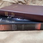
Comparisons
Here’s how the Warner Bibles KJV New Testament compares to a few Bibles that are similar in size and build. Two are full reference Bibles in double-column layouts in goatskin while the other is the only other large print KJV single-column paragraph New Testament that I’m aware of.
TBS KJV New Testament Large Print Paragraphed Edition
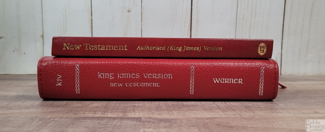
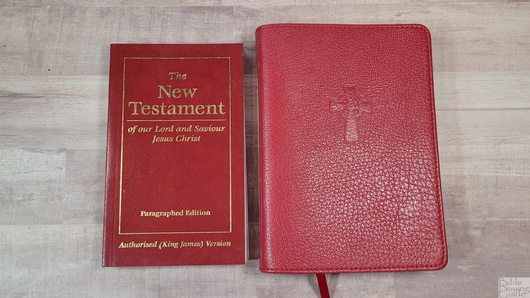
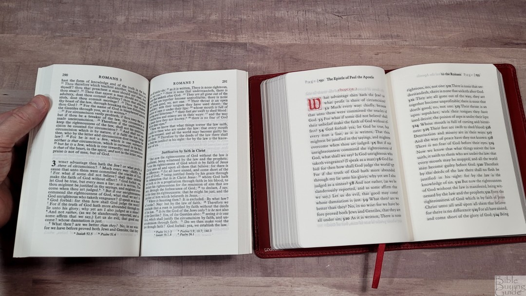
The TBS KJV New Testament Large Print Paragraphed Edition is a paperback edition with a sewn binding. It’s a lot smaller and has a 10.5, black-letter text. It’s also a single-column paragraph edition with lots of paragraphs and includes section headings and a few references. The text is denser and darker, and the paper is thinner but more opaque.
Cambridge Cameo


The Cambridge Cameo has a similar footprint but it’s a touch thicker. The Cameo’s cover is thicker, stiffer, and doesn’t have as much grain. Its tab isn’t as stiff, so it stays open better. Even though its paper is 28GSM, it seems to be more opaque. It isn’t as easy to turn, though. The print is darker for both red and black letters, but much smaller and compact.
Schuyler Personal Size Canterbury


The text block for the Schuyler Personal Size Canterbury is the same height but it’s 1/4″ more narrow. It looks larger because of the yapp. Its calfskin leather is a lot thicker and it’s smoother and the tab isn’t as stiff. The red letter is slightly darker in the PSC, but the black is about the same darkness. Both have a clean and readable text, but the PSC’s text is a lot smaller. The 28GSM paper in the PSC is whiter and has slightly less show-through.
Conclusion
The Warner Bibles KJV New Testament is an elegant KJV New Testament. I found the size to be perfect for carry and the 11-point font comfortable to read. The materials and construction look and feel high quality. I wouldn’t mind if the edge-lined tab wasn’t as stiff, the paper was a touch more opaque for 40GSM, and the text had paragraph breaks. Even with these minor issues, I find this NT a joy to use. If you’re interested in a premium KJV New Testament, the Warner Bibles KJV New Testament is a great choice.
_________________________________________________________
This Bible is available at Warner Bibles website
_________________________________________________________
Warner Bibles provided this Bible in exchange for an honest review. I was not required to give a positive review, only an honest one. All opinions are my own.


p iii “content” ?
Just on the strength of this review, I *had* to get one of these for myself! It turned up today.
It’s a really rather charming little Bible and I love it. The review says everything better than I might manage myself, so the most relevant bit is probably that my copy is absolutely consistent with the example shown and described here. The cover is incredibly soft and I was quite taken aback when I first held it. The colour is also nice and makes a pleasant change to the almost inevitable black of leather covers; it’s a good match for my Allan 52 which seems to be a practically identical shade.
The single-column big font layout makes it very approachable. While I’m also a bit “I’d kinda like paragraphs” too, I like the fancy chapter-opening letters enough that if it was a choice of one or the other (which it may have come down to) I’d rather have the fancy letters! And though my first impression of the big bold chapter:verse numbering was “they’re a bit bold” it actually works well and isn’t intrusive, as you say; on the contrary, it quite effectively breaks up what might otherwise be ye olde wall o’ text. It’s very easy reading for late-in-the-day tired eyes and is highly legible even in low light.
I thought the Celtic cross and font were a nice touch, too. Maybe it’s just me being a Northumbrian, maybe it just makes it seem friendlier than e.g. Cambridge (don’t get me wrong, I love them, but they have the scholarly and serious business aspects turned up to 11) and makes it its own thing without seeming at all overdone.