


Thomas Nelson has continued to replace their older editions with their new Comfort Print typeface. My latest edition is the Giant Print KJV Reference Bible. This is a large print KJV along the lines of the Longprimer or Turquoise, but with inexpensive materials making it a great choice for the low-end market. I’m reviewing the imitation leather edition, ISBN: 9780785215288, made in China.
_________________________________________________________
This book is available at (includes some affiliate links)

and many local Bible bookstores
_________________________________________________________
This Bible was purchased for review.
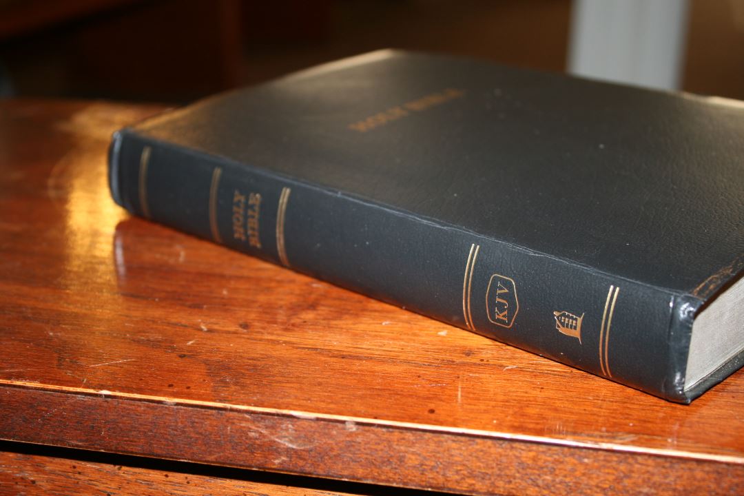
Cover
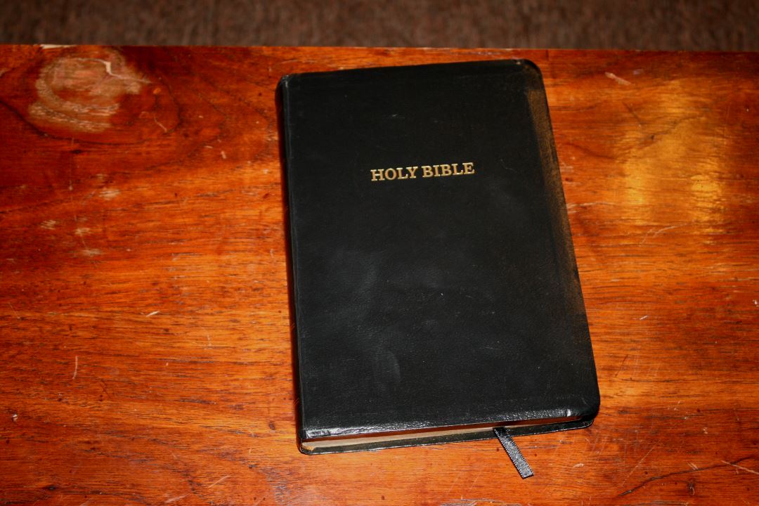
This edition is imitation leather. I chose it because the price at Christmas was too crazy to pass up. It doesn’t really feel like leather but for an inexpensive edition for carry it’s not bad. It isn’t the type of cover I’d want for everyday use, but it’s priced right for a Bible to carry on a trip or use until you can get a better cover.
The text block is sewn. It lies flat anywhere out of the box but it will need to be broken in before it will lie completely flat in Genesis. It’s still usable in Genesis out of the box. The overall size is 9.6 x 6.5 x 1.1″. It includes one ribbon.

Paper

The paper is maybe around 30gsm (that’s just a guess though) and is decently opaque. A touch more opacity would make it easier to read under direct lighting. It doesn’t have glare. It has a slight red tint that’s more prominent on my pulpit. I don’t mind it much but I do prefer white or slightly cream. The paper has a rough texture that I found easy to separate and turn. The gold gilt is the spray-on type and has a dull finish.
One thing that impressed me was page-curl was almost non-existent when sitting next to a Bible with 36gsm paper that had bad page-curl. In fact, I changed from a more expensive Bible with page-curl to this one so I could finish preaching without my pages curling.
Typography
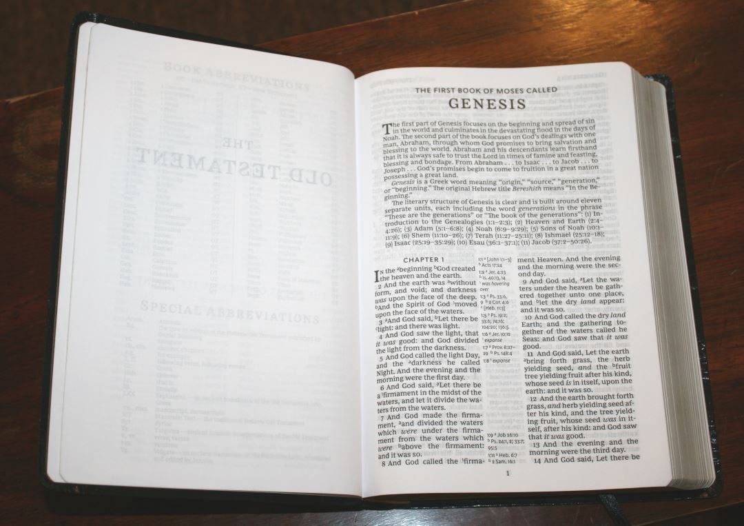
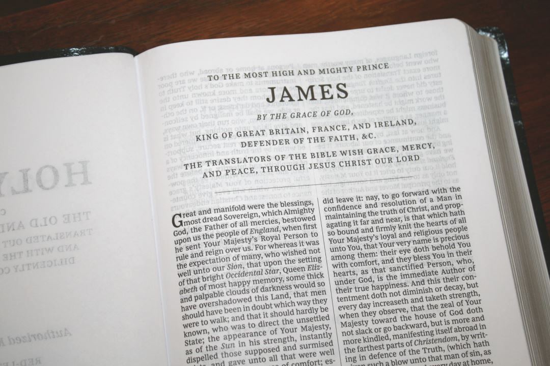
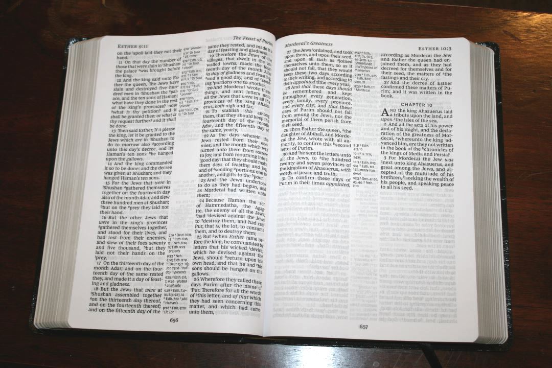
The text is presented in verse-by-verse format with center column references. It isn’t ideal for reading but it works well for preaching. For reading, I recommend a single column paragraph edition (unfortunately there isn’t one in Comfort Print). The header includes the book name, chapter number, and verse number in the outer margin and a page summary in the inner margin. The footer contains the page number in the center.
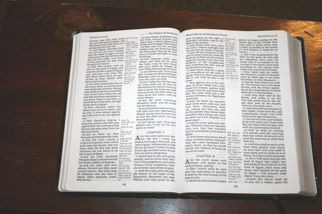
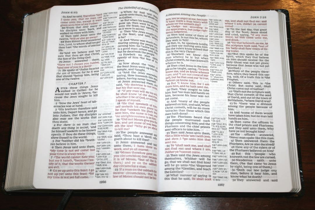
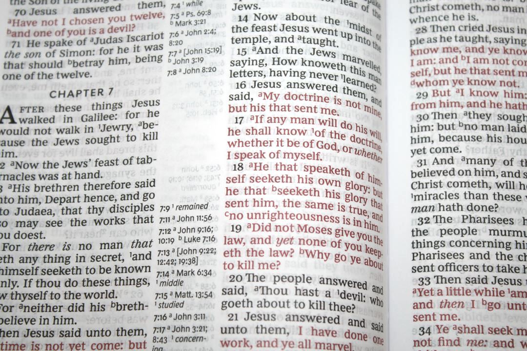
The typeface is the Comfort Print designed by 2K/Denmark. This font is a joy to read. It’s printed in 12.2-point in red letter. The red varies slightly from medium to dark red. The black is more consistent and is dark (the kind of dark that I like – not quite bold, but not medium either). It doesn’t have self-pronouncing text but it does have footnote and reference keys. The keys are small enough to ignore easily but large enough to see clearly. It uses italics for supplied words.

It has around 32 characters per line with around 5-6 words per line. Rather than using the chapter number as the drop-cap, the drop-caps are the capital letter of the first word of the chapter. Verse numbers are indented to make them stand out- making this a better choice for preaching than reading. Books start on a new page, leaving a little space for notes.
References and Footnotes
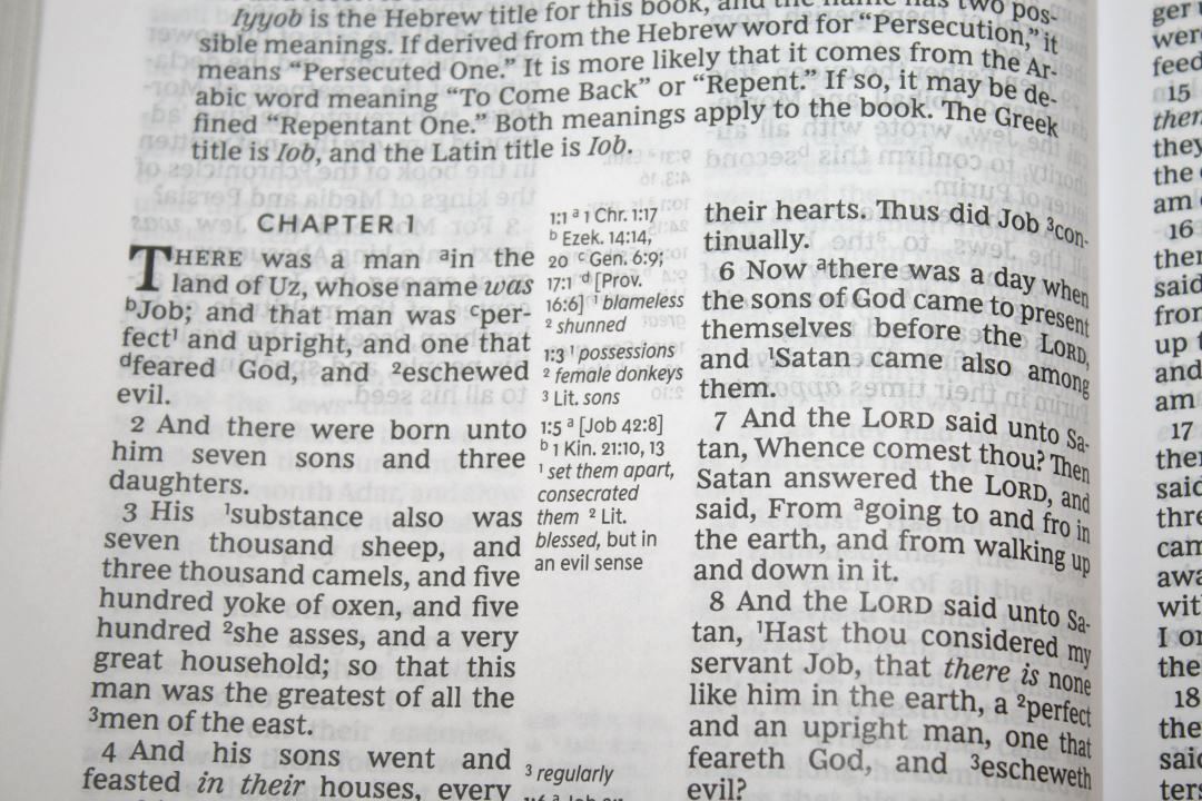
References and footnotes are placed in the center column. Those for the left column are at the top and those for the right column are at the bottom- creating a gap in the center for most pages. They’re labeled with the chapter and verse number followed by the letter or number they’re keyed with. They’re larger than most references, making them easy to read.
Here are some example references to help you compare:
- Genesis 1:1 – Jn 1:1-3, Ac 17:24
- Deuteronomy 6:4 – Dt 4:35, Mk 12:29, Jn 17:3, 1 Cor 8:4, 6
- Isaiah 9:6 – Lk 2:11, Jn 3:16, Mt 28:18, Jd 13:18, Titus 2:13, Eph 2:14
- Matthew 17:20 – Lk 17:6
- Mark 11:23 – Mt 17:20, 21:21, Lk 17:6
- Mark 12:29 – Dt 6:4, 5, Is 44:8, 45:22, 46:9, 1 Cor 8:6
- John 1:1 – 1 Jn 1:1, Rev 19:13, Jn 17:5, 1 Jn 5:20
- John 2:19 – Mt 26:61, 27:40
- Acts 2:38 – Lk 24:47
- 1 John 1:1 – Jn 1:1, 14, 2 Pet 1:16, Lk 24:39, Jn 1:1, 4, 14
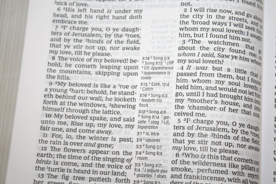
The footnotes are not those from the translators. These are the Thomas Nelson footnotes that provide updated words for archaic words or words that have changed meaning (this is essential as many words have changed the meaning and a lot of readers don’t realize this. I’d like to see all KJV’s provide definitions in the text). They also provide definitions of some Greek or Hebrew words such as weights and measures.
Book Introductions
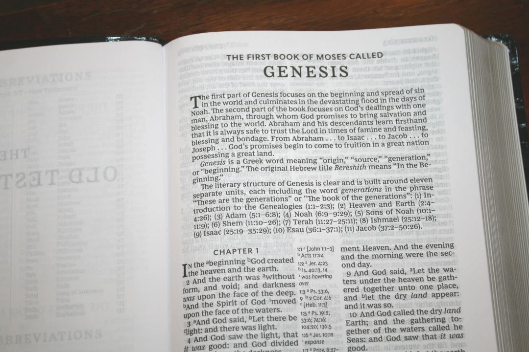
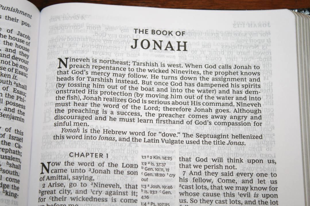
Each book has a short introduction (about a half page). They don’t all have the same information, but most give a basic overview of the book, discuss the meaning of the book’s name in its original language, talk about the literary style, discuss what’s unique about the book, etc. Some provide more detail than others in specific areas. Some provide an outline. They’re written well and give some good basic information to help with understanding the context and setting.
Miracles and Parables of Jesus

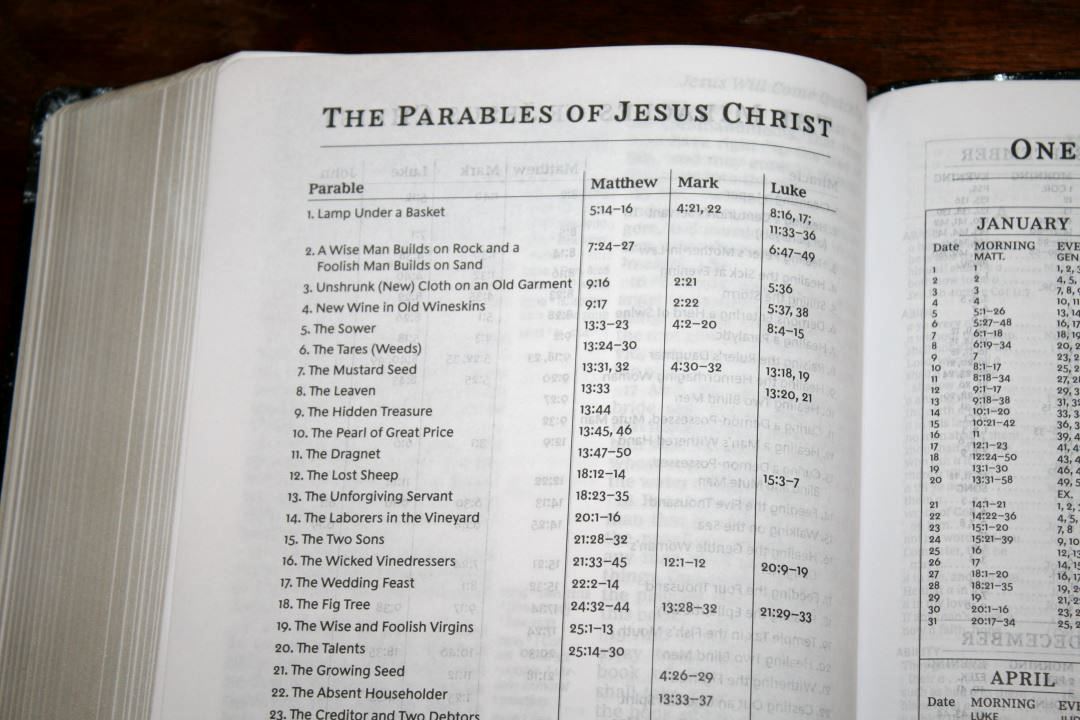
These are a set of one-page tables that lists 37 miracles and 39 parables of Jesus. It provides a description of the miracle and shows the references within each book the miracle is discussed.
Reading Plans
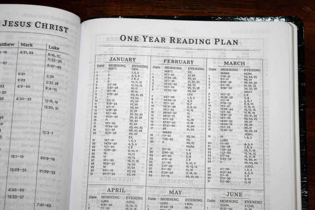
This is a one-year reading plan that gives you two readings per day for 365 days. The readings are split into morning and evening with one being from the OT and one being from the NT. It provides the month, day, morning reading, and evening reading.
Concordance

The concordance is 68 pages with three columns per page. It’s a decent concordance for looking up something on the go. For serious study or sermon prep you’ll need a more complete concordance, but for basic study this one will be helpful. Here are a few sample entries when the number of references to help you compare:
- Christ – 15
- Christian – 3
- Faith – 94
- Faithful – 38
- Faithfully – 1
- Faithfulness – 4
- Faithless – 3
- God – 54
- Godhead – 3
- Godliness – 8
- Godly – 9
- Praise(n) – 30
- Praise(v) – 12
- Pray – 36
- Prayer – 34
Maps
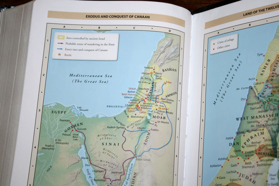
There are 7 full-color maps printed on 8 thick glossy pages. It doesn’t have an index but they are annotated well. I love the colors. They’re bright earth-tones. They include topography, distance, routes, borders, possible locations of lost places, battles, elevation, cities, and locations for the events of Jesus’ ministry.
Maps include:
- World of the Patriarchs
- Exodus and Conquest of Canaan
- Land of the Twelve Tribes
- Kingdom of David and Solomon
- Jesus’ Ministry
- Paul’s Missionary Journeys
- Jerusalem in the Time of Jesus
Final Thoughts on the KJV Reference Bible
Thomas Nelson’s Giant Print KJV Reference Bible is an excellent low-end edition of the KJV. I loved reading and preaching from Comfort Print typeface. The font is large, dark, and crisp. The pages are easy to read from and turn. More opacity would help a little though. It has a decent amount of references and other study tools. I do recommend a better cover if it’s an option, but even the imitation leather is worth its money and it’s a great choice for those times that you just need a Bible or you need something to take with you somewhere that you don’t want to take an expensive edition.
I like this Bible enough to preach from it. If I wear it out I’ll consider buying one with a better cover. I recommend the Thomas Nelson Giant Print KJV Reference Bible to anyone interested in an inexpensive large/giant print reference KJV.
_________________________________________________________
This book is available at (includes some affiliate links)
and many local Bible bookstores
_________________________________________________________
This Bible was purchased for review.
Photography by hannah C brown