
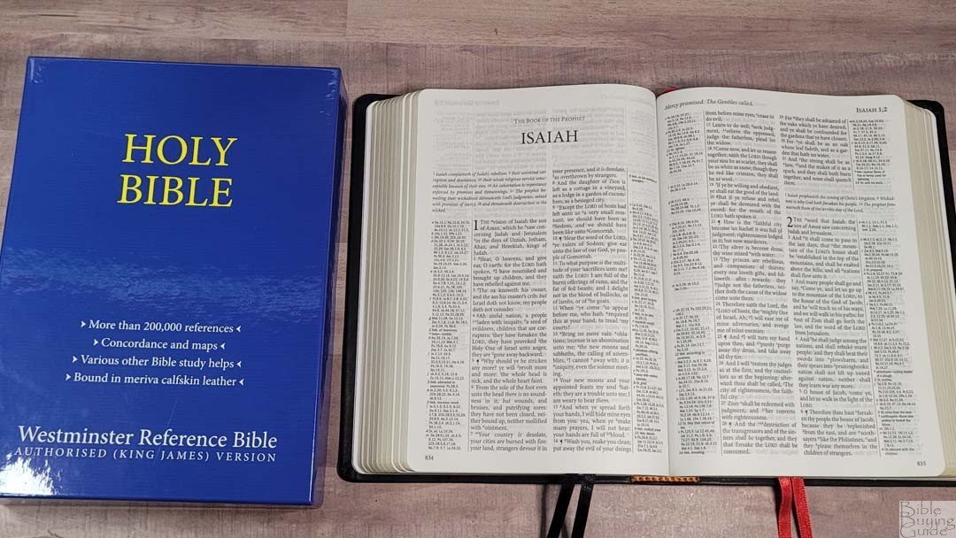

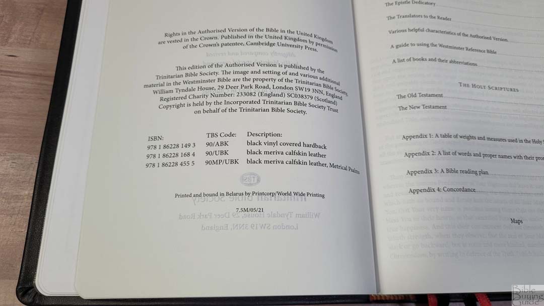
Releasing in 2012, the Westminster Reference Bible was the Trinitarian Bible Society’s replacement for their version of the Concord. It expanded on the Concord’s references to provide 200,000 contextual cross-references, making it one the best reference Bibles on the market. I reviewed the original soon after it was released. It was previously made by Royal Jongbloed but has now moved to PrintCorp to reduce production costs. The Westminster is available in hardcover and calfskin. I’m reviewing model 90/UBK, black calfskin ISBN: 9781862281684, made in Belarus by PrintCorp.
Trinitarian Bible Society provided this Bible in exchange for an honest review. I was not required to give a positive review. My opinions are my own.
_______________________________________
Buy from TBS
_______________________________________
Table of Contents
- Video Review
- Binding
- Paper
- Typography and Layout
- Cross-References and Footnotes
- Front Matter
- Back Matter
- Concordance
- Bible Atlas
- Comparisons
- Conclusion
Video Review

Binding

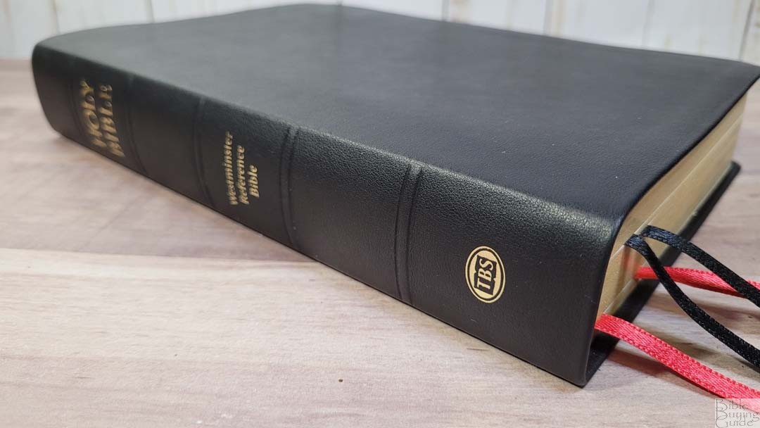

The cover is black Meriva calfskin. It’s thick and feels soft. It’s smooth with a touch of grain that gives it a little bit of texture. It has no printing on the front and doesn’t include perimeter stitching. The cover folds around the edges. The spine has gold printing and five non-raised bands to indicate spine ribs.

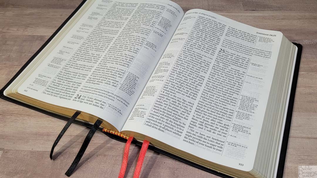
The liner paste-down vinyl. This makes the cover stiff, which makes it easy to handle and hold open in one hand. The binding is sewn and has no trouble lying open in Genesis 1 out of the box.
It includes four ribbon markers: two black and two red. The overall size is 6 1/4 x 8 3/4 x 1 1/2” and it weighs 2 lbs 4 oz.
Paper

The paper is around 32gsm. It’s white in color and is highly opaque. The show-through isn’t noticeable where the text is printed. This paper has no glare under any light. I found the pages easy to separate and turn with one hand.

In the back are 24 blank pages for notes, outlines, memory verses, events, studies, lists, etc.
Typography and Layout
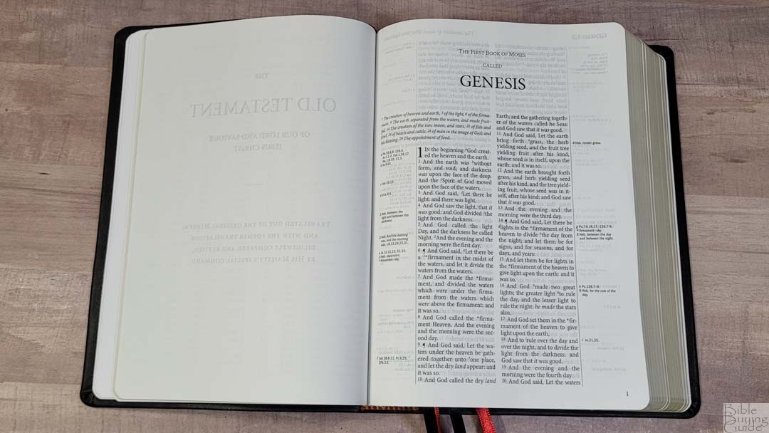
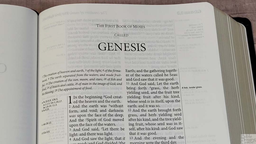
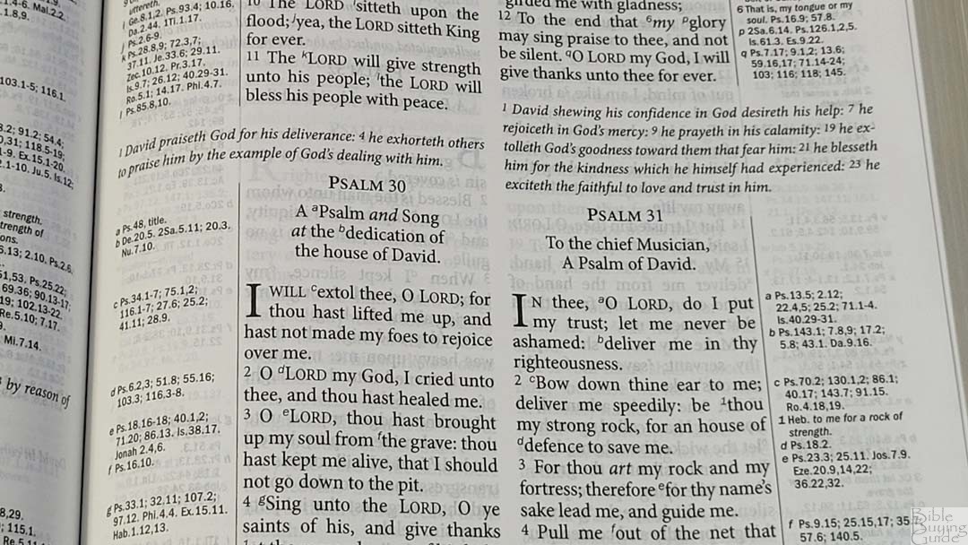
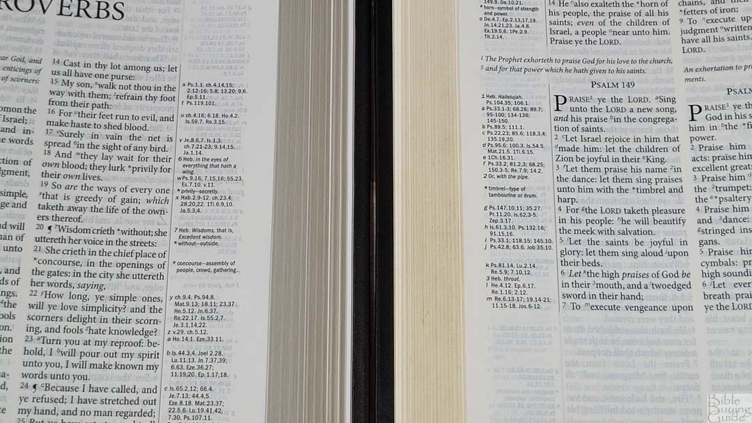
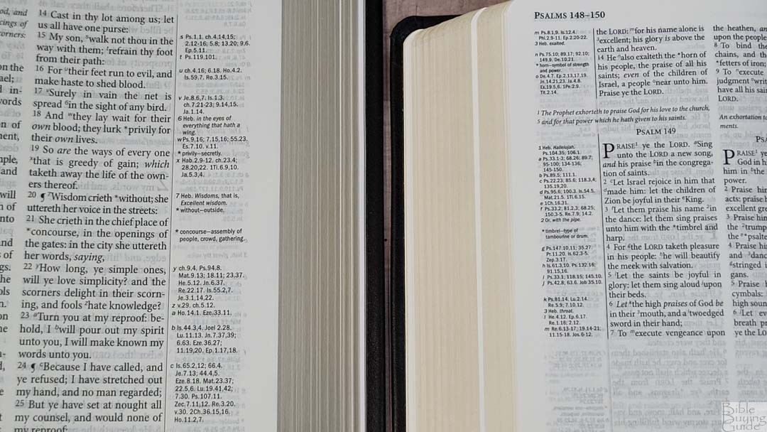
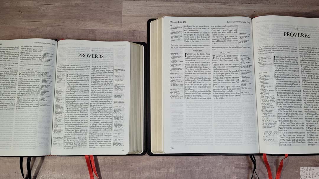
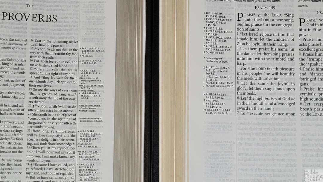
The KJV text is presented in a double-column verse-by-verse layout with no formatting for poetry, letters, or lists. Cross-references are in the margins next to their verses, creating four columns per page. The header shows the book name and chapter numbers in the outer margin and a page summary in the inner margin. The footer has the page number in the outer margin. Chapter summaries are placed across the column of text and its references. Books start on the page the previous book ends.

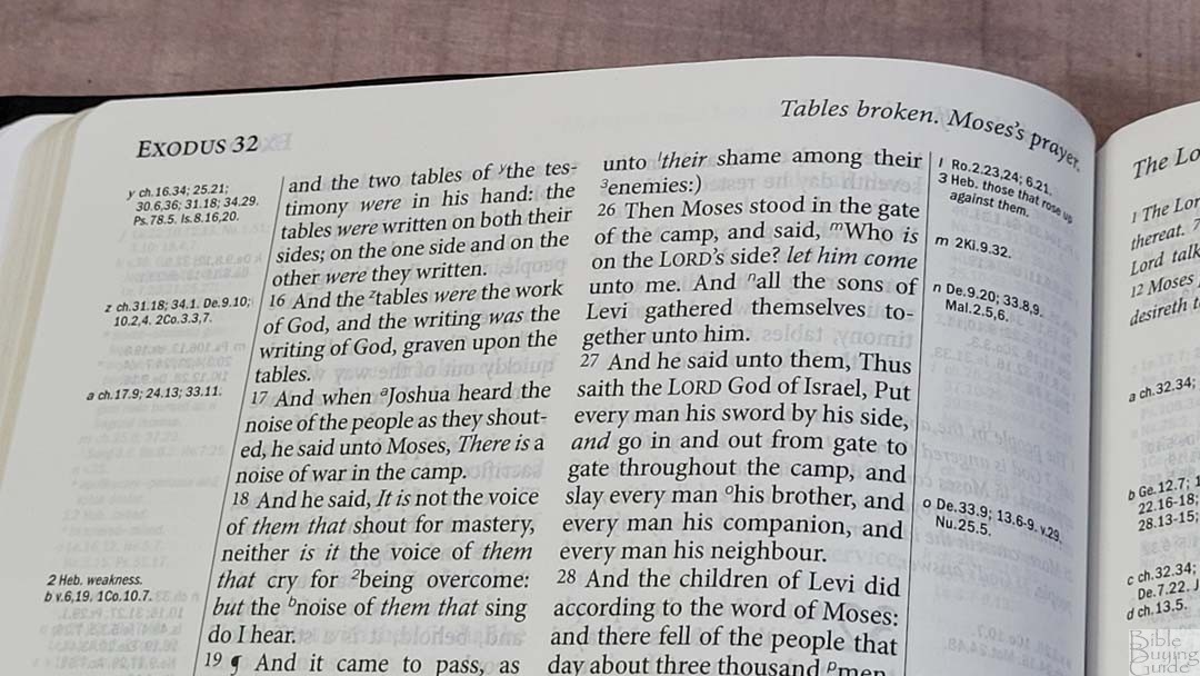
The font is 9.6 black letter with lots of space between the lines so the text never feels cramped. The font design is thin and tall, making it about a medium in darkness. It has around 5-7 words per line. There’s enough inner margin that the references don’t get lost in the gutter. It’s printed with line matching, meaning the text is printed in the same location on both sides of the page to improve readability. The text on the other side of the page is slightly noticeable, but it doesn’t affect readability.
The text includes italics for supplied words. It does not include self-pronouncing marks within the text. Fortunately, a pronunciation guide is placed in the back. I like this approach because it improves readability and the information is still available. The text also includes cross-reference and footnote keys, and asterisks to show there’s an updated word in the margin.
Marginal Wordlist
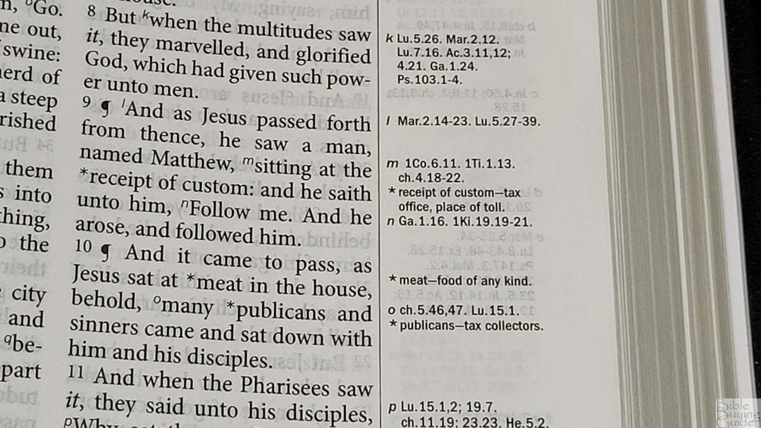
Rather than placing that glossary in the back of words that are no longer in use or have changed meaning, the Westminster Reference Bible places updated words in the margin on the page where the word appears. They are keyed to the text with an asterisk and the original word and a short definition. This makes them more prominent and more usable than placing them in the back.
Cross-References and Footnotes
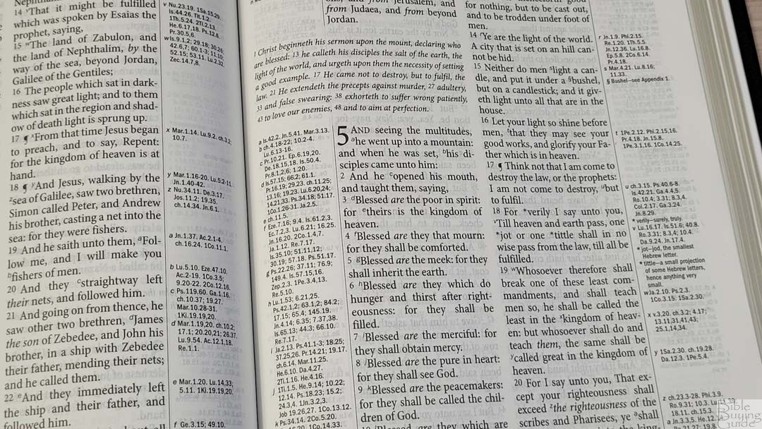
What sets the Westminster Reference Bible apart from all the others is its 200,000 cross-references. Most are from John Brown of Haddington’s The Self Interpreting Bible. The rest were taken from the Cambridge Concord. They’re placed in the margins as close as possible to the verses they correspond to and are keyed to the text with letters. The cross-references are contextual and include larger passages rather than just portions of verses. This means references start at the beginning of the context, so you’ll need to look at the beginning of a passage rather than just the verses. This works well for allowing Scripture to interpret Scripture. This makes the Westminster Reference Bible one of the best Bibles for study and sermon prep.
Cross-Reference Examples
- Genesis 1:1 – Ps 33:6, 9; 136:5; Jn 1:1-3; Col 1:16, 17; He 1:8-10; 11:3
- Deuteronomy 6:4 – 1 Ch 8:6; Mar 12:29; Je 10:6-11; Is 42:8; 45:22; 1 Jn 5:20; Jn 17:3; 1 Co 8:4, 6
- Isaiah 9:6 – ch 7:14; 4:2; Lu 2:11; Mat 15:24; Ro 9:5; 15:8; Jn 1:14; 3:16; 4:10; 6:32, 33; 2 Co 9:15; Mat 11:27; 28:18; Eph 1:22; ch 7:14; 63:1; Jer 31:22; Mat 8:27; Pr 30:4; Ju 13:18; Zec 6:13; ch 28:29; Jn 1:18; 17:8; 15:15; Re 3:18; Lu 7:30; Je 23:6; Ps 45:3-6; Jn 1:1, 2; Ro 9:5; Ti 2:13; ch 45:22; 63:1-4; 1 Jn 5:20; He 1:8; 7:25; Pr 8:23-31; He 5:9; 2:13; Jn 6:39-51; 10:28; 11:25; ch 53:10, 11; Ep 2:10; ch 53:5, 12; Je 23:5, 6; Mi 5:1, 2, 5; Ro 5:1, 10; 2 Co 5:19, Ep 2:14; Jn 16:33; 14:27; Phi 4:7; 2 Th 3:16
- Matthew 28:19 – Mk 16:15, 16; Lu 24:47; Is 52:10; Ro 10:18; Ac 2:38; 8:12; 1 Cor 1:13, 10:2; 1 Pe 3:21; Col 1:23, 28; Ac 20:27; 2:42; 1 Co 11:2, 23; De 5:32; 12:32; Ac 2:39
- Mark 12:29 – De 6:4, 5; 10:12; 30:6; Pr 23:26; Mat 22:37; Lu 10:27; 1 Co 13; 1 Ti 1:5
- John 1:1 – Ge 1:1; Ps 2:7; Pr 8:22-31; Col 1:16, 17; Re 1:2, 9; 19:11, 13, 16; 1 Jn 1:1, 2; 5:7; He 1:3; 4:12; ch 3:34; v 14; Lu 1:2, Ac 20:32; 2 Pe 3:5; Pr 8:30, ch 17:5; Zec 13:7; ch 10:30, 33; Phi 2:6; He 1:3, 8-13; 1 Jn 5:7, 20; Ti 2:13; Ro 9:5; Is 9:6
- Acts 2:38 – Mt 3:6, 8; Mk 1:4, 15; cha 3:19; 20:21; 22:16; 1 Jn 1:7; Titus 3:5; Isa 1:18; 55:7; Luke 24:47; Mt 26:28; ver 16-18; 8:15-17; 10:44, 45; 16:6
- Romans 10:9 – Mt 10:32; Lu 12:8; 1 Jn 4:2, 15; v13; Jn 6:69; Ac 8:37; 1 Jn 5:1; 1 Pe 1:21; Mar 16:16
- 1 John 1:1 – Pr 8:23; Mi 5:2; Jn 1:1, 2: Re 1:8; Is 41:4; 44:6; 2 Pe 1:16, 18; Mat 3:16, 17; Lu 24:39; Re 1:2; Jn 1:1, 14; 5:26, ch 5:7; Re 19:13
Footnotes

The translator’s footnotes are placed in the margins next to the verses they correspond to and are keyed to the text with numbers. They include Hebrew and Greek words with explanations, alternate renderings, more literal translations, etc. I prefer them to be included because they are helpful in understanding some of the translation choices.
Front Matter
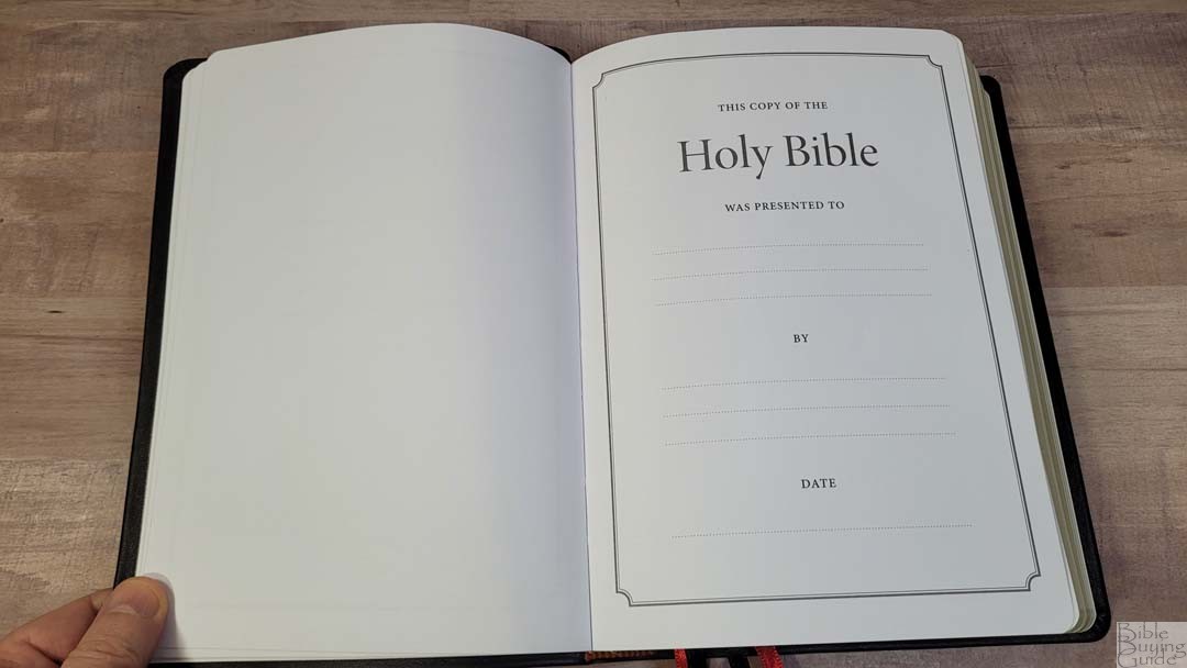

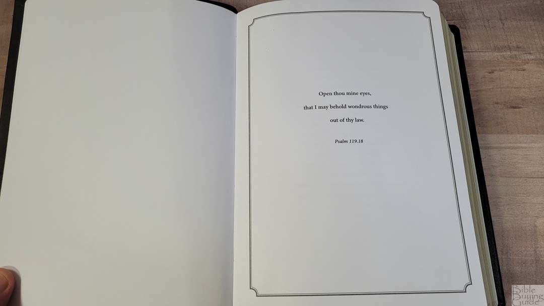
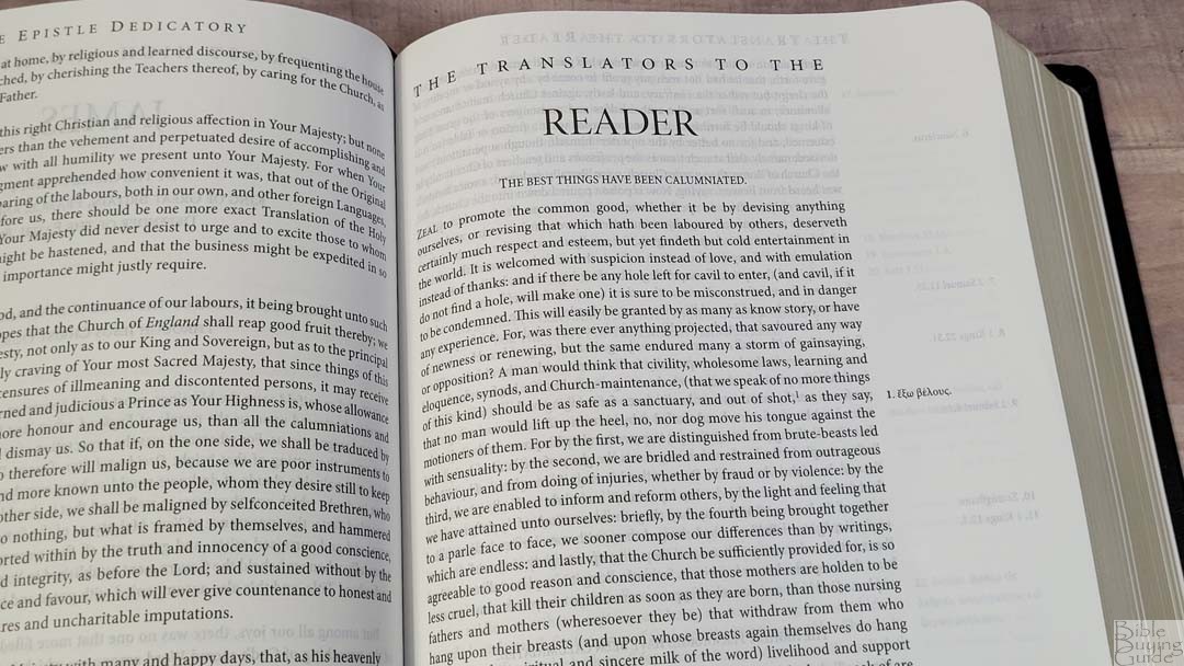
In the front are several thick end sheets with Scriptures and a Presentation page. They’re non-glossy and match the pages for maps in the back, giving the Bible extra structure. The front also has several documents including the Epistle Dedicatory, the Translators to the Reader, characteristics of the Authorized Version, a guide to using the Westminster Reference Bible, and a list of books and their abbreviations. The characteristics and guide provide good information that helps in using and understanding the KJV. I like this because many modern readers don’t understand the KJV’s usage of thee, thou, etc.
Characteristics of the Authorized Version
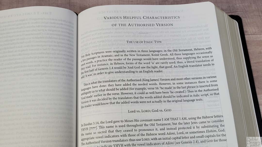
This covers KJV features such as italics, Lord vs. LORD; God vs. GOD, capitalization, OT names in the NT, Thou and Ye (includes thee, thy, and thine), and the pilcrow (paragraph marker). Most of these are explained in detail and give Scripture references as examples.
Guide to Using the Compact Westminster Reference Bible
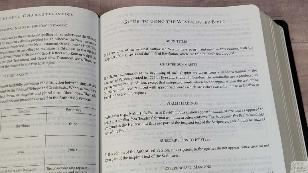
This covers the unique features of the Westminster Reference Bible. It includes book titles, chapter summaries, why psalm headings are included, why subscriptions to the epistles are excluded, references in the margins (most are taken from John Brown’s The Self Interpreting Bible and the rest from the Concord), and further content in the margins (which includes the translator’s footnotes and updated words). It shows a sample page and highlights running page heads, chapter summaries, superscript letters, superscript numbers, asterisks, and superscript section markers, showing how they work and how to use them.
Back Matter
In the back are several tools to help in Bible study and reading.
Tables of Weights and Measures
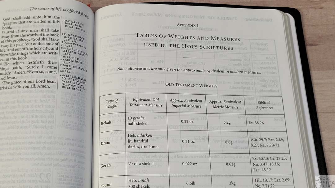
The Tables of Weights and Measures is 5.5 pages. The tables show the type of measure, equivalent Old Testament measure, equivalent New Testament measure, Hebrew and Greek words, approximate equivalent Imperial measure, approximate equivalent metric measure, biblical references, and the time that’s covered. The margins of the Bible include a symbol to tie the text to these tables.
Tables include:
- Old Testament Weights
- Old Testament Lengths
- Old Testament Liquid Measures
- Old Testament Dry Measures
- Old Testament Money
- Old Testament Time
- New Testament Weights
- New Testament Lengths
- New Testament Liquid Measures
- New Testament Dry Measures
- New Testament Money
- New Testament Time
List of Words and Proper Names
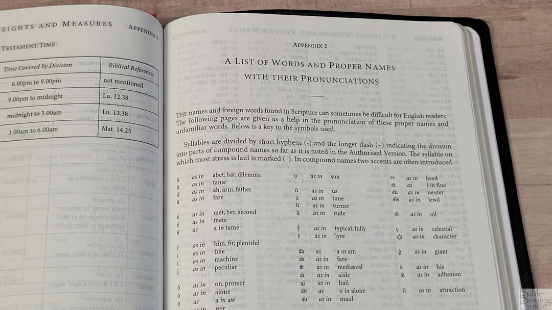
Rather than placing self-pronouncing marks in the text, the Westminster has a 15-page list of words and names with self-pronouncing marks. It shows the syllables and shows how to pronounce consonants, blends, and nouns. It contains every name and foreign word. A chart shows how to pronounce the symbols.
Reading Plan
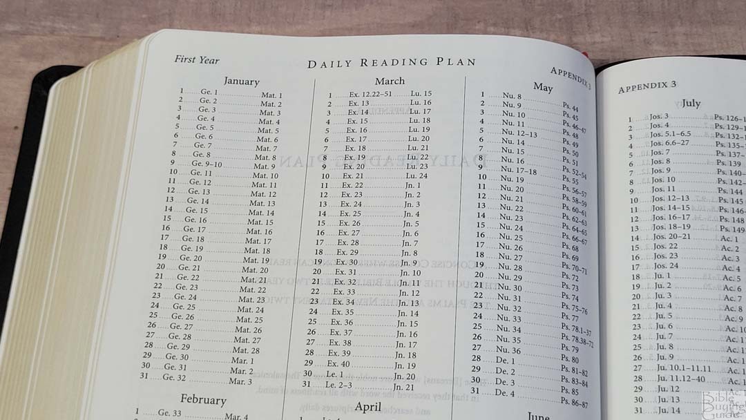
The Westminster Reference Bible prints the M’Cheyne reading plan in the back. This is a two-year plan that goes through the Old Testament once and the New Testament and Psalms twice. The first year starts with Genesis and Matthew, while the second year starts with Ezra and Acts. I’ve used it as a one-year plan with all four daily readings from different places in the Bible.
Concordance
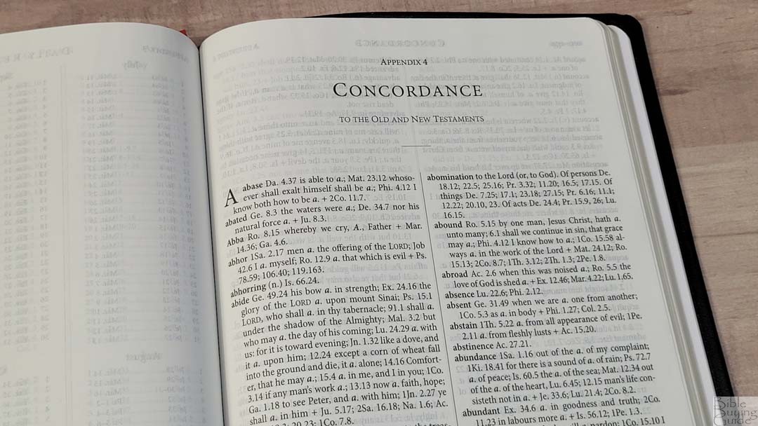
The concordance is 139 pages with 2 columns per page. The references are presented in a paragraph format and are indented to help the keywords stand out. Words with more than one part of speech are marked with their part of speech and have separate entries for each. For example, if a word can be either a noun or a verb, both are included separately and marked with (n) or (v). It has a lot of entries, but I find the paragraph format a touch difficult to use. This format does provide more references, though, so I do consider it worth the difficulty.
Here are a few examples with their number of entries:
- Christ – 36
- Christian – 3
- Faith – 54
- Faithful – 27
- Faithfully – 3
- Faithfulness – 6
- Faithless – 4
- God – 76
- Goddess – 3
- Godhead – 3
- Godliness – 4
- Godly – 2
- God-ward – 3
- Praise (n) – 11
- Praise (v) – 14
- Pray – 45
- Prayer – 22
Bible Atlas
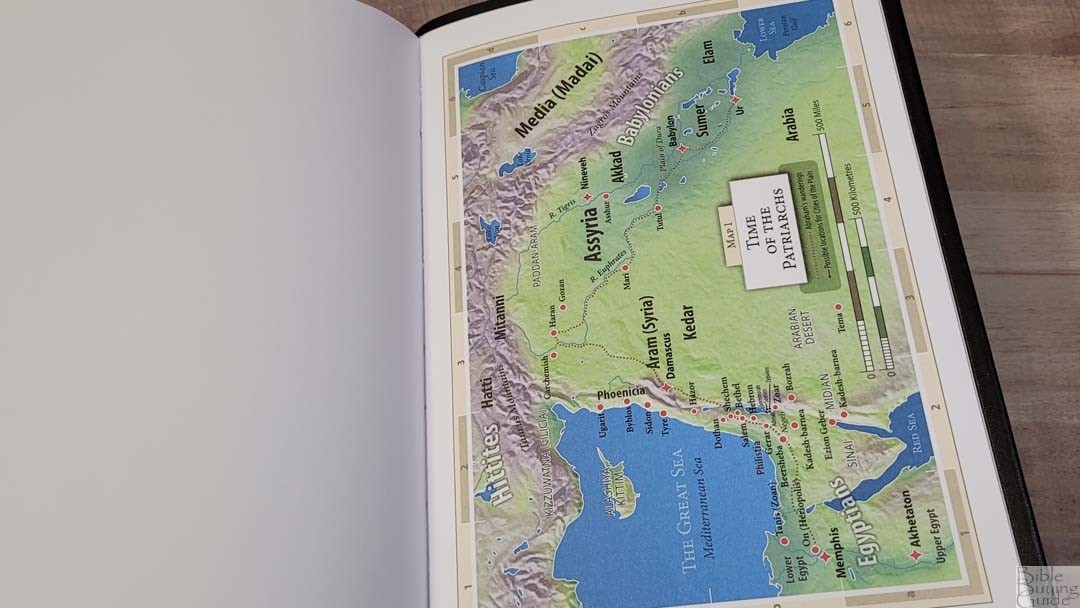
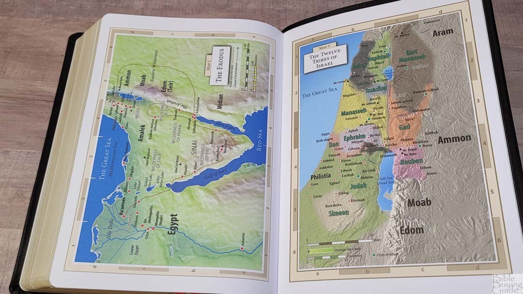
The 8 colorful maps are printed on thick non-glossy paper. The colors are bold so all the locations stand out. It does not include an index but the maps are annotated well and the names are printed very large. Maps include topography, distance, water, routes, capitals, borders, Scripture references, commodities, trade, subjection, royal residence, fortresses, events, dates, etc.
Maps include:
- Time of the Patriarchs
- The Exodus
- The Twelve Tribes of Israel
- Undivided Kingdom
- Kingdoms of Israel and Judah
- The Persian Empire
- Holy Land in the Time of Christ
- Paul’s Missionary Journeys
Comparisons
Here’s how the Westminster Reference Bible compares to several other Bibles from TBS.
Original Westminster Reference Bible
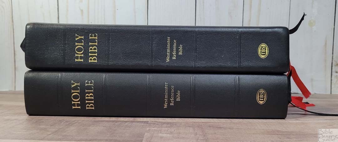


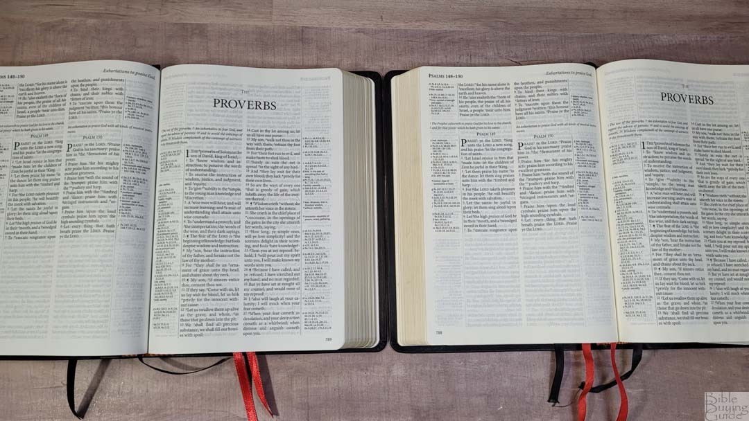
The original Westminster Reference Bible was printed in the Netherlands by Royal Jongbloed. The leather looks to be the same. The paste-down liner looks to be reinforced, which doesn’t seem to be the case with the current model. The paper in the original has a slight cream tint, while the new model has white paper. The maps in the new model have bolder colors and a different font for the location names. I prefer the new maps and the original paper.
Compact Westminster Reference Bible
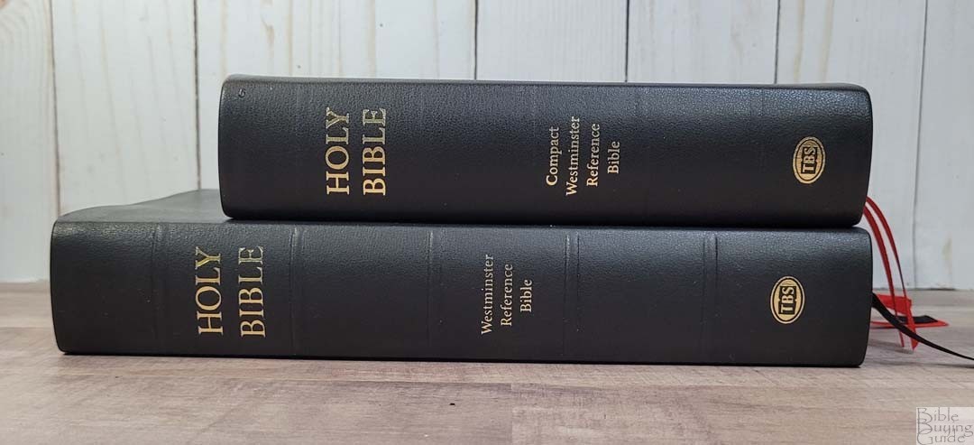


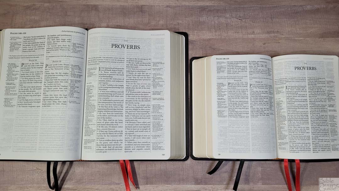
The Compact Westminster Reference Bible is also made by Worldwide Print Corp in Belarus. It’s a lot smaller. The paper might be slightly thicker. All the other materials and construction seem to be the same. This edition does not include a concordance.
Large Print Westminster Reference Bible
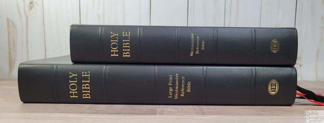

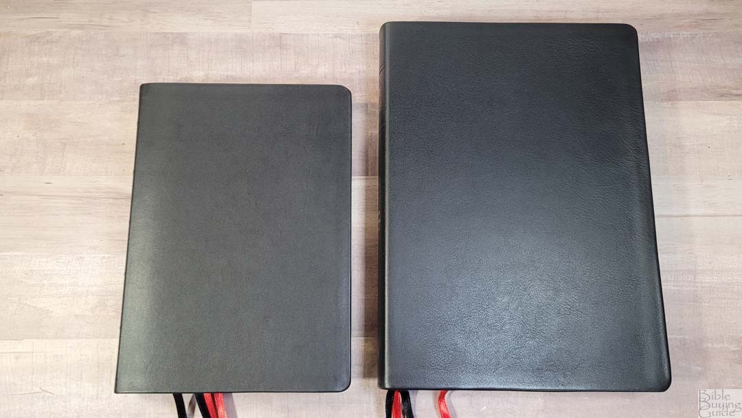
The Large Print Westminster Reference Bible is also made by Worldwide Print Corp in Belarus. It’s a lot larger. The cover is a touch thicker and the paper is heavier. This edition doesn’t include a concordance. The maps are the same.
Conclusion
The Westminster Reference Bible is easily one of the best reference Bibles available. TBS always tries to find the best balance between quality and price and the construction and materials are excellent for the price point. The 200,000 cross-references, updated words on the page, concordance, and other tools make it great for study and sermon prep. The three sizes make a great combo for carrying, reading, studying, and preaching, so there’s an edition for every need. Even though there have been lots of KJVs published since the Westminster Reference Bible was released in 2012, the Westminster Reference Bible is still one of the best KJVs available.
_______________________________________
Buy from TBS
_______________________________________
Trinitarian Bible Society provided this Bible in exchange for an honest review. I was not required to give a positive review. My opinions are my own.