

It’s common to want a Bible in a different size. Many publishers have realized the value of this and are producing their editions in both large and small versions, and sometimes in a mid-size version as well. The Bible that I’ve heard the most requests for a large print is the TBS Westminster Reference Bible. I consider the Westminster to be the best reference Bible on the market (it’s hard to beat its 200,000 contextual cross-references), so to get the Westminster in large print is a prayer answered.
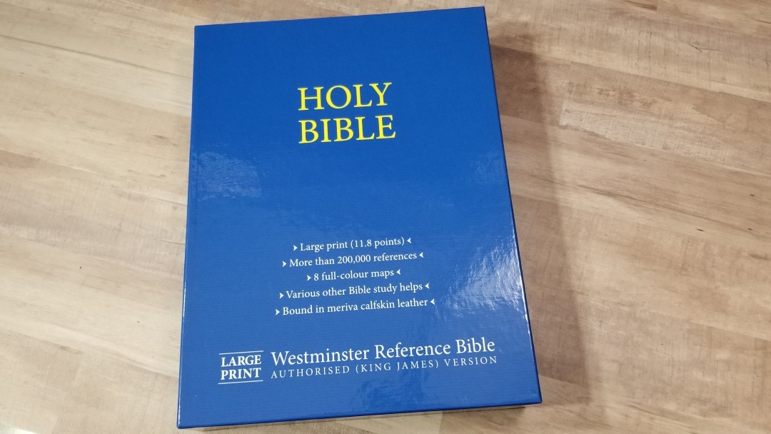
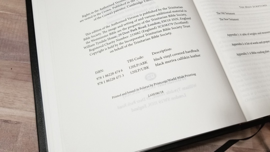
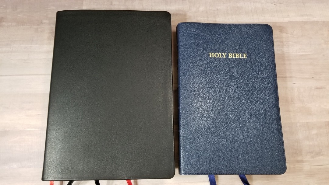
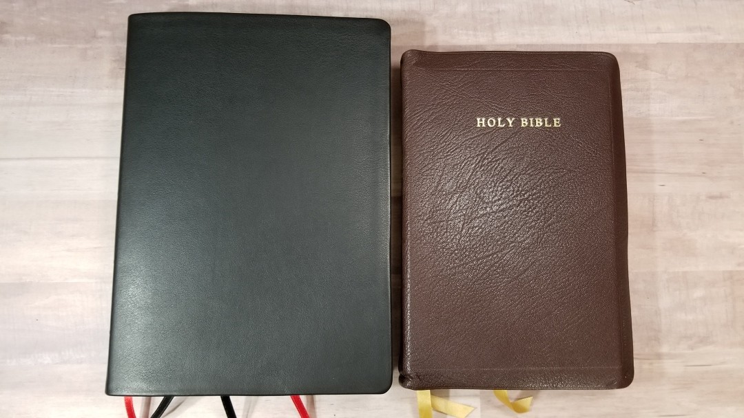
The Large Print Westminster is available in hardcover and calfskin. I’m reviewing model 120LP/UBK, black calfskin ISBN: 9781862284753, made in Belarus by PrintCorp.
Your first question will be “why is this made by PrintCorp instead of Royal Jongbloed?” This is due to the size of the Bible. The page size is too large for Royal Jongbloed’s equipment, so they were unable to print and bind it.
The follow-up question will be “does it use the same materials as the other editions?” And the answer is yes, it does. The paper does look and feel ‘slightly’ different to me, but this Bible absolutely fits well with the TBS lineup of Bibles.
Trinitarian Bible Society provided this Bible in exchange for an honest for review. I was not required to give a positive review. My opinions are my own.
_______________________________________
_______________________________________
Video Review

Binding
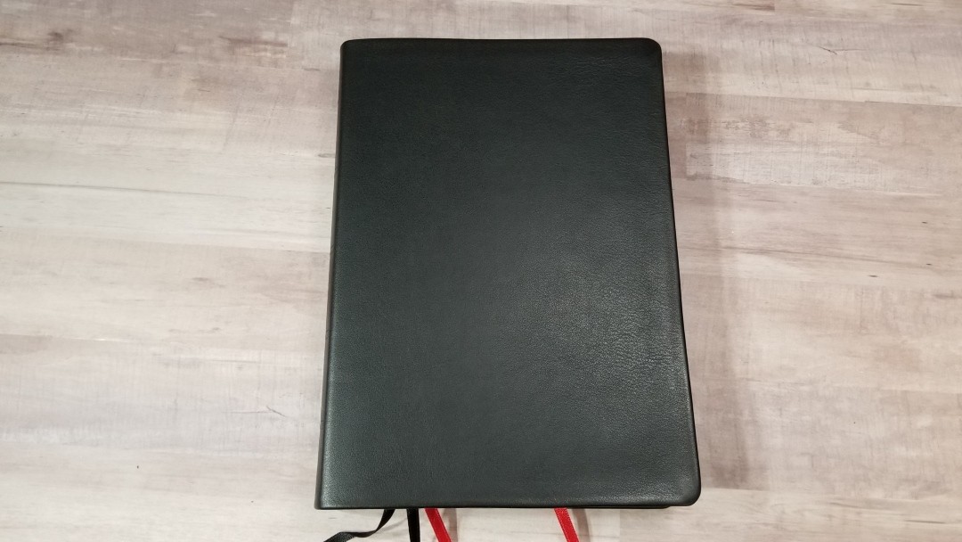
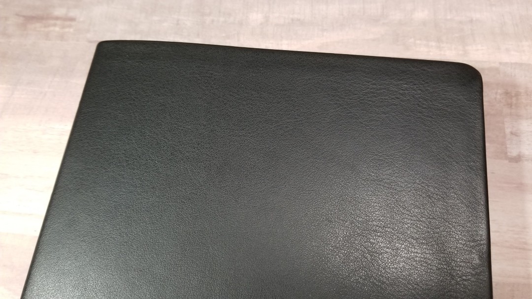
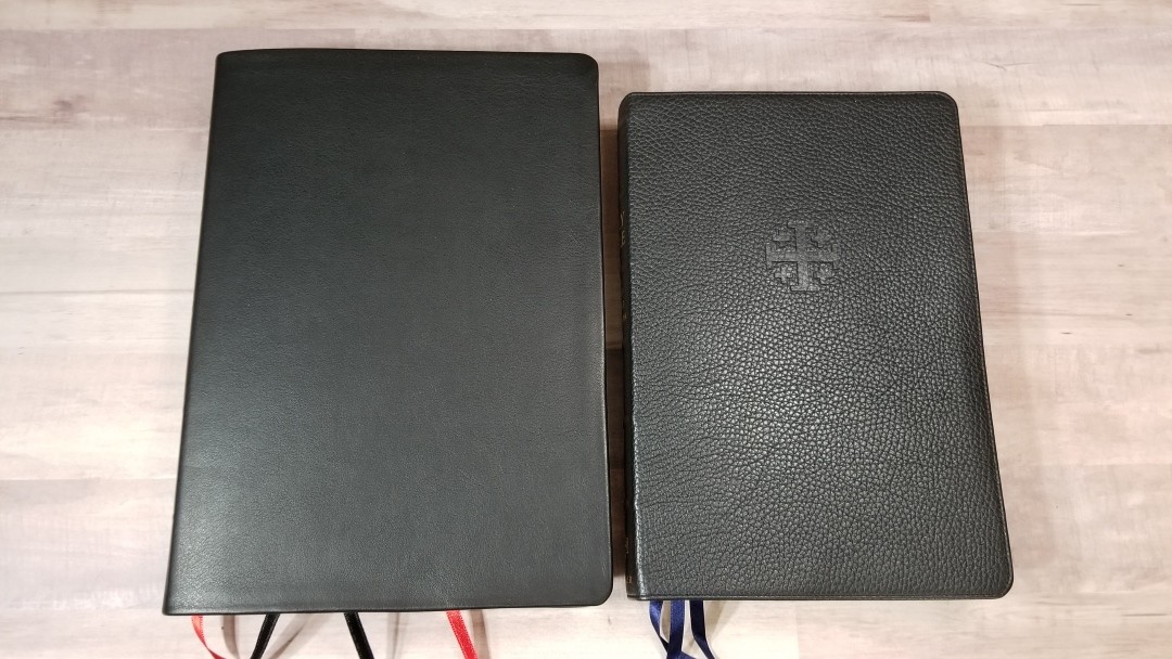
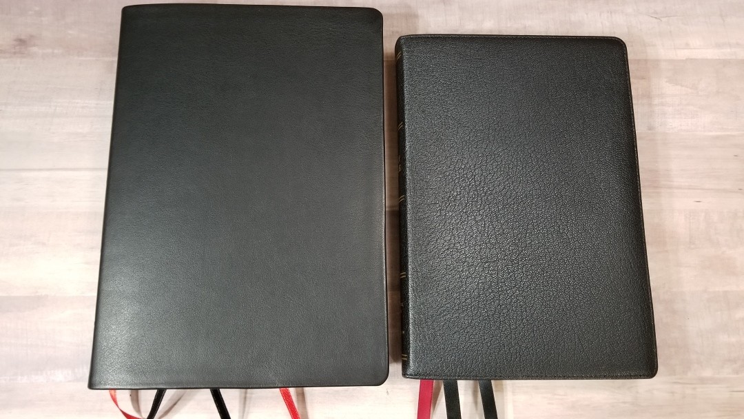
The cover is black calfskin. It’s soft to the touch. It’s thick and has a small grain with a little bit of texture. It has a paste-down liner. It has no printing on the front. The spine has Holy Bible, Large Print Westminster Reference Bible, the TBS logo, and five bands to indicate spine ribs. The ribs are not raised but they do look nice.

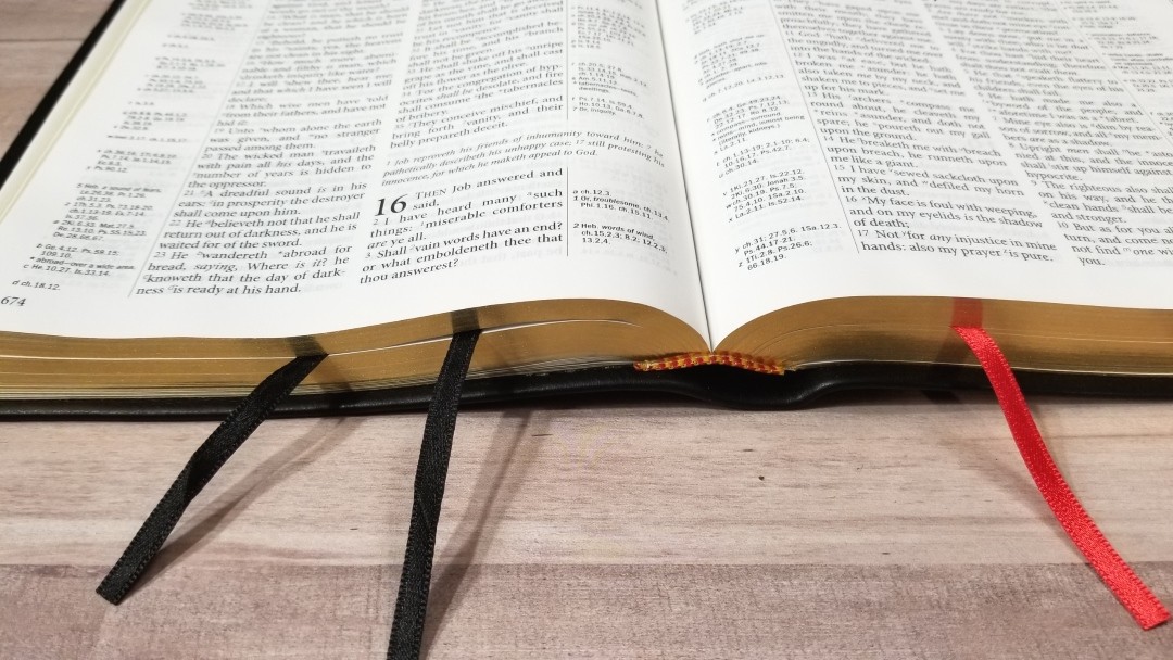
The binding is sewn and has no problems lying open in Genesis 1 out of the box – no breaking in required.
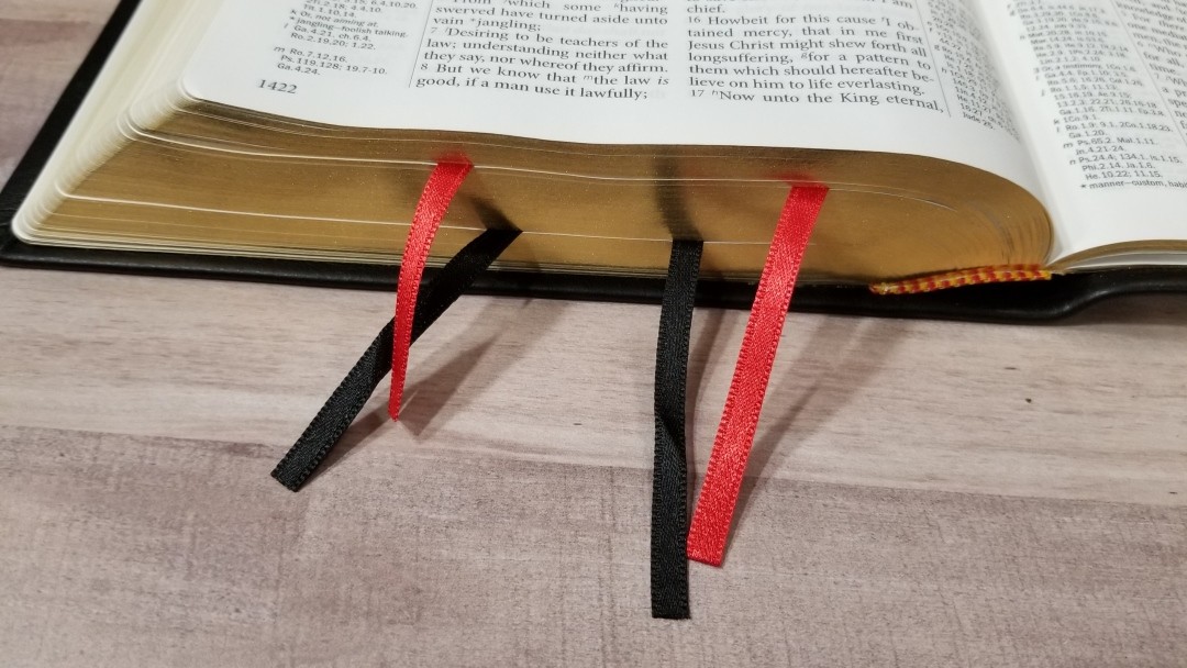
It includes four ribbon markers: two black and two red. The overall size is 10.75 x 7.8 x 1.5” and it weighs 3 lbs 8.4 oz. It’s not very thick, but it does look and feel like a large Bible. It comes in a clamshell box.
Paper
The paper is off-white in color and is highly opaque. It feels thicker than my older Westminster. It seems to have a touch more show-through, but I think that’s due to the larger font (more ink on the page). This paper has no glare under any light. The pages are easy to turn. I like to rub the pages together to separate them with one hand and this technique works perfectly for this paper.
I think this would be excellent paper for highlighting and making notes. There are 15 blank pages in the back for notes, outlines, memory verses, events, studies, lists, etc.
Typography
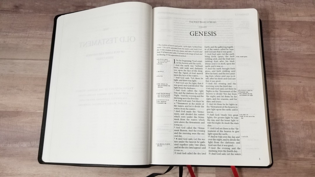
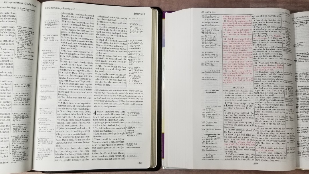
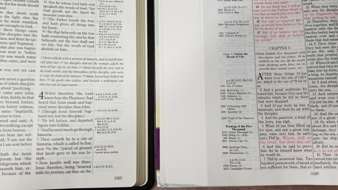
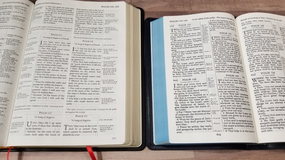
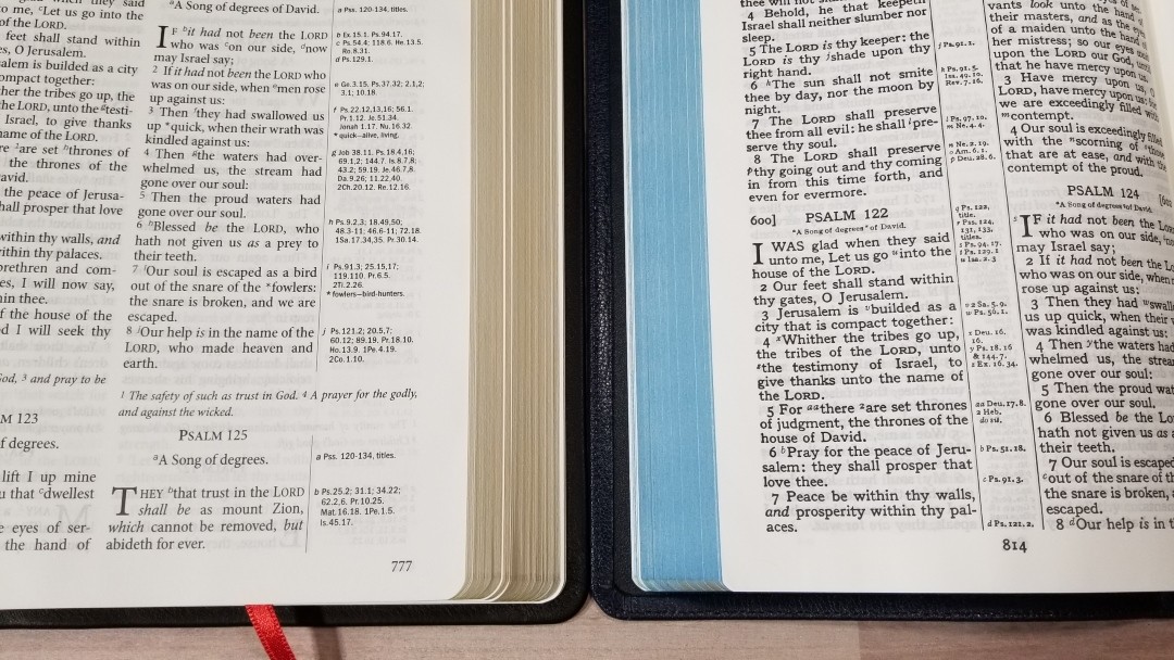
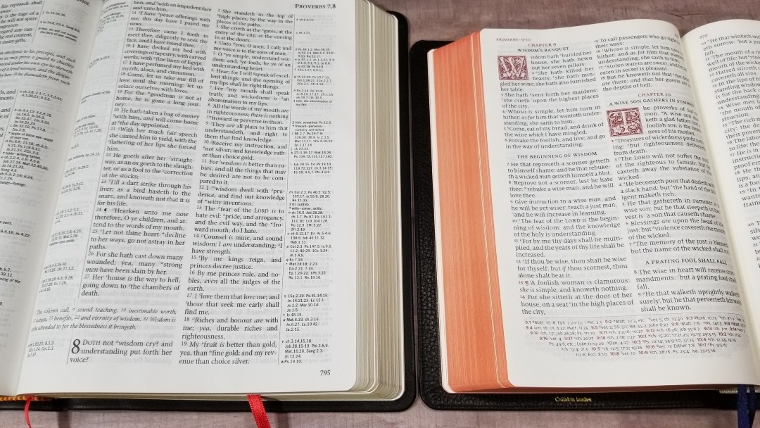
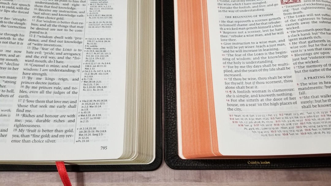
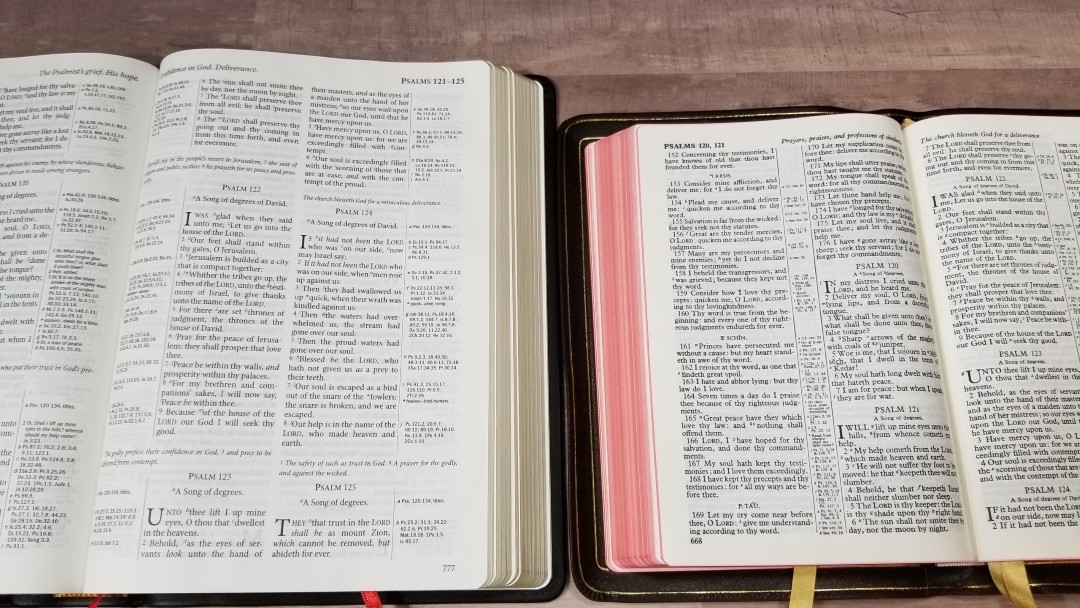
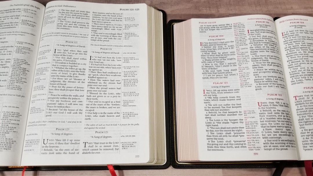
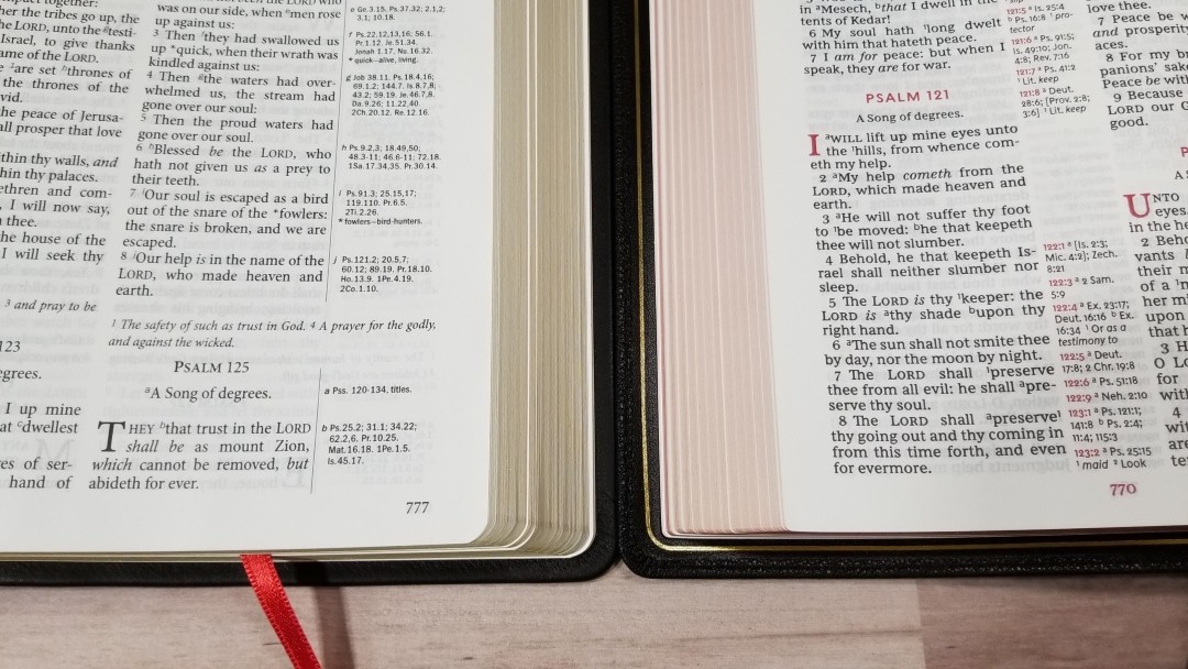
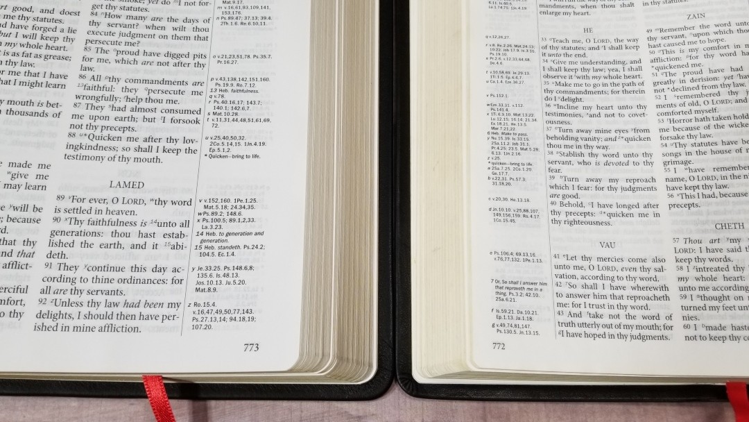
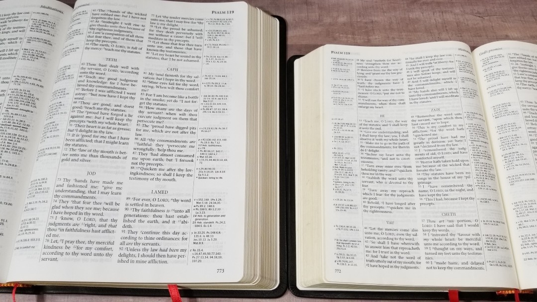
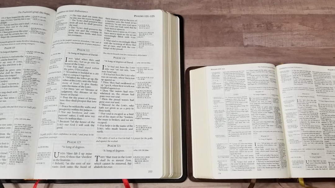
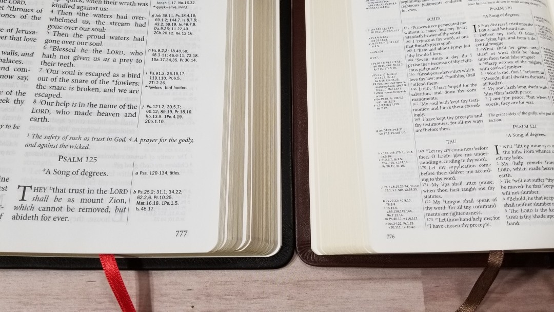
The text is presented in the traditional KJV double-column verse-by-verse. Cross-references are in both the inner and outer margins, creating four columns per page. The header includes the book name and chapter numbers in the outer margin and a page summary in the inner margin. The footer has the page number in the outer margin.
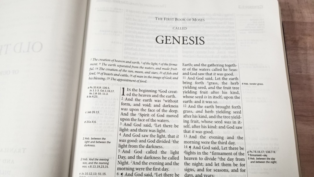
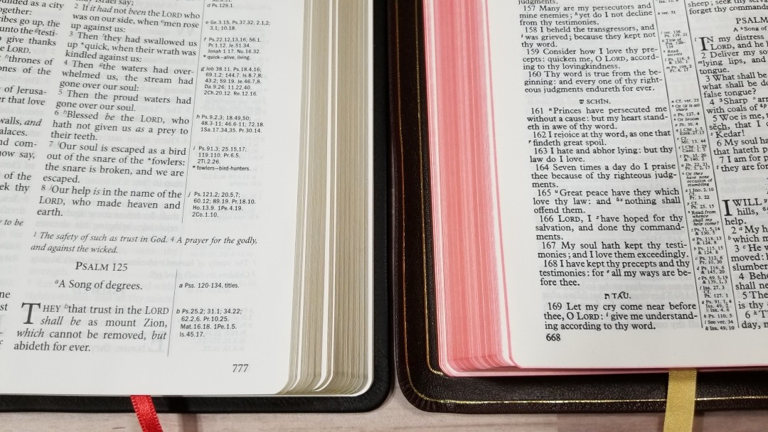
The font is 11.8 black letter with a generous leading. It’s dark and crisp throughout. The font is about the size of the Turquoise, but it’s sharper and not as dark.
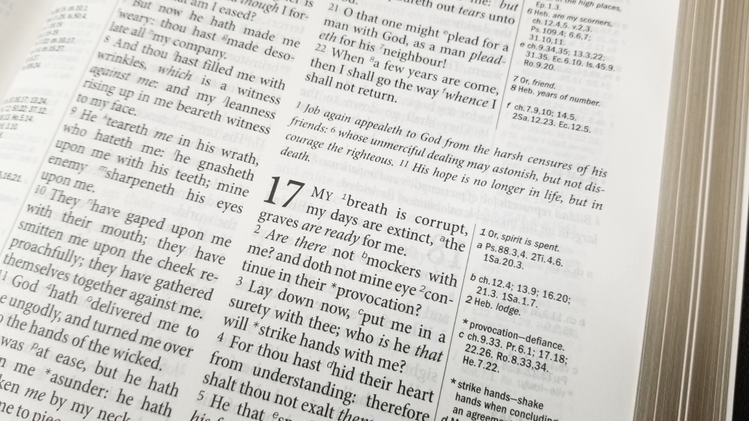
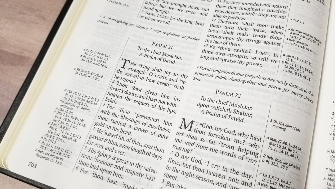
It doesn’t have pronunciation marks within the text. It does have a pronunciation guide in the back. I like this approach because it improves readability and the information is still available if you want it. It does have italics for supplied words. The text also includes cross-reference and footnote keys, and asterisks to indicate an updated word in the margin.
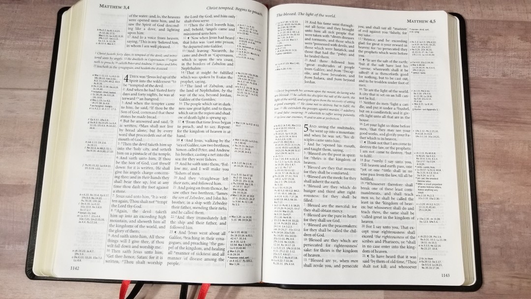

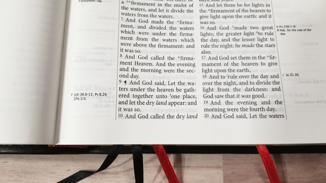
The text has 32 characters across with around 5-7 words per line. The text never feels cramped. There are 54 lines per page. There’s enough inner margin that the references don’t get lost in the gutter. It’s printed with line matching to improve readability.
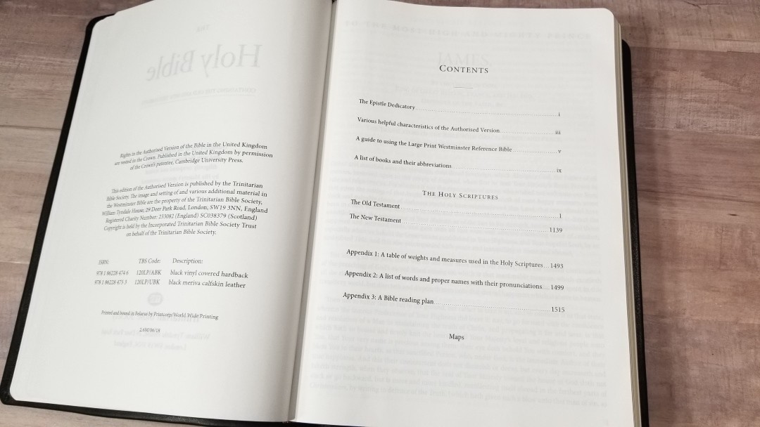
Front-Matter


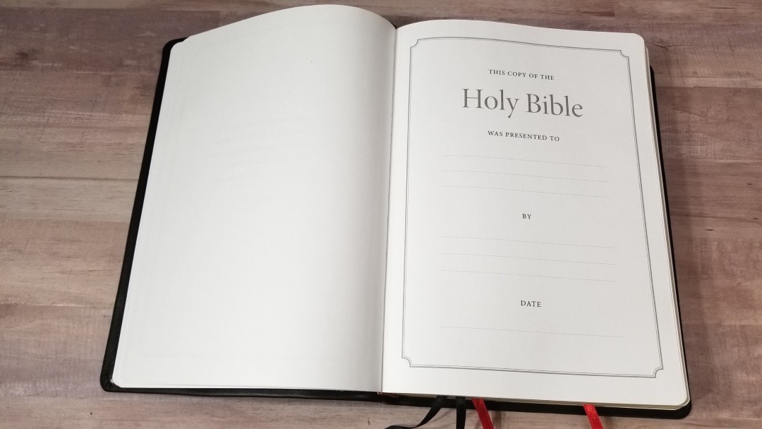
In the front are a couple of thick end sheets with Scriptures, a Presentation page, the Epistle Dedicatory, characteristics of the Authorized Version, a guide to using the Westminster Reference Bible, and a list of books and their abbreviations. It doesn’t have the Translators to the Reader. The characteristics and guide provide good information that helps in using and understanding the KJV.
Characteristics of the Authorized Version
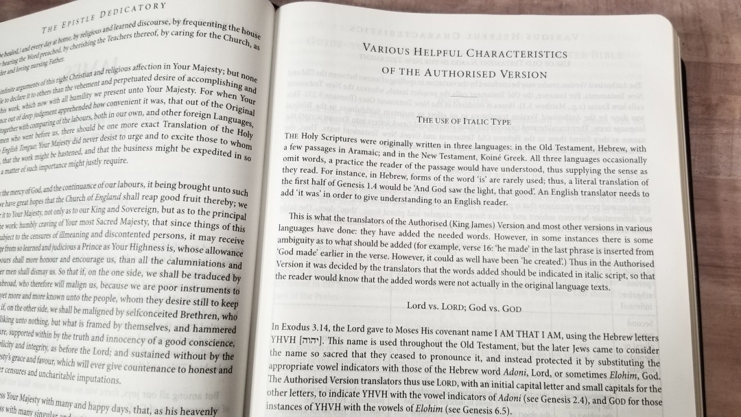
This section covers KJV features such as italics, Lord vs. LORD; God vs. GOD, capitalization, OT names in the NT, Thou and Ye (includes thee, thy, and thine), and the pilcrow (paragraph marker). Most of these are explained in detail and give Scripture references as examples.
Guide to Using the Compact Westminster Reference Bible
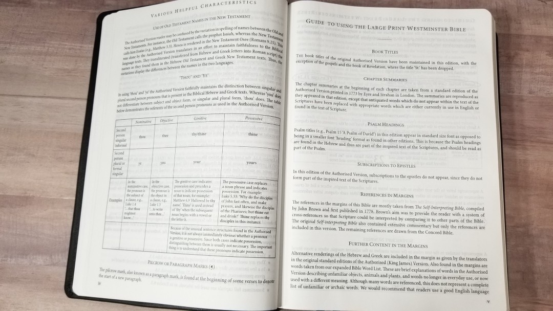
This section covers book titles, chapter summaries, why psalm headings are included, why subscriptions to the epistles are excluded, references in the margins (most are taken from John Brown’s The Self Interpreting Bible and the rest from the Concord), and further content in the margins (which includes the translator’s footnotes and updated words).
It also includes a sample page and highlights running page heads, chapter summaries, superscript letters, superscript numbers, asterisks, and superscript section markers, showing how they work and how to use them.
Cross-References
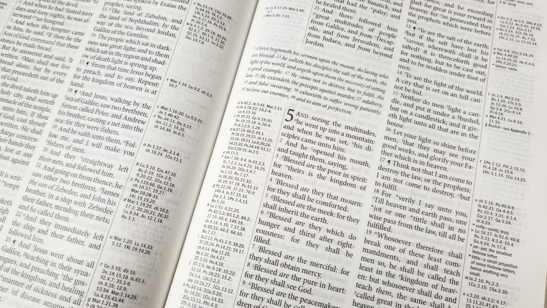
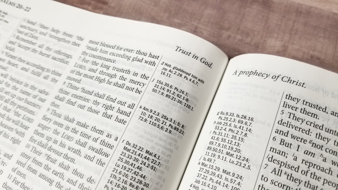
Where the Large Print Westminster really shines is its 200,000 cross-references. Most are from John Brown of Haddington’s The Self Interpreting Bible and the rest are from the Cambridge Concord. They’re placed in the inner and outer columns as close as possible to the verses they correspond to. They’re keyed to the text with letters.
They’re contextual and they include larger passages rather than just portions of verses. So, if you don’t see a reference next to a verse look at the beginning of the context. I like this because it allows Scripture to interpret Scripture. These are my favorite references in any Bible. They’re excellent for study and sermon prep.
Here are a few examples to help you compare. Some of these references are repeated within the same verse, but they actually correspond to different places within the verses.
- Genesis 1:1 – Ps 33:6, 9; 136:5; Jn 1:1-3; Col 1:16, 17; He 1:8-10; 11:3
- Deuteronomy 6:4 – 1 Ch 8:6; Mar 12:29; Je 10:6-11; Is 42:8; 45:22; 1 Jn 5:20; Jn 17:3; 1 Co 8:4, 6
- Isaiah 9:6 – ch 7:14; 4:2; Lu 2:11; Mat 15:24; Ro 9:5; 15:8; Jn 1:14; 3:16; 4:10; 6:32, 33; 2 Co 9:15; Mat 11:27; 28:18; Eph 1:22; ch 7:14; 63:1; Jer 31:22; Mat 8:27; Pr 30:4; Ju 13:18; Zec 6:13; ch 28:29; Jn 1:18; 17:8; 15:15; Re 3:18; Lu 7:30; Je 23:6; Ps 45:3-6; Jn 1:1, 2; Ro 9:5; Ti 2:13; ch 45:22; 63:1-4; 1 Jn 5:20; He 1:8; 7:25; Pr 8:23-31; He 5:9; 2:13; Jn 6:39-51; 10:28; 11:25; ch 53:10, 11; Ep 2:10; ch 53:5, 12; Je 23:5, 6; Mi 5:1, 2, 5; Ro 5:1, 10; 2 Co 5:19, Ep 2:14; Jn 16:33; 14:27; Phi 4:7; 2 Th 3:16
- Matthew 17:20 – ch 13:58; 6:3; v 17; He 3:19; Lu 17:6; ch 13:31; 21:21; Mar 11:23; 1 Co 13:2; v 9; ch 21:22; Mar 9:23
- Mark 11:23 – Mat 17:20; 21:21; Lu 17:6; Ja 1:5, 6; Ro 14:19, 20; 1 Co 13:2
- Mark 12:29 – De 6:4, 5; 10:12; 30:6; Pr 23:26; Mat 22:37; Lu 10:27; 1 Co 13; 1 Ti 1:5
- John 1:1 – Ge 1:1; Ps 2:7; Pr 8:22-31; Col 1:16, 17; Re 1:2, 9; 19:11, 13, 16; 1 Jn 1:1, 2; 5:7; He 1:3; 4:12; ch 3:34; v 14; Lu 1:2, Ac 20:32; 2 Pe 3:5; Pr 8:30, ch 17:5; Zec 13:7; ch 10:30, 33; Phi 2:6; He 1:3, 8-13; 1 Jn 5:7, 20; Ti 2:13; Ro 9:5; Is 9:6
- Acts 2:38 – Mt 3:6, 8; Mk 1:4, 15; cha 3:19; 20:21; 22:16; 1 Jn 1:7; Titus 3:5; Isa 1:18; 55:7; Luke 24:47; Mt 26:28; ver 16-18; 8:15-17; 10:44, 45; 16:6
- Romans 1:17 – ch 3:21-26; 5:15-21; 1:3, 4; 2 Cor 5:21; Phi 3:9; 2 Pe 1:1; 2 Co 3:9; Ps 84:7; 2 Co 3:18; Re 22:11; Hab 2:4; He 10:38; Ga 3:20; 3:11; ch 5:1, 2; Ac 10:43; 2 Co 1:24; 5:7; He 11:6, 7
- Galatians 3:11 – ch 2:16; Ro 3:20, 28; 1 Ki 8:46; Ec 7:20
- 1 John 1:1 – Pr 8:23; Mi 5:2; Jn 1:1, 2: Re 1:8; Is 41:4; 44:6; 2 Pe 1:16, 18; Mat 3:16, 17; Lu 24:39; Re 1:2; Jn 1:1, 14; 5:26, ch 5:7; Re 19:13
Footnotes
The translator’s footnotes are placed in the margins next to the verses they correspond to and are keyed to the text with numbers. They include Hebrew and Greek words with explanations, alternate renderings, more literal translations, etc. I’m glad they’re included because they are helpful in understanding some of the translation choices.
Marginal Wordlist
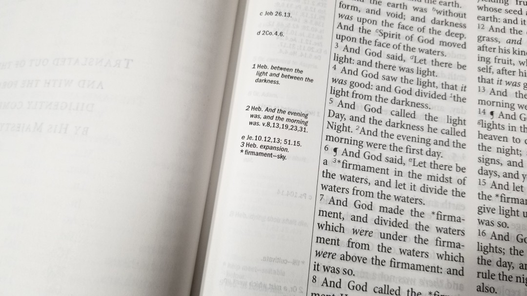
Rather than placing that glossary in the back of words that are no longer in use or have changed meaning, the Westminster places updated words in the margin on the page where the word appears. They are keyed to the text with an asterisk. The margins include the asterisk, the original word, and a short definition.
I like this approach. I don’t always know to look at a glossary in the back because sometimes the current meaning of a word can still fit in the context even though the older definition was how the translator’s meant for us to understand it.
Tables of Weights and Measures
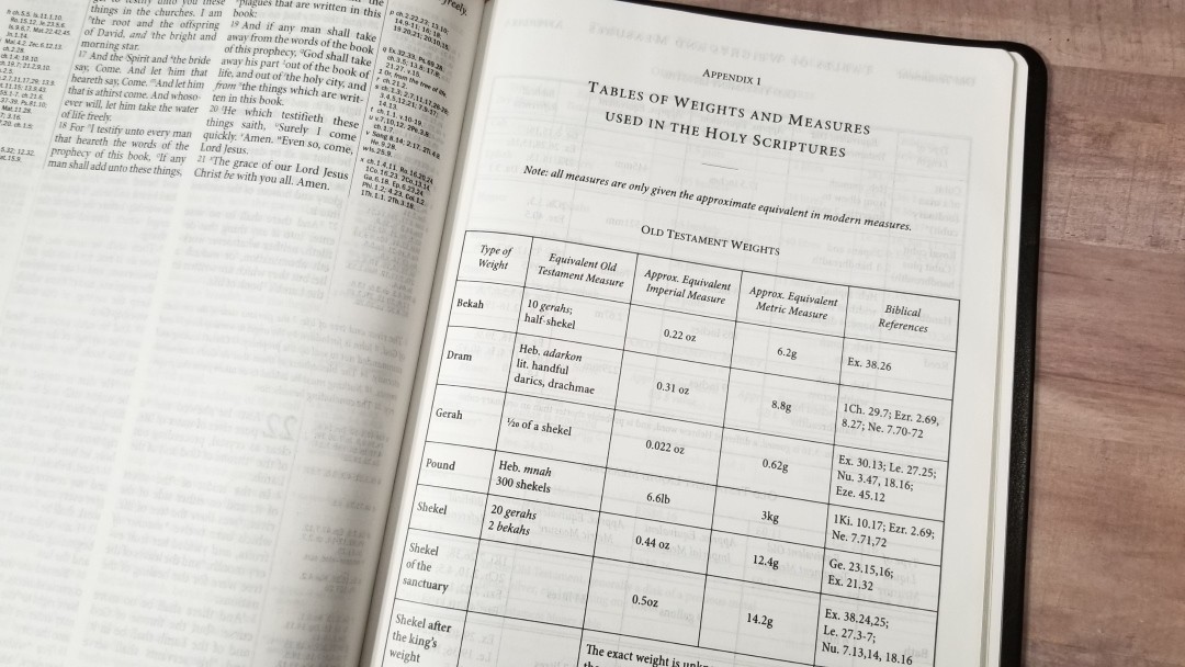
In the back is 5.5-pages of tables for weights and measures. They show the type of measure, equivalent Old Testament measure, equivalent New Testament measure, Hebrew and Greek words, approximate equivalent Imperial measure, approximate equivalent metric measure, biblical references, and the time that’s covered. The margins of the Bible includes a symbol to tie the text to these tables.
Tables include:
- Old Testament Weights
- Old Testament Lengths
- Old Testament Liquid Measures
- Old Testament Dry Measures
- Old Testament Money
- Old Testament Time
- New Testament Weights
- New Testament Lengths
- New Testament Liquid Measures
- New Testament Dry Measures
- New Testament Money
- New Testament Time
List of Words and Proper Names
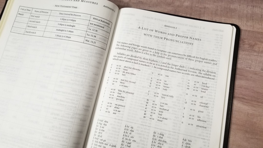
Rather than having a self-pronouncing text, the Westminster has a 15-page list of words and names with self-pronouncing marks. It shows the syllables and shows how to pronounce consonants, blends, and nouns. It contains every name and foreign word. It also has a chart to show how to pronounce the symbols.
Reading Plan
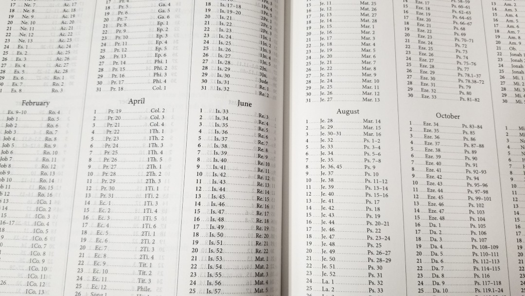
In the back is the M’Cheyne reading plan. This is a two-year plan that takes you through the Old Testament once and the New Testament and Psalms twice. The first year starts with Genesis and Matthew, and the second year starts with Ezra and Acts. It can also be used as a one-year plan, which would give you 4 readings per day with all four readings from different places in the Bible.
Maps

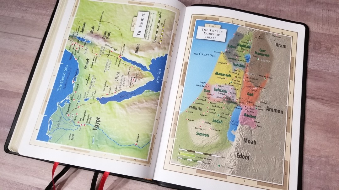
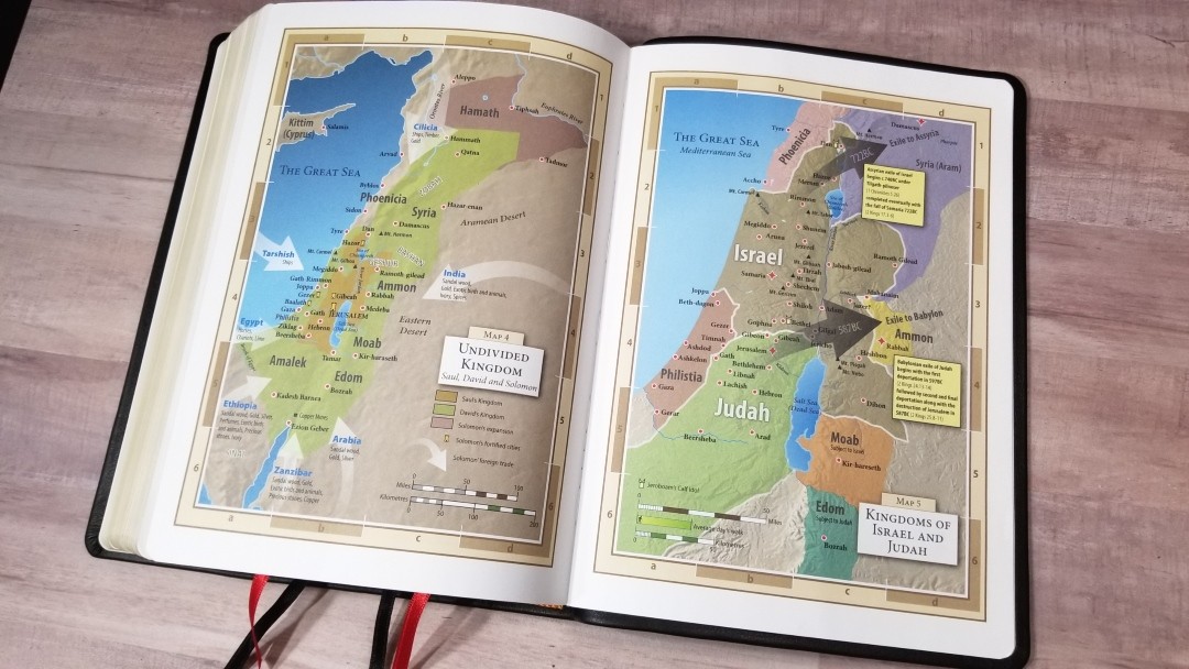

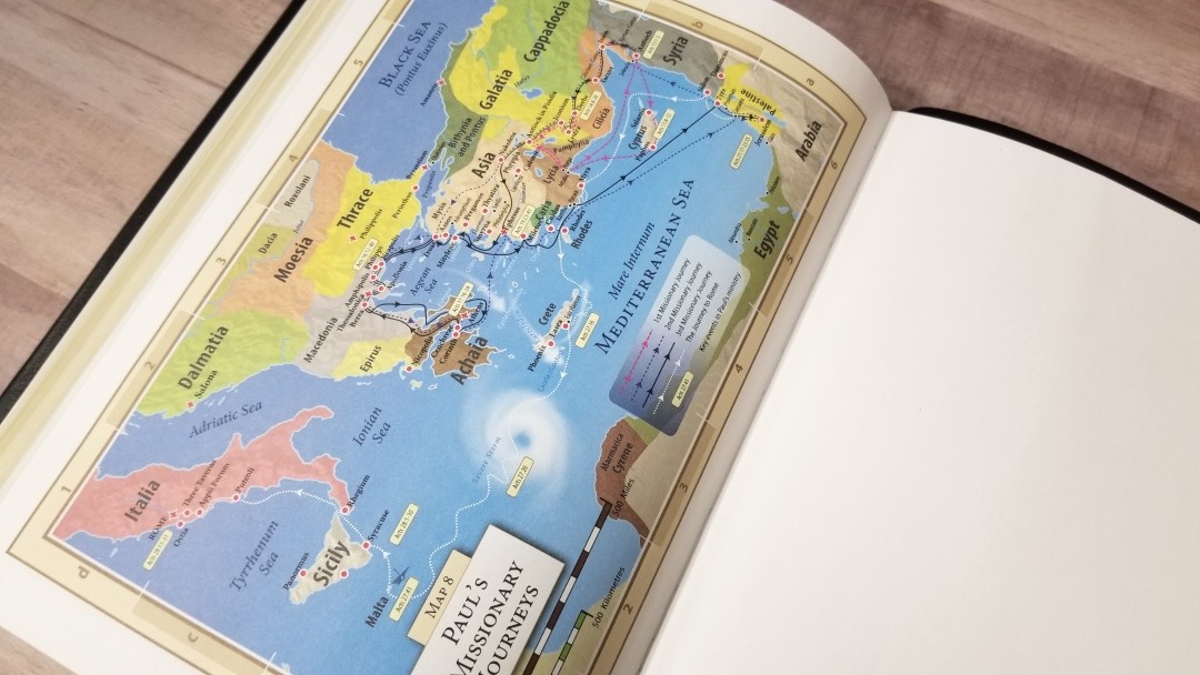
There are 8 colorful maps on thick non-glossy paper. The colors are bright and can seem a little cartoonish. I like this design a lot. It doesn’t have an index but the maps are annotated well and the names are printed very large. Maps include topography, distance, water, routes, capitals, borders, Scripture references, commodities, trade, subjection, royal residence, fortresses, events, dates, etc.
Maps include:
- Time of the Patriarchs
- The Exodus
- The Twelve Tribes of Israel
- Undivided Kingdom
- Kingdoms of Israel and Judah
- The Persian Empire
- Holy Land in the Time of Christ
- Paul’s Missionary Journeys
Comparisons
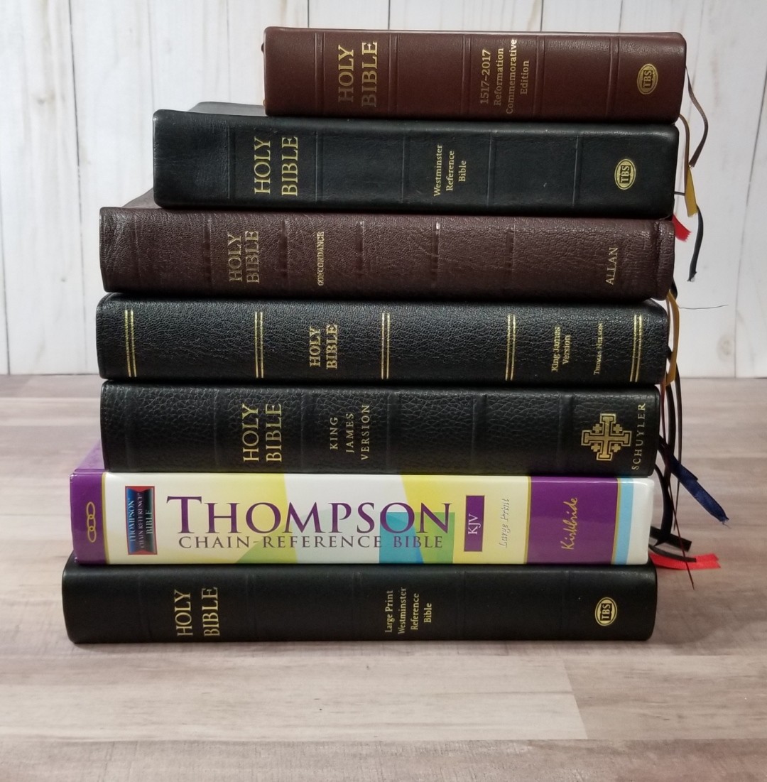
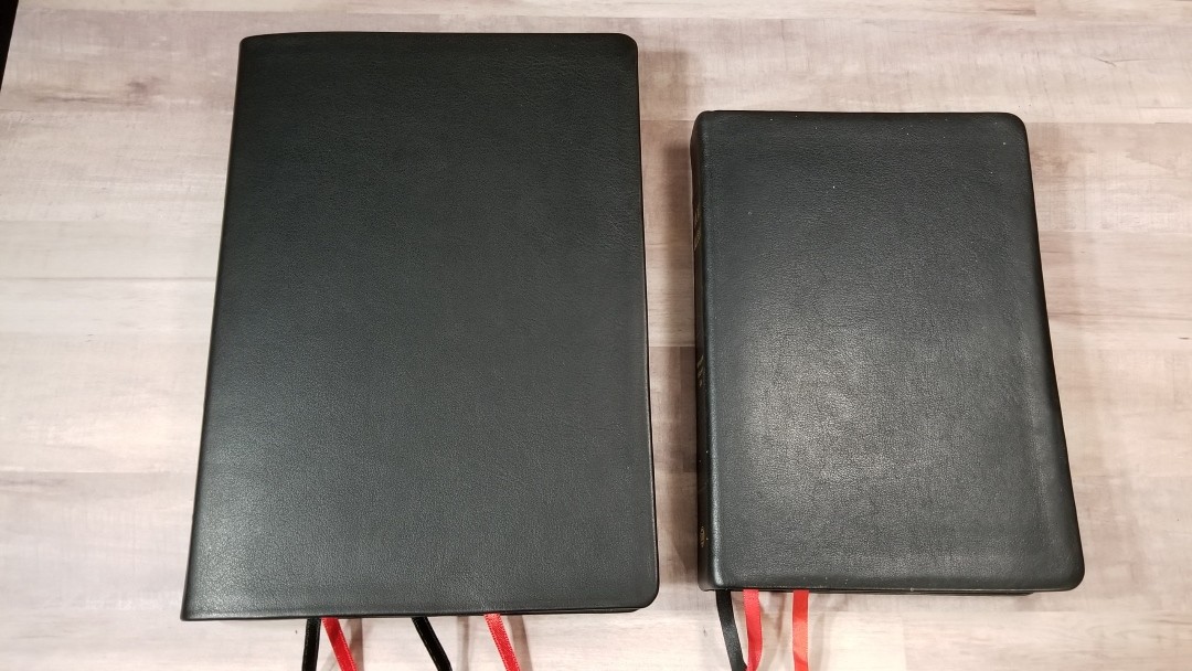
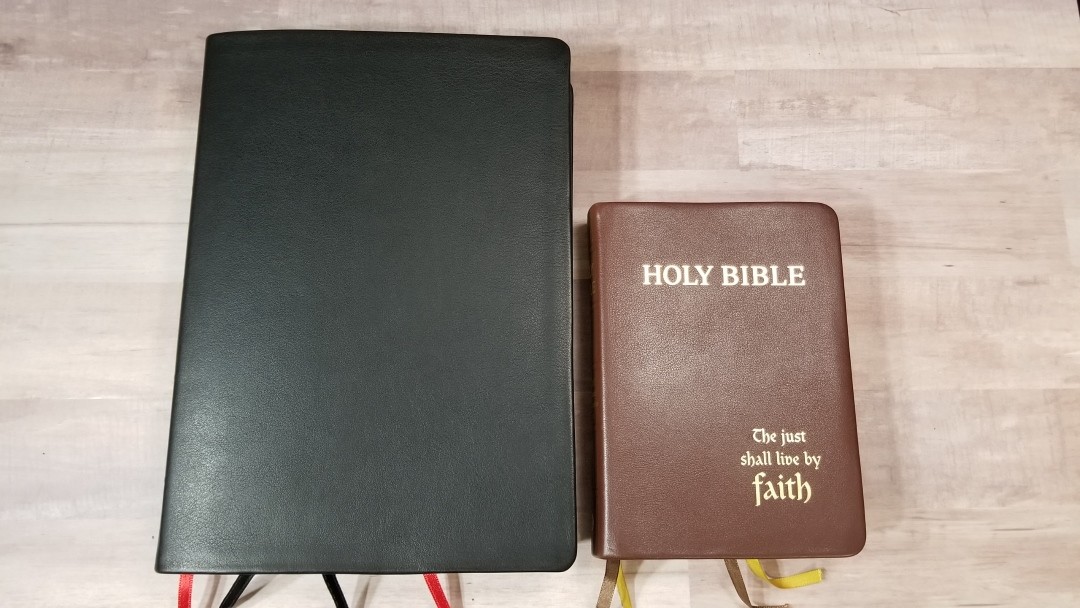
Here’s a look at how the Large Print Westminster compares to a few other large print KJVs. I’ve also included the regular Westminster, Compact Westminster, Large Print Thompson Chain Reference, Turquoise, Canterbury, Thomas Nelson Giant Print, and Longprimer.
Large Print Thompson Chain Reference
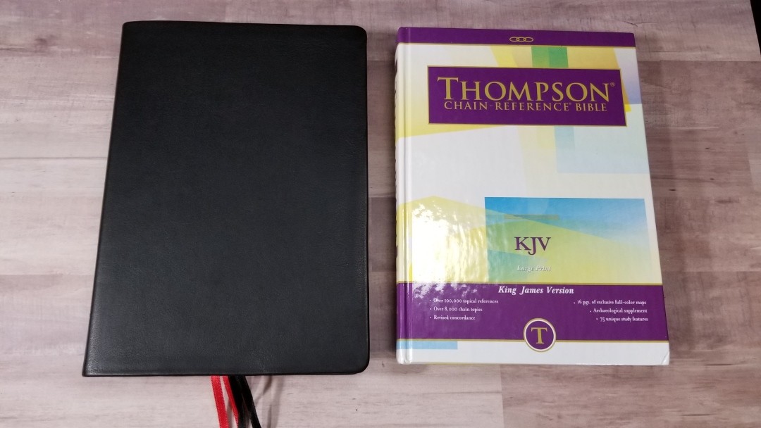
The Large Print Thompson Chain Reference Bible is about the same size. It has a smaller font and the paper isn’t as opaque. It has 100k forward-moving chain references.
Cambridge Turquoise
The Turquoise font is about the same size. It’s darker, but could be too dark for reading in good lighting for long periods of time. It has under 44k references.
Canterbury
The Canterbury also has a line-matched digital font. It has a more elegant paper, but it doesn’t include translator’s footnotes. It has 55k references.
Longprimer
The Longprimer’s font is slightly smaller but it’s darker. It doesn’t have as much white-space in the text, making it feel more crowded. It has 100k chain references that move forward and backward.
Premier Collection KJV
The Premier Collection Giant Print Reference has a similar font but it’s slightly darker. It has under 60k references (just a guess though).
Westminster
The regular edition has a 9.6 font and a concordance. The regular and large print both make a great combo – one for preaching and study and one for carry.
Compact Westminster
The Compact Westminster has a 7.3 font. It’s a lot smaller Bible but it’s great for carry.
Conclusion
The Large Print Westminster Reference Bible is a large Bible that fills the need for those who prefer large editions. For me personally, it’s a touch large for carry, but if you’re used to carrying a large print Thompon then you won’t have any issues carrying this one. For me, it really shines for study and preaching. The only thing missing is the concordance, but the 200,000 cross-references do help make up for that as a Bible for study. Even though the large print edition isn’t made by Royal Jongbloed like the other two editions are, the quality is still there. Print Corp did a great job with this edition.
I love that they now produce the Westminster in three different sizes. Together, they make an excellent combination for carry, reading, study, and preaching, and this means that there’s an edition for everyone in the family or ministry team. I highly recommend the Large Print Westminster Reference Bible to anyone looking for a quality cross-reference KJV in large print.
_______________________________________
_______________________________________

Trinitarian Bible Society provided this Bible in exchange for an honest for review. I was not required to give a positive review. My opinions are my own.