
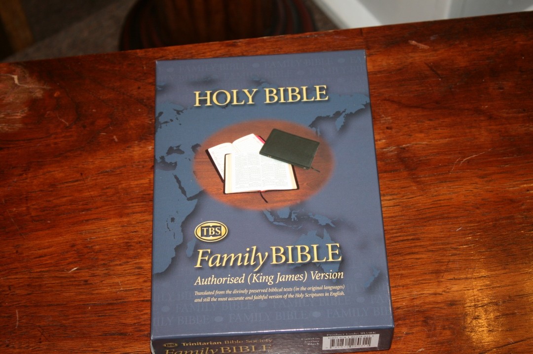
The TBS Family Bible is a text-only large print Bible that utilizes the Cambridge Large Print Text text-block. TBS has added a few features of their own to make it look and feel much different than the Cambridge edition. I’ve read from it, carried it around, and preached from it. In this review, I take a look at the TBS Family Bible and my experience with it, and how it compares to the Cambridge Large Print Text.

Features
- KJV
- 10 point font
- Black letter
- Thick paper
- Art-gilt edges
- Calfskin cover
- Sewn
- Head/tail bands
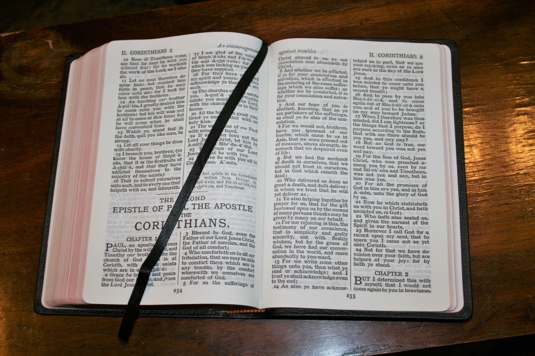
- 1 ribbon
- 8.5 x 5.8 x 1.2”
- Clam-shell box
- Printed and bound in Italy by LEGO
- Product code: 9U/BK
- ISBN: 9781862280311
Buy from: TBS | EvangelicalBible | Amazon
Video
Here’s the video review (includes bloopers)

Binding
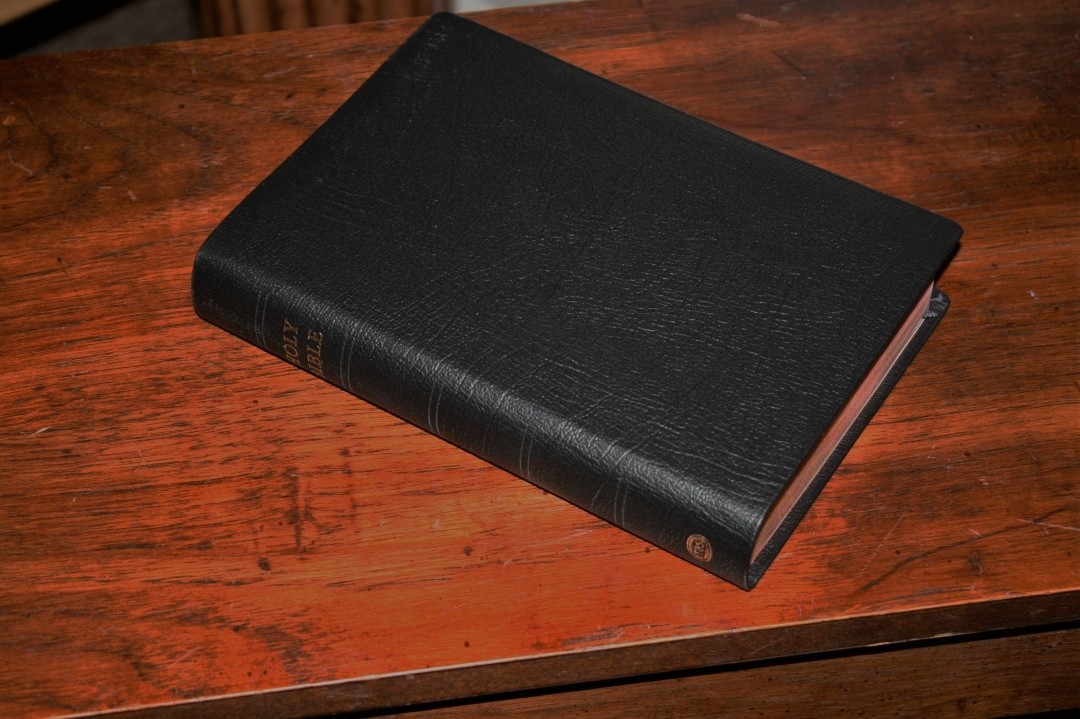
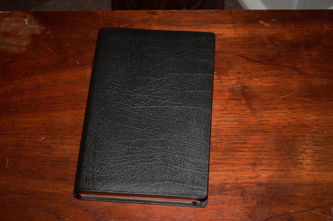
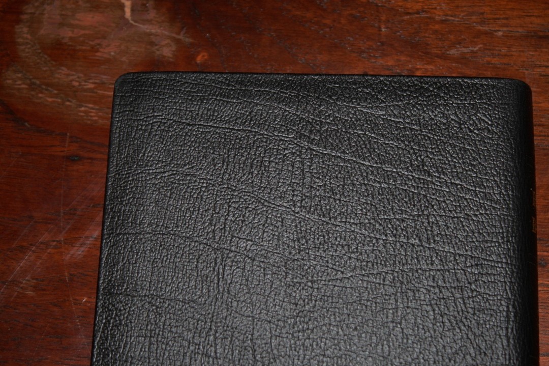
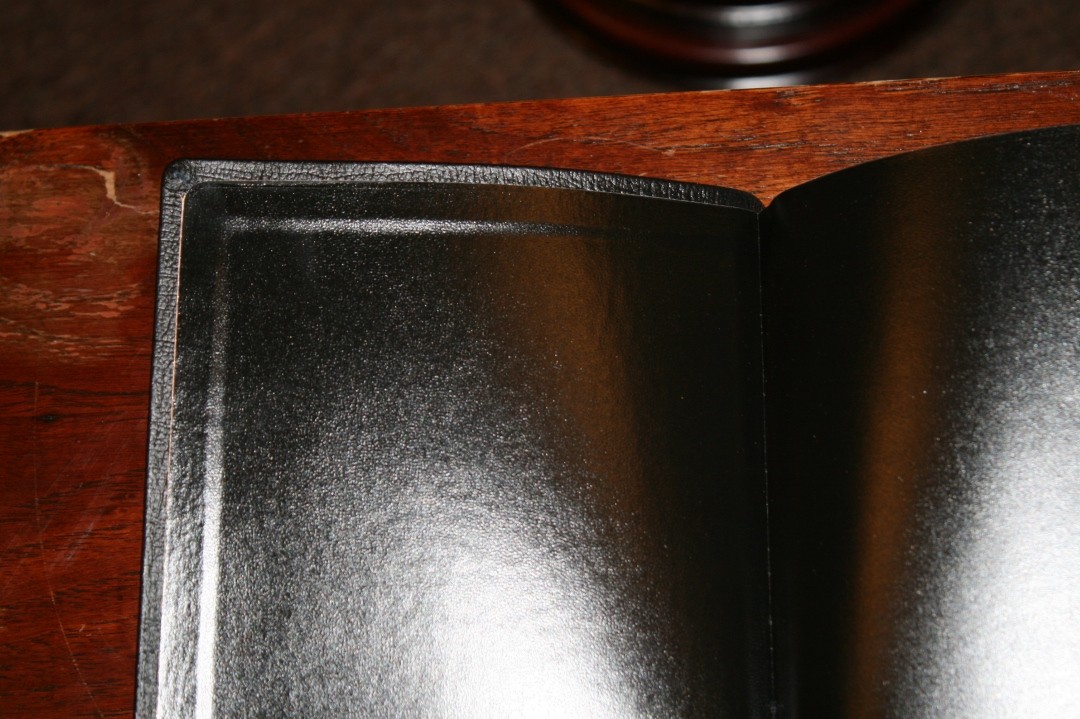
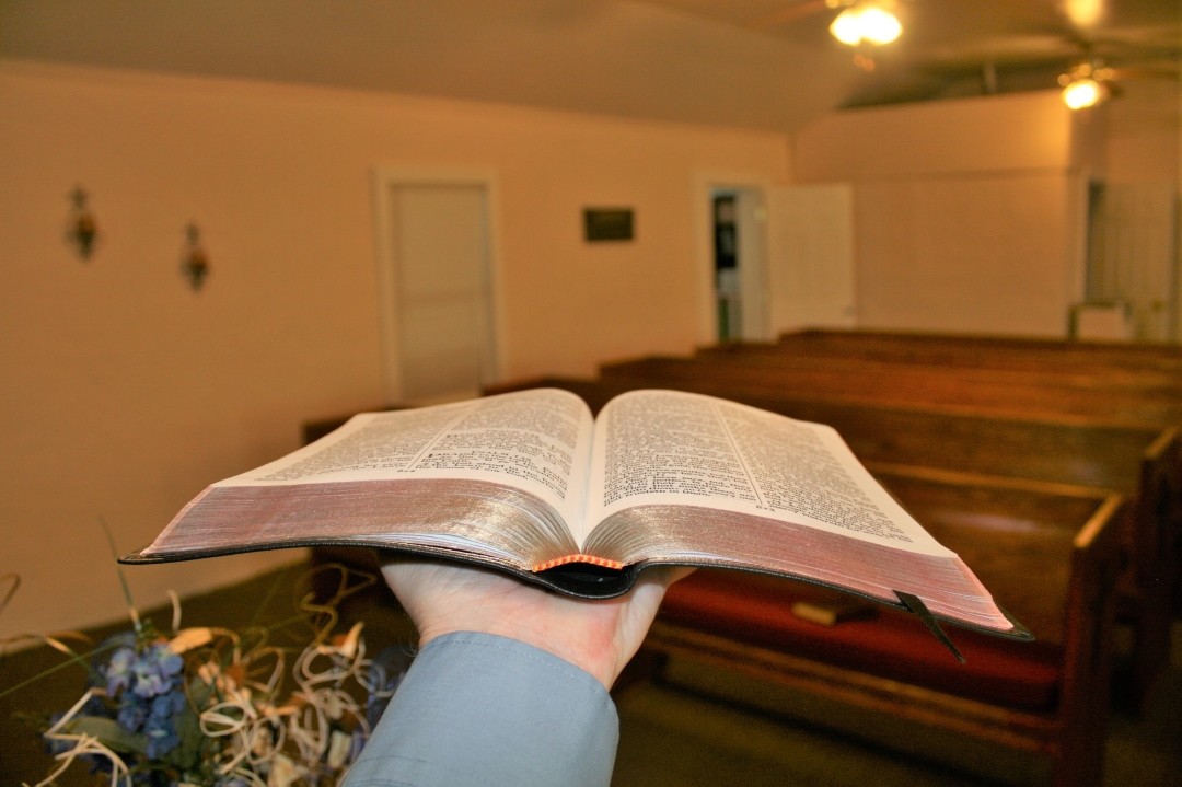
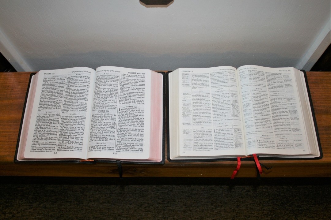
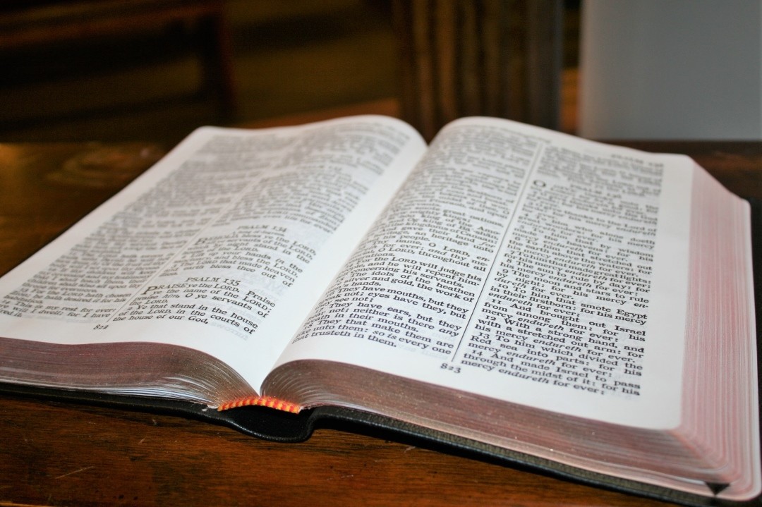
The cover is black calfskin with a pastedown vinyl liner. It’s stiff-ish and has a deep grain. It lays open in Genesis 1 with no trouble. The cover is more flexible than the French Morocco cover in the Cambridge Large Print Text and stays open better. It’s between the softer Westminster and the harder Windsor. It’s not as hard as the reviews that I’ve read. It easily lays flat in one hand (my preferred reading method), making it easy to hold and read.
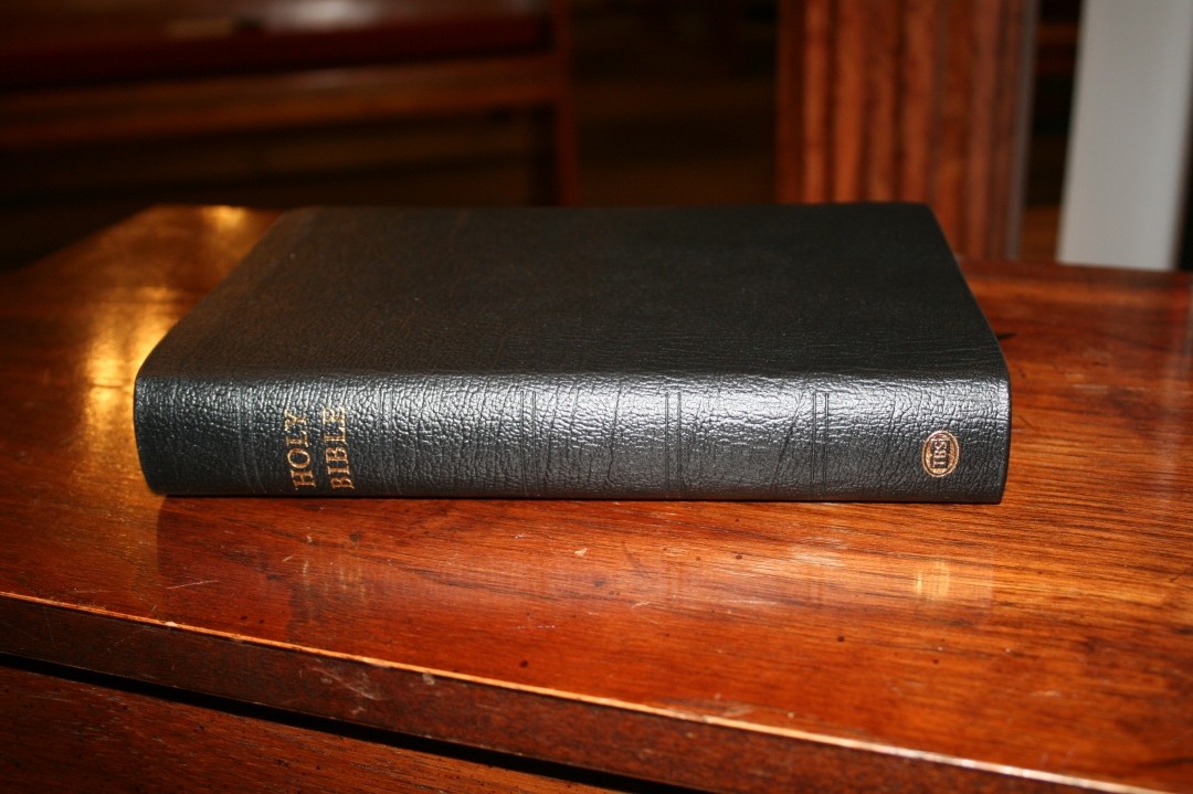
The spine includes the words Holy Bible and the TBS logo. Small ridges are imprinted into the spine but they’re just noticeable. The red and yellow head/tail bands are noticeable without standing out too much or looking out of place. When opened the spine curves over to one side. It looks a little odd but it still lays flat.

Paper
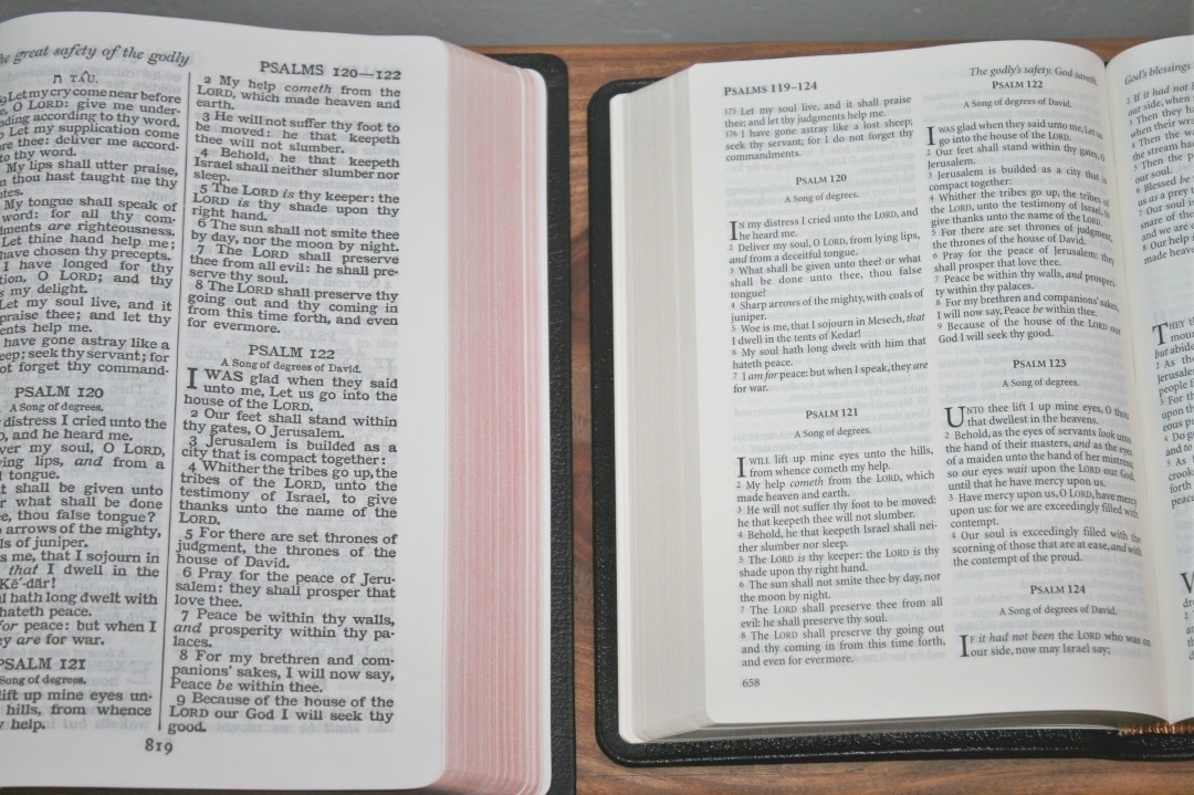
The paper is thick (31 gsm) and has an eggshell or ivory color. It’s whiter than the Windsor and Westminster. It’s opaque even considering how bold the typeface is. There is some show-through because of the boldness of the print, but it’s not enough for me to complain about. This is great paper for marking or highlighting.
I love the texture of the paper. It feels slightly rough to my fingers which is better for marking and turning. It doesn’t have a glare or a shine. I’ve rarely gotten page-curl from this paper. I’m sure that’s due to the page thickness. I’ve used it with other Bibles that were experiencing page-curl and this one did not. The pages are easy to turn.

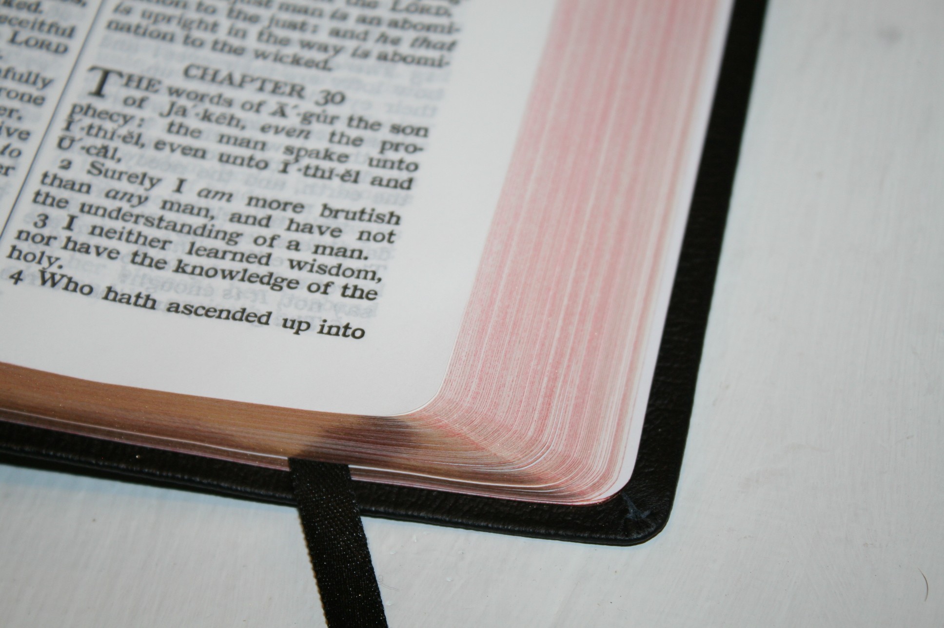
The edges have art-gilting. Speaking of edges, the page edges are cut straighter than the Cambridge edition, so this one doesn’t have the annoying curl on the edge of the page like the Cambridge has. There are a couple of thick end pages in the front and back that can be used for notes.
Typography
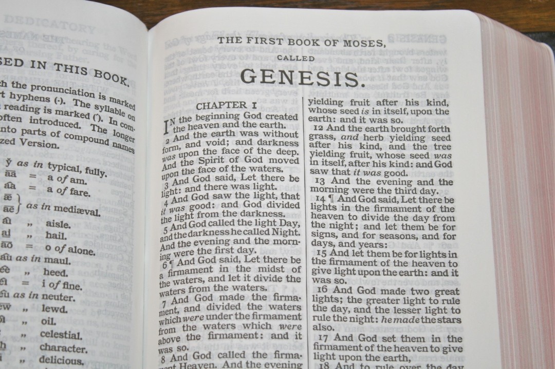
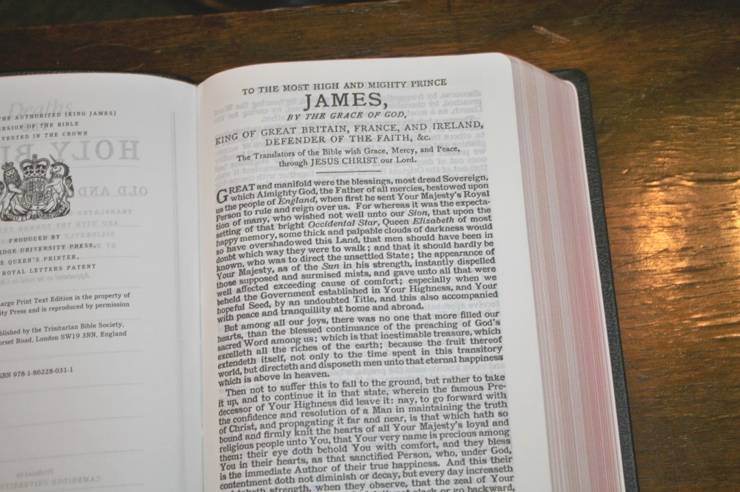
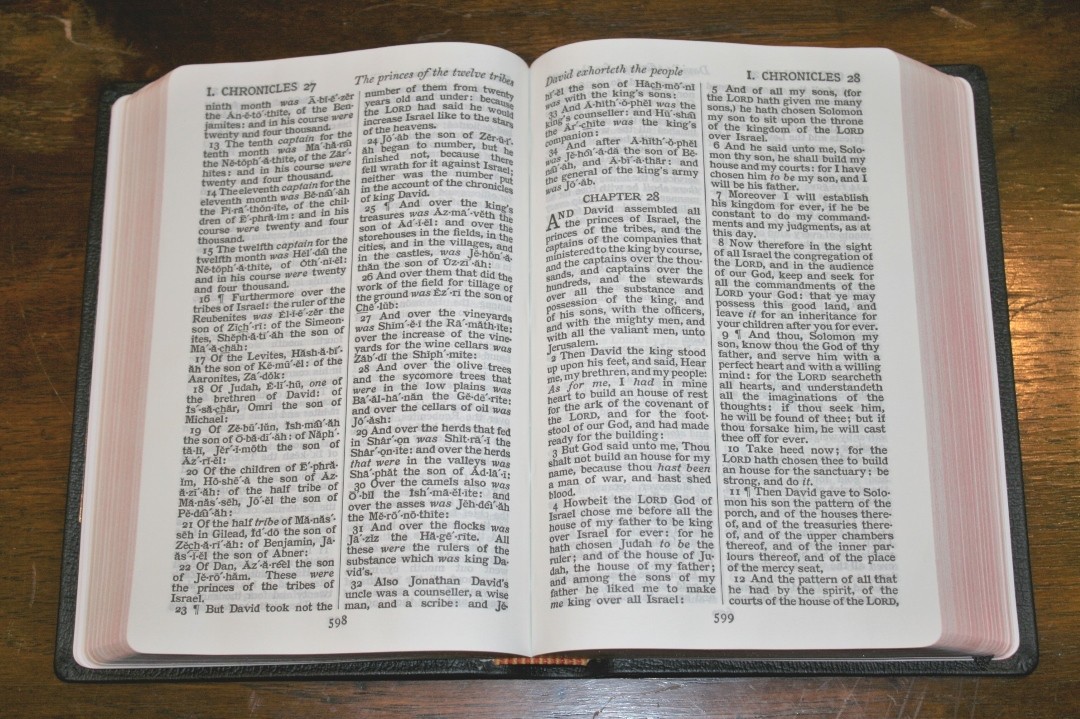
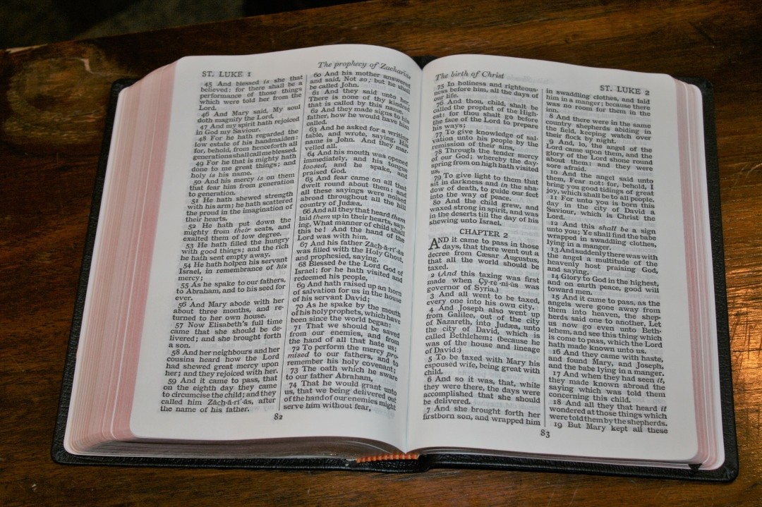
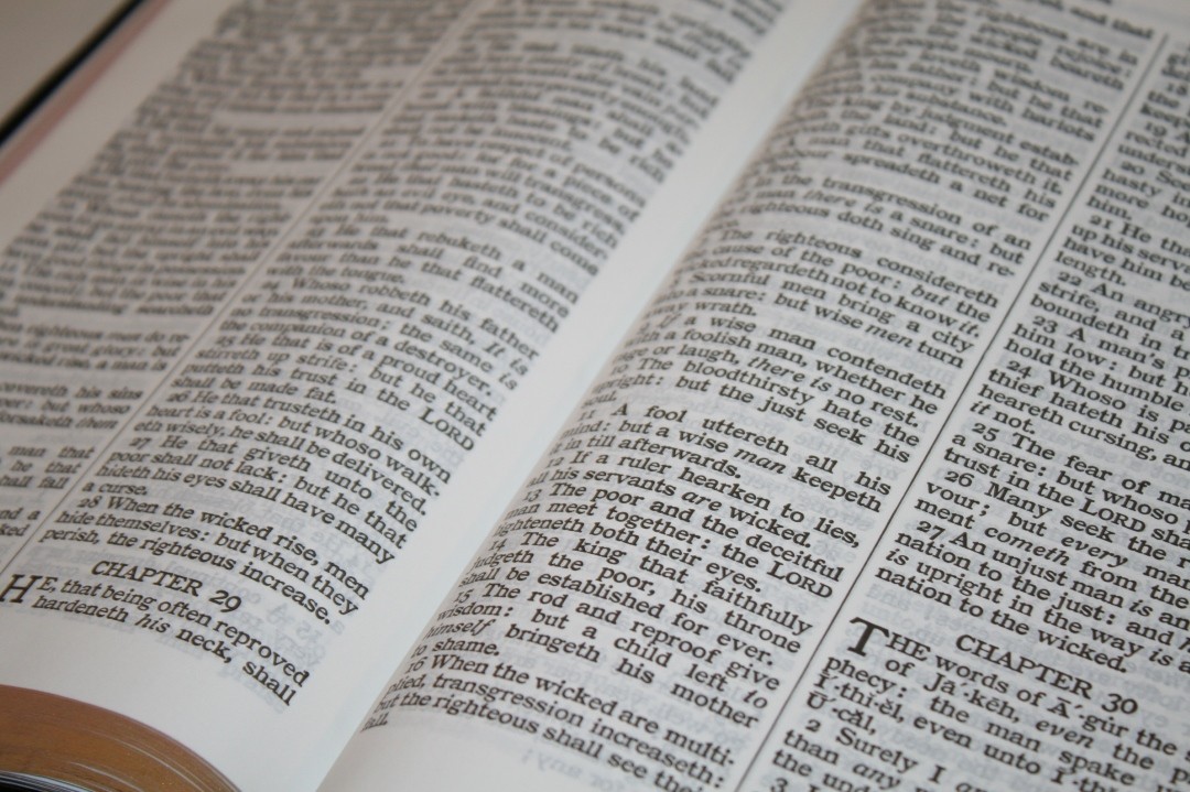
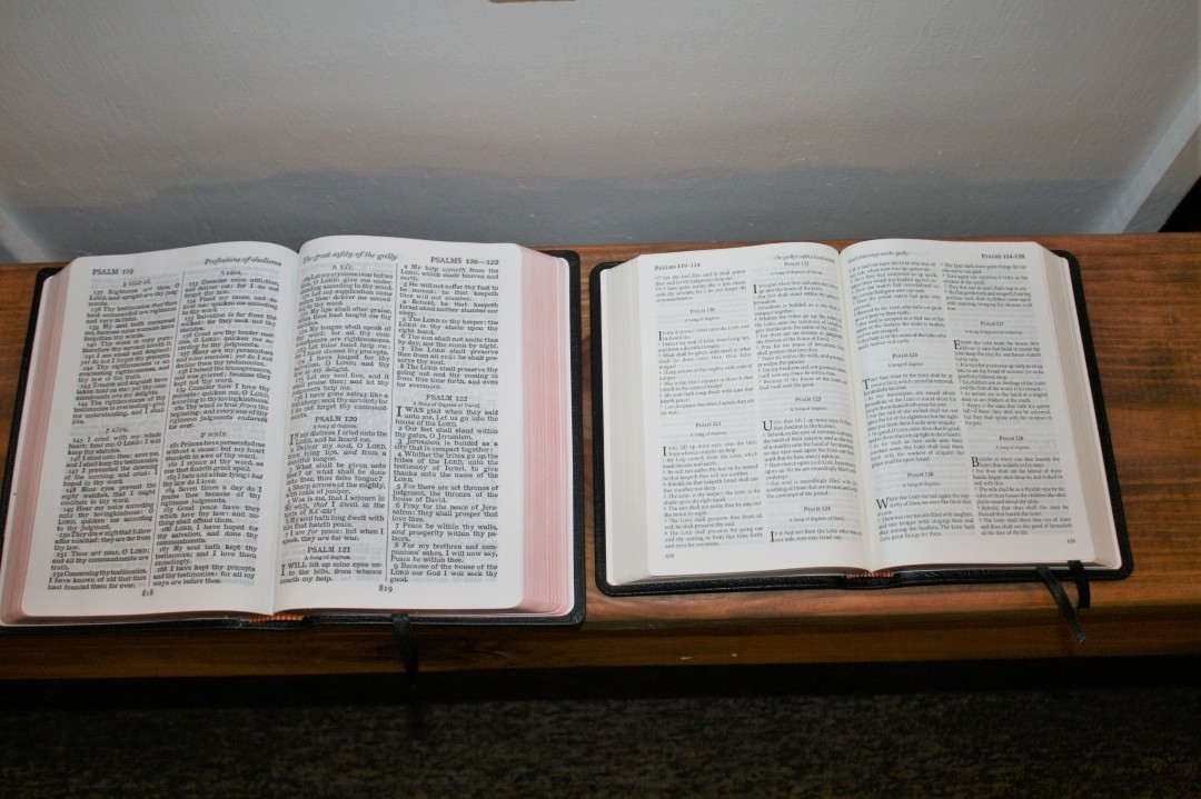
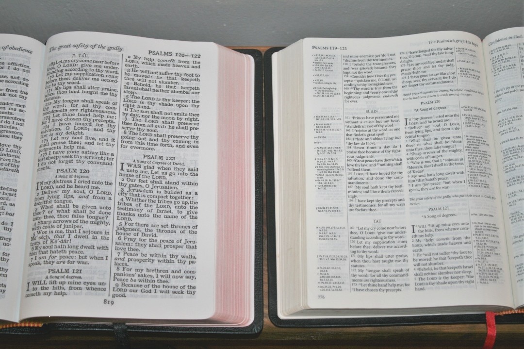
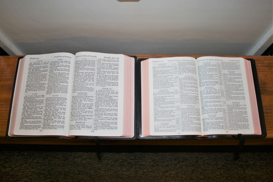
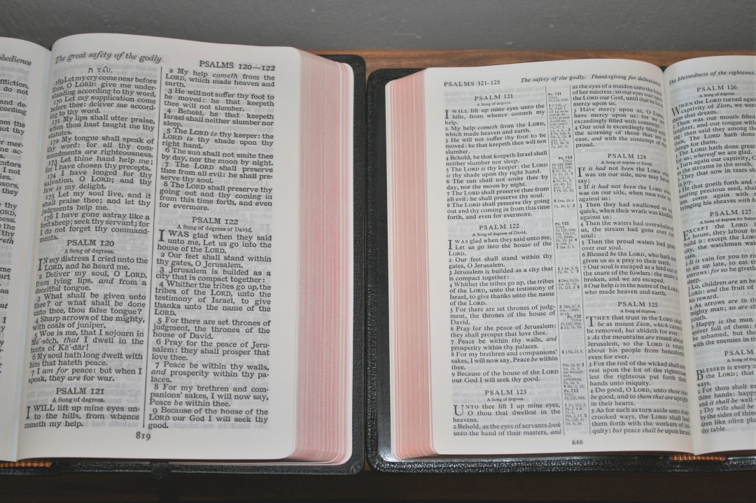
The layout is the standard old-style double-column verse-by-verse that the KJV is known for. Each verse is indented, making them easier to find at a glance.
The font is 10-point bold. It reads much larger than that due to the style and boldness of the print. It’s black letter and is consistent throughout. It’s an old hot-press setting that used movable type. The font style is much heavier than most modern digital fonts.
There are a few places where the words are scrunched together and almost look likeoneword. It doesn’t happen often but it does happen. The columns are 2 ¼” wide and have around 30 characters. It actually looks line-matched. I’m not sure if that’s on purpose but it does help readability.
It has self-pronouncing marks within the text for difficult names and italics for supplied words. A guide in the front shows how to use the pronunciation marks.
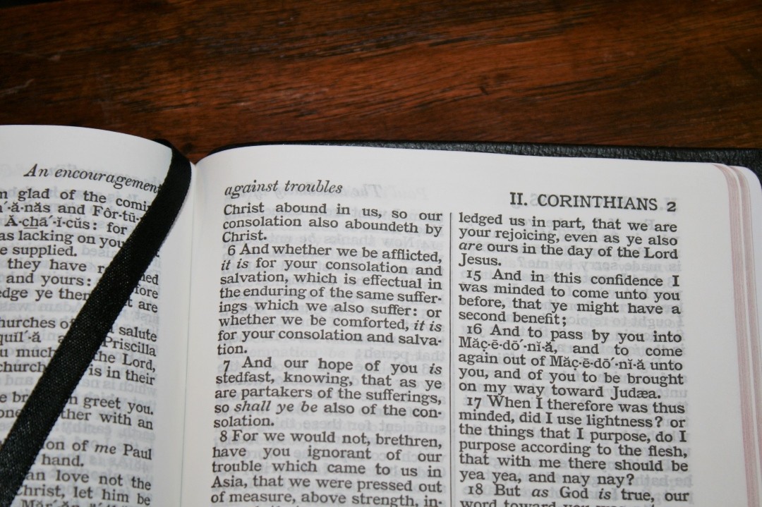
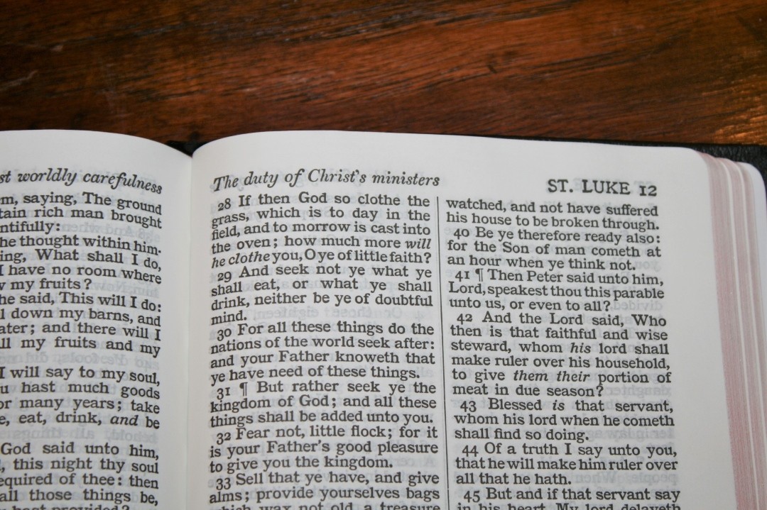
The header includes page summaries near the inner margin and book names with chapter numbers near the outer margin. The footer contains the page number. The first word in every chapter is in all-caps. Paragraphs are marked with pilcrows. Most of the NT doesn’t have them. The epistles contain the Cambridge book endings, telling who the book was written to and from. If there is enough room the next book starts on the same page the previous book ended.
There are ½” inner and outer margins and in the footer. This brings the text out of the gutter and even leaves enough space to write some references or draw some symbols. If you write small you can get some short notes in the margins or in the footer.
Family Pages
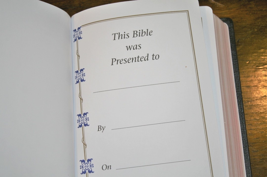
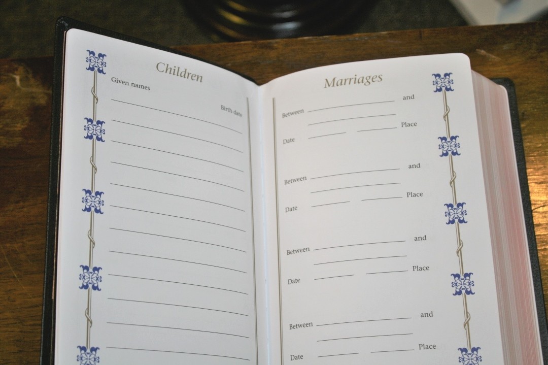
What makes this a family Bible is the fact that it has pages for your family records. In the front, you’ll find the presentation and family pages. Family pages include:
- Family record
- Children
- Marriages (2 pages)
- Grandchildren
- Deaths
I’d like to see something for baptisms and maybe a page for special occasions. There are enough thick pages in the front and back that you can add your own information easily.
Using It
I used this Bible for reading, preaching, and carry. It does all three well. Here are my thoughts on how I use it and why it works for me personally.
Carry
I would consider this a personal size large print Bible. It’s slightly taller than most person size Bibles but that’s offset by it being thinner than most of them. I actually prefer a thinner Bible because the text doesn’t bend into the gutter as much as thicker Bibles, so this shape works for me better than most personal size large print editions. For my perfect Bible, this is the upper limit on the size but it is within my perfect range. For my hand, it’s not too large to carry and hold for long periods of time. I carried it in the car and read from it behind the wheel while waiting in the parking lot of the grocery store with no regrets. If you’re like me and like to take a Bible into a restaurant this one is on the upper edge of the comfortable size. For restaurants, I usually prefer smaller Bibles, but this one still works for me.
Reading
I prefer to read while either holding the Bible in one hand and tilted toward me or laying in my lap. This one excels at both. I have bifocals and I prefer Bibles that I can read from either lens it the text still be in focus. This one excels at that too. This is the kind of Bible I like to read – no distractions in the text, dark and large font, eggshell colored paper, thick paper that’s easy to turn, hand size, not too thick, not too heavy, lay flat in one hand, etc.
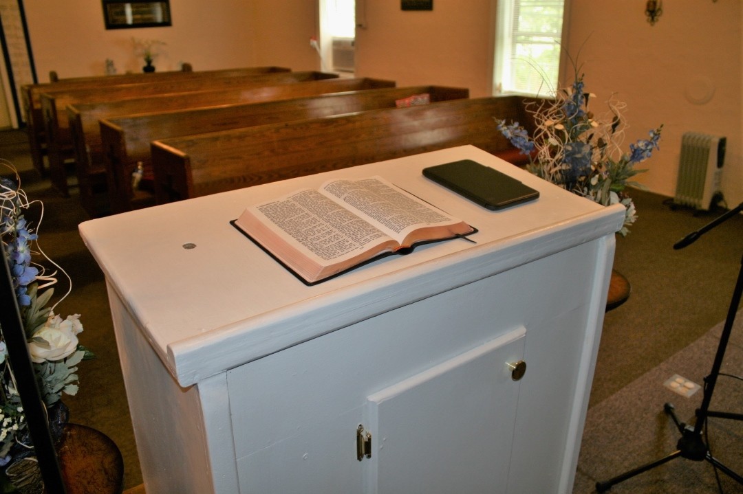
Preaching
I prefer preaching from a Bible with large and dark fonts and opaque paper. I also don’t want the pages to be so large that I feel like I’m making big motions with my hands just to turn a page. The book and chapter names are placed in the corners so I can find verses quickly. The pages must be easy to grab and turn. I also prefer italics for supplied words so I can point that out if needed. This font is bold enough and it’s on the bottom end of the perfect size for preaching, but it is within my preferred range. If words are tooclosetogether it might make me pause and extra breath in order to read it, but it’s not that bad.
If I Could Change One Thing
First, the TBS Family Bible is just about perfect for me. I love it for reading and preaching. If I could have one thing changed or added it would be to add a glossary in the back. Reading plans are nice too, but I would want the glossary first. Even without it this is a fine Bible.
Comparisons
Here’s a look at how the TBS Family Bible compares with the TBS Windsor, Cambridge Concord, and TBS Westminster.
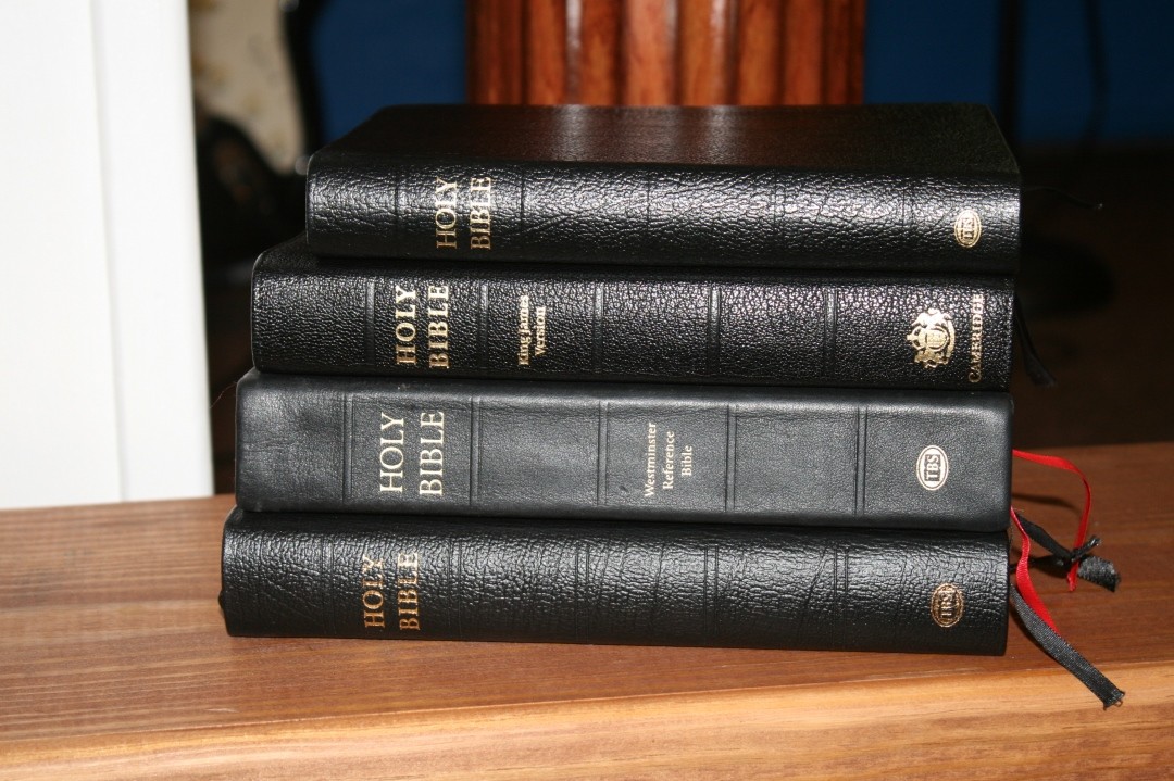
From left to right: Concord, Family Bible, Westminster, and Windsor.

Windsor:
Westminster:
Concord:
Conclusion
I’ve used the TBS Family Bible for over a year now (a different copy than the one I’m reviewing; this one is new) and it’s become one of most used Bibles. It’s perfect for reading, preaching, and carry. It feels like it’s built well and time will tell if it can stand up to daily use, but I have no worries about using it. The cover won’t scratch easily, the pages are easy to turn and are great for writing, and the large and dark font is easy to read and preach from. The TBS Family Bible is a great choice for anyone wanting a well-made large print KJV with no distractions.
Buy from: TBS | EvangelicalBible | Amazon
Trinitarian Bible Society provided this Bible free for review. I was not required to give a positive review – only an honest review. My opinions are my own. Some of our links are affiliates.