
Review by Jonathan Ammon of Bible Reading Project

The KJV TakeNote Bible

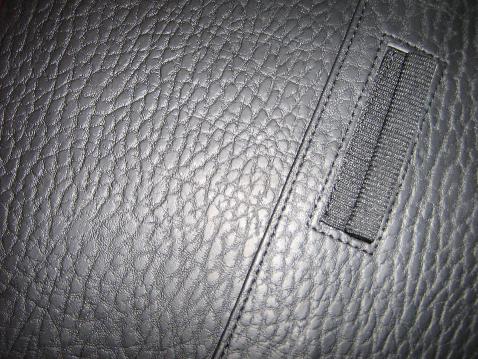
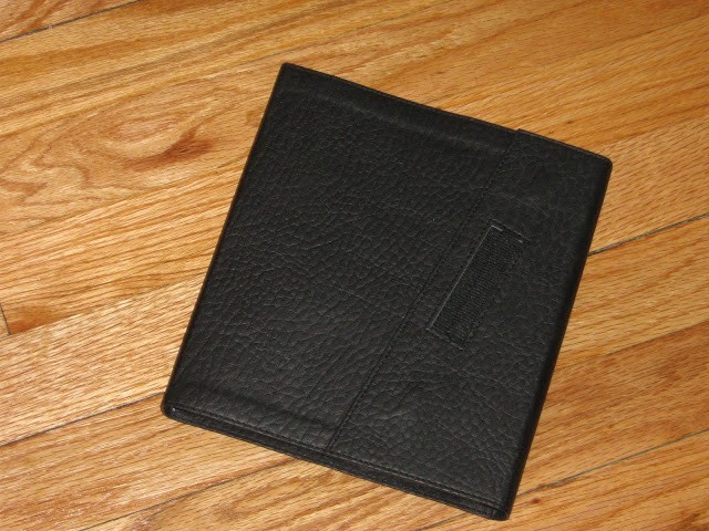
The most immediately noticeable feature of the Bible is its incredibly soft and flexible imitation leather cover. This is by far the best imitation leather cover I’ve handled. It’s both softer and more flexible than Crossway’s TruTone and features a handsome pebble grain finish. I was surprised by the suppleness, which easily performs the yoga position and allows the Bible to bend easily. It’s actually more supple than some of the goatskin Bibles I’ve handled, and while this may not be a must for every reader it’s a great benefit when you have an edition that’s 7.5 inches wide and certainly challenges most of the journaling Bibles out there, which tend to be hardbacks.
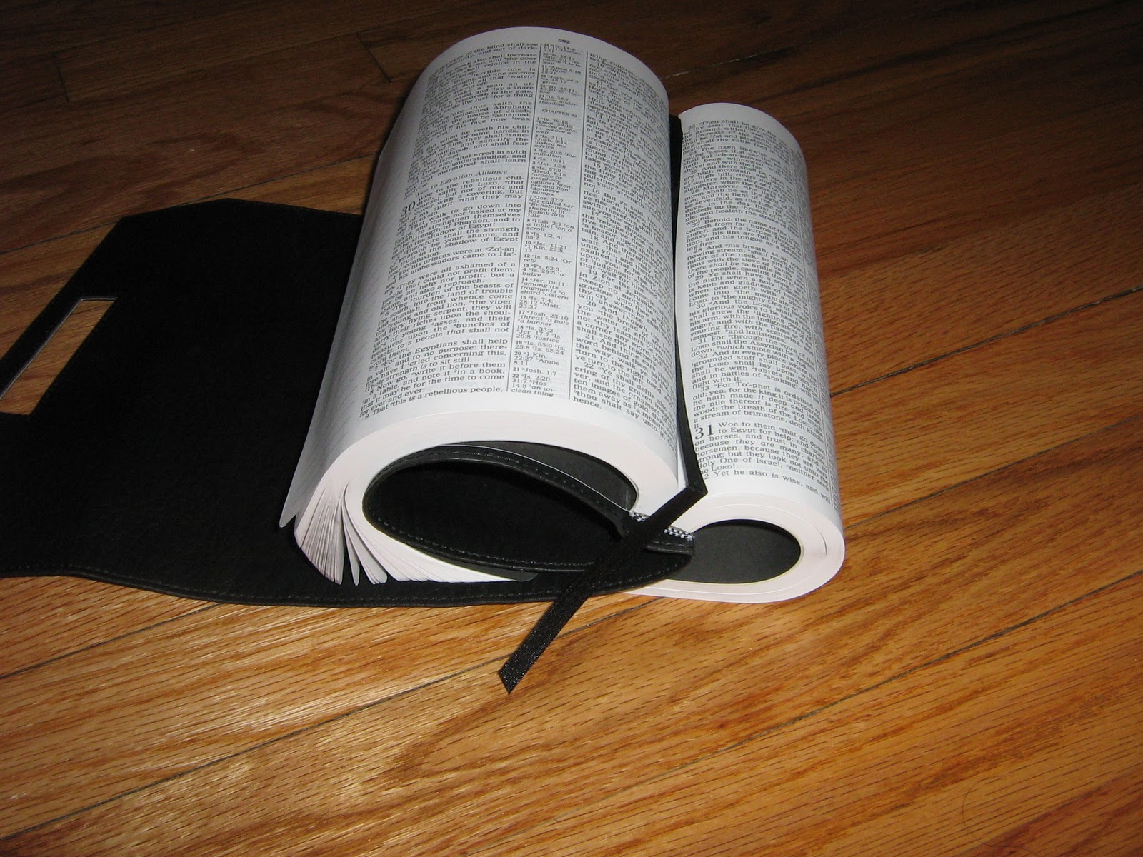
The edition handles the contortions well; only time will tell if the glued binding holds up to the strain of being folded over in such a manner. The layout manages to stay clean and uncluttered without a cramped or minimalist look, but this results in a Bible over 15 inches wide when laid open which may make the flexibility necessary for those who choose to curl the cover behind the back.

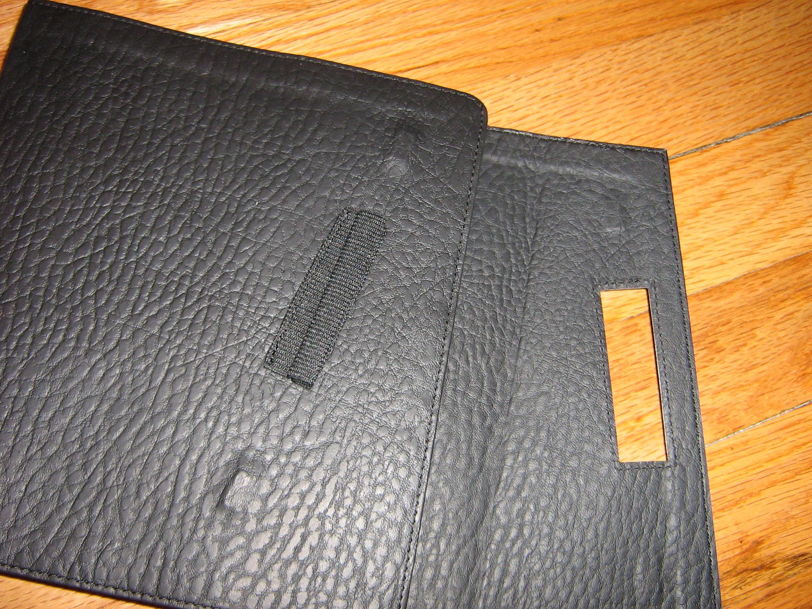
Any wide-margin Bible layout includes a number of compromises and the balance is rarely perfect for everyone. In this case, Nelson has achieved great success in producing a readable layout with suitably wide margins for thorough, though perhaps not extensive, note taking. The font size is one feature that most find lacking in these editions and the TakeNote edition runs parallel with its relative editions with about a 7.5 font. What the TakeNote version adds is a comprehensive center column reference system that features alternate and literal translations for certain words, as well as textual and language notes. This center column reference makes this the only reference journaling Bible I know of and explains the square shaped and size of the Bible (8.125in x 7.5in). The note-taking margin is a little over 2 inches, but the lines only extend about 1.5 inches. My preference is margins without lines, which frees me to create arrows, pointers diagrams etc. However, writing evenly is a concern for some. As a whole the layout is a success, there are no jarringly neglected features and it contains the content in an orderly fashion without clutter. Many would argue that a single column setting with side references would be ideal, but the traditional column setting is still a must for many, and it’s achieved here as gracefully as possible.
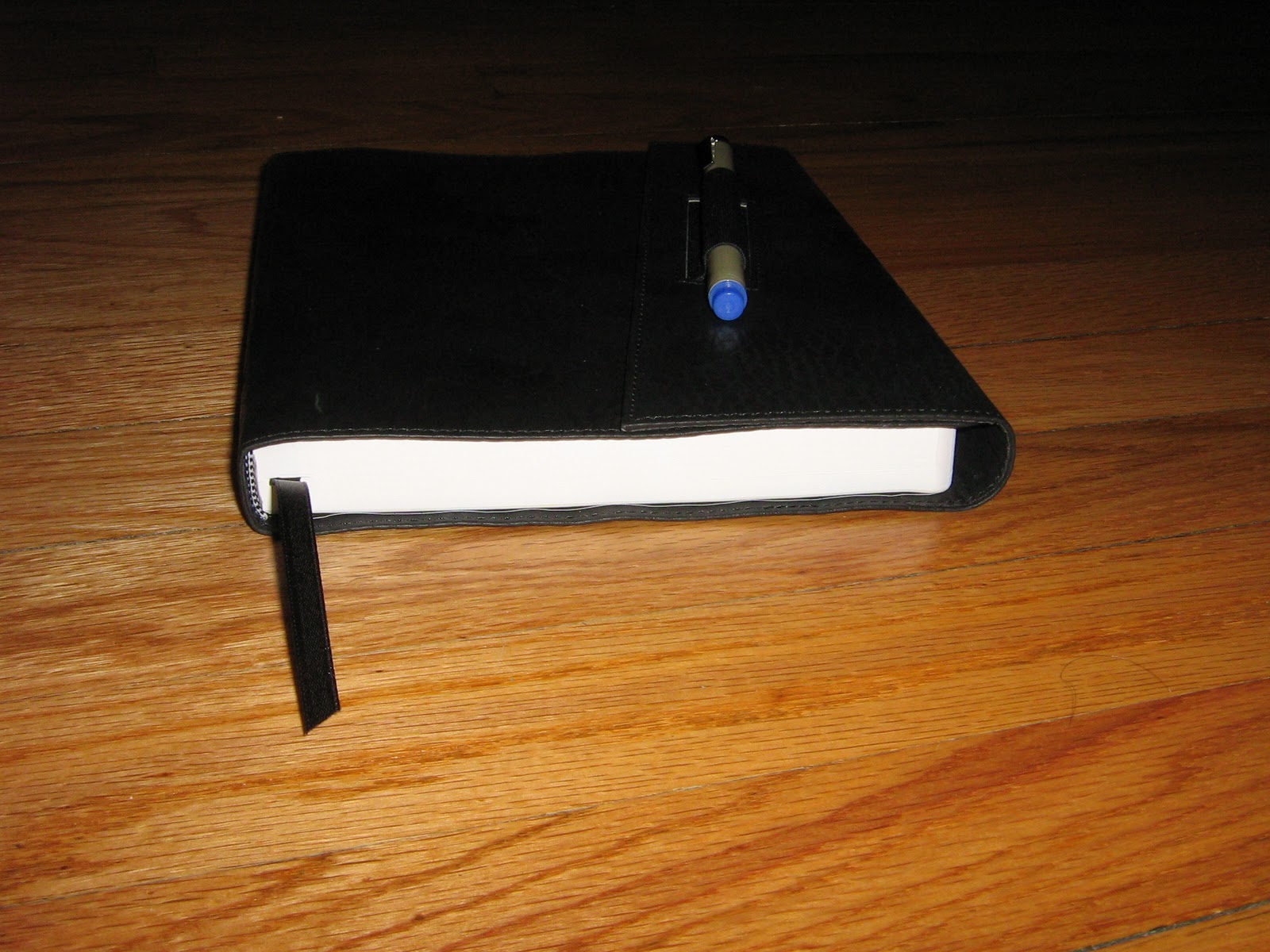
One characteristic I’m not a fan of is the thinness of the spine. I appreciate a thick volume and have never been pleased with thinline or ultraslim editions. The quality of the paper and optimizing the layout should far outweigh any concern for a thin spine. A thicker spine fills up the palm and is only suitable for a book as large as the Bible. This edition probably has the same thickness of an ultraslim edition and this unfortunately means thinner paper with less opacity which is greatly detrimental to any Bible you’re using for note taking. Compromises between construction and layout must be made, but I would love to see publishers opt for a thicker spine, allowing heavier paper, larger print and larger margins.


The KJV TakeNote Bible is a welcome addition to user friendly, feature-packed wide margin Bibles designed for the mainstream. Thomas Nelson has included a number of improvements in the design and has surrounded a well handled layout with useful study tools, practical features and a beautiful, high quality imitation leather. Only time and use will test the durability and endurance of the construction, but the design evidences careful and creative thought. While I might prefer a thicker spine, heavier paper, larger print and a smyth sewn binding rather than glued, this is a welcome edition with many strengths, and I would not hesitate to recommend it to KJV lovers and note taker’s alike.

Labels: KJV, review, wide margin