

Review of Cambridge Concord Reference KJV in Black Calf Split
By Matthew Everhard
“This is not your father’s Oldsmobile.”
So says the famous automobile advertisement. In every field and market, there exists a tension between the ancient and the modern. The time-honored and the cutting edge. There is a perpetual tug-of-war between “the way it has always been done” and new technologies and innovations that make the former way obsolete. Rarely does a product or design balance both so effectively.
Enter the KJV Cambridge Concord Reference Bible.
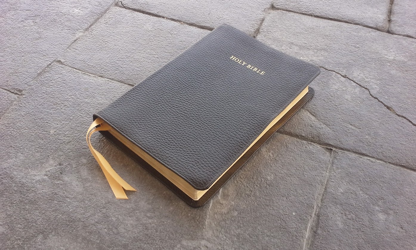
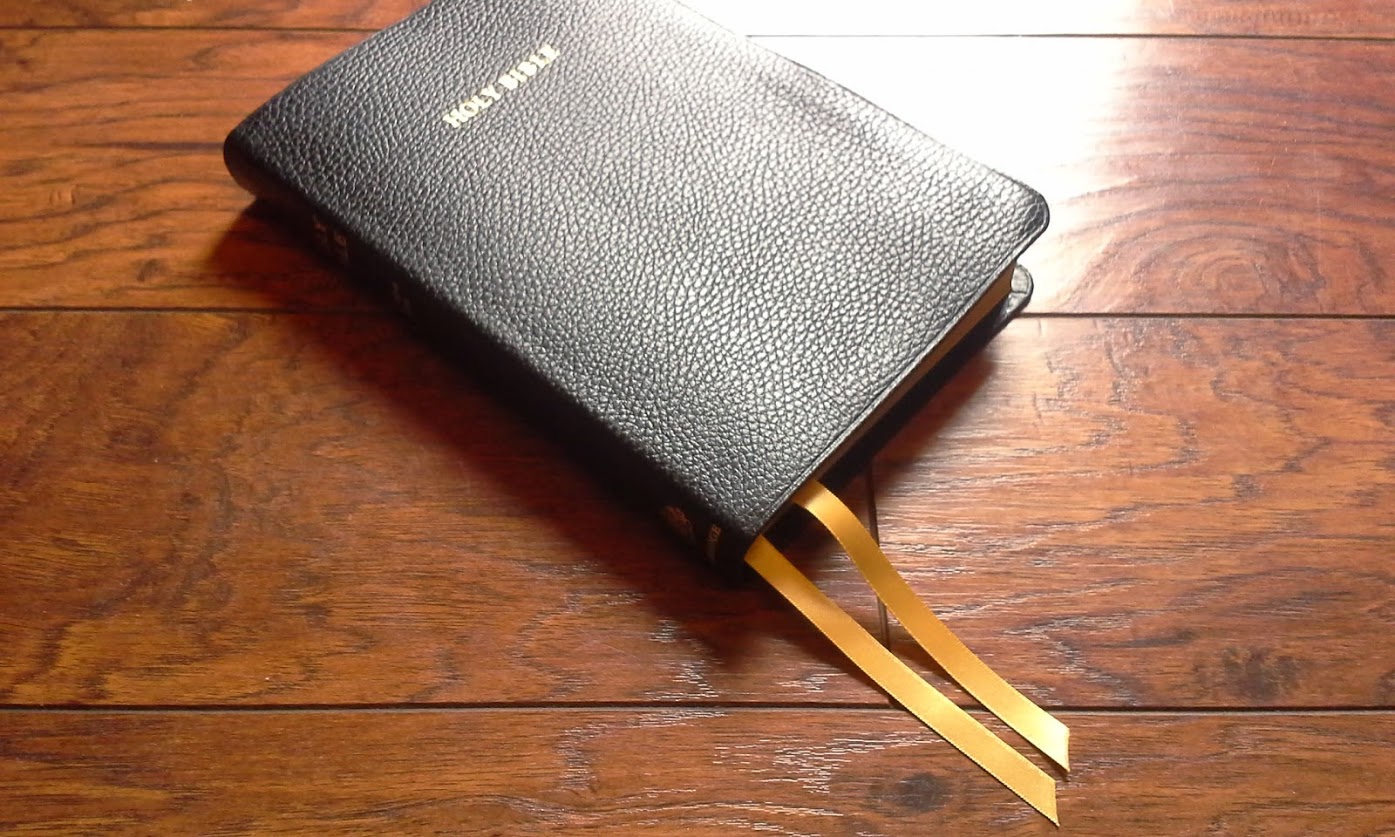
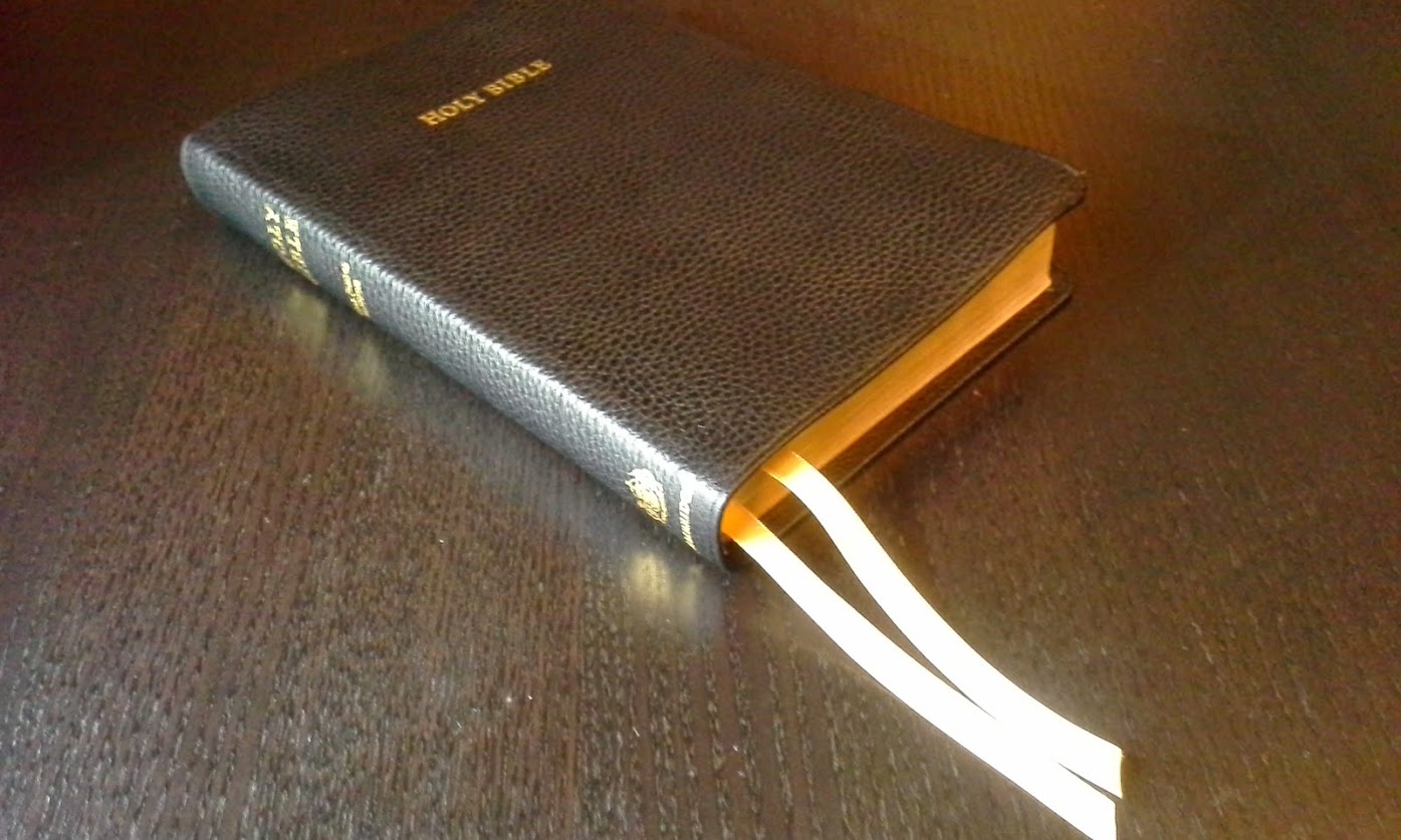
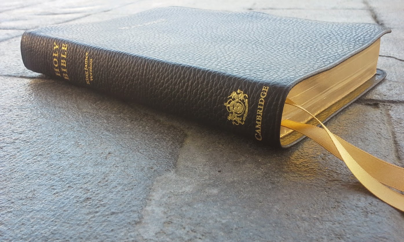
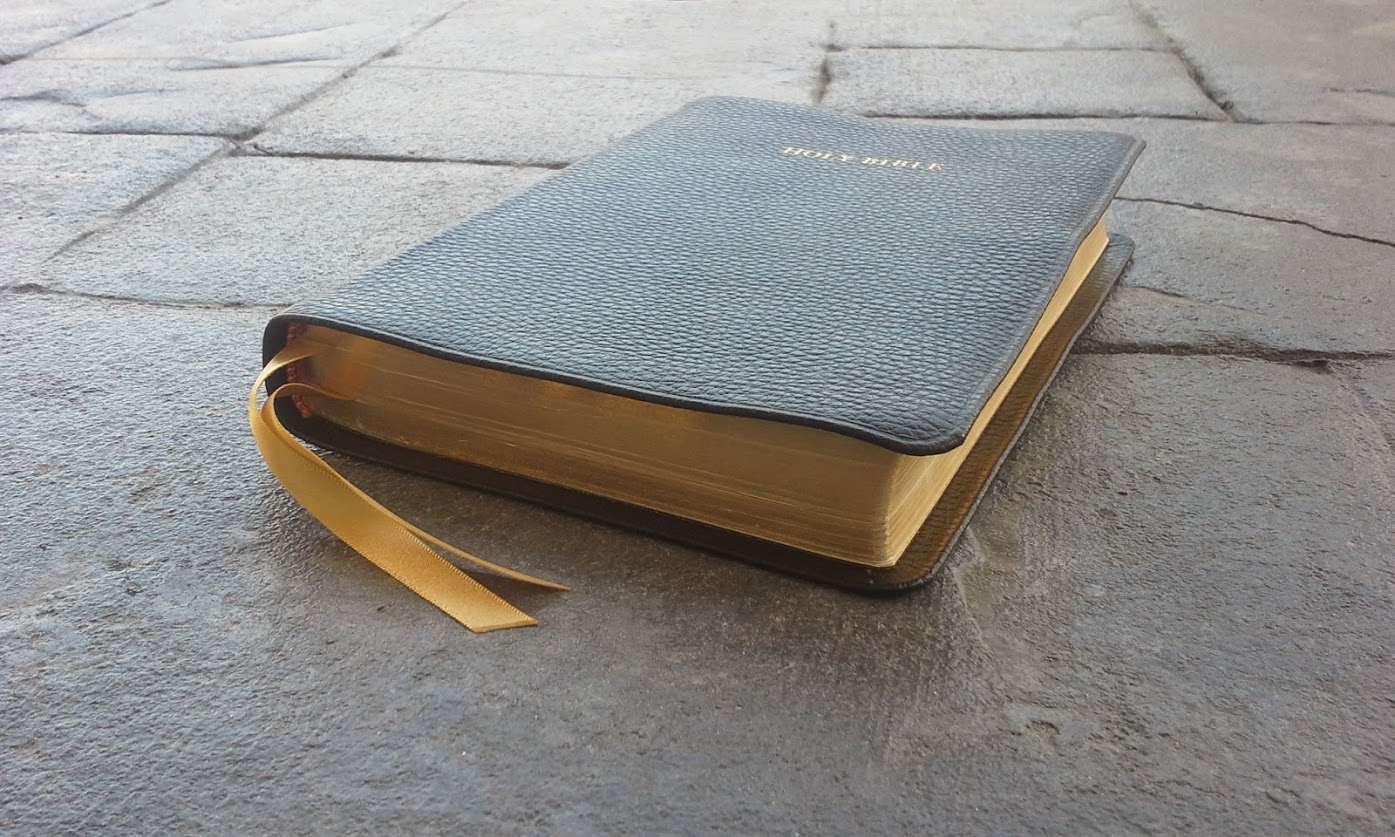
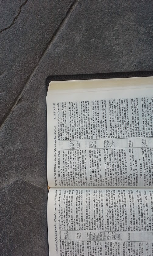
Custom ribbons installed by Matthew Everhard
Before us today, we have a Bible that superbly combines the look and feel of an old-style King James Bible—produced by the world’s most ancient continuing Bible publisher—with the sleek design styling of some of today’s newest and best editions of the sacred writ.
Overview
- Aesthetics: Classically proportioned and increasingly tactile with use.
- Binding: Smyth sewn; Cambridge/Jongbloed binding works loose and opens flat within hours.
- Cover: Black calf split matures slowly but surely with plenty of manipulation.
- Ergonomics: This perfectly sized edition should inspire more 8’ X 5’ range Cambridge editions and translations.
- Features: Numerous study features are accessible, if outmoded by the digital age.
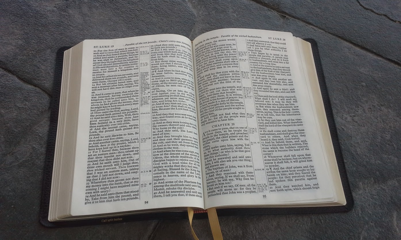
- Layout: Double-column, verse-by-verse format will be well-loved by traditional KJV fans; the center column references are slightly more awkward.
- Lining: Is it time for Cambridge and Jongbloed to look into new lining structures?
- Paper: Paper is soft to the touch; white in good lighting, and better than the Clarion.
- Readability: Legible 8-point font in Times Semi-bold 421 makes this a user-friendly edition.
- X-Factors: The quasi-ancient styling and text of this modern Bible production makes it a KJV lover’s dream reference Bible.
It is no secret that I love Cambridge Bibles. The very fact that they are the oldest existing publisher of Bibles in the world–running back to the days of the Reformation–is alluring enough to this history buff. The fact that I can hold a Bible today in my hands (the same translation even!) that came off the presses of Cambridge 400 years ago makes my heart go pitter patter.
Adding to this the fact that Cambridge continues to produce some of the best Bibles in the world today explains my desire to collect this label above and beyond other makes. The KJV Concord Reference is yet another essential edition to the stellar lineup by the British/Dutch tag-team of Cambridge and Jongbloed.
So, I took this model with me to the campus of Reformed Theological Seminary for a week’s worth of doctoral courses. What follows are some of my observations after working with this commendable edition of the Authorized text on campus for five days.

Let me run down some of the features of this text.
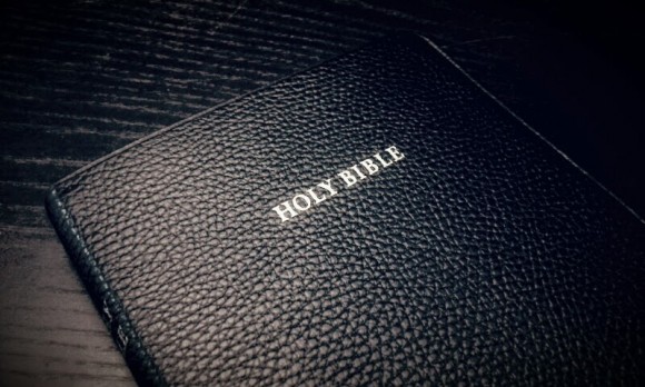
At first glance the Bible is gorgeous and well-proportioned. The dimpled texture of the cover is a delight to look at and feels wonderful too. I looked forward to pulling it out of my black leather messenger bag every morning and setting it down on the table in a room full of pastors and scholars. Immediately, it strikes the user as having a strong and durable leather, rather than a soft and floppy one. This one will hold up for years! The words “Holy Bible” are printed, center set, in gold letters in the upper quadrant giving this book a nostalgic aura.

As with every Jongbloed printed Bible I have ever seen, the page edges and gilting are utter perfection. There is no hint of unevenness or imprecision in the plaining of the pages. (Owners of some editions of Crossway’s Legacy will know what I mean by that; the gilting is wavy and uneven in some copies). Signature after signature meet exactly at page end like a placid golden river in the Concord.

This Bible does well in the category of aesthetics. No, it does not melt in the hands like an R.L. Allan cloaked in their famous Highland Goatskin. It doesn’t even double back on itself or fold over very well without stressing the joints. But I am giving this Bible a high score with the expectation that it will soften up like my Cambridge ESV Pitt Minion (in the same calf split leather) has done. I am grading it based on what I believe it will be rather than what it currently is.
Despite the fact that calf split is supposed to be the under-carriage of a good hide, my Pitt Minion (same skin) has become one of my most tactile Bibles in my possession. The calf split here in the Concord Reference too gets good grade in anticipation that it will become like its little cousin. This process may take some time though, and about six months from now the Concord Reference should be one of my most delightful Bibles to touch, hold, and use.
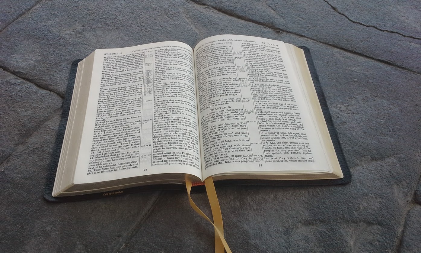
I should make some remarks about the text and font. Here is where the Concord gets its “old school” billing. Out of the box, it has the look of something that was printed in the vintage eras of yesteryear. This older look is especially notable when compared to a very close competitor, the TBS Windsor. The Windsor, by contrast, has chosen to employ a modern font (Swift) that gives that particular Bible an updated look. I almost forget I am reading the KJV with the Windsor, but the Concord constantly reminds me I am holding a descendant of a 400-year old textual tradition. The font used in the Concord Reference, Times Semi-bold 421, gives it an “undated” effect of appearing much older than it really is. I like that.
In my view, Cambridge got the sizing just right here. I personally find that Bibles in the 8’ X 5’ range are just right in the strike zone for all around usage. I think the sizing here is in the Goldilocks Zone: small enough to carry easily; large enough to use in public reading and teaching settings. Although 9’ X 6’ Bibles seem to be gaining the larger share of the market these days (Quentel anyone?) – no doubt due to their ability to bear larger and cleaner fonts – I am personally convinced that the 8’ X 5’ range is better for all around usage. For this reason, some KJV readers may find that this Bible could be their coveted “The One.” That is to say, the only Bible they need to do just about everything.
During my week on campus I used it in multiple ways: as a quick reference to follow the professor’s lectures, as a devotional reader in the evenings, and for some light sermon prep for this coming Sunday. Can this Bible be a reader? Yes. Can it serve dutifully in the pulpit or lectern? I believe it will. Does it have the functionality of a reference-based study tool? Absolutely.

If anyone from Cambridge happens upon this review, my plea to him or her would be to do more Bibles in this same size range. I have been pining for an ESV in this size range that shares the exact same text and layout formats as the Pitt Minion and the large Wide Margin.
But that plea is for another article.
I am a bit surprised that Cambridge and their Dutch partners at Jongbloed don’t toy around with the lining a bit, however. Some experimentation and variation of their “tried and true” paste-down might do them well. I understand that adding real leather liners would cause costs to soar (for both consumer and publisher), but I have observed that their cardboard strengthened liners can be a bit too stiff at first. I wonder if they considered a thinner piece of cardboard between the leather and the synthetic paste-off liner whether that would improve the overall aesthetic right out of the gate. In fact, I wonder what would happen if they toyed with using the polymer liner used in their goatskin editions with the calf split leather.
Is that even possible?
As a minor critique, I would have left out the various helps in the back of this text block. They did not help me much with my sermon preparation. With the voluminous amount of information readily available on our laptops and smart phones, much of this information is too easily gathered elsewhere. Some of this stuff is better reserved for the study Bible format. For the sake of discussion, here is a brief list of the “bonus features” included in this reference edition:
- Presentation Pages
- Glossary of Biblical Usage (just a few pages)
- Concordance (140 pages)
- Concise Bible Dictionary (130 pages)
- Cambridge Bible Maps
- and Map Index
Aside from the maps and the map index (very helpful by the way), I would go ahead and leave the other features out for the sake of aesthetic considerations in future editions. Shaving off a few ounces—and a couple hundred pages—from the final hand-held edition would be addition by subtraction.

[Note: Having just said that, there are some times that I am separated from my computer and need these features for a Bible Study or sermon preparation. More and more, however, those times of digital disconnect are infrequent].
In all, there is very little to find fault with in this reference Bible. It is a worthy heir to the King James publication legacy as well as the strong Cambridge Bible heritage. It is both robust and beautiful; classic and utilitarian.
As far as KJV texts go, I won’t need any others for a very long time.
I rate this Bible as “very good.”