
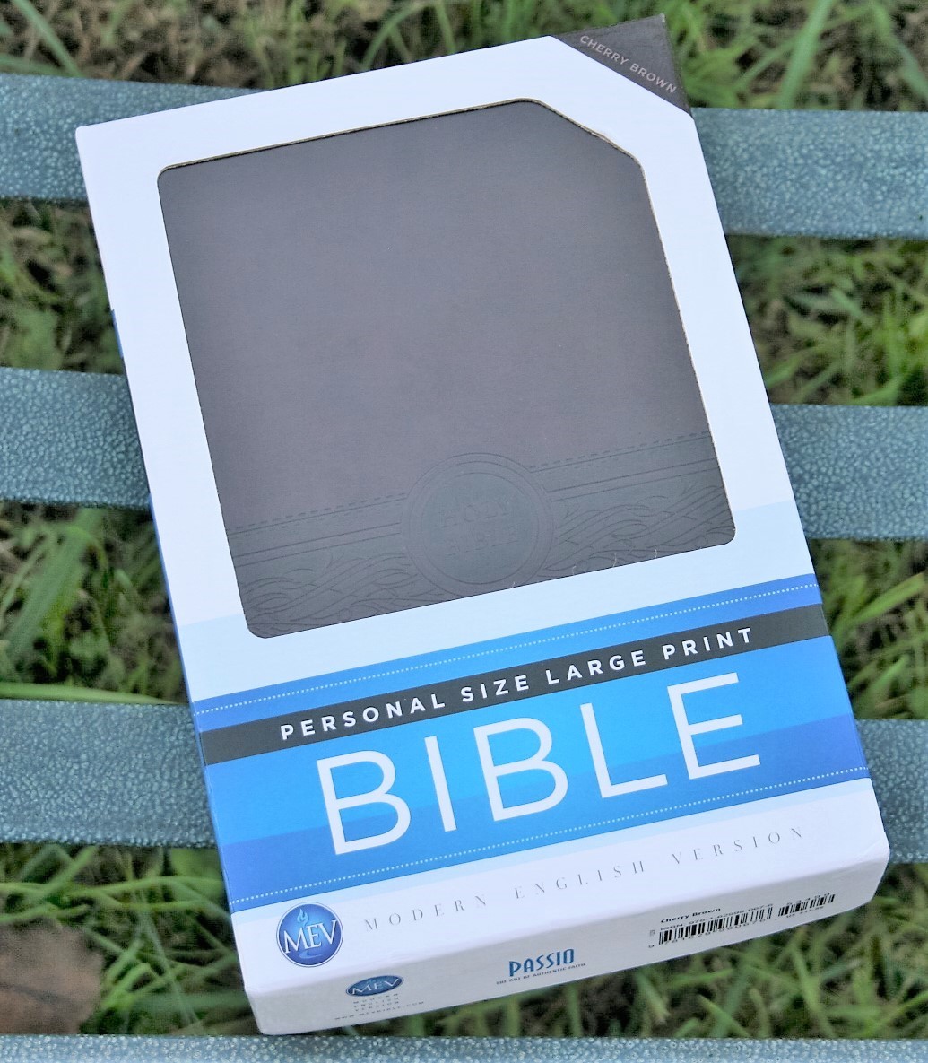
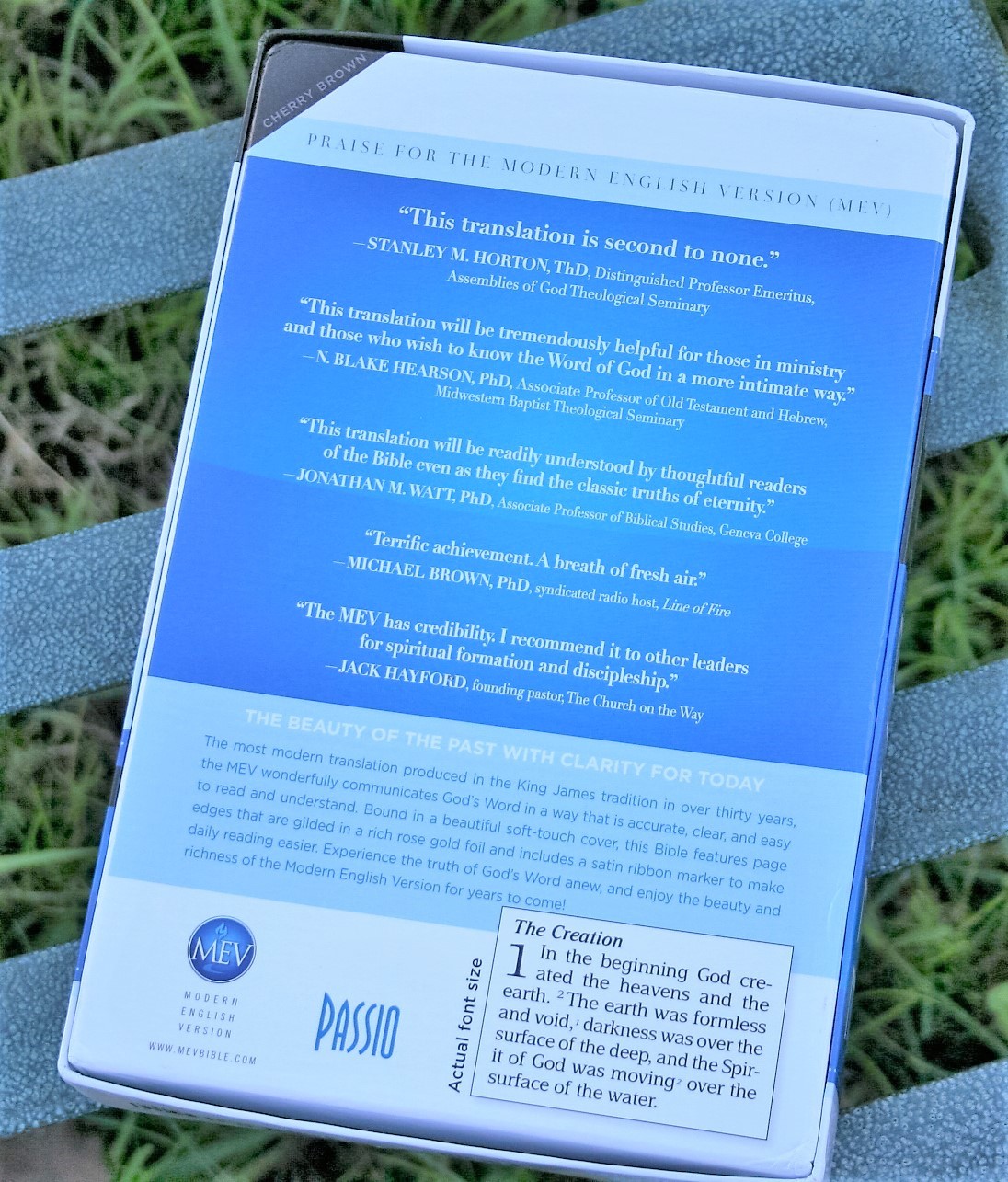
The large print personal size Bible is a staple in the Bible publishing industry. In my opinion every publisher and translation needs a Bible in this format. The format lends itself well for carry, reading, and preaching, without bogging the Biblical text down with lots of features that readers can get elsewhere. The focus is often on the text. This is a format that I very much appreciate. Passio produces the Modern English Version (MEV) in this very format. In this review I’m taking a look at Passio’s Personal Size Large Print MEV Bible, ISBN: 9781629980676.
Binding
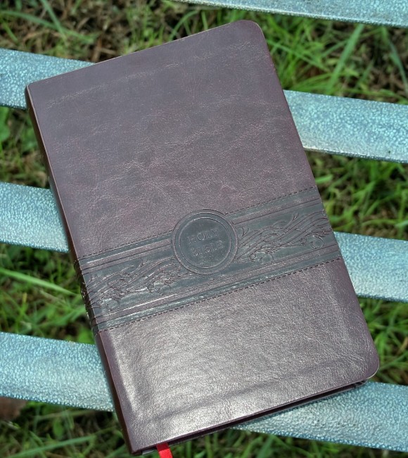

This edition has a Cherry Brown polyurethane cover. I love the textured look and feel. This is how I like imitation leather to look and feel. Rather than looking cheap, it looks elegant. Obviously imitation leathers won’t last as long as genuine leather, but the price reflects that. It has a nice elegant design embossed through the middle that goes horizontally all the way around with HOLY BIBLE within a small circle in the front. It isn’t too large and doesn’t look at of place. The liner is a paste-down heavy paper that follows the cherry theme.


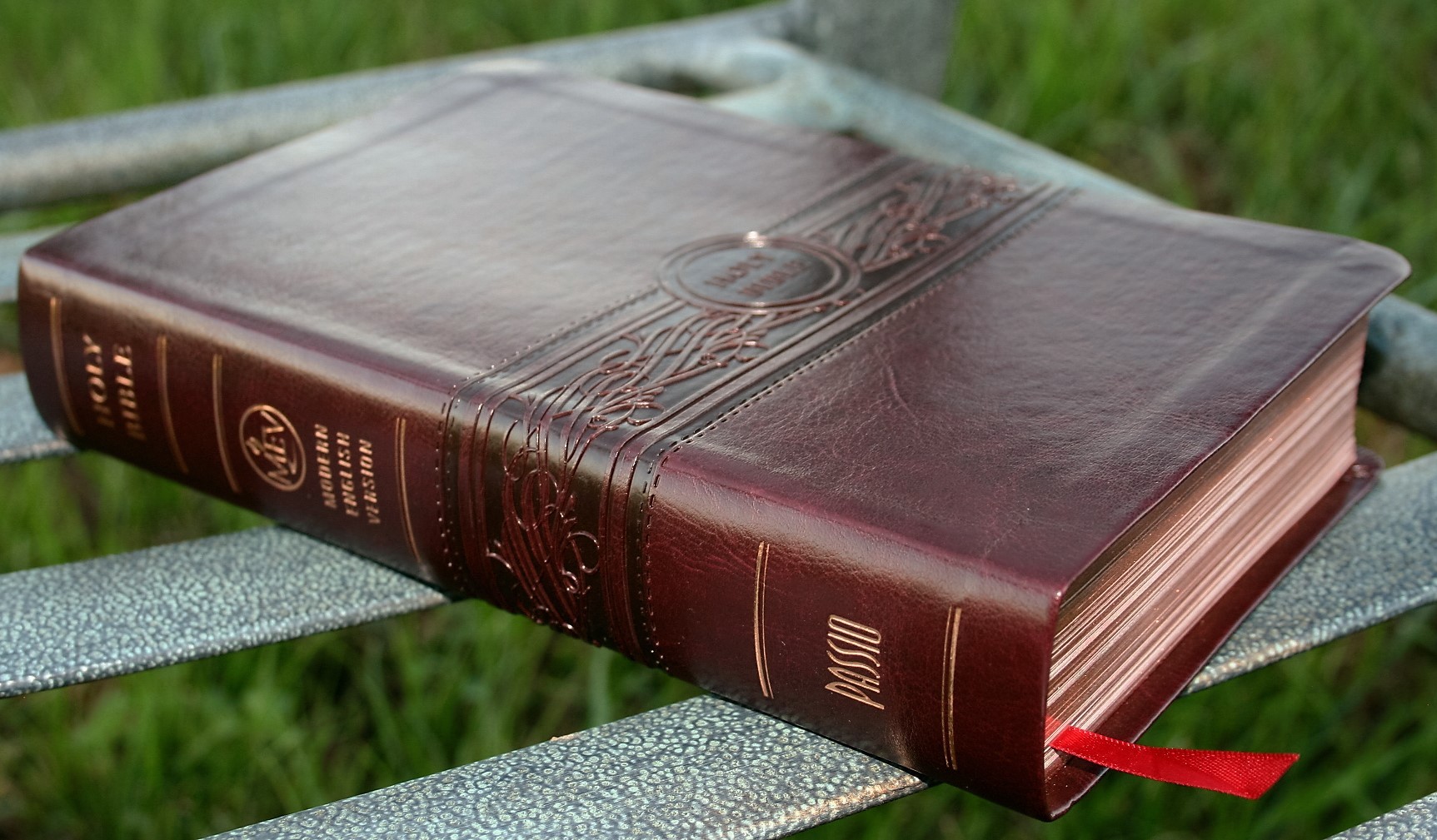
On the spine is engraved six spine ridges, HOLY BIBLE, the MEV logo, and the Passio logo. They’re gold stamped and look elegant. They’re not too large or overdone.
It’s Smyth sewn and lays flat when opened. It will take some breaking in before it will stay open in Genesis though.
The overall size is 5.7 x 8.75 x 1.5 making it easy to carry and hold. It has a burgundy ribbon that matches the color scheme.
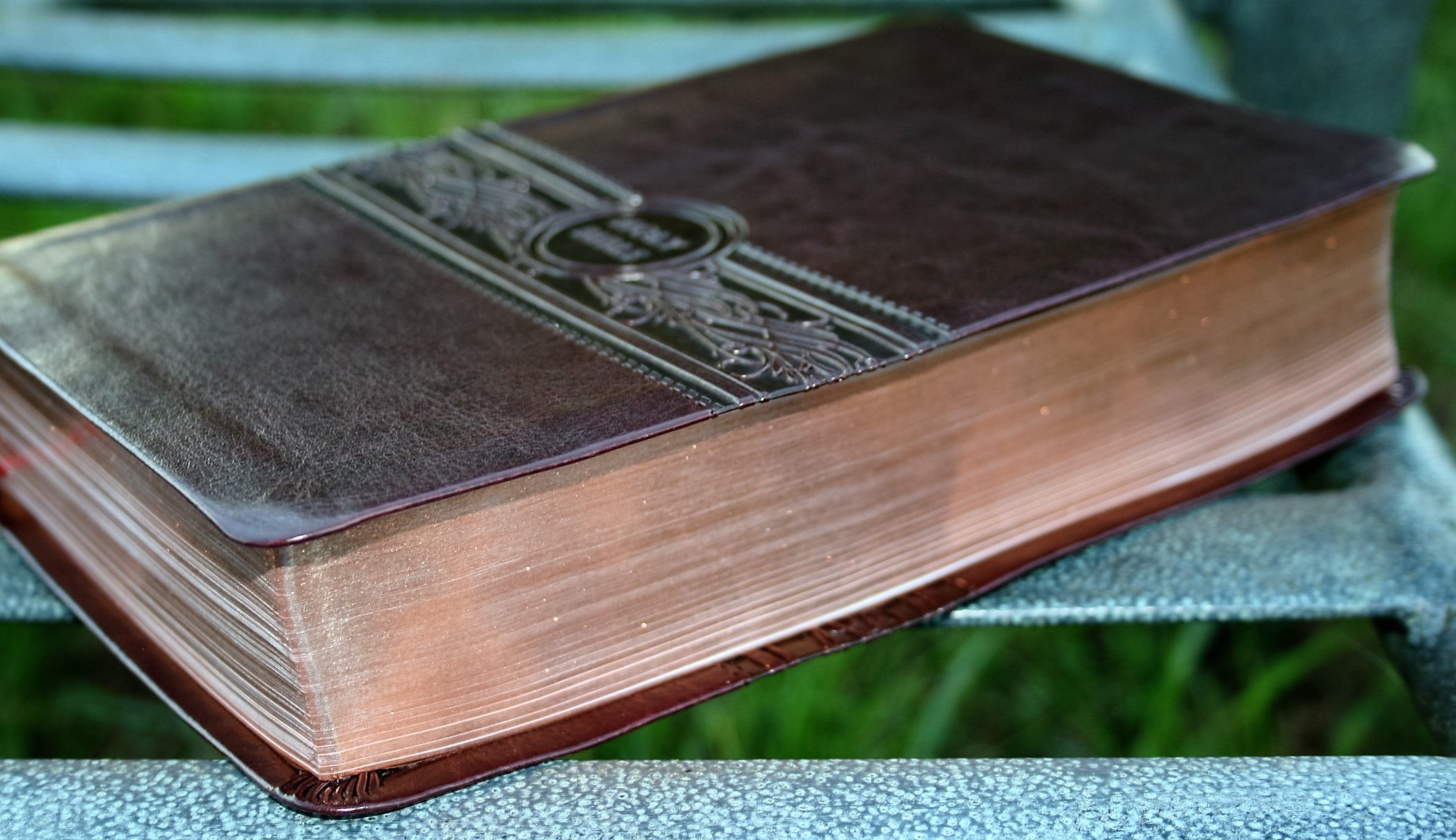
The art-gilt edges are rose under gold. It’s dark and looks great against the cherry brown cover. It’s amazing to have art-gilt on a Bible in this price range. This would be a good Bible to rebind in calf skin or goatskin.
Typography
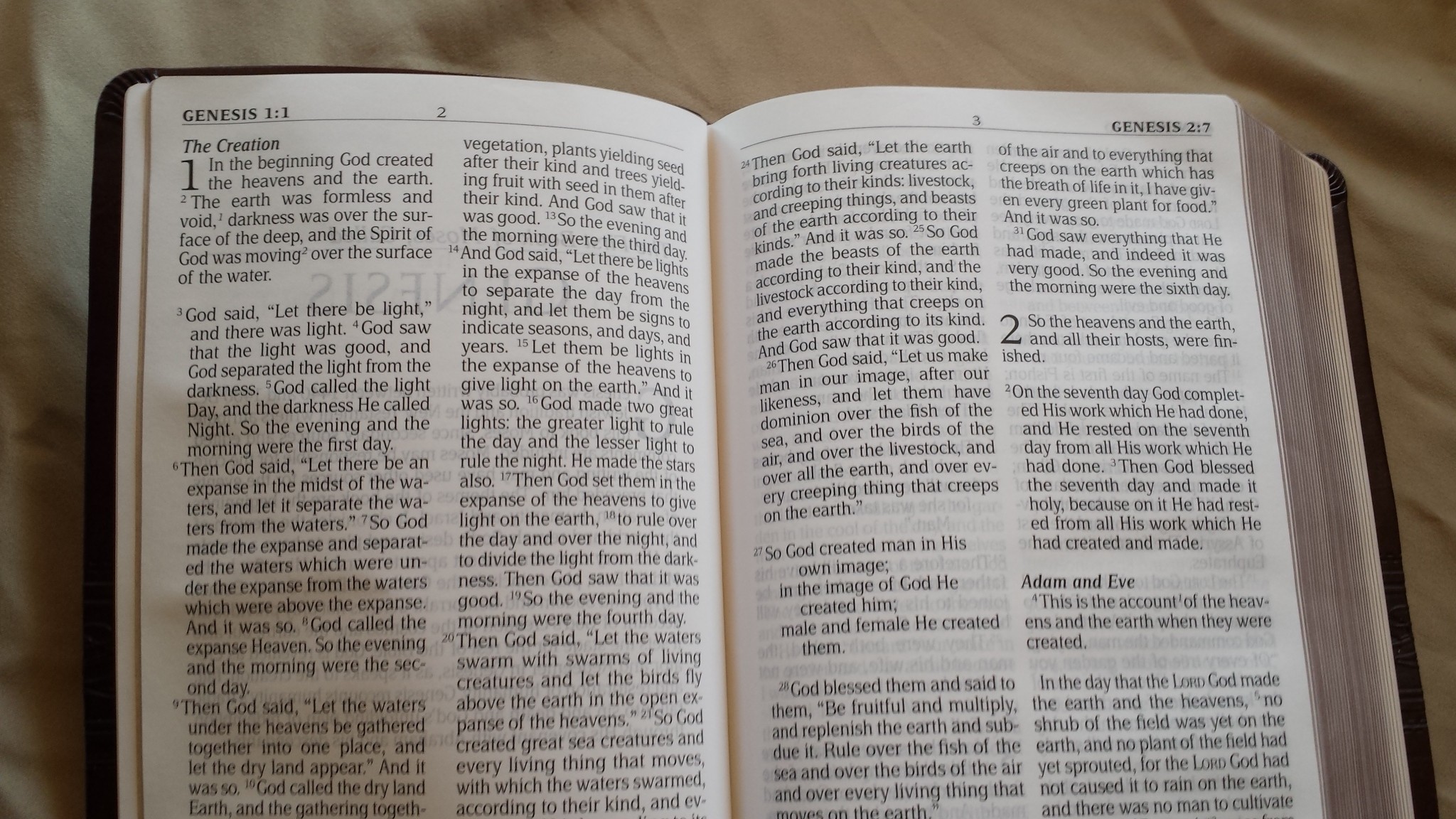
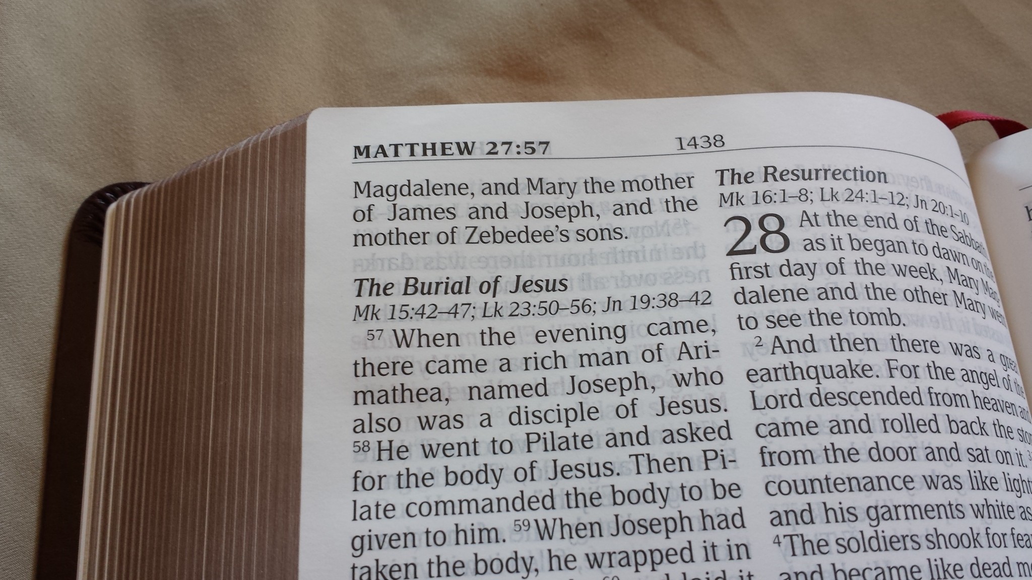
The text is set in double-column paragraph format with poetry in poetic verse – even through the New Testament. Prayers and letters are indented to set them apart. The typeset uses line-matching. This helps readability quite a lot. The poetic sections do have a lot of lines with a single word. Dialog are placed in quotations, but not on their own line.
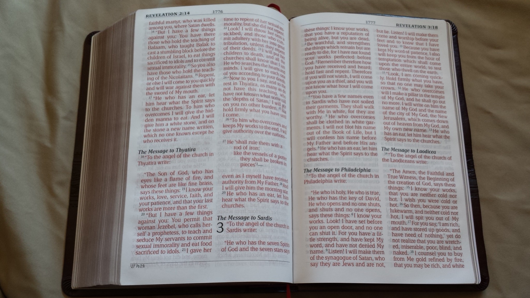
The font is 11-point with red letter. To my eye it looks more like a 12 point. The font itself is modern, clean, and very readable. I like this font a lot. The black letter is good and dark. It’s not overly bold, but it is heavier than average and falls within my personal tastes for boldness. The red is bright and follows all the way through Revelation. Both black and red are consistent throughout. Supplied words are not in italics except for those that were inserted as a footnote within the text.
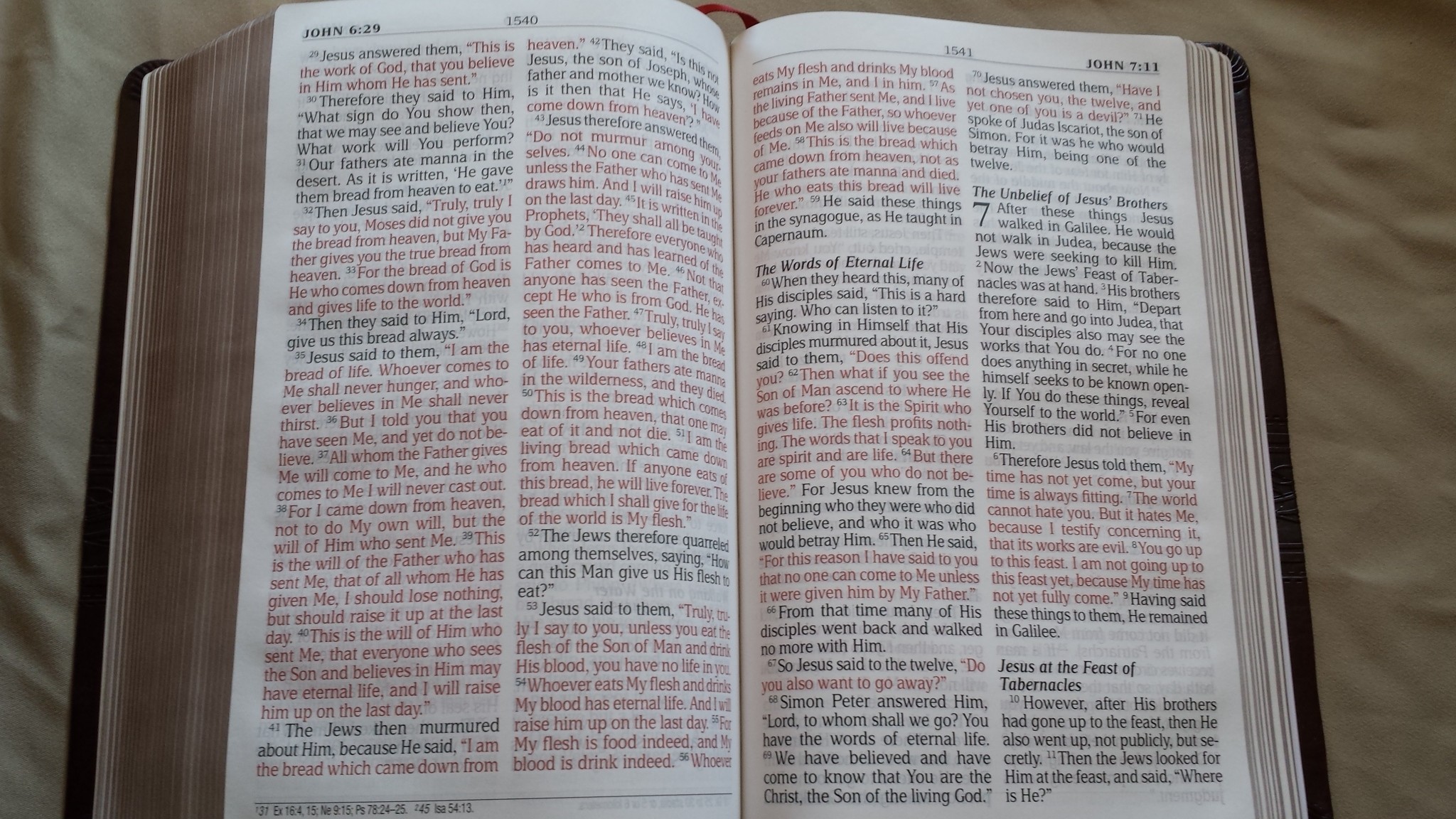
The typeset has 32 characters across. It never feels crowded and it doesn’t have any awkward spaces. Unfortunately it does have a lot of hyphens, but that’s hard to avoid if you want even spacing between words.

Verse numbers are a little difficult for me to find. They are smaller and lighter than the text and they tend to blend in. There is a little bit of space between the verses. That helps, but I would prefer a bolder font for the verse numbers. For reading this is preferred, but it does make it more difficult for study and preaching or teaching.
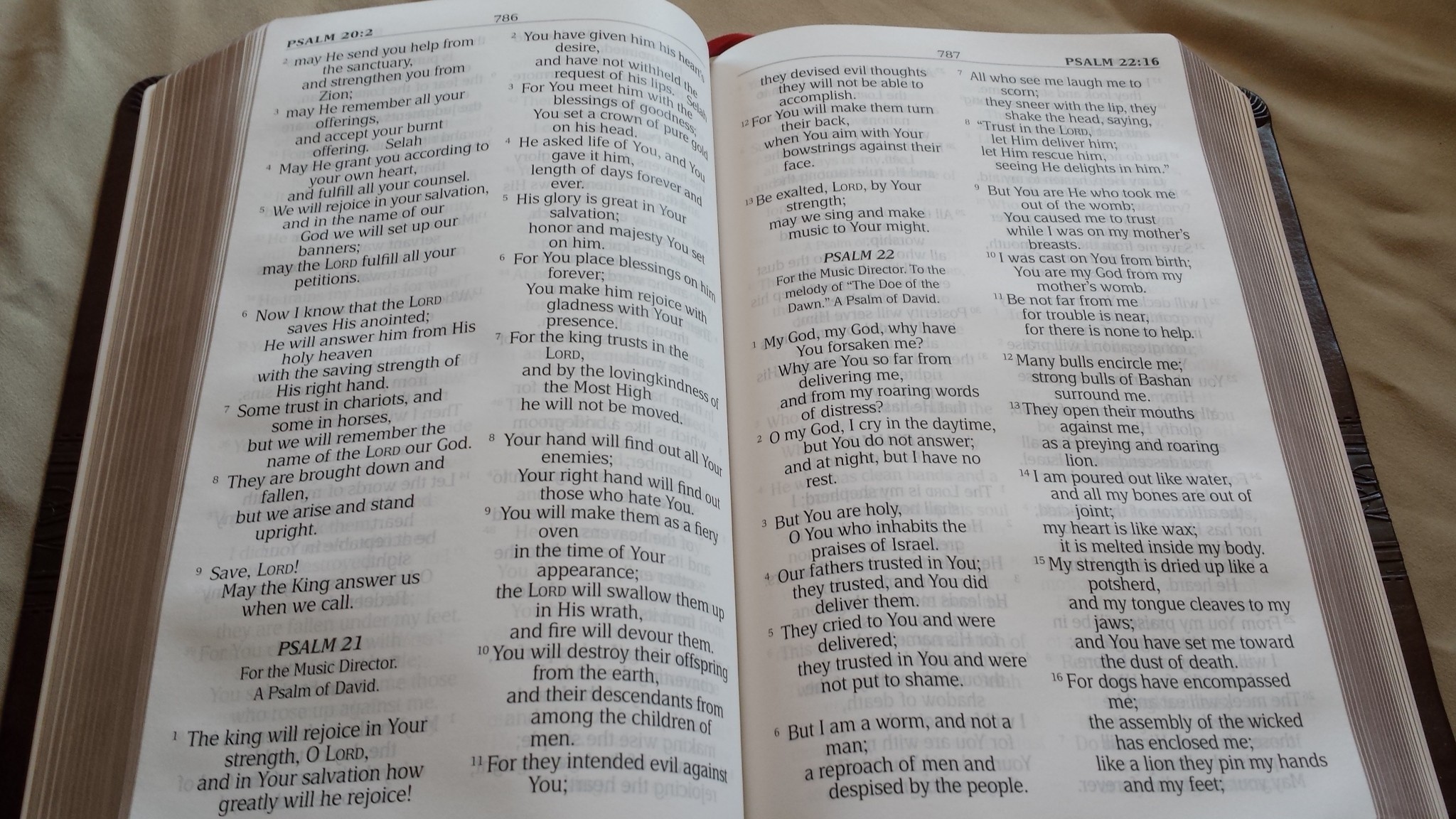
There are plenty of section headings throughout the text. They’re in bold italic and include references to parallel passages. This is found in the historical books of both testaments.
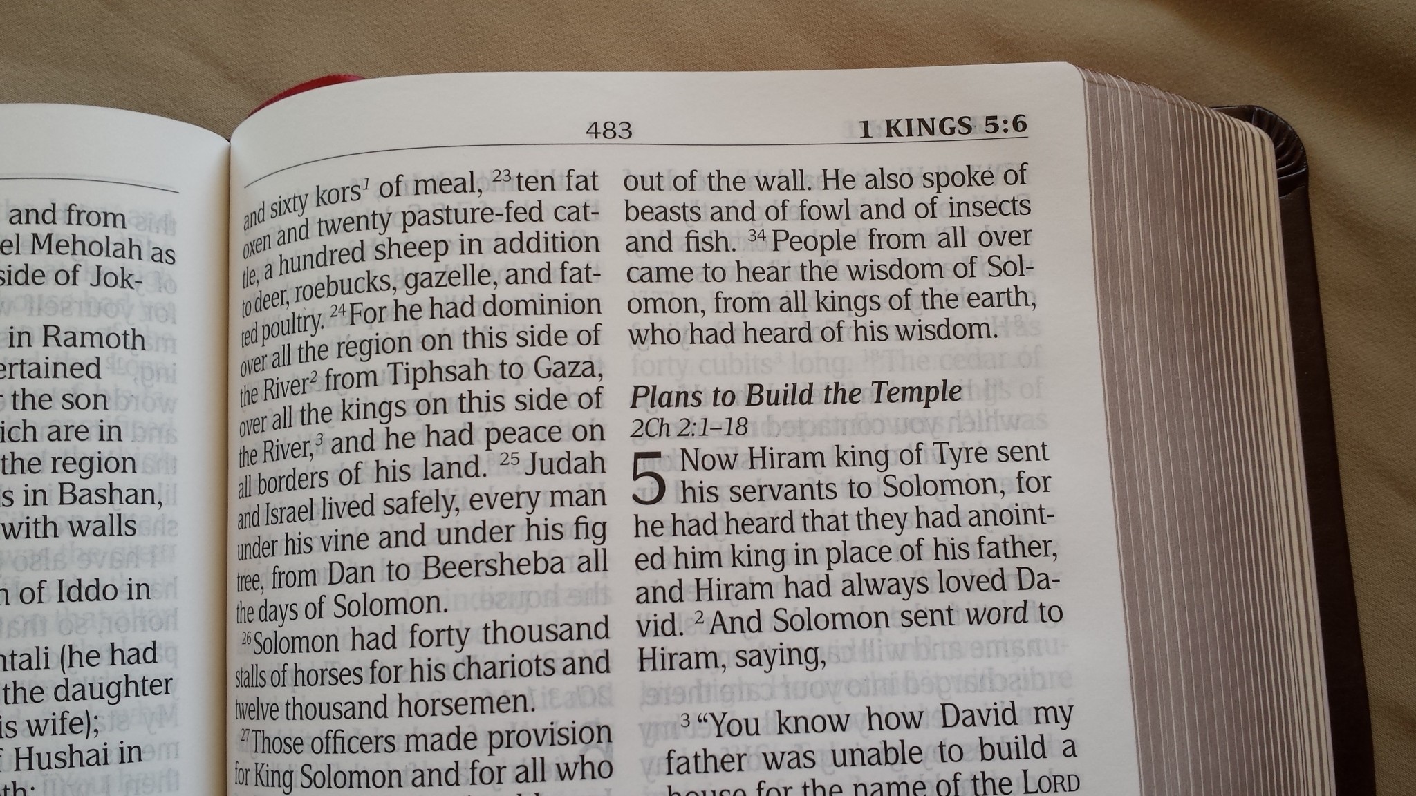
The header shows the book name, chapter number, and verse number. The page number is centered. The footer contains the translator’s footnotes.


Paper
The paper is white and has good contrast. It’s not as opaque as I’d like. The low opacity doesn’t make it unreadable. It isn’t shiny at all (which is something I very much appreciate). It’s thin but not so thin that I have trouble turning the pages. It’s more like the paper found in today’s typical study Bibles. If I were to guess I’d say it’s in the upper 20’s for gsm (maybe 28, but I’m just guessing). At over 1900 pages I can see why they chose the thin paper. The show-through is more noticeable in the poetic settings. It isn’t bad enough to keep me from using and recommending it, but I do want to point it out.
Book Introductions
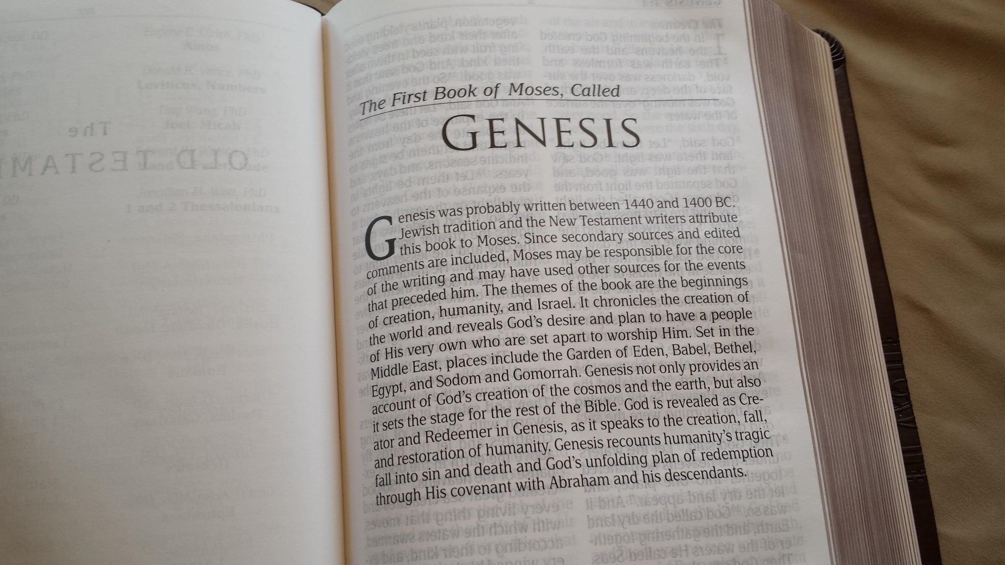
Book introductions are on their own pages. They have a paragraph that takes about a third of the page. They tell who the author is, the date of writing, the purpose of the writing, major themes, and audience.
They’re short, simple, and to the point. They’re also useful for helping you understand the setting of the book quickly.
Footnotes
The translator’s footnotes are placed in the footer of the page and include the verse number and a number to key the footnote to a specific portion of the verse. They include alternate renderings in the text, weights and measures, where something was quoted from, where something was prophesied, explanations, etc. There aren’t a lot of footnotes, but those that are there are helpful. There are lots of references in the footnotes – especially in the New Testament.
Concordance
The concordance is 133 pages with two columns per page. The entries are the words only (with no other info). It’s actually one of the better concordances in a personal size Bible and it helpful for study and sermon prep.

Here are some example entries with their number of references:
- Christ – 56
- Christian – 2
- Christians – 1
- Christs – 1
- Church – 23
- Churches – 6
- Faith – 46
- Faithful – 18
- Faithfulness – 9
- God – 57
- Godly – 2
- Gods – 13
- Praise – 23
- Praised – 3
- Praises – 4
- Praising – 2
- Pray – 10
- Prayed – 2
- Prayer – 14
- Prayers – 5
- Praying – 5
If I Could Change One Thing
I’d like to see the paper be more opaque. A certain amount of show-through doesn’t bother me. I expect to notice that there are words written on the next page but I don’t like being able to read those words. I can read not only the opposite side of the page but also the following page. If the paper was at least opaque enough to mask the following page it would become much more readable and take advantage of the gorgeous typeset. I realize that would increase the price, but it would be well worth it.
Thoughts on the MEV Translation
Unlike all other modern translations that are based on the Critical Texts, the Modern English Version is based on the Textus Receptus line of manuscripts. It’s also based on the Jacob ben Hayyim edition of the Masoretic Text. It uses the KJV as its basis and updates it. It does a good job (possibly the best job) of updating the KJV in my opinion.
I’ve used the MEV for a while now and I like it. There are places where the NKJV doesn’t update the words enough. In those places the MEV does a better job at modernizing without losing or changing the meaning.
For example in Galatians 5:19-23 for the works of the flesh and the fruit of the Spirit, the NKJV follows the KJV and includes uncleanness, revelries, and longsuffering. The MEV modernizes them with impurity, carousing, and patience. That’s much easier to understand and I don’t have to make a marginal note in order to explain the word.
I don’t have many complaints, but there are a few verses that still bother me:
- Isa 14:12 includes the Latin Lucifer without giving a footnote that the Hebrew states day star or morning star.
- Esther 1:1 includes the footnote of Ahasuerus being Xerxes within the text itself in italics – this should not be in the text, but should be a footnote.
- 1 Jn 5:7-8 they do include a footnote showing that it was a later insertion, but instead of saying that only a few manuscripts include it it says the earliest Greek manuscripts lack, which gives the wrong impression in my opinion.
Overall I think it’s a good translation. I would like to see footnotes of the same quality as the NKJV (the footnotes are one of the NKJV’s strengths).
Conclusion
The size of the text-block and font are great for carry, reading, and preaching. It doesn’t include any references other than what’s found in the footnotes and section headings. It also doesn’t include other helps such as tables (weights, measures), maps, or lists (Harmony of the Gospels, miracles, etc.). Instead of those tools it has a better than average concordance. My complaints are minor and easy to ignore at this price. The Passio Personal Size Large Print MEV is a good choice for anyone interested in a modern translation based on the TR for reading, carry, and preaching.
Passio provided this Bible free for review. I was not required to give a positive review – only an honest review. My opinions are my own.