
The new NKJV Personal Size Large Print Reference Bible from Thomas Nelson is a verse-by-verse, end-of-verse reference edition that’s easy to carry, read, and follow along with others. It’s available in lots of imitation leather options at an affordable price. I’m reviewing the Deluxe and regular editions. Both are imitation leather, made in China.
Thomas Nelson provided this Bible in exchange for an honest review. I was not required to give a positive review, only an honest one. All opinions are my own.
_________________________________________________________
These Bibles are available at (includes some affiliate links)

and many local Bible bookstores
_________________________________________________________
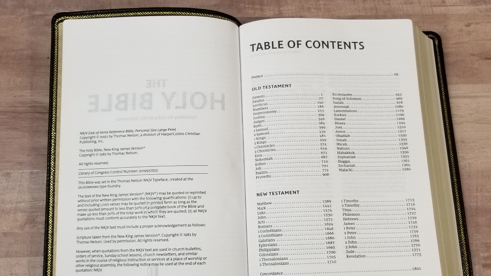
Table of Contents
Video Review

Binding
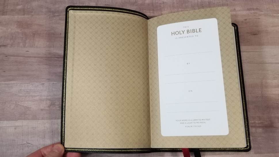
Both editions are imitation leather. They’re Smyth sewn and have no trouble staying open in Genesis, but they will need to break in a little bit to stay open in Genesis 1. The liner is paste-down paper and doubles as the presentation page. The overall size is 5 3/4 x 9 x 1 1/2″. They weigh 2lbs.
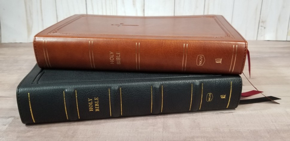
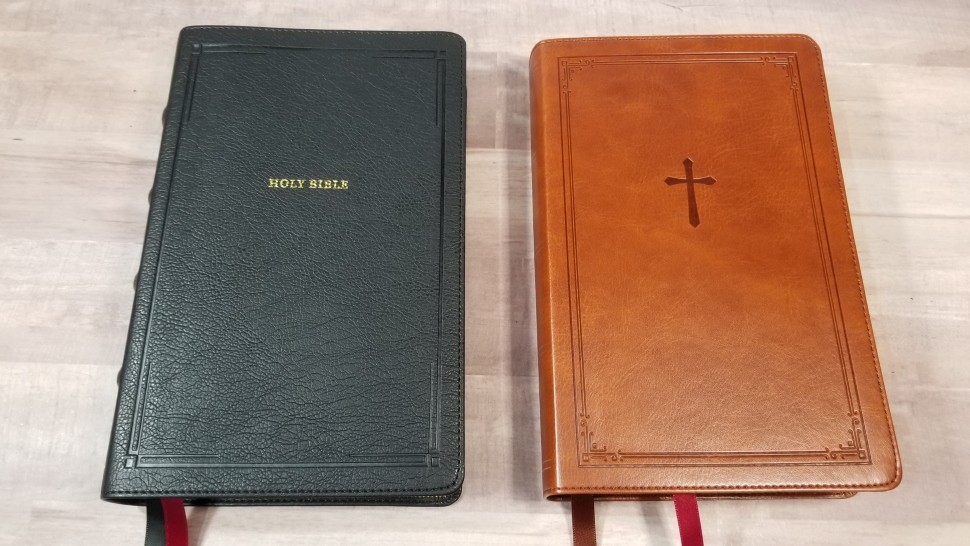
Deluxe with Black Leathersoft
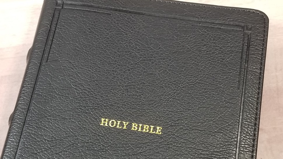
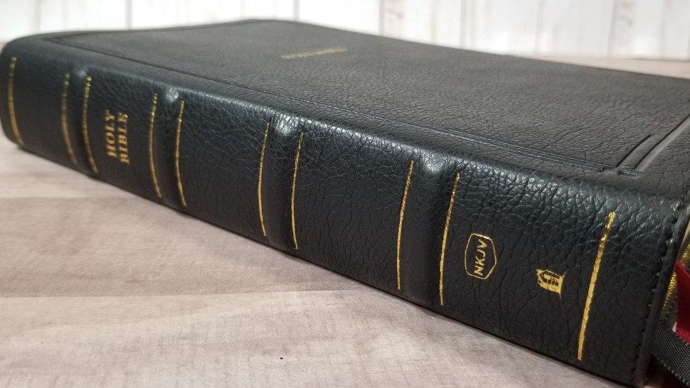
This is imitation leather and includes perimeter stitching. It has a grain that looks like goatskin. The front and back have a debossed decorative border. Holy Bible is printed in gold on the front. The spine includes extra-large raised hubs with gold lines on both sides. The text and logo are also printed in gold. The inside is decorated with a gilded chain. The grain, raised hubs, and gilded chain gives this Bible an elegant design. It has one black and one red ribbon. It comes in a one-piece box.
Brown Leathersoft
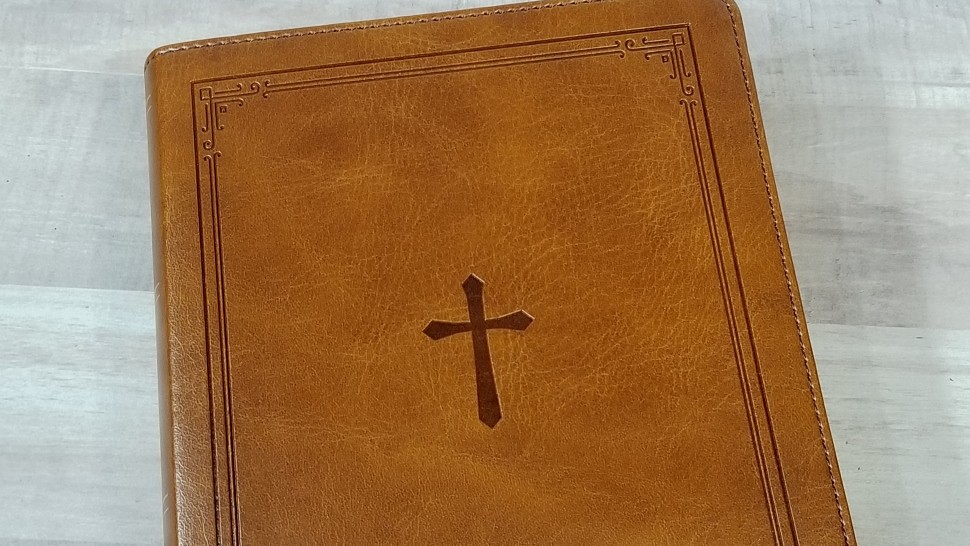
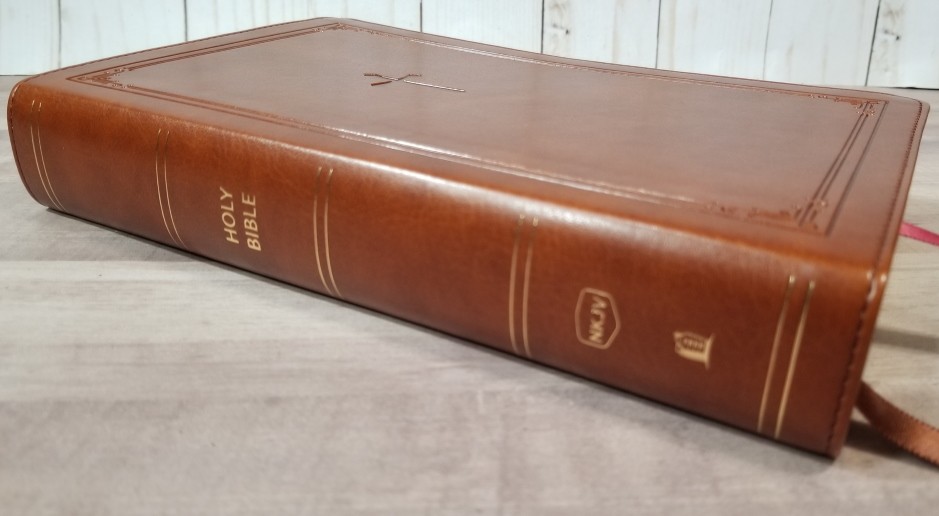

This one has a smooth grain with some color variation that gives it visual texture. It also includes perimeter stitching. It has a debossed border and a cross on the front. The spine has rib indications printed in gold and the text and logo printed in gold. It has one red and one brown 3/8″ ribbon. It comes in a sleeve.
Paper
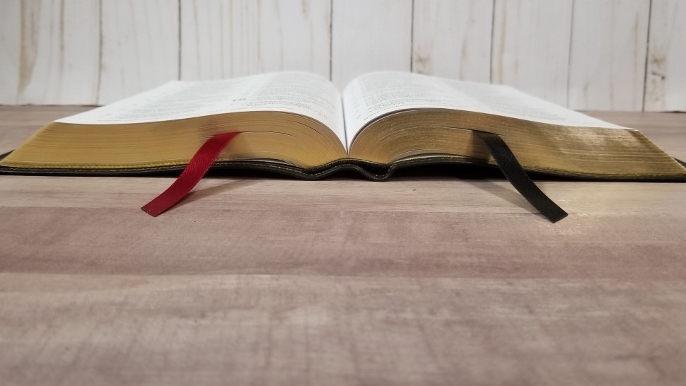
The paper is 30gsm. It looks like the standard paper that Thomas Nelson uses in their imitation leather editions. It’s slightly off-white in color and it’s highly opaque. Show-through is only noticeable in poetic settings. It does not have glare under direct light. The texture is slightly rough, making it easier to grab the pages to turn. The edges are gold gilt. I like this paper a lot. It’s excellent for reading.
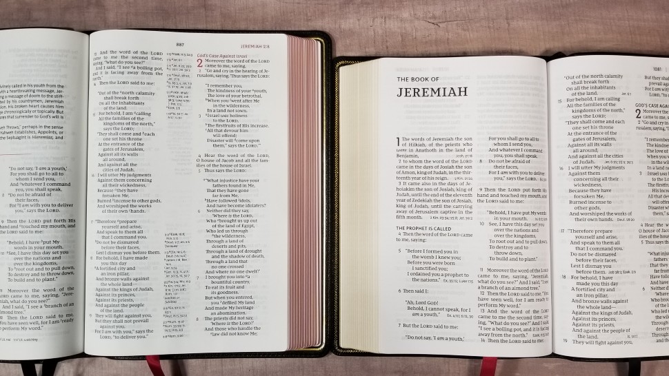
Typography
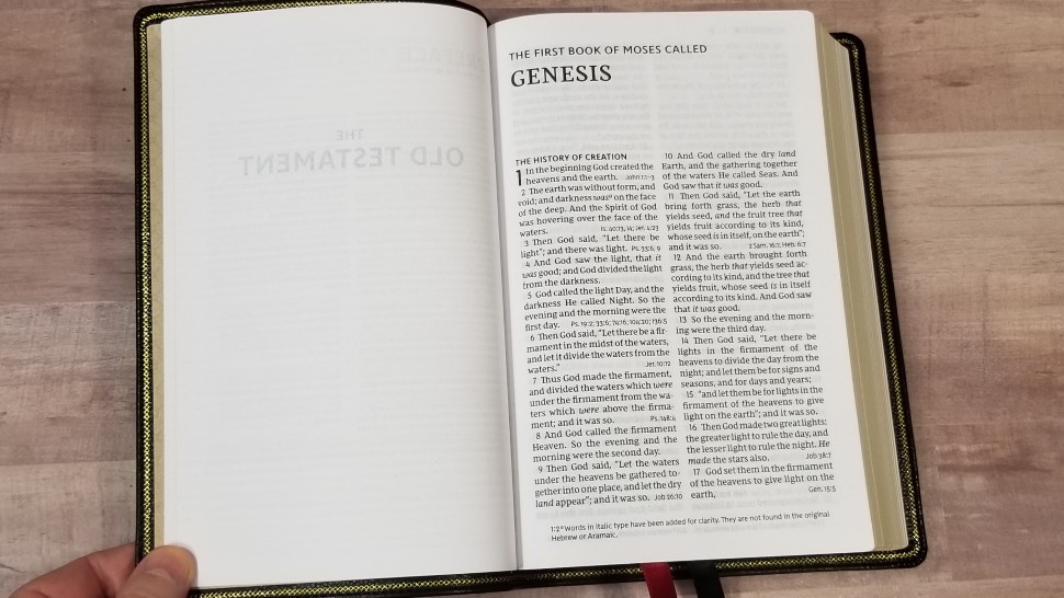
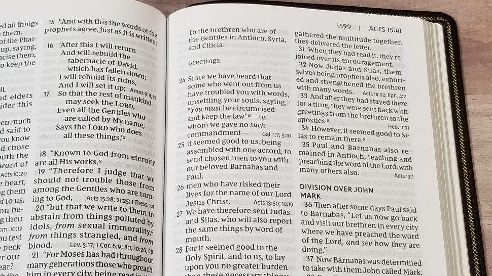
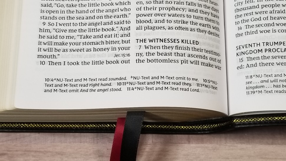
The text is presented in a double-column, verse-by-verse format with poetry set to stanzas and letters indented. The header shows the book name, chapter number, verse number, and page number. The footer includes the translation footnotes. Section headings are in all-caps. Cross-references are placed at the end of verses.

The typeface is a 10.5 Comfort Print with the words of Christ in red. The columns have around 8 words per line and enough space between the lines to make it comfortable to read. It has enough inner margin space that the text doesn’t bend too far into the gutter.
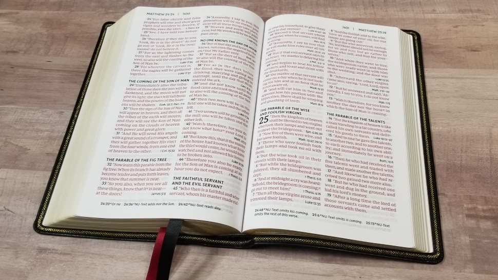
Both the black and the red are dark and consistent. It’s printed with line-matching (meaning the lines are printed in the same location on both sides of the page). This improves readability and the paper is opaque enough that the text isn’t affected by having text printed behind it.
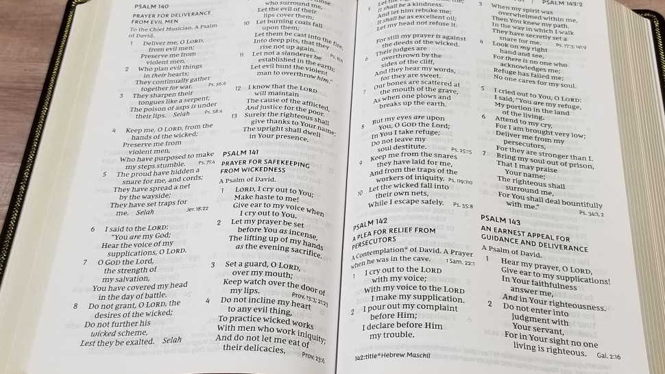
Poetry is divided well so that it doesn’t have a lot of lines with just one word. Lines that wrap are indented so it’s easy to know that it continues the line above it. The translation footnotes are out of the way, but still easy to access. This is an excellent text to read and preach from. I didn’t find the end-of-verse references distracting.
References
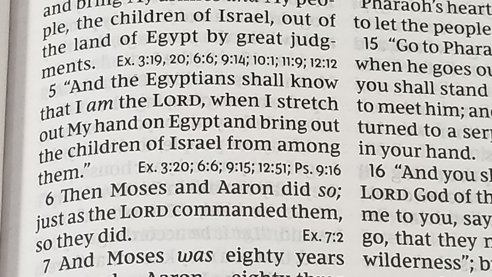
Cross-references are placed at the end of verses in a smaller type than the verse. There aren’t a lot of references, but those it does have are helpful for quick study or general reference.
Here are a few example references to help you compare:
- Genesis 1:1 – John 1:1-3
- Deuteronomy 6:4 – 1 Cor 8:4, 6
- Isaiah 9:6 – Matt 28:18; Luke 2:11
- Matthew 28:19 – x
- Mark 12:29 – Deut 6:4, 5
- John 1:1 – 1 John 1:1; Rev 19:13
- John 3:16 – x
- Acts 2:38 – Luke 24:47
- 1 John 1:1 – Luke 24:39; John 1:1, 4, 14
Concordance
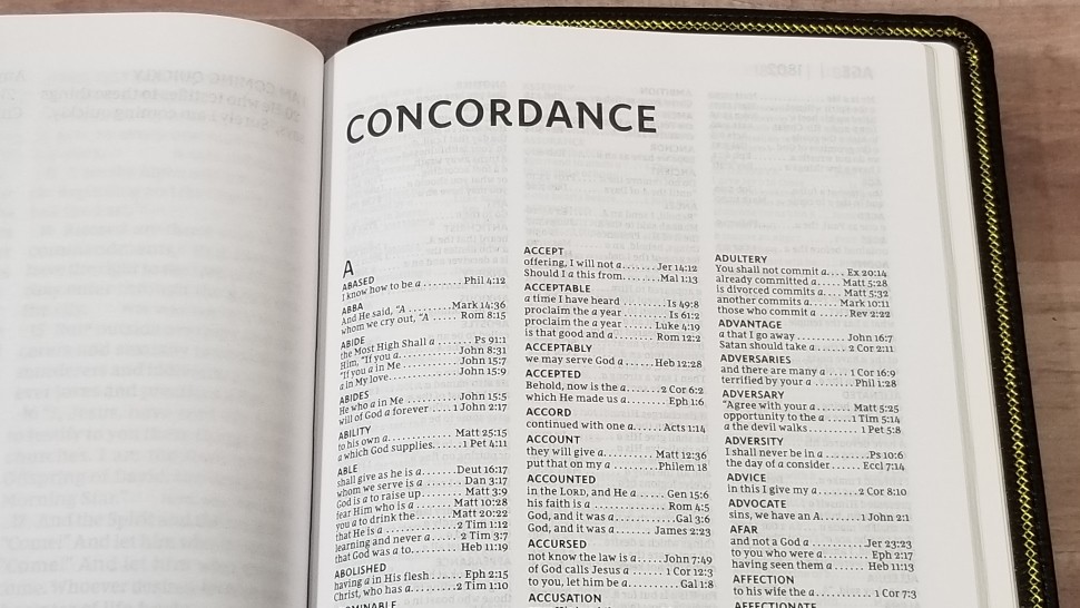
The concordance is 42 pages and has 3 columns per page. It’s a good basic concordance for finding the most common words and references. Here are a few entries with their number of references to help you compare:
- Christ – 13
- Christian(s) – 2
- Faith – 40
- Faithful – 20
- Faithfulness – 5
- Faithless – 2
- God – 38
- Goddess – 2
- Godhead – 2
- Godliness – 4
- Godly – 3
- Praise – 25
- Praised – 4
- Praises – 2
- Praiseworthy – 1
- Praising – 3
- Pray – 14
- Prayed – 2
- Prayer – 16
- Prayers – 5
Maps
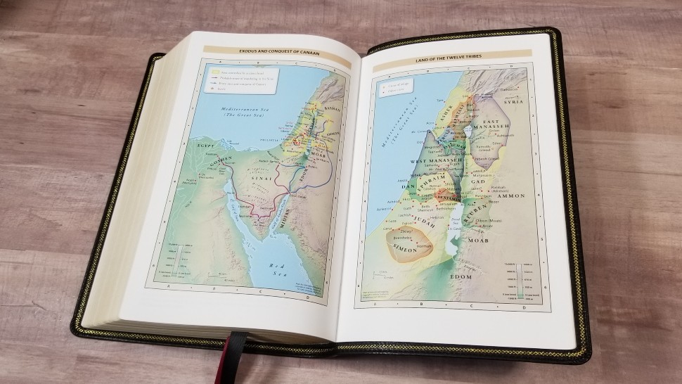
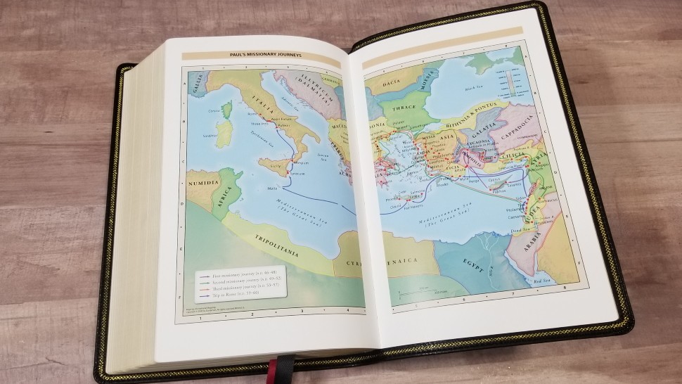
It includes 7 full-color maps printed on 8 glossy pages. They’re printed in bright colors. They include topography, distance, routes, borders, possible locations of lost places, battles, elevation, cities, and locations for the events of Jesus’ ministry. It doesn’t have an index, but the maps are annotated well. I found them easy enough to use.
Maps include:
- World of the Patriarchs
- Exodus and Conquest of Canaan
- Land of the Twelve Tribes
- Kingdom of David and Solomon
- Jesus’ Ministry
- Paul’s Missionary Journeys
- Jerusalem in the Time of Jesus
Conclusion
How the Large Print Personal Size looks next to the Large Print Reference
Thomas Nelson’s new Personal-Size Large-Print Reference Bible, Comfort Print NKJV’s are excellent Bibles. The overall size is great for general use and the large typeface and clean design are highly readable. The v-b-v setting isn’t my favorite for reading, but it is easier for study and following along with a teacher or preacher, and for teaching and preaching. Both editions are nice, but I really like the added features of the Deluxe edition. If you’re looking for a good all-around NKJV, the Personal-Size Large-Print Reference Bible in Comfort Print is a great choice.
_________________________________________________________
These Bibles are available at (includes some affiliate links)
and many local Bible bookstores
_________________________________________________________
Thomas Nelson provided this Bible in exchange for an honest review. I was not required to give a positive review, only an honest one. All opinions are my own.
Photography by Randy A Brown