
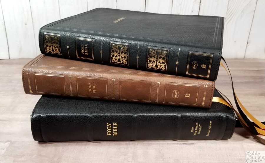

There are lots of options when it comes to designing a wide margin Bible. Readers often ask about a large print with extra-wide margins in a small package. I tell them to pick any two. Thomas Nelson’s NKJV Large Print Wide Margin Reference Bible was designed for those that want a large print text with a wide-enough outer margin that’s ideal for short notes. It’s well-suited for those that prefer a large print and want a little bit of writing space to aid in their study. The design has a lot in common with the NKJV Preaching Bible, and in my opinion, it’s even better for study and preaching. It’s available in brown or black imitation leather, and black goatskin editions. I’m reviewing all three.
Thomas Nelson provided this Bible in exchange for an honest review. I was not required to give a positive review, only an honest one. All opinions are my own.
_________________________________________________________
This Bible is available at (includes some affiliate links)

and many local Bible bookstores
_________________________________________________________
Table of Contents
- Video Review
- Binding
- Paper
- Typography and Layout
- Cross References and Footnotes
- Book Introductions
- Concordance
- Reading Plan
- Bible Atlas
- Comparisons
- Conclusion
Video Review

Binding
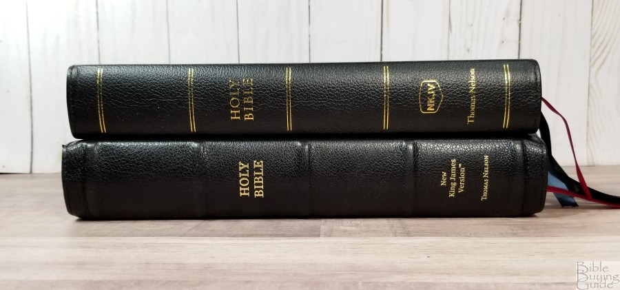
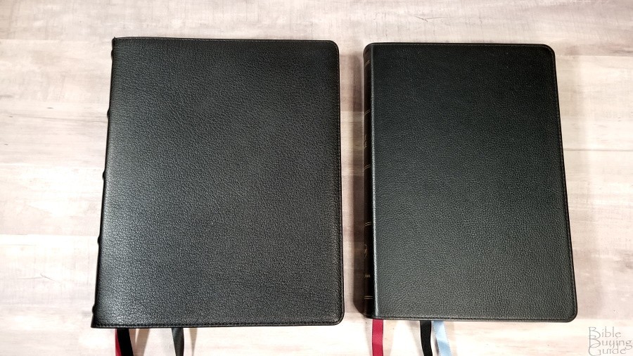
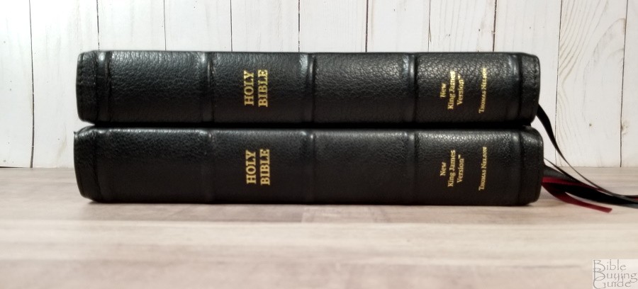
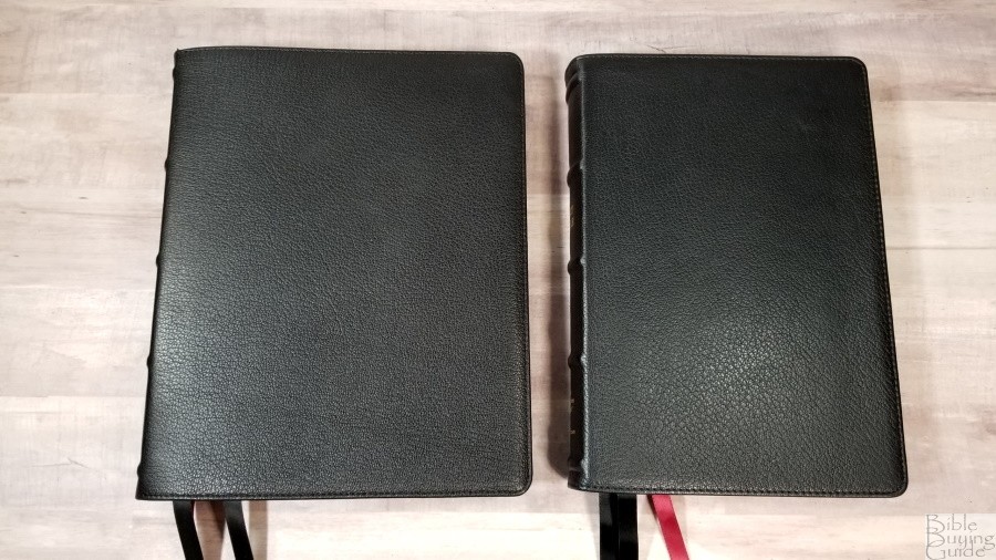
Here’s a look at each cover. All three are Smyth sewn.
Black Goatskin
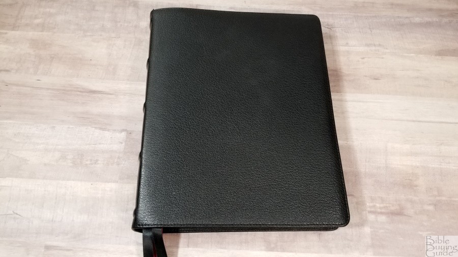

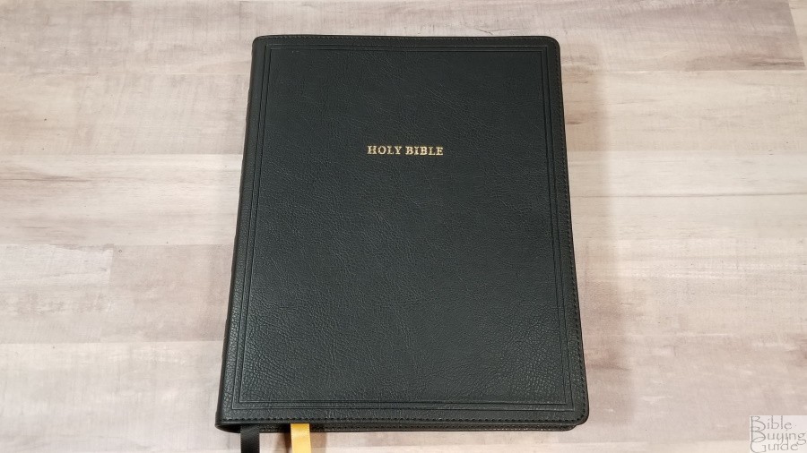
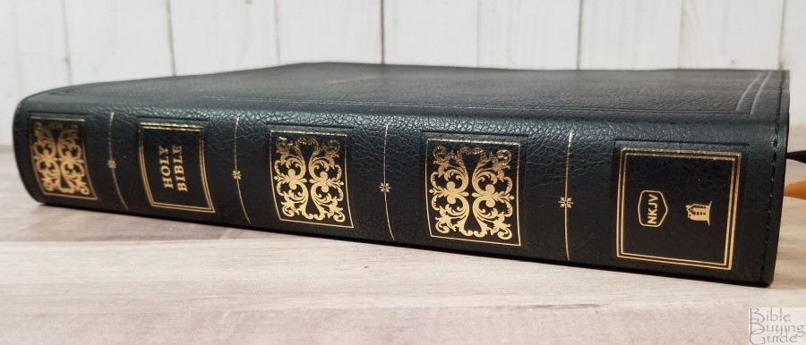
The black goatskin is thick and flexible. The grain looks and feels natural. It has stitching around the perimeter. It has a small yapp (overhang). Nothing is printed on the front. The spine has 5 raised hubs. The text is small and it’s stamped in gold. The small text keeps it understated and elegant. This leather did have a chemical smell for the first couple of days. It dissipated after that.
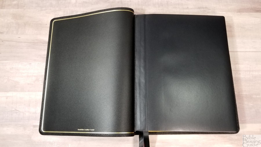
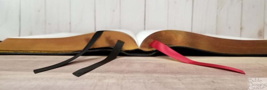

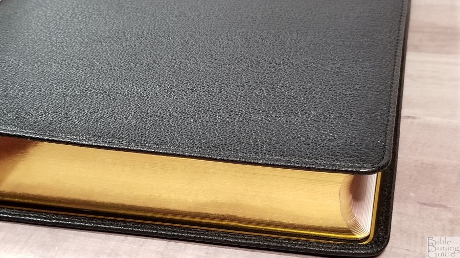
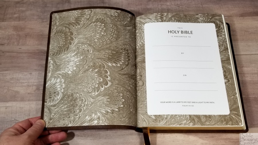
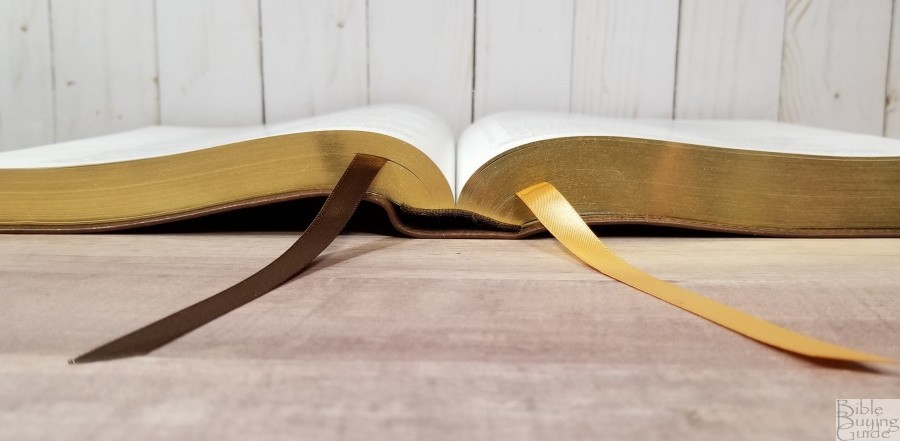
The liner is edge-lined leather. It has a gilt line around the inside perimeter. The edge-lined tab is a touch stiff at first, but it does stay open in Genesis. This edition has a separate presentation page. This block has overcast stitching in the front to help improve durability. This one has three ribbons- two black and one red. The head/tail bands are black. The overall size is 8 x 10 x 1 5/8″. It weighs 3 lbs, 8.9 oz.
Black Imitation Leather

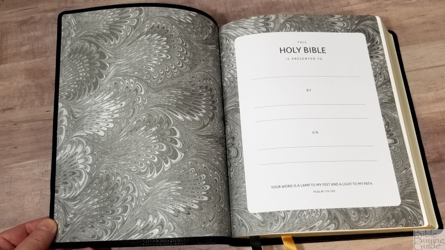
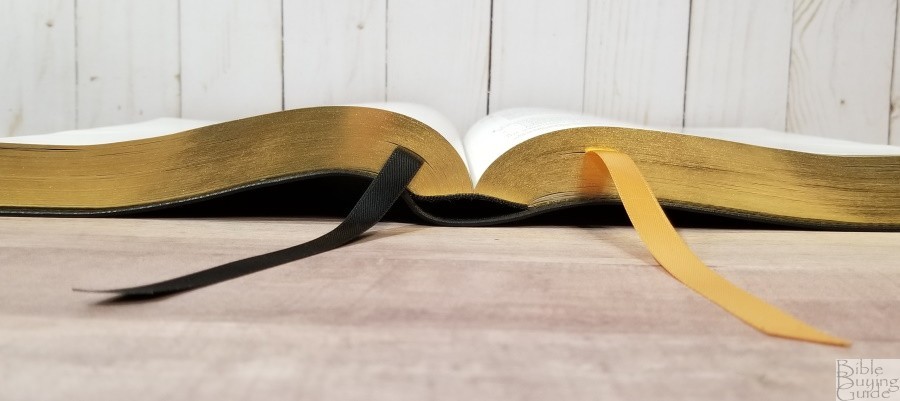

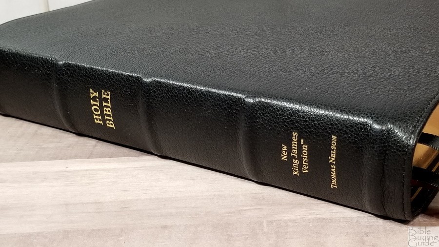
The black has a goatskin-like texture that looks like real leather. Anyone that didn’t know would probably assume it was leather. It includes perimeter stitching. Around the edges on the front and back are two debossed lines. The front has Holy Bible printed in gold. The spine has rib indications in gold, the text in gold, and 4 blocks outlined in gold. The liner is paste-down with a gray-styled paper that doubles as the presentation page. This edition has two ribbons- one black and one gold. The overall size is 7 7/8 x 9 3/4 x 1 1/2″. It weighs 3 lbs, 4.6 oz.
Brown Imitation Leather
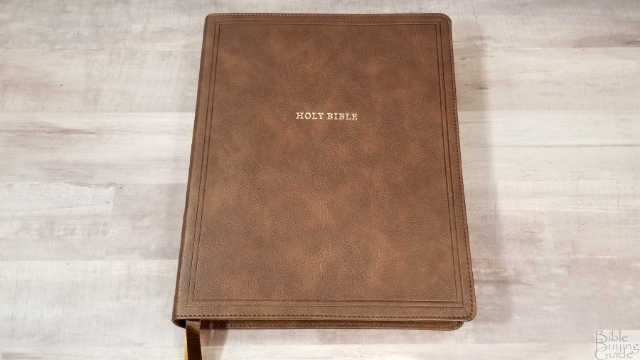
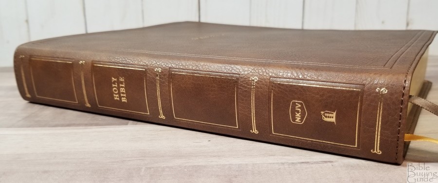


The brown has a goatskin-like texture and a touch of color variation that doesn’t look like imitation leather. The front has Holy Bible printed in gold. Around the edges are two debossed lines on the front and back. It’s perimeter stitched. The spine has rib indications in gold, the text in gold, and 4 blocks outlined in gold. The liner is paste-down with a brown-styled paper that works as the presentation page. This edition has two ribbons- one brown and one gold. The overall size is 7 7/8 x 9 3/4 x 1 1/2″. It weighs 3 lbs, 4.6 oz.
Paper
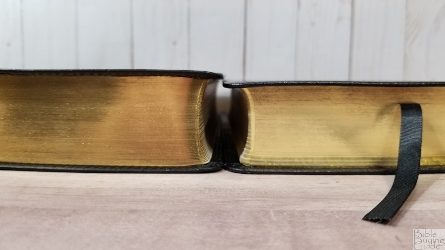
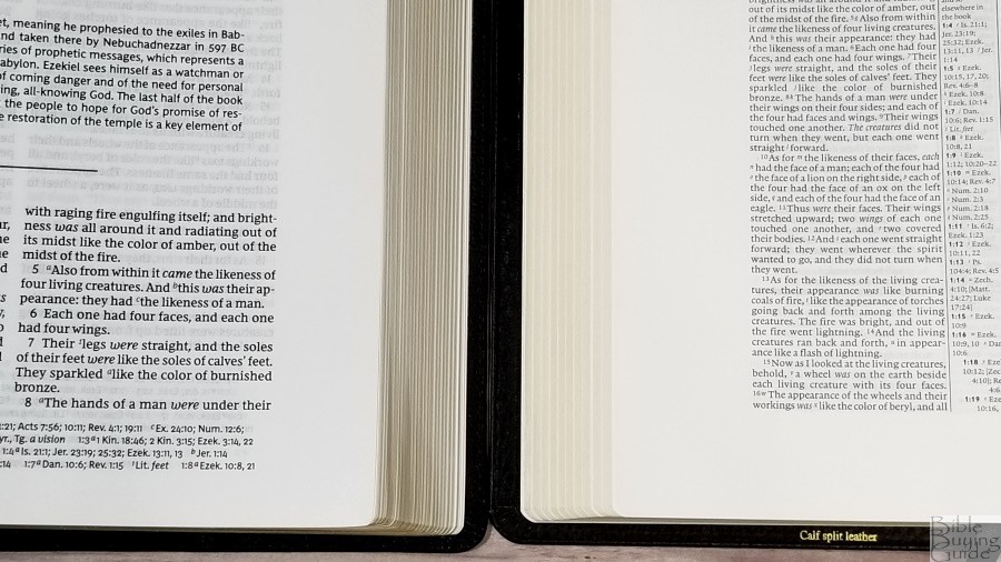
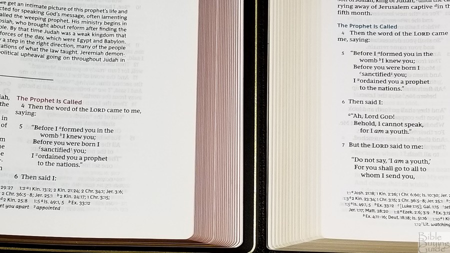
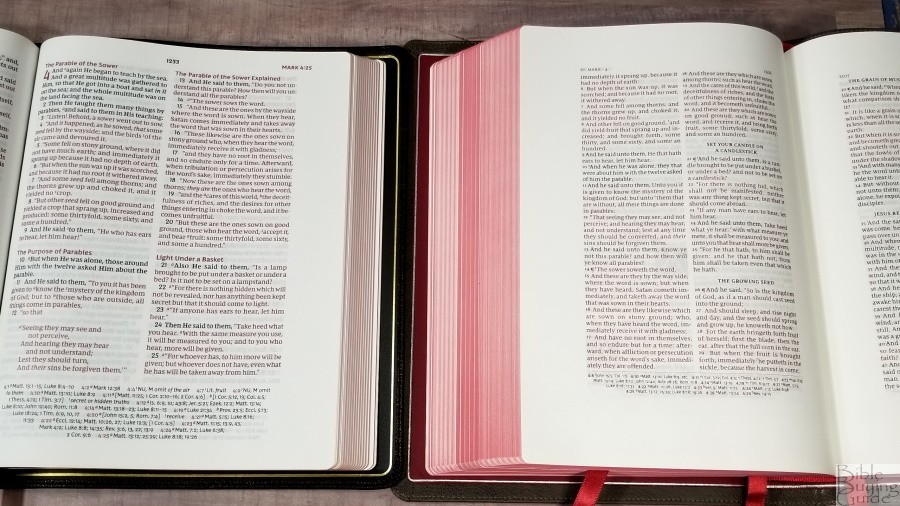
The paper is the same in the imitation and goatskin editions. It’s 36gsm premium European Bible paper. It’s slightly off-white in color, which is my personal preference since it’s not bright white. The texture is rough enough to make it easy to grab and turn with one hand. I haven’t written in it yet, but this paper is also excellent for notes. It does have a small amount of glare under direct light. It isn’t enough to bother me, but I wanted to mention it. The page edges for the imitation editions are gold. The Premier Collection is art-gilt with red under gold.
Typography and Layout
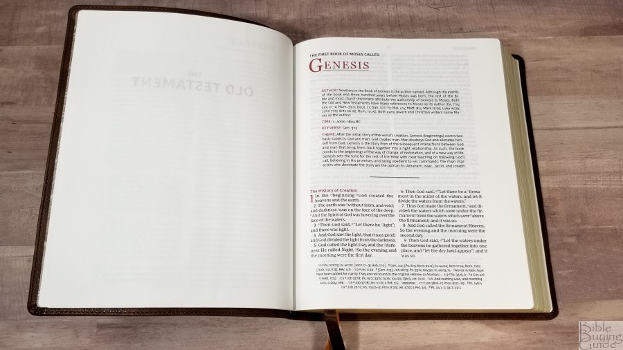
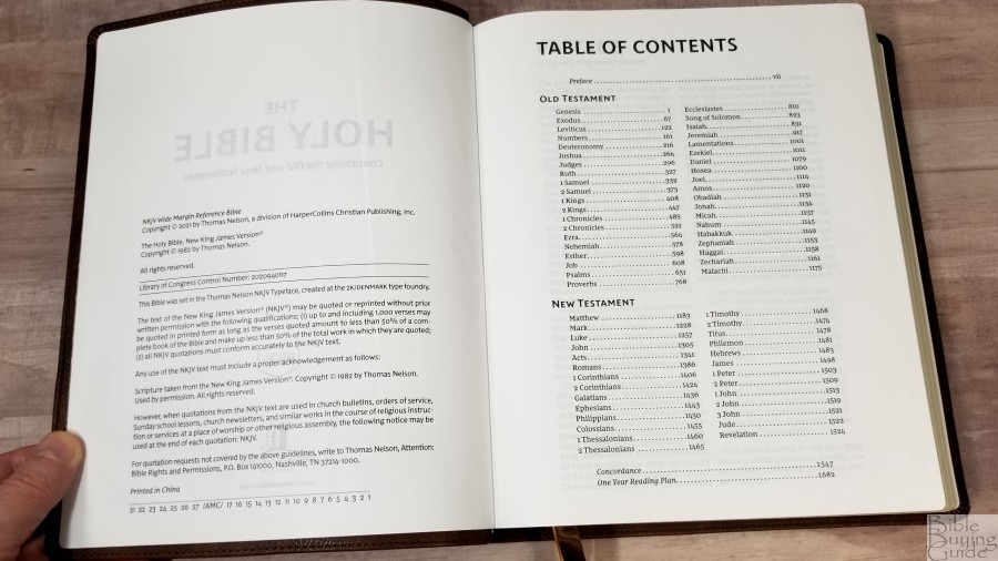
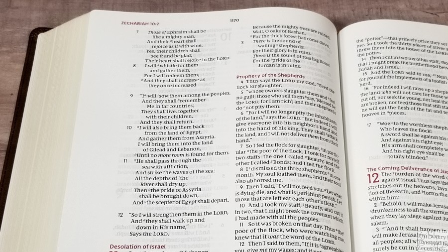
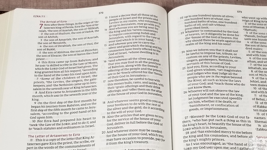
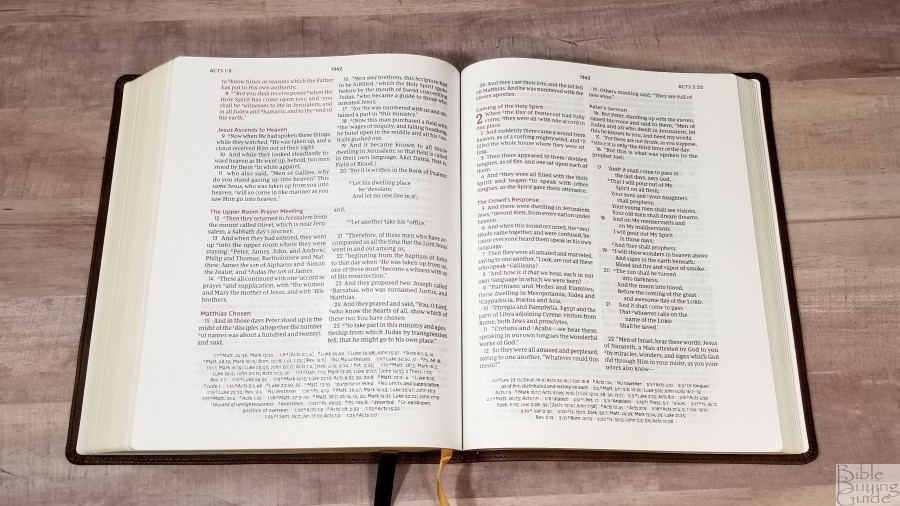
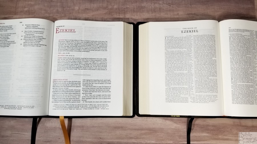
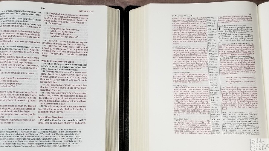
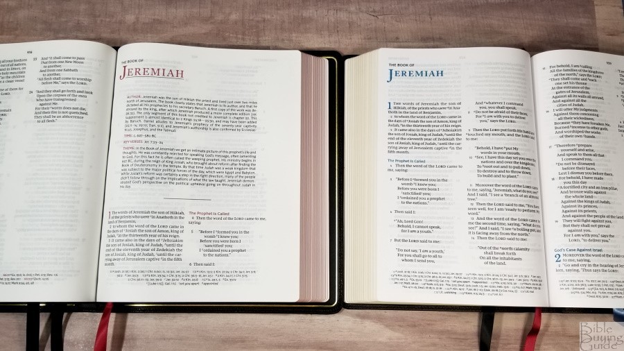
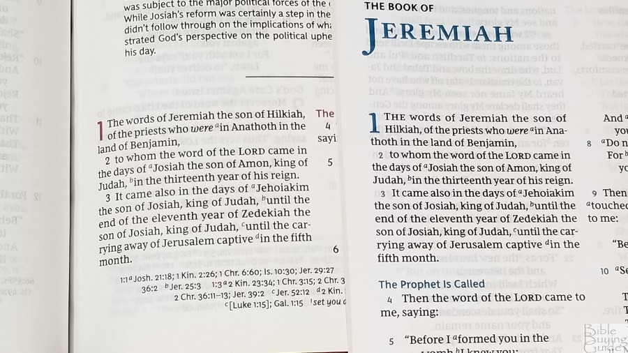
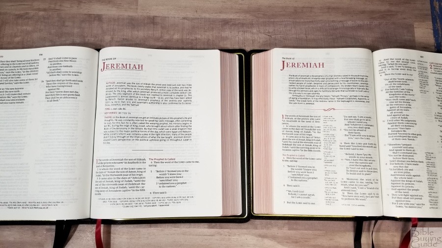
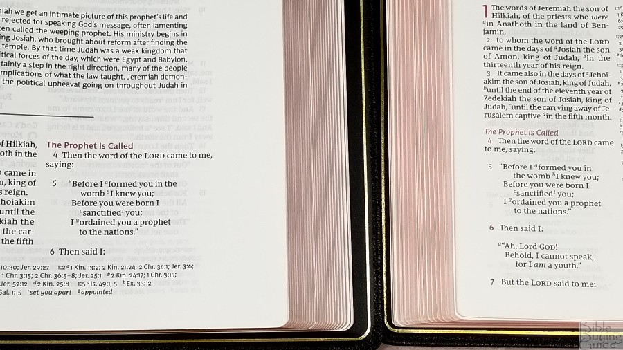
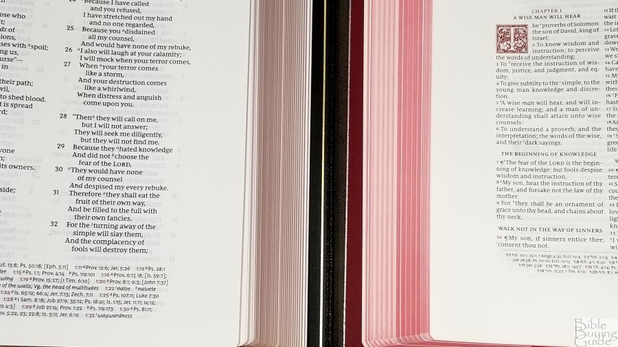
The text is presented in a double-column, verse-by-verse layout with poetry set to stanzas and letters indented. The header shows the book name, chapter, and verse in the outer margin in red and the page number in black in the center. These are brought out into part of the wide margin area to make them easier to find quickly as you’re thumbing through the Bible. References and footnotes are placed across the footer in a single column. Highlights, such as section headings, chapter numbers, reference and footnote keys, and pilot reference numbers in the footer are in red. Books start on a new page, there are lots of pages for notes throughout the text.
Typeface and Design
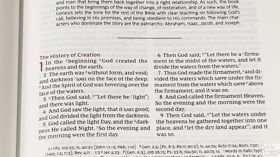
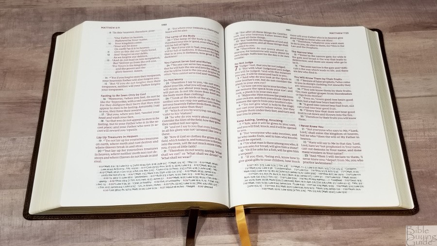
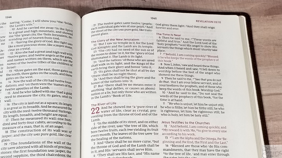
The NKJV Comfort Print typeface is printed in a semi-bold 10.5, red-letter, font. The red is a medium/dark shade. The red highlights are bold, making them even darker. I like this shade of red. Both the black and red are consistent throughout. I’m glad they chose red for the highlights. I do love the blue in the Preaching Bible, but my eyes are drawn more to the red. Even though it’s a verse-by-verse setting, the first letter of each verse that continues the sentence from the previous verse is in lower-case. This helps improve readability and retain the context, even in a v-b-v setting.
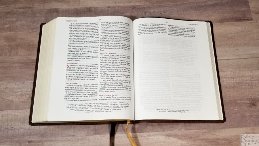
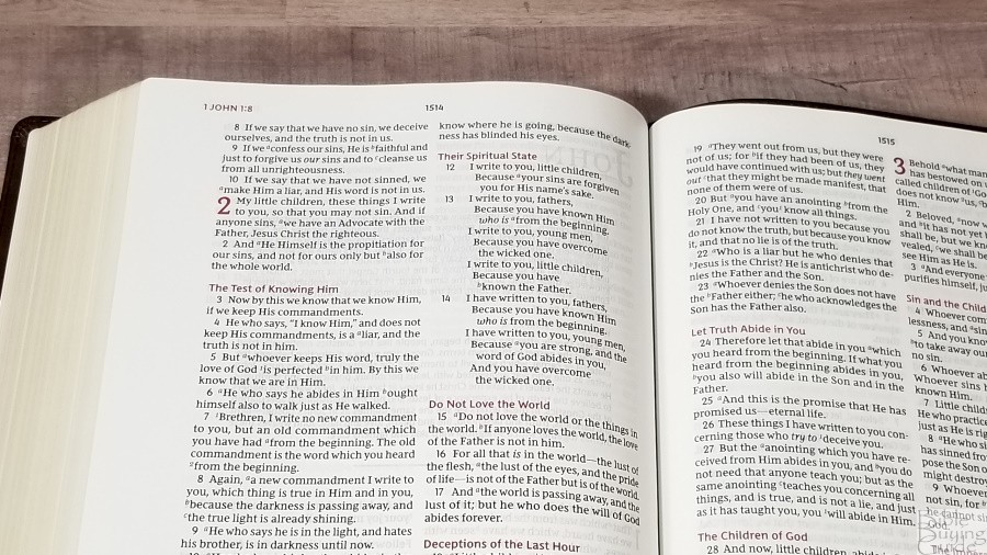
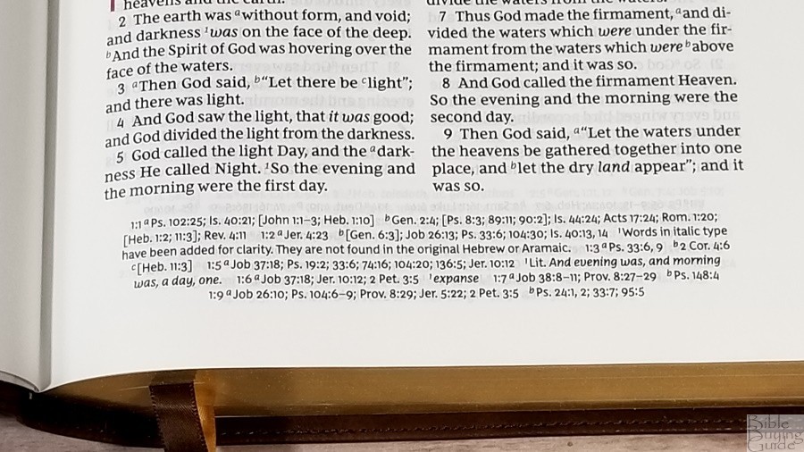
It has around 10 words per line with lots of space between the words and lines. This makes it comfortable to read and mark. It’s printed with line-matching, meaning the lines of text are printed in the same location on both sides of the page. This greatly reduces show-through and improves readability. The book introductions are not line-matched, but they’re printed with a smaller font, so that makes sense. It doesn’t set OT quotes in the NT in a different type. I actually miss this from the older NKJVs. Supplied words are in italics. This is my favorite word count for a Bible with a poetic setting because it provides the best balance between prose and poetry.
Poetry and Letters
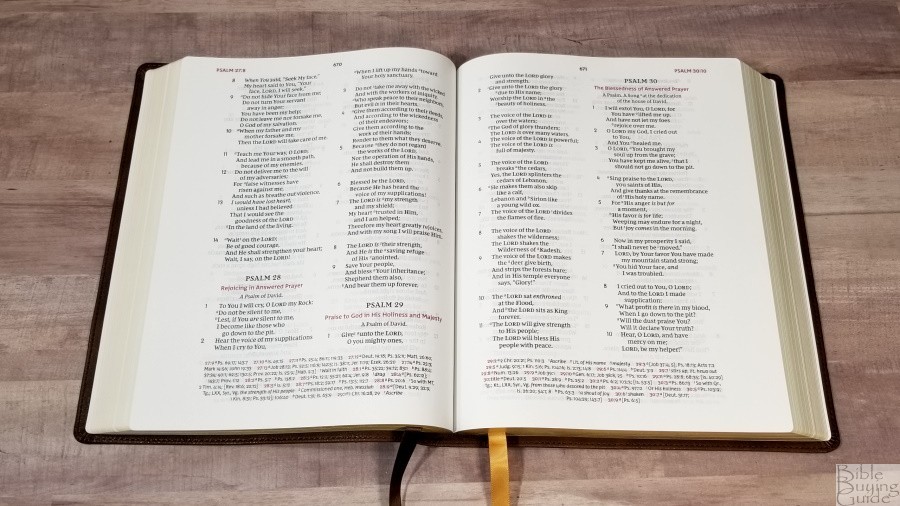
Poetry is indented, but the verse numbers are not. This makes the poetic setting stand apart from prose. The poetic setting is perfect. Having 10 words per line gives it enough room to divide the poetic lines in places that make sense, and they’ve done exactly that. Letters are indented in a similar way as poetry. They’re left-justified and have a ragged right edge. This makes them stand out and easy to identify. This formatting is one of the things that I love about the NKJV. I’m glad to see that poetry and letters retain this formatting even in a v-b-v setting.
Thoughts on the Layout
My perception is that they used the NKJV Preaching Bible as a starting point, added book introductions, tweaked the poetic lines where they needed to, and then added a wide outer margin. If this is what they’ve done, then this was a smart move. If it isn’t what they’ve done, then the two designs are obviously related, and this alone makes me like it. The NKJV Preaching Bible is one of the best v-b-v designs available for any translation.
Margins
The outer margin is almost 1 1/4″; the inner and bottom margins are 5/8″. This isn’t enough room for extensive notes, like sermon outlines or detailed commentary, but it is enough for short thoughts, word studies, references, bullets, etc. The inner margin isn’t really made with notes in mind, but you can get symbols or references to fit.
Cross References and Footnotes
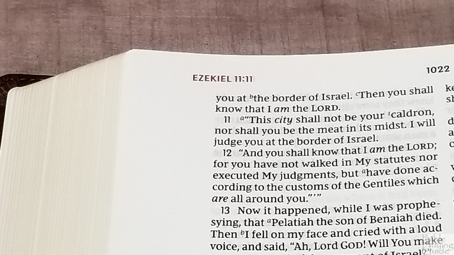
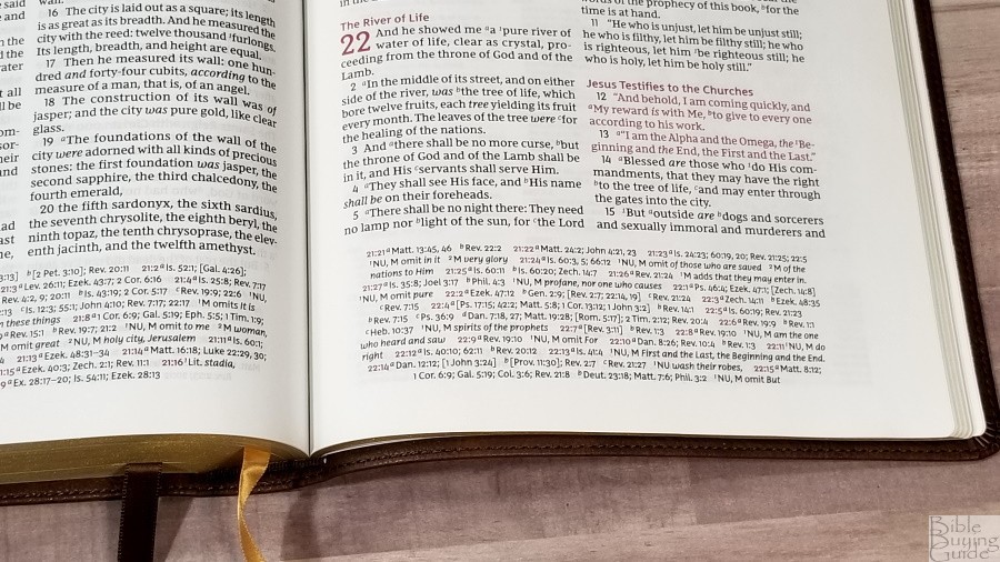
It has over 72,000 cross-references and the full set of translator’s footnotes in the footer. The footnotes are the standard NKJV translation footnotes. The full set is included. They provide manuscript variations and identify the manuscripts, making them some of the most useful translation notes.
Although it doesn’t show up well in my photos, the pilot reference is in red. It shows the references first, and then the footnote for each verse. This makes them easy to find and follow.
Here are some example references to help you compare:
- Genesis 1:1 – Ps 102:25; Is 40:21; Jn 1:1-3; Heb 1:10; Gen 2:4; Ps 8:3; 89:11; 90:2; Is 44:24; Acts 17:24; Rom 1:20; Heb 1:2; 11:3; Rev 4:11
- Deuteronomy 6:4 – Deut 4:35; Mark 12:29; John 17:3; 1 Cor 8:4, 6
- Isaiah 9:6 – Isa 7:14; Luke 2:11; John 1:45; Luke 2:7; John 3:16; 1 John 4:9; Matt 28:18; 1 Cor 15:25; Rev 12:5; Judg 13:18; Titus 2:13; Eph 2:14
- Matthew 28:19 – Mark 16:15, Is 52:10; Lk 24:47; Ac 2:38, 39; Rom 10:18; Col 1:23
- Mark 12:29 – Deut 6:4, 5; Is 44:8; 45:22; 46:9; 1 Cor 8:6
- John 1:1 – Gen 1:1; Col 1:17; 1 John 1:1; John 1:14; Rev 19:13; John 17:5; 1 John 1:2; 5:20
- John 3:16 – Rom 5:8; Eph 2:4; 2 Thes 2:16; 1 Jn 4:9, 10; Rev 1:5; Is 9:6;
- Acts 2:38 – Luke 24:47
- Romans 10:9 – Mt 10:32; Lk 12:8; Ac 8:37; Rom 14:9; 1 Cor 12:3; Phil 2:11
- 1 John 1:1 – John 1:1; 1 John 2:13, 14; Luke 1:2; John 1:14; 2 Pet 1:16; Luke 24:39; John 2:27; John 1:1, 4, 14
Book Introductions

Each book has a short introduction with a few paragraphs. The introductions include a section on the author, time, key verses, and theme. They highlight the main points and characters. Even though they’re short, they include enough information to be helpful in personal study and sermon prep.
Concordance
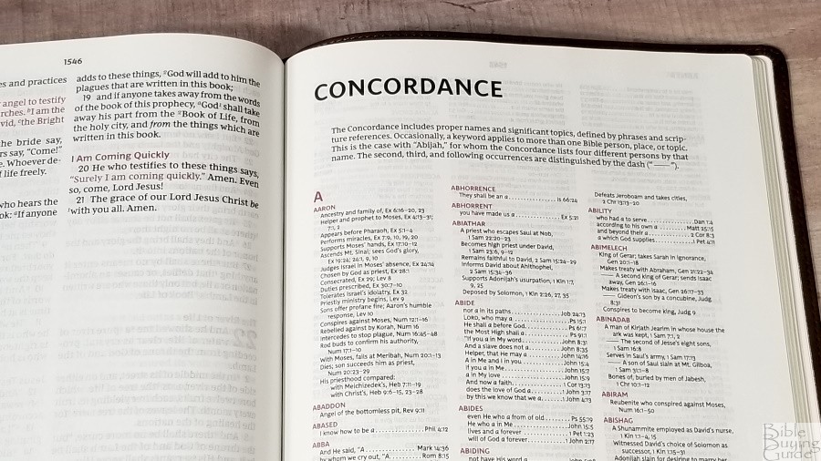
The concordance is 134 pages with 3 columns per page. The entries are in red. It’s comprehensive with a lot of entries. It has proper names with topical information about people and places. This is an excellent concordance for study and sermon prep. This is the same concordance as the MacArthur 2nd ed and the NKJV Premier Collection Large Print Center-Column Reference Bible.
Here are some example entries and the number of references they provide:
- Christ – 33
- Christian – 2
- Christians – 1
- Christs – 1
- Faith – 56
- Faithful – 26
- Faithfulness – 9
- Faithless – 2
- God – 70
- Goddess – 2
- Godhead – 2
- Godliness – 6
- Godly – 6
- Gods – 7
- Praise – 38
- Praised – 6
- Praises – 5
- Praiseworthy – 1
- Praising – 3
- Pray – 23
- Prayed – 3
- Prayer – 21
- Prayers – 9
Reading Plan
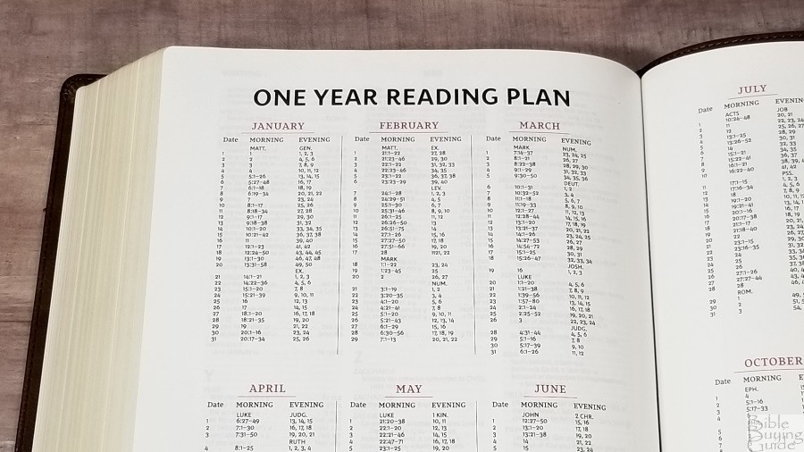
In the back is a one-year reading plan. It includes a morning and evening reading. it shows the month with the day, morning, and evening readings. The morning reading is from the NT and the evening reading is from the OT. I like this plan, but one thing I’d like to see different is that it includes a Feb 29th reading. This means for three years you’ll have to read extra on the 28th and/or March 1st to stay on target. I’d prefer to have the 29th as a catch-up day or a day to read favorite passages.
Bible Atlas
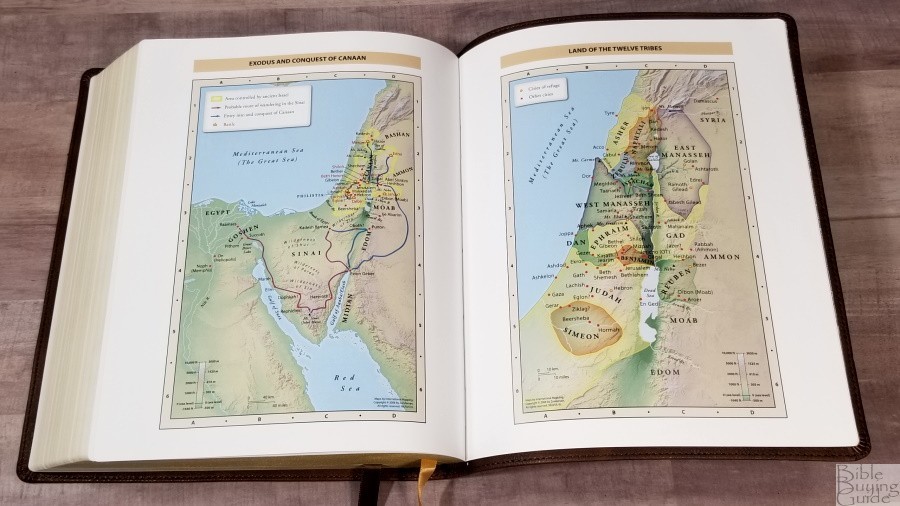
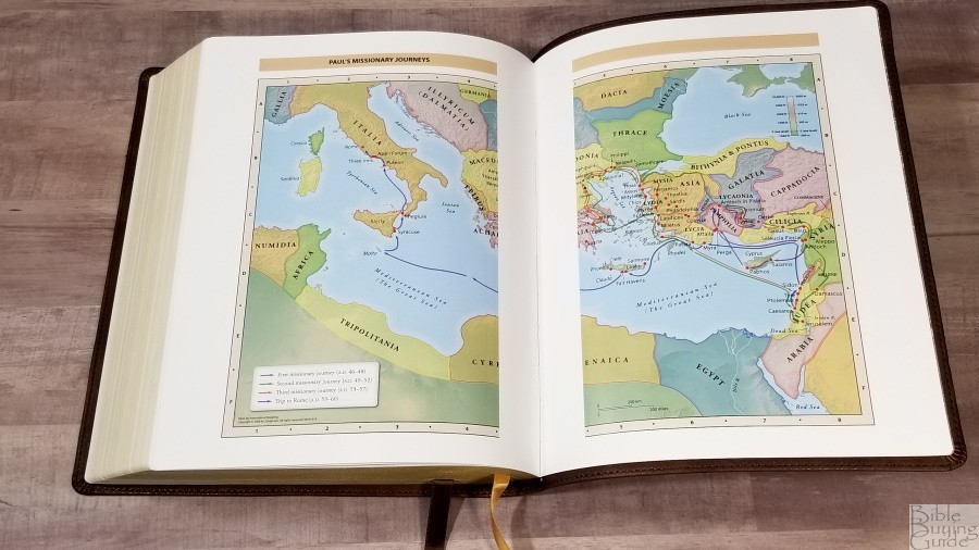
It has the standard 7 full-color Zondervan maps used by Thomas Nelson Bibles. Maps are printed on 8 thick semi-glossy pages. It doesn’t have an index to maps but they are annotated well. I’m a fan of these bright earth-tone colors. They show topography, distance, routes, borders, possible locations of lost places, battles, elevation, cities, and locations for the events of Jesus’ ministry.
Maps include:
- World of the Patriarchs
- Exodus and Conquest of Canaan
- Land of the Twelve Tribes
- Kingdom of David and Solomon
- Jesus’ Ministry
- Paul’s Missionary Journeys
- Jerusalem in the Time of Jesus
Comparisons
Cambridge NKJV Wide Margin Bible
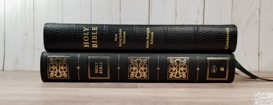

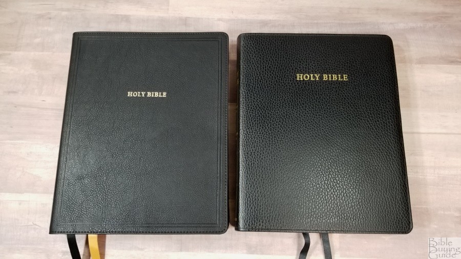
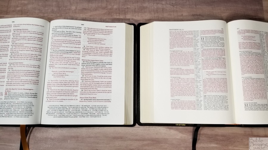
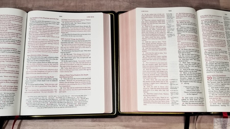
The Cambridge NKJV Wide Margin matches the Pitt Minion, giving you the ability to have a combo. It has slightly thicker paper, a lot smaller and lighter font, a paragraph setting, and ruled notebook pages in the back for notes. It’s just under 1/4″ thinner, but the footprint is the same. It’s an excellent choice if you’re okay with a smaller font and you prefer a paragraph setting. The Thomas Nelson is a better choice for anyone that wants a larger font, doesn’t need as much writing space, and prefers a vbv setting.
NKJV Preaching Bible

The NKJV Preaching Bible shares some common design elements. The pagination is slightly different (mostly because they added book introductions), but the font and character count are the same. The wide margin has more spacing between the words, making it even better for public reading. The Preaching Bible has blue highlights and even highlights the verse numbers. It does not include book introductions, a concordance, or maps. The references and footnotes are the same, but they’re printed in a larger font in the wide margin. The verse numbers in the wide margin text are also larger, but they’re black. The reference and footnote keys in the text of the wide margin are red, making them easier to ignore when preaching. I love the preaching Bible, but the wide margin is more refined and it’s a better choice overall unless you need a smaller Bible.
NKJV Premier Collection Large Print Center-Column Reference Bible

The NKJV Premier Collection Large Print Center-Column Reference Bible has the same references, footnotes, concordance (without red highlights), and maps. Verse numbers are in red. It has different book introductions. It’s slightly thinner and it’s 1 1/2″ narrower. The fonts are about the same size. This one has fewer words per line because of the center column references. Both are red-letter. The paper doesn’t have the slight glare that the wide margin has.
Schuyler Wide Margin Canterbury
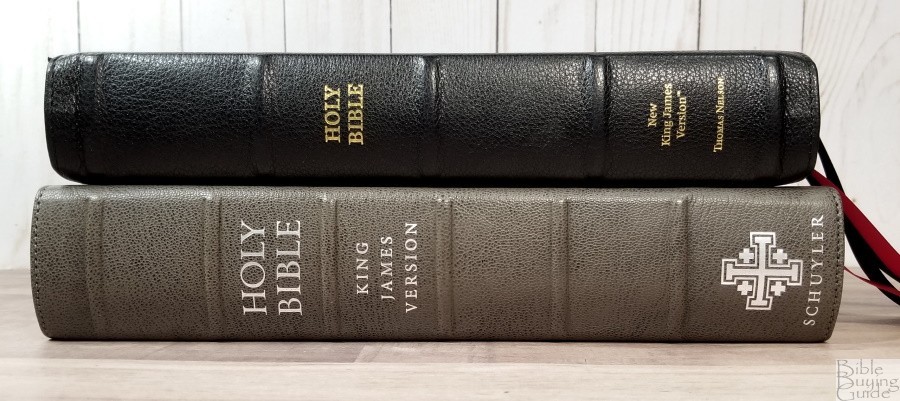
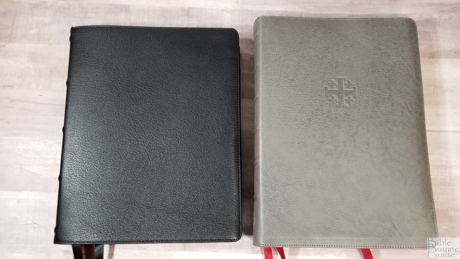
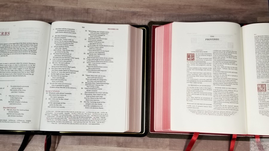
The Schuyler Wide Margin Canterbury is a KJV, but if they do produce a wide margin Quentel in the NKJV, it will be similar to this one with the exception of it being a paragraph edition. The wide margin Canterbury is a larger Bible. It has close to 40gsm paper, wide margins on all sides, and a smaller font.
Conclusion

The NKJV Large Print Wide Margin Reference Bible is one of the few Bibles available with both large print and wide margins. All three editions are made well and use the same paper. I love the print and paper quality. The imitation leather editions look elegant and are a great place to start if you don’t want to write in a goatskin edition. The inner margin and footer are slightly wider than normal, but most of the margin space belongs to the outer margin. This is not ideal for anyone that wants to write extensive notes. The NKJV Journaling Bibles might be a better option for this (for now, but there is a single column wide margin on the way from Thomas Nelson). But, it’s great for anyone that want’s enough space for small notes and doesn’t want to sacrifice print size.
For some tips on marking, check out my book Easy Bible Marking Guide.
_________________________________________________________
This Bible is available at (includes some affiliate links)
and many local Bible bookstores
_________________________________________________________
Thomas Nelson provided this Bible in exchange for an honest review. I was not required to give a positive review, only an honest one. All opinions are my own.