
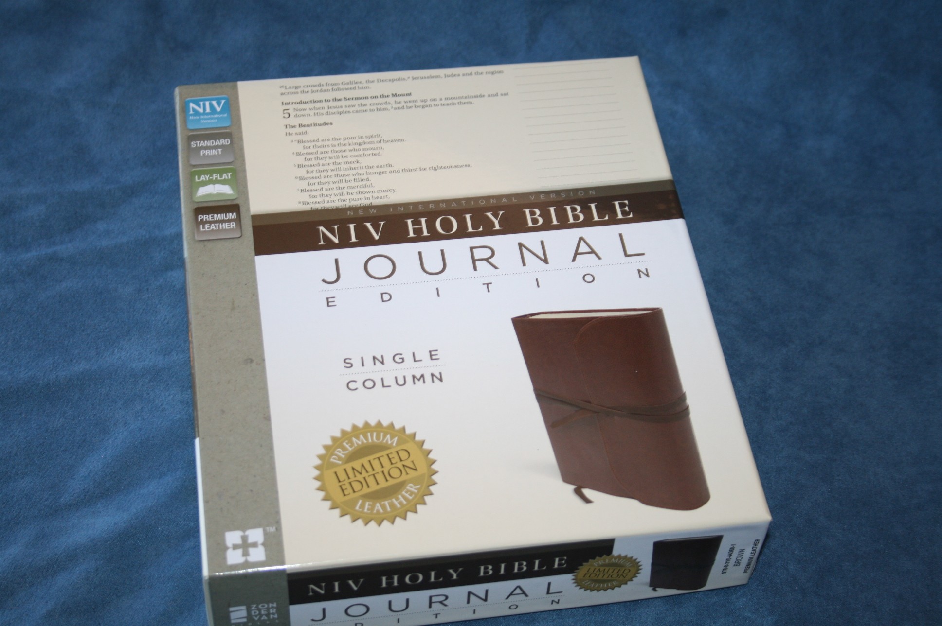
The single-column journaling Bible has become a staple format in Bible publishing (from an idea sparked by Mark Bertrand). I am glad to see publishers providing their translations in this format. This includes Zondervan’s latest edition: the NIV Journal Edition. This Bible, very wisely, doesn’t try to break new ground and do anything innovative. Instead, it follows the tried and true single-column journaling format to a tee, and does it as good as anybody.
Binding
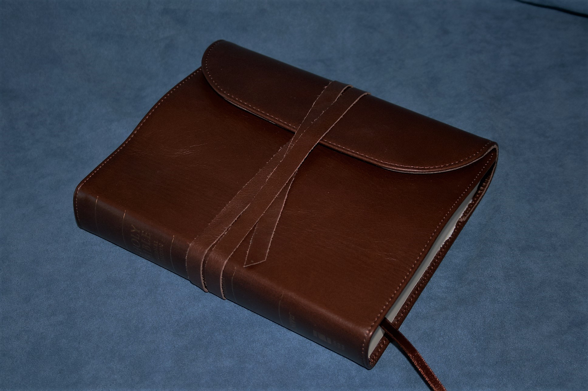
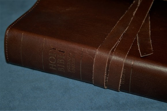

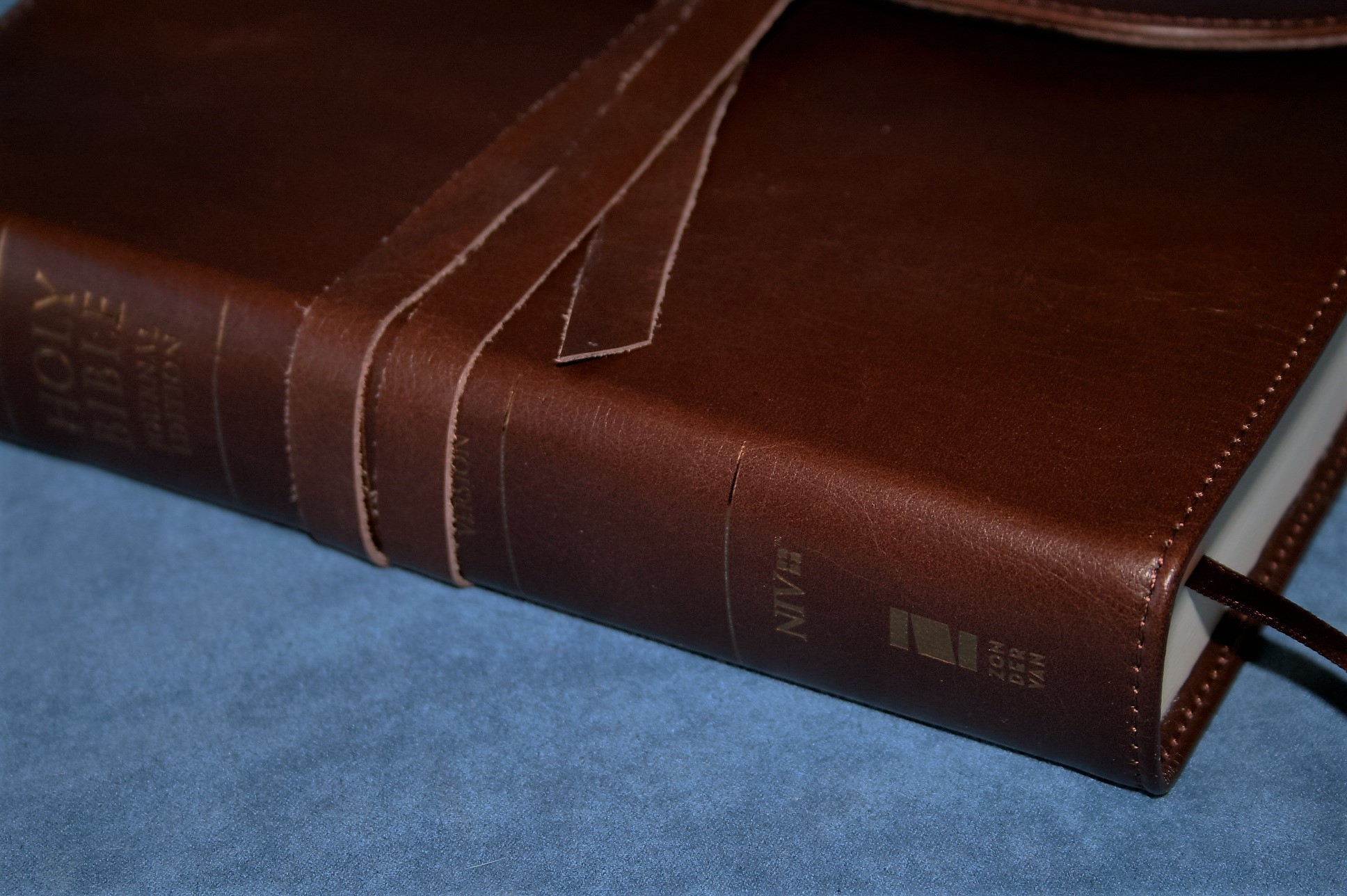
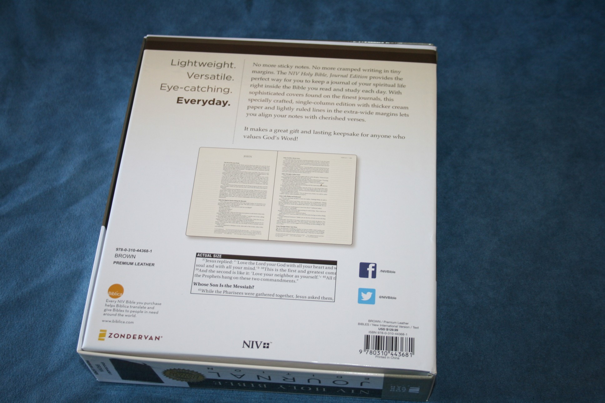
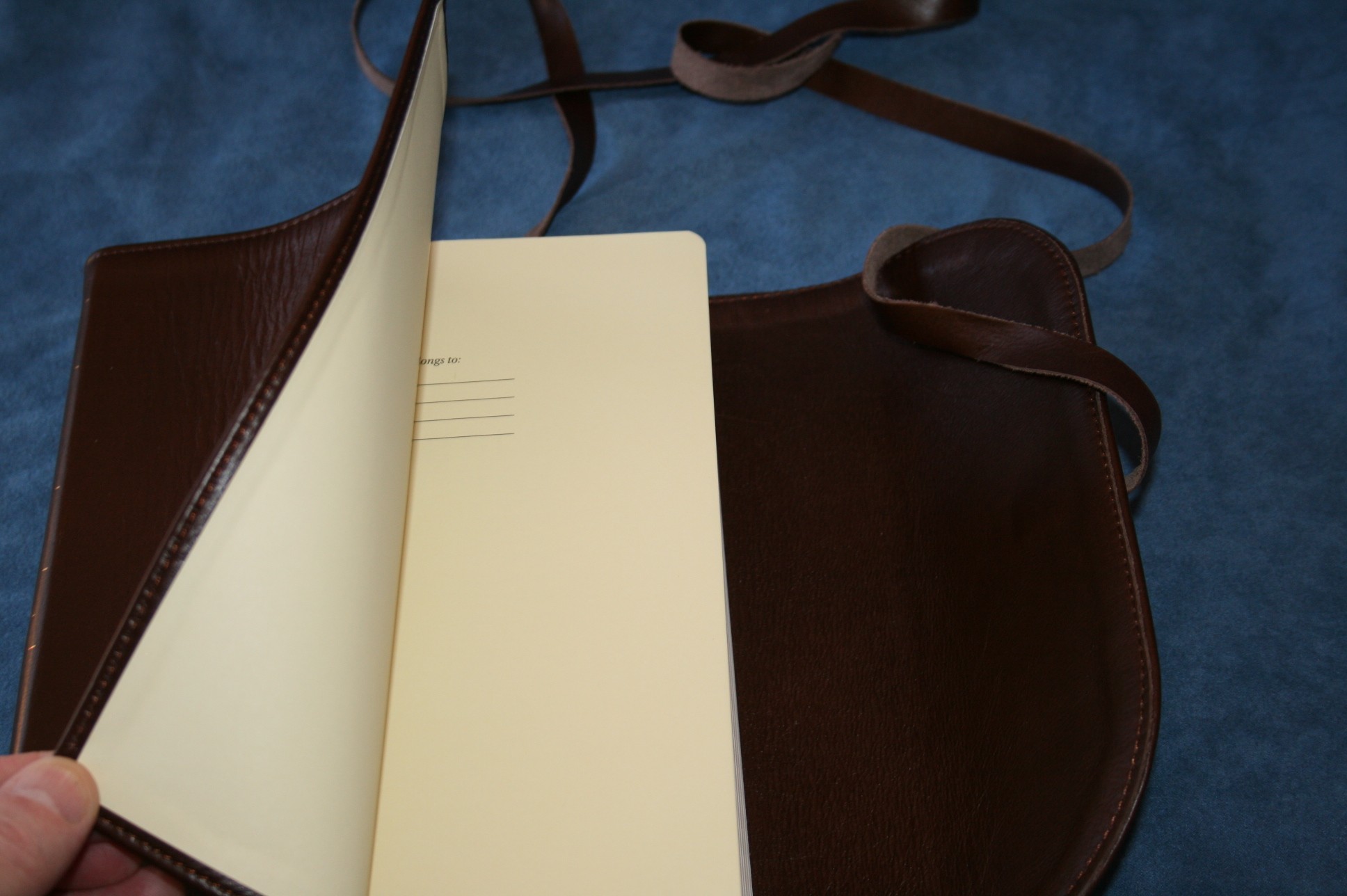
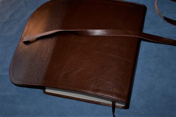
This cover is soft dark-brown leather that’s simply called “Premium Leather” (it’s also available in imitation and hard cover). I don’t know what the leather is but to my fingers it feels like soft calfskin. It’s flexible and soft to the touch (I suspect it has a soft material between the layers). It has a flap from the back cover that wraps around to the front and is tied with a long strip of leather that is long enough to wrap around the Bible twice. It’s perimeter-stitched and gold-stamped on the spine. The liner is a thick paper with “This Bible belongs to” on the inside. This specific cover is a limited edition. The overall size is 7 x 8.5 x 1.5.
It’s sewn and does lay open in Genesis. I’ve seen Bibles where the flap wanted to close but this one doesn’t have that problem. The flap lays over to the side and stays out of the way. The leather is as floppy and flexible as I’ve seen in any goatskin Bible. Holding it open and flat requires either two hands or to lay it across your arm and into your open palm. It has one long brown ribbon that matches the cover.

Paper

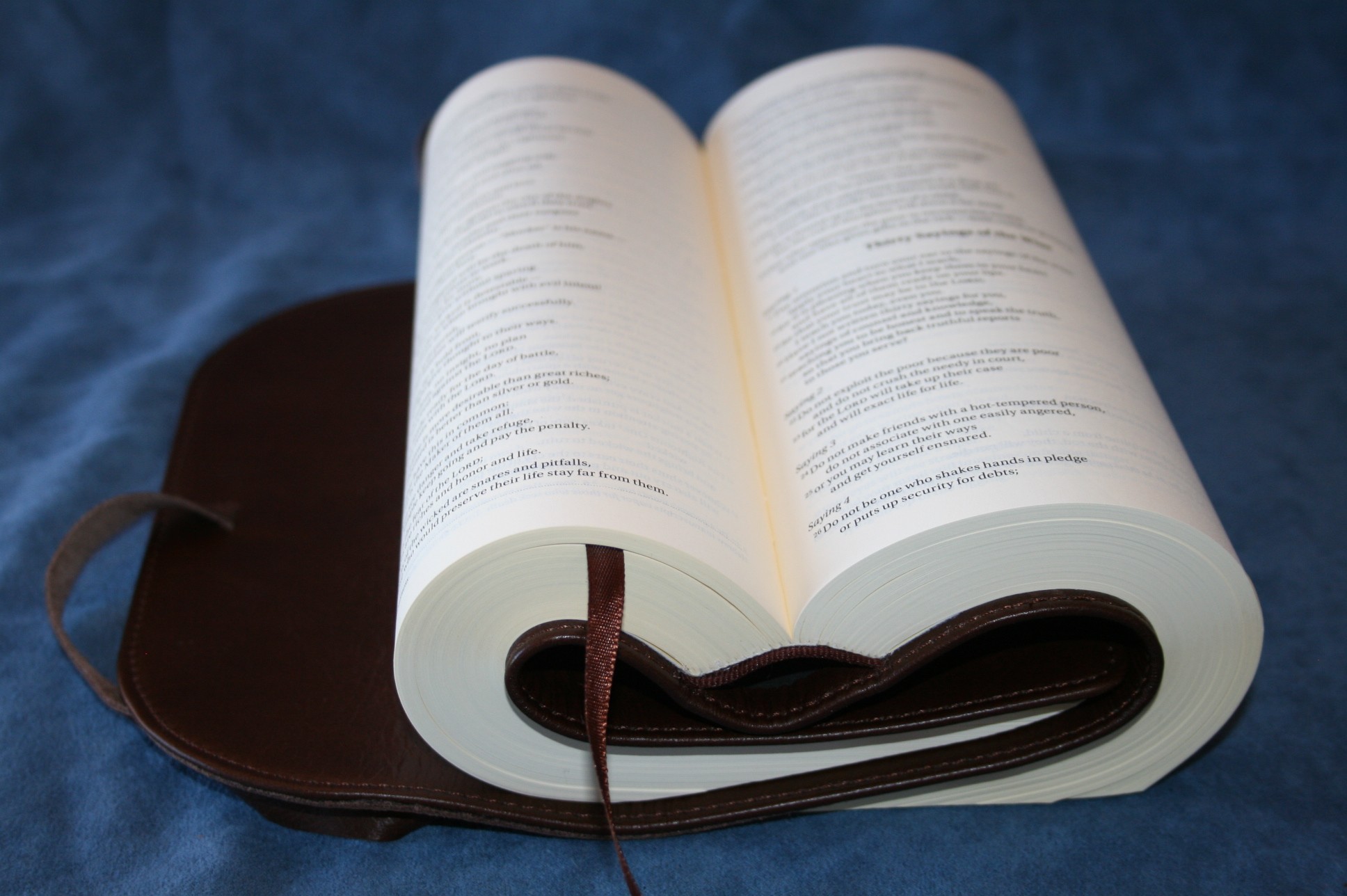
The paper is the same creamy paper found in other journaling Bibles. The gsm feels like it’s in the upper 30’s to my fingers. It looks like the same opacity as my 2012 ESV Single Column Journaling Bible and it’s more opaque than the Holman editions. This is good paper for notes and artwork. It has the same deep cream color that has become standard in journaling Bibles. I love this paper for reading because it’s easy on the eyes. The typeface stands out with the right amount of contrast to ease reading for long periods of time.
Typography
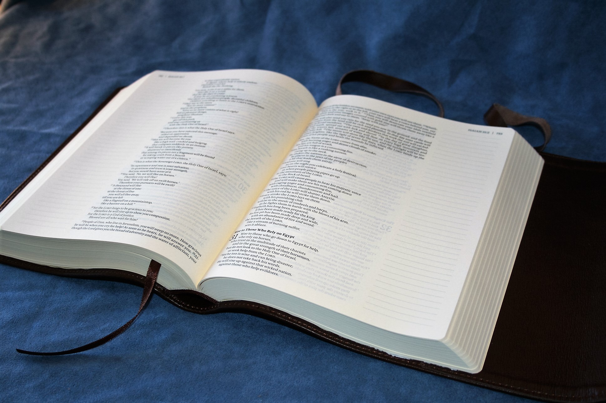
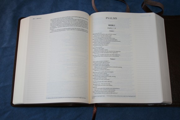
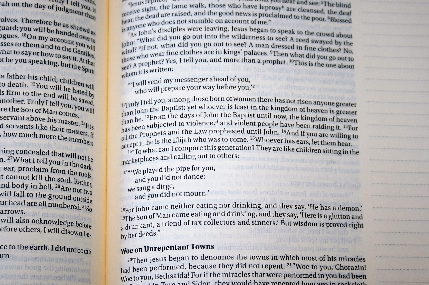
The text is presented in a single-column paragraph with poetry in stanzas, and prayers, lists, and letters are indented. This continues through the New Testament. Section headings are in bold and are left-justified. The single column to font size ratio lends itself well to the NIV’s poetic setting. This is some of the prettiest poetry I’ve seen. Of course this pretty typography, which requires excessive amounts of white-space, comes at a price: smaller print.
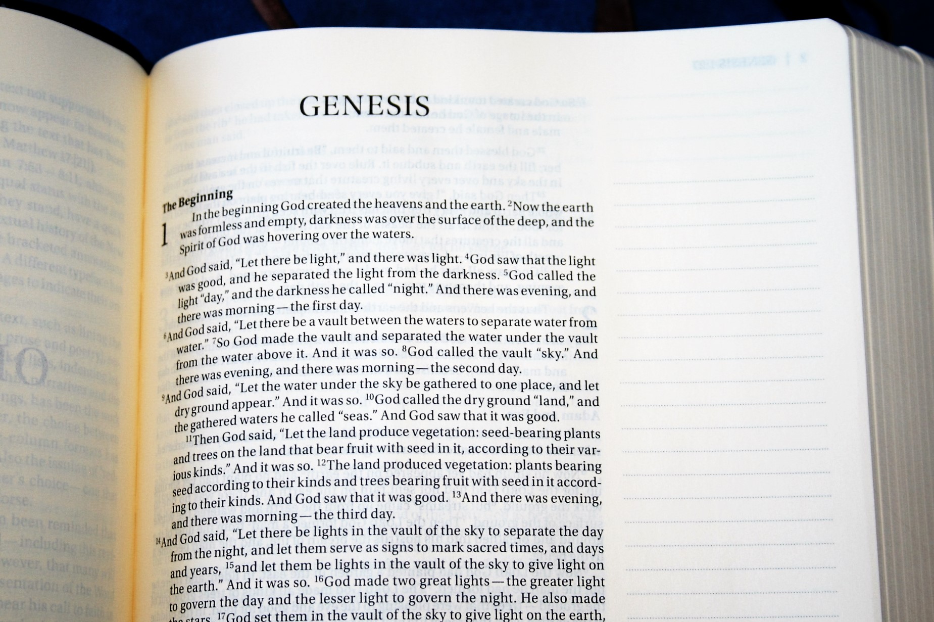
The font looks to be around 7-point. It’s black letter and dark. The print quality is consistent throughout the text. It’s extremely crisp and legible even at its small size. The verse numbers are superscript and are thinner and lighter than the text. They’re probably lower case numbers (or text figures).
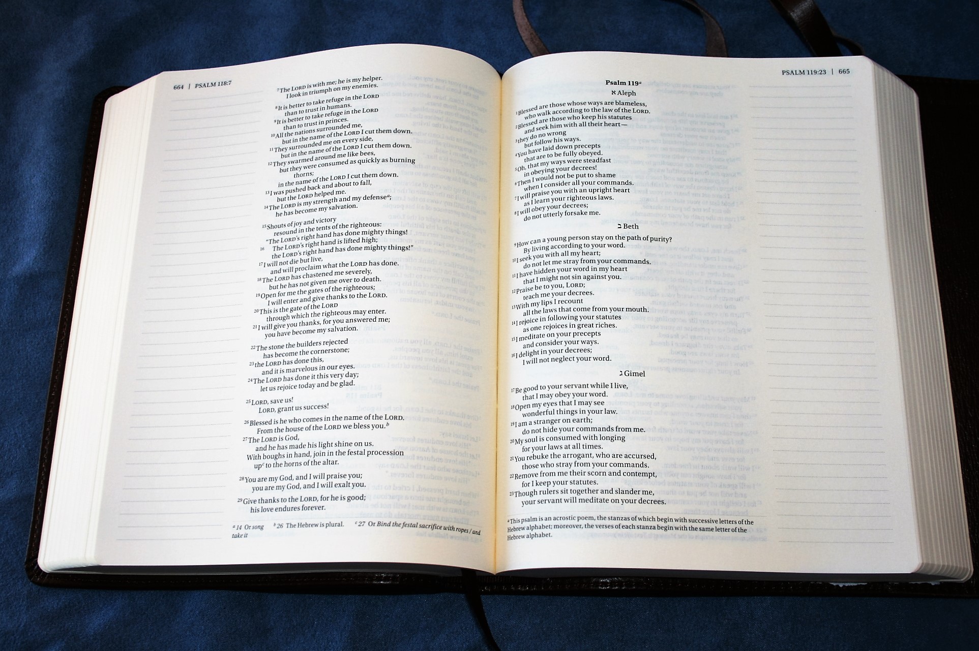
The column of text is 3.6” wide and has around 84 characters across. It probably averages 15 words per line. Normally I would have trouble finding the next line with that many characters but there’s enough leading that my eyes never got lost on the page. The inner column is .3”. This helps in bringing the text out of the gutter and makes it easier to read. The wider column means better word-spacing and fewer hyphens. There are 7 hyphens in Genesis 1.
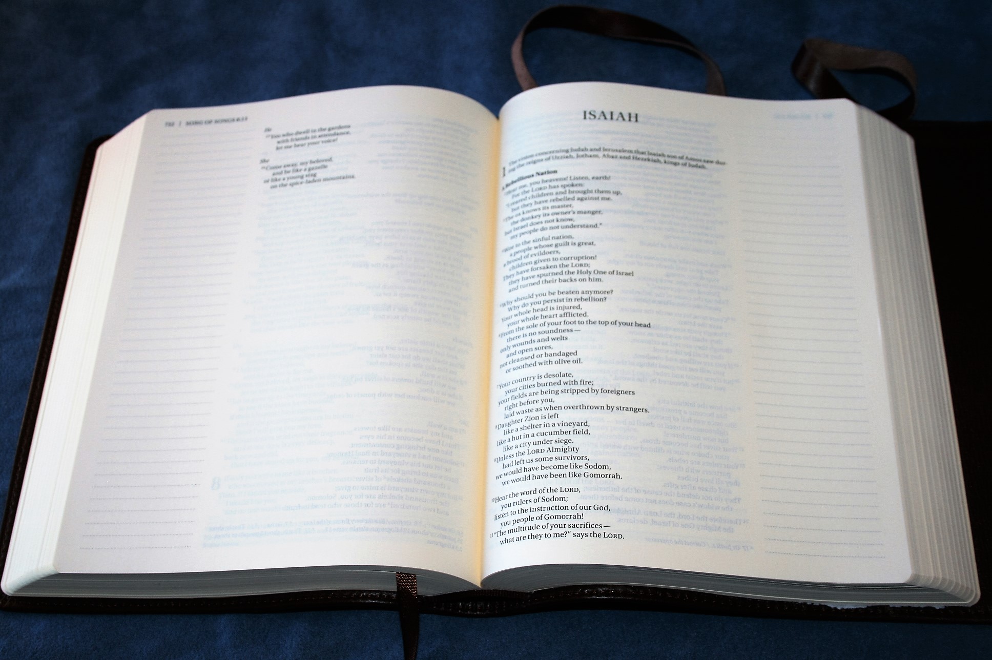
The header contains page numbers on the far outside followed by the book name, chapter number and first or last verse on the page. Since I spend more time looking for verses than page numbers I thought I would prefer to have the page number after the verse number, but in reality it doesn’t make any difference. They’re both easy to see in the corner of the page. Books start on a new page, so you’ll have some space at the end of some books.

The margins have ruled lines for notes. The ruled line is 1.6”. The column from the edge of the page to the column of text is 2”.
One thing I find interesting about the NIV headings for Proverbs. These are different from the section headings. Starting at verse 17 of chapter 32 is Thirty Sayings of the Wise. These go through 24:22. The rest of 24 is labeled Further Sayings of the Wise.
Footnotes
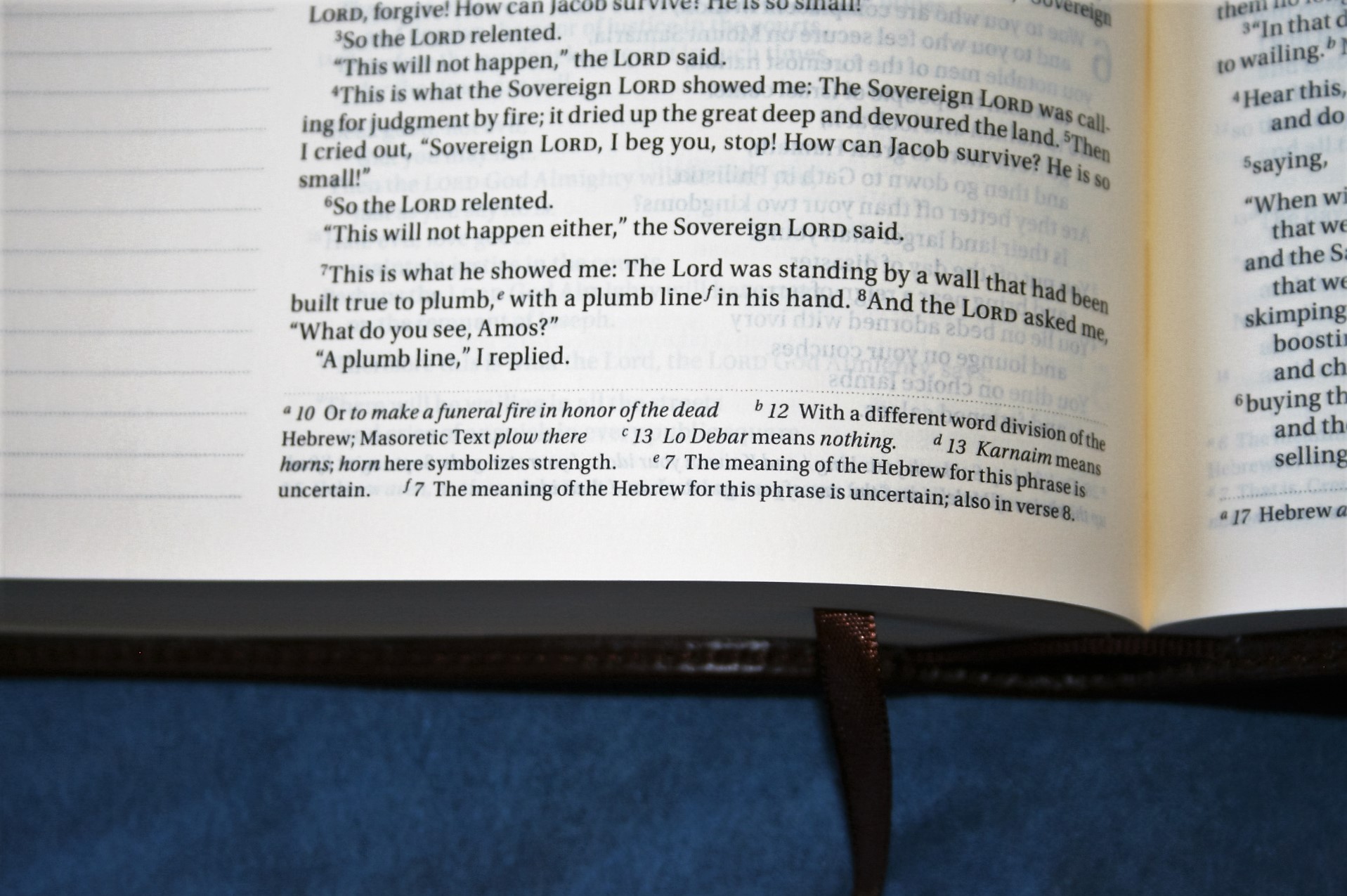
The translation footnotes are placed in the footer. They give alternate renderings, references to diseases, minerals, flora, etc. They also give measurements, meanings of names, manuscript variations, references to quotes, and the verse numbering of the Hebrew text when it differs. The footnotes are smaller than the text and don’t get in the way at all. I find them helpful for understanding the text; especially for meanings of names, references to quotes, and measurements.
Table of Weights and Measures

There is a single page in the back with the table of weights and measures. It includes weights, length, and capacity (both dry and liquid measures). It shows the Biblical unit, the approximate American equivalent, and the approximant metric equivalent.
If I Could Change One Thing
I’d like to see a larger font. Of course that would change the overall size of this Bible. I think the size of this Bible needs to be left as-is. I’d like to see a larger version of the journaling Bible… a large-print edition. This goes for every journaling edition in all translations. I’m not the only one that wants this. In all of my discussions about journaling Bibles I get that comment more than all others combined. I realize that would make a larger Bible, but every note-taker and art-journaler I know wants that. There’s room and demand in the market for both. Journaling is not as much about the translation as it is about the Scriptures with journaling space. The first publisher to create a large print journaling Bible will win over a lot of fans.
Journaling
Bible journaling has become an art-form. There are many ways to journal including writing your thoughts, taking serious notes, and art-journaling. This Bible works great for all types of journaling whether you’re keeping track of your daily walk in God’s Word, creating the ultimate preaching Bible, or creating masterful artwork or simple doodles that pertains to the Scriptures on the page.
Here is a list of popular tools that work great for all types of journaling.
- Pigma Micron Markers
- Crayola Color Pencils
- PrismaColor Color Pencils
- Washi Tape
- Acrylic Paint Set
- Deluxe Journaling Kit
- Various Supplies
Comparisons

Here are a few photos to compare with other journaling editions. Starting from the top left corner and moving clockwise: ESV, NIV, KJV, and NKJV.
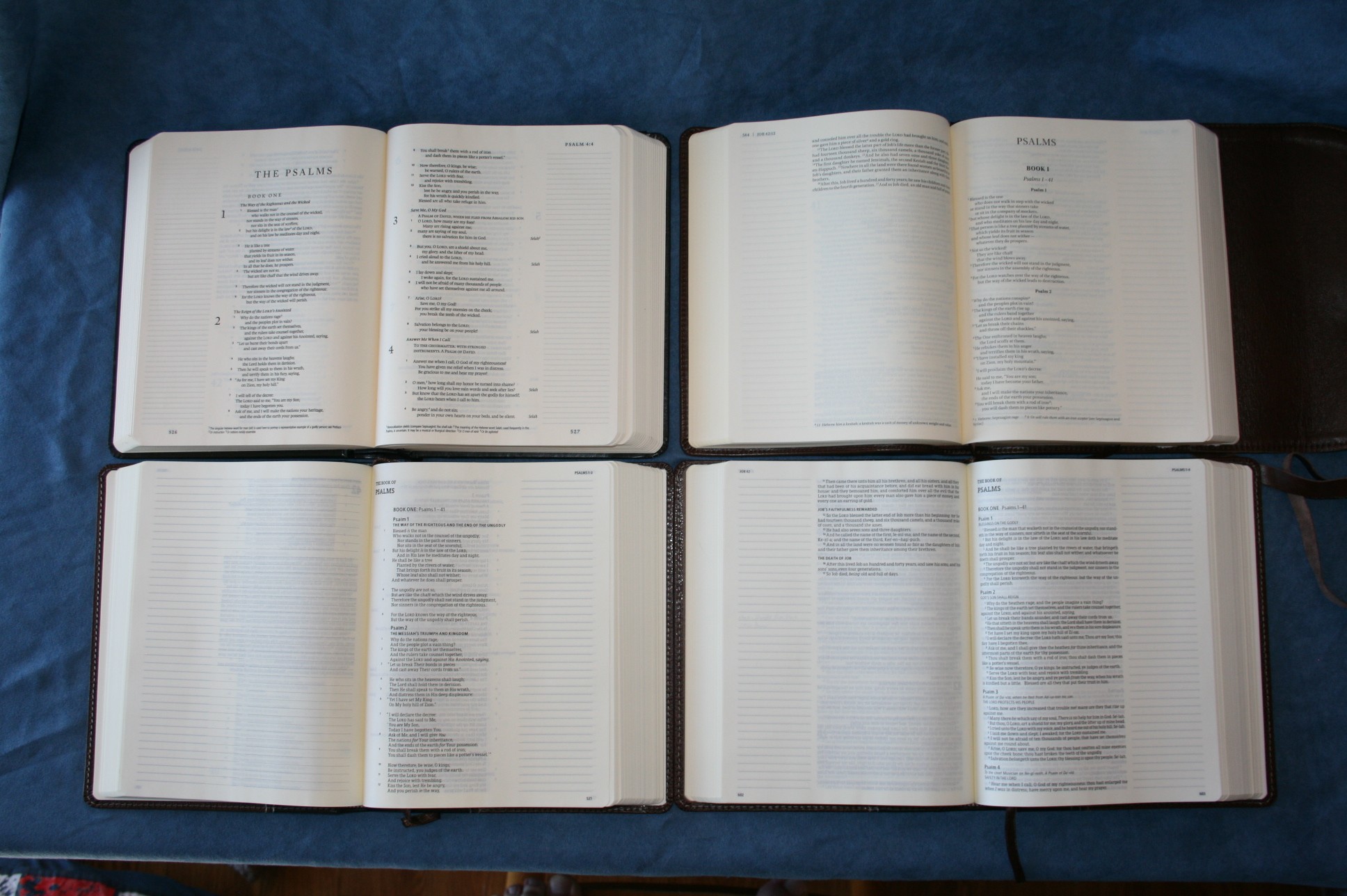
The ESV (2012 edition) has the darkest font. The NIV’s font isn’t as dark, but it’s still dark. The ESV and NIV has the same paper opacity. The KJV and NKJV has the same paper thickness, but are not as opaque. They have a darker font than the NIV.

Conclusion
The NIV Journal Edition is an excellent addition to the journaling Bible community. It has fewer features than it’s cousins (the other translations include concordances, maps, and reading plans), but those are not required in every Bible and I’ll bet they’re not used that often in a journaling Bible anyway. Zondervan’s journal edition is as good as they come. If you want a journaling Bible in NIV this is the Bible for you.
Zondervan provided this Bible free for review. I was not required to give a positive review – only an honest review. My opinions are my own.