
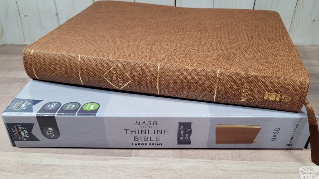

The Zondervan NASB Passaggio Setting Large Print Thinline Bible is one of their first Bibles in the new Passaggio setting. Its name comes from music when the singer changes from one register to another. This analogy describes how the Passagio setting changes layouts between prose and poetry. I’ll review all of the Passaggio Bibles, starting with this large print thinline edition, ISBN: 9780310456735, made in China.
Zondervan provided this Bible in exchange for an honest review. I was not required to give a positive review, only an honest one. All opinions are my own.
_________________________________________________________
This Bible is available at (includes some affiliate links)

and many local Bible bookstores
_________________________________________________________
Table of Contents
Video Review

Binding

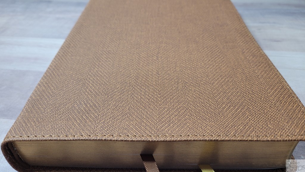
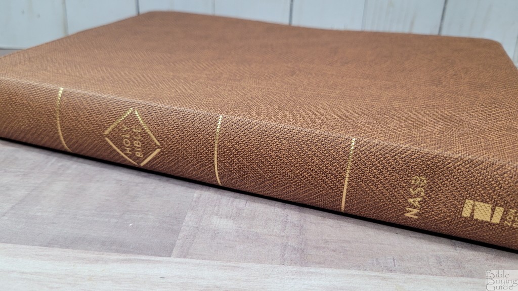
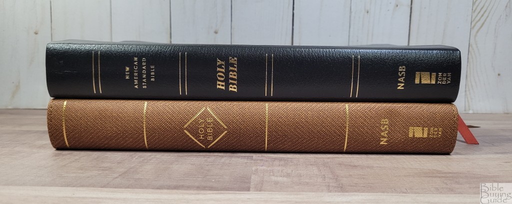
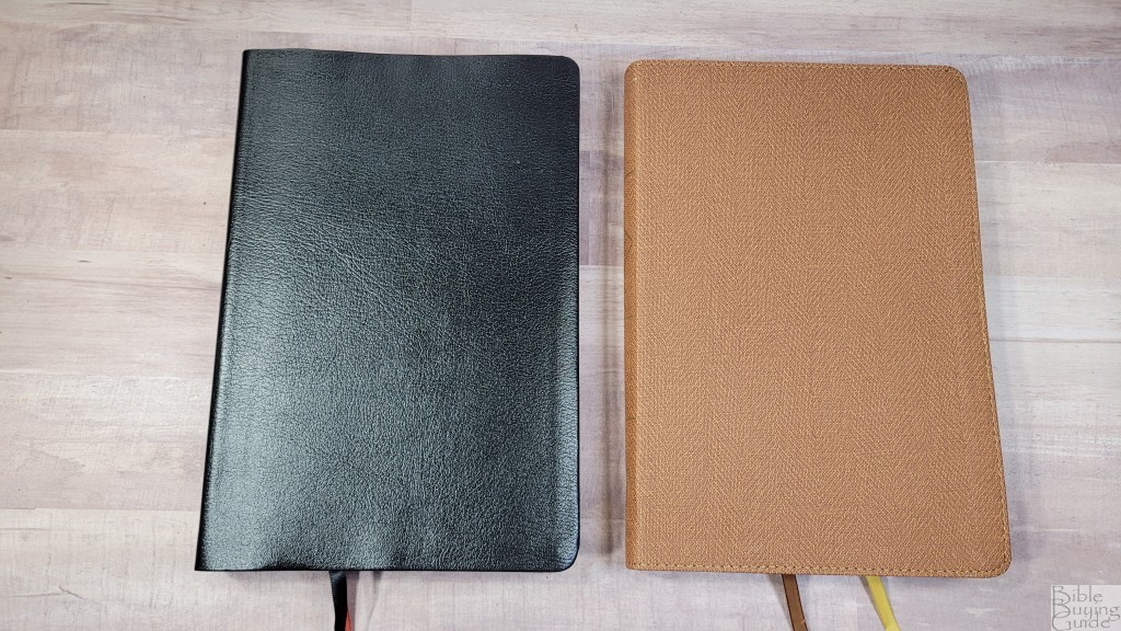
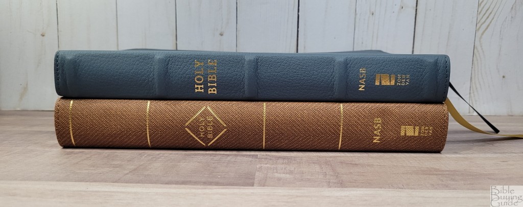
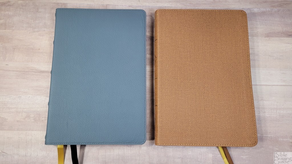
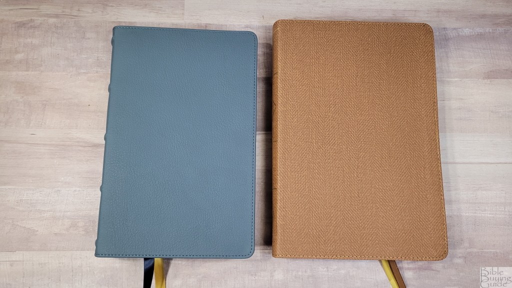
This edition is brown Leathersoft. Rather than attempting to look like real leather, it has a cloth texture. It has perimeter stitching. Nothing is printed on the front. The spine has minimal text and logos printed in gold along with 5 gold lines to indicate ribs. I like this design.
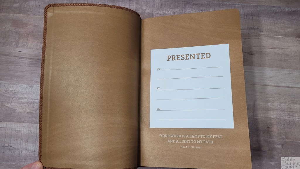
The liner is paste-down paper. The liner doubles as the presentation page. It doesn’t have any other thick end-sheets that would add structure. This block is sewn. Once it’s broken in, it stays open at the beginning of Genesis with no trouble.
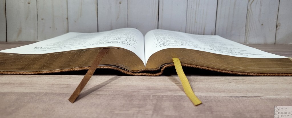

It includes one brown ribbon and one gold ribbon. Both are 1/4″ wide and they’re long enough to pull to the corner with no trouble. The overall size is 6 1/2 x 9 1/2 x 1 1/8″. It weighs 2 lbs, 0.5 oz. This is a good size for carrying and reading. It’s light and easy to hold, but I usually leave it on the desk to read.
Paper
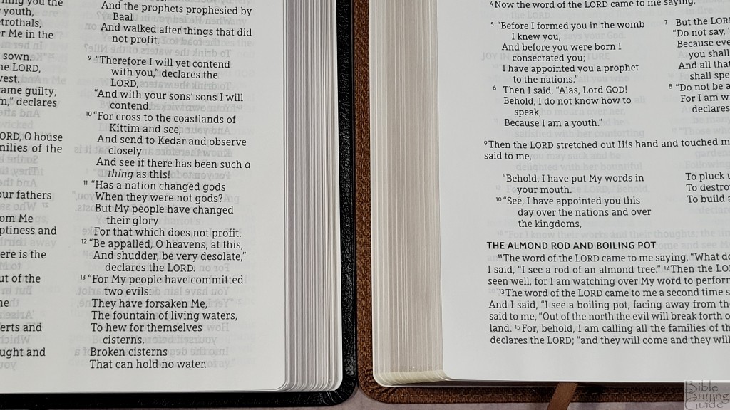
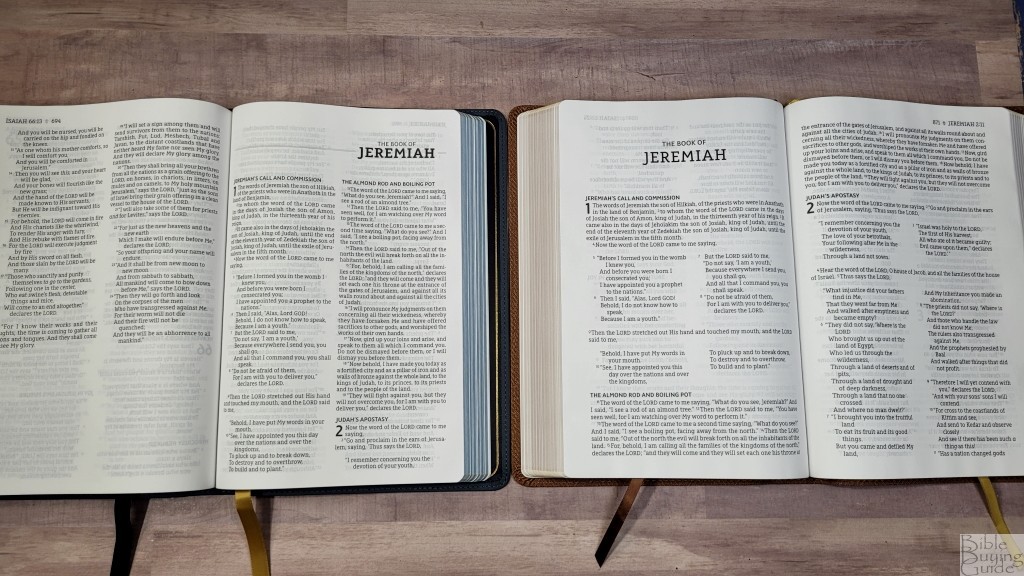
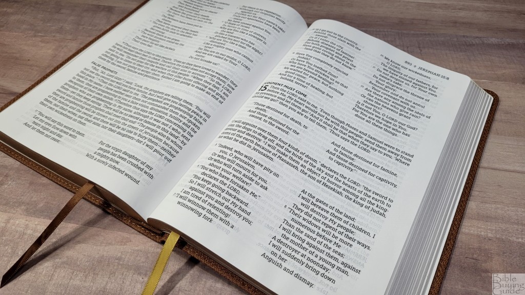
The paper is 30gsm. This is the same paper used in the other lower-end Zondervan editions. It’s white in color and it’s highly opaque for its price range. The show-through is only noticeable in the poetic settings. It doesn’t glare under direct light. The texture is slightly rough. I usually had no issues turning the pages. They did want to stick together a few times.
Typography and Layout
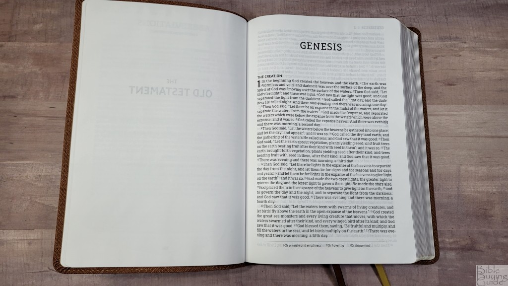
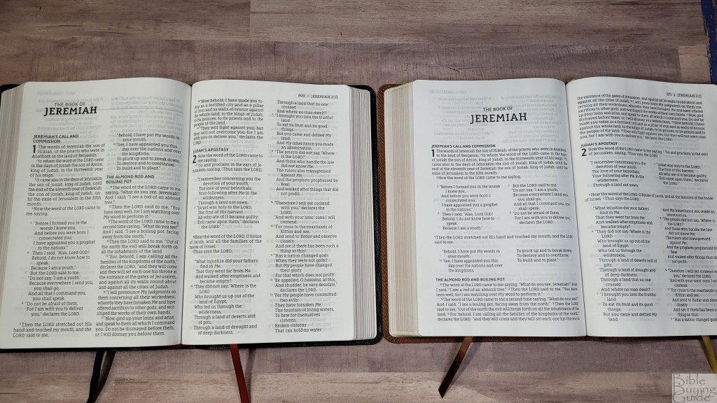
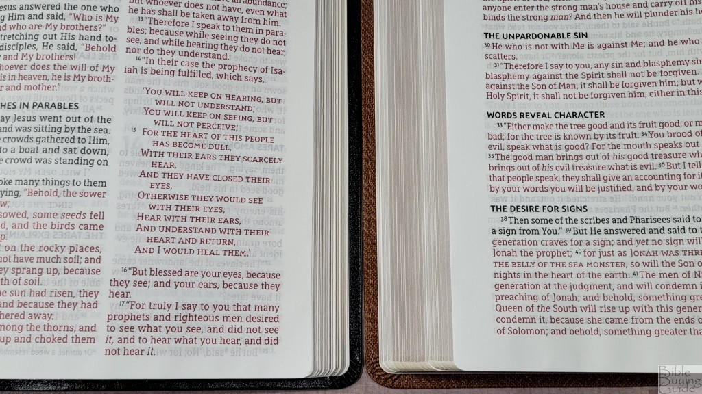
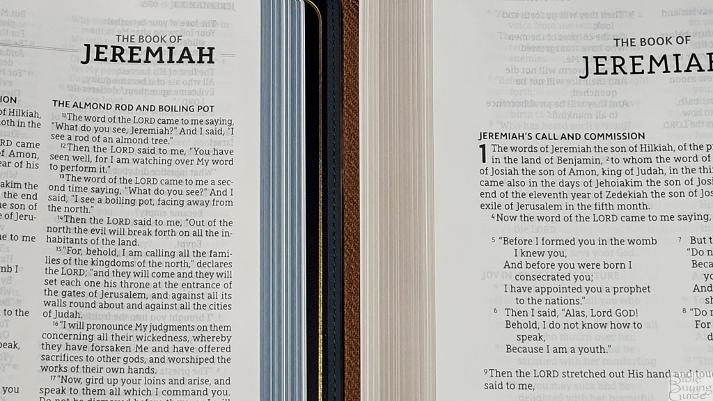
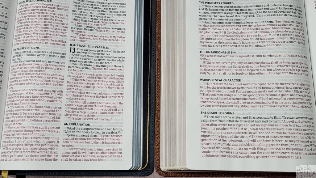
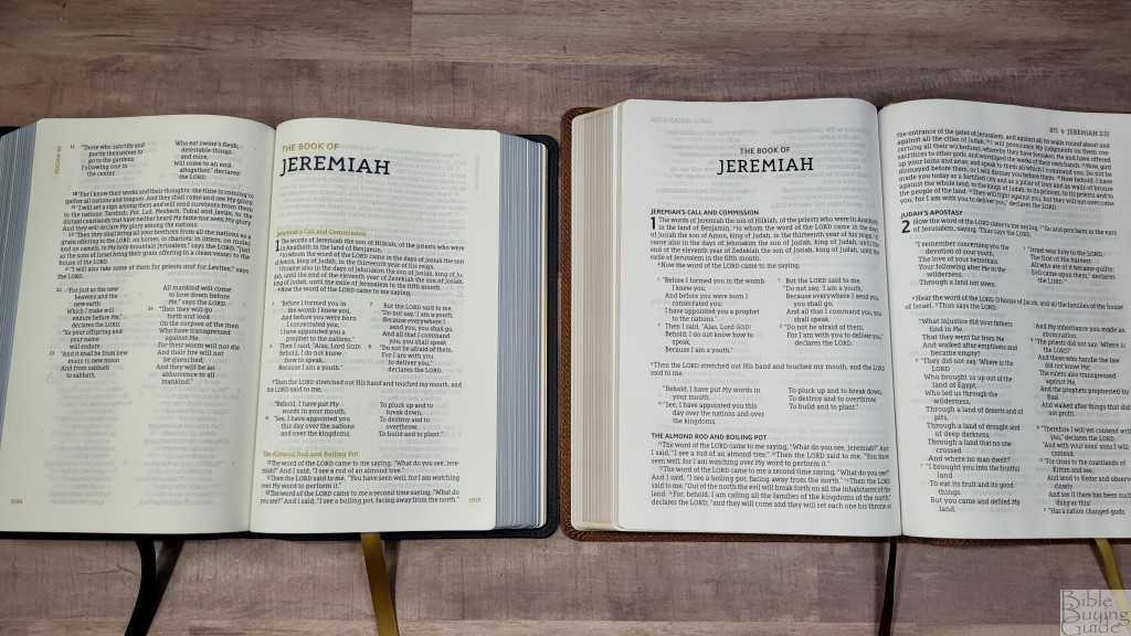
The text is presented in the new and unique Passaggio setting. The prose is placed in single-column and poetry is in double-column in stanzas. The header includes the book name, chapter, and verse number in the outer margin. The page number is placed just inside of this. Old Testament quotes are in all caps. They don’t include the references they’re quoting, though. I’d like to see them added because it makes the quotes more useful.
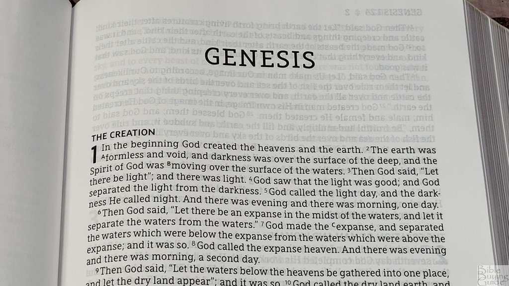
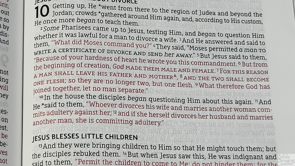
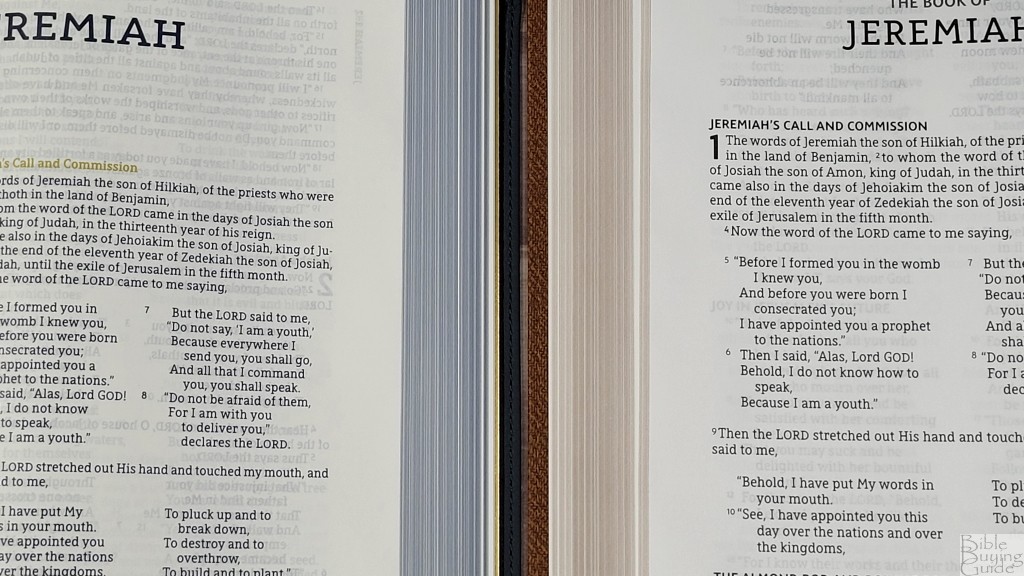
The typeface is a 10-point red-letter Comfort Print designed by 2K/Denmark for the Zondervan NASB line. The red is a touch on the dark side, which I prefer. It looks great and remains readable. Both the black and the red are highly consistent. It’s printed with line-matching to reduce show-through. The lines of text line up well on both sides of the page and the show-through isn’t enough to affect readability. There is a lot of space in the inner margin to bring the text out onto the flat part of the page.
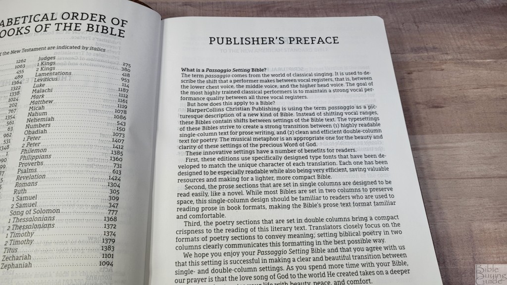
Passaggio Setting
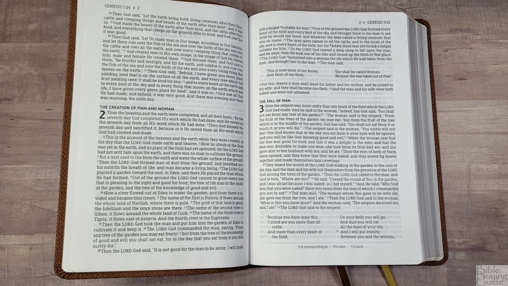
As I stated in the opening paragraph, Passaggio refers to music when the singer smoothly changes from one vocal register to another. The Passaggio setting utilizes the change between prose and poetry. When both prose and poetry are on the same page, it switches from one to the other and back.
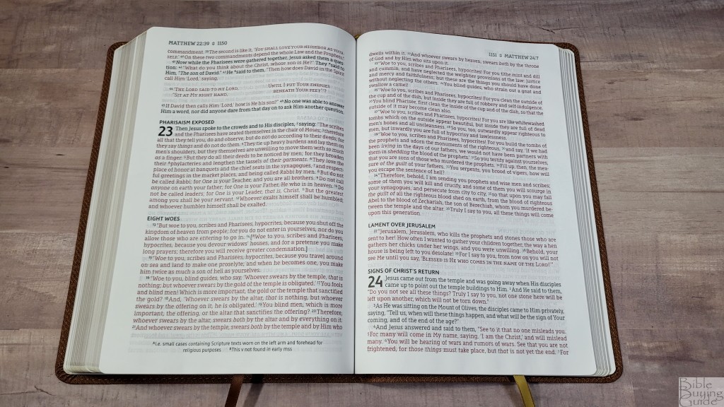
The prose is in a single-column, paragraph setting. This setting has 14 words per line. This is more than I prefer and for pages that have a lot of prose, but the inner margin space and extra space between the lines help with readability. The text never bends too far into the gutter, so the lines are mostly flat. There are a lot of words on the page, though, so it can be easy to get lost if you look away for a second.
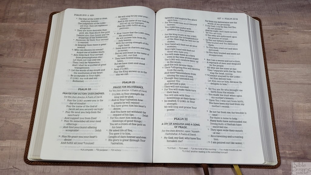
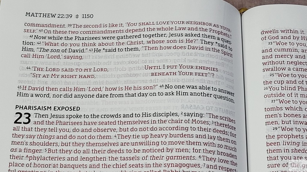
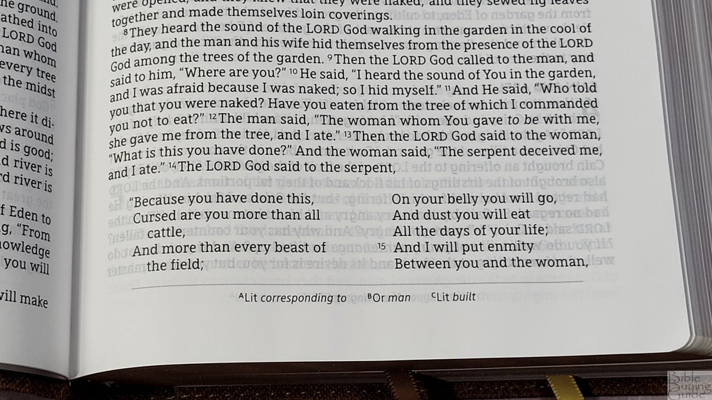
Poetry is in a double column. The poetic lines are not divided to fit the word count, so it does have a lot of lines with a single word. The current poetic divisions need a few more words per line to get the best design for poetry. It’s still readable.

The advantage of the Passaggio layout is that it reduces the wasted space of the single-column poetic setting. Many poetic lines are short, which means that sometimes up to half the page isn’t used.
Footnotes
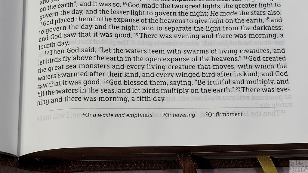
Translation footnotes are placed along the bottom of the page. They provide insights into Hebrew or Greek and include alternate renderings. There are only a few per page, so the footnotes are not extensive. The footnotes do not include references. This makes it difficult to know where something was quoted from. I find it a touch awkward to see an Old Testament quote in all caps, but it doesn’t show where it was quoted from.
Tools
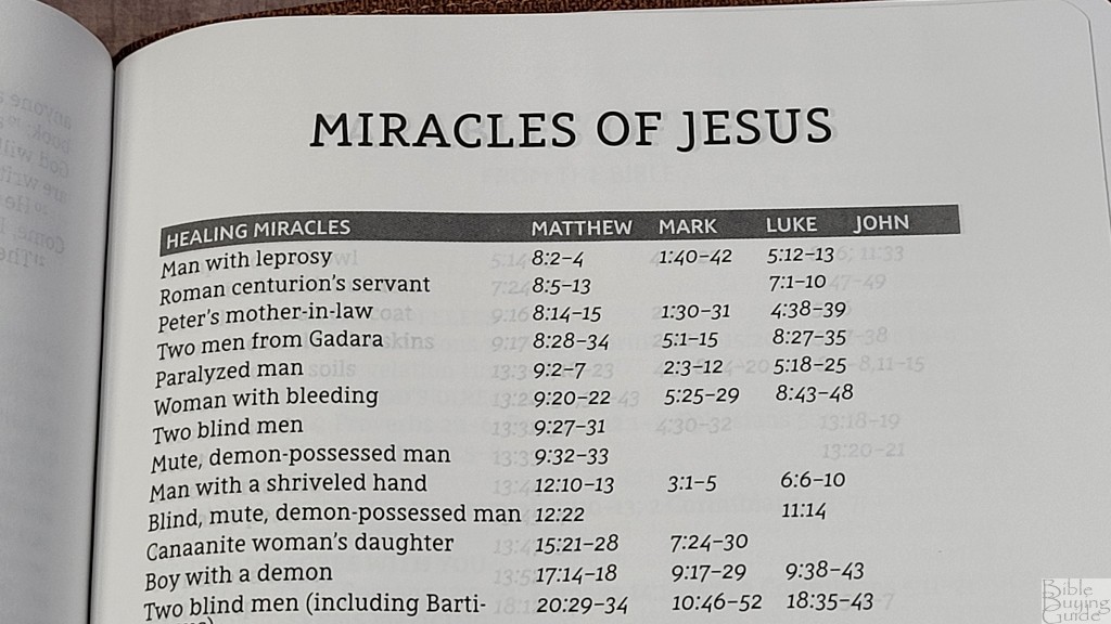
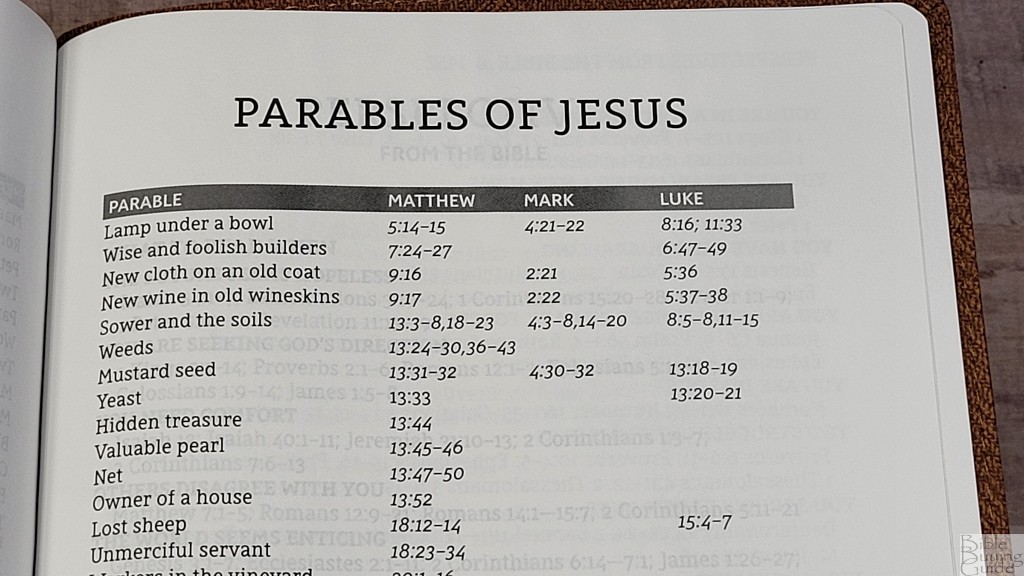
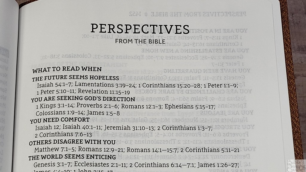
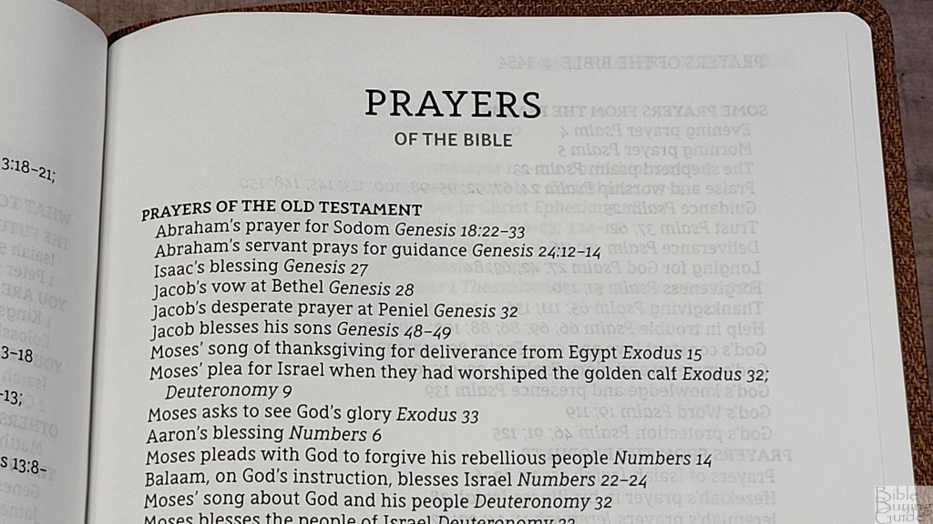
There are several lists in the back that help with study. They provide a topic and a list of references. They’re especially helpful since this Bible doesn’t include references. They include:
- Miracles of Jesus
- Parables of Jesus
- Perspectives from the Bible
- Prayers of the Bible
Comparisons
Here’s how the NASB Passaggio Setting Large Print Thinline Bible compares with several other thinline NASBs. I’ll also compare it to the other NASB in the Passaggio series.
Zondervan NASB Giant Print Thinline

The Zondervan NASB Giant Print Thinline has a larger print and is verse-by-verse. It has almost the same overall size. It’s a great choice for preaching and teaching. I prefer the Passaggio for reading. The paper and print quality are the same. It has the same tools in the back.
Zondervan NASB Large Print Thinline

The Zondervan NASB Large Print Thinline is a touch thinner but it has the same footprint. The font is slightly smaller. This is also a verse-by-verse edition that’s good for preaching. It has the same tools in the back and adds maps.
Zondervan NASB Passaggio Heritage Bible
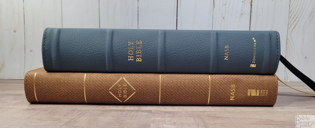
The Zondervan NASB Passaggio Heritage Bible is the other Passaggio NASB (review coming soon). This is a personal size edition with a slightly smaller print and fewer words per line. This is a verse-by-verse edition and has premium paper. It also has the same tools in the back and adds maps. It’s an excellent choice for preaching and carrying. I prefer the thinline for reading and this one for preaching.
Conclusion
The NASB Passaggio Setting Large Print Thinline Bible is an excellent design for reading. It’s made well. Even though the paper is thin, it doesn’t have a lot of show-through. The Passaggio setting keeps the Bible thin without having to reduce the size of the font. It does have more words per line than I prefer, but the extra inner margin space and space between the lines helps a lot. The verse number takes an extra second or two to locate. It might not be ideal for preaching, but Zondervan has a v-b-v for that. If you’re interested in a large print 1995 NASB for reading, this is a good choice.
_________________________________________________________
This Bible is available at (includes some affiliate links)
and many local Bible bookstores
_________________________________________________________
Zondervan provided this Bible in exchange for an honest review. I was not required to give a positive review, only an honest one. All opinions are my own.