
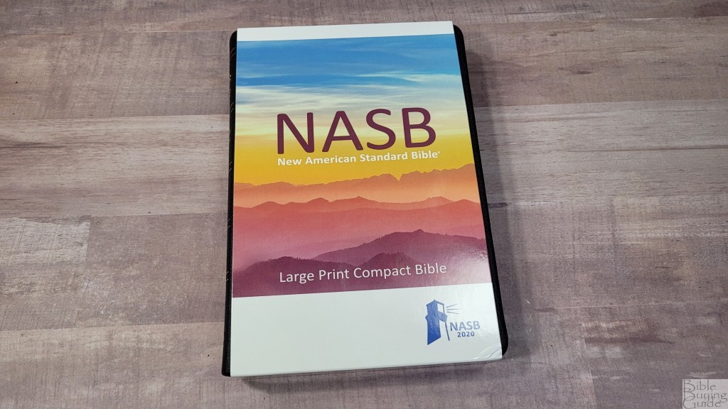

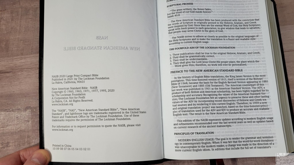
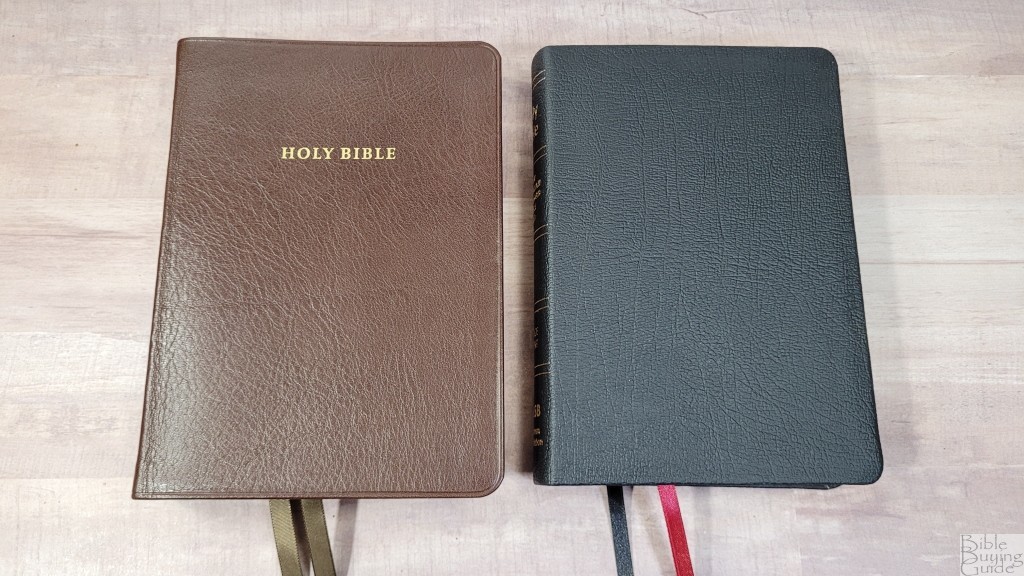
The Lockman NASB Large Print Compact Bible is a highly readable, single-column, edition of the 2020 NASB that’s designed for everyday carry and use. It’s available in several cover options. I’m reviewing the black genuine leather. This is ISBN: 9781581351873, printed in China.

The Lockman Foundation provided this Bible in exchange for an honest review. I was not required to give a positive review, only an honest one. All opinions are my own.
_________________________________________________________
This Bible is available at (includes some affiliate links)

and many local Bible bookstores
_________________________________________________________
Table of Contents
Video Review

Binding
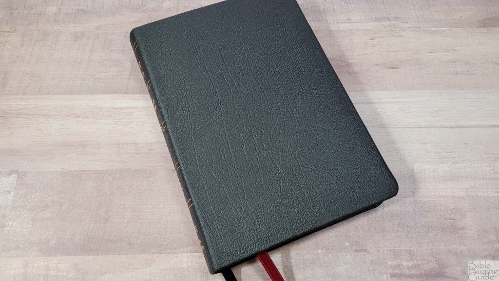
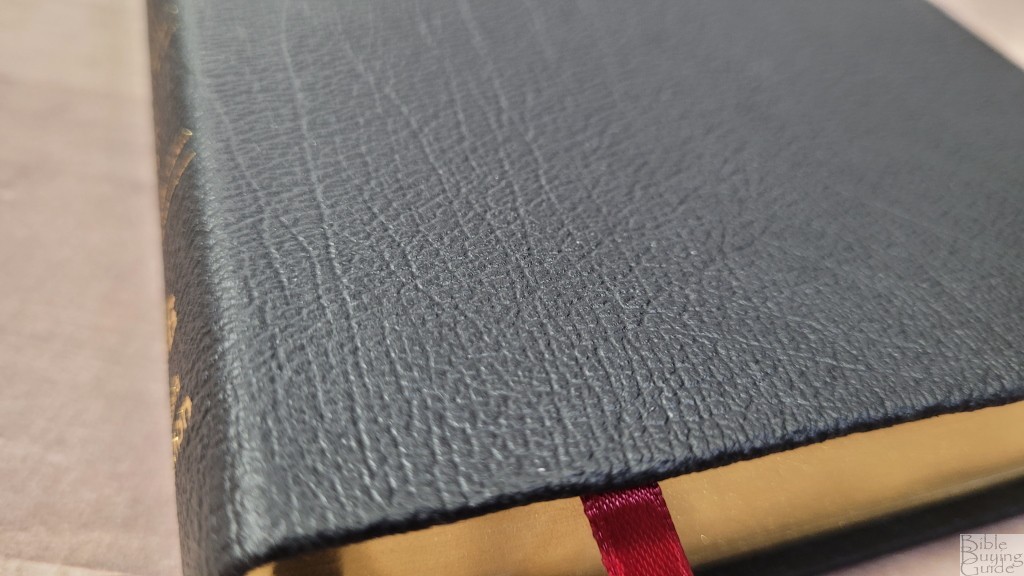
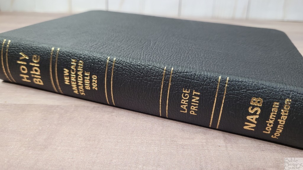
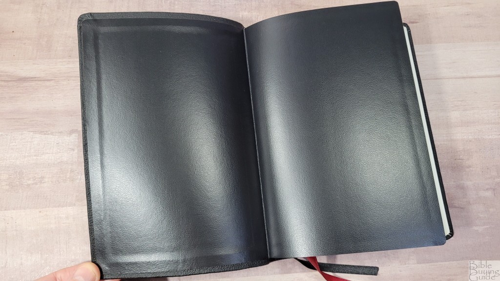
The cover is black genuine leather. It has a touch of a grain that looks and feels stamped, but I like the design. Nothing is printed on the front. The back includes the ISBN. The spine has 5 rib indications and text that are printed in gold.
The liner is pastedown vinyl. It looks to be reinforced. The cover is stiff. This can make it a little difficult to use. Even when opened to the middle of the Bible, one cover doesn’t open enough to touch the table at first. It will close in Genesis. It has loosened a little, so hopefully, it will break in after enough use. The text block is sewn.
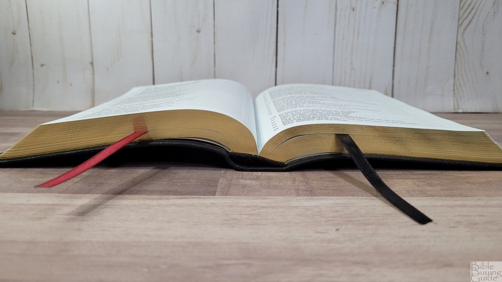
Ther are two single-sided 1/4″ ribbons- red for the Old Testament and black for the New Testament. They’re long enough to pull to the corner to open the Bible and have more than enough left to hold it. The head/tail bands are black. The overall size is 5.25 x 7.5 x 1.12″. It weighs 1 lb, 6.5 oz.
Paper
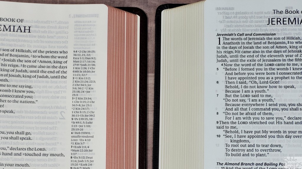
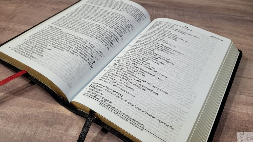
The paper seems to be the same 30gsm that’s used in the large print thinline. It actually feels thicker than that to me. I find it easy to grab and turn. It’s white in color with a slightly blue tint that’s just noticeable. It isn’t enough to bother my eyes. The show-through isn’t bad. It’s mostly noticeable in the poetic settings.
Typography and Layout
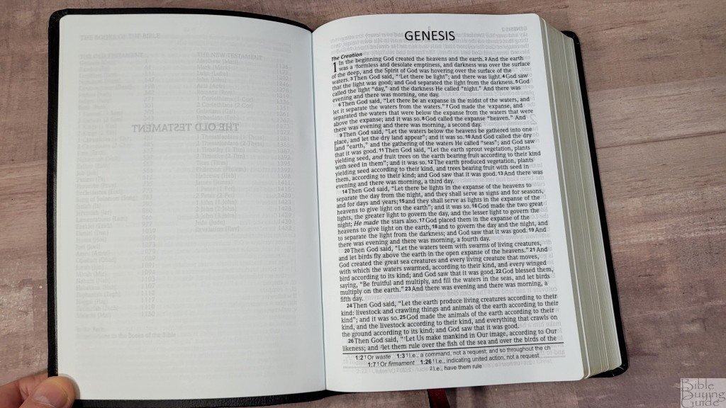
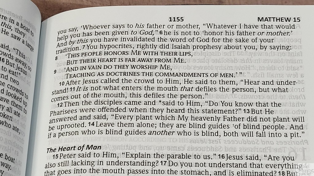
The text is presented in a single-column, paragraph layout. Poetry is set to stanzas and it’s indented. Old Testament quotes in the New Testament are in all caps. Section headings are in bold italics. supplied words are in italics. The header includes the page number in the center and the book name with the chapter number in the outer margin. Footnotes are placed in the footer and they’re separated from the text by a line.
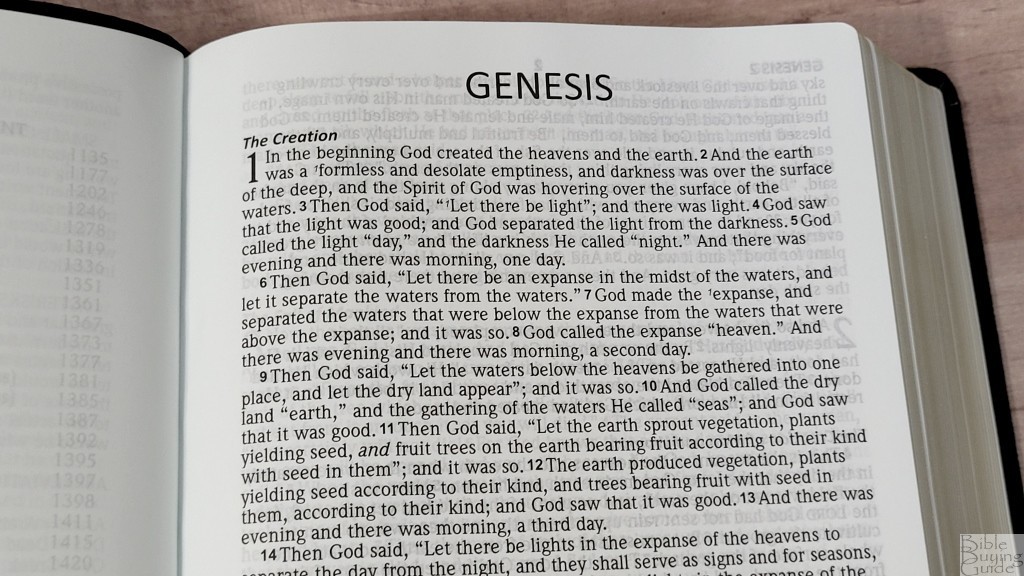
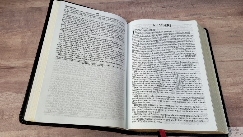
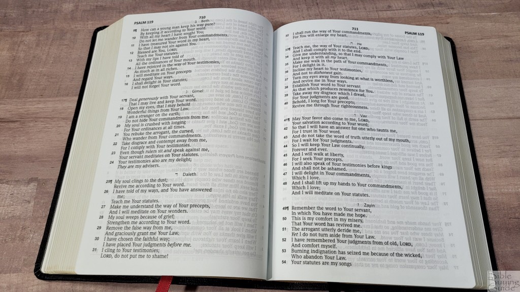
The typeface is 9 point, black letter. It’s dark and consistent throughout. It has around 16 words per line and it’s printed with line-matching. They placed the margin space where it mattered the most for readability. It has a wide inner margin to bring the text out of the gutter. All other margins are small. The text stays on the flat part of the page and never bends into the gutter. This keeps the lines straight. The text is only left-justified, so it has a ragged right edge.
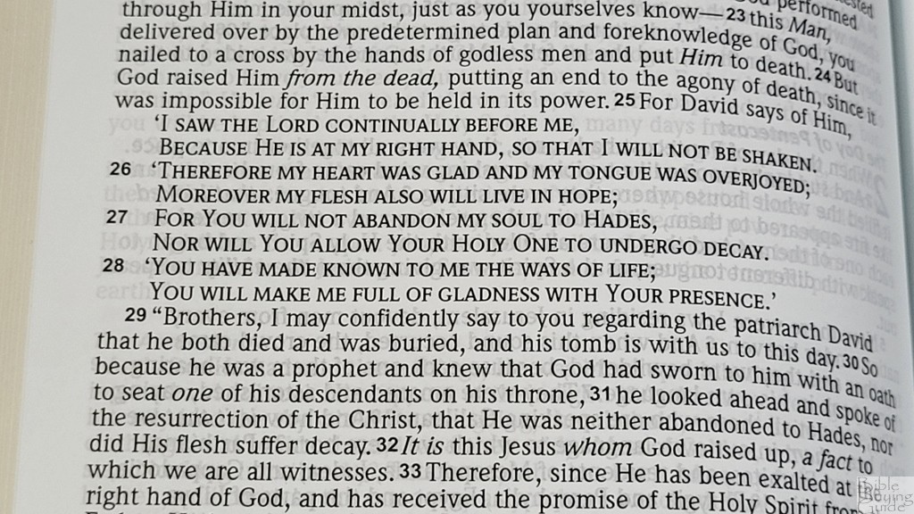
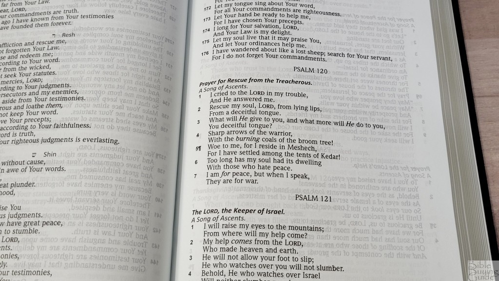
Poetry looks great at this word count. One thing I find awkward is that poetry includes pilcrows next to the verse numbers. I think a space between the paragraphs would look cleaner and be more understandable at a glance.
Footnotes
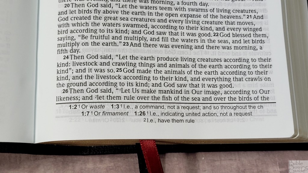
The translation footnotes are placed in a single column along the bottom of the page, and they’re separated from the text with a line. They’re printed in a smaller font. They include alternate renderings, explanations of the original languages, etc. These are helpful for studying and getting insights into the 2020 NASB translation.
Introductions

In the back are introductions to each book of the Bible. Each is about a paragraph and includes information about its title and the main themes of the book. They’re not detailed, but they are helpful.
Comparisons
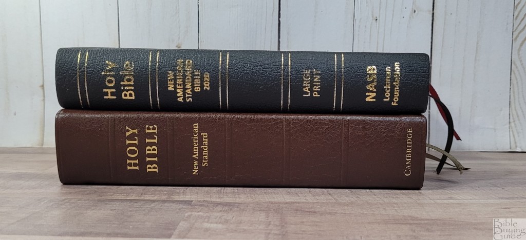


The Cambridge Clarion is in a different price range, but it has the same footprint and a similar layout. The Clarion is a full reference edition with references in the outer margin and includes a concordance and maps in the back. The font is slightly larger and lighter. The paper is thinner (28gsm vs 30gsm), but it’s the French Indopaque paper that’s a lot more expensive. I prefer the elegance of the Clarion, but the size and readability of the Large Print Compact.
Conclusion
The Lockman NASB Large Print Compact Bible is an excellent edition for carrying and reading. The size is just about perfect for everyday carry. The text is dark and clean, making it a great choice for reading. The bold verse numbers make it a great choice for those that preach from a paragraph edition. My only complaints are minor and they won’t keep me from using it. I’m planning to start 2022 with this Bible for my NASB 2020 read-through. If you’re interested in a single-column compact NASB 2020, the Lockman NASB Large Print Compact Bible in genuine leather is a great choice even with my minor complaints.
_________________________________________________________
This Bible is available at (includes some affiliate links)
and many local Bible bookstores
_________________________________________________________
Lockman provided this Bible in exchange for an honest review. I was not required to give a positive review, only an honest one. All opinions are my own.