
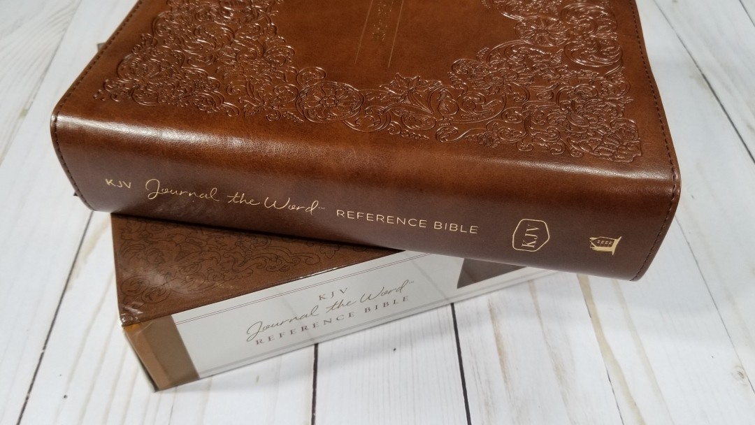
Journaling Bibles are popular because they provide wide margins and thick paper at low costs when compared to wide margin editions. One thing they typically lack is cross-references. Those who want them have to use part of the margin for references, which reduces the space they can use for notes. Thomas Nelson’s KJV Journal the Word Reference Bible solves this by providing a journaling Bible with references in an elegant design. I’m reviewing ISBN: 9780785220206. It was made in China.
Thomas Nelson provided this Bible in exchange for an honest review. I was not required to give a positive review, only an honest one. All opinions are my own.
_________________________________________________________
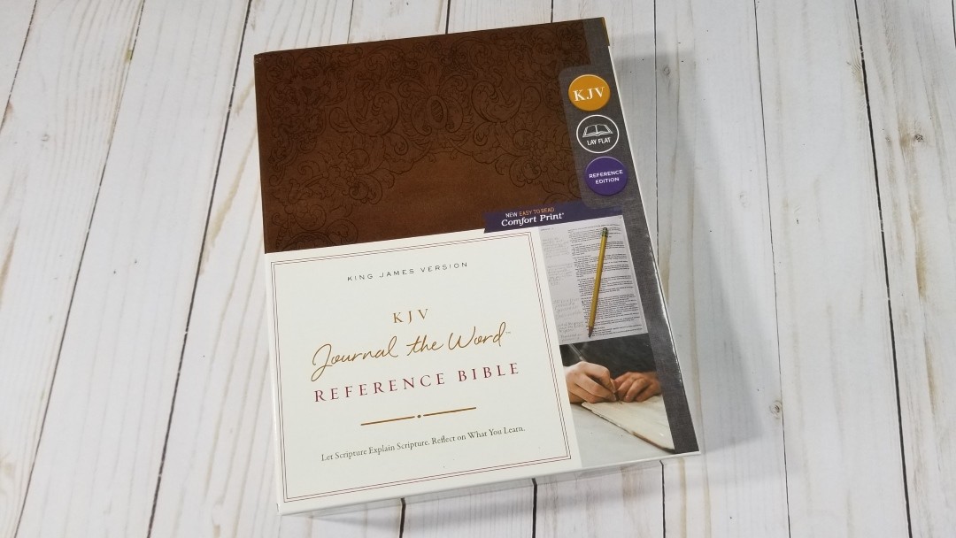
This Bible is available at (includes some affiliate links)

and many local Bible bookstores
_________________________________________________________
Video Review

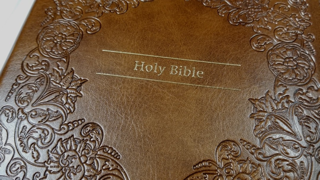
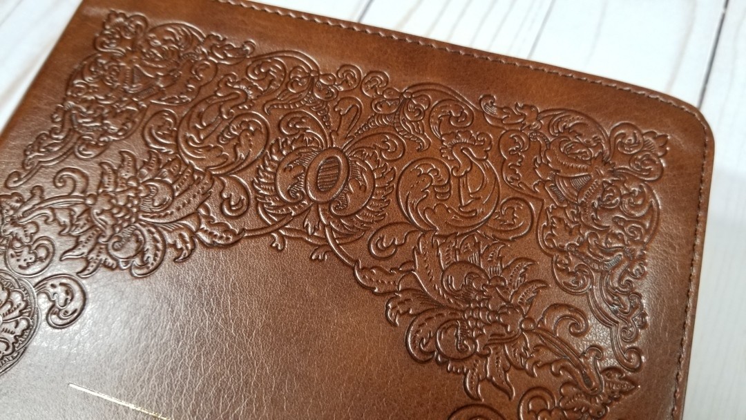
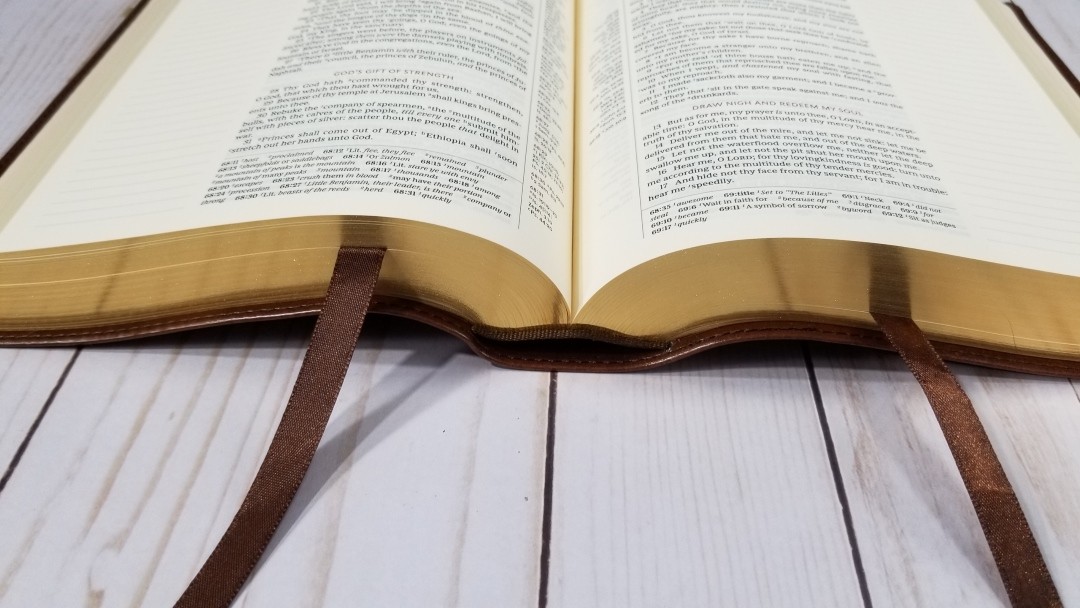
Cover and Binding
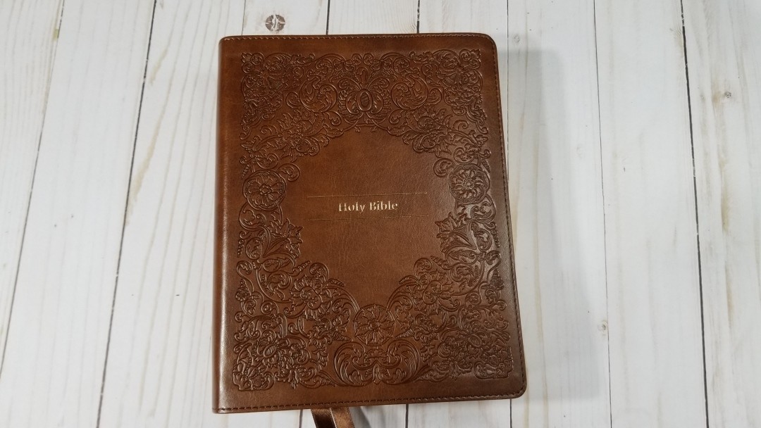
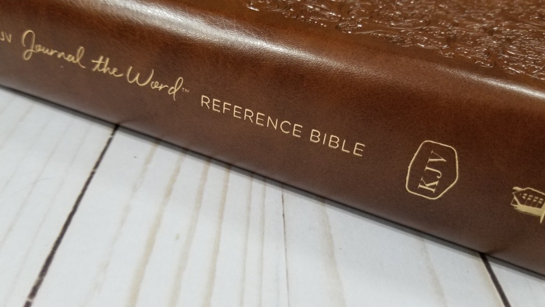
The cover is brown Leathersoft. It has an elegant pattern embossed into the front that looks like tooled leatherwork. In the center is the words Holy Bible with two gold lines. The spine has the title and logos stamped in gold. Even though it’s imitation leather it looks and feels elegant.

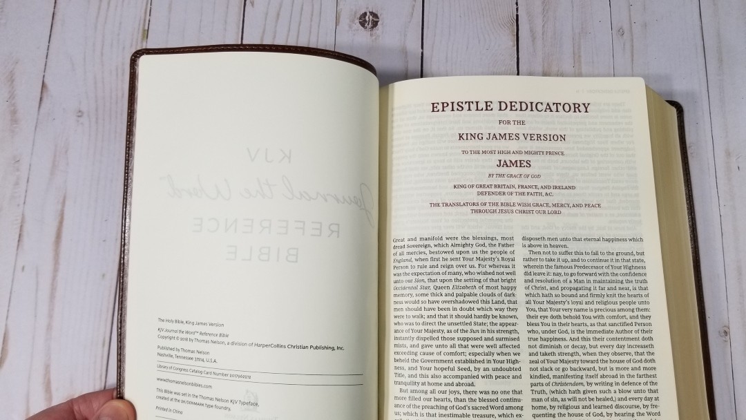
The liner is paste-down paper. It has a nice pattern and includes a place for the owner’s name. The text-block is Smyth sewn. It will need to break in before it will stay open in Genesis.
The overall size is 8.25 x 6.75 x 2″ and it weighs 2lbs,9.6 oz. It has two long brown ribbons at 3/8″ wide.
Paper
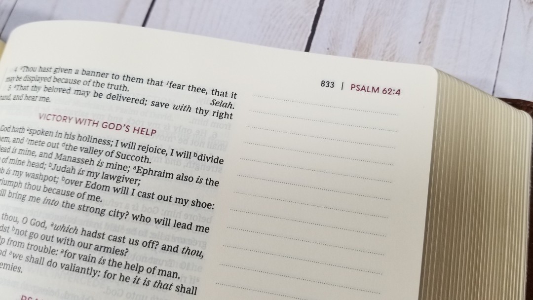
The paper is around 38+ gsm. It’s the standard paper that’s found in most journal editions and it’s great for pens, markers, highlighters, art, notes, etc. It’s not quite yellow but it is on the yellow side of cream. I was actually hoping for the whiter paper used in the Zondervan edition. I do like cream paper, but I prefer it closer to white than yellow. This is great for notes, though. The paper has a slightly rough texture that I find is perfect for turning pages. It’s highly opaque.

It has 6 lined pages in the back for notes.
Typography
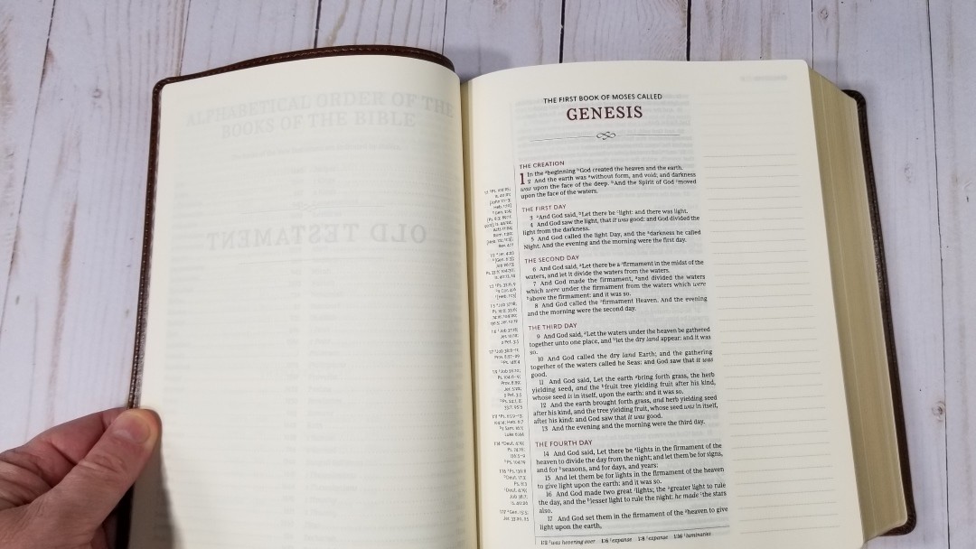
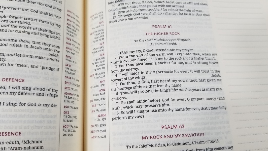
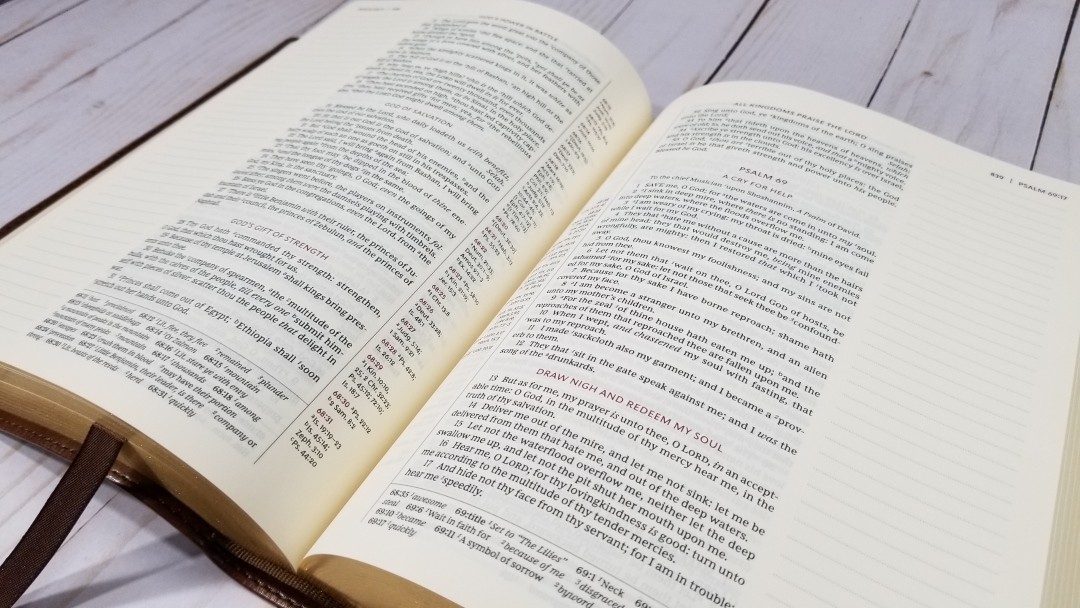
The text is presented in single-column verse-by-verse format. References are placed in the inner margin and are centered. Footnotes are placed under the last verse on the page. The header includes the book name, chapter, and verse numbers in dark red in the outer corner followed by the page number in black. The section headings, book names, chapter numbers, and pilot reference numbers in the margin are printed in dark red. This is probably my favorite red in any Bible. The margins are 2″ and include dotted lines.
It uses the Comfort Print typeface designed specifically for the KJV by 2K/Denmark. The typeface is labeled as 8.5. It is on the small side, though. I would have guessed it around 7.5. It’s similar in size to the Cambridge wide margin Pitt Minion series but slightly smaller than the wide margin Concord. It does have a lot more space between the lines (leading) than any of the wide margin editions. This helps make it comfortable to read.


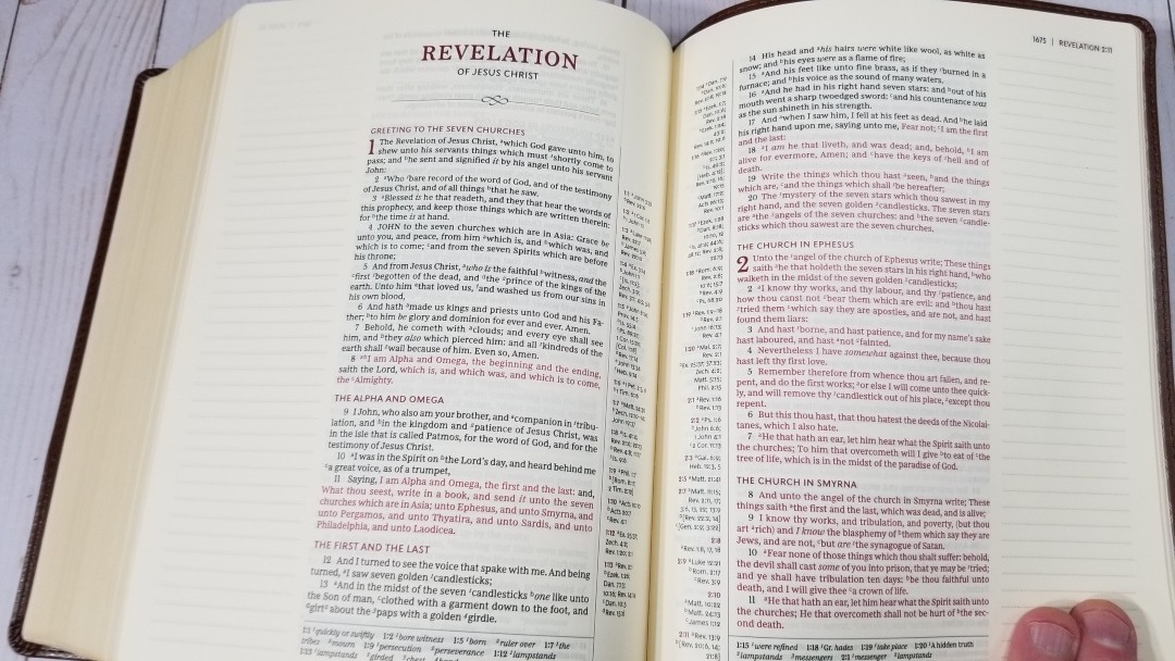
This is a red-letter edition. The red isn’t as dark as the highlights, but it still looks great. Both the black and the red are dark and consistent throughout. For my eyes, a little bit of the legibility and the elegant highlighting is lost due to the yellow paper. It has around 12-14 words per line. It seems to be printed with line-matching.
References
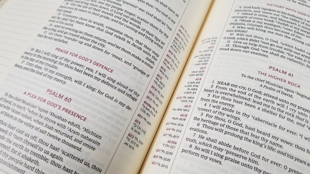
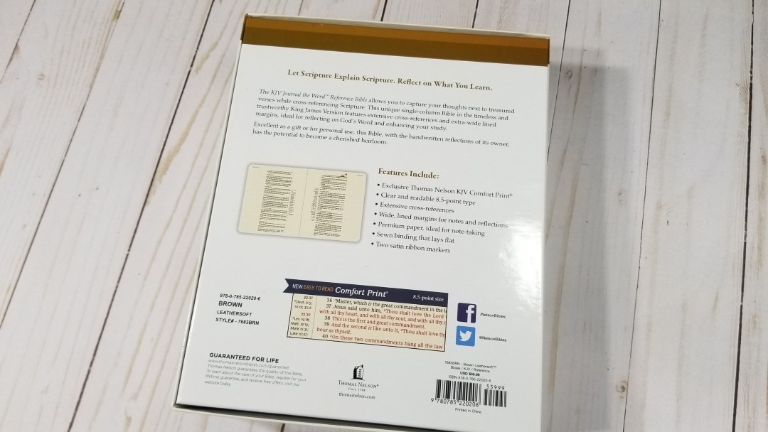
This Bible has more cross-references than other reference editions from Thomas Nelson. These are the references found in the KJV Study Bible. They’re excellent for study and sermon prep, which is especially important considering it doesn’t have a full concordance.
Here are some example references to help you compare:
- Genesis 1:1 – Ps. 102:25; Is. 40:21; John 1:1-3; Heb. 1:10; Gen. 2:4; Ps. 8:3; 89:11; 90:2; Is. 44:24; Acts 17:24; Rom. 1:20; Heb. 1:2; 11:3; Rev. 4:11
- Deuteronomy 6:4 – Deut. 4:35; Mark 12:29; John 17:3; 1 Cor. 8:4,6
- Isaiah 9:6 – Is. 7:14; Luke 2:11; John 1:45; Luke 2:7; John 3:16; I John 4:9; Matt. 28:18; I Cor. 15:25; Rev 12:5; Judg. 13:18; Titus 2:13; Eph. 2:14;
- Matthew 17:20 – Matt. 21:21; Mark 11:23; Luke 17:6; I Cor. 12:9
- Mark 11:23 – Matt. 17:20; 21:21; Luke 17:6
- Mark 12:29 – Deut. 6:4, 5; Is 44:8; 45:22; 46:9; I Cor. 8:6
- John 1:1 – Gen 1:1; Col 1:17; 1 John 1:1; I John 1:14; Rev. 19:13; John 17:5; John 1:2; 1 John 5:20
- Acts 2:38 – Luke 24:47
- 1 John 1:1 – John 1:1; I John 2:13,14; Luke 1:2; John 1:14; 2 Pet. 1:16; Luke 24:39; John 20:27; John 1:1, 4, 14
Footnotes

The footnotes are placed at the bottom of the page, under the last verse. They’re separated from the text with a line and they’re printed in a slightly smaller font. They include the pilot chapter and verse numbers in bold black. These are the Thomas Nelson’s updated footnotes which include definitions of words that have changed in meaning, such as describe, prevent, and let. These notes are excellent for study and I’m glad to see them included, as most journal editions do not include footnotes for the KJV.
Dictionary / Concordance
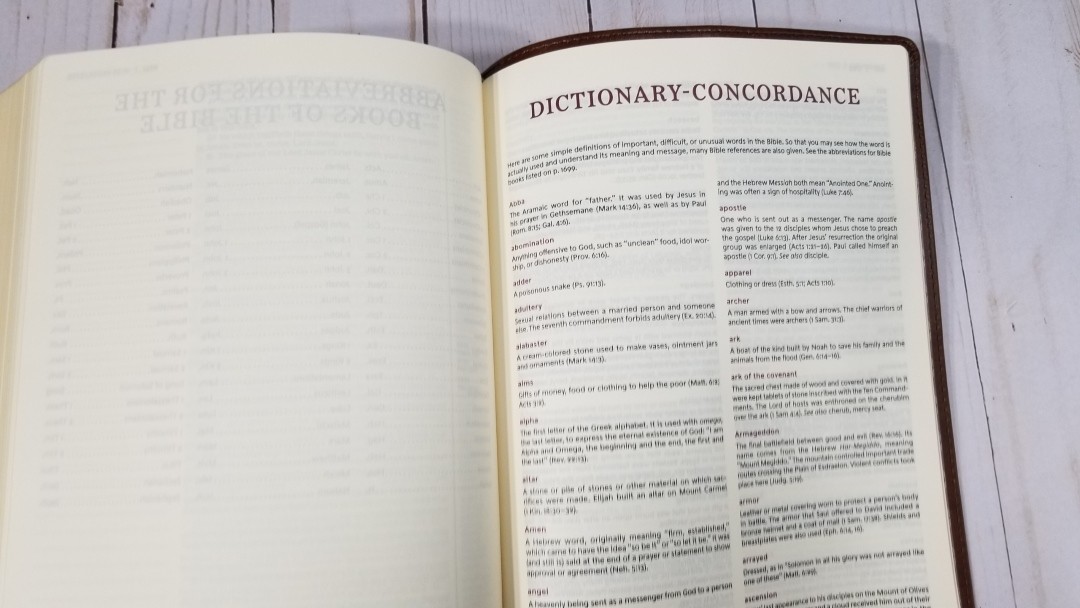
Rather than a regular concordance, this one has a dictionary/concordance combo. It’s small (13 pages) and focuses more on the dictionary portion than the concordance portion of its name. It mainly covers definitions of important and difficult words. It’s small, but it is helpful for looking up those words.
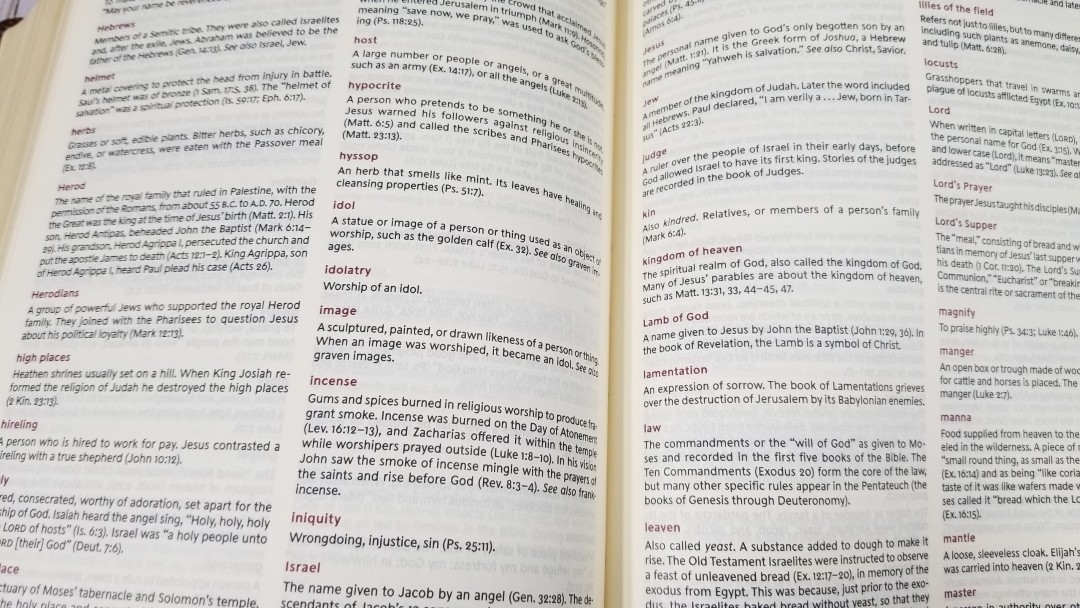
It covers things like Atonement, Ark of the Covenant, baptism, etc. It covers them from more of a historical/factual standpoint rather than a theological standpoint. It doesn’t include words that have changed in meaning (like describe, prevent, and let), but a lot of those are handled in the footnotes.
Conclusion
Thomas Nelson’s KJV Journal the Word Reference Bible is an excellent journal edition. The text and highlights are elegant. Some of this elegance is hidden due to the yellowish color of the paper, but the paper is great for writing and turning. If you’ve seen a regular journaling edition then you’ll be familiar with this paper. With the cross-references from the KJV Study Bible it’s a great choice for those looking for a Bible for notes and study.
_________________________________________________________
This Bible is available at (includes some affiliate links)
and many local Bible bookstores
_________________________________________________________
Thomas Nelson provided this Bible in exchange for an honest review. I was not required to give a positive review, only an honest one. All opinions are my own.