
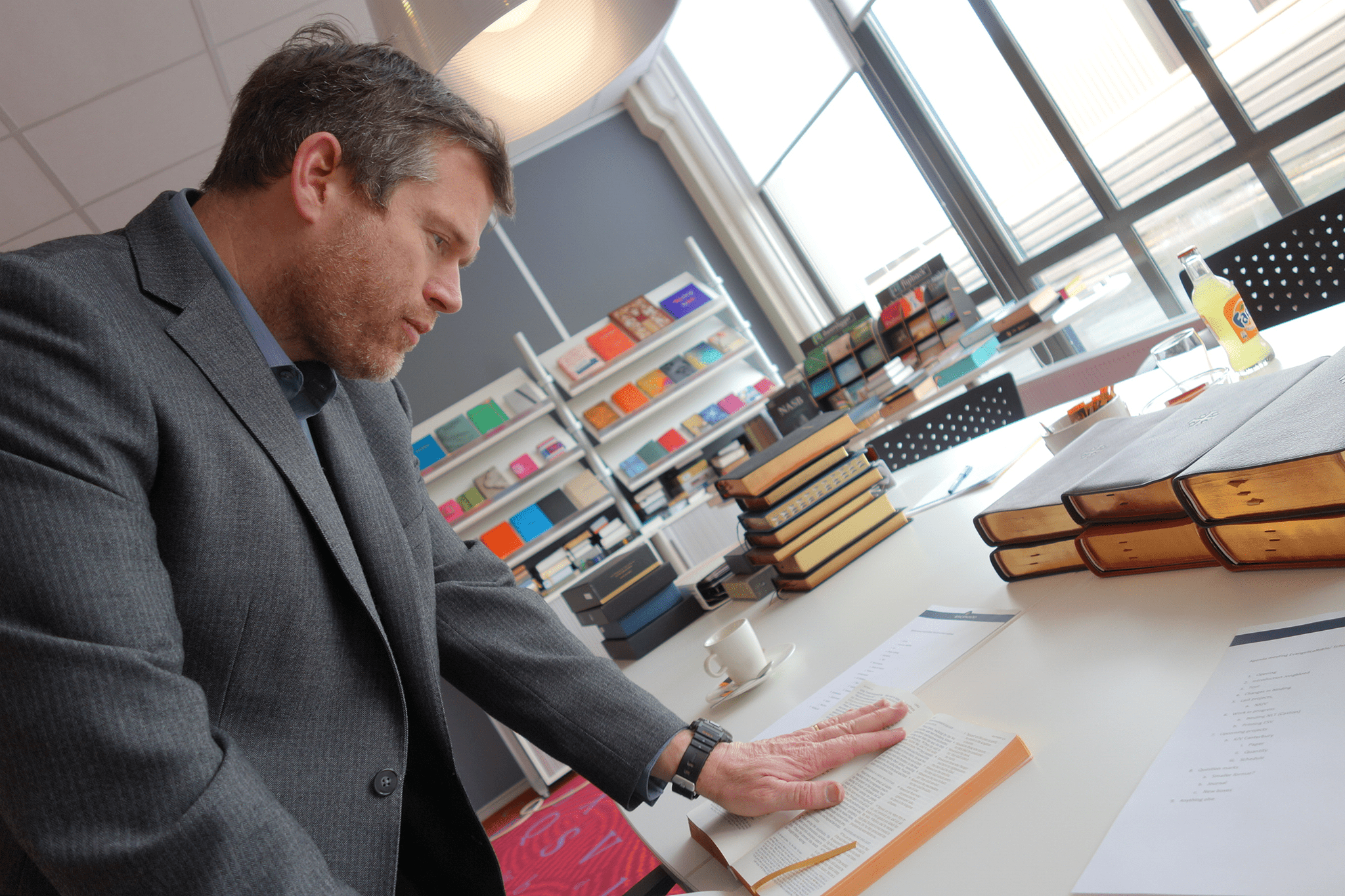
I’ve book looking forward to the Schuyler Treveris since its announcement last year. This is a unique layout, starting with the KJV, which focuses on the text for reading. while remaining usable for study and carry.
Now that the Treveris is available for pre-order, I wanted to gain a few insights on the design from Sky Cline – the owner of Evangelicalbible.com and Schuyler Bibles. I’m happy to announce that Mr. Cline agreed to an interview! Here are his thoughts in the Treveris…
The Schuyler Treveris is a unique design. Tell us about that design and how it came about.
The Treveris was designed from the start to be a ‘Reader’ – that is a Bible without all of the man-made clutter of headers, callers, summaries, and numbers, etc. We wanted to have a Bible that was essentially free of human interference, facilitating a closer encounter with the Word.
At the same time, we acknowledge that some of these human conventions are practical and useful. So we kept the verse numbers, but we took them out of the text and put them in the margins. Likewise, we put chapter headings in the ‘headers.’ As a result, the reader can appreciate the unencumbered reading experience but can decide to use verse and chapter numbers when those conventions are useful.
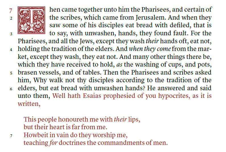
It should also be noted, for the King James Version, this layout is pioneering design. The Treveris’s poetic sections and quotations have been ‘set off’ in a block verse-by-verse format. This is extremely rare for a KJV layout. We actually consulted with the renowned King James scholar, David Norton, regarding conventions to ‘set off’ the poetry and quotations. Norton wrote Cambridge’s Textual History of the King James Bible and edited the Cambridge New Paragraph Bible. These indentations make for a more informed and intuitive if not enjoyable encounter with the Bible.
What are the benefits of using a Bible like this and how do you imagine this Bible being used?
Some Reader Bibles have stripped out all verse numbers and identifiers – which make for a unique reading experience – however it is likely that this Bible will remain in the realm of ‘specialty.’ By adding these practical features in the margins, we have designed a ‘Reader’ that can still be one’s ‘Primary’ Bible. It is a Bible that can be used in preaching, studying, and devotion. So basically the reader has the best of both worlds. He can enjoy the benefit of a truly immersive reading experience, free of man-made interference, but can utilize the identifying tools on the sidelines as necessary.
The overall size seems to be close to the middle between the Quentel and Personal Size Quentel. How did you decide on this size?
The short answer is that I have always liked the Cambridge Concord for its size. For those of you are familiar with this Bible – it is almost exactly similar in size.
As a Bible designer legibility is always my most important criterion. The Treveris’ 10 point bold font and Bible size produce a very portable and very readable edition. It hit my personal ‘sweet spot’ for Bible size.
I’m excited to see the Treveris design and I’m glad you started with the KJV. When will the next translation for the Treveris be revealed?
One of our most common questions is which translation will be next in line. One of the reasons for this excitement is because the Treveris gives our modern translations a more classic – ‘Canterbury’ style which has become enormously popular. Though we have not made any firm decision – it will likely be the ESV – but of course publication decisions can change rapidly.
My Thoughts
I’d like to say a special thank you to Sky Cline for the opportunity to talk with him about the Treveris.
I love the Treveris design. This design focuses on readability and that’s something that we all need more of. The poetic layout in the NT is something I’ve wanted for the KJV for many years. Moving the verse numbers to the margin helps make the verses easy to find. The verses still start with a capital letter and many verses start with a new sentence anyway, so it won’t be that difficult to find them. Plus, the worst case is we read a little bit before and after a verse.
I’m looking forward to seeing the Treveris in person. It’s currently available for pre-order in several colors including goatskin and calfskin. For more information, see the Treveris page at Evangelicalbible.com.